Being an art spectator can be a challenging endeavor. With great effort comes the expectation for a worthwhile reward, yet laboring in an attempt to understand can be an equally fulfilling exercise. Confusion, discomfort, or uncertainly can be virtues not vices. Sometimes, work is intended to be misunderstood…and it’s best that way. Compelling visual or visceral experiences, inexplicable as they may be, are catalysts for art experiences, as Brian Eno would refer. And then there are the other works—the other experiences—when the true challenge is in developing the stamina to search for merit.
The same can be said for design, with the difference being a thorough, if not fan-like, attempt to appreciate design on display. Exhibited design compels, through its elevation, a desire to see work flourish in this context: pristine, honored, preserved. The work is often pushed out of its original contextual relationship, betraying its value some would argue. Matali Crasset has designed an exhibition that is a proposal of experiences and form, and in this she avoids this context manipulation issue inherent in combining previous works for display. In creating new design for exhibition the context is the exhibition. The designer’s challenge then lies in creating a cohesive and compelling body of designs that lack the luxury of previous realization as proof. Crasset attempts this by exploring and proposing audiovisual interaction in the home, in her installation soundscapes as part of the Solos series at the Copper-Hewitt National Design Museum.

Solos: Matali Crasset is the first solo exhibition in the U.S. of the multidisciplinary French designer’s work. [Architectural digression begins] At no fault of Crasset, the experience of viewing work in the Cooper-Hewitt’s basement level is always a strange endeavor. The exhibits tend to be linear, but the stairway which enters to the beginning of these exhibits is a dubious find in the lobby. Thus most visitors descend to the lowest level via elevator, emptying into what is often the end of the exhibit. Like others, her exhibit starts on this note of confusion. [Digression complete]
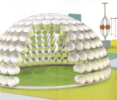
The first piece, and again intended to be the climax, is an 8- or 10- foot-tall half-sphere, constructed of white plastic bucket-like forms approximately a foot in diameter each, arranged to form a cell-like shell with their openings facing the exterior of the sphere. A doorway-sized opening allows entry into the sphere. The interior takes on the lime hue of the floor (see illustration from exhibition collateral above). Inside, four approximately 4-inch speakers are mounted near ear level. They emit a slightly gray form of white noise—pops and blips occasionally appearing among the static. At moments, the sounds seem to lock into rhythm. It seems too, that the volume increases in relationship to the body’s proximity to the speakers—more-so than the natural physical effects of this position change, though the piece, neither in form nor in fabrication, appears to address this. Where this experience is tangent to real experiences, especially those in the home, is left unarticulated.
This also fails to explain the assortment of objects displayed inside some of the bucket openings on the sphere’s exterior. A foot or so below eye-level, low enough to require a hunch to view, within these openings sit various sound-making devices, all electronic, mostly consumer radios and such. Was Crasset involved in their design? This remains unanswered as several of the pieces are clearly designed, at least in their physical styling, by Philippe Starck. Other examples are not actual objects at all, but facsimiles in the form of color printed photographs and/or computer renderings of the objects. What’s seen is more showroom or portfolio than proposal.
Unarguably, a flat surface can represent, suggest, or be derived from sound, but like these multi-generationally-removed prints, the other flat works on display are far from immersive. Consider their contrast with the installation’s title, soundscapes. Crasset’s adhesive wall designs rival those prominent in the Brooklyn domestic design scene, adding a bit more technology & science in lieu of tree branches and deer, yet their ability to arouse new notions of sound & interaction, as the accompanying texts propose, remains suspect. For the most part, they are satisfying decoration, and like the only piece in the installation that could find a real place in a home.
An animation projects on one wall. Linear forms and shapes, sharing a palette with the rest of the soundscapes wander through space, sometimes flat, sometimes dimensional, always without audible sound and evidently unaware of the environment. When Maeda creates similar but dynamically-generated visuals for a corporate showroom, it isn’t difficult to imagine their application in a future residence as a sort of living wallpaper. Crasset misses this same sense of feasibility, perhaps from the lack of warmth or organic motion evidenced in Maeda’s work.
A similar animation accompanies immersion—a plastic chair sitting low to the ground, formed from rigid, mostly rectilinear forms. The chair faces another whose backrest is replaced with an LCD screen and whose arm rests are turned upward and cradle speakers. In the most provocative piece in the installation, Crasset suggests a conversation between person and media, as both lounge and face one another, as equal and exchangeable entities. Unfortunately, sitting in the uncomfortably rigid chair appeared to have no effect on the images or sound one faces. One-way media does not interaction make.
Why so frustratingly and subtly quiet, this exhibit concerning the experience of sound? Why animated, but unresponsive? With forms that sing of retro-futuristic utopianism, the soundtrack to the future is unclear and the experience alienating. Where’s the hook? The challenge to find it can be compelling, but please, turn up the volume.
Solos: Matali Crasset is at Copper-Hewitt National Design Museum from May 19th through September 24th, 2006.


