Speak UpA Former Division of UnderConsideration
The Archives, August 2002 – April 2009
advertise @ underconsideration
---Click here for full archive list or browse below
  
Going Postal

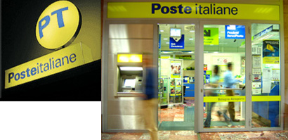
I recently paid a visit to an Italian Post Office. I was sending some postcards to friends and family when I realized how drawn I found myself to this place—with its bright yellow, big glass windows and spare advertising (within the store).

The postal service is something that we all use, on a regular basis, no matter where we are. Yes, e-mail has spared us the daily visit, and the FedEx guy stopping by everyday has also reduced our interaction with the long lines in inevitably warm rooms but, in the end, we depend on it. So why not pay more attention to their design?

Let’s take a look at what is out there, on a regional basis:


divider

NORTH AMERICA

divider

Canada: Canada Post


With over 60,000 employees, Canada Post processed 11.1 billion pieces of mail in 2005.


2006 stamps.

divider

United States of America: United States Postal Service


Free mail delivery in large cities began in 1863, but no official uniforms were worn until after July 27, 1868 (when Congress passed legislation authorizing use of uniforms by letter carriers).


2006 Stamps

Trivia: I thought you should know that in 2004 alone, 3,268 letter carriers were attacked by dogs. Please people, leash your puppies.

divider

Mexico: Servicio Postal Mexicano


One of the first postal services in America, it was established in 1580, they currently employ 19,735 people across all areas.


divider

SOUTH AMERICA

divider

Brazil: Correios


Going beyond postal, it also provides internet access, banking (Banco Postal), and immediate forwarding (Sedex).


divider

Argentina: Correo Argentino


divider

Chile: Correos Chile


divider

EUROPE

divider

Italy: Poste Italiane


Approximately 14,000 post offices.

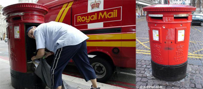
United Kingdom: Royal Mail


With 260 years of service, in March 2004, Royal Mail Group developed an independent charitable trust to manage the heritage of all Royal Mail, Post Office and Parcelforce Worldwide.


divider

France: La Poste


They also operate in the French Overseas Departments of Réunion, Guadeloupe, Martinique and French Guiana, and the territorial collectivities of Saint Pierre and Miquelon and Mayotte-while their postage stamps are valid for use in the Overseas Departments, they are not in the Territorial Collectivities.


divider

AFRICA AND THE MIDDLE EAST

divider

Israel: Doar Israel


Less than forty-eight hours after the proclamation of the Independent State of Israel on Friday, May 14, 1948, enemy planes had launched their first attack and Israel had issued her first postage stamps.

divider

Kenya: Posta Kenya


divider

South Africa: SAPO, South African Post


Dealing with some eight million mail items to almost 6,5 million address-3,4 million of these are street addresses and three million are postboxes.

divider

Iran: I.R.I Post Company


divider

ASIA

divider

Japan: Japan Post


divider

China: China Post


“The logo of China Post combines the calligraphy of the Chinese character and the image of the postal network. Taking the look of wings, it can be associated with the ancient figuration for message exchange. Simple but vigorous, the logo is mainly made up of horizontal and vertical parallels, indicating the sense of order and far reaches. The right-leaning writing gives the sense of direction and speed. The logo of China Post implies that our target is to serve thousands of households and our image is to be rapid, accurate, safe and far reaching.”
China Post 2004 Annual Report


divider

Singapore: SingPost


Singapore Post has a heritage dating back to the founding of Singapore by Sir Stamford Raffles in 1819. In those days, a single mail office collected and delivered the small volume of letters. It was located in the previous Parliament House and run by just three persons.


divider

I can see that blue is not only the color of Corporate America, but of the entire postal service. As I searched for logos and images of this service I was amazed at the color palette. Don’t get me wrong, it makes sense, what with blue skies and safe colors, there is no better marriage than blue with a bright happy color such as red or yellow.

Nor was I surprised by the vast amount of “wings” across the world, although I am particularly fond of Kenya Post. It is softer, cuter and somewhat localized, which makes it a bit more special in my heart. Granted you want to be global as a postal service, but does that mean you need to lose your national identity? And look like everyone else?

In the end, I have to admit I am not impressed or smitten with any of the identities I randomly researched (other than the Italian one, which started it all). Why? Why don’t we pay more attention to a company that represents us on an international level, that connects us within our country and with those we love? One of the few institutions that deal on every area of a country, be it the largest city or the most remote village—always present, usually an eyesore.

Maintained through our ADV @ UnderConsideration Program
ENTRY DETAILS
ARCHIVE ID 2728 FILED UNDER Discussion
PUBLISHED ON Jun.23.2006 BY bryony
WITH COMMENTS
Comments
Tselentis’s comment is:

Why don't we pay more attention to a company that represents us on an international level, that connects us within our country and with those we love?

Bryony, the same question could apply to our currency, a god-awful collection of greens on an old and weathered sheet of paper that's plastered with dead white men. But the answer lies at the top level: government. Has the government (specifically our's) ever been aesthetically concerned with its identity? Whether the post carriers, space program, currency, or government identity itself?

On Jun.23.2006 at 01:26 PM
Alex Torrance’s comment is:

I have found that in continental Europe yellow is more the prominent colour of the postal service. Italy, France, Germany and Spain all have yellow as the colour of their vehicles and post boxes. Usually with the logo in blue. The Royal Mail uses yellow as a secondary colour to red moreso than it does blue.

I'm also surprised by the lack of post-horn insignia, I always assumed this was a global device. Wings present a more modern take on the mail system, representing an international service. I wonder if the post horn has lost favour to the wing.

On Jun.23.2006 at 01:45 PM
DC1974’s comment is:

Actually, the USPS WAS radically altered to a more brand friendly point of view in the 1990s by the Postmaster General of the time who not-so coincidentally was the husband of a branding consultant based in Nashville. When he ran the Tennessee Valley Authority -- or TVA -- previously, he also, with her assistance, oversaw the rebranding of that organization, a part of the federal government.
Although blue became the dominate color for the TVA, the history of blue with USPS already existed (like Red in England) and so is probably more a function of history -- and all those post boxes -- than anything.
Also note, that as of right now -- and this is set to change -- Japan Post is also Japan's state-controlled banking system, especially for savings deposits of rural residents. (And a frequent system whereby Japanese politicians fund local building projects.)

On Jun.23.2006 at 01:54 PM
JonSel’s comment is:

The British Royal Mail tried, a few years back, to brand themselves as more than just "the post office". They even adopted a generic corporate moniker, Consignia. It failed miserably. You can read about it on BrandChannel.

On Jun.23.2006 at 04:41 PM
Héctor Muñoz’s comment is:

Come on, I'm sure you could find a better picture for the mexican post service, this pic is only missing a mule!

Check out: http://www.palaciopostal.gob.mx/

On Jun.23.2006 at 05:25 PM
Bryony’s comment is:

Has the government (specifically our's) ever been aesthetically concerned with its identity? Whether the post carriers, space program, currency, or government identity itself?

Should this be excused? or should "somebody" do "something"?

Come on, I'm sure you could find a better picture for the mexican post service, this pic is only missing a mule!
Indeed I did. It was also the best example of all the different countries for the remote village point I am making. Is it stereotypical? Only if you want to see it that way, since as a Mexican I am used to seeing it be this way (and Royal Mail didn’t have anything that would serve my needs).

(And the music on that site [Palacio Postal] made me avoid it on purpose.)

On Jun.23.2006 at 05:35 PM
marian bantjes’s comment is:

I spend more time at the post office now than I have in many years. I send and recieve a lot of packages, so I actually go inside a few times a week and look around at the place while I'm waiting. Luckily, I go to a small, easily accessible post office here on the island and the wait is usually short and often taken up with local gossip and chit chat.

But I have to say that the Canada Post "brand" is heavily leveraged, and used consistently enough to have a recognizable look. They have a wide variety of branded envelopes and packaging materials, posters and commemorative items (stamps and coins sets from the Royal Canadian Mint), along with t-shirts and tchochkes like post-box piggy banks and little bears dressed in postal outfits. Barf. Ahem.

So I would say that a great deal of attention is given to the design and branding of the postal service (and I am beginning to suspect that their main line of business is in the sale of collectible items, rather than mail delivery) ... it's just not exactly to my taste (or probably, to yours).

This is one of those areas, like the marketing of candy bars, where the design is dialed to appeal to the vast majority of the population. And, much to my eternal horror, it seems that most Canadians like things I do not like (witness our government).

On Jun.23.2006 at 08:51 PM
marian bantjes’s comment is:

By the way, I also noticed and admired both the Italian Postal identity and Britain's, when I was there. I think it might be safe to say that Italians generally have better taste than we do, and as for Britain, while the logo type for Royal Mail is an abomination ... well those cast metal post boxes are just so goddamned cute!

On Jun.23.2006 at 08:55 PM
Bryony’s comment is:

Most of them have the branded boxes and collectibles, but overall I find rather hideous. Everything is too big, too bold, too over the top for me. Most of the websites have a shopping sections where you can purchase these items (unless they don't work or are coming soon), but especially the most collected item across the world: stamps.

I agree Marian those English mailboxes are beautiful, if only they didn't have to be associated with that awful logo. If only one could live consistency of quality...

On Jun.24.2006 at 08:00 AM
Pesky Illustrator’s comment is:

I 'm less concerned about their choice of colors... if only they could deliver packages that weren't mangled or opened. How do they manage to stuff my 9" x 12" envelopes in those 4"x 4" x 12"
apartment postal boxes?

On Jun.24.2006 at 08:23 AM
Jason A. Tselentis’s comment is:

bryony wonders should "somebody" do "something"? Yes, somebody should design instead of letting the government get away with what they call "design."

On Jun.24.2006 at 01:44 PM
felixxx’s comment is:

in 2004 alone, 3,268 letter carriers were attacked by dogs.

Oh, thats rich. 50 of those incidents must've come from my block. Whenever Kitty (my dog) is on the porch, and the substitution carrier is on the march, the entire neighborhood goes postless.

In this US Postal Service Logo growler Tony Spaeth calls our current mark "strained and instantly dated". THough I agree Raymond Loewy's design is better, I think its just barking. Theres no real science here.

On Jun.25.2006 at 09:42 PM
bootchec’s comment is:

Please have a look at Polish post its branding is slightly different from others because of the historical context
http://pocztapolska.pl/

On Jun.26.2006 at 04:41 AM
Tom ’s comment is:

I have found that in continental Europe yellow is more the prominent colour of the postal service.

Yellow strikes again with the Swiss.
I kind of expected something different. Am I alone here?
Interesting manipulation of the Swiss cross. Ouch.
swiss post

On Jun.26.2006 at 11:17 AM
bryony’s comment is:

I am particularly bothered by the white underscore in the Swiss Post logo.

Maybe because of the personal closeness that I have with Canada, US and Mexico I have to point out the similarity between these logos and wonder if the touching borders have anything to do with it. From color, to rules, to shapes, to overall size and shape, direction, slant...Am I reading too much into these?

On Jun.27.2006 at 08:10 AM
dan’s comment is:

I agree the Swiss Post logo is not that good with the underline. Overall not many stand out as being great marks.

Here is another post company to the mix - New Zealand Post - I like how alot of the promo material only uses their mark and not the logotype (not many examples of this are on their website though).

On Jun.27.2006 at 01:20 PM
Matthew Rodgers’s comment is:

I have to say that I'm very taken with Kenya's logo. It does the bird=flight=fast mail connection much more subtly than more familiar marks.

On Jun.27.2006 at 08:34 PM
mogo’s comment is:

The Canada Post brand is one of the few Canadian governmental brands I actually enjoy. *sigh* Now the Ontario trillium logo has been "updated". I have no words, really for this.

On Jun.28.2006 at 12:11 PM