Speak UpA Former Division of UnderConsideration
The Archives, August 2002 – April 2009
advertise @ underconsideration
---Click here for full archive list or browse below
  
Logophobia

The last thing one needs is undue media attention. The point when people know (or think they know) what you do is the point when you start getting the kind of random feedback which traditionally drives designers nuts.

Adding to the client psychotherapy that is part of our daily duties, is the increasing need to combat misconceptions which result from everyday media. For example, I was dumbfounded by Chevrolet’s recent Winter Olympic ad campaign which stated “America’s Brand Supports America’s Best” — not for their quality; but because they used the word “brand” so blatantly.

Since when does the American public know what branding is?

Along with general public discourse on box office receipts, cooking and political campaign strategies, we have recently seen televised exposés on fashion, bounty hunting and now, logo design.

Yesterday morning, the program CBS News Sunday Morning aired their “Money Issue”. Among stories about businessmen, corporate philanthropy, personal debt and retirement, correspondent Russ Mitchell went “behind the draft boards to find out how logos are made.”

In the segment, a team from C&G Partners (including Steff Geissbuhler, Emanuela Frigerio, and Jonathan Alger) designed a logo for “The Money Issue” while Steve Heller discussed their methodology as well as the cultural effect of corporate logos. The C&G team only had three days to come up with a presentation and it was noted that they were not going through the research and preparation stages usually required before sketching.

After individual work, group critiques and explorations of animation possibilities, C&G whittled it down to three choices.
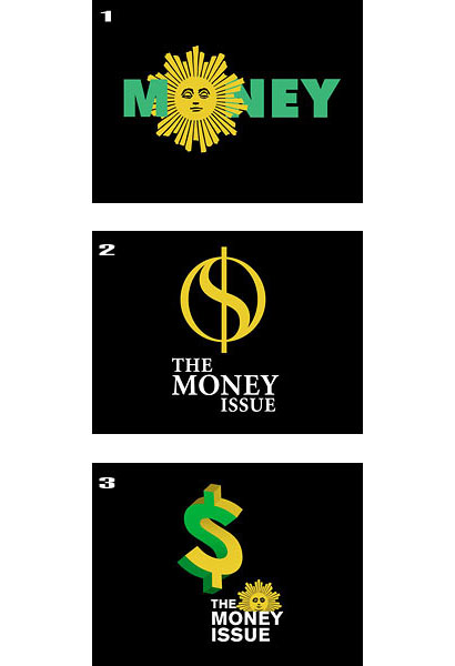
cbs_logo_candidates.jpg

The proposals were not presented on air. To see them, viewers were instructed to visit the Sunday Morning website — where they could vote for their favorite. No discussion about why they were selected above all the other designs; no discussion about iconography, intent nor context. Nothing.

Except the promise to reveal the winner next Sunday Morning.

Most see the designer as a set of hands — a supplier — not as a strategic part of a business. Their background is primarily marketing, purchasing, or advertising; only incidentally or accidentally are they connoisseurs of design. It is their uninformed, unfocused preferences or prejudices, their likes or dislikes, that too often determine the look of things. Yet they may not even be discriminating enough to distinguish between good and bad, between trendy and original work, not can they always recognize talent or specialized skills. They have the unique privilege, but not necessarily the qualifications, to judge design.
— Paul Rand Design, Form, and Chaos

By the nature of presentation, CBS’s logo exercise — as well as Target’s imprimatur of “design” — cannot convey enough to make any designer comfortable. Design is a practice based in doubt. Doubt about form, meaning, context, personal reputation, the competition, intent, and production mean the most minor decisions can require excruciating deliberation. Much too vague for a five-minute segment.

So for immediacy’s sake, the general public is offered soundbites about companies burning through lots of cash in the creation of logos and advertising platitudes. Design inspires… Design shapes… Design shines… But rather than rail against the injustice of surface interpretations, perhaps we should attempt incorporating everything we’ve come to hate about them into our strategy.
cbs_war_is_over.jpg

It sounds perverse enough to be useful. Or at least keep in mind that no longer how specific, how clear, how focussed you are; it’ll be something totally different in the end. Or maybe not. Oh damn, I wish I was smart enough to read Foucault properly.

The sagacity of the commentators is not mistaken: from the kind of analysis that I have undertaken, words are as deliberately absent as things themselves; any description of a vocabulary is as lacking as any reference to the living plenitude of experience. We shall not return to the state anterior to discourse — in which nothing has yet been said, and in which things are only just beginning to emerge out of the grey light; and we shall not pass beyond discourse in order to rediscover the forms that it has created and left behind it; we shall remain, or try to remain, at the level of discourse itself. Since it is sometimes necessary to dot the ‘i’s of even the most obvious absences, I will say that in all these searches, in which I have still progressed so little, I would like to show that ‘discourses’, in the form in which they can be heard or read, are not, as one might expect, a mere intersection of things and words: an obscure web of things, and a manifest, visible, Coloured chain of words; I would like to show that discourse is not a slender surface of contact, or confrontation, between a reality and a language (langue), the intrication of a lexicon and an experience; I would like to show with precise examples that in analysing discourses themselves, one sees the loosening of the embrace, apparently so tight, of words and things, and the emergence of a group of rules proper to discursive practice. These rules define not the dumb existence of a reality, nor the canonical use of a vocabulary, but the ordering of objects. ‘Words and things’ is the entirely serious title of a problem; it is the ironic title of a work that modifies its own form, displaces its own data, and reveals, at the end of the day, a quite different task. A task that consists of not — of no longer treating discourses as groups of signs (signifying elements referring to contents or representations) but as practices that systematically form the objects of which they speak. Of course, discourses are composed of signs; but what they do is more than use these signs to designate things. It is this more that renders them irreducible to the language (langue) and to speech. It is this ‘more’ that we must reveal and describe.
— Michel Foucault The Archaeology of Knowledge

~

This book first arose out of a passage in Borges, out of the laughter that shattered, as I read the passage, all the familiar landmarks of my thought — our thought, the thought that bears the stamp of our age and our geography — breaking up all the ordered surfaces and all the planes with which we are accustomed to tame the wild profusion of existing things, and continuing long afterwards to disturb and threaten with collapse our age-old distinction between the Same and the Other. This passage quotes a “certain Chinese encyclopedia” in which it is written that “animals are divided into: (a) belonging to the Emperor, (b) embalmed, (c) tame, (d) sucking pigs, (e) sirens, (f) fabulous, (g) stray dogs, (h) included in the present classification, (i) frenzied, (j) innumerable, (k) drawn with a very fine camelhair brush, (1) et cetera, (m) having just broken the water pitcher, (n) that from a long way off look like flies”. In the wonderment of this taxonomy, the thing we apprehend in one great leap, the thing that, by means of the fable, is demonstrated as the exotic charm of another system of thought, is the limitation of our own, the stark impossibility of thinking that.

— Michel Foucault The Order of Things : An Archaeology of Human Sciences

In using the coinage “logophobia”, I’m applying the Stoic definition of “logos”: a method or principle of generating specific seminal reasons (logoi spermatikoi) from which individual things are described. Nietzsche quotes Stendhal: “To be a good philosopher, one must be dry, clear, without illusion. A banker who has made a fortune has one character trait that is needed for making discoveries in philosophy, that is to say, for seeing clearly into what is.” (“Pour �tre bon philosophe, il faut �tre sec, clair, sans illusion. Un banquier, qui a fait fortune, a une partie du caract�re requis pour faire des découvertes en philosophie, c’est-�-dire pour voir clair dans ce qui est.”)

Being one of the most “phobic” when it comes to mass-media definitions of design, I’m attempting to wrap my brain around the possibility that there may be something of value in what, at the surface, appears to be a bullshit exercise — like the Sunday Morning logo contest. As in the Chinese encyclopedia, the media isn’t exactly wrong in their definition — only different. And from that difference comes meaning.

This isn’t to say that I’m perfectly happy with the portrayal of design on Sunday Morning, Target ads, The Apprentice, et al. In the specific case of the Sunday Morning logo story, I felt some cognitive dissonance between C&G Partners’s professionalism (ties, neat office, organized crit board) and their casual comments. Now, casualness of speech and interaction are important in a creative environment to encourage uninhibited participation. But how often do we see people in business dress speaking this way on television? Outside of situation comedy, that is.

Heller, on the other hand: articulate and surrounded by books; both consistent with each other, and with the preconceived notion of an author.

Frankly, these perceptions are my hang ups: idiosyncratic and limiting. Misconceptions are a gift. They’re a reality check and they describe the discourse. The challenge is finding value in these “Chinese” definitions; in the portrayal of design to clients and to the world. I have vague thoughts about design strategies which combat preconceived notions — avoiding the search for the “magic” typeface, diffusing inflated expectations, etc. — but that’s going to take a while. Yet I’m certain about one thing: reporters will most likely get it wrong. So, keep it simple.

Maintained through our ADV @ UnderConsideration Program
ENTRY DETAILS
ARCHIVE ID 2550 FILED UNDER Essays
PUBLISHED ON Feb.27.2006 BY m. kingsley
WITH COMMENTS
Comments
Jeff Gill’s comment is:

Mark, I'm not sure if I really understand this post, so I am looking forward to reading what the discussion by persons more intelligen than me brings to light. However, I must say that the system of animal classification from a 'certain Chinese encyclopedia' is the best, most inspiring thing I've read in at least a week.

On Feb.27.2006 at 08:45 AM
Von Glitschka’s comment is:

Concerning the CBS Morning Logos.

Design 1: Can you say 'Art Explosion'? This design would have been great if created by a secretary in 1969. It has that clip-art feel to it.

Design 2: What do you get when the Safeway Logo, Oprah's 'O' Logo and a Caducious have a minashatwa?

Design 3: If Esher used clip-art he'd design a logo like this.

These are absolutely horrible. The C&G Partners make LogoWorks.com look good.

Seems like CBS execs are playing art director and because the pay check is big enough C&G is just catering rather then designing the graphics. The fact this is the end result of their creative process is very sad I think.

It's this type of work and methodology that degrades the non-designers perception of our industry.

On Feb.27.2006 at 12:43 PM
szkat’s comment is:

well, it's also a wierd sensationalist assignment done for good money in three days. theoretically, every assignment should be given thoughtful consideration, but to be absolutely frank i wouldn't expect too much for an editorial assignment like this. i agree it feels clip-arty and would be totally curious to see the background ideas on it...

On Feb.27.2006 at 01:02 PM
h.a.’s comment is:

Von,

I agree that the solution are nowhere near ground breaking. But after checking out your work, I don't think your in the position to be calling anyone's work 'clip-art.' Every single one of your logo looks like clip-art. And the packaging art you did for Kimberly Clark is a total rip-off of Felix Sockwell and tons of other single line illustrations thats seen EVERYWHERE.

The easiest thing is to bash in a glance. Try thinking of what you could've done instead of jumping to conclusions.

On Feb.27.2006 at 01:49 PM
m. kingsley’s comment is:

Jeff, you're right. It needed a couple more paragraphs, which have been added. Thanks for playing editor.

Von, I sincerely doubt that C&G Partners saw any money — only an opportunity for some promotion.

On Feb.27.2006 at 03:06 PM
Von Glitschka’s comment is:

I thought this was a design discussion board? I posted my take on the CBS Logo work. I have no idea how much if anything C&G got paid and if they didn't get paid then isn't that spec work? Yes it's promotion, but the work rendered is still weak.

h.a.'s it's easy hiding behind a nebulous screen-name and bashing me and my work. Try de-clocking and acting a bit more civil.

I didn't rip anything off of Felix. I sketched and refined those from my own head and looking at reference photos of the sport. Ripping off Felix would mean I took something he did and used it as is. Continuous line (Linear) style has been around since the days of Picasso and before, back then it was called gesture drawing. The fact it's a popular style now is not my problem. I was contacted by the client to do the work and they wanted that style. Using your logic I should have just forwarded that client to Felix?

On Feb.27.2006 at 03:46 PM
m. kingsley’s comment is:

> I thought this was a design discussion board? I posted my take on the CBS Logo work. I have no idea how much if anything C&G got paid and if they didn't get paid then isn't that spec work? Yes it's promotion, but the work rendered is still weak.

Von, a theme of my post is that the format of a 5-minute piece on television isn't enough to convey what we would like to see about design. I really don't think it matters who is interviewed; it's going to come off weird no matter what.

I'm quite confident that if I participated in the exercise, I'd look equally marginalized as C&G. Because in the end, it was Sunday Morning who decided to turn it into the horrorshow of a public vote.

Yes, Speak Up is a design discussion site. But there's got to be more to the discussion than "I like this," "I like that." In the context of any dialogue which occurs when designing a logo (i.e. between designer and client, between designers, within a designer's mind) we have limited access, and we're only slightly better qualified than the general public to make pronouncements. The meaning and measure of a logo come through in their use; not necessarily suspended in amber, as a stand-alone text.

On Feb.27.2006 at 04:39 PM
Armin’s comment is:

Unlike Von, I actually consider these logos pretty good, and way above average must logos I have seen recently — they have an elegance and simplicity that any one designer can only dream of in achieving… in three days. Having said that, I think what this little episode exposes is a very dark secret that designers don't talk about or would rather jump off a cliff before admitting to: that being that you can arrive to a very, very serviceable logo within three days, with little communication with the client, with no competitor logo check and with no pay. I think we have all done it at one point or another, where we can deliver a "good enough" solution in a short amount of time, simply because we have the ability to make something that is finished and usable — this is more common and viable with designers who have more experience and talent… and less time. These logos look as convincing as if they had been done in three months, despite C&G quickly pointing out that this is merely three days of work.

In the end, and deep down, sometimes our contribution to communication can boil down to three days of work, whether anyone wants to admit it and face it or not.

On Feb.27.2006 at 07:12 PM
Pesky Illustrator’s comment is:

I agree with Armin, that sometimes the measure of one's work is expressed in minutes not hours, days not months.

It's probably more of a challenge sometimes when the limitations exceed the potential and it's the measure of a mature designer to know when to do their best in the time allotted and not whine about it.

To say these "aren't so bad" is a compliment considering the difficulties, I suppose. And any designer who has been in the same circumstance would have to admit in their heart of hearts that sometimes you don't always get what you want. To succeed is to finish without humiliation. It may be less than ideal or even slightly "off" but never too derivative. That's OK. If you have something worth presenting: you can either call it a logo to your client's face or you can pack your bags and go sell vacuum cleaners. They really suck.

On Feb.27.2006 at 11:38 PM
Tan’s comment is:

If I understand you correctly, Mark — this discussion is about giving design media access to the public: how to demystify the process and creation of creative work, but do it in a way that still holds some resemblance and integrity of the full, real process.

Television can only give glimpses of real life. But I think that's ok. It's better to introduce the idea of design as a discipline and profession rather than not at all. Will the public see through the shallowness of a 5-minute spot? Of course not, but most people will never be involved in a design process — except serve as the end consumer. So I think a glimpse does more good than harm.

I guess what I'm saying is that some exposure and PR for our profession is better than nothing at all. We don't have to be so defensive.

Now, I think it would be a thousand times worse to fabricate smoke and mirror processes to give the impression that design strategy is more complicated and noble. I know you're not suggesting that, Mark. But when you start quoting Foucault, Nietzsche, and the Chinese encyclopedia to establish the context of your point — well, that's getting dangerously close, mon frére.

On Feb.28.2006 at 09:33 AM
felicks ’s comment is:

nice article King Slee.

I highly doubt C&G would stoop to free. But you have to admit, that sun image looks vaguely similar images found in

here. great book. mediocre logos.

On Feb.28.2006 at 11:56 AM
h.a.’s comment is:

The sun is not C&G's work, it is the main logo of the Sunday Morning News.

On Feb.28.2006 at 12:07 PM
On Sabbatical’s comment is:

Thank's Ha

I was going to Post the SAME COMMENT in reference to the ICON of CBS Sunday Morning.

Shows the Depth of Knowledge of those Posting Comments.

Very Shallow as Pre Usual in Commentary and Anaylsis.

Which seem to be the Modi Operandi.

This is not an Corporate Identity, FOLKS.

It is an Identifier for a Broadcast Segment under five minutes.

The Semiotics are very Appropriate under the Circumstances of 72 hrs.

Not Revolutionary, Nevertheless Kick Ass.

It would be Different if an Identity and System were Designed for CBS Television within 72 hrs.

Then I'd understand the Blasphame.

As I said to you last night D. Mark Kingsley Your Best Editorial Analysis Ever.

Yes, Televison Marginalyzis Design without cleary Documenting Methodology and Process.

It's like the Galloping Goumet Cooking a Soufflé

showing you the ingredients and within 3 minutes

taking the finish product out of the oven.

More Importantly, The Man with The Golden Arm. is Correct.

Shows just how Powerful the Formalist Method of Creating Logos is when incorporated properly without Research, Marketing and Communication. Which is the Functionalist Method.

Paul Rand, Formalist, Design Driven without Research.

Saul Bass, Functionalist, Marketing Driven and Communication Driven with Extensive Research.

TEXAS BAD ASS

Don't Make me Break My Silence Again!!!!!

See ya wouldn't want to be ya.

DM

On Feb.28.2006 at 12:55 PM
Von Glitschka’s comment is:

Felix is right. A friend of mine after reading this thread emailed me this image he pulled from 'Adobe Design Elements Library'.

I understand limited timelines and budgets. But it is a bit ironic that this mark lasted 20+ years and they think they can develop a new one to last the next 20+ years in 3 days?

On Feb.28.2006 at 12:55 PM
On Sabbatical’s comment is:

Vonster:

It is not the CBS SUN ICON that is being

Revitalized.

It is their Three Minute Money Segment Logo that is being Revitalized.

DM

On Feb.28.2006 at 01:06 PM
felicks suckwell’s comment is:

either way they could have developed something a little more interesting. 3 days looks like three hours and three minutes.

thats my 3 cents

back into the closet with DM and his Abba CD

On Feb.28.2006 at 01:14 PM
m. kingsley’s comment is:

Tan (my brother in corporate identity), the post is more of a meditation than a discussion. I don't have any answers, but I am suggesting a position where the public's misconception of what we do can be considered valuable. Valuable to the public, and valuable to our client relations.

Re: complexity — you mean you never waded through complex thoughts to end up with something simple?

On Feb.28.2006 at 01:26 PM
m. kinsgley’s comment is:

Ceterum censeo Bierutus esse delendam.

On Feb.28.2006 at 01:39 PM
szkat’s comment is:

It is an Identifier for a Broadcast Segment under five minutes.

see, i had no idea this was the case. that changes my whole understanding and expectations of the project. from the article, i had the impression that "The Money Issue" was a full-blown part of the larger show, like an appendix half-hour to CBS News Sunday Morning. or like "all things considered" / "marketplace" segments on NPR.

learning that

a) it's using an existing logo and

b) this project is for something so relatively minor

puts me in a much more accepting frame of mind, somehow. does that make sense? in light of those two points, i see these as much stronger images because i'm not expecting their voice to be so loud or complicated.

back to the original point, however - the point was to go "behind the draft board," and they never did according to this article. to show point A and point B with no journey does nothing but enable a client to say to their branding resource

"well, CBS got one in three days."

On Feb.28.2006 at 02:31 PM
On Sabbatical’s comment is:

szkat

I've never actually timed the Segment.

CBS Sunday Morning is an One and a half hour

show.

Most of the Segments are 15 minutes long.

I imagine the Money Segment is shorter.

The Money Segment on CBS Sunday Morning is

not used as an Identity similar to Televsion Shows such as Face The Nation, The McLaughlin Group, Meet The Press, Hard Ball with Chris Mathews etc.

It is a Segment within a News Magazine Program.

It can be considered a sub-brand among other Segment sub-brands for CBS Sunday Morning. That have their own Unique Broadcast Segment Identifiers for varous segments.

Abba Kadabba Signing Off.

DM

On Feb.28.2006 at 04:03 PM
Tan’s comment is:

>you mean you never waded through complex thoughts to end up with something simple?

Of course, of course...but you do it with style, Mark.

On Feb.28.2006 at 04:24 PM
Nathan Philpot’s comment is:

I am not sure what this posting is about either? The last words "were keep it simple."

But I like the bit about Focault and trying to make sense of 'words and things.' I think it applies very well to the world in which designers live. That is if I understood it correctly.

I like the third one. It gives the feeling that money is complicated and tricky, worthy of 3 minutes of TV everyweek.

On Feb.28.2006 at 04:44 PM
h.a.’s comment is:

I think Nathan's right on the money about the 3rd one.

On Feb.28.2006 at 06:25 PM
Josh B’s comment is:

Mark, in your essay you ask "Since when does the American public know what branding is?" I suppose that's a valid question to ask, but I think the answer may be more apparent if you pretend for a moment you're not a designer with a strongly held notion of what branding is.

The general public is plenty familiar with "brands." We've all seen those detergent commercials growing up that compare the product in question to "America's Leading Brand", or, more ominously, "Brand X." I think we all (designers and non-designers) have a simpler idea of what a brand is, and this is easily demonstrated by asking the person to your left (or right) "What brand of soda/sneakers/batteries/camera/stun-gun do you prefer?" And I think Chevy's claim to be "America's Brand" is more likely tied to that simpler definition of brand, than some over-wrought designerly definition.

Given your essay's eventual thesis about the value of differing perceptions/lexicons, I hope there's some value in revisiting your initial dumbfounded reaction to those Chevy ads. I believe you're right (and have phrased it quite wonderfully) that "misconceptions are a gift." And surely there's nothing wrong with a little good-natured re-gifting.

On Feb.28.2006 at 09:21 PM
m. kingsley’s comment is:

Josh, I guess in my mind there's a difference between your accurate definition of "brand" — as understood by the public — and "branding" as practiced by experts, like those at Pentagram. Correct me if I'm wrong, but I am under the impression that allowing the customer to know they're being "branded too" switches the focus from customer experience to company strategy.

There probably are specialists who would claim a company's basic function is to establish a brand relationship to their customers. While there's truth to such a statement, in this case the phrase "America's Brand" could be applied to pretty much anything: Levi jeans, McDonalds, Budweiser, Marlboro, Ticonderoga pencils, Chuck Taylors, Viagra, Trojan condoms, etc.

So I guess what I glossed over, in the desire for a dynamic shift in the essay, is basically Chevrolet's laziness and/or marketing department myopia in not finding a way to say "America's Car and Truck Brand Salutes America's Best."

Just off the top of my head:

America's Wheels Salute America's Best

America's "Go" Salutes America's "Win"

Let's Drive, Let's Win

Drive to Win

Hey, I kinda like that... Chevy: Drive to Win

Anywho, point is: there's a better, less mercenary, way to say it.

I don't evaluate films based on the weekend box office receipts, and people probably don't choose a car based on the (Capital "B," capital "S") Branding Strategy — but on the intrinsic qualities of the (lowercase "b") brand.

"Gee honey, I kinda like how they appealed to my sense of patriotism. Let's go ahead and buy that Dodge truck."

Now there's some Capital "B," capital "S"!

On Mar.01.2006 at 01:52 AM
Rob’s comment is:

back to the original point, however - the point was to go "behind the draft board," and they never did according to this article. to show point A and point B with no journey does nothing but enable a client to say to their branding resource

"well, CBS got one in three days."

Actually, they did to a point. In the segment they showed shots of the designers working out sketches on paper, as well as animating one of the designs. They showed the design team meeting at least twice to narrow down direction and possible solutions.

While this wasn't what any of us would call a 'perfect' view of the design world, it certainly was better coverage than most of what I've ever seen or heard. I felt that the mere fact is showed someone sketching a logo by hand — rather than everything being done on by computer — is a reminder that design does take talent and isn't as easy as just pushing a button on a computer.

On Mar.01.2006 at 10:10 AM
fatknuckle’s comment is:

But do they spin?

On Mar.01.2006 at 10:35 AM
Tom B’s comment is:

Part of the problem, as I see it, is that design is romanticised in the public eye.

Design is made out to be some semi-mystical process, performed by geniuses.

We designers are always complaining that our profession isn't given the respect it deserves, but we often forget to mention that design is just a process like anything else - it isn't magic.

Is it any wonder that the average Joe doesn't understand what we do. We fight so hard to cling on to our glamorous mystique. 'I'm a designer - Oooh'

Clients are often surprised when it becomes apparent that they should be involved in the design process. They flit wildly between two extreme positions: 'You're the designer - surprise me' and 'I'm the client, I call the shots'.

Designers ought to chill out a bit. We're not going to spontaneously combust if more people understand what we do. We should stop trying to be the keepers of secret knowledge, and start being simply talented professionals who can get a job done well.

On Mar.01.2006 at 07:43 PM
Doug Fuller’s comment is:

A couple of years ago, Discovery Channel (I think it was them) did a behind-the-scenes program on design. They focused on a Pentagram project where they designed the ultimate grill for Design Within Reach. They showed client meetings, internal design reviews, presentations and fabrication of the final prototype. It was very thorough and informative and I hoped they would do it again, but I never saw anything else like it.

I'm not sure that type of show about graphic design would be as interesting because in the end, the result isn't something as tangible as a product like a grill.

On Mar.02.2006 at 08:39 AM
Doug B’s comment is:

Part of the problem, as I see it, is that design is romanticised in the public eye.

I don't think that's the case at all. Certainly not with graphic design. Product design gets some of that attention, fashion design gets a lot more. The US media will cover J Lo's or P Diddy's new fashion lines before they will cover anything related to 2D design. Any of the 'designers' on ABC's Extreme Home Makeover show are infinitely better known by the public than any graphic designer currently working in the U.S.

On Mar.02.2006 at 12:10 PM
Tan’s comment is:

>Design is made out to be some semi-mystical process, performed by geniuses.

I agree with you that design does need to be demystified, but you make it sound positively utilitarian, Tom.

Great design is still part genius and magic. After all, it's a creative process, not a pure engineering exercise — there are steps in creation that no formula can control or predict. That's what makes it desirable.

Design should still be aspirational, even as it's becoming more accessible.

On Mar.02.2006 at 12:53 PM
Tom B’s comment is:

Okay, I take your point - I tend to over-simplify things.

The point I was trying to make is that designers ought to stop worrying about the general public.

It often feels like designers are trying to keep design a big secret, and then we complain when people don't understand it.

The fault, dear Brutus is not in our stars, but in ourselves.

You're completely right that the best design is part genius (I wouldn't go so far as to say magic, but we'd just be arguing semantics).

That genius won't be diluted by more people knowing about it - quite the opposite.

On Mar.02.2006 at 02:01 PM
Doug B’s comment is:

The point I was trying to make is that designers ought to stop worrying about the general public.

This would be a useful strategy if I wanted to run my design firm into the ground...

On Mar.02.2006 at 02:21 PM
Tom B’s comment is:

This would be a useful strategy if I wanted to run my design firm into the ground...

What, worrying is a great business strategy?

On Mar.02.2006 at 05:05 PM
Josh B’s comment is:

I never saw the expose on the grill Pentagram designed, but back in 1997 or so Nightline did a full hour on the firm IDEO. They researched, concepted, and built a completely new type of grocery shopping cart. In a week! It was pure genius and purely inspirational. I honestly believe it was the moment I realized I wanted to be a designer (although I suspect the epiphany wasn't as succinct as at). So I think there really is a way for the media to present the process of design in a meaningful way that enriches the "discourse" Matt writes about. And it doesn't necessarily require anything be demystified.

Then again, I think the general public (myself included) has a particular fascination with the inner workings of processes or machines or whatever. A few years ago Fox aired that show that revealed how all the popular magic tricks and illusions are done. As I recall it was a hugely popular show. I myself have read a little about how such tricks are engineered/designed, and a few years ago when I saw Penn and Teller perform I knew exactly how most of the act was done. It didn't diminish my enjoyment of it at all; if anything I enjoyed it more.

The average gear-head knows how a car engine is built, but they still love the purr/roar of a well-tuned machine come to life.

On Mar.02.2006 at 05:32 PM
Shahla’s comment is:

I liked the bit of history in the epilogue of the clip on C & G Partners’ site: “The CBS “eye” logo was inspired by designs painted on the sides of barns in Pennsylvania Dutch country to ward off evil. It first aired in 1951.”

It touches upon the metaphysical.

And I wonder why you changed the order of the symbols in your post. Numerology? Just kidding you, Kingslé, old boy! I’m almost certain you feel no particular affinity with or aversion to the number two.

Seriously, placing the transposed dollar-and-cent or tao-shaped mark as number 2 (in between the other logos) unlike the order at CBS’s website shouldn’t matter at all because when the designer, banker of sorts, wants to sell the logo, he should be able to fine-tune any of the final three.

On Mar.02.2006 at 08:24 PM
Shahla’s comment is:

… correction:

“…when the designer, banker of sorts, wants to sell the logo, he, or she, should be able to fine-tune any of the final three.”

…addition:

Will CBS be re-branding?

On Mar.02.2006 at 08:41 PM