Speak UpA Former Division of UnderConsideration
The Archives, August 2002 – April 2009
advertise @ underconsideration
---Click here for full archive list or browse below
  
Logo-Licious or Lame?
Fortune Decides

A few days ago I was browsing the magazine stack at home in an effort to reduce the risk from a perilous tower. I pulled the latest Fortune (February 6) and was surprised to find a large sidebar talking about re-brandings (by Telis Demos). Was this for real? Fortune is now paying attention and finding interest in the subject? Kodak. Intel. Sprint. at&t. As taken in by “veteran corporate logo designers” (Howard Belk, Bill Gardner and Jeff Fisher).

A few interesting things I found:
1. They don’t mention who did the work (old or new).
2. Good and bad aspects of the re-branding are mentioned.
3. A few descriptors:
“It’s a nice kind of twist”
“sufficiently grown-up”
“post-apocalyptic”
4. The Kodak logo includes the top and bottom bars that with a little research one now knows are not part of the logo.
5. Who picked the background color? Do they not like Sprint?
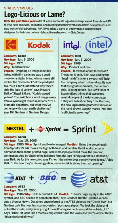
While I feel it is good to have business magazines focusing and partaking in design issues, I can’t help but wonder if waiting a little longer would be better. Once they figure out that research is a big plus, that mentioning those involved is important and they understand color a little bit better.

Maintained through our ADV @ UnderConsideration Program
ENTRY DETAILS
ARCHIVE ID 2533 FILED UNDER Discussion
PUBLISHED ON Feb.07.2006 BY bryony
WITH COMMENTS
Comments
Tan’s comment is:

I find it fascinating that the judges' comments concentrate mostly on aesthetic nuances of the revamped marks — peppered with language that would be more familiar to designers rather than Fortune's business audience.

I don't disagree with the comments —�I've mirror some of them myself in our discussions — but what is their intent? To teach business readers how to evaluate the design subtleties of a new logo? I think it's a mistake to use such shallow, superficial, vernacular language ("click-clack", "to swoosh", "grown-up", and "post-apocalyptic/croquet ball") when describing the subjective success or failure of a logo redesign.

By using such witty, casual critique language — it makes the work seem simplistic, non-strategic, decorative, and inconsequential. When in fact, for some of these companies, changing their corporate brand could potentially be the single most significant milestone in their company's history.

I'm not suggesting that the evaluations be filled with verbosity, but it should be more in-line with the professional level of business prose that I'm sure can be found elsewhere in the issue.

Is anyone else bothered by this?

On Feb.07.2006 at 02:23 PM
Armin’s comment is:

One of the things I find bothersome is that it is treated as sidebar fluff. I am not advocating for a lengthy feature article, but sidebars in FOBs (Front of Book) are usually fun(ny), can-you-believe-this? commentaries that are somewhat amusing and make for good trivia. As Bryony points out, mentioning who designed the old and new logos is a Google search away and would lend credit where credit is due; without mentioning the design firms involved it minimizes the effort to that of reordering the office supply closet by some forcedly-appointed committee.

On Feb.07.2006 at 02:41 PM
Derrick Schultz’s comment is:

Meaningful logo critiques are so last century.

I too am concerned about how much is placed on the aesthetics. While it certainly plays a part, there could have been a better focus on positioning and business needs. Especially in a magazine like Fortune.

On Feb.07.2006 at 03:04 PM
Daniel Green’s comment is:

While it's encouraging that identity design is receiving some attention in a business publication, this treatment carries about the same weight and depth as a People magazine review of Golden Globe fashions.

Hopefully, it will open the door to more strategically focused treatment down the road.

On Feb.07.2006 at 03:53 PM
Sheepstealer’s comment is:

As a business professional, who uses design to reach real objectives, I have trouble attaching credibility to anything ending in “-Licious.”

On Feb.07.2006 at 05:05 PM
Sam Potts’s comment is:

Barely-propos, did anyone remark how few swooshes and gradients there are in this crop of Web 2.0 companies' logos? (link via everywhere)

Plenty of to-be-expected blue, and a predictable orangeyness and lots of rounded sans-serifs, and thanks to James Gleick --actually, designer Jamie Keenan--and Flickr, the trunctd spellng thng is bound to be big.

On Feb.07.2006 at 05:25 PM
bryony’s comment is:

I am glad to see that most of you share my overall feeling. While good, it is terrible. Yes they should be talking about design, yes it should become an ongoing subject, but they are going at it from the wrong side, with poor choices on style, respect, level of information, design, etc.

I wonder who was the �licious-editor who allowed this piece of grand stature to print?

On Feb.07.2006 at 05:49 PM
felicks socksmell’s comment is:

I think Tan has struck just the right cord for once (damn, I just agreed with Tan again. That softy from Seattle. Damn him.)

Bryony, you cain't have it both ways ma'am (ie: quoting a noted verbosity crooner on the insert of "Stop Being Sheep" (or was that stealing?) pledging "The way I see it, too much graphic design is still obsessed with graphic design... and should be for the writers of Fortune".

Maybe you just just don't like money. No?

Maybe I'm wrong. Maybe we're all wrong. The future of graphic design intellect? I say flow charts. Cash flow charts.

On Feb.07.2006 at 05:54 PM
Mr. Frankie L’s comment is:

As a designer, I agree with the points made,

however, if we put ourselves in the shoes of a

typical reader, does it(article) still have the

same faults?

My point being, the way this article was written

is exactly the way our profession is perceived by

most business people/non-designers. I'm not

refering to "enlightened" clients or those who

"get it". I'm talking about 98% of the world.

Non-designers read the article, feel mildly

entertained and "learn" a little bit about

design(so they think).

The real problem goes back to the gap

between "us and them".

On Feb.07.2006 at 07:43 PM
Tan’s comment is:

>Non-designers read the article, feel mildly entertained and "learn" a little bit about design(so they think).

But that's where the problem lies. It's a business article in a top business magazine — why should a design-focused topic be treated as entertainment? Why didn't the magazine or the judges for that matter, approach the rebrands from a business perspective?

If I put myself into the shoes of a typical reader, I would expect to learn more about the business reasoning and significance behind the design/branding initiative. Instead, the editor chose to treat the material as fluff — which is a dis-service to both the design profession as well as the readers.

>The real problem goes back to the gap between "us and them".

No it doesn't. The gap doesn't exist on this level. Branding agencies of this caliber know just as much about business as their clients, and can stand toe-to-toe with just about any senior business manager.

But magazine articles like this one perpetuate the stereotype that design is not capable of solving significant business problems.

...

And cut it out Felix, don't go all Brokeback on me. Herd your own sheep, man.

On Feb.07.2006 at 08:44 PM
Chris Rugen’s comment is:

I agree with...everyone! It's sidebar fluff that wouldn't have been there, I bet, if there had been something else to fill that space. And man, byrony, you called it: that color choice is ridiculous. I assume a designer layed that out, right?

But, as Mr. Frankie L. points out, the audience doesn't care that much and wants that surface treatment. Particularly since that's how they perceive design: pretty-paint for extra success. The sidebar is water cooler fodder ("Hey, want to know about Sprint's logo?"). What they should do is put together a full-length examination of one well-maintained brand/company. But what are the chances of that? Design is important, but is irrelevant, from a business perspective, if the other elements aren't there. I'm sure a CEO would gasp at some of the claims that design mags make about the impact of an ad campaign or an identity. We all have our own blinders on. Though I'd like to think we aren't so glib about it.

On Feb.07.2006 at 09:04 PM
Jim Antonopoulos’s comment is:

I think we should be glad that design (corporate branding) got a mention in a business magazine.

I also think it is up to us, the design industry, to create a strong definition of who we are, what we do and how we can offer return on investment and true marketing know-how.

If we are perceived as only being able to put a nice coat of paint on something for extra business success, shouldn't we be looking at what is giving people those percpetions and fix it?

On Feb.08.2006 at 01:10 AM
Steve’s comment is:

What's brand? Isn't that what you do after your first million? Sort of like hand sewn ties! Classy!

I hate the colors!

On Feb.08.2006 at 03:01 AM
Tan’s comment is:

Sorry, but I want to flip the mirror for a bit.

Now that I work in a hybrid ad/design agency, I've been getting a variety of different trade magazines for advertising, retail marketing/branding, as well as design.

Overall, I've been very impressed at the advertising periodicals and their comprehensive coverage of not just the advertising world, but global business in general. Same goes for the retail marketing mags. They seem to have a much wider understanding of the ins and outs of day-to-day business and how it impacts their respective creative industry. The articles and coverage are as insightful and relevant as any financial or business magazine. They are deceptively sharp and informative.

In comparison, most of the design magazines we subscribe to are woefully lacking in business-relevant news and current events. Instead, it's more about the latest techniques, the latest list of hot studios or hot designers, or the latest social/cultural cause or event that's sweeping those in the know, as well as their important friends. Think I'm being unfair — flip through the latest stack of mags on your desk. Business-relevant features aren't sexy enough to move mags off the rack, apparently.

The one exception perhaps, as I bite my tongue in realization, is GDUSA. *Sigh*

Why can't we have a design magazine that's as smart about business as it is about our business? Why, for God's sake, why?

On Feb.08.2006 at 03:20 AM
Jim Antonopoulos’s comment is:

I'm with you all the way Tan.

I've been working for hybrid agencies for most of my career and have found just as much value (if not more) from reading marketing/advertising trade rags and business/branding books.

Maybe it's time someone put something together.

A show of hands? :)

On Feb.08.2006 at 04:13 AM
bryony’s comment is:

But, as Mr. Frankie L. points out, the audience doesn't care that much and wants that surface treatment.

Do you read magazines for the fluff? or to learn something new with every issue?

If you are going to take up my time by having me read a sidebar, it should add value.

Also, every subject covered should receive the same level of respect. Be it business, an individual under review, a company, an event or a profession.

On Feb.08.2006 at 09:04 AM
Daniel Green’s comment is:

Why can't we have a design magazine that's as smart about business as it is about our business? Why, for God's sake, why?

Tan,

@issue: is a publication that nicely balances business and design. (Actually, it calls itself "The Journal of Business and Design.")

On Feb.08.2006 at 09:09 AM
Jason L.’s comment is:

I am also in total bewilderment at the lack of business info in the design mags. While I appreciate the role they play in highlighting good work and interesting people in the profession, I don't see how this can't be teamed up with some analysis of the industry cogs at work.

Design as an industry has an issue with sounding self-important and often relying on lingo and specious (at best) aesthetic reasoning behind the success of a project. Why not put some actual numbers into the equation. It's clearly being done by successful firms, and equating into large accounts. But from Print, and CA we would never really know it.

How is it that CA, either online or in print hasn't covered this huge array of redesigns. It's jaw-dropping frankly that leading design publications ignore this for overly simplistic and incredibly obvious articles on how to arrange a portfolio or make a cold call. While I appreciate the civic and artistic qualities of design, for most designers it is still a business.

Do I sound too serious. I'm not. Seriously. No, really.

Keep the faith.

On Feb.08.2006 at 10:48 AM
Tan’s comment is:

>@issue: is a publication that nicely balances business and design.

Yes, I've been a fan of @issue for many years now, and am really glad Sappi has decided to continue its existence. But @issue is more a compendium of design case studies and industry retrospectives. It has smart business sense, but it's not about current events or daily commerce. Alas, it's still mostly eyecandy, albeit business-relevant eyecandy.

You should pick up the latest copy of AdAge or a similar trade rag to see the vast difference.

On Feb.08.2006 at 12:35 PM
jenny’s comment is:

I'd love to see more business-related articles in design magazines. An in-depth feature on a major logo redesign/rebranding would be fascinating - in either a business magazine or a design magazine.

Do you read magazines for the fluff? or to learn something new with every issue?

I have to say, I expect sidebars to be fluff . And that's the problem - a rebranding on the scale of Kodak, or Sprint, or AT&T is more than fluff...

I guess I'll be checking out AdAge...

On Feb.08.2006 at 12:43 PM
Armin’s comment is:

> Yes, I've been a fan of @issue for many years now, and am really glad Sappi has decided to continue its existence.

I think it's actually going away. We just received the latest issue and an accompanying letter says that it's the last... Or maybe I dreamt this?

On Feb.08.2006 at 12:59 PM
Tan’s comment is:

I got the same mailing — the letter actually says that "it's the last issue....unless you renew your subscription." Which I haven't done yet, dammit. I'm pretty sure it's not going away.

On Feb.08.2006 at 01:05 PM
Mr. Frankie L’s comment is:

The gap doesn't exist on this level. Branding

agencies of this caliber know just as much about

business as their clients, and can stand

toe-to-toe with just about any senior business

manager.

Yes, the top design/advertising firms understand

business..

BUT do the top business executives understand graphic design?

IF SO, then why the abundance of seemingly poor re-designs?

Why is such an article relegated to sidebar fluff? I suggest it has

to do with a lack of true appreciation/understanding.

If not,what is the problem?

So if us designers bitch about how badly

the AT&T logo sucks, then either the firm

who designed it sucks, or the client is ignorant

of what the hell good design is, OR if we insist

that the client is knowledgable about design,

then we should stop bitchin' so much.

If the latter was true, we wouldn't have this

discussion about why a design article is put

on a sidebar, and written like a fashion critique.

Unless the real problem is the lack of props

from the writer.

On Feb.08.2006 at 02:24 PM
Armin’s comment is:

> I got the same mailing — the letter actually says that "it's the last issue....unless you renew your subscription."

They clearly had me at hello and I didn't bother to read the rest.

On Feb.08.2006 at 03:30 PM
Mr. Wonderful’s comment is:

Arm:

"As Bryony points out, mentioning who designed the old and new logos is a Google search away and would lend credit where credit is due".

Agreed, Unless Google takes them to Identityworks.com or Speak Up, there's really no way of finding out.

In reference to the Critiques in Fortune. I'm almost certain a lot of information our Colleagues shared was Edited.

Another Reason, Publications should not be engaging in Identity Critiques. By the time the Blogs Critique said Identities they're old news.

Understandably, Fortune is just trying to Capitalize on the Success of Business Week's Model using Rob Giampietro and Kevin Smith Critiquing Identity Revitalizations.

Any Publicity Design and/or Corporate Identity receive from Business Publications is noteworthy. I wish the Critiques were more Profound, Substantive, and Holistic. As opposed to IJargon Ridden, Cliche Driven,I Colloquialism.

Again, I'll assume because of Space Profound Comments were Edited.

No disrespect to my Brethren and Luminaries of Identity Practice.

I don't know what my Colleagues are Reading, there is a Publication Devoted to the Business of Design. The Name is Design Firm Management. Published by Wefler

Associates. There's NO Pictures, I suspect many won't be Reading it.

JASON L.

"How is it that CA, either online or in print hasn't covered this huge array of redesigns. It's jaw-dropping frankly that leading design publications ignore this for overly simplistic and incredibly obvious articles on how to arrange a portfolio or make a cold call".

Design Publications like to Cover Extraordinary Corporate Identity Design, Revitalizations and/or ReBrandings.

Such the Torino Winter Olympic Games, Identity by Antonino Benincasa and Nicole Husmann of Studio Benincasa-Husmann.

The Breathtaking, Groundbreaking, Pioneering, Trailblazing Pictograms by Brad Copeland, Iconologic, formerly Copeland Hirther.

The Fact that all of these Corporate Identity Revitalizations and ReBrandings since the Death of Bass and Rand, 1996 have Been PROSAIC. Speaks volumes of the current Recession and State-of-the-Art of Identity Practice.

Design Publications Focus on Identities that Exceed the Original or Last Incarnation.

None of the Identities Mentioned in Fortune, Critiqued on Speak Up, and Analyzed by Maestro Spaeth Accomplish that Monumental Task.

There have been noticeable few exceptions.

1. Bank of America, Original Landor, Revised by Enterprise IG.

2. Burger King, Original Unknown, Revitalized by Sterling Brands.

3. United Airlines, Original, Charles Coiner, Revitalized by Saul Bass 1974, Last Revitalization Pentagram.

4. bp, the most revolutionary of all Recent Rebrands has Garnered the most Press. Design Landor.

I'll PING, Uncle Bill and Howard Belk to see if they will Comment online.

DM

On Feb.08.2006 at 03:33 PM
Zoelle’s comment is:

I’m going to stick my neck out and say that I think the actual impact the logo (graphic) has on at&t’s revenue is insignificant. Telecommunications logos are not a fashion commodity. In my opinion, people don’t buy at&t’s products based upon the look of their logo. Wine — yes, phone service — no.

I have a Sprint cell phone because of the coverage area and the plan rates. I don’t care if the logo type is in Papyrus. The ad campaigns which accompany the release of a new logo no doubt grab new customers who may not even know what the competition has to offer. The message just �speaks’ to them.

So with that said I think that the at&t logo is sidebar fluff, if and only if, the comments are related to the graphic and not the actual rebranding.

On Feb.08.2006 at 04:00 PM
Jeff Fisher LogoMotives’s comment is:

It might interest those who have commented to know that, in my own case, the two quotes of mine came out of several back and forth emails of content/comments about the identities in question, and a nearly 40-minute phone interview, with the Fortune writer. I know that I answered many of the questions raised by byrony in his piece - as the others quoted probably did as well. I learned a long time ago that you can provide a publication/writer all the information you desire and nearly 100% of the time they will somehow get at least part of it wrong - or maybe even reduce it down to two minor comments taken out of context. Once comments come out of your mouth it's up to the writer and their editor to determine what goes on the printed page and what spin is put on the information. I do wish the piece had a bit more substance to it and had covered some of the other re-designs discussed - Quark, Visa, USA Network, Unilever, UPS...

On Feb.08.2006 at 05:23 PM
Tan’s comment is:

>In my opinion, people don’t buy at&t’s products based upon the look of their logo.

And that, Bill, is perhaps where at&t's new logo has failed. A more successful rebrand might have elevated the logo to represent more esteem to its consumers. Just because you currently don't find value or representative esteem in the logo, it doesn't mean that esteem couldn't be achieved in the category.

The at&t logo could've been something great in the right hands. It could've fulfilled a potential instead of underwhelming its current, cynical consumers.

On Feb.08.2006 at 06:04 PM
Tony Spaeth’s comment is:

I was out of town when the Fortune reporter called, at Howard Belk's suggestion. We talked the next day. He had already closed the piece (a 24-hour research job?). But we talked, and I pitched the bigger story we'd like to see in Fortune, the purposeful use of design by a leader as a tool of leadership. He seemed enthusiastic, promised to explore this with his editor and call back in a week. Fortunately I'm not holding my breath.

I will, however, continue to build this story, case by case.

On Feb.08.2006 at 06:08 PM
Zoelle’s comment is:

It could've fulfilled a potential instead of underwhelming its current, cynical consumers.

Maybe I'm being cynical, but I have a hard time believing that a logo alone has the power to win back the trust of cynical customers. I think I’m distorting your point a bit.(?) It would help if you defined what it means for a logo to fulfill it’s potential.

Quite a few of the non-designers I know have a tendency to be �graphic deaf’. That is, they are not aware of the graphical changes around them unless it alters function. The new gaudy bobble at the top of a phone bill won’t even register; and if it did, it may prompt the reader to check the charges and services against a bill prior to the change. Now if charges dropped slightly a positive association to the logo could be made.

I can see how a new logo would be a signifier to investors that a company is going through a change. The investor would be more likely to base a decision on the potential for growth by reading the new mission statement and the comments of the CEO, then by judging the aesthetics of the new logo.

On Feb.09.2006 at 09:59 AM
Mr. Frankie L’s comment is:

Ultimately, isn't the quality of the company

responsible for how customers "perceive" the

quality of the logo?

On Feb.09.2006 at 10:07 AM
Tan’s comment is:

>isn't the quality of the company responsible for how customers "perceive" the quality of the logo?

Ideally, yes. But in reality, no. How much do you really know about the quality of Sony as a company? The fact is, most of their industrial design is farmed out to a number of companies, and their manufacturing is shared and rebranded all over the globe. But yet, when a consumer sees the logo "Sony" on a product — there is an automatic value placed on that logo and brand.

Of course it's more than a logo — we're talking about a brand here. But in at&t's case, they had a real opportunity to remake their brand and their logo's attributes. The SBC merger was a real event, not just a reorganization. The company could've taken the opportunity to elevate itself and reinvent its brand through its logo. That's what I meant by potential, Bill.

And not all telecommunications companies are dry, practical buys. Virgin does a great job of selling phones and services to a younger demographics — and in their case, it's all about the Virgin brand, not their rates or coverage.

On Feb.09.2006 at 12:42 PM
Mr. Frankie L’s comment is:

But yet, when a consumer sees the logo "Sony" on

a product — there is an automatic value placed on

that logo and brand.

Right, the perceived quality of the company as

seen by the consumer, regardless of whether or not

that company is actually worthy of it. At some

point people found Sony products to be superior

and thus they associate greatness with its name,

with its letter mark.

I would also argue, for example with

Verizon, though their logo looks aesthetically

like a hack job, the company status has

elevated the perception of that logo in the

eyes of the public.

Don't get me wrong, I agree that the AT&T and

SBC re-designs could have been done better, but

outside of our club, I question how big an impact

it has.

So why does it matter?

For me, it matters because good design is

about pride in craft. But I do realize this

appreciation is a trait, most non-designers

don't acknowledge in their daily existence.

On Feb.09.2006 at 01:43 PM
Mr. Frankie L’s comment is:

I want to add,

perhaps what ultimately matters is,

not the logo, but the Brand.

On Feb.09.2006 at 01:45 PM
Ravenone’s comment is:

I'd *LOVE* a magazine that discussed the business side of the arts and design. Serriously. At least from my perspective, it'd be a great help.

...than again it probably wouldn't be picked up by the local bookstores, so I'd have to special order it or something, but that's a whole different kettle of fish.

On Feb.10.2006 at 12:37 AM
JenB’s comment is:

I couldn’t help but draw a parallel between this sidebar review of logos with the catty comments in People magazine of Super Star fashion....

“TERI HATCHER: WORST DRESSED AT THE GRAMMY’S

The Desperate Housewife and Grammy presenter is a sheer disaster in her see-through dress and bondage-style stilettos!”

As you have all said in other ways — indeed the service we provide (or fail to provide) is much more significant than a fashion disaster on the red carpet.

On Feb.10.2006 at 04:34 PM
Tan’s comment is:

>I question how big an impact it has.

Actually, outside of our group — it can have a bigger impact. I think designers see logos for what they are, more than what they represent, because we can see behind the curtain. It's not absolute magic to us. But for the public, some logos can have extremely high value — enough so to be tattooed (Harley/Davidson), collectible (Coca-Cola), or stolen (VW, MBenz badges).

>Verizon...the company status has elevated the perception of that logo in the eyes of the public.

I disagree. People may recognize their logo more because it's plastered everywhere — but I don't think it has gained any higher esteem value because of it. Is it because the logo sucks? Maybe, but it's probably because Verizon is still a practical buy. They position themselves squarely as a value purchase — they offer the highest coverage at a reasonable price. It's quality in a practical sense, not a desirable, esteem-value sense.

On Feb.10.2006 at 05:57 PM
Mr.Frankie L’s comment is:

Tan, while we may disagree about the Verizon

topic, I certainly hope what you said about

the impact of a logo proves to be true in the

future; hopefully exemplified by an outstanding

re-design!

On Feb.10.2006 at 06:49 PM
f'elix’s comment is:

Frankie,

My intuition (and your resume) tell me you do not work for a statistical analysis firm. If you did, your research would most likely conclude that the Verizon logo is not in any way a factor in "elevating" anything other than the stench of its hacktastic form. You are the 1st designer with an appreciation for what many have fingered as the worst corporate indentity in design history.

On Feb.12.2006 at 10:39 PM
Mr. Frankie L’s comment is:

felix,

You're right.

I don't work for a statistical analysis firm.

But you've misinterpreted my thoughts:

My belief is that the logo represents a company,

so if that company sucks, its logo is going

to take on an unfavorable light, and vice versa.

(by the public)

This isn't about aesthetics itself.

Therefore, I am not the 1st designer to appreciate

Verizon's logo, I've been talking about how the

perception of a logo is influenced by the

status of the brand it belongs to.

p.s. If we were all judged by our resume, whom

would qualify to speakup?

On Feb.13.2006 at 11:27 AM
Telis Demos’s comment is:

Hello, all. I see I've been really been getting taken to task here. The truth is, I agree with much of what's been said. Identity design clearly is much more than just logo aesthetics, and my charticle did not do justice to the field.

However, in my defense, I did have a rather small space to work with. It was my first exposure to ID, and I had no idea such a large and active web community existed, or exactly what "logo designers" did. The purpose of the piece was to critique the logos themselves--not the corporate strategies that they represent. I think I did convey some of the depth of what goes into a logo design (commenting briefly on the "brand equity" question), but to do so at length would require a lot more research, and comments from the company and from various experts and analysts—well beyond the scope of the piece.

But as Jeff Fisher and Tony Spaeth above mention, I did speak at length with the designers quoted in the article about much more than just the flip aesthetics of the logos. And I am interested in doing something more in-depth about companies that take identity design seriously. Kodak was mentioned as an example of a company that didn't get it—the company's executive leadership wasn't engaged, and the redesign was seen as merely a bit of decoration. And clearly, the failure of their logo to convey anything meaningful about the company and the company's struggles to find a new niche and grow are not a coincidence.

I would love to pursue a feature piece, perhaps by closely following a company going through the logo design process. I'd love to speak with more of you about how significant logos can be, and to come up with some concrete illustrations of how a smart logo (or graphical branding in general) can really change a company's fortunes. Please do hit me back with any feedback or ideas for good companies to profile.

--Telis

On Feb.16.2006 at 04:04 PM