Speak UpA Former Division of UnderConsideration
The Archives, August 2002 – April 2009
advertise @ underconsideration
---Click here for full archive list or browse below
  
The m5 Optimistic Globalization

A few months back, Coke unveiled m5 or Magnificent Five, a design project that involved five design groups in five continents in order to share and create “visions of optimism”. The assignment was to create artisitic renditions of:

1. Aluminum Coke bottles that would be exclusively released in the world’s finest clubs. The M5 bottle is scheduled to arrive first in Germany, Spain, Italy, Mexico and Brazil before embarking on a global tour. Each design is printed directly on aluminum (which helps keep the beverage cold), and they have night and day modes, as they are appreciated by natural light or under black light in a nightclub. The bottle itself is only half-filled to encourage club-goers to fill the other half with their favorite alcoholic beverage for drinking straight out of the bottle.


(Rollover for night effect)

I hope that in real life, the night/day factor is better achieved than in the website, where they seem to simply be inverting the colors.

2. A 3-to-5 minutes short film set to music from an up-and-coming music group, including Towa Tei, Citizen Bird, Guided by Voices, Fischerspooner, and The Flaming Lips.

The Solutions:

~ The Designers Republic ~
(London, UK)

Bottle: Love Being

“When retro is done right, it looks more modern than the moment from which it was created. This exuberant bottle from The Designers Republic beams with optimism rather than iron and yet is as comfortable as your favorite 70s tee shirt. Anyone lucky enough to come across this M5 bottle may start to regard it as a good luck charm.”

So far, this is the only bottle that has been released and the one I discovered in a Mexican tabloid magazine flying back after the holidays. A search in ebay might get you one if you wish to own it.

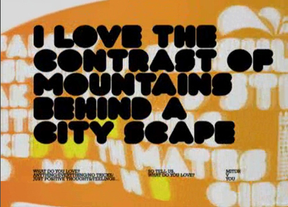
Movie: Citizen Birds’ “Joy”
Watch the full movie here
Or here for the complete m5 collection.

~ Lobo ~
(S�o Paolo, Brazil)

Bottle: Club (February 2006)

“The mechanic and the organic came together on this striking bottle from the Brazilian animation and design studio, Lobo. Sleek, warm graphics remind us that technology can indeed coexist with nature, even human nature.”

The image that has been released showcases a forgotten FPO.

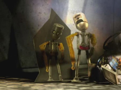
Movie: The Flaming Lips’ “You Gotta Hold On”

I can’t help but be reminded of the recent Robots movie.
Watch the full movie here
Or here for the complete collection.

~ MK12 ~
(Kansas City, USA)

Bottle: (Not Named)

“Birds and flowers swirl in, out, and around a modern color scheme punctuated by unexpected bursts of red. The bottle is instantly recognizable but profoundly re-imagined.”

Movie: Guided by Voices’ “Back to the Lake”

Watch the full movie here
Or here for the complete collection.

~ Rex & Tennant McKay ~
( Johannesburg, South Africa)

Bottle: (Not Named)

“Mesmerizing. Undulating. Tactile and intriguing. Keep looking at this bottle long enough and you will start to understand evolution in a whole new way. The organic color palette is spot-on delicious and the whimsical shapes exist to illustrate a playful emergence of our collective psyche.”

I am somewhat surprised that the Coke logo is treated in anything other than red (also in the last design).

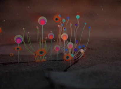
Movie: Fischerspooners’ “All We Are”
Watch the full movie here
Or here for the complete collection.

~ Caviar ~

Bottle: (Not Named)

“This mind-blowing bottle could have only been designed by Japanese creative team Caviar. It’s a homage to electronic music and video while also honoring the natural elements that tie us all together. The rogue color scheme takes the bottle in a thoroughly modern direction just as the classic ribbon is a not to the fact that we shouldn’t forget where we came from.”

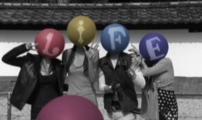
Movie: Towa Tei’s “Milkyway”

I have to say, mid-way along the movie these characters become rather endearing and you begin to relate with the “facial” expressions they convey.
Watch the full movie here
Or here for the complete collection.

While one would want to achieve some unity across the designs, I can’t help but feel that Illustrator was the only software allowed. Do these designs really represent the optimism as seen from five distinct cultures around the world? I can’t even tell which one was designed where.

One main attraction, at least for me, was the inclusion and collaboration that the project seemed to promise when I first came across it, in a “world-wide” reach scope. I am left wondering though, if there was any work done in conjunction or if it was more of a to each his/her own. I suspect the latter and find myself disappointed by this, as the richness of diverse cultures and alternate thinking could have brought it all to a much higher standing. It is much easier to see the cultural differences in the movies that are to be used to introduce the designs. Why was this not carried through the entire project?

As I take in each solution by itself I am overall pleased. Fun, interesting, with a message to communicate, each bottle and each movie makes a strong impression on me. It is when I approach the project as a whole that I find myself disillusioned.

Is this the globalization in style that everyone is so afraid of?

Maintained through our ADV @ UnderConsideration Program
ENTRY DETAILS
ARCHIVE ID 2529 FILED UNDER Discussion
PUBLISHED ON Jan.31.2006 BY bryony
WITH COMMENTS
Comments
saron’s comment is:

U seem to contradict yourself somewhat. In the begining you say that there should be some unity in the design. As a whole do they not look like a cohesive unit? Then you say that the work seems kind of "to each his/her own" , is that not the cultural differences of all of these countries? And if this is apparent, how would this be the globalization of style. The whole scope of the project involved the ideas of love and optimism and I think the bottles convey just that. Maybe everyone has similar ideas of utopia, as seen in the design of these bottles. What would you have done? I think this project is very inventive and the site is amazing.

On Jan.31.2006 at 03:20 PM
Bryony’s comment is:

I do in a way contradict myself. When I look at each bottle individually I reach one conclusion, and when I see the whole project as a unity my feelings differ. Yes, each bottle is different, but there is nothing in them that tells me 5 distinct groups produced them. As they stand one studio could have designed them all. Where then is the value of having 5 countries involved?

What would you have done?

I don’t know.

From a visual stand point, I have no idea at this moment. From a research approach, read (understand and challenge) the brief, interview people (to enrich difference of opinions and overall thinking on life) and let myself go with the project. After that, I would have to actually do the project to know.

Maybe everyone has similar ideas of utopia

I don’t really think this is a reality given the socio-political aspects of the world today.

On Jan.31.2006 at 03:32 PM
Kevin’s comment is:

I'd like to buy the world a coke...

On Jan.31.2006 at 03:35 PM
Jose Nieto’s comment is:

I think I get what you're saying, Briony -- I kind of feel the same way when I spend a lot of time at Design is Kinky, or reading iDN magazine. Compared to the diversity of work shown in Geoffrey Caban's World Graphic Design (or in the Icograda website), "commercial" international design seems to have been flattened into a narrow set of stylistic flourishes. Kind of pleasing, but pretty shallow.

The videos are fun, though.

On Jan.31.2006 at 03:43 PM
Petter Ringbom’s comment is:

There's been some talk lately on SpeakUp about the line between inspiration and appropriation. This is a piece I did together with Agnieszka Gasparska and FischerSpooner for Amnesty International back in 2001. Now look at the thing that Rex & Tennant Mckay did. Guess it's nice to see ones 2D work rendered in 3D.

On Jan.31.2006 at 04:12 PM
oo’s comment is:

I would have loved to see a monochromatic, etched design, where we would have texture + image, something that acknowledged the material being used for the bottles.

On Jan.31.2006 at 04:53 PM
Petter Ringbom’s comment is:

Just clarify my earlier post, I'm talking about the film they made, not the bottle.

On Jan.31.2006 at 05:06 PM
Petter Ringbom’s comment is:

Just clarify my earlier post, I'm talking about the film they made, not the bottle.

On Jan.31.2006 at 05:06 PM
Derrick Schultz’s comment is:

my problem with the solutions is that they all speak to the exact same audience: The urban (or hip suburban) 20 something who likes motion graphics and electronic music. Not much globalization there, just a very specific global audience.

And they are all very western hemisphere, commercial solutions.

On Jan.31.2006 at 07:12 PM
David E.’s comment is:

I had a similar reaction; that they all look exactly the same. It's not just a globalization of style, but a very limiting style. Whoever was the first person to do this style of illustration (Ryan McGuiness, maybe?) ought to continue doing it, and everyone else ought to find something else to do. Coke wasn't after a "vision" of optimism, or anything else — just a trendy look.

Then again, if I ever happened to be in "one of the world's finest clubs," I'd probably buy one. They do look pretty cool, after all.

On Jan.31.2006 at 08:44 PM
pk’s comment is:

The urban (or hip suburban) 20 something who likes motion graphics and electronic music.

yeah, i was thinking that too. it seemed really weird to do something so global in concept for such a teensy little audience (of alcoholics).

it strikes me as insider myopia leaking to the surface. a lot of agency people looooooooooooooove being the coolest kids at the party.

but at least it's kind of pretty myopia.

On Jan.31.2006 at 09:09 PM
Ravenone’s comment is:

-These are my thoughts on the bottles, I haven't seen the comercials (Curses, dialup!)-

While all the bottles do have their differences, they all seemed to have limmited palletes, simplified very geometric-looking images on them, that look like they were all done in the same program. The swirly-whirly layout seems simmilar, though that might just be me.

As a 20-something and supposedly part of the demigraphic, I'm going to state my opinion:

Blah. I've seen it all before.

If they're supposed to be from different countries and representing those areas as well as Coke, why don't I get that feeling? It doesn't matter where they were designed, the location of the place of design seemed to have nothing to do with the work. Why go to that effort just to come up with Retro-Hymogonized art when you could've gone to one company?

Surely there's more to optimism around the world and people's identification with the brand than THIS?!

Do these bottles make me want to buy them? While the concept of a bottle that looks different in normal and black lights is very cool, and eye-catching... none of these bottles pull the 'gotta have me' strings. Half-full also tends to lead to dismay, while I understand they're trying to get you to fill the other half with the booze of your choice, I can't help but see the glass as...half empty.

Off the top of my head I have seen other bottles of simmilar packaging out there; can't recall the brands, but the style seems to be 'the thing' especially with the more 'healthy' energy-type drinks...

Are they all filled with regular coke, or do the packaging things come with diet, vinilla, etc?

On Jan.31.2006 at 10:35 PM
Unnikrishna Menon Damodaran’s comment is:

Is this the globalization in style that everyone is so afraid of?

Looks like juice extracted from flowers! coke with frangrance!

doesn't look like a bottle to drink. may fit in a bathroom ambience. anyway people are using it as a toilet stain remover.

not really, it is not an issue of style.

but i do not want to drag this into SpeakUp. but please check the link just for your information.

www.indiaresource.org/campaigns/coke/2004/heatison.html

On Feb.01.2006 at 02:00 AM
marian bantjes’s comment is:

I too was surprised by the similarity between the graphics.

I'd love to know what went on behind the scenes. I find it so hard to believe that 5 individual firms anywhere would come up with such similar graphics without a whole lotta coercing. It really is very strange. And stranger still that this is what they would want. A really squandered opportunity for truly localized design.

Or, as noted above, perhaps that demographic really is the same all over the world. Sigh.

On Feb.01.2006 at 03:59 AM
marian bantjes’s comment is:

and there's something about this statement that i find surprising ...

The bottle itself is only half-filled to encourage club-goers to fill the other half with their favorite alcoholic beverage for drinking straight out of the bottle.

That just seems ... wrong, somehow. I guess I don't spend enough time in the world's finest clubs.

On Feb.01.2006 at 04:01 AM
szkat’s comment is:

the bottle designs are homogeneous at best and repetitive at worst. i predict this is one of those things that the 20-somethings might embrace and then disregard. the demographic goes nuts on things like this with such gusto because they KNOW something will replace it in six months. welcome to coke II, invisible coke, diet cherry vanilla coke, and a plethera of other things that lasted under a year. these are nothing more than spoonfed waves of supply and demand disguised as solid business.

and this?!

The bottle itself is only half-filled to encourage club-goers to fill the other half with their favorite alcoholic beverage for drinking straight out of the bottle.

this really pisses me off, because i get the implicit message that all the commercials that say "drink responsibly" are such a farce. marketing and bottom line outweigh compassion and accountability, yet again. it's more than a mixed message... it's not like we don't all have jack & cokes, but come on. it's not like people need more creative ways to get loaded.

bah humbug.

On Feb.01.2006 at 08:22 AM
Su’s comment is:

The bottle itself is only half-filled to encourage[...]

Don't you mean half-empty?

*cough*

I really should just shut up now. There are so many holes in this ranging from being just pure bullshit to full-on hubris that I can't even think of where to start.

I'm usually more amused by this kind of marketing crap than anything else, but this is seriously crossing over into insulting.

On Feb.01.2006 at 09:12 AM
jo’s comment is:

I agree: repetitive.

A really squandered opportunity for truly localized design.

But what is "truly localized" design? When I think "local," what comes to mind is your local (slack-jawed) yokel sign shop, not interesting regional or national tics and quirks. I don't think I'd be able to identify "localized" design if walked up to me and shook my hand. Perhaps that's a bit of an exaggeration; at the heart of what I'm trying to say is, "Do we have localized design anymore?"

I think I may have been inundated with so much of the "flattened" international design that I'm a little jaded or blind at this point.

it seemed really weird to do something so global in concept for such a teensy little audience (of alcoholics).

See, this makes sense to me. There's something appealing about buying into "global" idea in a product or a design. The way it gets calcucated in my head is that by doing so you become open, wide-reaching, well-rounded person. You have discerning taste, because you're (supposedly) looking outside yourself and seeing the world for the menagerie that it really is. You're in touch with the people in other nations; you could almost call it a spiritual unity (without, of course, all of the diplomacy and politics that are really necessary). That's the idea they're selling.

Of course, this is the furthest from the truth when it comes to Coke and other international brands. When you buy into this, you're actually one step away from what I'll call "real cool," because the "real cool" people don't know that they're expanding their horizons in a "real cool" way. These twenty-somethings going to high-profile clubs can afford to buy "real cool".

...

I hope I don't sound like I hate the campaign--I genuinely enjoy it, and I do think the bottles are interesting and I myself would probably buy one, because it's a nifty, shiny, well-designed object. I collect those kinds of things (as I'm sure you all do), but I'll probably find mine on ebay and not half-empty at a drunken club scene.

On Feb.01.2006 at 09:22 AM
Tan ’s comment is:

My guess is that much of the homogenization of the designs all stemmed from Coke's strong branding. Eventhough each team was probably tasked with designing something unique, they were also probably asked to find a way to relate it back to Coke. And no matter how you skin Coke's "Dynamic Wave" ribbon or whatever the hell they call it, it's immediately recognizable and derivative.

It also makes me wonder what other "guidance" and elements each team was asked to consider incorporating into their designs. How much did the bottle's shape play in determining scale and rhythm of the designs? Who knows what else?

Take snowboards and skis for example. I think 85% of all snowboards look the same. Same goes for skis. Is it the form factor? The audience? Or is it the designers' fault?

Having said that, I do find the similarities between these bottles ultimately disappointing. I've been involved in a number of competitive pitches for packaging work on a similar scale, and you'd be surprised at how difficult it is to do break-out, off the beaten path thinking and designs. Every company wants new thinking, but they expect minimal risk and immediate mass appeal at the same time. It's incredibly difficult to deliver both.

On Feb.01.2006 at 02:24 PM
Jason L.’s comment is:

I agree that the idea of distinct geographic styles of design aren't represented, so the evolution angle is a bit obtuse. But in general they are very nice pieces, and aluminum bottles are cool. I'm sorry. They just are.

The videos do show a bit more range, however. And given the market they will be released in, the design works for me. And the website is impressive. An easy and visually interesting interface. It works great, it looks great, I'm sold. (But I'm easy)

And while I think the partially filled bottle idea is both horrifying and freaking genius, I have yet to see that anywhere on the site. I'm hoping someone can tell me where Coke has advertised it.

(Side note) Clearly Coke sees that drinks like Red Bull are actually outselling it I think 7 different countries, so it's about time they started making an in roads to this market.

Much Love!

On Feb.01.2006 at 02:56 PM
zach’s comment is:

Local design: the huevos rancheros restaurant down the street. The space above and to the sides of the counter is tightly packed with disparate boards filled with two-inch rub-on helvetica. Yellow, blue, green, red. Helvetica like it's never been set before. Beautiful.

Where's the wonderful eccentricity we (should) hope for?

On Feb.01.2006 at 03:34 PM
felicks suckwell’s comment is:

This sphincerian tatoo language is the hot new thing apparently.

(anyone see a New York Magazine, Microsoft resemblance? Tan?)

I know a "local" Washington firm was also tasked... Local today, gone tomorrow.

On Feb.01.2006 at 04:07 PM
Ravenone’s comment is:

Zach-

Where's the wonderful eccentricity we (should) hope for?

I think the world bought a coke and kicked eccentricity out of the playground. :(

On Feb.01.2006 at 04:07 PM
Tan Le’s comment is:

>anyone see a New York Magazine, Microsoft resemblance? Tan?

A bunch of mags came out w/ the tattoo look at about the same time, the New York, Entertainment Weekly, and a few others since.

The Windows campaign is actually MRM, not YRB, and is old but still has legs. VH1 has aped it as well.

On Feb.01.2006 at 05:35 PM
Tselentis’s comment is:

And no matter how you skin Coke's "Dynamic Wave" ribbon or whatever the hell they call it, it's immediately recognizable and derivative.

Amen. Unless they tone down the organic quality of that ribbon accent and the logotype itself, there's no fresh approach. They always seem to maintain that ribbon accent, take this identity from China. While I'm not 100%, the can in this top-left stack looks like sans-serif Hindi. I'm checking with a Hindu student of mine to fact check this.

Here's the problem though, if global is the direction, where are the multi-lingual solutions? Just take the bottle for example, do we need the identity stamped at the bottom of them all, in English of course? I thought the bottle was iconic enough, but Coke seems to feel it can't carry the brand without the logotype. How's that for insecurity?

On Feb.01.2006 at 07:36 PM
christina’s comment is:

Coke is a corporation who desires to sell more of it's product. If promoting a new campaign as being the global collaboration on cultural optimism (!) fits within their branding, well, that's what they'll do.

We shouldn't expect a conservative multi-national to actually deliver on any of these lofty ideas. Nor should we expect true diversity. Brand recognition, collector appeal, yes. Designs which are too specific to any one particular country, so as to scare off the trendy bar goers? no. The idea of a multi-cultural collaboration is more sellable then the reality.

They all look cluby and techno because the campaign is being launched in clubs. The bottles are half full for alchohol because the campaign is being launched in clubs. Coke, having captured the highschool kids and the mal-nourished people in third world countries, is looking for new markets.

The designs are good, the films are good. It's only when we pile grander expectations on them that they fail. Do you really buy basketball shoes so you can jump higher?

I would absolutly love to see a true collaboration of this sort. The Idea is fantastic, I just don't think Coke is the one to deliver it.

On Feb.01.2006 at 08:33 PM
m. kingsley’s comment is:

1. The Coke wordmark is known as "Spencerian script"

2. The wave symbol is known as the "dynamic ribbon"

3. Not all products come in glass bottles

4. Singular appearance, or combination, of the three icons (script, ribbon and bottle) in different contexts (with or without the red color) allow for infinite variety

5. Fastidious adherence to the above elements is proper brand maintenance and focus, not insecurity

6. It's easy to blame Coke for the sameness across all 5 firms' solutions, but keep in mind each firm supplied that artwork, cashed the check, etc.

7. We've all seen illustration like this before

8. Many of us with Adobe Illustrator have probably dallied with this kind of look before

9. Designers and clients share the credit for what things look like

On Feb.01.2006 at 09:15 PM
Jason Tselentis’s comment is:

Designers and clients share the credit for what things look like . . . a valuable point.

Fastidious adherence to the above elements is proper brand maintenance and focus, not insecurity . . . adherence to "brand maintenance" for this M5 exercise limits its scope, whether a singular brand (blech, I hate that word because it makes me imagine cattle on farms in Nebraska) element is used or more than 3. And in keeping with the notion of client+designer that you point out, ask yourself, "Did a creative brief drive these, and did the client or designer write it?"

On Feb.01.2006 at 09:42 PM
pk’s comment is:

when su and i talked about this today, we ended up not really caring what the bottles look like. (they're nice, but who cares. it's garbage designed to look its best.)

the idea seemed kinda galling at first, and it fell apart entirely upon closer look.

glaring problem number one: bottles are sold in the world's "finest nightclubs." i'm not even sure what that's supposed to mean, but in advertising-speak, "fine" tends to mean expensive and fussy. so we'll go with it. a "finest nightclub" kind of club here in chicago runs around $15-$20 to enter on a heavy-traffic night.

folks involved in nightclub culture for creative reasons avoid "finest nightclubs" because those clubs attract tourists, leeches, and fashion slaves. tourists don't know where the actual party is. leeches are working the crowd. fashion slaves are busily throwing a lot of cash at anything (usually leeches) that will assure them of their beauty or popularity or desirability or what the hell ever they need to hear about their vain-assed selves. coke, in this case, is kind of leeching.

not optimistic!

glaring problem number two: the bottle is designed to fill with booze, which is also not optimistic at all. alcohol-related deaths account for about half of road deaths in the US, and a lot of those happen after one's been out nightclubbing. nightclub culture is based upon a bombardment of the senses, so the impetus to keep drinking is pretty high. a lot of nightclub goers end up being accidental full-time alcoholics or binge drinkers. coke's playing right into that.

basically, coke's piggybacking themselves onto someone else's cool. and it's, like, not even a cool person's cool. it's second-tier cool. they're acting like that jackass everyone knows "who has a friend who can get us in free tonight," but then their friend turns out to be the lowlife in the shiny shirt and gold chain. so classy!

On Feb.02.2006 at 01:20 AM
pk’s comment is:

also: global message is complete bullshit. probably about 20% of the world's population, the rich 20% will ever even see these things. it's candy-coated sentiment wrapped up in nothing much.

On Feb.02.2006 at 01:23 AM
Erik Larsson’s comment is:

I think this is a perfect example of graphic design in a society heading for, or well into, decadence and decline.

But as mentioned before, looking to Coca-Cola to break the status quo would be a bit of a stretch.

On Feb.02.2006 at 03:48 AM
Tselentis’s comment is:

I think this is a perfect example of graphic design in a society heading for, or well into, decadence and decline. Quite an Orwellian take on things, don't you think?! And just imagine our society falling into decay, devolving because of . . . Coca-Cola! Oh, the horror. The horror.

On Feb.02.2006 at 08:52 AM
Jose Nieto’s comment is:

Quite an Orwellian take on things, don't you think?!

I would say Huxleyian (if that's a word), rather than Orwellian. The cover for the next edition of Brave New World should be covered in vector swirls...

On Feb.02.2006 at 11:50 AM
Tan’s comment is:

>Oh, the horror. The horror.

haha...but you know what's truly terrifying though? Sorry to get off topic a little here...But the other night, I saw this commercial that was quite nice. It was a sweet little narrative about everyday people seeing smiling faces in everyday things. There was sophistication in the shots, and it paced quite nicely. Then as it closed.....AAARGGH! It was a commercial for Wal-Mart!! Horrors beyond horrors, someone took the stupid in-house Walmart commercials and made them tasteful, almost pleasant to watch.

Surely the end must be near.

On Feb.02.2006 at 11:58 AM
marian bantjes’s comment is:

PK said it perfectly.

On Feb.02.2006 at 01:07 PM
Ravenone’s comment is:

Wonder if they'll update the Designer's Road to Hell with a link to these coke bottles?

On Feb.02.2006 at 04:54 PM
Tselentis’s comment is:

The ribbons do look like roads, and to hell, no less.

On Feb.02.2006 at 07:01 PM
mark Notermann’s comment is:

And on that road, there are passengers and drivers...

On Feb.03.2006 at 03:22 AM
m. kingsley’s comment is:

Bryony, I'm curious where you learned that the bottles are "half-filled to encourage club-goers to fill the other half" with the liquid of their choice. I have a friend who's working for Coke and this struck both him and myself as odd, if not implausible.

It seems somewhat foolhardy for the largest brand in the world to place themselves in such a potentially liable position.

On Feb.03.2006 at 04:21 AM
Steve’s comment is:

It's all well done and all, but... To what degree, I don't know. I personally didn't find it striking. Well, I thought it was cool... But like it was said before, it's... Nothing that will stick.

On Feb.03.2006 at 05:15 AM
bryony’s comment is:

Bryony, I'm curious where you learned that the bottles are "half-filled to encourage club-goers to fill the other half" with the liquid of their choice.

During my research I stumbled upon:

Coca-Cola's Magnificent Five (December 31, 2005)

"Coca Cola's product advertising is minimized through the use of a solitary M5 bottle at the bottom of the screen. Clicking the bottle takes you to an entirely new area of the site which showcases each of the 5 different bottle designs. Each design is printed directly on the aluminum and contains glow-in-the-dark ink to mimic the website's day/night design modes. The bottle itself is only half-filled to encourage club-goers to fill the other half with their favorite alcoholic beverage for drinking straight out of the bottle. The use of aluminum furthermore keeps the drink cold."

Something I did not included in my post (because I just could not buy it) that they also stated:

"Matt Fraction (one of MK12's founders), described the creative freedom Coca-Cola gave them: 'Coke was a sponsor, really: they made it all happen and left everyone alone to do the work. No product placement, no credit, etc. They didn't want a Coke commercial. They wanted to commission a piece of work from us.'"

On Feb.03.2006 at 08:51 AM
jn’s comment is:

Ok, seriously, when is this floral-ornamental-collage-crap going to go away. It needs to go to the graphic design graveyard -- pronto. Honestly, I am depressed looking at this work. 5 design studios and probably a huge budget -- and that's all they could do??

Wow. Talk about being "Late to the party."

On Feb.03.2006 at 11:43 AM
r agrayspace’s comment is:

PK is my new hero. Totally nailed it.

Also the whole half full thing is utter bullshit. Not only are they opening themselves to a liability nightmare but its also just a ploy sell less product and more AIR!!!!

AHHAHAHAHHA!

genius.

On Feb.03.2006 at 01:47 PM
m. kingsley’s comment is:

Bryony, PK and agrayspace —

I think the jury's still out on the half-full bottle issue.

I need more than one mention on a blog from a cool-kid in SF.

The last thing Coke would want is a slew of publicity about how they're fleecing customers with half-full bottles. Besides, it's easier for a bartender to pour drinks into a wide-mouthed glass than the small opening at the top of the bottle. I've seen one of these things in real life — empty — and can't imagine an easy and sanitary way to add liquid.

On Feb.03.2006 at 04:46 PM
Timothy’s comment is:

on the visual similarity of the bottles:

though there's a lot more stylistic variation on view at each of these firm's sites, I would think it a safe bet that most of them would name the Designer's Republic as inspirations, to some degree. I'd think MK12, for certain; and there's a definite similarity of approach to some of Rex's work. At least, nobody's work shouts out 'Good God, how I hate the Designers Republic!"

Once you commission a widely influential firm like DR, you need to mix it up a bit more, find someone who seems the polar opposite. Surely there are some firms trendy enough, in globally disparate locales, producing messy, hand-drawn/letterpressed/rubber stamped, muted color palette work with (visual) depth? Or something different, anyway.

Any suggestions, for a more varied 'dream team' of 5 firms?

On Feb.03.2006 at 07:08 PM
marko savic’s comment is:

Building on Christina’s ideas, I really want to stir the pot here. I'm not sure how to react to all this. My first reaction as a 20 year old, Coke drinking, college student, I instantly thought,

Shiny! Pretty! Me want!

I was really astounded. I've been collected pop cans and bottles since I was 14, and I just had to have these. But as I read the discussion here, my optimism for the bottles seemed to, well, wither and die.

Perhaps I missed the whole point of why these designs are not representational of worldwide design, but I think they work as a statement themselves as to how globalized, commercial and targeted commercial design has become. It's not necessarily a bad thing, but a different thing. We all read the same magazines, read the same blogs, see the same work. And sadly, even great designers tend to all fall into a trendy style now and then. Looking at the imagery of the bottles, separate from the style of the bottles, I think it’s very culturally specific but unified in a "global" style.

I feel that, and please argue with me, part of everyone’s objections to this comes from designer’s living in their own ideological world. We want the new “International Style.” We want the modernist era pedagogy changing our world and making beautiful design for the masses. This isn’t social ambivalence, its marketing. Coke knows their market. The designers know this market. Would a messy, hand-drawn/letterpressed/rubber stamped, muted color palette appeal at all to this market? It sure would appeal to indie kids, artists, creatives and generally, people would want the bottles but not the Coke. Generally, people in these demographics are, or feel they are, more educated about social, environmental and health issues:

Coke is a megaglobal corporation, bad!

Coke is addictive, eats away your teeth and rots your stomach, bad!

Coke is trying to be “cool,” like Nike ads try to be “cool,” bad!

You can’t sell corporate (except maybe Apple) to the above demographic. The world’s finest clubs patrons are already supporting the big corporate, rot your stomach and replace your teeth with “grills,” lets try to be cool ideology. Coke wants this market. Lots of money to spend on Coke, and they don’t care about the health, environmental or social implications.

You want socially responsible, globally inspiring design: find an organic cola company (my favourite is BlueSky Soda Company), and have them embark on this project. You would get your variety of style because that’s what the market demands. It would be acceptable. The underdog is allowed to be cool.

I don’t see the problem of these designers portraying Coke in this style. Can I satiate your desire for something more grand by claiming it as an intentionally similar style purported by the design studios acting in cahoots to undermine Coke by providing an ironic piece of art about how the world has devolved into a global melting pot, while still meeting all the marketing criteria?

I’m probably wrong, anyhow. But I’m going to get the bottles, only now with a halfhearted disdain for what I thought was cool because of what could have been. You ruined my ability to live in a delusional world. Thank you, SpeakUp!

On Feb.04.2006 at 03:18 AM
Bradley’s comment is:

The designs make great wallpaper. Too bad they're fused to the aluminum. I'd say a pretty noble attempt for a really challenging client (Coke people are known to debate the precise definition of "a serving," among other things). I don't think there's much of an idea behind any of these things, it feels a bit overwrought, but I appreciate the effort if nothing else.

Hey, look. It's hard to change people's minds about things. Sometimes you're gonna fail--most of the time probably. But consider this: a project of this scope paves the way for better things in the future, at the very least. I would have loved to work on it myself!

On Feb.04.2006 at 08:34 PM
Su’s comment is:

So the question. For me, anyway, though it seems like I may not be the only one...

I think this is utter bullshit:

A) Refuse job; principles win!

B) Listen to Sherry Bobbins(audio); take money, run

B2) ...do something better with it.

C) Other

As I said to PK when we were talking about this, I'm probably the last person to be getting all socially conscious about anything, but if I want to buy somebody a little optimism, I'd rather get books or something for say, this project than buy a round of fucking Jack and Cokes[1] for all my fabulous friends at our fabulous club.

I'm not entirely sure that I have an answer. B2 sounds nice and everything, but even the simple participation is problematic, not to mention that whatever fee a given studio receives is probably a tiny fraction of the real budget being thrown at this overall. Every bit helps(said the old woman...), but when it could be so much more, it still just seems wrong.

[1] ...which is a waste of both.

On Feb.05.2006 at 07:37 AM
Armin’s comment is:

> I think the jury's still out on the half-full bottle issue.

I need more than one mention on a blog from a cool-kid in SF.

Half-filled may be the cool-kid in SF's exageration... What about two-thirds? Here is another mention.

On Feb.05.2006 at 09:50 AM
M.Vamel’s comment is:

Style = Burp!

On Feb.06.2006 at 01:02 AM
pk’s comment is:

i think the interesting subtext going on in this discussion is that a lot of people in the thread wants to appreciate the object on a simple decorative/aesthetic level. however, they don't because the bullshit concept is getting in the way—and only a handful of commenters are buying the optimistic thing on any level.

the immediate mistrust of the message's source is interesting. it says to me that large companies are not capable message-makers. but if they had simply presented others' messages adequately—say, if the public had just been given an opportunity to appreciate custom work coke has commissioned from artists we respect—then the idea would have worked.

additionally, are these criticisms being driven by our experiences as coke purchasers (or even seasoned participants in the brand, which most of us probably are), or as fellow professionals?

is that interesting to anyone else, or am i overthinking?

On Feb.06.2006 at 06:59 PM
pk’s comment is:

afterthought:

additionally, are these criticisms being driven by our experiences as coke purchasers (or even seasoned participants in the brand, which most of us probably are), or as fellow professionals?

...or is everyone just bitching because they're tired of looking at work like that?

On Feb.06.2006 at 08:00 PM
Zoelle’s comment is:

I wonder if Coke thought that if they teamed up with some hip designers that they could turn the designers and their fans into marketing drones. That is, they would perpetuate the marketing of the new bottles by enlisting the help of one of the most self promoting clichés on the planet. Each company selected for the bottle designs will undoubtedly market their own design — therefore marketing Coke.

Truthfully, I don’t think that Coke has created these bottles to directly sell the cans themselves. I think that they are hoping to grab some news airtime and blog buzz by making this new Coke bottle behave like a celebrity. It wears designer clothes and only hangs out at exclusive clubs. It’s the Paris Hilton of soft drinks — complete with it’s own alcohol rumor.

On Feb.07.2006 at 11:16 AM
pk’s comment is:

actually that kinda makes sense. now i'm bored with them.

wow, that was easy.

On Feb.07.2006 at 11:54 AM
bryony’s comment is:

It’s the Paris Hilton of soft drinks — complete with it’s own alcohol rumor.

So simple. Beautiful.

On Feb.07.2006 at 01:38 PM
m. kingsley’s comment is:

It looks like the alcohol/partly full rumors are reality.

Independent research confirms this, and I stand both amazed and corrected.

On Feb.07.2006 at 05:29 PM
bryony’s comment is:

Mark, care to elaborate (without naming names)?

On Feb.07.2006 at 05:50 PM
m. kingsley’s comment is:

An English friend.

On Feb.07.2006 at 10:15 PM
Mark.S’s comment is:

Printed onto aluminium, glow in the dark mode, half filled, sold only in clubs that inspire, wow!

I think inspiration in clubs and lounges will lead to the majority of half filled bottles ending up resembling one of Pemberton's original formulae!

On Feb.07.2006 at 10:54 PM
Brendan’s comment is:

i'm not thinking as deeply as most here are, but i've been drinking coke since i was born and i like the bottles that they had, the classic coke bottle were the best, i don't see a point in making these new ones, they are all so expensive anyway, u can only get them on ebay or something, i miss coca colo when it was just a good drink

On Jul.12.2007 at 07:13 AM
asa’s comment is:

maybe you are interested in the following auction !?

i have two rare different trays of the coke M5 bottles (africa and asia)

http://cgi.ebay.de/ws/eBayISAPI.dll?ViewItem&rd=1&item=31002142924

greetings

a.

On Feb.12.2008 at 01:18 AM