Speak UpA Former Division of UnderConsideration
The Archives, August 2002 – April 2009
advertise @ underconsideration
---Click here for full archive list or browse below
  
The Dude Abides

All of a sudden, it’s the 70’s all over again.

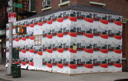
New York City is a hotbed of what the media industry calls OOH (Out-of-Home) advertising, and recently a couple images from my childhood have been dug up, dusted off, and sent out to wander the streets like black and white zombies. October saw the album cover of Bruce Springsteen’s Born to Run — puffed with hot air and released in a 30th Anniversary edition — and December brought the Dude from the Maxell ads.

Dude_recent.jpg

Dude!

At this moment, the Dude appears in street snipes (aka ‘wild posting’) and peeks out from behind a Don’t-call-it-Coke! Spencerian swash and mediocre tag line. But beyond any simplistic aesthetic issues, I have the vague sense that there’s something wrong here.

According to Maxell Executive Vice President Don Patrican, “The image of the hip, young guy being completely blown away by his entertainment experience is timeless. We had allowed this icon to become marginalized over the years. But now, when brand is so important in our business, we’ve decided to leverage this image that tens of millions of people associate with Maxell by putting more energy and investment behind it.”

Patrican continued, “Attempts had been made over the years to contemporize the ‘blow-away guy’, but we decided that the genius of the ad was the purity of the black-and-white image and how it thoroughly and elegantly communicates the joy of a great recorded entertainment experience. We just needed to find new ways to expose that powerful image.”

Now back in 1979, the Dude was hip, even with the tie and choice of Wagner in the television ads. Besides the leather jacket and long-ish hair — both symbols of generic rebellion — his hipness came from the Edmond May-designed JBL L100 speaker on the floor.
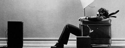
Dude_then.jpg

In the late 1970s, I was enthralled with the romance of the high-end audio shop. Before Razrs and iPods, groovy stereo equipment was a prime method for (usually) men to display their sophistication; and audio shops were full of these (lowercase) dudes engaged in endless discussions about speed control, wiring and pre-amps. These dialogues didn’t necessarily equip people to quantify the ineffable details of how one hears music; but they did contribute to the cult of the speaker.

So perhaps what I sense about the Dude’s reappearance, is similar to a phenomena described by David King in his 1997 book The Commissar Vanishes: The Falsification of Photographs and Art in Stalin’s Russia:

Like their counterparts in Hollywood, photographic retouchers in Soviet Russia spent long hours smoothing out the blemishes of imperfect complexions, helping the camera to falsify reality. Joseph Stalin’s pockmarked face, in particular, demanded exceptional skills with the airbrush. But it was during the Great Purges, which raged in the late 1930s, that a new form of falsification emerged. The physical eradication of Stalin’s political opponents at the hands of the secret police was swiftly followed by their obliteration from all forms of pictorial existence.

Photographs for publication were retouched and restructured with airbrush and scalpel to make once famous personalities vanish. Paintings, too, were often withdrawn from museums and art galleries so that compromising faces could be blocked out of group portraits. Entire editions of works by denounced politicians and writers were banished to the closed sections of the state libraries and archives or simply destroyed.

The source of the image’s “genius” referred to in the Maxell press release is the speaker. Otherwise, this could be an ad for pretty much anything, from Le Corbusier furniture (his chair) to air conditioning to lap dances. The Dude is the Dude because his passion is music. His rebellion is a rebellion described by Thomas Merton: a decisive turning away from the world’s distractions in order to follow his heart.

Sadly, advances in technology and the market have forced Maxell to expand beyond high-end audio tape, and they find themselves in the difficult position of trying to brand a company without a signature product. They still make analog cassettes, but when was the last time you popped one into a deck? The format was introduced in 1963 and still has market share in some parts of the world, but there are whispers of its eventual demise within 10 years. Beyond audio tape, their blank CDs are considered to be of medium quality; and they’re one of the remaining companies still producing legacy DAT/DDS tape formats.

So what makes them different? Where’s the equity? Where’s the sex?

That’s right, the Dude abides. But now, he’s just a Potemkin Dude; pantomiming his affections to a phantom muse.

Maintained through our ADV @ UnderConsideration Program
ENTRY DETAILS
ARCHIVE ID 2508 FILED UNDER Critique
PUBLISHED ON Jan.02.2006 BY m. kingsley
WITH COMMENTS
Comments
marian bantjes’s comment is:

This is really the strangest campaign, as noted. But it is an interesting metaphor in itself: the cropped (destroyed), iconic image, hiding behind a new!improved!swoosh! is highly representative of a company that once had something to sell, and now flounders in a market of iPods and online streaming.

Sad to see the Dude drown that way.

On Jan.02.2006 at 01:45 PM
Michael B.’s comment is:

I can't believe I'm saying this, but this is a good case for why "design" has to be kept away from advertising. The original print ad (by Scali, McCabe, Sloves) was so elegant. The Steve Steigman photograph (art directed by Lars Anderson) was a perfect combination of understated cool and (even without the tv commercial) Wagnerian bombast.

Although it was popularly called the "blown away" ad, those words appeared nowhere. Instead, the headline was simply "No Other Audio Tape Delivers Higher Fidelity." Headline above, photo below, logo at the bottom. Boring and devastatingly effective.

The new version has the thuddingly obvious headline, and the gruesomely hideous wavy lines beneath. And those colors. Sigh. If this is design, get it the heck out of here.

On Jan.02.2006 at 04:22 PM
m. kingsley’s comment is:

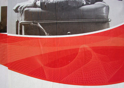
Michael, you have no idea how hideous the wavy lines are. Here's a detail from an installation on a neighborhood workshed. I interpret the distorted gridwork as the designer's desire to suggest something technical — an Adobe Illustrator way of making Lissajou Figures.

And from a distance, it takes on a Diet Coke air.

While I appreciate your quotes around "design", I'll argue that it's really "decoration". But whatever you call it, I think we could agree on the campaign's "fear".

On Jan.02.2006 at 05:30 PM
felixxx’s comment is:

wow.

terrible.

yet funny.

also, in small

crimes dept... your

citing the dude

inaccurately.

C'mon, everyone knows

the Dude, man.

On Jan.02.2006 at 09:35 PM
m. kingsley’s comment is:

Hey Felixxx,

In the words of the Stranger (Sam Elliot):

The Dude abides.

I don't know about you but I take comfort in that.

It's good knowin' he's out there. The Dude.

Takin' 'er easy for all us sinners.

Shoosh.

It ain't no crime to quote.

Just watch the beverage.

On Jan.03.2006 at 01:15 AM
Armin’s comment is:

It may be a sign that I'm actually getting old(er) but I have a vivid memory of watching this ad on tv... My older brother probably made me watch it, who, at the time, was the target audience embodied. The Dude hasn't aged well. Well, he has, his context has not.

Luckily, he can still kick his imitators' asses. (Click, scroll down).

On Jan.03.2006 at 08:42 AM
Stefan’s comment is:

I agree that the new, Coke-ified version of the ad/photo is weak, pale imitation of what it once was.

For what it's worth, the "Dude" was actually Peter Murphy of Bauhaus fame. It wouldn't be hard to imagine that the long hair, black jacket, black tie were all his own - given his status as a post-punk goth rocker. I don't know if Maxell advertised that it was him in the photo, but I thought it was an interesting side-note to the conversation.

On Jan.03.2006 at 11:49 AM
Rob’s comment is:

The image with the speaker was something then. It had meaning. It had suspense. It had killer instinct to make you want for whatever the Dude was listening too and through.

The new 'ad,' if you can even grace it with that moniker, is the result of less-than stellar creative brief for a client whose brand is lost in wireless world of the new century, and too cute Illustrator tricks having nothing to do with selling the product.

That's bad design.

On Jan.03.2006 at 04:51 PM
Timothy’s comment is:

Actually, Peter Murphy appeared in the European version of the Maxell ads.

The lamp seems to have been blown completely off set (replaced by ducks?) and Peter's chiseled cheekbones give a nice approximation of the effects of G-force winds.

On Jan.03.2006 at 10:35 PM
Michael B.’s comment is:

The European version got Peter Murphy. We Americans got someone else:

Finding the right long-haired male model was not easy, so Steigman convinced his make-up man, "Jack”, to shave off his moustache and pose in the chair (as I recall, Jack was a hairdresser as well). The chair was part of Scali's office furniture, and after testing several pairs of sunglasses, a 14' wall was erected in Steigman's loft studio and a high-powered fan was brought in. But the fan barely made a ripple in Jack's shoelaces, so some improvisation was necessary. The lampshade was tied back, Jack's long hair was loaded with hairspray to give it a fly-away look (some strands were actually tied to the ceiling with wire), and his tie was positioned using stiff wire, as well.

Those were the (pre-Photoshop) days. Read the rest here.

On Jan.03.2006 at 11:24 PM
Timothy’s comment is:

I love to read this kind of backstory-- the amount of rigging and fussing needed to achieve a simple image.

The only background on the European ads I'm aware of is that Mr. Murphy received a lot of free cassettes as part of the deal.

On Jan.04.2006 at 09:43 AM
felixxx’s comment is:

Just watch the beverage

My bad, Duderino.

On Jan.04.2006 at 10:33 AM
ben weeks’s comment is:

I'd always perceived maxell cds were the best. They seem widely available and haven't given me many errors that I can recall.

Even after reading the various posts about the maxell campaign, i'm really not sure what other products they have that would intrest me or my demographic (25 year old male) I can't see a blank cd sustaining a company as it's main product line for more than a decade.

Yes, the ads were cool in the 80's but they are simply not relevant now. We have surround sound commonly available..so a unidirectional blast of sound is passe, no matter how loud.

On Mar.10.2006 at 03:29 PM
Mark’s comment is:

The new Maxell ad is just that not effective

the wavy lines really break up the space and minimizes the impact

"Get blown away" is too obvious

and theres just to much blank white space at the bottom.

Man, what business is Maxell in now? CDs?

they better think of something new soon because VHS tapes are on their way out.

maybe they'll get in the DVD business??

On Jul.25.2006 at 11:46 AM
George Emerson’s comment is:

Per Ben Weeks's comment that today's surround sound technology makes Maxell's icon sonic blast irrelevant: I think surround sound, especially for music, is as inauthentic as Maxell's recent attempt to update its own icon. Surround sound is a kind of technology fallacy, of trying make the artificial more "real" than the real thing, which only ends up emphasizing how truly fake it is. Ben, no one in the 80's thought the Maxell dude was actually being "blown away" by the music. It's what, like, we used to call, uh, you know, uhm, a metaphor.

On Sep.18.2006 at 08:25 PM