Speak UpA Former Division of UnderConsideration
The Archives, August 2002 – April 2009
advertise @ underconsideration
---Click here for full archive list or browse below
  
Another Pretty Face
VISA Rebrands

For a while now, I had been planning a piece on the sorry state of graphics on credit cards: a bit of a rant which I held off writing because I worried that really it was just an extended whine. Then I got the tip from David Weinberger that Visa had rebranded, and as I already had a large collection of card images, I decided to take it on.

I have never before done one of these rebranding posts because a) I’m no expert, b) I try to avoid the use of the word, as I’m fuzzy on the big-picture concept and c) I’m on record as being leary of critique of something so bound in the complications of the client-designer relationship.

But here goes.

I decided that before I even look at the material David sent me, I’d put some thought into Visa as a brand, and why they would even want to rebrand. So as I write, I have not yet seen the new … um … whatever it is.

Going back to my collection of utterly hideous Visa card images, it occurred to me that Visa is in a fairly unique position of being constantly in competition with other identities on what, in fact, belongs to them. At least I think it does. I have always been confused by who owns my Visa cards. Who is dominant, the bank or Visa? If something happens to my card, do I call Visa, or the bank? Does Visa know me as a customer? What is the arrangement between the bank and Visa? Can I be a direct customer of Visa and cut out the bank?
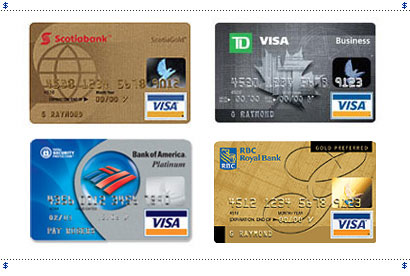
When I look at these almost universally putrid cards, I notice that the Visa logo competes not only with the bank, but often with the logos of various rewards, clubs and membership programs, thus further muddying the dominance of brand:
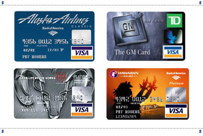
On top of that—or underneath to be more precise—are a bewildering array of excremental images, all swirling in a kind of graphic witches’ brew: all crying out for a few minutes with a Sharpie marker (can you do that? Is there any law against altering one’s credt card?):
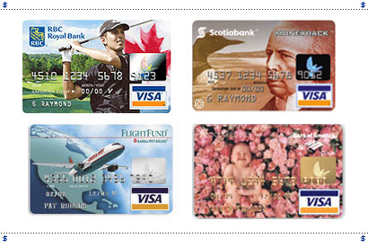
And of course, Visa is not alone in this. Given a wallet with several cards, all abundantly endowed with a vomit of logos and seething digital effects, well, what’s a brand to do?
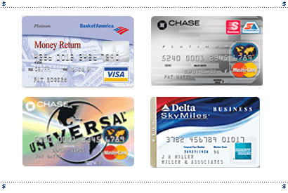
When I think of Visa, I see that blue and gold bar above and below “VISA” set in a blocky sans (although I admit I thought this was an old logo, and I was surprised to see that it was still in use) but mostly I think of that holographic bird. I’ve always been quite fascinated with it, I never get tired of looking at it, and um, call me nuts, but when I cut up my old cards, I always keep the bird. That’s right, I can’t throw it out. How’s that for a powerful piece of design?

So that, surely must be the challenge for a rebrand of Visa: how to create dominance for the identity in a visually competitive space, and then presumably how to transfer that identity out into the world.

Still having not looked at the “solution” to the presumed problem, I wondered “What would I do?” Well, I’d lay down the damned law on all those graphics for one thing, and I’d create some kind of regulated, uninterrupted space, tied to the hologram, for the Visa identity to sit. And I might even incorporate that bird into the Visa identity.

So there I’ve done it: the first mistake of any design critique: assume a problem, and create a clientless solution.

OK, David, what’s the real story? Let’s see what he sent me.
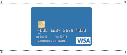
Well, it would appear that contrary to what I’d thought, their prime directive in rebranding is to encapsulate the fact that “Visa has evolved its brand so that it better reflects the growing choice of products and services available today and in the future.” as well as “refresh the look and feel of the brand to ensure it remains up to date and relevant.”

They’ve moved the “well known” dove to the back of the card (incorporated with the magnetic strip) which in part allows for “a larger part of the front of the card to be used for new designs or communication.”
(Yikes. ’Cuz god knows we need more of that.)
And they’ve “introduced a new look for the famous blue, white and gold logo.” [Italics mine.]
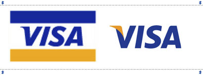
You know what this is? It’s cosmetic surgery. It’s people blaming the unhappiness of their lives on how they look. They feel pressured to constantly update: a little tweak here, a little tuck there—instead of working on who they really are and standing by it. Sure, people change, companies change, but getting a nose job isn’t going to help you communicate that to the world. I’ve said this before, I’ll say it again: Corporations of the world, don’t fuck with your logo unless it’s scar tissue! And especially don’t fuck with your logo if it’s famous.

Visa is saying “You don’t understand me; I’m different than I used to be, and I Botoxed my forehead to prove it to you.”

Even less believably, of their new identity, they claim: “It ensures consistency and clarity across all lines of business.” which is just plain idiotic. What ensures consistency and clarity? a) Nothing. b) policing. To whit, the very page that this comes from has three, count’em, three versions of their logo on it.
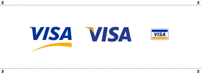
I just don’t understand it. You may like the new logo better. You may like the slightly curved corner at the apex of the A, or the slightly more open S, and the slightly less oblique letterform. Hell, I like the new logo better. It is “cleaner” without the 2 bars of colour, but it is also much weaker. It joins a party of newly streamlined, liposuctioned logos: stripped of lumps and bumps, and airbrushed into a tidy sameness of taste and simplicity. Communication-wise, it represents nothing. It changes nothing. It says absolutely nothing about the new services of the company. And why would it? That task was and is still up to the company.
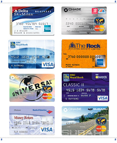
In a crowd of the pretty and not-so-pretty, sometimes you’re just looking for a familiar face.

Maintained through our ADV @ UnderConsideration Program
ENTRY DETAILS
ARCHIVE ID 2265 FILED UNDER Branding and Identity
PUBLISHED ON Apr.04.2005 BY marian bantjes
WITH COMMENTS
Comments
Plamen’s comment is:

It is all that pro-active approach where a company has to do a change where it does not need to. The flag-style image is still the most recogniseable worldwide, although Visa intoduced the swooshy simple logo only a couple of years ago, and now they go again.

To be honest, the newest new logo is more, hm, useable and versatile - they can certainly think of better ways to incorporate it in card front images. Oh, and you forgot to remove the birdy from the front of the "Money Return" card.

On Apr.04.2005 at 03:31 AM
Michael Surtees’s comment is:

I'm outraged! Is there a petition I can sign somewhere? Actually I'm not outraged but I'm left scratching my head. I think the new version of the Visa logo gets lost on the card - but I'm more interested in seeing how it will be applied outside of the card. Once you have a visa card, you know it's Visa so maybe it's not that big of a deal. How will the mark work in getting more people to sign up to Visa as opposed to MasterCard or American Express?

I found this image a couple weeks ago, I wonder how the new Visa logo would work out if it had the same treatment?

On Apr.04.2005 at 08:27 AM
steve’s comment is:

While I think it is a nice rebrand and a clean solid solution and you bring out great points that it is a minimized point of brand on the older cards, arent they going to loose a buttload of money by not pimping out the front of cards to other brands and offers (like rewards programs and Tiger Woods)???

On Apr.04.2005 at 08:38 AM
Chris Rugen’s comment is:

Ugh. Graphic design gets another kick in the shorts from misguided 're-branding'. "Hey everyone, graphic design is all about pointless change!" I agree with Marian completely: "I just don’t understand it."

Re-branding really doesn't absolutely necessitate a re-logoing.

Sure, you can read 'VISA' more clearly, but they've ridded themselves of a their most valuable identity asset. Looks like an airline logo. Come fly the lendy skies.

On Apr.04.2005 at 10:32 AM
Bryony’s comment is:

While it may read better, it feels generic and a smidge wimpy. It will need (in the very least) a larger white box in order to try and obtain the same impact/presence that the previous logo did. BTW what does the little yellow flippy-thingy signify?

You can get some logo evolution info here.

On the other hand, I do like the idea of moving the bird to the back on the magnetic strip. It is time that somebody did something with that stripe to make it a little bit more interesting and unique.

On Apr.04.2005 at 11:07 AM
Gunnar Swanson’s comment is:

I have no idea what prompted the LEM (Logo Extreme Makeover) but I can guess why they did what they did once they were committed to anesthesia anyway:

1) The old modified picture of a mid ’60s BankAmericard is no longer needed. People know what Visa is.

2) The old image takes up a fair amount of space. If you have a given space for the logo, eliminating the color bars means “Visa” is going to be bigger. (Okay, sometimes you end up with the damned white box. You can’t win ’em all.)

3) Medium equity: Like not just settling for a little botox or a subtle lift, not wanting people to just say “Marian looks good. Has she been sleeping better?” and not notice that you’ve had the work done but not wanting to suddenly be dark and round-faced.

You want all the benies of plastic surgery (“Wow! That’s great! You look positively vibrant!”) but you don’t want old friends to pass you on the street without saying hello because they don’t know it’s you. In this case the new image didn’t need to signal radical change (something like “We used to suck but now we’re okay so try us again” or “We’re not like we were when the judge convicted us”) but the combination of context and massive advertising meant they didn’t have to be overly cautious.

On Apr.04.2005 at 11:21 AM
Jason Tselentis’s comment is:

My wife, who's a banker, still sees these every so often.

For all that nostalgia's worth, there's no ignoring the fact that banking and commerce have entered the NASCAR arena. For God sakes, today these things are running out of space, and I don't agree with VISA's move to reimage themselves at a time like this when they keep adding endorsements, content, and imagery to the cards.

I can't wait for the day when the cards are holographic or projection-based, and the card (or whatever instrument is used) lists even the bank's board of directors by scrolling downward (or inwards or outwards) into bankcard infinity.

On Apr.04.2005 at 11:48 AM
marian’s comment is:

I would kill for one of those old Visa cards.

Nice comment, Gunnar ... I always love to see an analogy worked. (Seriously.)

As brands go, this is obviously no tragedy. It's a bit of a shoulder shrugger. But I do think there's a small lesson here which points to a much bigger one.

I do not understand the "need" to "refresh" a corporate identity—to keep it "up to date". The silicone goes in, the silicone comes out. Sure, we can still see it's Visa, because it says Visa, but what they had was one of those iconic identities where you could put pretty much anything between those 2 bars, and you'd still read it as Visa. To me, that's what a brand is ... instant, almost subconscious recognition.

Surely that's where the value of a brand is. I mean isn't that the pinnacle? I would propose that they could have removed the word Visa, and replaced it with all that other junk (bank name, airline, whatever), and they'd have more brand recognition than they do now.

In fact, what they had was the potential for Santafication. The blue and gold (saffron!) bars are a very solid, well established signifier, that they could have worked in some interesting ways.

They just threw away their most valuable asset.

What they're left with is a prettier face with zero personality. Put her in a crowd of a hundred streamlined logos, and you'll have a hard time picking her out.

On Apr.04.2005 at 12:24 PM
Kirsten’s comment is:

I can't wait to have my Visa card implanted as a chip in the tip of my index finger. No room to brand there. Oh, I guess I could have my nails done with a Visa logo decal. Would they pay for my manicure?

Marian, I think you should show your beautiful business card/credit card that you designed for Margie. It's sublime.

On Apr.04.2005 at 12:39 PM
Sam Royama’s comment is:

I agree with Marian concerning the logo. Completely. The change does not reflect/say anything different.

However, keep in mind that branding is much more than just the logo. As ugly as they may be, the "designs" on the card might be very significant in terms of branding. The various designs might work much like the inter-changeable face plates on cell phones. They personalize the product for the customer.

Perhaps I'm strechting it - but that is always the way I saw it. If you are offered the Mike Wier Golf Visa card, then you are most likely a Canadian golfer - probably a member of a Canadian golf club. So now the card speaks to you. You like to look at it, you like to use it...

In other words. I don't see much of a rebranding effort. I'm assuming they are still going to be adding the designs to the cards. The logo change is, as Marian says, rather pointless and unnecessary.

On Apr.04.2005 at 12:40 PM
Jason Tselentis’s comment is:

Yes, show it, Marian!!!

On Apr.04.2005 at 12:40 PM
marian’s comment is:

they've ridded themselves of a their most valuable identity asset. Looks like an airline logo. Come fly the lendy skies.

Chris, my apologies for not crediting you with saying it first.

It is time that somebody did something with that stripe to make it a little bit more interesting and unique.

Um. It's a magnetic stripe. The only time I look at it is when it looks like it's getting worn from swiping, and i worry it's not going to work any more.

Why does every single surface, element and last detail of our lives have to be branded, swooshed, textured and colourized?

White space! Remember the importance of white space? I feel suffocated by graphic clutter, sometimes.

On Apr.04.2005 at 12:47 PM
marian’s comment is:

Yes, show it, Marian!!!

Oh fer gawd's sake. It's completely irrelevant, but it's here (3rd and 4th frame of the flash thingummy) on my bogus website.

On Apr.04.2005 at 01:02 PM
Kirsten’s comment is:

Marian, don't be so humble. That card is one of my favourite pieces of yours. It's even more beautiful in real life. The blue background is made up of tiny (really tiny) metallic numbers. It shimmers like fish gills.

Rock on Marian.

On Apr.04.2005 at 01:26 PM
Armin’s comment is:

Given that this is not a literally extreme makeover, I don't think it — the change — really matters. The logo was not improved nor desimproved. Other than the two heavy color bars, the most recognizable element of the logo was the type and the mini swoosh. And now you have them both in the same logo. So the idea — in essence — is good, but…

Execution-wise, it could have been pushed a lot more. The yellow wing seems more propped on the V than looking integrated. An elegant turn-of-leaf effect would have been more interesting.

> Sure, you can read 'VISA' more clearly,

I find that to be a very legitimate reason for wanting to change. If you see Marian's examples of cards with the new and previous logo, it's still very recognizable — the type and the two colors are still there. If this logo change improves readability and recognizability by the smallest of margins then it's a valid reason for rebranding. As I said, this is a logo that could have been executed with a higher degree of sophistication, but unlike other rebrandings this one doesn't give me goose bumps.

On Apr.04.2005 at 02:07 PM
marian’s comment is:

If this logo change improves readability and recognizability

Please do not confuse these 2 things. Readability does not necessarily equate recognizability, and as i've already stated, I think Visa sacrificed recognizability for readability.

No, it's not that anyone will think "what's that? is that Visa?" Of course not. It's just that in the crowded world of logos, what was recognizable was the 2 bars: it was graphic language: it doesn't need to be read. And imho to have graphic recognizability is far far more powerful than to be easily read.

These thoughts are only coming clear to me in this discussion (Yay blogs!), and if I could I would rewrite my Visa piece with more emphasis on this perspective.

On Apr.04.2005 at 02:23 PM
freelix’s comment is:

anyone notice another new rebranding going on?

at least they didnt step on the mark, which is the 1st major abstract logo design authored by the legendary C&G,NY in 1950s.

I asked my Chase bank manager today what he thought; "Its not not fairing too well around here". Fair enough. My opinion- its a hair too trendy. Slight modifications to the old face wouldve been better/ more seamless.

On Apr.04.2005 at 03:46 PM
Armin’s comment is:

> Please do not confuse these 2 things. Readability does not necessarily equate recognizability

You are right Marian, my bad. What I meant to say is that by removing the bars the type becomes bigger and I think the blue, all caps, slanted type is a very recognizable element as well, probably not as much as the bars, yet I assume that they did exhaustive testing on the recognizability of the type. So, by making the logotype bigger, more readable and with a quicker popping factor off a cluttered card it can become an equally recognizable logo as the original.

> And imho to have graphic recognizability is far far more powerful than to be easily read.

Unlike UPS, VH1 or even MTV2 I don't think VISA gave up much recognizability by losing the two bars. I have to admit that I, personally, never associated VISA with the two bars; if you had asked me what the VISA logo was, I would have said the all caps with yellow swoosh underneath, so my opinion on the rebranding is based on my perception of the new logo —�as well, I'm quite indifferent to the change.

On Apr.05.2005 at 09:16 AM
Gigi Frias’s comment is:

Readability does not necessarily equate recognizability...And imho to have graphic recognizability is far far more powerful than to be easily read.

I completely agree - the difference between readability and recognizability is greater than most people care to notice. Just because something's readable, it doesn't mean the intended audience will remember it much less recognize it immediately.

In a perfect graphic design Utopia, we'd get both out of every logo; but if a choice had to be made between the two, recognizability would win out every time.

Btw, I really like your Digitopolis identity Marian!

On Apr.05.2005 at 10:24 AM
Frank McClung’s comment is:

I think the Visa logo makeover is a perfect reflection of American culture. Old logos, like people, can't appear to be "out of touch," so they get nips and tucks to try and look young again. New logos want to feel older than they really are so they go for the faded, distressed, worn-around-the-edges look to add maturity to their fledgling company.

In either case it's vanity. Style triumphs over content and substance once again. Barf.

On Apr.05.2005 at 12:26 PM
Zoelle’s comment is:

It is time that somebody did something with that stripe to make it a little bit more interesting and unique.

Even the magnetic strip is not immune to marketing:

On Apr.05.2005 at 12:51 PM
Jeff Gill’s comment is:

...readability and recognizability... In a perfect graphic design Utopia, we'd get both out of every logo

which illustrates why Utopia can't exist & would be a miserable place if it did.

On Apr.05.2005 at 03:55 PM
Tan’s comment is:

I don't miss the old bars, though I agree they are very recognizable. Was it supposed to be a flag? Would make sense considering the name. I thought it just looked like a tiny version of a credit card itself.

The biggest equity is the name itself. "Visa" is a great name, like Xerox or Exxon. It's a name that borders on the realm of verbal vernacular, like Kleenex and Band-aid and the last two.

For that reason alone, there's not really much they could do to evolve the logo, except to make the name more clear, uncluttered, and prominent. The little flag/lapel collar on the V is a nice touch of wit.

On Apr.05.2005 at 04:51 PM
Ash Arnett’s comment is:

Someone mentioned UPS. The new-ish UPS mark is the first thing that came to mind as I read your examination of the Visa identity. Gosh, it's practically the same degree of arc and angle in the Visa swoosh as in the UPS badge.

This comparison underscores your point about the rampant genericization of identities. Me, I blame the rampant genericization inherent in the ways and means of modern branding.

Specifically I mean that prominent companies with valuable brands like these are having their identites tinkered with, often overhauled, by service providers who have so carefully formulated the service they provide that it's only natural that out of it comes a bunch of same looking marks. The marks, after all, are most likely informed by the brand attributes--in all likelihood pretty generic themselves--in accordance with the generic brand service provider process.

Probably most of the time, the service providers are acting in good faith. (Some are not, of course, and couldn't care less about what's ultimately good for the their clients or their clients' customers.) So, what can be done to avoid this downward generic spiral?

You know the answer to that.

Respectfully,

aa.

On Apr.05.2005 at 06:39 PM
Bryony’s comment is:

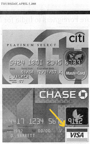
This just in from the NY Times.

On Apr.07.2005 at 08:54 AM
freelix’s comment is:

The little flag/lapel collar on the V is a nice touch of wit.

Hmm. Anyone laugh at that wit? Since when is curling typography funny?

On Apr.08.2005 at 11:19 AM
freelix’s comment is:

Everywhere You Want to Be.

On Apr.08.2005 at 11:36 AM
kevin steele’s comment is:

Wow, what a pointless waste of money and time. And it's just getting started.

I tend to shrug my shoulders at many of the 'big' rebrandings. I'm not so bothered by the new UPS logo. And, since it mostly appears on trucks and forms that always need repainting and reprinting, it's a workable project.

The Visa logo, on the other hand, is everywhere. And many of the places it already is, like store windows, etc., it won't be changing any time soon.

The inevitable result of this change is that there will be a new mark in circulation, but the old mark will remain ubiquitous.

And as Michael Surtee's photo shows, in the real world, it's not the word 'VISA' we recognize. Ironically, as the corporate redesign page shows, you can shrink the flag/card logo to the point where the word Visa becomes illegible, and the mark remains 100% recognizable.

Elswhere, MasterCard has their two overlapping circles (globes) which creatives use again and again in interesting ways in tv spots. As well, the 'priceless' campaign has infinite legs since it is based around the idea that there is more to life than what you can buy, which puts the product in perfect perspective.

I suppose it does not really matter though. Most of us choose credit cards based on things like interest rates and other real-world concerns, or based on short-term offers that have little to do with issuing credit card company.

On Apr.11.2005 at 08:53 AM
Armin’s comment is:

> And as Michael Surtee's photo shows, in the real world, it's not the word 'VISA' we recognize.

Like I said before, I really doubt that the word VISA is not recognized. Rebrandings like this don't happen without obligatory focus groups. If people had said that they didn't recognize the word VISA, this already-shy and conservative rebranding wouldn't even have happened.

On Apr.11.2005 at 09:02 AM
Tan’s comment is:

"Wit" doesn't always mean "funny" Felix. It also means "Keenness and quickness of perception or discernment; ingenuity" I'm not saying it's the greatest logo trick in the world, but it's not inelegant either.

>Voila

Nice. I'm very impressed at your wit Felix. Do you have a point, or just making an observation? I assume your point is that you think you can do better. Ok, I bet you can too.

>And as Michael Surtee's photo shows, in the real world, it's not the word 'VISA' we recognize. Ironically, as the corporate redesign page shows, you can shrink the flag/card logo to the point where the word Visa becomes illegible, and the mark remains 100% recognizable.

It's the word and the mark. But I do agree w/ your point, Kevin — that the symbol has a lot of equity in its recognition — but that doesn't necessarily mean it's a great mark. It just means that it's been used forever, everywhere.

We've all been trained to recognize the color bars as the brand. But is it enough? Is it more valuable than the name Visa itself? And to what degree can the new logo retain those colors and still be recognizable?

In my opinion, a strong brand name is always more valuable than a strong brand mark. Marks can be emulated, bastardized, or as Felix proved — mocked. Strong brand names are harder to develop, but they can withstand the test of time better and transcend visual clutter. Think "American Express" or "Ikea" or "Rolex" — what's stronger and more valuable, their name or their logo?

I'm just guessing here, but if the name "Visa" is becoming irrelevant just as you've said Kevin, than this rebranding is indeed a clear indication of what the company needed to do to save its brand name. There's nothing needless or stupid about that.

Try to think about the business issue as well as the graphic execution when you're evaluating these things.

On Apr.11.2005 at 12:44 PM
Tan’s comment is:

>Try to think about the business issue

Sorry, but I meant to direct this at all of us, not just Kevin.

And for the record, I do think it's possible to successfully rebrand a mark that also elevates the name at the same time. The Citibank card above is one such instance. So is Fedex.

In Visa's case, did they needlessly sacrifice the mark for the name? Probably, but only time will tell if it was a smart or stupid move.

On Apr.11.2005 at 01:37 PM
Michael Surtees’s comment is:

In my opinion, a strong brand name is always more valuable than a strong brand mark.

I wonder about this, I think a brand name and mark run in parallel for importance. Each element doesn't have much inherent value until it's given meaning or buy in from the perspectiv audience participant.

On Apr.11.2005 at 05:31 PM
freelix’s comment is:

Wit also means "Keenness and quickness of perception"

OK. OK. Lets not go to court over it. I usually associate "wittiness" with humor, but hell, I aint done much book-learnin.

You win- the new mark is incredibly keen.

Nice. Do you have a point?

Busted. I didhave one. Kinda shot myself in the foot. Should went with boomerang, hummingbird or lemon pie

The whole waifish, curled corner thing is so ubiquitous with the airline industry. There seems to be much more equity in the yellow/ blue stripe. You could just lose the type and people would still read Visa. Eh, who cares.

Anyone know the rebrander here?

On Apr.11.2005 at 06:05 PM
freelix’s comment is:


who knows.. maybe theres a master plan?... ending in 2008 with just a yummy piece of custard.

On Apr.11.2005 at 06:20 PM
David Weinberger’s comment is:

Anyone know the rebrander here?

Yep, it was done in-house.

The designer is Greg Silveria, former Creative Director at FutureBrand and designer of many high profile brand identities. Caterpillar is the one that comes to mind right now. Greg is currently the Creative Director at Visa International. John Elkins, former CEO of FutureBrand (and co-founder of Diefenbach Elkins, which later became FutureBrand) is the Executive Vice President of Global Brand and Marketing, Visa International. It's a small world.

Over the past five years or so, a few top brand consultancies have been contracted to look at the Visa mark, but none have successfully sold the decision makers on a new one. Recently, there were two finalists, one by Greg and the other by a consultancy. In the end, Greg's simple wordmark was chosen for several reasons, not the least of which is that the Visa flag will be living out there for quite a while, whether it's in wallets or on storefronts, and the new mark can live along side of it fairly well.

BTW, great review Marian.

On Apr.11.2005 at 07:11 PM
Haig Bedrossian’s comment is:

fyi - additional commentary can be found here:

http://www.ploom.com/probe/

On May.16.2005 at 09:52 PM
Mark’s comment is:

Interestingly the so called "old" Visa logo is still seen in the newest Visa commercials,IMHO (In My Humble Opinion) The radical change was unnecessary.

My wife, who's a banker, still sees these every so often.

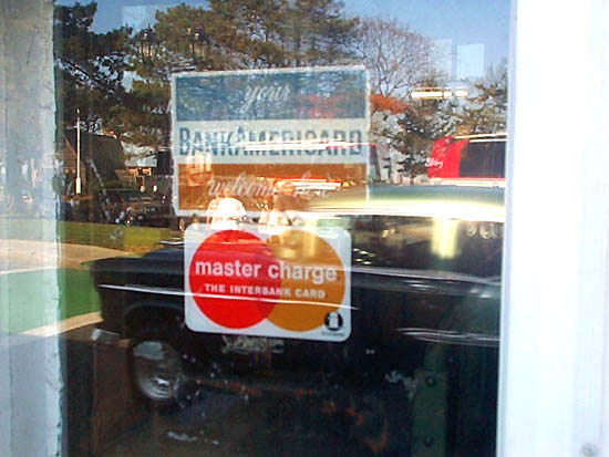
Heh,interesting. I see old versions of credit card stickers on doors of businesses that have been around for years.

One example Flieg & Newbury a local art store of my area has old credit card logos and other old stuff such as Kodaks "K" logo.

Plus it has lots of vintage cameras too.

Heres an example of old credit card stickers

Personally I have to confess, when I was younger I cut out credit card logos from magazines and flyers and stuff and collected them.

I never knew exactly why, probalbly it was the color and design heh, I have to admit Discover's and Mastercard's logos were (and still are) my personal favorites.

I'm a sucker for old logos :)

Design aside,charge/credit cards can be a big burden on your money if you use them to pay for everything.My parents learned that the hard way and now do the smart thing,pay with money,use checks when appropriate,and use debit cards sometimes.

On Sep.27.2005 at 05:06 PM