Speak UpA Former Division of UnderConsideration
The Archives, August 2002 – April 2009
advertise @ underconsideration
---Click here for full archive list or browse below
  
Design School Part 2 - Can a line be Happy?

One of the specific classes I remember most vividly was actually one of the first chronologically. The professor was trying to teach us something and he succeeded with precision. It wasn’t a moment—It was a lesson.

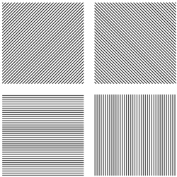
On the first day of a freshman class called, “Two-Dimensional Design” (it was not a graphic design class), our professor asked our class a question. “What characteristics can a line have?” Well, after looking around at each other for a minute, someone replied, “a straight line?” The professor then had that student go up to the board to draw a straight line. “Great, what else,” he said, clearly looking for more, lots more. In no time, we had enthusiastically covered the usual suspects. A curvy line. A thick line. A short line. A long line. A calligraphic line. I think my contribution was a dotted line.

DWLines1_HL.jpg

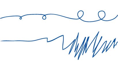
Then came something unexpected. A student who had previously sat silent, quietly said, “a happy line.” A happy line? Can a line be happy, we all wondered? The student walked up to the board and drew what he envisioned was a happy line. Finally getting to what the professor had been planning, that simple line opened up the minds of fifteen college students. Pretty soon, the board was filled with angry lines and sad lines and scary lines and feminine lines and old lines. We were thinking. We were being intellectually and artistically adventurous.
DWLines2_HL.jpg

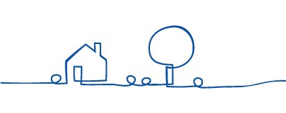
We also discovered that a simple line can be representational as well. A single, continuous line can accomplish many of the same things that a painting, drawing or sculpture can. A line can be a house or a smile or a landscape. A line can tell an entire story if designed skillfully.
DWLines3_HL.jpg

That professor, who is actually a painter, gave me my first glimpse into the world of design. Those lines were the first time that I realized that emotions and ideas and even stories (and later, brand strategies) could be shown through nonrepresentational forms. As designers, sometimes we have words to convey a message. Sometimes though, we have only a picture. Or a blue square. Or a line. We have the ability to give meaning to these forms simply by the way in which we craft them. We give lines meaning. We can even give words meaning, which is pretty damn powerful.

So yes, a line can be happy. A line can be anything you want it to be.

Since that day, since that class, I have always noticed the extraordinary things that lines can accomplish. Here are a few examples, chronologically:

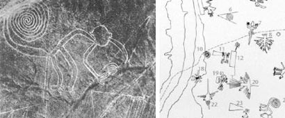
The lines in Nazca

“Stretching across the Nazca plains - like a giant map or blueprint left by ancient astronauts, lie the famous Nazca Lines of Peru. Etched in the surface of the desert pampa sand about 300 hundred figures made of straight lines, geometric shapes most clearly visible from the air. No one know who had built them or indeed why.”
Nazca_HL.jpg

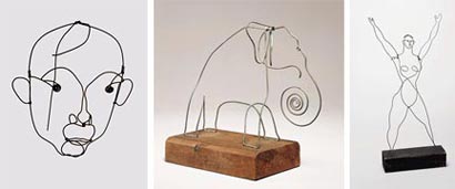
The wire sculptures of Alexander Calder
Calder_HL.jpg

Crockett Johnson’s “Harold and the Purple Crayon”

“Crockett Johnson’s understated tribute to the imagination was first published in 1955, and has been inspiring readers of all ages ever since. Harold’s quiet but magical journey reminds us of the marvels the mind can create, and also gives us the wondrous sense that anything is possible.”

Harold_HL.jpg

The illustrations of Laura Ljungkvist

Her own series of books

Ljungkvist1_HL.jpg

Covers for a series of novels by Isaac Bashevis Singer

Ljungkvist2_HL.jpg

The “Monsoon Wedding” title sequence

Ljungkvist3_HL.jpg

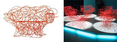
The Corallo armchair by the Campana brothers

“This sculptural bench, introduced in April 2004 at the Milano Salone del Mobile, is made from bent steel wire and is meticulously hand-sculpted by skilled craftsmen at Edra.”
Campana_HL.jpg

Click here for Part 1 of Design School

Maintained through our ADV @ UnderConsideration Program
ENTRY DETAILS
ARCHIVE ID 2253 FILED UNDER Design Academics
PUBLISHED ON Mar.23.2005 BY David Weinberger
WITH COMMENTS
Comments
marian’s comment is:

Wicked. Great post David. (This is a lame comment, but I just had to say ...)

On Mar.23.2005 at 10:58 AM
David Weinberger’s comment is:

Thanks Marian, and Happy Birthday! (Don't worry, I won't tell anyone)

On Mar.23.2005 at 11:11 AM
Andrew Twigg’s comment is:

David

Thanks for the awesome post. Next quarter for the first time I'm teaching "Drawing & Composition" which is a low-level class for all of the graphic/fashion/interior design students at school. The examples of Calder and Nazca (et. al.) you've given have sparked all kinds of thoughts and ideas.

And, HAPPY BIRTHDAY Marian! (David, this best not be a joke).

On Mar.23.2005 at 11:25 AM
geeky’s comment is:

i loved Harold and the Purple Crayon as a kid, and i still love it today. it's amazing the imaginative spark a purple line can create.

On Mar.23.2005 at 11:42 AM
Don Julio’s comment is:

I think all of these examples rip off today's illustrious Feluxe Socksmell.

Especially Calder - what a futurist he must have been to accurately see this far ahead ;)...

I remember that same lesson about lines, we had to listen to music - all types - and translate it into a continuous line.

On Mar.23.2005 at 01:14 PM
marian’s comment is:

(Gee thanks! Very impressive colour usage, andrew!)

I am a happy line.

On Mar.23.2005 at 01:47 PM
JAbbott’s comment is:

Great stuff. Thanks for the post. You may appreciate this use of continuous line I saw recently: NYCtoTahitiNonstop.com.

On Mar.23.2005 at 03:08 PM
David Weinberger’s comment is:

Yes the Tahiti stuff is great and was covered in Quipsologies Vol. 5.

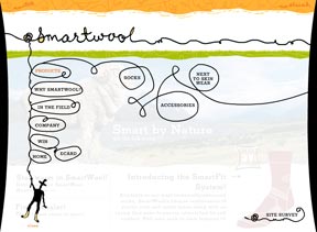
The Smartwool identity by Missy Wilson is fun too…and smart.

I think all of these examples rip off today's illustrious Feluxe Socksmell.

Especially Calder - what a futurist he must have been to accurately see this far ahead ;)...

Yes, Felix does use this style as do other designers/illustrators. A few that come to mind are Anders Wenngren (whom I believe was the first one), Dennis Clouse, Filip Yip, Paul Howalt, Missy Wilson, etc. They are all talented. Speak Up's very own Marian Bantjes uses lines to create absolutely beautiful work, as well.

On Mar.23.2005 at 03:39 PM
Randy’s comment is:

These are also a treat to the eyes:

http://www.microsoft.com/mscorp/ads/tv.asp

of course...it doesn't work in Safari, but that's another blog on another day

On Mar.23.2005 at 04:07 PM
Armin’s comment is:

Inconsequential to the discussion, but, isn't there a Pink Panther episode where PP struggles with a "line"? Maybe not…

I still have nightmares of first-semester exercises where I had to — by hand, ink and an instrument whose name I can't remember — do this:

Now, that just took me 3 minutes to do. At school it would take me hours and hours because of all the messups I would do with the ink.

An interesting bit of trivia… this technique in Mexico is refered to as Ashurado and what's funny about it is that it comes from the Hebrew word Shura which means line. So, there.

On Mar.23.2005 at 04:12 PM
ian’s comment is:

armin, if memory serves, i think it's known as a ruler by some and a straight edge by the real pro's

i too had to do a similar exercise where we had to draw our own graph paper in several different scales.

that was the longest project of my design education

(with the exception of the foundations project of creating a life size self-portrait out of bamboo skewers and hot glue…a 3-D exercise in line)

On Mar.23.2005 at 06:41 PM
Robynne Raye’s comment is:

WOW. Love the NYC to Tahiti nonstop, and have always been a fan of Smartwool. This is a great post.

On Mar.23.2005 at 07:01 PM
Héctor Mu�oz Huerta’s comment is:

Armin, I had to do those lines in the first semester as well, I guess the instrument whose name you can’t remember may be the estilografo or the tiralineas.

I had a professor in sixth semester who made us trace with ink, straight edges and compass a whole typeface at the size of 12cm per glyph. It was very difficult to find the right places for the overlapping circles to form the curves.

On Mar.24.2005 at 01:20 AM
Armin’s comment is:

> estilografo or the tiralineas

Hector, yes, thanks! Man, hello 1995. Tiralineas means, literally, Line Thrower. But enough with the language trivia…

On Mar.24.2005 at 08:02 AM
thorri’s comment is:

A great post! A lesson learned early in school, but all to easily forgotten. This has been saved in my NoteBook.

...

I have to nit-pick at a tiny detail that bothers me though. Maybe a candidate for a new (or old) disussion?

"We give lines meaning. We can even give words meaning, which is pretty damn powerful."

Myself, I lean towards the notion that words (or lines) don't contain meaning within themselves; the meaning is in the eye of the beholder.

The reason for my nit-picking is not the nits themselves, but the search for a better wording for the quoted sentence. Mayhaps we don't give words or lines meaning, but rather we give them life? Whatever we give them, it's surely the means to give meaning...

... I'll stop now.

On Mar.24.2005 at 10:43 AM
David Weinberger’s comment is:

In a conversation of semantics, yes, you are correct. We don't give lines meaning, however, nor do we "give them life." To be really particular, or "nit-picky," we give people the opportunity to find meaning in them. This distinction was not my intent.

On Mar.24.2005 at 11:52 AM
Don Julio’s comment is:

The reason for my nit-picking is not the nits themselves, but the search for a better wording for the quoted sentence. Mayhaps we don't give words or lines meaning, but rather we give them life?

In the same basic design class where we learned that lines can have meaning, we also learned basic vocabulary through critique of our work. Words like nice or cool quickly fell by the wayside in exchange for contrast of scale, proximity, juxtaposition and terms that more aptly described and gave context to the work.

Words and lines might be the only tools a designer really needs.

A little color now and then might be okay too.

On Mar.24.2005 at 11:53 AM
thorri’s comment is:

"To be really particular, or "nit-picky," we give people the opportunity to find meaning in them. This distinction was not my intent."

I must say though, that your original wording is very much to the point, and I have yet to find better words for it (semantics aside). That was the aim of my original pickyness, for we are doing something to the lines (or for them), yes?

On Mar.24.2005 at 01:12 PM
wes’s comment is:

Christoph Niemann's attention to line is highlighted in the latest issue of Print. I have always liked his simple-yet-witty concepts (which are broken down into a formula, in the same issue, by Mr. Niemann himself), but his control of line weight is equally as impressive.

On Mar.25.2005 at 03:39 AM
Rob’s comment is:

David, a wonderful post. It's so easy for us to forget how simple it can be to communicate. And how beautiful it can be done, even with the simplest of graphic elements. Inspiring for sure.

(To Marian, a belated Happy B'day)

On Mar.26.2005 at 06:51 AM
Tom B’s comment is:

Can I pick some nits as well?

It seems to me that we're not doing anything to the lines, since they didn't exist before we drew them.

We are creating lines, and using our own mind as a model for how others will interpret any emotional content.

In this sense, we are not giving meaning to anything. We are creating meaning.

Unless, of course, we are talking about potential lines and potential meaning.

----

Okay, picking over. Any remaining nits can carry on doing whatever it is they do (I think nits are head-lice, actually).

On Mar.26.2005 at 10:16 AM
thorri’s comment is:

"It seems to me that we're not doing anything to the lines, since they didn't exist before we drew them."

Spot on. I need to polish my phrasing a bit :)

"In this sense, we are not giving meaning to anything. We are creating meaning."

I don't think we're creating the meaning, but lines, yes.

"Unless, of course, we are talking about potential lines and potential meaning."

Yes this discussion is slanting towards metaphysical :)

"Okay, picking over. Any remaining nits can carry on doing whatever it is they do (I think nits are head-lice, actually)."

Actually, nits are head-lice's eggs.

On Mar.26.2005 at 10:33 AM
Tom B’s comment is:

I don't think we're creating the meaning, but lines, yes.

Frivolity aside, this is quite an interesting point.

Something that doesn't exist cannot possibly have a meaning. So when I create a happy line, where does its 'happiness' come from, if not from me: its creator?

Does it come from 'context', whatever that means? or from 'culture' whatever that means?

Or perhaps it isn't really there at all (at least, not as some definite, empirical essence that we can ever hope to point to successfully)

This is the crux of the whole structuralism/post-structuralism argument that has been haunting these disscussion boards.

I think that when we infer meaning from something, we base this judgement upon the fact that we are all fundementally similar to each-other.

This is what I meant when I said that we use our own mind as a model for how others will interpret any emotional content.

Of course, two members of a shared culture are more simmilar than two people from different cultures. But I also feel that everyone in the world is fundementally similar: the differences between cultures are tiny when compared to the similarities amongst the whole human race.

When I create a 'happy' line I must simulate in my own mind how I would feel about various altenative lines, and choose the one that best suits my intention.

This can only work if I am confident that anyone else's interpretation of this line will be the same as mine (if not exactly, then at least very similarly)

The mistake of deconstructivist approaches to meaning is to say that since we can never be sure of this match, then meaning is never achievable.

The trick is not to go chasing after an exact match (which will never be achieved), but to explore the infinite number of very similar matches.

Each time we create something new, we are exploring this narrow (but infinite) realm of very similar interpretations: discovering never-before-seen solutions. And each time we do this we add a tiny bit of new meaning to culture.

So yes, I do think we are creating meaning.

And this, I believe, is what design is.

On Mar.26.2005 at 11:45 AM
thorri’s comment is:

I'll start out by saying that I agree with everything in the post I'm quoting from below. A very interesting and strong argument.

The ability to identify a drawings mental state is very important to designers. The tool with wich design desitions are made.

However...

"Something that doesn't exist cannot possibly have a meaning. "

I've written a 20 page essay on 'nothing'. A feat I undertook when studying philosophy. One I did just to be able to say to people, that I had written a 20 page essay on 'nothing'.

Existance is very related to the topic of 'nothing' for what is 'nothing' if not something that doesn't exist? But if it doesn't exist, how can we discuss it?

But again, great argument on the creation of meaning. I've already copied it to my NoteBook for storage :)

On Mar.26.2005 at 01:09 PM
felix sockwell’s comment is:

Anders Wenngren (whom I believe was the first one),

first since whom? picasso? leger? calder? i love it when futurebranders wax design history. no offense david, youre a good observer, but dont go pullin a Heller. Wenngren's old grilfriend (Lauri Rosenwald) does one liners, perhaps better!

as far as the one liner style, a lot of people do it. designers and illustrators alike. one day 6 years ago, interestingly, i called lara ljungkvist to ask a question, within a few minutes she had burst out crying, saying "felix, stop, youre ripping me off". now, it seems harsh that i actually burst out laughing but as the conversation progressed she calmed down, perhaps feeling better after i rattled off 25 people who currently work in the one liner style (can history heal?). my favorite purveyor of the method could be todd waterbury or perhaps my pal tom vasquez. everyone has a different way of drawing. richard mcGuire is a brilliant one liner.

my favorite illustrator has always been Christoph Niemann. At least, sinced starting around 7 yrs ago...

On Mar.26.2005 at 01:16 PM
David Weinberger’s comment is:

This isn't about ownership, Felux. I was simply creating a context. Wenngren obviously didn't come before Picasso, Leger and Calder. I placed him in a group of contemporary illustrators, any of whom could be used as an example in the post instead of Ljungkvist. If I am incorrect about Wenngren being first in that group, feel free to correct me.

On Mar.27.2005 at 05:06 PM
felix sockwell’s comment is:

I didnt mention or allude to anyone owning anything - but interestiung that you've decided to bring it into conversation. The thing that strikes me in your reference to Wenngren and Ljungkvist is that they arent particularly known (at least in these eyes) for pure one liners. They both have a preferrence to solid geometric shapes underneath their linework.

Am I wrong here?

As far as who came first, you cant avoid the masters (picasso, calder) who popularized the style/ method. Everyone else, myself included, is merely a stooge/ huckster.

On a critical note, the references you post seem to be rigid, less freeform (pure?) than the masters. why not show Picasso or Calder? Talk about why Picasso was so interested in movement of thought vs actual thought. Is your intention simply to rehash half of Minneapolis for re-popularizing it in the early 90's? OK, then what about Alvin Lustig or Paul Rand? Paul Rand in the 50's and 60's..? oops, no... not something a Futurebrander should post...

On Mar.28.2005 at 11:12 AM
David Weinberger’s comment is:

They both have a preferrence to solid geometric shapes underneath their linework. Am I wrong here?

No, You are correct. However the post wasn't about "pure one liners." The post was about giving meaning to form. The examples I supplied were of "extraordinary things that lines can accomplish." The Calder sculptures often use more than a single wire, for example and yes, Ljungkvist often uses solid geometric shapes.

why not show Picasso or Calder?

Calder was one of the five examples shown.

Talk about why Picasso was so interested in movement of thought vs actual thought…OK, then what about Alvin Lustig or Paul Rand? Paul Rand in the 50's and 60's..? oops, no... not something a Futurebrander should post..

Felix, you have the opportunity to add something to this post (and to Speak Up) besides your attitude. Use it. Tell us what your inspirations are. What do you think is an example of the extraordinary use of lines? What brought you to your style? What sets you apart? We will all benefit, so feel free to share anything you think would be valuable.

On Mar.28.2005 at 11:48 AM
freelix’s comment is:

add something besides your attitude.

whats wrong with a little attitude? speak up could use a little more attitude every now and again. dont you have any attitude?

What sets you apart?

attitude. i'd never have shown up to this post had not some speak uppers personally e mailed me with great attitude. "weinberger is chumping you on speak up" they said. well, i dont see how that happened, but i can perhaps agree that several of your examples are weakly referenced. not your fault. you like what you like and thats that.

What brought you to your style?

money. i needed the money. i had a hunch i could add

a conceptual twist the the genre and make money thereafter.

i was right!

What sets you apart?

money. people assume i'm expensive these days. i have to constantly remind them what a cheap whore i am.

(hence nickname: freelix) i wish i could create a new style for each assignment but the fact is people like it simple and easy.

If art directors and art buyers said "do whatever you want" fostering an enviornment conducive to creativity boy what great attitude we'd all have.

On Mar.28.2005 at 12:32 PM
KP’s comment is:

Pardon me for playing out the logic of your two statements, Felix, but if you're a (self-admitted) stooge/huckster, why should anyone foster an environment condusive to creativity for you? I don't believe referencing art and design from the past in your work automatically generates a custom-fit larcenist suit in your size, and, sorry, I don't believe you think that either.

Also, don't you owe David an apology for calling him out on what you consider more appropriate examples when he in fact provided one (Calder)? To say his examples are "weakly referenced" is simply mean-spirited. "Some examples, in chronological order". Is that such a problem?

I don't mind attitude, and I enjoy spontaneity, but in fairness you might consider reading your posts and others thoroughly before responding. Your reputation for great work and smart thinking can only be further rewarded by that effort.

On Mar.29.2005 at 05:14 PM
Don Julio’s comment is:

When I create a 'happy' line I must simulate in my own mind how I would feel about various altenative lines, and choose the one that best suits my intention.

True that every indivdual has influence, but written language and alphabets have evolved through common usage of primal symbols - lines if you will. Large masses have accepted these representations of a concept or idea as a basis for language. That may imply that rather than a line in your own mind - there are other minds that will view and interpret your gesture as it was designed. That it already in fact has meaning. Potentially, the more simple and to the point the solution is - the wider the audience that will comprehend to it's meaning. This would explain how various artist's have evolved historically, possibly without influence over one another.

A jagged and sharp line - even if happy in your mind for example, might be difficult for others to interpret as happy. I would argue that lines have inherent meaning and we mold them as tools to enhance the way we communicate.

Feluxe = Picasso. Discuss.

Swoosh = failed dotcoms (and Nike). Is imitation the sincerist form of flattery, or is a swoosh just a bold happy line that tapers at the ends - and everyone just wants to be happy dammit?

On Mar.29.2005 at 09:18 PM
freelix’s comment is:

On Mar.30.2005 at 09:36 AM
freelix’s comment is:

OK, here we go. I manage to figure this thing out every once in a while. Here are some images from a presentation Vasquez & I gave in Des Moisnes a few years ago... above: me lopping off one of my wifes breasts. i was fairly aroused.. next...

On Mar.30.2005 at 09:39 AM
freelix’s comment is:

here we see our beloved dog, Kitty, dressed

in festive holiday costume... notice the lines... shes happy.

must be the larcenist, whatever that means (firey?)

On Mar.30.2005 at 09:44 AM
freelix’s comment is:

some old gradeschool doodles

On Mar.30.2005 at 09:46 AM
freelix’s comment is:

Kitty hiding out in Iran. Shes tricky.

Notice the single line. Good girl.

On Mar.30.2005 at 09:52 AM
freelix’s comment is:

Back home in Jersey... Is she Happy?

Sure, if thats what you see.

On Mar.30.2005 at 09:56 AM
freelix’s comment is:

feeling horny.... "WEll, I'm no Picasso", says Kit.

Heh, we know thats bull...

On Mar.30.2005 at 09:59 AM
freelix’s comment is:

pedigree: a German line, circa late 40's

On Mar.30.2005 at 10:03 AM
freelix’s comment is:

....me reading interesting German dog manual.

"Shepherds outta Line" by Kaspeh McFrendle-Gost

On Mar.30.2005 at 10:08 AM
freelix’s comment is:

big kitty. actually, for a line of socks. notice

the courageous line.

On Mar.30.2005 at 10:13 AM
freelix’s comment is:

das bundesliga... ?

On Mar.30.2005 at 10:18 AM
freelix’s comment is:

chip wass.. i thought that sounded swiss.

Happy. Happy. Fun. Line.

On Mar.30.2005 at 10:22 AM
freelix’s comment is:

(Hans Schleger - aka "Zero" circa 1966)

OK shows over. back to the castle. Peace.

Apologies to Weinberger (German?) for the

lapse on Calder. Apologies to Kitty, Casper

and any other animals mamed or disfigured

during battle...

On Mar.30.2005 at 10:33 AM
BlueStreak’s comment is:

Freelicks swings the doors wide open on his whorehouse of design tricks!

It was very inspirational Mr. Socksmell.

Thank you sir, may I have another?

On Mar.30.2005 at 11:14 AM
freelix’s comment is:

happy to... but gotta paint... pay bills... stay tooned

On Mar.30.2005 at 02:52 PM
Tom B’s comment is:

A jagged and sharp line - even if happy in your mind for example, might be difficult for others to interpret as happy.

This is why I spoke about using our own mind as a model for how others would interpret meaning, and about choosing an appropriate line.

I see a jagged sharp line - I think 'this is an aggressive, angry line' and I assume this is what other people will think.

If I thought that this was a happy line, I'd be useless at reading cultural cues from markings, and I'd be useless at communicating.

I'm not trying to say that when I draw a line I completely re-invent culture; only that I add a little bit to it. I add a specific line that has never before existed: that has never before meant what this specific line means.

When you say that meaning is inherent in the lines, I suspect you're referring to general meaning. But I still defend my statement that this line's specific, unique meaning comes from me.

Meaning comes from people. It just happens tiny bit by tiny bit.

On Mar.30.2005 at 06:38 PM
Don Julio’s comment is:

If I thought that this was a happy line, I'd be useless at reading cultural cues from markings, and I'd be useless at communicating.

Wouldn't achieving this end - changing perception of what a jagged line culturally means - actual demonstrate the influence we could have over line, and be a possible measure of one’s effectiveness as a communicator?

The fact that an upward curved line (or swoosh) inherently represents a smile is hard to overcome. Human qualities apparent in line forms, will almost always be read at some level and produce similar assumptions, despite a designer's assertiveness in repurposing the line.

Meaning comes from people.

Isn’t meaning interpreted

On Mar.31.2005 at 02:36 PM
Don Julio’s comment is:

Isn’t meaning interpreted by people?

damn those HTML tags...

On Mar.31.2005 at 02:38 PM
Steven’s comment is:

Meaning comes from both the intentions of the line creator and the inferences of the line observer. It's not one or the other.

This reminds me of an argument I had years ago with some roomates about whether art without an audience has meaning. The argument went around and around until we all decided that the most important part of the argument was that we were arguing about the meaning of art.

---

Those Corallo armchairs are very cool. But at $6,675 a pop, I might be inclined to make one myself. But I have enough on my plate right now...

On Mar.31.2005 at 03:48 PM
Tom B’s comment is:

I'm not arguing that a line's meaning comes from its creator (I said above that we're not giving the line meaning.

We interpret the emotional quality of a line from all we know (both consciously and sub-consciously) about human culture.

What I am saying, however, is that by creating a new line — and making decisions about its creation — we add a little bit extra to culture.

Whenever we interpret meaning from anything, we are drawing upon a wealth of cultural knowledge that exists all around us.

And where does this come from?

It has built up bit by bit, every time anyone creates anything new.

So the act of being creative creates meaning. Not the meaning of this line, but the raw material for future meaning.

On Mar.31.2005 at 07:35 PM
Steven’s comment is:

Tom, I'm not sure we're in disagreement. And I completely agree with your notion of iterative cultural growth.

What I was trying to get at is that both creator and observer hold responsibility for the interpretted meaning of that line.

On Mar.31.2005 at 08:38 PM
freelix’s comment is:

So the act of being creative creates meaning

I'd second that.

AS far as a line becoming happy? Forget it. Lines, that is continuous lines are searching for meaning/form.

On Apr.01.2005 at 01:56 PM