Speak UpA Former Division of UnderConsideration
The Archives, August 2002 – April 2009
advertise @ underconsideration
---Click here for full archive list or browse below
  
Target: Design For All?

From airport terminals decorated like Starbucks to the popularity of hair dye among teenage boys, one thing is clear: we have entered the Age of Aesthetics. Sensory appeals are everywhere, and they are intensifying, radically changing how Americans live and work….Aesthetic pleasure taps deep human instincts and is essential for creativity and growth.
Virginia Postrel, The Substance of Style: How the Rise of Aesthethic Value is Remaking Commerce, Culture and Consciousness.

This desire “aesthetic pleasure” has given us “designer” toilet brushes, “designer” kitchen gadgets, even “designer” (sized-to-fit, no less) condoms. These products flaunt their utter designer-ness.

And now, dear readers, we have this, from our very own “designer” department store: Target.

I love Target. I love the store, I love the products, I love the stock. It wasn’t always Tarjay, however: the company that created Target was originally named the Dayton-Hudson Corporation. You remember them, don’t you? They are the owners of such fashionable hotspots as Marshall Field’s, Mervyn’s and of course, Dayton’s and Hudson’s. It actually wasn’t until 2000, two years after the corporate revenues topped $30 billion and the stock split three times, that the company officially changed their name (and their stock index) to Target.

Target was launched in 1962 as “a new idea in discount stores.” Though Target was the company’s top producer by 1979, this new idea didn’t fully take shape until 1994, when Bob Ulrich, Chairman and CEO of Target, began to see that design could make a difference and launched his now famous “Power of One” and “Speed is Life” business philosophies.

This is the “text” from their new ad:

Design inspires
Design shapes
Design shines
Design creates
Design transforms
Design moves
Design fits
Design protects
Design comforts
Design colors
Design unites

Target is now a veritable mass market designer hothouse, with items from Michael Graves, Mossimo, Isaac Mizrahi, Amy Coe and Cynthia Rowley. However, they discontinued their Phillippe Starck line. Karim Rashid told me that it was a financial disaster. Which got me thinking: Is Target only committed to profitable design ventures? Should they be offering more “risky” design options if they are truly committed to design? Are they “mainstreaming” design? Are they commodifying design? Could they be “dumbing down” design? Could this be designer manipulation? And does that matter? Should this be something that bothers us?

***

Thank you to E. Tage Larsen for the idea and inspiration for this discussion.

Maintained through our ADV @ UnderConsideration Program
ENTRY DETAILS
ARCHIVE ID 2200 FILED UNDER Critique
PUBLISHED ON Feb.01.2005 BY debbie millman
WITH COMMENTS
Comments
JonSel’s comment is:

I love this ad simply because it defines the very purpose of design (to me): to look good and be usefully functional at the same time.

I'd like to spin a question off from one of Debbie's. What does "truly committed to design" mean? Offering money-losing products that look great hardly fits that bill. If the Starck line didn't sell, then it should be discontinued. "Profitable" could be used interchangeably with "successful", and that's an acceptable benchmark for a retailer. They are not the Museum of Modern Art, whose purpose is to provoke and suggest new forms and ways of seeing. Target's goal is to offer up products that succeed on two fronts: 1) they are visually interesting and unique, 2) they are suitably functional so people will use them and want them.

"Dumbing down of design" would mean they are developing lines of products that aren't unique. "Dumbing down of design" is the new VW Jetta, genericized to blend in with the Camrys, Accords and Tauruses of the world. "Dumbing down of design" is not a whimsical tea kettle or a low-cost, nicely designed sweater. "Dumbing down of design" occurs when you underestimate your customer and aim to the lowest-common denominator. Target is not "dumbing down" design.

On Feb.01.2005 at 10:13 AM
Peter’s comment is:

I've visited the new Brooklyn NY Target a few times. My feeling is the marketing is more design-intensive than the shopping experience, which is similar in lighting, noise, presentation to Kmart, &tc. Target has the same objectives as any other discount store business model--low overhead, low prices, make money on volume. It's natural for this kind of business to dump lines that don't sell, and they have no obligation to support good design for its own sake.

On Feb.01.2005 at 10:18 AM
chad r.’s comment is:

seconds into this tv spot, I knew it was for Target... and I think that says something as to how strong their brand is. And to manage that beast is a tough job. I felt this ad says it all, loud and proud. And hopefully the message of good design will stay in the minds of all consumers...

ps> anyone know who was behind this tv spot? my research leads me no where

On Feb.01.2005 at 10:58 AM
Don Julio’s comment is:

they discontinued their Phillippe Starck line

I love his work even though it sometimes rings of an egoist “architects can design everything” mantra. I did a simple t-shirt design in trade for his plastic outdoor sofa that lists around $800 at Design (almost) Within Reach. Regardless of income, especially examing the detail up close and personal, you can’t help but question the unrealistic price. Worst of all, the curvature of the hollow plastic molded seat collects rain in a large puddle, when a slight adjustment of a few degrees would have nicely solved this drainage problem.

Profitability is the biggest reason Tar-jay has been succesful in the stock market. Thankfully design is a differentiator and they are out there proving it. If it wasn’t, this strategy would be long gone from their business model.

Accessibilty is the other factor that I think is predominantly missing from Starck’s work, and possible reason for it’s failure at Target. Michael Graves Collection is very appealing with a reasonable price. I subscribe to philosophies like those of the Eames’ and believe in good, and affordable, design for the masses. Today’s price of their molded ply chair seems contradictory to their original design philosophies. Phillippe Starck’s work, while exciting and engaging, comes with a price tag that doesn’t seem to respect that ideal. Karim Rashid’s work does.

Virginia spoke at the AIGA Y Conference last year and again last week on NPR about this topic. Unlike a design forum, it’s a completely different feeling to be driving down the road hear public discussions about what we do. Love or hate the Starbuck’s idea, it too is a well designed and personalized experience with mass public support (I think that’s called success). Call it a symbol of consumerism if you prefer, but it is done well and fills a void in the marketplace. Smaller cafés, not unlike smaller design firms (present company included) can find their niche along side the larger players.

The bigger victory here is the public at large, talking about design, at last!

On Feb.01.2005 at 11:20 AM
debbie millman’s comment is:

a dear friend just sent me this link.

Do politics play into your decisions on where to or where not to shop?

On Feb.01.2005 at 11:20 AM
DesignMaven’s comment is:

I think Target more than any other discount store is creating Design Awareness.

Through several vehicles, the Identity, the marketing campaign, second to none. Through it's product line.

I'll never forget approximately four years ago.

I.D. Magazine took a poll, target was voted the most memorable Identity of the Twentieth Century.

The poll was taken in 2000. I laughed, of course. Target has been a trend setter and clearly has no competition. Other discount stores, such as, Kohls, Sears, K Mart, and Wal*Mart are trying to pick up on the magic. Falling short.

Wal*Mart, presumably is King of the Hill sales.

Target, is King of the Hill in their Product Design line.

Insofar as discontinuing merchandise. Happens all the time, in all retail markets.

I shop Neiman Marcus, aka Needless Markup. They discontinued their MISSONI Line.

After carrying MISSONI for over twenty years.

Shoppers got smart. Instead of paying 2,000.00 dollars for the most beautiful sweaters in the World. Smart shoppers waited to the end of the year sale. When merchandise was reduced to half price and below. Needless Markup got smart and stop carrying the merchandise. As well, as other High End merchandise.

Does this make MISSONI inferior ? I think not.

It just means shoppers would rather not pay the markup for High End quality merchandise. Albeit, Jhane Barnes, and Coogi ripping off their style. Selling similar merchandise at cut throat prices.

Now twice yearly, I visit the MISSONI boutique in New York. Just to window shop. Maybe buy a pair of socks.

With Starck, every product that bears his name is not an anomoly. There are flaws in every Design. Perhaps consumers find flaws in Starck Design Products.

On Feb.01.2005 at 11:37 AM
Armin’s comment is:

OK… So am I the only one who totally despised the ad? Maybe despise is too harsh a word but it certainly didn't send tingles of joy down my spine of seeing the word design splashed on TV. It's lame. It's inferior in technique to the previous ads where they beautifully paired disimilar — in function — objects through their similar shapes. Those ads "said" design much more without having to literally spell out the word on screen. And that type! So blah and unimaginative — but that's subjective anyway, so strike that. To me, this new ad looks and feels like those Microsoft ads from a couple years ago where people flew from one place to another to the tune of Madonna's Ray of Light. That cheesy, yes. And forced.

Plus "design" is already a commonality on the street. This ad is three, four years behind.

On Feb.01.2005 at 11:38 AM
Pesky Illustrator’s comment is:

You're not the only one who doesn't like the ad, Armin. What is it that's so...creepy...about that ad? A perpetually smiling set of flawless young zombies walking thru a series of strangely cold plastic scenes showing us our future unimpressive products....

Target: merchandise for a Stepford Planet...

On Feb.01.2005 at 12:10 PM
Daniel’s comment is:

The bigger victory here is the public at large, talking about design, at last!

I think Target more than any other discount store is creating Design Awareness

I agree. For those who aren't designer-types, Target is much like a gateway drug. They can bring more into our fold.

On Feb.01.2005 at 12:13 PM
Michael Surtees’s comment is:

design as blah.

My stomach was hurting a bit after watching it, though I had attributed the feeling to mixing my vitamin with coffee - maybe it was the clip. It came across to me as being over the top as MoMA wannabe. The clip treated design as a a throw away commodity with little inherent value. Isn't design supposed to be part of a larger philosophy/process? Style is important for the emotional decisions that people make, but do they do this in a museum?

On Feb.01.2005 at 12:24 PM
Tan’s comment is:

First of all, I have to say that Target's Design campaign is more successful than the futile attempt Ogilvy dished out for AIGA a few years ago.

Target's campaign is aspirational, intelligent, and simple. Come to think of it, that's exactly what good design should also be.

They make it look easy, and I know it isn't.

>Dumbing down of [good] design

This statement suggests that design is a privilege that has a distinct threshold of consumption. I don't think this is true. Rather, design is a quality or expectation of product development, just like usability or reliability. And like those other qualities, good design can only improve the consumer experience. That in itself is a benefit to society that Target chooses to offer. In return, hopefully, it helps them to increase sales and differentiate from competitors.

On Feb.01.2005 at 12:30 PM
Tan’s comment is:

wow. Did I see the same ad everyone else did? I didn't seem to find it that contrived.

I loved the old Target ads too, but thought they were way too abstract for most consumers. It was just eyecandy — not that eyecandy is bad — but still, what's the point? At least the new campaign has more content.

On Feb.01.2005 at 12:49 PM
Maugs’s comment is:

I think everyone needs to step out of their design-er skins and look at the ad again.

Sure, it may seem forced to us, but imagine the housewives/househusbands who don't often windowshop manhattan nor blog designobserver/speakup/etc -- I bet this was a breakthrough for them.

Imagine all the little clichelightbulbs popping up across the country at primetime commerical tv hour:

"Oh yeah, you know I dont need the blue rubberized handled tea kettle, but you know what.. its damn cuter than mom's was!"

ps: Michael hit it:

Its NOT a museum. Is a STORE.

On Feb.01.2005 at 12:50 PM
Daniel’s comment is:

My position is mostly nutral in regards to this discussion and it's arguments i.e. "Are they "mainstreaming" design?", "Are they commodifying design", "...dumbing down"...etc. These questions live in contexts; all things relative. To me, it doesn't feel as though design is being mainstreamed at all--design is something different to me as a practitioner. When I look at the text from the ad, I replace the word "Design" with "Planing".

Although the advertisement does suggest a couple of these products have been developed in response to natures blue print (or design); for the most part, it seems the public (those who may not fully understand all that "Design" entails) is getting the "second definition" of design; the product of design.

Design is being marketed as fashionable, something to have and not to develop or create: They are not marketing the creation of coffee, they are marketing the coffee machine. Cooking utensils (in this advert) hardly suggest a culinary creation. The little girl creating the wonderful plastic garden; that was probably pre-planned for her--the instructions most likely come in the box. Did the art appreciator create a place to sit?

I'm not a big shopper anywhere really--maybe the Apple store when I need equipment to do more of what I love (I might develop a role at target or pick up some toothpaste). But for those who do shop discount stores, Target surely steps ahead in defining/offering designery products (the second definition) .

On Feb.01.2005 at 12:51 PM
szkat’s comment is:

I did a simple t-shirt design in trade for his plastic outdoor sofa that lists around $800 at Design (almost) Within Reach.

ah, yes. you mean Design Within Reach of My Credit Limit. i bring their magazine to the office and we laugh at their $700 within reach lamps, etc. i am dissatisfied with DWR solely on principle. if they mean within reach of upper class, then they should say so. my two years out of college paycheck makes their name a false statement. makes me cranky.

Do politics play into your decisions on where to or where not to shop?

one of my side projects is my role as visuals editor at Identity Theory. we make all the books we review linked to amazon, who apparently has republican undertones (amusing when our site has leftist tendencies). we sent out a mass newsletter, asking if people would prefer another option, a democratic or non-partisan option, and the majority of people didn't care at all. out of close to seventy responses, i think only eight really adamantly approved or disapproved. most of them were just impressed we found out and brought it up. personally, i look at products for their own value, and see if it's what i need to get my s**t done. amazon delivers books, i need books, game on.

On Feb.01.2005 at 01:11 PM
Daniel’s comment is:

I don't think the advert to be that different in overall feel and delivery, (as compared to what); I don't know, there are other adverts out there that play similar tunes to evoke similar emotions with similar colors and photography.

I'm with Armin on the use of type--blah.

On Feb.01.2005 at 01:12 PM
Bradley’s comment is:

The ad was done by Milla Peterson Hooks in Minneapolis, and they've been handling a lot of the advertising for the past several years.

Armin I can certainly see why you'd ache at seeing this spot, part of me does as well, but from an ad guy's perspective...its such a breath of fresh air. The world of 30 second spots is brutally contrived because they come from an industry that aspires to appeal to the lowest common denominator and insult the intelligence of nearly every individual. This is a well-executed, intelligently conceived, expertly art directed commercial.

My only complaint is that its so damn literal and direct. While there's no doubt that the ad was done well, by saying design this, design that...well, maybe we should get back to showing rather than telling? The beauty of design is that its just that: design. Visual. Communicative and explosive.

Target does good work, they really do. Having worked on a variety of retail accounts, pretty much everyone sits around figuring out how to follow them and come off as unique. Its pathetic.

Personally though, I think that Target has to be careful about what they do and say and how. Because without realizing it, they could turn into a sort of Versace fashion model--aesthetically astonishing, but utterly vacant.

Design is more than pretty.

On Feb.01.2005 at 01:20 PM
szkat’s comment is:

oh... the topic. almost forgot.

i'm with armin on the ad, entirely. it's like everything else i've seen in the past few years. but Maugs makes a good point, that it's helping people personify themselves as capable of having classy and well designed everything. Bradley, i agree that it's nice to see something that takes its time a little, but that's kind of common on the internet to have a lengthy eye candy intro.

there was an article in Time magazine, like years ago (1997?), in which they basically said, now that everything's about as functional as it will get (nowhere left to go with things like an ice cream scoop, right?), things from here on out will just get cooler, with more options. bells and whistles galore, hence target's expansion of every gadget in the kitchen.

On Feb.01.2005 at 01:25 PM
David’s comment is:

I like the feeling the ad evokes, but the type treatment bugged me.

I think majority of the "designer" products that Target sells are styled better than their generic counterparts, but aren't necessarily "designed" better.

I bought a majority of the Target Starck products when they came out, especially the baby products, which coincided with my son's birth. A majority of them were nicely styled, but poorly designed. A beautifully minimalist baby bottle with a cap proved difficult to use. The cap was near impossible to get off. I would have to resort to banging the bottle on the edge of a counter to pop the cap off. Likewise, some Tupperware-like containers were also poorly designed. The lids would not seal shut and constantly pop open.

As has been commented before, the in-store shopping experience is much different than the advertising would have you believe. On the surface, there is not a whole lot of a difference from Target to Kmart. Target merely has more products in packages with better graphics.

I still shop there over Kmart and definitely over Wal-Mart, price be damned.

On Feb.01.2005 at 01:25 PM
ryan peterson’s comment is:

I live in a booming suburb and have the priviledge of a choice between a Super Target on one side of the street and a Super Walmart on the other. I don't know if its just the advertising appealing to my designer senses, or if its also other things, but I almost always choose Target.

The interior space of the grocery section feels more thought out as well. The aisles feel wider, and atmosphere lighter. In Wal-Mart I tend to get a little "Lets grab it and get the hell outta here" attitude going.

Anyway, that aside, I just had to post today because the talk was that of successful marketing campaigns. I hope McDonald's pursues it's "Make sweet man-love to our burgers" campaign.

Some chatter about it can be found here at this Link

On Feb.01.2005 at 01:44 PM
ben’s comment is:

What follows are many separate thoughts that may not be stitched together in the quilt we call a paragraph:

Didn't Rick Valicenti go talk to some people at Target to motivate them to start creating better design?

It is the right of Target to use whatever means possible to be profitable. If it bothers you, don't go there. This is what I call the 'underground' syndrome. You listen to this band you love, and the next thing you know they get popular, start getting played on the radio and you are no longer the loyal committed fan, because there are thousands of you. You don't have any ownership. You have to decide would you rather see this band you love so much become successful, or keep playing shows in front of a small group of people.

If the masses do not know design, how can they appreciate what you do?

Somewhere along the line you have to stop desiring to be an exclusive club, and allow everyone to understand and possibly appreciate design. (While not compromising the integrity.) Subliminally, many people have no understanding of why they are in Target, they know they like shopping at Target because for some reason things seem cleaner and more organized. AIGA guy said something about ROI (return on investment). Individualism is part of a capitalistic society, its just helping clients understand this that has always been the problem.

Why did DesignMaven decide to buy a pair of socks from the expensive store?

Why do kids shop at abercrombie and fitch, banana republic, or express?

Because it's the USA, God Bless America! Support Our Troops! Support Breast Cancer! Magnets, magnets, magnets....!!!!

On Feb.01.2005 at 03:48 PM
Andrew Twigg’s comment is:

Should they be offering more “risky” design options if they are truly committed to design?

Debbie, I've thought about this much. I'm in a project right now with the end goal being distribution in Target stores. My current understanding is that that in order for Target to carry your product after its initial order, you have to move @1500 of an item per week. There are @1300 Target stores in the U.S., so that's just over 1 item per store per week.

While I imagine that in some stores it would be easy to move 1+ of a given "designed" item weekly (Brooklyn, any of the three Chicago Metro stores, Minneapoilis, etc), I doubt that this would be possible in Greensburg, PA - my parents' location - where the design sensibilities of the general public tend to run a bit less, well, "design educated".

Nonetheless, I do feel that Target has done more for design than most major corporations. And it has put a lot of "designed product" into the financial and geographic reach of "the people." To me, that's the ultimate, and I hope it keeps working.

On Feb.01.2005 at 03:53 PM
stn’s comment is:

Target is simply trying to set themselves apart from the Kmarts and Walmarts of the world and also the baggage that comes from being a low cost mass merch. Certainly these words have been said before but maybe not to this audience that is why is is is a good commercial.

On Feb.01.2005 at 05:12 PM
agrayspace’s comment is:

Okay so the ad was actually ugly. Verticle type? Um.. Are you kidding? Anyway.

I am particularly bothered by the notion that everything is design. Q-tips = design? Maybe in the broadest general sense but not in a way that differentiates Target Q-Tips from WalMart. That is the "dumbing" down that I am seeing. By equating everything with design, the word could lose meaning very quickly (see Branding), and I imagine everyday people could begin resent the word. Just wait for the iPod backlash.

And when I think about it, I really don't see their product line as a whole, beyond a few high profile items, being representative of designed objects for the masses. Most of the stuff is ordinary and ugly. Which as a designer, I kinda resent being told is design.

Still I do admire them for doing as much as they have. I guess I am territorial.

On Feb.01.2005 at 06:10 PM
Feluxe ’s comment is:

Jonsel,

You nailed it perfectly. Target is not MOMA. The fact that theyre even mention in the same sentance with MOMA is quite hilarious and proves they are onto something.

Armin is on crack (again). I found the ad a hair creepy at first then incredibly seductive. Whos doing these? Kirschenbaum? Damn I love Target. I've been working with them on and off for years (designed/illustrated their in-store POP and toy store signage) . Seems they've replaced me recently in their cafe... it certainly wasnt due to my Karim Rashidesque fee.

On Feb.01.2005 at 06:36 PM
Priya’s comment is:

ah, yes. you mean Design Within Reach of My Credit Limit. i bring their magazine to the office and we laugh at their $700 within reach lamps, etc. i am dissatisfied with DWR solely on principle. if they mean within reach of upper class, then they should say so. my two years out of college paycheck makes their name a false statement. makes me cranky.

I thought they were called 'Design Within Reach' because they could physically get the product to the customer in less time than if the customer ordered directly from Europe/manufacturer. am i mistaken?

seconds into this tv spot, I knew it was for Target...

me too! i was actually watching it with my family (all of which are scientists/doctors/engineers) and they just 'got it'. i almost saw all the lightbulbs go off as they just began to understand what it is that i do with my life.

i loved the ad and the idea. the fam did too. :)

On Feb.01.2005 at 06:37 PM
BlueStreak’s comment is:

>Armin is on crack (again).

Nah! He's just not getting enough fiber in his diet.

Come on guysygals, design for the masses is not such a bad thing. Some of you sound like the French aristocrary. You are the public and you are not revolting — well most of you anyways.

And have any of you noticed Target's recent move on the Pier1 market?

Global Bazaar

On Feb.01.2005 at 07:49 PM
Stephanie’s comment is:

When I was younger, I didn't like Target because their products and image ere just blah, like K-mart (not Wal-mart, because Wal-mart's image has always just been stuff you need for dirt cheap). Then Target changed their image, they became "cool" but still affordable. Since then, I always become very excited when I visit Target, see Target ads, etc. This is because I'm all about making design accessible for the masses (as were/are many others) and I believe that Target is doing this best. I can't think of any other affordable-end department store that you can go into and purchase items created by a big name designer.

Someone also mentioned that the atmosphere is the same as K-Mart, Wal-mart, etc. I would have to say definitely not. First, there's the obviousness of the better designed packaging. Something else that gives Target a more inviting atmosphere is the layout. Target tries to arrange items into sensible categories. The aisles are wider, the placement is more inviting. Wal-mart, on the other hand, is cramped (small aisles and/or too many people). Products put in every available space, it's just so cramped. K-mart, isn't quite as cramped, but it just feels so kitchy (I suppose Martha Stewart & Kathy Ireland don't help). Of course, maybe I'm biased since I get excited just thinking about Target and what it's done for design.

One last thing, about taking design "risks". First, there's the valid point that Target is a business, they are there to make money. But here's another thing. "Risky" design tends to turn people off, just like "Risky" art. If someone doesn't get it, or it doesn't work right, they're not going to want to learn more about design or purchase "designed" products. If the products of Phillippe Starck aren't selling, then they shouldn't be there. I don't know what the Phillipe Starck products were like at Target, but if they were anything like this chair then I would think Starck would turn people off to design anyways. At my university, they built us a new art building. The art department bought a bunch of Philippe Starck's Bubble Club, Kartell 2000 chairs to put in hallways. Sure they look kind of cool, but they're absolutely horrible to sit in. Not only are they hard plastic, they're not even close to being molded into a comfortable position. If I was an average joe, I would be very turned off by design after sitting in that chair.

On Feb.01.2005 at 08:22 PM
Daniel’s comment is:

I felt I missed something so I revisited the spot. I know there's a message; I understand it. Szkat presented the idea that "... everything's about as functional as it will get..."; sure, so now coffee brewers can look like your fridge and walls--I'm alright with that. Design For Aesthetic Better.

What I couldn't see, is how it represented design as something more. Kind of like what Michael was getting at with:

"Isn't design supposed to be part of a larger philosophy/process?"

The most utilitarian product in the advert would have to be the Adhesive Bandage, with the Plastic Baggy coming in second (and the Safety Swabs third). These products are also being marketed as designed, but not in the same way the coffee maker is being marketed as "designed". Does the audience see/understand this?

I still agree with Armin when he says "it's inferior in technique" (compared or not). However, I would like believe the Bandages were not painted in Target red or hip, blue, pink, or green for a reason, other than: consumers associate best with these utilitarian goods as they have been presented.

On Feb.01.2005 at 09:24 PM
marian’s comment is:

I'm late to this discussion (spent half the day having my hair redesigned). Of course, we don't have Target here, so I'm familiar with it only by reputation. But there is something that bothers me about [industrial] design being marketed as aesthetics.

Design is being marketed as fashionable, something to have and not to develop or create.

Indeed. I spent a good part of yesterday trapped in a printer's waiting room with little to read except Skin: Surface, Substance and Design by Ellen Lupton et. al. It looks like a fairly superficial book, but as I got into it I became really fascinated by the technological aspects of much of the industrial design presented. Not just fascinated, totally excited.

From what I can tell, Target really focusses on the "makeover" style of design. A different-looking coffee maker or whatever. In this I think they do do the world of design a disservice.

now that everything's about as functional as it will get (nowhere left to go with things like an ice cream scoop, right?), things from here on out will just get cooler

This is just a very short-sighted statement: one that is bred by the type of "design" that Target sells.

Hmmm. I have more to say, but supper has been designed for me and i must go eat it.

On Feb.01.2005 at 10:25 PM
marian’s comment is:

... oh, that was a well-designed meal. yummy.

OK, the other thing, the bigger thing I want to say is that there appears to be the mistaken idea that a particular aesthetic=design. To those who laud Target for bringing design to the people I say the same thing as I do to those who laud Martha Stewart for the same thing. This whole clean and simple "purity" of form is a design aesthetic, it is not design. Martha Stewart and Target have been instrumental in making this aesthetic pleasing to the mainstream populace. If you like it, great, but don't mistake it for the broader umbrella of Design.

There is a store here called Caban (the housewares/furniture line of Club Monaco). You can go there and buy and entire suite of furniture and objects for your home, throw everything else you own out, and your home will look "well designed." Except it's not designed at all, it's just fashionably accessorized in a manner that is currently considered "good taste." Know what? It makes me barf.

So the Target ad ... I have no opinion about it, except that it is just another piece of a certain clean, friendly aesthetic that is sweeping the continent. It bores me, but I'm sure it is very successful at doing what it is designed to do: get people in the store.

On Feb.01.2005 at 11:02 PM
lorenzo’s comment is:

Yeah, I remember now, I did see the ad and it really didn't do much for me, though I do have to say that the post-it notes used for type is quite nice.

The way I look at it is that Target is bringing design to the masses and that is not always a good thing. When I first saw Target selling Stark merchandise, I thought to myself; Wow! Design for the common people. But on closer inspection, I noticed that many of the products were poorly made, but hey, great packaging! Perhaps this poor craftsmanship has changed over the years.

I'm beginning to see a trend as many of you may have as well. Many companies such as IKEA, Volkwagen and even APPLE are trying to tap into a consumer market that appreciates design though cannot afford the high-end product, i.e.: many of the IKEA products, iPod shuffle and the Jetta. This is perhaps dumbing-down the consumer; the designer should know better than to participate with poor manufacturing.

Another interesting tidbit.

Szkat: ah, yes. you mean Design Within Reach of My Credit Limit. i bring their magazine to the office and we laugh at their $700 within reach lamps, etc. i am dissatisfied with DWR solely on principle. if they mean within reach of upper class, then they should say so.

Priya: I thought they were called 'Design Within Reach' because they could physically get the product to the customer in less time than if the customer ordered directly from Europe/manufacturer. am i mistaken?

If I'm not mistaken it’s not about the price of the merchandise or the shipping time. The reason the company name is DWR is because many of the classic furniture designs used to be available through designer showrooms only. Now through Forbes and his company, he has made it possible to manufacture many pieces here in the US using latest technology for many of these classics, literally making Design Within Reach for the people who want this designer furniture.

On Feb.01.2005 at 11:36 PM
M Kingsley’s comment is:

Tan writes:

> design is a quality or expectation of product development, just like usability or reliability. And like those other qualities, good design can only improve the consumer experience. That in itself is a benefit to society that Target chooses to offer.

BlueStreak admonishes:

> Come on guysygals, design for the masses is not such a bad thing. Some of you sound like the French aristocrary.

lorenzo sagely, then naively writes:

> When I first saw Target selling Stark merchandise, I thought to myself; Wow! Design for the common people. But on closer inspection, I noticed that many of the products were poorly made, but hey, great packaging! Perhaps this poor craftsmanship has changed over the years.

My friends, it's been over a year since I last ranted about Target on these hallowed web pages. Perhaps a minor recap is in order...

First, a visit to the store is in order. One must touch these designer items; weigh their heft — or lack of; and search for qualities beyond the purely visual. In every case except one, I've been sadly disappointed.

First, Michael Graves.

Designed in Rhino (the software), these items are merely quotidian objects dressed up in Michael Graves drag. The toaster, specifically, has a flimsy handle and in real life doesn't seem any better — in functionality or quality — than a 10 dollar Sunbeam special.

I've had the pleasure to hear Michael Graves speak. He's highly intelligent, insightful and left me truly inspired. Seeing the final production on what probably looked great in presentation, left me crestfallen. This isn't Michael Graves, but a hollow simulacrum.

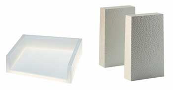
Second, Philippe Starck. On the left, a plastic desk tray; on the right, plastic bookends.

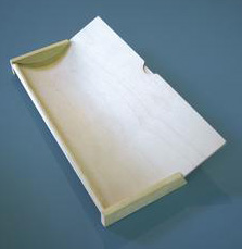
The bookends, like much of the Starck products, have a Starcktexture that resembles decorative ball-peen hammer work. Unfortunately, they're quite light and struck me as useless. The letter tray? A piece of plastic. Probably cost pennies to make. Is it signed?

Hey! He also did a play tunnel! Fun!

One can easily imagine your typical customer's WTF reaction when being told that it's a designer play tunnel.

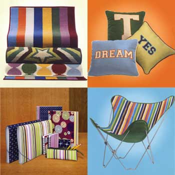
Finally, Todd Oldham.

Let's see, he decorated towels, pillows, school notebooks and a butterfly chair. Yes, there's a bit of design; but it doesn't quite live up to Tan's definition of design as a quality or expectation of product development... like usability or reliability. In fact, I could say the same for the Graves and Starck product lines as well. It's design as surface, design as fashion, design as sizzle — not steak.

Bradley is correct, design is more than pretty. And this cynical exercise in designer-branding probably won't, as Daniel suggests, bring more (potential clients or customers) into our fold. To think otherwise diminishes our abilities to that of menial turd shiners; and we certainly have much more to contribute.

Don Julio exalts:

> The bigger victory here is the public at large, talking about design, at last!

Don, perhaps that's exactly the problem. My life is certainly easier and my work better when the stakes are low. The less attention, the better — an idea I'm going to give further consideration.

Andrew Twigg — hoping a Target buyer will read and think kindly upon him — writes:

> I'm in a project right now with the end goal being distribution in Target stores... (snip) ...Nonetheless, I do feel that Target has done more for design than most major corporations. And it has put a lot of "designed product" into the financial and geographic reach of "the people." To me, that's the ultimate, and I hope it keeps working.

Kissing up a bit, Andrew?

Obviously we disagree. More than Target, how about the Pentagon or NASA's contributions to design; which then reaches "the people"? Nike? Levis? Methinks you spread your favors to Target too readily.

On Feb.02.2005 at 03:17 AM
Steven’s comment is:

I have no opinion about it, except that it is just another piece of a certain clean, friendly aesthetic that is sweeping the continent. It bores me, but I'm sure it is very successful at doing what it is designed to do: get people in the store.

I'm with Marian. It's just sooo cliche.

Although, some of the earlier ads were much more creative and compelling to me. They had subtle yet smart and compelling branding. But that's really all there is to Tar-jay--surface sheen.

And, I'm not all that thrilled with the in-store experience. Very corporate, very sterile, lots of people mulling about looking for cheap fluff. Maybe it's better than K-mart or Wal*Mart--but then that's not really saying much is it? It's just another "big box" store selling stuff produced by exploited workers in China or elsewhere.

But then, I make a point of buying things from smaller local retailers, for the most part. I find the experience of shopping at a mega-corp discount retailer to be rather depressing and alienating.

On Feb.02.2005 at 03:48 AM
Michael Surtees’s comment is:

What I couldn't see, is how it represented design as something more. Kind of like what Michael was getting at with: "Isn't design supposed to be part of a larger philosophy/process?"

Daniel,

Both friends and foes have accused me of not being understandable in the past, so hopefully I can clarify my position above. My main issue is that the word design in that commercial is treated as a fashion accessory - enlightenment can be attained through consumption or purchasing of design. I think you could easily trade the words “design is ” for “buying is” in that commercial and the same emotions are felt. Yes we live in a society that treats going to the mall as sport and hobby. There's nothing wrong with that (is that sustainable though?), I do it myself. A concern for me is that people will equate design=$$$, while partially true it's not the full cope of design's potential. There's a lot of about design that has nothing to do with buying, yet that clip suggests design can only be purchased.

Hopefully no one thinks I'm a communist here - I love my individual brands too (Hugo Boss, Swiss Army, Assouline, NYT etc) . It's just that it concerns me when design is treated as just a form of empty consumption. Now, if you were to ask me what I've done that isn't somehow related to the message of design=$$$, I'm not sure that I could say anything yet. That probably makes me a hypocrite. I suppose that's why I like a form like this so I can work my thoughts out. If none of this makes sense - I'll end with saying I agree with what Marian wrote above. Overall this has been a great discussion and what SU is about.

cheers

On Feb.02.2005 at 08:50 AM
Feluxe ’s comment is:

Kingsley,

Your eye kean for a price-conscious kid in Chelsea who shops in France. Target is not the Moma Store. In its category (cheap shit the likes of K Mart and Walmart) Target at least has balls and vision. If nothing else those ads give clarity to the landscape. But then someone will undeniably look at those Walmart ads and say..."finally, now heres an honest company! "

On Feb.02.2005 at 09:46 AM
Darrel’s comment is:

Is Target only committed to profitable design ventures?

Probably. They are in the business of making money.

Should they be offering more “risky” design options if they are truly committed to design?

The risk factor is always a part of good design. A succeful design in retail must balance that risk factor with the target market and other variables.

Are they “mainstreaming” design?

I think they are a clear contrast to things like Wal-Mart, that do not factor in quality of design into their product offerings.

Are they commodifying design?

Not sure what you mean.

Could they be “dumbing down” design?

Again, not really sure what you mean.

As for the Target web site you linked to...I agree with many other posters...WTF? I clicked around for a few minutes before getting completely bored and not 'getting' any of it. Ah well, they are clearly better at product design than web design.

On Feb.02.2005 at 10:50 AM
Don Julio’s comment is:

Lorenzo: literally making Design Within Reach for the people who want this designer furniture.

Literally? Um, maybe theoretically. Since the name implies more than it’s original meaning, it is misleading. It also reinforces the notion that “designer goods” come with a substantial price tag, contrary to the Tar-jay discussion. I still prefer Design (almost) Within Reach. Even if it is more accessible on one level, it is still not on another. The Eames furniture is no longer design for the masses.

And yes the type is weak in the ad - but getting that specific message in front of millions of viewers is pretty cool.

Kingsley: Don Julio exalts: The bigger victory here is the public at large, talking about design, at last!

Don, perhaps that's exactly the problem. My life is certainly easier and my work better when the stakes are low. The less attention, the better — an idea I'm going to give further consideration.

Don Julio retorts: You’re here in this forum discussing the issue, which hopefully implies a deeper commitment to producing meaningful work than I suspect you are letting on. Lowering the bar may make life easier, but it sure doesn’t make it very rewarding.

On Feb.02.2005 at 11:53 AM
M Kingsley’s comment is:

> Your eye kean for a price-conscious kid in Chelsea who shops in France. Target is not the Moma Store. In its category (cheap shit the likes of K Mart and Walmart) Target at least has balls and vision. If nothing else those ads give clarity to the landscape. But then someone will undeniably look at those Walmart ads and say..."finally, now heres an honest company! "

Felix, I've seen badly produced items in the MOMA store too. Just because its got a Bruce Mau "tweaked" logo on the receipt, doesn't mean its spun gold. Designers have a responsibility to the customers as well as the client. And giving Target a pass because they're in a "cheap shit" category isn't holding them to the higher level claimed by their branding.

On Feb.02.2005 at 12:06 PM
Daniel’s comment is:

"My main issue is that the word design in that commercial is treated as a fashion accessory - enlightenment can be attained through consumption or purchasing of design."

Position Clarified.

I see what your getting at Michael; I agree.

On Feb.02.2005 at 12:39 PM
Darrel’s comment is:

I think it's important to separate the concepts of 'well designed product' and 'designer product'. They are mutually exclusive concepts.

For DWR, most of the stuff is both well designed, and marketed as upper-tier class/income designer products.

Which is a shame for the masses that were The Eames' original target audience. ;o)

If anything target helps bring those two concepts into focus. One does not need designer products, but one can certainly appreciate well designed products...especially when they don't need to have the designer product price tag.

(and as it was mentioned, there's the whole issue of the craft side of things...handmade vs. exploited sweatshop made being a part of the total design package, but we can save that for antoher debate. ;o)

On Feb.02.2005 at 12:44 PM
vibranium’s comment is:

Isn't the bigger issue DESIGN AWARENESS? And even if subjectively we don't care for the ad / design / style.

It's hoisting the flag, and thats a good thing. No?

I for one would be thrilled if AIGA just said "Give me dues for 2 years and for 2 years we will not run any functions geared towards designers - but we will focus all time, money and energy on educating, networking and creating awareness and establishing more VALUE to design in the business and consumer sectors."

On Feb.02.2005 at 01:17 PM
Lorenzo’s comment is:

Let me try this link again... something interesting

This design thing, I believe it's all a trend. Even graphic design.

M Kingsley: First, a visit to the store is in order. One must touch these designer items; weigh their heft — or lack of;

M Kingsley, I believe you're right, a visit to those particular departments are in order. Haven't really seen much in those sections lately, it all looks the same. During a visit to Target I just don't care to see all that crap.

One thing though, I have noticed that Graves and Co. is redesigning most, if not all, of the Target brand packaging. Sort of banal work, but then again, I'm sure it keeps costs to a minimum.

Don: Literally? Um, maybe theoretically. Since the name implies more than it’s original meaning, it is misleading.

Yes, the name implies more than what they intended. To tell you the truth, a few years back when I first saw the catalog I thought, "they still make this furniture? (Eames, Noguchi, Mies, etc)." Well if I'm not mistaken, the name may imply getting that classic furniture manufactured today from that era/designer.

The Eames furniture is no longer design for the masses.

True, it's not made for the masses anymore. Now the 'ordinary people' have IKEA, and oh yeah, Target as per the discussion!

On Feb.02.2005 at 03:06 PM
Zoelle’s comment is:

When I see Target ads on TV I feel refreshed. They portray such a strong consistent aesthetic identity. GAP ads feel similar. I agree that Target does seem to market the trendy clean look, but I still visit the store because of the product organization and my affinity for the “clean” aesthetic. I like going to the home furnishings department and finding color groupings of related items on the shelf. If I wanted each item in a room to be unique I would go to Pier 1.

Target does a nice job of pushing design as a look, but I do feel like they fall short from time to time on function. The single best “designer” commercial I’ve seen is the Dyson ad. There are no flashy graphics, no black turtlenecks and no talking cookies. Just the designer having an honest conversation with his audience about how his vacuum functions better than others. And the best thing is — it’s true.

On Feb.02.2005 at 03:58 PM
Tan’s comment is:

>Isn't the bigger issue DESIGN AWARENESS?

Thank you. That's exactly the issue here.

Look, if I had to buy a toaster and had $25, I'd rather buy a better "designed" one rather than a plain Sunbeam version. Giving the public that option is a positive, aspirational thing. Who really cares if it's more aesthetically driven, or it's a makeover attitude rather than something more substantial — the point is that Target is trying to differentiate through better design, and bring it to a consumer level that's not accustomed to such offerings. In my book, that's a fucking great thing.

And as to the quality of the Graves collection, I agree that it's rather low-grade manufacturing in many cases. But that's not because Target is trying to flim-flam the public. It's because at the price point they're competing at, that's the quality of manufacturing that's available. You can't expect to buy a set of Graves kitchen knives at $20 and compare it to a $300 set of Wusthof-Trident. Let's be realistic here Mark. If you prefer, you can spend your $20 on a generic set of plastic-handled knives made in China. Would you prefer that?

>DWR

Ok, just FYI. Before DWR, if you wanted to get your hands on an Eames plywood chair, you had two options — buy it yourself straight from Herman Miller for the full MSRP, or hire an interior designer and have he/she buy it for you for 40% below Herman Miller's MSRP. The standard 40% is usually only given to interior designers or architects as factory-direct, industry pricing. But remember that you also have to pay the interior designer or architect for his/her services.

DWR is a direct outlet that can offer the public access to the higher-end collections of furniture at the 40% off MSRP prices. Yes, that's right, those outrageous prices at DWR are already 40% off MSRP. That Eames plywood chair offered for $547 on DWR is listed at $917 MSRP in Herman Miller's catalog.

So theoretically, it's Design that's available Within the public Reach at industry-direct prices. So don't blame DWR — just start saving up.

On Feb.02.2005 at 04:19 PM
Feluxe ’s comment is:

the higher level claimed by their branding. -MK

what claim? where? the branding is clean, and as Zoelle points out, its farily clean in store (comparatively). True, the merch isnt the best, but big corps move slowly.

I can tell you this - having worked with them on Childspree and Grace Academy (charity, educational outifts), the higher ups consistently hire non-corporateers (like me) to

design their materials. The only bad thing about Target is that they insitiute a work for hire contract, which I never sign. In this case I researched it via AIGA and others and I have to say Target has an impressive ethics record.

I signed a WFH for the first time, but (knock on wood) havent regretted it...

On Feb.02.2005 at 04:30 PM
Tan’s comment is:

>design is treated as just a form of empty consumption.

Michael — when did morality become such an important factor in design and consumerism? Why can't companies offer up a little more joy in the experience of buying or using their product without being accused of sinister or immoral motives?

Restaurants make good food for empty consumption. Eat it, enjoy it, crap it out later.

Movie studios make good movies for empty consumption. Nine bucks for two hours of escapism in a dark room among a few hundred strangers.

Clothing stores offer up jeans, shirts, and sweaters for empty consumption. Buy it, wear it to be hip, discard a couple of years later to Goodwill.

I don't think Target is promising enlightenment — just a bit more joyful experience or user satisfaction by purchasing one of their "design" products.

Don't buy it if you don't want to.

When the hell did all of us designers become moral evangelists and priests?

On Feb.02.2005 at 05:01 PM
Zoelle’s comment is:

When the hell did all of us designers become moral evangelists and priests?

Amen brother!

On Feb.02.2005 at 05:17 PM
Tan’s comment is:

Sorry Michael, I didn't mean to single you out personally. I know you're just creating dialogue — my comment is in response to the general holier-than-thou attitude voiced here and in other similar threads.

That, plus I'm a little crabby overall today. Not sure why.

On Feb.02.2005 at 05:49 PM
debbie millman’s comment is:

Deb: Are they commodifying design?

Darrel: Not sure what you mean.

Darrel, what I meant by commodifying was questioning whether or not Target is using the worst sort of stereotypes to sell DESIGN in order to appeal to the largest number of people.

Deb: Could they be “dumbing down” design?

Darrel: Again, not really sure what you mean.

What I meant here is using the sex appeal of the idea of something being better because it is labeled with a designer's name without necessarily actually being a better product. An all style, no substance thing. An emperor's new clothes kind of thing. This reminds me of David Weinberger's thread on Louis Vuitton, et al.

Tan asked:

When did morality become such an important factor in design and consumerism? Why can't companies offer up a little more joy in the experience of buying or using their product without being accused of sinister or immoral motives?

Oh, I think morality has become a huge factor in design and consumerism--it has been getting bigger and bigger since No Logo, though it was apparent well before then.

Re: Brands/Brand Companies/Brand Designers/Brand Strategists--there is a pervasive notion out there that we all do a lot of bad stuff and create a lot of garbage and hideously bad design. And I actually agree that sometimes that is true. But sometimes it is not. I'd like to think that the "sometimes it is not" moments are more pervasive than the "sometimes it is true" moments. As with everything else in life.

And don't worry Tan--I got your back.

On Feb.02.2005 at 06:28 PM
Michael Surtees’s comment is:

Tan, it's going to take a lot more than that to get me offended. Like I said before, I'm just trying to work things out. You bring up some valid points on why throwing away stuff is ok. If I had a dog, I would want to buy well designed biscuits. On your food analogy I would argue that when I was at Union (a restaurant) in Seattle last year, there was nothing empty about it. Probably one of the best meals I've ever had. As for your priest comment, I'm not trying to lead anyone else - just trying to get a bit better at what I have a passion for.

On Feb.02.2005 at 06:40 PM
M Kingsley’s comment is:

> the general holier-than-thou attitude

Tan, I'm sorry you're having a bad day. Best wishes for a better one tomorrow.

I can understand why you see my comments as holier-than-thou; but please understand that my motivation is more aspiration than cynicism, with a bit of sadness at seeing designers that I hold in high esteem — in this case, Graves — opt not to use their insight and experience to TRANSFORM their products. That sadness deepens when you see a company with such a fantastic image as Target accept something which is OK. Not great, but OK.

If you spend some time looking at the Graves-designed appliances, you'll notice that all the dials look the same. Perhaps there's no need to give the user other choices besides Some, Bit More, Midway, Kick It Up A Notch, and Whole Hog. But, as an example, in the case of the toaster, did they explore the option of not including a dial and figuring out a way to adjust levels by how far you depress the side lever? That would have eliminated the need for another part that could break, and potentially streamline production. See? That's the kind of transformative thinking that increases value AND "raises the Design flag".

I feel that Target is missing a grand opportunity. The economic scale of their production is many times larger than a company like, for example, Droog Design. Yet, Droog consistently transforms simple materials and engages the consumer; without cynicism and with respect for the end user.

I agree with you — I also don't think Target promises enlightenment through design. But they are promising value at a good price. In that context, I know they can do better.

Ironically, the best "designer" products sold in discount stores are the Martha Stewart line at KMart. I have several of her kitchen items; all which have held up well, are well proportioned, and have been given a degree of thought. Martha's perfectionism — heck, Martha's aspiration — to make the world around her better is a quality we would all do better to emulate.

I've had the pleasure, and terror, to work for her indirectly. She was a demanding editor, art director and colorist. In other words, a perfect client who wouldn't allow me to coast. I can only encourage the marketing department at Target to be equally demanding.

You asked when designers became moral evangelists and priests. My argument is if you're not, then you're just doing an adequate job. Tibor Kalman once made the comment that the level of quality in contemporary design was so high, that good work was now actually mediocre. Good is the enemy of great.

Good is the enemy of great.

Amen.

vibranium spake:

> I for one would be thrilled if AIGA just said "Give me dues for 2 years and for 2 years we will not run any functions geared towards designers - but we will focus all time, money and energy on educating, networking and creating awareness and establishing more VALUE to design in the business and consumer sectors."

Vibranium, be the change you want to see. The AIGA can only deliver what designers can.

On Feb.02.2005 at 07:36 PM
Tan’s comment is:

Great retort, Mark.

I agree — the products could be better. There are design flaws and manufacturing shortcomings aplenty. But where it is, is a good place to start, is it not?

About the moral issue. Moral in sustainability is one thing — which I agree is important to uphold. But determining the degree of moral involvement in the consumer's experience is going too far I think. It feels like you're suggesting that the public shouldn't have access to better design choices unless we, as designers, are ready to let them experience it — because they are incapable of determining quality and value for themselves. That's a bit arrogant, isn't it? And that has nothing to do with settling for adequacy or striving for greater excellence in design. It's about lowering the threshold barrier for access and increasing awareness.

On Feb.02.2005 at 07:54 PM
vibranium’s comment is:

True M Kingsley’s... I know, I know. If I want to see change, get off my ass and make it happen.

I think, for the time being, while we (as an industry) are getting our ducks in a row - awareness is awareness. Even if (subjectively) it's seen as shallow. I trust that the designers/creatives working on the target spot had some belief in what they were creating, and the sentiment behind it, I believe is heartfelt. Like Felix said, Target hires "non-corps" - and I think they 'get it'.

I guess in the end I am sorta 'blindly' accepting the spot - and thinking, LETS JUST DO MORE for design awareness...

On Feb.02.2005 at 08:08 PM
M Kingsley’s comment is:

Tan preaches:

> But determining the degree of moral involvement in the consumer's experience is going too far I think. It feels like you're suggesting that the public shouldn't have access to better design choices unless we, as designers, are ready to let them experience it — because they are incapable of determining quality and value for themselves. That's a bit arrogant, isn't it? And that has nothing to do with settling for adequacy or striving for greater excellence in design. It's about lowering the threshold barrier for access and increasing awareness.

Tan, the moral issue is a personal one rather than an edict from on high. If you're not demanding more from yourself or your profession, then you're not making the kind of contribution that (hopefully) got us into this line of work. Worrying about the customer's experience is an act of empathy. And isn't that what we're supposed to be doing anyway?

> Great retort, Mark.

Not Good? Gee, thanks!

; )

On Feb.02.2005 at 08:23 PM
Tan’s comment is:

You're not quite getting what I'm asking, and I'm probably missing your point a bit as well.

Demanding perfection and excellence of the things you make is one issue. Done. I agree it's paramount of every designer. No need to preach that sermon further.

But not everything is that simple. You can't have state-of-the-art manufacturing, the best quality materials, uncompromised design, and a price point that's attainable by the average consumer — all in one product. And if you can't, you're suggesting that the public doesn't deserve it at all. They have no right to access good designs — only uncompromised, great designs. How is that empathy instead of arrogance?

To Tibor's example — I love the watches he designed for M&Co. But it took me years before I could afford to buy one. Now, Michael Graves offered a line of watches at Target that sold for about $30. They were better designed than any other watch at that price. I bought one, and marveled at how great it was that I could afford such a great design at that price. Now, my Tibor watch is a great, uncompromised design — but is it really any better of a "contribution" to society than the Graves watch?

I'd argue no. To think that it is, isn't "empathy."

On Feb.02.2005 at 09:16 PM
Andrew Twigg’s comment is:

I've been out of the loop for a while, but I think since a question was asked of me, I ought to reply.

Andrew Twigg — hoping a Target buyer will read and think kindly upon him — writes... [insert what I said]...Kissing up a bit, Andrew?

- M Kingsley

No, actually not kissing up. And unfortunately, I can't tell if your tone with this was just being sarcastic or if you're really "accusing" me of something.

And I'll agree with you that not everything Target sells is great. I think most of the Graves stuff is poorly made. I remember the cell phone with the "chromed" plastic antenna that was broken on every model of the phone I ever saw anywhere. Likewise, the Karim Rashid dog bowl manufacturing was impressively flimsy and extra janky.

But not everything that Target sells is crap. The issue with some items is that they can't be brought to a price point without major compromises in quality. But for things like smaller home furnishings (lets say bedding, for example), Target is a much better alternative - for many people - to spending $400 on a comforter cover from Marshall Field's, Macy's, or Bloomingdales.

I think that Target trying to make design accessible is a great thing. I'm not willing to be a snob about it. Target needs to perfect its game - figure out which products it can successfully produce without compromising quality and which it will have to pass.

My product (which I'm not actually trying to shamelessly promote, M Kingsley - it's just the example I know best) is one which is already at a $25 price point for boutique stores, not far from the $15 to $20 other products like it sell for in stores like Target and Kmart. This is the kind of product Target can successfully "bring to the people" without compromise. It can do this because of volume. Just like Martha Stewart products. Is that a bad thing?

On Feb.02.2005 at 10:21 PM
M Kingsley’s comment is:

> You can't have state-of-the-art manufacturing, the best quality materials, uncompromised design, and a price point that's attainable by the average consumer — all in one product

Tan, perhaps you're forgetting that design is a process — one that doesn't necessarily require state-of-the-art manufacturing or the best materials. As an example, here are several items and descriptions pulled off the Droog site:

Birdfeeder

This object is born from a gesture that many of us perform every day. You can brush the crumbs from your breakfast table into the box. Place it in your window and serve the crumbs to the birds. The brush can be stored in the feeder.

designer: Paolo Ulian

material: Wood

size: 31,5x17,5x5 cm

year: 2002

Chest of drawers

All drawers are collected from the street and re-used in this chest. Each chest is unique.

designer: Tejo Remy

material: Drawers, maple wood

size: 60x110x120 cm

year: 1991

Oil and vinegar set 'Salad Sunrise '

Due to the difference in gravity, both liquids can share the same bottle, but have separate nozzles.

designer: Arnout Visser

material: Pyrex glass

size: 4x18 cm

year: 1990

Flower bulb packaging 'Bolle box '

The packaging also serves as fertilizer when you put both in the ground.

designer: Andreas M�ller

material: Compressed cow dung

size: 8x8x8 cm

year: 1994

Granted, some have wider commercial appeal than others; but that's not the issue at hand. We're speaking about design and design awareness... and the value that the design process can add to a product. In each item above, humble materials are made greater through their transformation.

No, not every one of our projects work out as well as the above. But, what if? What if?

That's design.

Target is using — and selling — an idea of design that I take issue with; probably as a means to get people to buy their bulk toilet paper there, instead of at WalMart. Like I've said, if you talk the talk, then you should walk the walk. What really shocks me is that I have to defend design to fellow designers. Come on, people!

p.s.

I got my M&Co. watch for about $150-175. In the whole scheme of things, not that much more than a $30 Graves. Probably better made and will last longer; so in the long run, which is cheaper?

p.p.s.

Andrew, more poking fun than sarcasm. I couldn't resist, you made such a tempting target. Sorry, mate. And if you're looking for a comforter, may I suggest the Martha Stewart line at KMart.

On Feb.02.2005 at 11:16 PM
M Kingsley’s comment is:

Before I forget, here's another amazing example of design. In this case, using your finger as a telephone!

On Feb.02.2005 at 11:19 PM
Daniel’s comment is:

"What really shocks me is that I have to defend design to fellow designers."

Touché, Mr. Kingsley’s, Touché.

You're doing a darn fine job of it too.

On Feb.02.2005 at 11:50 PM
Andrew Twigg’s comment is:

M Kingsley

Just out of curiousity, do you know what any of these Droog products go for? I know it's not really about that, but I'm curious.

I found a company a while ago named offi that sells some well-made producs at a price point that won't "leave everyone out". As matter of fact, some of their products are available at Target.com/ and Amazon.com.

And, while we're at it, Target has the Red Hot Shop which features some well designed objects, produced in smaller runs and less "compromised" than some of the products available in the store. Of course, not all their products are so great and are more fad than anything else. But I think it shows that Target might be more commited to design than using it to sell Charmin in bulk.

On Feb.03.2005 at 12:37 AM
M Kingsley’s comment is:

Andrew, searching around http://www.mossonline.com/index-exec/" target="_blank"> Moss' website, I found the chest of drawers priced at $19,500. Remember, it's handmade and a limited production item.

The Arnout Visser oil and vinegar pourer is about $70.

I suspect the compressed cow chip container is much less.

For the rest... What, your Google's broken?

To your other point, first a quote from http://www.artsjournal.com/postclassic/archives20050101.shtml#95558" target="_blank"> ArtsJournal.com:

My mother has a stock answer for people who draw generalizations from insufficient data. She replies... “All Indians walk single file. I saw one once, and he did.”

The Shuichiro Koizumi stool and Le Sac Igloo are the only designer items on the Red Hot Shop page. The remaining items were only decorated. I should also point out that the stool and le sac were not designed specifically for Target.

Target may be more committed to design than they seem to be. But for the present moment, I only see two Indians walking single file.

On Feb.03.2005 at 01:42 AM
CactusJones’s comment is:

>design as sizzle — not steak.

Hopefully Jezus an' Our Man Vit will be furgiven a my metaphor here. But ya done brawt up sizzlin' steaks an that hits home. Its my area a expertness. Makin' the steak anyway. I leave the grillin' to the cookies.

An its a cuz a my expertness that I got to sit in own one a them fancy meetins they had about sellin' them Target cattle. An hurz how t'went.

First they plunked down sum them cheap ass Wal-Mart steaks. One a 'em said out loud, "damn fellers we ain't never gonna get our steaks that damn cheap, and dammed if weed wont to." Ugly piece a shit it was. So they said, "Fuck at, let's do sumpen else."

Then they layed out sum a them fancy city boy steaks. Idz awright ya know, but you coulda baught a hole damm cow fer what it was gonna cost. Apparently ranch taxes in Conneticut is high. The Target accountant guy, he's a nerdy suit wearin' city boy, anyway he's lookin' at his stack a papers an shakin' his head. He says, "nope our folks ain't gonna give up two months a diapers fer that."

So they assed me, a brandin' expert, what i'd do. I gave 'em real good advice and they listened hard 'n made some notes. Then one a 'em said sump'em about "integrated marketing" an assed me to leave the room fer a few minutes while they brung in the city boy advertiser, real young dude with nice boots.

I herd lottsa laughin' while he's in thur. Then they come out all patten him on the back, still a laughin' an sayin' how great his idea was. Turns out ad boy had just been ta France. An he sold them Target boys on a French idear. Damn them ad boys know how to talk good. Anyway he showed 'em how to took ther own steak an cut it in a fancy circle. Then they rapped a strip a bacon round it. Said it was "Fill-A-Minion" steak.

I was humbled. That's won a the best damn brandin' idears I ever heard an it werent mine — fill a minion. Everbody wins. Humble folks get a nice lookin steak that tastes OK. It costs a little extra, but it taste a little better and looks a hell of a lot purdier. And the good folks waht buy it still got 'nuf left to buy junior a Happy Meal.

Now ya may not hunker to Target, but you gotta admit them fellers got spunk fer tryin'.

On Feb.03.2005 at 07:11 AM
Greg’s comment is:

I really wanna be haughty and look down my nose at what Target is attempting. I do. And to that end, it should be easy, I mean, products that are priced a bit higher and aren't really any better, just more aesthetically pleasing... I should be outraged, right? But I look at the brand they have built, and the commercials are miles ahead of anything short of Apple's Ipod (though the dancing silhouttes ARE getting a bit old), and the way they've put design at the forefront of what they do... it's hard to hate them. It's a good entry point for people that want to get into designerish things. I'll forgive the commercial for being slightly self-indulgent, i.e. "we bring design to the masses, aren't we great?" As far as type flying about in the commercial... it reminds me every time of the Crystal Pepsi/Van Halen "right now" commercials. Except that The Concretes are way cooler than Van Halen.

On Feb.03.2005 at 08:57 AM
Andrew Twigg’s comment is:

The Shuichiro Koizumi stool and Le Sac Igloo are the only designer items on the Red Hot Shop page.

But they're not the only designed objects for sale in the Red Hot Shop. Someone designed the graphics for those tshirts, that offi tiki stool (Eric Pfeiffer), designed those bowls (Jennifer Panepinto). Sometimes that somebody has a "name", sometimes not. But the object is still a designed object.

Also, I'm not certain which generalizations you think I'm drawing from "insufficient data". If it's about the Red Hot Shop, I never said it was "chok full" of designed things... but some are in there. You'll have to explain that one to me in more detail.

On Feb.03.2005 at 09:08 AM
Andrew Twigg’s comment is:

I feel I should also clarify one thing:

I know all objects you get in a place like Target are "designed" in one way or another, but Target does a nice job of finding "designerly" goods beyond the latest Gillette razor or bottle of Tide laundry detergent.

On Feb.03.2005 at 10:14 AM
Don Julio’s comment is:

The Concretes are way cooler than Van Halen.

Van Hagar, or Van Halen? Van Halen 1 will always hold a a special place. Unfortunately corporate influences diminished what began as an initial powerful and raw idea. Or in the context of this discussion, you could argue that they dumbed down their product for the masses.

Now ya may not hunker to Target, but you gotta admit them fellers got spunk fer tryin'.

Hell Yeah.

You can't have state-of-the-art manufacturing, the best quality materials, uncompromised design, and a price point that's attainable by the average consumer — all in one product.

Why can’t you? Isn't that part of the problem to solve? Long live Tibor.

There was another recent thread that questioned the designer’s role once the idea left the drawing pad, or digital files left the studio. This touched on cradle to cradle responsibilities, but ideally the designer should be involved from concept through delivery, implementation and even considerations about usage - not just concept to production.

In the Graves examples, and Starck as well, you have to wonder how involved they remained through the latter stages of product development and manufacture. At their level they certainly should have been as there is an obvious impact on the perception of their brand.

On Feb.03.2005 at 11:43 AM
Lorenzo’s comment is:

Don't forget about LOT/EK, they're right up there with Droog. Now this is stimulating!

On Feb.03.2005 at 12:20 PM
M Kingsley’s comment is:

Greg, my issue isn't with the big-picture Target project, but specifically with their co-option of capital-D design. Their branding powers reign supreme and when they start mentioning design, I get worried.

Andrew, I only saw those two items on the webpage you linked to. Adding the stool and the bowls now makes four Indians. The t-shirts are decorated. What I mean here is that the graphics are "designed", but they are more style and fashion than products of an extended design process; more likely picked from a larger collection of proposed graphics — i.e. the shotgun approach.

When I start a project, my mindset is "what can I do to transform it", not "I'm feeling ironic — or whatever — today, let's do that". That's pretty much what Herr Sagmeister meant when he said Style=Fart. The t-shirts on the Red Hot Shop page and the designerstar product lines are more style than design. Advertising them as anything else is yet another reinforcement that we're all style monkeys. And I don't know about you, but the last thing I want to be is a designer with an identifiable style that's now out of fashion.

Vibranium brought up design awareness. The reason I'm slogging it out on this topic is to snap you all out of a tacit approval of an ad campaign that only reinforces the cliché of designers as style mavens. We're that AND more. You all want More, don't you? That's why branding shops, kids with computers, and Donald Trump's Apprentices are all eating our lunch. They're selling More.

On Feb.03.2005 at 12:36 PM
Laura Pavelko’s comment is:

Just because an item is sold at Target doesn't mean that its design has been dumbed down. It's high time that real people with real budgets were able to look classy without spending their entire livelihood on a single sweater, light fixture, or coffee pot. Middle America deserves more than battery-operated clothing with little fuzzy snowmen appliqued to the front, you know.

Viva la Target, mes amis.

As for whether or not we should be "bothered" by Target's implementation of mass-market design, I don't think we should. Why do we design? For elitism that's only accessible to the top tax bracket? Frankly, I'd love it if more middle-class people in the the Midwest gave their Packer sweatshirts a break and donned something from Target's Issac Mizrahi or even H & M (Which is a European Old Navy IMHO *and that's okay*).

On Feb.03.2005 at 01:43 PM
Armin’s comment is:

As a thought, and maybe to take this discussion's focus away from Target since we are getting too caught up in specific examples, what are some parallels to Target's "approach"?

For example, is Old Navy or Gap doing the same thing to fashion design?

Or, Pier 1 for furniture and home decor?

On Feb.03.2005 at 01:57 PM
Tan’s comment is:

>Why can’t you? Isn't that part of the problem to solve? Long live Tibor.

Don, you know very well what I'm saying here. You can't produce something that costs $100 and sell it profitably for $10. There's no designer in the world that can solve that problem. Not even Tibor and his damn $250 M&Co watch. His proverbs are not what I'd call realistic.

>What really shocks me is that I have to defend design to fellow designers.

The funny thing is, I feel like I'm defending Target's right to offer design to the masses. Your opposing stance is more territorial — who gets to define what's good design and whether or not Target is abusing it. Am I wrong?

Which is the more egalitarian point of view here?

On Feb.03.2005 at 03:51 PM
Andrew Twigg’s comment is:

The t-shirts on the Red Hot Shop page and the designerstar product lines are more style than design. Advertising them as anything else is yet another reinforcement that we're all style monkeys. And I don't know about you, but the last thing I want to be is a designer with an identifiable style that's now out of fashion.

I don't know too many people who want to be associated with being "out of fashion" but I also don't share what I understand to be your take on style. Style is present - in the broad sense - in the work we do, regardless of the style chosen. "No style" is just as much style as any other style. And while I don't want people to think I'm only a "style monkey", I also don't have a problem with people referring to me for stylistic advice. It's a part of a broad spectrum of things I can do as a design professional. Doesn't the act of designing include styling???

As for this TV spot, I can't comment on it because I've not seen it. But for what Target is doing in terms of putting "Design" within reach of "the people" I stand my ground.

On Feb.03.2005 at 04:26 PM
M Kingsley’s comment is:

Tan, my position is more on the "whether or not Target is abusing" design... yadda, yadda, yadda.

Egalitarian? When did I ever claim that?

I'm just defending what we do; and to do that, you gotta pick a side. You know, designers are so starved for love and attention that we get all a twitter when a film has a character who works as a designer, or when a large company uses the D-word. It's kind of like the Pat Metheny mailing list: "his music was on the Weather Channel today!!! Joy!!!"

Stay the course folks. Just because Target has a huge advertising budget, a cool logo, and total media saturation...

Andrew, style = fart. Style is surface. It's part of what we do, but there's more to design than that. The difference between many of Target's products and let's say... Sears, is styling.

Target is also better at the branding game.

You're getting hung up on styling vs. design. Keep in mind the big picture items: how we define ourselves, how we sell ourselves, how we think about ourselves...

That is, unless you really think Todd Oldham is as good as Michael Graves. You don't think that, do you?

On Feb.03.2005 at 04:47 PM
Tan’s comment is:

the egalitarian thing was just me, I know you never claimed this Mark.

At the end, I guess I'm just not as offended by Target's campaign. But I can see how you might feel differently.

Hey, let's unite and go kick the shit out of another unsuspecting store like Mervyn's or Ikea or something...

On Feb.03.2005 at 05:09 PM
Don Julio’s comment is:

You can't produce something that costs $100 and sell it profitably for $10.

Did I mention that I am first an idealist and an optimist before a realist, if that is not too many “ists” to be?

On the flip side should something be designed for $100 and sold for $5000, or lets say $800 in the case of Phillippe’s molded plastic sofa? I realize there is a cost for tooling dies and production ramp up, etc., etc. I guess it’s also how you do the math. You may sell 1000 of these to people without budget constraints vs. 10,000 to a larger audience at a lower price. No one should have to overpay for a product that feels cheaply made or fails to deliver on one’s expectations - Be it a Michael Graves Toaster, or an overpriced couch. And from the random recurring car thread, there’s the market demand fees dealer’s are asking for the Mustang and Chrylser 300’s. Clearly in excess of the value and cost. Are they worth it? Certainly not in the long term.

I’m in favor of GOOD design for the masses. The watch could even be an example of a good product at a good price, but I don’t know what you’d call that...

While not a Style Monkey here, style is inevitably linked to success of the design solution, but IDEALLY as the outcome of sound concept, strategy and process.

On Feb.03.2005 at 05:23 PM
Don Julio’s comment is:

Not to ignore Armin...

Gap and Old Navy are marketing their own goods. Wouldn't that be like going to Target and everything having, well, a Target label on it? The store would then look like the ads - at least the red series.

Maybe Nordstrom (during the half yearly sales), or even Home Depot vs. Pier One (for the masses) to get beyond the department store realm.

Style = Fart + Designer Fragrance

On Feb.03.2005 at 05:37 PM
vibranium’s comment is:

Tacit approval?

Some credit por favor...

I think it's easy to get caught up in an arguement about design being the 'sport of kings' or for the privilaged by the privalaged.

Design will NEVER gain momentum or acceptance without mass appeal. Even if that puts said design out of my aesthetic. I can't dictate what DESIGN is. I can own my output, but not yours or there's. But I can appreciate someone hitting an easy flyball in my general direction if it means I get to make a great play - even if my team isn't winning (did that analogy go too deep?)

Heres my ending (or is it?) statement. Design, is NOT for the few... ($250 M&CO watches) it Is for all of us. And 'all of us' is $30 watches from target (if we're lucky.) At the end of the day design is not a concept, it's a way to put food on tables. Its not theory - it's livelyhoods. Most design professionals cannot afford the luxury of theory. Do they NOT count?

On Feb.03.2005 at 10:10 PM
debbie millman’s comment is:

>Stay the course folks. Just because Target has a huge advertising budget, a cool logo, and total media saturation...

Really? A cool logo? Target?

Could be considered a little derivative of another well-known identity, imho.

Seems like Target has used that huge advertising budget and total media saturation in a similar way as yet another well-known brand, with pretty much the same results.

On Feb.03.2005 at 10:33 PM
M Kingsley’s comment is:

Oh Debbie, Debbie, Debbie... you're not going to get me into a logo smackdown about the Target logo. Let's just say that I admire anyone with the guts to use something so plain, so basic, so... so... undesigned.

As for the success of their branding; yes, I'm a firm admirer. That's why my reaction to their message is so strong, sans doute.

On Feb.03.2005 at 11:43 PM
debbie millman’s comment is:

>you're not going to get me into a logo smackdown about the Target logo.

damn.

On Feb.03.2005 at 11:47 PM
Andrew Twigg’s comment is:

Andrew, style = fart. Style is surface. It's part of what we do, but there's more to design than that

Isn't this what I said: (styling is) a part of a broad spectrum of things I can do as a design professional.

Also, just because a Designer with a big "D" said "style = fart" doesn't mean I believe it. BTW, Mr. Sagmeister questions whether or not he was right about this. Check out this interview and do a 'find' for "style=fart" on the page.

The difference between many of Target's products and let's say... Sears, is styling.

Yes, and that's why I'd rather shop at Target than at Sears, unless I want a major appliance. Yes, style isn't everything. But all other things the same, I'll choose something which appeals to my sense of style over something that doesn't. But there needs to be more than style. (Actually, Sagmesiter comments on this in the same interview I mention above, and I agree with him on this.)

That is, unless you really think Todd Oldham is as good as Michael Graves. You don't think that, do you?

I'll step out and say that I don't care for Graves' style. And I'll leave it at that.

On Feb.03.2005 at 11:58 PM
Darrel’s comment is:

DWR is a direct outlet that can offer the public access to the higher-end collections of furniture at the 40% off MSRP prices.

Huh?

DWR sells the Eames furniture for the same price as every other retailer carrying the line. Even a few bucks more than some.

Other than clearance items, I've never seen anything at DWR that I'd label 'discount outlet prices'.

(now, if you truly want an 'eames' chair at a discount, talk to one of your architecture buddies, as Tan suggested, or shop here: http://whiteonwhite.com/ )

On Feb.04.2005 at 10:22 AM
Don Julio’s comment is:

Interesting article. The excerpt in question:

Scene 360: “Style = Fart” is a great notion rolled into a memorable slogan. Have there been times when you found yourself not living up to it, or enjoying other designers’ work that were lacking on the conceptual side?

Sagmeister: Yes, on both counts. I am not so sure about the entire "style=fart" idea anymore. I found that attention to style can make the delivery of good content easier, so why not pay attention to it.

I also found that by changing our own style on every project we stayed much on the surface stylistically and were in danger of ripping off styles developed by other people. I still find work that is gorgeous, but has nothing behind it — it's fascinating at first, and then see it go stale quickly (kind of like a dumb blonde).

On Feb.04.2005 at 11:45 AM
Michael Surtees’s comment is:

in the spirit of ideas and time: waste not a moment

On Feb.05.2005 at 12:25 AM
Jennifer Sadauskas’s comment is:

I suppose that making quick money is the singular goal of Target, in that more time is spent on making a product beautiful than making it for the purpose intended. Target assumes that the public shops like a group of children in a toy store, buying the coolest looking items. But people actually go to target to buy inexpensive essential items demanding quality and not aesthetics. Though decoration can be pleasing here, this is not the place to explore aesthetic perfection.

On Feb.06.2005 at 09:30 PM
Rob’s comment is:


But people actually go to target to buy inexpensive essential items demanding quality and not aesthetics.

I have to disagree. If they were only going for price, certainly they would be going to Wal-Mart instead. Target has made themselves different by emphasizing the aesthetic and, as Mark has pointed out, practically ignoring quality. So while their brand preaches about the importance of design, they have only completed a part of the design process when it comes to the products in their stores.

Debbie brought up another question about whether or not politics effect our purchasing decisions. I for one remember boycotting Coors products due to their far-right activities, and to this day I have never purchased or used any of their products. My parents refused to buy Ford vehicles due to Henry Ford's anti-Semetic writings. I don't ususally go out of my way to ask about a manufacturer's political position before I buy a product but if I have prior knowledge it can effect my decision to buy or not.

On Feb.07.2005 at 09:30 AM
heather’s comment is:

"If anything target helps bring those two concepts into focus. One does not need designer products, but one can certainly appreciate well designed products...especially when they don't need to have the designer product price tag."

I think this properly sums it up.

"If they were only going for price, certainly they would be going to Wal-Mart instead. Target has made themselves different by emphasizing the aesthetic and, as Mark has pointed out, practically ignoring quality."

Are you suggesting Wal-Mart pays attention to quality? Personally I've found the same level of quality in both. I've been surprised by some products and disappointed by others. But luckily, I didn't pay too much for either, so I'm over it.

On Feb.10.2005 at 04:32 PM
Ellen Shapiro’s comment is:

Woweee. I am in the middle of writing a feature for C.A. magazine about Target. I printed it out this whole thread, sat down with a Vietri mug of Gevalia coffee in my Crate & Barrel butterfly chair and read it. Would any of you like to be quoted in the article? Just send an e-mail to ellen@visualanguage.net

On May.26.2005 at 08:57 AM
Armin’s comment is:

Ellen, I think it might be more productive if you selected the quotes that are appropriate for your story and research and then contacted each author.

Glad you are finding the contributions here on Speak Up valuable for your article.

On May.26.2005 at 11:44 AM
Beth ’s comment is:

"Target assumes that the public shops like a group of children in a toy store, buying the coolest looking items. But people actually go to target to buy inexpensive essential items demanding quality and not aesthetics. Though decoration can be pleasing here, this is not the place to explore aesthetic perfection."

It seems to me that what is missing from many arguments in this discussion is proof in the unequivocal success of Target's approach. The majority of Target shoppers doesn't know or care who Michael Graves is. Yet, when they shop at Target (presumably for a bargain) they are choosing to spend a little bit more on Graves' products. What Target offers (and what so few other don't) is the choice between the cheap stuff and "designer" stuff. What Target's sales suggest is that the masses are not the mindless, devouring cows that all you cynics imagine them to be. The purchase of a Michael Grave's product at Target requires some consideration from the consumer--and people are choosing (mindful of it or not) the better design!

So, stop bitching and moaning about corporate greed, unimaginative fonts, the fetishism of commodities, etc... Michael Graves may not suit your personal tastes or meet your standards, but I, for one, am inspired by Design's overwhelming success at Target.

On Jul.26.2005 at 03:43 PM
Brian Collins’s comment is:

Mark:

Sorry to join the dialog so late in the game.

But a few entries ago you raised some notable points.

"Adding the stool and the bowls now makes four Indians."

Perhaps, Mark. But since you mentioned Jennifer Panepinto's "Mesu" measuring bowls and they were developed in our grad class at the School of Visual Arts, I have some first hand insight into the Target style versus design puzzle you raise. Jen's idea had its genesis in her personal, life-long struggles with weight gain and nutrition. A few years ago she finally understood that the best way to improve her health and lose weight was through well- managed portion control. Yet, when she went looking for a system of bowls and plates that were also accurate systems of measurement ( a cup is a cup, etc. ) she found nothing. Zip. And she got so tired of carefully measuring everything she had to eat - and then putting that carefully measured food on plates and in bowls- that she finally gave up and chose to save time and effort ( and washing all those extra dishes ) by simply eating out of glass Pyrex measuring cups. A workable design solution? Perhaps. Healthy? For sure. But enjoyable? Stylish? To use in front of guests? No, no and no.

So, in our class, she developed all sorts of alternatives and settled on her final, amazing design strategy. It was equally a very high quality "industrial" design solution ( the stunning ceramic nesting bowl ) and a "graphic" design solution ( the multicolored measuring symbols on the front and base ). I was so convinced of Mesu's potential that I promised Jen that I would fund her first large-scale order. So she went to China to get them produced. And almost two years later they still sell like gangbusters on QVC and, of course, Target. Design ( smart ) and style ( appealing ) and manufacturing ( quality ) all worked.

Interestingly, when I invited Jen to go to Chicago to speak about her project at the How Conference, she learned some new, even astonishing things about the role of style in the success of her product. An attendee approached Jen after the presentation and, almost in tears, told her how the Mesu bowls had inspired her obese daughter to lose over thirty pounds. Up to that point, her daughter had been embarrassed by having all of her food pre-measured by her mom - and she resisted her diet. Her Mom purchased Mesu sets for her entire family to use all the time - instantly eliminating the embarrassment her daughter felt by being the odd girl out. She could now eat with everyone without embarrassment and with, say, style, as it was how the whole family ate together. And with better health for everyone as a happy consequence.

So, in this story, "style" made all the difference. And a problem that was the most personal to Jen inspired a celebrated design solution that sells across the country. 100 Mesu bowls at the How Conference apparently sold out in about ten minutes or so.

You also said: "The difference between many of Target's products and let's say... Sears, is styling."

Again, perhaps.

Take Deb Adler's creation of ClearRX, the new medicine / prescription delivery system at Target. Like Jen, Deb's idea also had its start in a very personal story. Deb's grandmother had taken her grandfather's medication by accident and became ill. Although her grandmother quickly recovered, Deb was curious about how often this sort of mistake happens. What she discovered was an epidemic of unintentional medication misuse totalling more than $75 billion in subsequent health care costs in the U.S. alone. Astonished by these figures, and the tragic, heart-breaking stories she heard along the way, in her SVA thesis project she aimed to dramatically redesign and improve the typical prescription bottle. It had seen little change in thirty years.

So in class, Deb did just that, creating a system of redesigned prescription bottles that are color-coded by person with blindingly clear instructions on the label.

Fortunately, Target's leadership instantly recognized the potential of Deb's idea and moved to drive it with their brand. They used their "Design for All" brand campaign to a launch ClearRX earlier this summer. In the charming, bouncy commercial done by Target's smarty pants agency Peterson Milla Hooks ( www.pmhadv.com ) they say "Design innovates, simplifies, personalizes, informs and clarifies."

You bet it does.

And this is no longer just a style conversation about who makes the 'coolest' neo-modernist throw pillows.

Phillipe?

Todd?

Michael?

Nope, this is now about how Target has also become a champion for the kind of design thinking that can make tangible, real differences in people's lives. In fact, not long ago Deb received a letter from Dr. Richard H. Carmona, the United Sates Surgeon General, thanking her, and Target, for her contribution to the health of all Americans.

By contrast, when I was walking home tonight I noticed that Target was hosting a fashion show in the middle of Rockefeller Center. Fashion Smashion, I thought. Very Target. But I really want to get home. Still, runways and pretty models might be cool, right? So I lingered. And then I looked up. And I saw that three catwalks were built running down the FRONT of a twenty-story building. And then the models appeared on the roof - and started walking down the walls, vertically.

Vertically.

It was startling.

And it was perfectly branded by Target.

Style? Enjoyment? Delight? Fun? Surprise? Nutrition? Health?

Yup. Design - for All of it.

Onward, Target.

The way I see it Mark, I hope they forever challenge their competition using design thinking as their mantra and mission.

On Jul.28.2005 at 05:49 AM
m. kingsley’s comment is:

Brian, although you have masterfully presented several logical fallacies of distraction; appeals to emotion and inspirational non sequiturs have little to do with my point.

When Debbie Millman started this thread six months ago — after stating her love for Target — she asked:

Is Target only committed to profitable design ventures? ... Are they “mainstreaming” design? Are they commodifying design? Could they be “dumbing down” design? Could this be designer manipulation? And does that matter? Should this be something that bothers us?

Obviously, something bothers me.

I'm bothered when a very large company:

1. defines what we do, and gets it wrong

2. tacitly equates styling with (to use an AIGA-ism) the power of design

3. claims design as a specialty, but fills their stores with mountains of poorly made designer products (see my comments above)

If you visit Target's Design for All page (the campaign that launched ClearRX), you will see such, ahem... well-designed items as the paper clip, a Toblerone bar, an egg, a Q-tip, and a french coffee press. No matter how much I try to make sense of how an egg can be Design, or figure out the relational calculus between ClearRX and Toblerone; the result is always cognitive dissonance.

Many of Target's design products are available elsewhere — often beforehand. On many points, Target is not unique in what they carry — beyond styling issues like rounded corners vs. right angles or blue plastic vs. chrome. And when you consider Peterson Milla Hooks' slogan (Design innovates, simplifies, personalizes, informs and clarifies), I suspect most of the products could only be classified as personalized.

Yes, it's admirable that Target's acceptance of ClearRX may transform prescription medication packaging for the better; but your claims for their design leadership still remain to be made. One prescription bottle does not counterweigh dozens of cheap Michael Graves products, striped Todd Oldham folders, or Phillipe Starck plastic pencil holders.

You ended with the hope they "forever challenge their competition using design thinking as their mantra and mission." I would counter that they challenge their competition with "design" marketing. They may think design, but they have yet to think like designers.

Earlier in the thread, Andrew Twigg admitted he was working on a project that he hoped would end up in Target. Why do I get the feeling, Brian, that you're about to pitch them? If so, I wish you the best of luck with the hopes that some of the comments found here will find a home; thus truly making Target the company people think it is.

On Aug.01.2005 at 04:26 AM
chris’s comment is:

you no what probably annoys most people about the target debarcle is the fact they are making sooo much many out of the 'design' money pot, when we all strive so hard to hone in and tweak our own design for next to nothing!

There prime goal is to make money and have realised that placing the word 'design' around the place sells!

There will always be places like target that offer design at bargain prices however there will also be design that is more complex and conceptual, too conceptual for the masses, for us to appreciate.

On Nov.27.2007 at 09:05 PM