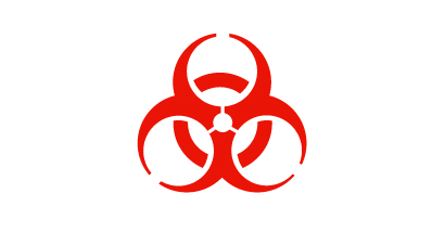
So states a resource page at the website for the Genetic Engineering Network, a watchdog group concerned with the proliferation of genetically modified foods. Though certainly tongue-in-cheek, it seems a little odd to use ‘exciting’ and ‘delicious’ in close proximity to a signal of warning.

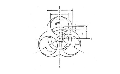
Developed in 1966 at Dow Chemical Company by Charles Baldwin and some “marketing people”, the trefoil design addressed the need for a universal mark - a la the radiation symbol - to warn humans of potential or actual dangers from biologically hazardous material. At the time, a non-standardized array of symbols were in use to mark infectious agents: a blue triangle emblazoned with ‘BIO’ (Army), a pink rectangle with radiating yellow bands (Navy), Hermes’ caduceus reversed out of a violet field (Universal Postal Convention).
Baldwin’s fiery red-orange symbol was researched, tested and finally presented in 1967 to the American Association of Contamination Control. Soon after, it received the blessings of the Centers for Disease Control, the Occupational Safety and Health Administration and the National Institutes of Health.
It’s a wicked little abstract glyph that 21st century popular culture has enthusiastically appropriated and transformed. Examining the historical connections will lead to the ancient, tribal symbols triskalion and triquetra. The organic influence of the trifoliate shapes of red clover and Bird’s-foot operate as testament to the symbol’s biological context. And there is no denying the underlying mathematical purity of the mark.

Advance to the late �90s. Baldwin encounters a seminar speaker who, as a gift to attendees, designs a necktie with a pattern of biohazard symbols. Though apparently happy with the graphic ubiquity, he chides the man for abusing the mark in such a fashion.
Wouldn’t he be amazed at what is going on today?

And tattoos.
But wait… In an inspired and somewhat macabre turn, a biohazard tattoo on a gay man has come to mean: “I am HIV positive.” One would think that the disclosure of seropositive status is usually a discrete matter, but some are intent on doing away with the hush and mutter that can result from diagnosis. Asymptomatic patients with this kind of tattoo have made clear the facts not evident on cursory inspection. Furthermore, the shocked awareness raised by this remarkable gesture goes a little deeper into one’s consciousness than something a common red ribbon might trigger.
It’s a tricky move. Back in ‘86 William F. Buckley Jr. thought it would be a good idea to mark HIV positive individuals for easy social identification. Should we think nothing of the potential for discrimination, harassment and surveillance?
However, this is what the original mark was designed for: a warning. Who’s being more responsible, more true to the intent of Baldwin’s symbol? The trinket makers or the voluntarily tattooed? The biohazard symbol serves to alarm that the material in this container presents a “risk or potential risk to the well being of man, either directly through his infection or indirectly through disruption of his environment.”
In light of this twist, perhaps the unmotivated significance of a pop cultural icon will be replaced and returned to the motivated significance of a potential danger. To paraphrase Baldwin: this is not simply a cool design to be taken lightly.
![]()
Steve Mockensturm is an artist and creative partner with Madhouse, a small design shop on the banks of the Maumee River in Perrysburg, Ohio. He plays piano, stacks rocks and is a chocolate snob.


Nothing to add other than to say that was a fascinating little read.
On Nov.22.2004 at 11:17 AM