Speak UpA Former Division of UnderConsideration
The Archives, August 2002 – April 2009
advertise @ underconsideration
---Click here for full archive list or browse below
  
Portland Posters

I just returned from a week long vacation in Oregon. Spent most of our time enjoying the coastal fog, seafood, and some amazing public transportation systems in Portland. While it was a family vacation, I was able to sneak out for a few minutes to take a look at the exhibit highlighting the winners of the Portland Design Festival now showing through October 17th at the Pacific Northwest College of Art in downtown Portland’s Pearl District.

It’s not a big exhibit, but a nicely condensed sampling of some of the best design in the region with focus on Architecture, Industrial Design, Fashion Design, Graphic Design and Typography. Many of the winners (warning: gratuitous use of Flash on that last link) are obvious recipients…Nike, Sandstrom, Second story, Plazm—but there is definitely a nice mix of work.

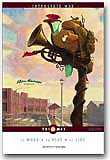
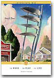
The one winner that really caught my eye was a set of posters for Portland’s Mass Transit Rail system, Tri-Met. These are slightly retro—yet clearly modern illustrations created by Eric Bowman and turned into wonderful posters by ID creative services to promote a sense of community and pride in Portland’s light rail system. I found them a stunning mix of art, design, and civic promotion/pride. (Not to mention a decent moneymaker for the transit system, as they are sold as fine art prints.)

Whenever we take a vacation, we strive to find art to bring home with us. Not finding anything in the affordable range on this trip, and not really having many examples of fine poster design hanging on my walls, I immediately went online upon returning home to purchase a few of these fine wall decorations.

Alas, this is where the irony kicks in.

These posters are nowhere to be found in any decent representation online. The link above to the news article is sans photographs. The Portland Design Collaborative spent more time in making their web site’s menu animate than they did in placing actual content on the site. The collage of art dedicates a mere paragraph of their site to this rather substantial show. And, the kicker, Tri-met’s own site—where you can purchase said posters—only has the most miniscule of thumbnails for you to peruse:

So, in summary:

  • If you live in, or plan on visiting Portland, definitely check this show out
  • If you plan to sell posters online, give the buyer a chance to view them

(If anyone knows of any site showing larger images of these posters, please let me know. Also, if you know if ID Creative Services or Eric Bowman have web sites, I should give them a link as well.)

Maintained through our ADV @ UnderConsideration Program
ENTRY DETAILS
ARCHIVE ID 2111 FILED UNDER Discussion
PUBLISHED ON Oct.14.2004 BY darrel
WITH COMMENTS
Comments
Armin’s comment is:

Portland is quite the hotbed for design. I wonder if it will be the next Minneapolis or Nashville.

Those posters are great Darrel, I really like the integration of a simple, yet distinct. design with the illustrations.

On Oct.14.2004 at 09:04 PM
Peng’s comment is:

These posters exemplify great design. I do wish the poster thumbnails were a bit larger though. I'm going to get myself a couple of them.

On Oct.14.2004 at 09:48 PM
Damion ’s comment is:

Given that I work in the design field here in Portland, I have to say thanks for the kind words.

This poster exhibit is actually part of a design festival that is in it's second year. The festival is a showcase for all the different disciplines of design (architecture, fashion, graphic, interactive, furniture, advertising, and film and video. It's largely funded by an urban development commission. While there are some rough spots to be sure (some well noted in the article), it is a grand vision and on many levels quite inspiring.

The keynote speaker this year was Marcel Wanders of Moooi (formerly of Droog Design. Last year it was Yves Behar of Fuseproject.

It's interesting to hear an outsiders perspective of even part of the show.

But more to the point of the tri-met posters. This is also the second year of this campaign for the transit system. The first year was equally well executed. A few of the illustrations can be seen on Jeff Foster's site (ta Portland based illustrator of the first campaign). These images are quite large for the web. So take a look at images 12, 13 and 14 to get an idea. While they aren't in the context of the graphic designed poster (type can be a beautiful thing as we all know) I'm sure you can appreciate the art itself.

Cheers from Portland.

On Oct.15.2004 at 05:20 PM
Damion ’s comment is:

Oh BTW click on the the thumbnail images and you'll get an even larger view. Sometimes people miss that.

On Oct.15.2004 at 05:21 PM
Jeremy’s comment is:

I hate to always play a bad guy and ruin everyone’s fun, but these posters are great examples of illustration. That’s about it. I applaud the artists for their creativity, but placing them in the same bag as “Great Graphic Design” is like putting the bread in with the milk. It’s the wrong thing to do.

If anything they fall in the genre of advertising, not design (Which in my mind are completely different). Large focal image with supporting type set to lead you back to the main image. No more, no less.

On Oct.17.2004 at 03:46 PM
JonSel’s comment is:

Large focal image with supporting type set to lead you back to the main image. No more, no less.

Good design is also knowing when to leave well enough alone and not overwhelming your primary imagery with design for design's sake.

On Oct.17.2004 at 04:45 PM
Armin’s comment is:

Jeremy you are not ruining anybody's fun, don't worry. Mostly, because your comment is not fully correct. Yes, the posters' main focus are the pretty illustrations but did you notice the color coding in the top and almost-bottom bands? The typography which is not part of the illustrations? The attention to white space? And, even with the small thumbnails the typesetting looks very well considered. I would, myself, call that graphic design.

> If anything they fall in the genre of advertising, not design

How so? The use is what makes advertising be advertising. Not the look, not the use of illustration, not the typesetting. Although graphic design done by advertisers tends to have bad look, bad use of illustration and bad is putting it mildly for the horrible typesetting.

On Oct.17.2004 at 05:27 PM
Michael Surtees’s comment is:

Jeremy: nice to read your encouragement of discussion. Just curious, how do you define graphic design in its finest form?

On Oct.17.2004 at 10:23 PM
Darrel’s comment is:

It's all design.

;o)

On Oct.17.2004 at 10:39 PM
Jeremy’s comment is:

There is a sizable difference between design and Great Design. While good design is all about maintaining a balance of positive/negative space, incorporating a strong grid system, or not, activating the edge, giving the viewer closure, strong typesetting (if you can’t set type get out of the business), blah, blah, blah. There are to things keeping it from Great Design.

These posters are not Great Design and are maybe good design at that. What separates design from Great Design are 2 things in conjunction with negative space, grid systems and the rest of the blah, blah, blah. Originality.

The most important aspect of Great Design is a big thing called originality. Originality is not the color- coding in the top and bottom bands nor is it knowing when to leave well enough alone. Originality is about doing something different in the modernism-plagued society we have created. Originality is not about doing whatever the client wants to collect a check at the end of the week. So due to the lack of originality these posters are not Great Design.

As far as the advertising comment I made goes, I was not as clear as I should have been. So I apologize if I’ve offended any one. This leads me to the second thing. Design is an art. This idea of the designer as an artist and not a "Mac operator" is bastardized in a corporate setting but hey, what’s not? The designer is an artist, well, the good designers are. Just because my little brother is computer literate doesn’t make him a designer because he, the artist, puts nothing of himself in to his work just the ideas of another person or business. (I used to work in advertising and this is pretty much how my firm worked, some may not work this way.)

So in closure, this is how I define graphic design in its finest form. I would include a picture but nothing from the past few years is really worth looking at. But why should we look at what has already been done when we can be thinking about what hasn’t been done.

So now that you are finished reading my rant, remember I do not think that these posters are not design, or good advertising. They are just in no way shape or form Great Design!

On Oct.19.2004 at 06:07 PM
Darrel’s comment is:

Jeremy:

You are confusing the terms design and graphic design.

Design does not have to be original. In fact, lots of great design is highly derivative. In terms of the business of graphic design, I could argue originality isn't a prerequisite to greatness, either. In terms of art, I could still argue that, but would tend to agree with you more in that realm.

On Oct.19.2004 at 10:46 PM
Ken’s comment is:

And now for something different.

I know that I am chiming in a bit late with this one, but I just stumbled upon the web site for ID Branding, the Portland based branding agency responsible for designing the Tri-Met posters. Although the site lacks the high quality images I believe you were hoping for, it does showcase several other uses for the illustrations that were commisioned for the project.

The images can be found in the Portfolio section under Case Studies.

On Oct.25.2004 at 11:27 PM