– Arnold Toynbee via Lester B. Pearson* via Bruce Mau (as his definition of design)
I entered the exhibit of Massive Change at the Vancouver Art Gallery determined to keep an open mind. I was prepared to be critical, but I was also intent on understanding as best I could, what it was all about. I had a press pass, a notebook, and the desire to leave no element unexplored. I was there for 2 hours one day and another hour the next. This, in the first of 4 parts, is my report.
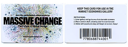
When I entered I received a “Market Economies Card,” which, equipped with a barcode, I understood was to be used as an interactive device. Massive text (there’s a lot of really big text here—more on that later) told me I was “a part of the project” and “inside an interface.” I was oddly excited; I couldn’t wait to use the card.

Bruce Mau is the curator of Massive Change. This may also be an accurate description of what he does in the world as well, as we discussed briefly here. The 10 unnamed postgraduate students from the Institute without Boundaries are the ones responsible for the content and display of this exhibit. It is a collection of ideas, innovations and products from a variety of fields assembled under the cause of designing a new future for the human race. “Aesthetics are off the table,” Mau says in his 9-foot high, 3 panel introduction. We are encouraged to think in the framework of “economies,” and we are told that “even nature, even life [is] falling to the power and possibility of design.” That got my back up, but I was heartened by an acknowledgement of the conflict between our dominion over, and subject to, the forces of nature.
Actually, to be honest, I was heartened by the entire introduction. Its optimism is undeniably contagious. There is a peculiarly Canadian sentiment in the nobility of the text which strikes me at the core of my prairie soul. I take a grain of salt, consider the possibility of marrying Bruce Mau, and enter.

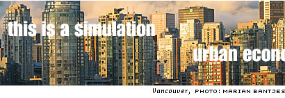
The first room has a long wall (approx 50 feet by 6 feet) of video images: 6 screens showing anywhere from 1–6 images (where, when one, it is 50 feet long), viewed at a distance of about 15 feet. A voiceover narrative booms through the space, telling of sustainable housing, the greening of cities and the integration of the city into the natural environment (an eventual loss of boundaries between urban and nature), all the while words and phrases are superimposed over the images.
This is information overload. I can’t watch 6 wall-sized screens, read moving text and listen to a barrage of information at the same time. The viewing distance is too close, and the effect is almost dizzying. But I sit through it twice.

Ultimately, despite the feeling of being overwhelmed I was also completely sold on the message. Sold and inspired. They could have recruited me right then and there. I would have signed on the dotted line: “I, Marian Bantjes, do hereby give up all my worldly possessions and agree to dedicate my life to the betterment of cultures around the world, building better homes in sustainable environments, hand in hand with Bruce Mau.” I’m serious.
But the clock is ticking. Move along, move along.
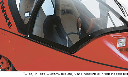
Along one wall is a museum-like display of a line of vehicles in various stages of tech and with varying combinations of pedal and electric power. They document the use of third-world materials practicality, like the rejuvenated Indian bicycle rickshaw and the African bicycle ambulance (designed by Vancouver’s Niki Dun), as well as the high-tech prototype and manufactured product. There is the bubbalicious “Sparrow” by Myers Motors, a 3-wheeled electric vehicle in gleaming, shiny red, along with various, less successful designs ranging from a souped-up golfcart to some oversized tupperware on wheels. I was particularly taken with the Twike, a 2-person recumbant pedal+electric powered vehicle.

These are backed by a wall of black and white images of traffic from around the world, and faced by an entire subsection devoted to prototypes of the iBOT wheelchair designed to climb stairs and the vehicle that that technology spawned: the Segway. I’ve always considered the Segway to be compelling in design, but ultimately idiotic in purpose.
The segue from here to the room of Information Economies features a wall of car crash images and a history of the crash test dummy; followed by a wall-sized flight-path diagram with black lines on white and no map or countries shown, just the flight lines. Despite the lack of detail it is instantly recognizable for what it is, and very beautiful. Calming, and appropriately bird-like.
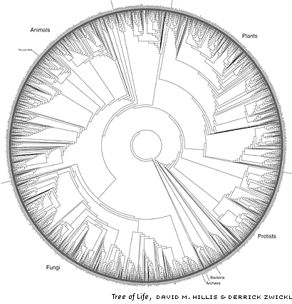
A variety of input devices (keyboards and button-punching information systems, mouse variants, joysticks, etc.) are mounted to the wall, behind plexi, at the entrance to this section. Up to this point, the displays are relatively simple, minimalist and almost crude. Then we enter the black room, which features a long underlit display of global systems imagery, or “global portraits”. Weather patterns, an active air traffic control map, the global internet map (Massive Change’s signature image), and, most beautifully, The Tree of Life, which charts the evolutionary relationships of 3,000 species, by David M. Hillis and Derrick Zwickl from the University of Texas, which is truly a stunning piece of graphic design.

Some of these were also projected in live motion of some kind onto the black walls. Compelling and meaningful.
There is an even darker (2-hits-of-black) ante-room with flashlights dangling from the ceiling for you to illuminate the text on the walls. Children were hogging the flashlights, so I left. It’s the only room I didn’t properly see, but I learned afterward that it was the “energy room”.
At this point I’m still pretty euphoric from my urban economy experience, I am wanting a pedal-electric vehicle (in blue, please), and I’m aware that there’s all sorts of activity going on in the world with all sorts of technology tracking and disseminating infomation on that activity. It’s all very David Suzuki, only happier.
::
*Lester B. Pearson is a former Canadian Prime Minister who won the Nobel Peace Prize in 1957.
A CD of images was provided by The Vancouver Art Gallery in my press kit. I would have preferred to take my own, but it was not allowed. Unfortunately the exhibit shots are not of the actual exhibit, but from the models and prototypes, and some are unusable (which is why I made my own simulation of the urban economies screen). If I had been able to take my own photos, they would have been much more dynamic and informative, I assure you.


Beyond optimism, I am sure this show was truly inspiring. Thanks for sharing this with us Marian. It is amazing to me to see all the things individuals are doing around the world to create a better world for us and future generations, the resources they use, the materials and the concepts themselves are mind-bogging. It also amazes me how larger corporations have managed to stall the development of many of these projects for years (such as in the case of electrical of alternative fuel based cars), which are finally being pushed aside by a stronger and more determined group.
On Oct.12.2004 at 07:54 AM