Speak UpA Former Division of UnderConsideration
The Archives, August 2002 – April 2009
advertise @ underconsideration
---Click here for full archive list or browse below
  
The Votes are in

After 544 votes, five posters have been selected as finalists. Without divulging which poster got how many votes (ambiguity still plays a role here), these are the number of votes for the top five: 36, 34, 31, 30 and 30.

As you see, there was no overwhelming majority, the voting was very spread and even. What happens next? A vote-off! Effective now until Friday, October 8th at 11:59 pm EST.

In original numeric order, these are the five finalists:

Scroll all the way down to submit your vote.

114_small.gif
— 114 —

114_small.gif
— 118 —

130_small.gif
— 130 —

137_small.gif
— 137 —

147_small.gif
— 147 —


That’s it. All you have to do is vote on your favorite finalist to determine the winner. This time, there doesn’t have to be a minimum vote difference between first and second place, if the leading vote getter gets only one more vote than the runner-up then that’s all it takes.

Voting is closed.

Maintained through our ADV @ UnderConsideration Program
ENTRY DETAILS
ARCHIVE ID 2098 FILED UNDER Speak Up Announcements
PUBLISHED ON Oct.05.2004 BY Armin
WITH COMMENTS
Comments
Jeff Gill’s comment is:

Hooray! My choice made it through.

On Oct.05.2004 at 09:22 AM
agrayspace’s comment is:

Very interesting. Only one of these was in my top 5, or top 10 for that matter. I can't tell whether I am disappointed or if the selection of these as finalists is going to make me see something in them I might have missed.

This either proves design is indeed HIGHLY subjective almost to an idiosyncratic level, or some people have a lot of friends.

Just my .02�

On Oct.05.2004 at 10:10 AM
pedro’s comment is:

WOW!!!

540 votes thats a great turnover!!

So 3% of the posters got 30% of the votes!! That's 1 in 3 of the votes went for these 5 posters - that's some sort of consensus isn't it??

(sorry cant help it with my math/probability background)

BTW Hooray! One of my pre-choices made it through too. Although my final vote went for one that didnt appear in the finalists.

Good luck to the final winner of this Friday

On Oct.05.2004 at 10:32 AM
Ben Wexlar’s comment is:

agrayspace wrote: I can't tell whether I am disappointed or if the selection of these as finalists is going to make me see something in them I might have missed.

I wouldn't have thought any of these would make it into the final running for this contest. Although they are all very striking posters, I felt there were ones that better illustrated the topic word: garbage. Maybe people are voting on the most attractive poster . . . and that's it.

On Oct.05.2004 at 10:36 AM
Nick Fr�hling’s comment is:

Um...were you serious about the part about them illustrating the topic "Garbage", because that's another event altogether...

On Oct.05.2004 at 10:45 AM
TJ’s comment is:

Anticlimactic. None of these were on my radar.

I really liked #146 "Art and Design are cousins..."

by Marian(?), and #011 "Whatever..." which had a great use of color and paper tone use, plus a nice use of sequential art, and quote integration.

Next year we definitely need that five dollars kicker.

On Oct.05.2004 at 10:49 AM
Nick Fr�hling’s comment is:

Correct me if I'm wrong, Armin, but even if ones we liked didn't get into this group, there are still 3 that the judges are going to choose seperate from the winner here.

Am I correct in that assumption, or am I making a you know what out of you know who and me?

On Oct.05.2004 at 11:31 AM
Michael H.’s comment is:

Granted that this is a subjective process, I too am surprised at that top 5 selected posters. There is one poster in there that was one of my personal top 5 posters, but I'm afraid for different reasons (it just looks cute).

I thought about speaking up (pardon the pun) last week and saying what was on my mind, but I had hoped that I would be proven wrong by the outcome of this contest. It seems that maybe I was not, so I will talk here and now.

At the beginning of this contest, Speak Up recieved a whole new audience: a class of students. Students in general is a good thing, since I would imagine there to be a small percentage who would have the desire and awareness to come here and walk away with a good grasp of understanding the topics that are discussed here. So obviously the more students that are attracted to this site, the better.

Unfortunately, what drove this particular class of students to SU was a competition as a class project. Student work is typical to this arragenemnt: some are good, some are bad, and most are mediocre. I think this was reflected in the student entries for the contest and it was noticed by other SUers in the pervious comments for the voting post.

I know this may sound harsh, but I do support students getting as much real world experience as possible (as I've said here before). However, while I admire the fact that so many students submitted their work to this contest, my point is that my concern (last week) was that the same level of quality of student work that was entered would also be the same level of quality of student opinions voiced during the voting process.

And now I think my concern has been validated. I'm aware that the entire purpose of this site is to get all kinds of folks who are in the graphic design industry together to talk. That means student's and old masters alike (even if this site seems to be mostly populated by those of us who are the in-betweeners). But one thing I was looking forward to with this contest was seeing the voting process exercised by my peers.

I honestly had no idea that 544 of my peers hit this site. But maybe word spread faster than I give this site credit for and many more came just to vote. To be honest, I love this place and think it should be flooded with other graphic designers and am continuously surprised that it's usually the same handful of individuals that post in the majority of topics (but I will definitely say that it's great to see a lot of the same people here that I like and admire).

I told some of my friends about the poster contest and even provided them with a link. But I also stressed for them not to vote -at all. I did this because I didn't want the votes to be jaded by non-designers. But I'm afraid that maybe the students didn't do this. Maybe I'm not giving them enough credit, but I am having a hard time visualizing some of the students not telling their friends and family to vote for their poster. (Keep in mind that I never expected for my entries to be selected in the top 5, so this is not a cry for foul play.)

Maybe this sounds elitist and I completely misunderstood the point of this contest. But I think I may not be the only one and I actually hope I'm in the majority. Has the poster contest become something other than what was intended? Were all the votes conducted by other designers? Are these top 5 posters really the top 5 choices of the professional designers across the world that are SUers?

On Oct.05.2004 at 11:35 AM
Armin’s comment is:

Nick, no, no, you are right. Once the votes are in for these five posters we will announce it, of course, and then remove it from the entries we will send the judges… well, actually, we'll keep the poster there but it will be highlighted as the online winner so the judges know.

And yes, there are still three posters left to be chosen by the judges. So all posters, except the online winner will be "selectable" once again when they get to the judges.

> I really liked #146 "Art and Design are cousins..."

by Marian(?),

Let's still keep this anonymous, until the end. It's more fun!

Michael, you have actually raised some really good — and not far from the reality — concerns. (I'm glad you did, and in a very nice manner may I add). I expected the result of this online voting to be odd, I knew that the best poster(s) would not be the ones with the most votes and we personally took a risk on giving such decision-making power to a loose voting system to determine a poster that we potentially wouldn't like and that we would have to pay for. But that's totally cool, if we had set out to create four award winning posters that would enter the annals of design I would have asked the judges to design the posters instead of asking them to judge. Yes, the result matters, but in this case I think the process is what made this contest succesful and it is for the process that it would (could or should) be remembered.

Personally, of the finalists, there is one poster I would absolutely love to see printed and one that would drive me into fits of rage for having to print it. C'est la vie.

Also, it will be very interesting to see what the judges pick.

On Oct.05.2004 at 11:49 AM
Armin’s comment is:

> Are these top 5 posters really the top 5 choices of the professional designers across the world that are SUers?

I meant to answer this too. Most of the people who voted I recognized their names, so they were from accross the world that is Speak Up. I would say 20-25% of votes, I had no idea who they were.

On Oct.05.2004 at 12:07 PM
Michael H.’s comment is:

Thanks for addressing my concerns Armin. I think you've put it in perspective for me and you're right about the process being the successful part of this endeavor. I wasn't here for the t-shirt contest but when I followed your link to the page I was surprised at the (lack of) number of entries (in repsect to the poster contest).

> I would have asked the judges to design the posters instead of asking them to judge.

Hmmm... will the identity of the judges be announced after they have done their part? Also, will the identity of all the authors of their resepctive posters be available? I believe you did so for the t-shirt contest...

> ...and one that would drive me into fits of rage for having to print it.

Armin in a fit of rage? This sounds entertaining.

> I would say 20-25% of votes, I had no idea who they were.

New members of Speak Up I would hope.

On Oct.05.2004 at 12:37 PM
Hrant’s comment is:

Although I only like one of the five, I think the results are great so far. The stats that Pedro cited are indeed indicative of health. I just hope that the 6th poster didn't get 29 votes or something - that would be unfair. (Hey Pedro, do the QQ math too eh? :-)

The Student Flood Factor:

I think it's wonderful, for a reason that I constantly find myself pointing out around here: you designers need more "outside" opinions - you're too insular. So people who are interested in design but not yet very good at it are the perfect demographic for such a contest!

hhp

On Oct.05.2004 at 12:49 PM
Tan’s comment is:

I was going to say something smartass about voting and Bush, and how this is no different — but it seemed a bit mean-spirited.

Populist voting is what it is. So congrats to the finalists.

Regardless of who wins this popular vote, this has been a very interesting process.

On Oct.05.2004 at 12:51 PM
Armin’s comment is:

> will the identity of the judges be announced after they have done their part?

Michael, that's no secret, the judges are Art Chantry, Ellen Lupton and James Victore.

> Also, will the identity of all the authors of their resepctive posters be available?

Yup.

> Armin in a fit of rage? This sounds entertaining.

Oh, it so is.

On Oct.05.2004 at 12:58 PM
keith ehrlich’s comment is:

First off I'd like to point out that this is my first time posting here and basically, I have checked out the site from afar for several months. I've heard nothing but great stuff about the site, the community, and the ideas being promoted on the site.

While I hate to introduce myself on a bit of a sour note I would like to convey some disappointment. I work in the motion design field / advertising. TIme and time again, I find myself complaining about a current lack of clever thinking and communication being conveyed in this facet of the design field.

Style seems to rule over content often. I was truly hoping the outcome of this contest wouldn't fall victim to this concern. While I truly applaud everyone who participated, I must point out that there was quite alot of style over content. The biggest disappointment to me was to see the actual quotes which people chose. I can't really say the finalists in my opinion represent anything outside of the ordinary.

I graduated art school not all that long ago. This was the problem in college as well. I too wonder how much student content plays into this. Sorry to be bitter. Again, thanks for holding the contest and everyone for participating ...there was some great work.

On Oct.05.2004 at 01:23 PM
Anthony’s comment is:

yeah, I agree with some of the above comments that the surge in mandatory student entires and votes had an impact on the final five. I don't know if this is good or bad but I'd say it influenced voting and meant a number of the posters recieved a good deal of attention outside of SU before the voting. I really dig a couple of these posters and I'm scratching my head about a couple of them.

Whatever the case, I'd say the contest was a hit. I wasn't aware of the t-shirt contest so it looks like awareness and participation in SU among designers and students is growing exponentially. I was introduced to the site by a professor of mine in a critical issues in design course (where is discussion in design, etc). I've since graduated and come back with some frequency and made a couple poster submissions (not in the top five, softly sobbing into my powerbook...). I'm interested to see the posters selected by the jury. I think it's healthy that we see some differeing opinions on the five, voting, etc.

But boy, I can't wait till Nov 2 to cast my big whopping swing-state vote. Oh yes.

On Oct.05.2004 at 01:57 PM
Greg’s comment is:

I think a good thing to keep in mind is that there are actually four winning posters here...three selected by outside judges who probably know a thing or two about design (sarcasm sense tingling?) and one selected by a good old democratic process. And, as in any democratic process, it's not always who should win, it's who campaigns better.*

*how's that for a thinly veiled Bush joke, Tan?

On Oct.05.2004 at 02:11 PM
Michael H.’s comment is:

> Michael, that's no secret, the judges are Art Chantry, Ellen Lupton and James Victore.

Oh that's right. I have the attention span of a puppy.

On Oct.05.2004 at 02:16 PM
Rob ’s comment is:

current lack of clever thinking and communication being conveyed in this facet of the design field....Style seems to rule over content often

l have to disagree with this statement, in terms of design industry overall. If anything, I think the opposite is true. Over the past years, I think we've seen a change from being all about a 'style' to really bringing design in line with the content. Using both to compliment one another to really sell the message or communicate the idea.

As for the contest, I don't have an issue with the populist aspects of it. It just goes to show you how subjective our field is and what may be great to one designer is an utter tragedy to another. It's what makes us human.

I think Armin and Bryony are to again be congratulated for taking the contest on, pulling it off and allowing it to be a what it was. And by the way, one of the one's I thought worked best, is among the final selections.

On Oct.05.2004 at 02:32 PM
DesignMaven’s comment is:

Armin:

ambiguity still plays a role here.

You're like my OLD BOSS. We loved to say. He kept us in the Dark by Putting A Paper Bag over Our Heads and Sticking his Foot Up Our ASSES.

Having said that. Glad the selection process is over.

Needed to punish myself. Didn't participate in selection process.

Kinda felt unworthy. Ashamed, that David Weinberger and TAN found time to participate. I did not !!!!!!

GOD KNOWS, there's nobody busier than them.

On Oct.05.2004 at 03:09 PM
laura’s comment is:

I'm sorry, is this piss and moan hour 'cause your own poster didn't get in?

It's a contest.

On Oct.05.2004 at 03:10 PM
laura’s comment is:

I'm referring to the haters only here...

On Oct.05.2004 at 03:11 PM
danielle’s comment is:

hmmm... funny how few choices i have this time and how reluctant i am to vote on one. if only there was a comment field when voting to describe why it was chosen; i'm curious to know why these were chosen over the ones i *knew* would make it to the final round.

interesting that they're all on white paper.

On Oct.05.2004 at 03:33 PM
Patrick C’s comment is:

I too am surprised by the five finalists. I'll admit that two of them were totally unfamiliar to me, though the other three were ones that caught me eye a little when sifting through pile.

But it's nothing to get your panties in a knot over. Only one of these will be voted a finalist and the remainder chosen by the judges.

This is why Armin and Bryony have to be congratulated. Not only did you two put this together and get it to this point (how you managed it I really don't know) but you structured the contest in such a way that, as much as can be gauranteed, there would be an even and responsible selection of winners at the end.

Really great work!

On Oct.05.2004 at 03:34 PM
jo’s comment is:

This is from a post by Michael H. awhile back, but I felt like commenting on it anyway:

Maybe I'm not giving them enough credit, but I am having a hard time visualizing some of the students not telling their friends and family to vote for their poster.

That's a definitely valid concern, I think, as I'm sure many of my friends would have rallied to my cry, had I made one. And as for non-designers voting on poster designs, that's a concern too. After all, we've been talking about how little the general public seems to know about what is "good" in design. But the key here is that the way that we've chosen to choose this particular poster is by the democratic process. As Armin said, results do matter, but this is only going to be one of the results of this contest. I don't think it's a total wash, since we will have judge-picked posters too.

As a just-graduated student (well, maybe not just graduated, since that was back in May and all) I can bask in thefact that I told my husband, "Vote for the one you think is best, which probably isn't mine."

On Oct.05.2004 at 03:43 PM
agrayspace’s comment is:

I'm sorry, is this piss and moan hour 'cause your own poster didn't get in?

I'm referring to the haters only here...

This is hardly sour grapes. As a contributor and then having to cast a vote I had to separate myself from my own work. I put together a list of the top posters I thought were the most successful "designs". And I think I speak for some of the other commentors that I was very suprised to see the results of the populist vote. And henceforth we are merely discussing the merits and results of that system and the impact of the student work in the competition. These are issues that I think are worth examining and I have enjoyed hearing other perspectives on the issue.

And part of the responsibility of trying to be great designers and move our profession forward is to be critical of design, always. Otherwise its still just commercial art not design.

Calling it "hating" is just silly.

On Oct.05.2004 at 03:48 PM
laura’s comment is:

Calling it "hating" is just silly.

Call it what you will, but I feel a lot of the critism presented here is negative of the outcome results. Not constructive.

On Oct.05.2004 at 04:06 PM
Armin’s comment is:

Not to take anybody's side, but I haven't sensed any "hater" vibes, most of it has been some concerns, which are really valid and that have actually happened. In fact…

> Maybe I'm not giving them enough credit, but I am having a hard time visualizing some of the students not telling their friends and family to vote for their poster.

> That's a definitely valid concern, I think, as I'm sure many of my friends would have rallied to my cry, had I made one.

I think this is currently happening with the voting for one of the finalist posters. And, to be honest, I'm not exactly happy about it. But as they say, we'll cross that bridge when we get there.

On Oct.05.2004 at 04:14 PM
Tan’s comment is:

>it's who campaigns better.*

Nice Greg.

You know, I never even conceived the fact that anyone would "campaign" for their own poster with friends and family. But as Armin said, only 20-25% of voters were previously unknown SU participants. Still, the five finalists were chosen by 30% of the votes. Hmmm.

Ah hell, who really cares?

If you think about it, giving 544 people more than 150 choices to vote on was quite ambitious. Too few votes for too many candidates. So is it any wonder that we have little concensus on the resulting finalists.

This is why design competitions are judged upon by a few, not voted upon by the general populace. The bitchfest would never end.

So laura — while I agree w/ you about the "piss and moan hour" — how do you suggest we turn this into something constructive?

You start.

On Oct.05.2004 at 04:26 PM
Jeff Gill’s comment is:

I can bask in the fact three out of the four votes that I received (just an optimistic guess) came from my wife, my mother & my sister.

Here's my constructive thought: there is an awful lot of crap design out there. It is my guess that the percentage of designers in the world that are crap is only slightly higher than the percentage of designers that read & contribute to Speak Up that are crap. And the percentage of crap work that good designers do is exactly the same whether they participate in Speak Up or not.

So Armin & Bryony put together this great contest and a bunch of us take a few/many hours & build some posters. A bunch of us are crap. Some of us are good. We look at the entries. Shock! Horror! We're not the Vienna Secession after all. We're not even the beginning of Britart. Must be the dang students' fault.

Here's how we move design forward:

1. Realise there's a pretty good chance that you are a crap designer and probably will never be a great designer.

2. Quit, or improve.

3. Lighten way way up (that goes for all the valid concern people and for the people who so desperately need to win this contest that they mounted a campaign and for me.)

-

Finally, thanks for this contest, Armin & Bryony. I almost never get to do personal projects. This contest was a great release for me.

On Oct.05.2004 at 04:48 PM
agrayspace’s comment is:

We look at the entries. Shock! Horror! We're not the Vienna Secession after all.

This is the funniest thing ever!

On Oct.05.2004 at 04:58 PM
Steve Mock’s comment is:

Can I go first? (Though, be warned... I can't get my tongue out of my cheek.)

114: Scary. I think it's the eye, but my gaze goes right to the mouth, so it may be the mouth. Maybe if the eye were closed a little more it would look less insane. Of course, I think insanity is the message here. (though the actual quote is quite sane) Good job in that regard... the insanity. Nice tweakage on the type. A hand drawn-looking font that's been poked and prodded to give a random sensation. The colors. Again good job in conveying insanity. My eyeballs are literally vibrating. I'm craving more subdued colors. The way the text dips in and out of the foregound/background is also a little disorienting. Look at the eyebrow! Wow... right through the O. Not a bad swing overall, but I'm really bugged by the disconnect from the type to the image. And that is, for sure, a four aspirin pink. Insane? Yes. Friendly? No.

118: This is clever and whimsical, though a bit immature in development. Seems like a design class exercise writ large. Nothing wrong with that. I've seen worse things hanging on the wall. Excellent tie-in with the quote. Wry. Humorous. Simple. Really simple. It is what it is. Colors make sense. Didn't Adobe make one of these? My mom would love it.

130: Why am I looking for my 3D glasses? This has that "purposefully unsophisticated" look that seems popular from time-to-time. Tried and true color scheme (ask Howard Johnson), though the overprinting is bound to look like doo. I like the funny little people in the bobsled, but I think the hell hands could've been worked over a little more. More flamey? More handey? I don't know. Good hustle.

137: Am I looking for more shapes in there? I want to see something in there besides the text. Like a squirrel or a bunny. Try to really camouflage the text (it's not very hidden) then have it jump out in a big Aha! moment. But then... why have any text at all? Somebody spent a lot of time on the squiggles. Might have been a little more effective if the pieces were tighter/actually looked like they would fit together. Was that the intent? (My eyes!! Ouch!) Study some Escher. Good job.

147: Now we're getting somewhere! Did you draw that sheep? Nice. I'm a sucker for any "blood of the lamb" type stuff. I'd want to see what this was all about from across the street. Nice color combo. Thank you for resisting black. White space rules! Satan drools! Way to run it out.

That is all. Good night.

On Oct.05.2004 at 05:31 PM
Jason T’s comment is:

An aside...

I've got a hunch. This whole thing is a test for Veer. They're trying to find out if contests can be moved to the WWW.

When will they structure more competitions like this? Doesn't Graphis, Print, How, and ID get the picture? Digital is the way of the future. And the voting process can be monitored much better compared with the old fashioned means. Maybe if Presidential voting was interactive rather than analog, we'd have the right man in office. No?

On Oct.05.2004 at 05:32 PM
Nick Fr�hling’s comment is:

I liked the positive approach to that last post, where everybody is a winner.

Let's have more of those.

On Oct.05.2004 at 05:36 PM
Nick Fr�hling’s comment is:

And because I apparently type too slow, I really meant the post two time before this one, where some constructive criticism was offered for each poster.

On Oct.05.2004 at 05:38 PM
marian’s comment is:

I'm going to go out on a limb here and attempt to constructively critique these 5 finalists, with the caveat that critiques have never been my strong point.

#114 - My first reaction is that the quote is so much of the "woe is us" mentality (or rather, the poster puts the emphasis on that aspect of the quote) that I am immediately prejudiced against it. As a statement it is not something I would want to put on my wall or be reminded of every day. The graphics add an aggressive dimension to that which further disqualify it as a contender, for me. This style would be appropriate to a band or social cause that was meant to make you really angry and take action (e.g. go see the band), and then maybe keep on the wall of your all-black room as a reminder of that really headbanging time you had at the show.

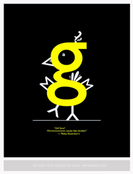
#118 - I like the Gill Sans chick. It's cute, and well done. It's graphically strong (might be interesting on the black paper with white/flourescent yellow overprint), and would be pleasing to have on the wall. But I detest the quote. It seems senseless, and not representative of the discussions on Speak Up.

#130 - This poster just doesn't move me in any way. It has a peculiarly retro colour palette, and a slightly mis-registered look that reminds me vaguely of some kind of late '50s board game packaging, but I can't imagine why the effect. The quote just seems to be plopped there, and the whole thing just seems to cry "Why do I exist?" It's an exercise in something, I'm just not sure what.

#137 - This one was actually on my short list for a while. It has some thought, and some concept, but it seems kindof like a sketch. There is a certain Matt Groening charm to the rendering of those puffy blobs, and yet ... I think it needs more work. I think it has somewhere to go, it's just not there, yet.

#147 - I don't get it. Can someone explain it to me? The sheep has been ... dyed? Walking through blood? It makes me think it came from a discussion about abortion or animal rights. The quote, which is mine (thanks) is so ambiguous it could have come from anywhere. It holds no connection to the sheep, Speak Up or, quite frankly, me.

So that's my more-than-2-cents. To be honest I'm having a hard time voting. The "this poster rocks" button is giving me serious pause.

On Oct.05.2004 at 05:40 PM
Nick Fr�hling’s comment is:

Make that three, or rather four before this one.

I'm sorry, I'll never post without thinking again.

Yay poster costest.

On Oct.05.2004 at 05:40 PM
Nick Fr�hling’s comment is:

Foiled again!

On Oct.05.2004 at 05:41 PM
marian’s comment is:

Hmm, while i was writing and answering emails etc. Steve Mock beat me to The Big Crit.

On Oct.05.2004 at 05:42 PM
Hrant’s comment is:

> This is why design competitions are judged upon by a few

No. The reason is it's expensive to wine-dine-69 celebrities.

> Maybe if Presidential voting was interactive

> rather than analog, we'd have the right man

> in office.

No. Putin doesn't have US citizenship.

--

Constructive criticism? Only half the story.

hhp

On Oct.05.2004 at 06:47 PM
laura’s comment is:

So laura — while I agree w/ you about the "piss and moan hour" — how do you suggest we turn this into something constructive?

I guess what I am trying to say is that if it was my poster that made the top five I wouldn't feel like I received any recognition for beating the odds because some reputable designers have shat all over the contest concept. I'm feeling real bad for the "winners" right now cause these posts have made them out to be like they snuck through the cracks somehow. Why? Cause they told their Mom's about it?

On Oct.05.2004 at 06:58 PM
danielle’s comment is:

#114

I have to say that I'm not sure how I feel about this poster. I'm impressed with the effort that was taken on each individual character and how the words fit so nicely into each other. But I have to agree on the angst... I understand that the quote originally was explaining the concept of a logo design, but it has been translated into a frustration of futility. I'm mostly beset by the fact that increased visibility has little to do with a loud burst of anger.

#118

Yes, it is cute. reminds me of an awesome spread I saw in an eyewire catalog a few years back where they took a similar approach with 5 or 6 different concept people to promote a few fonts. I suppose there are only so many features you can make out of a uniform width sans serif font. I think that if a greater variety of characters were used to create more features, it would be even more impressive (a few feathers out of inverted lowercase m's... i don't know, i'd have to play with it). author's name could be smaller or separated... and is it supposed to be possessive? I like the presence of the yellow g on the black background... good choice. But I think it might have gotten a little more mileage by using another shade of paper and swapping the white for another color. might just be me.

#130

Because of my personal taste, I like the design of this one. Perhaps it's because that's one of my fave color schemes. But I love the whimsy of this one, especiallyin the people. I think the flames need more work... the offset outline seems like a last-minute treatment. As for the type, i think the font fits with the cornered edges of the flames, but perhaps if it wasn't reversed out of the block, the focus would be appropriately placed on the people in the bobsled.

#137

haha, I open this one in the larger window and I can't read it. good thing it would have credits on the bottom if it's chosen - otherwise it might get hung upside down. at first i didn't like this one at all - it looked too squiggly and the sentence fragment bothered me. but i'm drawn to the fact that out of these posters, it is the best representation of its quote. great effort here, whether it was done by hand or in illustrator. i think it's the only poster, too, that uses just one color.

#147

A certain movie with sheep came to mind from years gone by in the connection with the sheep and quote, but I can't recall which one. Was it a kid's movie? Doesn't matter. I think this one was the most discussed poster, but I can't figure out why either. I like the illustrated quality of the sheep, but I don't get the connection with the red. It also seems like the copy in there is unnecessary, and I understand the use of that font in this application as much as I do au bon pain's logo. I like the focus on the "causes" part of the quote by using the red. The author's name seems awkward, what with the altered "j", the proximity to the quote, the size, and the color.

That's all I think. I think. I still have no idea which one I'm voting for. I think I know which one the student poster is, but if it's that hard to distinguish from a professional's, good for you! Can't wait to see the judges' three selections. Armin, will we get their opinions along with them?

On Oct.05.2004 at 07:02 PM
DesignMaven’s comment is:

Comments Below: From the GURU IN RESIDENCE: TAN LE

This is why design competitions are judged upon by a few, not voted upon by the general populace. The bitchfest would never end.

So laura — while I agree w/ you about the "piss and moan hour" — how do you suggest we turn this into something constructive?

You start.

DesignMaven Comments:

I actually, just read all the postings. Chiming in again for the first time. Since my earlier post.

Legitimate concerns by all. Always happy to see Student Participation. I wholeheartedly support them.

Our Democratic Process has been TARNISHED.

For Better or Worse.

For Better, because we're going to correct the problem.

As an Elder that regularly contribute to this site. I'm disappointed by the apparent Stacked Deck.

ANNOUNCEMENT:

Next Year if you're not a Registered Participant of Speak Up. Or on our Mailing List. Before the Contest is Announced.

YOU WILL NOT BE ALLOWED TO VOTE !!!!!

I'm personally following through on this mantra.

With the owners of this Extroadinary Design Forum.

FOOL US ONCE, SHAME ON ...

FOOL US TWICE, It will never happen.

On Oct.05.2004 at 07:24 PM
JonSel’s comment is:

Next Year if you're not a Registered Participant of Speak Up. Or on our Mailing List. Before the Contest is Announced...YOU WILL NOT BE ALLOWED TO VOTE !!!!!

and someone else said...

and as for non-designers voting on poster designs, that's a concern too. After all, we've been talking about how little the general public seems to know about what is "good" in design.

Ok, isn't this getting a bit ridiculous? A public vote is just that, a public vote. Who's to say that "Registered Participants" of Speak Up aren't bad designers? Will we be required to go through a portfolio review before being allowed to vote, or even post? Quit the bellyaching. Everyone is entitled to their opinion, and just because you feel one way does not mean the rest of the voters must. In the real world, non-designers judge our work every day, and their opinion, in the end, has more impact.

In my opinion, the contest voting is set up exactly right. There's the public vote portion and the juried section. If the two results don't jive, well, then everyone can study the selections and maybe learn something.

On Oct.05.2004 at 09:42 PM
Jason B.’s comment is:

I have to agree with JonSel. This is the public vote. The popular vote. What is popular is not always good. What is good is not always popular.

Or something like that.

Not to say that I wasn't surprised by the top 5. (None of which were on my shortlist BTW.)

Of course I think there is a clear winner among these 5...

PS - Hello SpeakUp.

On Oct.05.2004 at 10:30 PM
Anthony’s comment is:

Next Year if you're not a Registered Participant of Speak Up. Or on our Mailing List. Before the Contest is Announced...YOU WILL NOT BE ALLOWED TO VOTE !!!!!

to this comment my gut reaction is yes, that could be a good short term solution to the problem. But one of the things that attracted me to this forum when I first come to it was that you don't need to be a registered participant or be on a mailing list. The authors left the front door open, and that's cool with me.

On Oct.05.2004 at 10:54 PM
Armin’s comment is:

> Next Year if you're not a Registered Participant of Speak Up. Or on our Mailing List. Before the Contest is Announced. YOU WILL NOT BE ALLOWED TO VOTE !!!!!

Thankfully, next year is still a year way and as I said before and as they say, we will cross that bridge when we get there. (Although I doubt it will be as harsh a process as Maven suggests).

On Oct.05.2004 at 11:02 PM
Agrayspace’s comment is:

I would fear a process that required too much registration as the PRIMARY APPEAL of this site is its competely open door policy and friendliness to anyone passionate about design.

I am relatively new to SU and I really enjoy being able to post comments here and participate in discussions without any "in crowd" snobbery.

The more apt solution to the problem, if there really is one, is to simply evolve the rules of the contest, not the wonderful open door philosophy of the venerable Speak Up.

On Oct.05.2004 at 11:12 PM
Steve Mock’s comment is:

But one of the things that attracted me to this forum when I first come to it was that you don't need to be a registered participant or be on a mailing list. The authors left the front door open, and that's cool with me.

May I second (third?) that? No registration. No forms. Nothing. Just start posting. Besides being an inviting design and a cool hangout, it's really easy to... you know... and I think this is a huge part of the success.

And the poster thing? Bah. Move forward.

On Oct.06.2004 at 12:17 AM
Keith McCord’s comment is:

hello all of you out there in speakup land.

I hope that no one gets their underwear all in a bunch about what i say, but i feel there has been a bit of a bias here among those posting comments about certain aspects of the fairness of this contest or the voting process. First, i would like to ask anyone who has said anything about being able to separate the "student work" from the "professional work" to put their money where their mouth is. There have been some genuinely rude remarks made about the ability of students and their grasp of "good design." I think that even though students may not have as much experience as the "veterans" who come to this site, their coice is still valid. Students look at design everyday, just as everyone else does. Some of it is good, some bad, and the rest mediocre. But students are still able to make valid opinions about good design, and will eventually mold what exactly that is.

Consequently, i wasn't at all impressed with the t-shirt entries (which armin posted in the voting post) that were apparantly not "infiltrated" by students. I think that the appropriate shirts got the popular vote, but who is to say that they didn't all call their mothers and friends to vote for their work. I think that if there were 152 people who were able to find their way onto this site to submit work, and maybe 30(1/5th) of them were students, that still leaves 120(4/5ths) or so by the pros. I don't think that an amazingly high percentage of these were "great pieces," so that means that some of you pros out there are doing work on the same level as students...if not worse.

I am not saying that my poster was wonderful, but i'm not getting on here to rant about how terrible it is that the "popular" vote has been tainted by student voters. All I know is I voted for a piece that I was pretty sure wasn't student work, and when i saw it did not make the final five i voted for a piece i am pretty sure is student work...and why did i vote for it? Because I don't think bleeding sheep, chicks made out of lower case g's, and cartoony bobsleds rocketing into the fires of hell are good representations of the design community. But that's just my opinion...take it or leave, i am very willing to discuss my opinions and i hope that the most popular poster wins.

On a more gentle note...Armin and Byrony, you are saints to put this much effort into a most valuable forum for discussion on the issues in graphic design. Also, thanks to those who have put up constructive criticism. It shows that you have taken the time to really consider all the choices and not just shoot your mouth off.

thanks to all for the great posts i have been reading since i have found speak up, be they negative or positive, it has given me great insight into my chosen field of work.

On Oct.06.2004 at 05:14 AM
ben’s comment is:

*Don't blame me, I didn't vote.

*what a cop out. i do hope everyone has a really great day today, i have a sore throat. and that is one thing graphic design can't fix

On Oct.06.2004 at 09:04 AM
DesignMaven’s comment is:

JonSel:

I'm Surprised to say the least: (laughs)

Well mean Ole Mr. Maven got some Last Night.

Kinder Gentler Maven.

Resolution:

Keep the Contest as is. With Four Winners.

Just make one of the Categories, a Student Category.

Off To See The Wizard.

Will Chime In Later.

Really JonSel !!!!!!

On Oct.06.2004 at 10:00 AM
JonSel’s comment is:

Just make one of the Categories, a Student Category.

Well see, Maven, that's a perfectly reasonable solution. Most competitions have such a category as it gives students a chance to compete solely against their peers. Apples to apples. Of course, nothing guarantees the "Professional" category the same equal basis of comparison, but that's life, isn't it? The 25-year old freelancers compete against the 45-year-old creative directors and vice versa.

On Oct.06.2004 at 10:44 AM
marian’s comment is:

Well mean Ole Mr. Maven got some Last Night.

I've heard a confession or two on this site before (perhaps even made some myself) but this one might just make it onto a poster some day.

With Mr. Maven's permission of course.

On Oct.06.2004 at 11:04 AM
JonSel’s comment is:

Well mean Ole Mr. Maven got some Last Night.

See, I was going to let that one go, but if Marian's on it, then I'll offer a belated congratulations. ;-)

On Oct.06.2004 at 11:13 AM
agrayspace’s comment is:

Now for some more critique:

#147

I feel I must come to the defence of this poster. I see it as the only poster in the final five that isn't directly illustrating its quote, aside from #114 which while striking has an image that has very little to do with the quote at all.

#118 and #130 while high on the cute factor are direct illustrations of their quotes. And while #137 begins to elaborate on the idea of seeing the unseeable, I feel it would have been more compelling (as previous posters pointed out) if there was more to be seen than just the text.

The design of #147 is adding another level of interpretation to the subject of the authors quote, that of sticking to your own beliefs in the face of opposition. If the sheep is representing the masses and their common if foolish beliefs, then it can be questioned as to which side the author is actually on. I find this idea compelling.

It also seems some are getting caught up in the use of the red. I find this element not to be a literal reference to blood but rather a nice device which adds gravitas that deeply underscores whatever "causes" the author might be refering to.

I am interested to hear more opinions about the work.

P.S.

Enough bellyaching about the bellyaching. The whole point of this is to discuss this project and the work and just panning the dissenters is again missing the point. I even hesitate to call them dissenters because they were merely expressing surprise over the finalists. And from what I gather most of the people here are equally surprised. There nothing wrong with that. To be so concerned over someones hurt feelings that we should be discouraged from discussing it is a little bit over sensitive. Lighten up.

This is by no means to belittle the work of the students because it appears they have held up reasonably well to the work of the professionals. Cause its not the like the majority of the professional work was over the top brilliant anyway. So kudos all around for everyones hard work. And I don't think anyone will hesitate to congratulate the winner.

This has been interesting to say the least. And its only just begun.

On Oct.06.2004 at 12:19 PM
ian’s comment is:

Jeff Gill > "I almost never get to do personal projects. This contest was a great release for me."

thank you jeff! wasn't this the point for us-non students. a chance to do something fun where the only constraints were the painless guidelines set forth by armin and byrony and any you chose to place on yourself.

get off the students as well. all these people saying that it's the influx of students which lowered the bar, please. critique them individualy or as an entire group, but i doubt, with any consistency, anyone could pick out the student work vs the "professional" work.

my only comment on voting is that i was expecting to pick my top 3 or 5. that i would be able to rank my top choices and that would influence the bigger picture, a point system if you will. 1st choice gets 3 pts, 2nd gets 2 pts, and 3rd gets a point. i feel this helps even things out somehow. my suggestion for the next, highly anticipated speak up design competition.

cheers to armin and byrony! and seriously, when's the next one?

Jeff Gill > "It is my guess that the percentage of designers in the world that are crap is only slightly higher than the percentage of designers that read & contribute to Speak Up that are crap. And the percentage of crap work that good designers do is exactly the same whether they participate in Speak Up or not."

or in the words of Todd Snider:

"they say 3% of people use 5.26% of thier brain,

97% use just 3% and the rest goes down the drain.

i'll never know which one i am, but i'll bet you my last dime

99% think we're 3% 100% of the time."

statistician's blues

On Oct.06.2004 at 01:23 PM
Armin’s comment is:

> and seriously, when's the next one?

We are currently drafting instructions for the Speak Up Fanny Pack Contest.

Seriously though, probably until next year around this time (third quarterish). This gives us time to produce and unload this year's contest and prepare for the next one. We plan to do different things each year.

On Oct.06.2004 at 01:30 PM
ian’s comment is:

i'm going to rock the fanny pack competition! :{

On Oct.06.2004 at 02:06 PM
marian’s comment is:

The design of #147 is adding another level of interpretation to the subject of the authors quote, that of sticking to your own beliefs in the face of opposition. If the sheep is representing the masses and their common if foolish beliefs, then it can be questioned as to which side the author is actually on. I find this idea compelling

Ok, so the sheep = the masses

&

the author [represented by me] is choosing not to be a sheep

...

what's to question about which side the author is on when there's no cause represented? There is the sheep and there's the author. They don't agree. But on what? To me it seems like the whole thing lacks context. It's a statement about nothing.

On Oct.06.2004 at 02:24 PM
Armin’s comment is:

> There is the sheep and there's the author. They don't agree. But on what? To me it seems like the whole thing lacks context. It's a statement about nothing.

I think it "acquires" context by being a Speak Up poster. Granted people who have no clue what Speak Up is will find it ethereal, but since most people who buy the posters will know of Speak Up, the sheep comment will make sense. Plus, it obviously ties back with Stop Being Sheep (although I'm not sure if that was the intention).

On Oct.06.2004 at 02:30 PM
Bryony’s comment is:

To be honest I'm having a hard time voting. The "this poster rocks" button is giving me serious pause.

I would have to say that if it doesn't feel right, don't feel obligated to vote. Abstinence might be your answer... (ont his one)

On Oct.06.2004 at 02:36 PM
szkat’s comment is:

Armin...

really now, do we have to do Fanny Packs, or can we do Man Purses?

On Oct.06.2004 at 02:40 PM
agrayspace’s comment is:

I thought the author could either be with the sheep or against it. It can go both ways. I interpreted it as being a poster about taking a stand either with or against mass belief and reaping the consequences.

It doen't necessarily have to be about a certain cause. The ambiguity is part of the point.

Now the context that it aquires by being a poster for Speak Up is somethign I hadn't even realized. And its connection to Stop Being Sheep is awesome.

On Oct.06.2004 at 02:41 PM
Clark Kent’s comment is:

So before I make a long winded commentary about #147 (which was one of the ones I made) and everything else. I was just wondering if it was approriate to use my real name to post about before voting has ended. If so I will continue to use Clark Kent as I am now because I always really dug Lois not because of the glasses.

On Oct.06.2004 at 02:46 PM
Armin’s comment is:

Mr. Kent, please keep writing under your pseudonym. And enter http://xxx.com in the URL so that your e-mail is protected too.

On Oct.06.2004 at 03:37 PM
Nick Fr�hling’s comment is:

Mr. Kent, please keep writing under your pseudonym. And enter http://xxx.com in the URL so that your e-mail is protected too.

Yikes! Don't actually enter that URL, atleast make it www.underconsideration.com or something!

On Oct.06.2004 at 03:41 PM
Armin’s comment is:

Right! I didn't even think of the consequences. OK, try http://www.dccomics.com

On Oct.06.2004 at 03:45 PM
debbie millman’s comment is:

>Well mean Ole Mr. Maven got some Last Night.

>I've heard a confession or two on this site before (perhaps even made some myself) but this one might just make it onto a poster some day.

I concur with Marian. This is very possibly the best confession on Speak Up to date.

Re the posters: okay, enough already! let's move on! Did anyone truly expect that there would be unanimous agreement amongst us? Has there ever been anything that had a unanimous reaction on Speak Up?

(other than how cool Maven is, of course)

Armin: when will the "hired" judges be voting and when will we be receiving the results?

On Oct.06.2004 at 04:10 PM
Armin’s comment is:

The judges will be reviewing the posters next week and hopefully we will have results a week or a week and a half after that.

Like all of you, the suspense is killing me!

On Oct.06.2004 at 04:15 PM
keith’s comment is:

Just a few questions for everyone reading and posting:

Glancing over all the participants, how thought provoking and communicative do you all feel the quotes chosen for the posters entered in the contest were? Any standouts? Lastly, in this case, to what degree should a designer be judged on for the quote that they chose for submission?

Should be interesting to see what you all think....?

On Oct.06.2004 at 04:33 PM
Seth’s comment is:

"my only comment on voting is that i was expecting to pick my top 3 or 5. that i would be able to rank my top choices and that would influence the bigger picture, a point system if you will. 1st choice gets 3 pts, 2nd gets 2 pts, and 3rd gets a point. i feel this helps even things out somehow. my suggestion for the next, highly anticipated speak up design competition."

I also was surprised the voting wasn't ranked and it made it very difficult for me to make up my mind. 3 of the 5 finalists were in my top 15 list, though only 1 of my top 5 ended up here.

I'd be curious to know how many votes each of the other posters got. I think it's awesome that so many people madse poster with such a wide variety. And I'd be hard-pressed to identify work that I was certain was student work, but then I just graduated and have lots to learn too.

On Oct.06.2004 at 06:28 PM
marian’s comment is:

I'm looking forward to Clark Kent's response. You see, because this is a point where instead of just blindly voting on our initial reactions, we can really have it out with these posters. Make our case, for and against. It's a manageable election now, why not talk about (and even to) the candidates?.

And yeah, I got the "Stop Being Sheep" thing, but that's a call to action and is therefor different in my mind.

On Oct.06.2004 at 07:12 PM
ian’s comment is:

all of us have lots to learn, thats why we read speak up so frequently...

On Oct.06.2004 at 07:22 PM
ian’s comment is:

like "that's" has an apostrophe...

On Oct.06.2004 at 07:23 PM
Clark Kent’s comment is:

First of all I'll start with the explaining. Earlier comments by "agraysspace" and additional points by Armin covered the gist of it. The point wasn't about being for or against the sheep. The Bloody Sheep is really the "voice" of the quote if one feels the need to specify. Not the actual author of the quote mind you. It is not really meant to be for or against a specific cause. It really pertains to anything you have to battle and fight for. In this context, sheep represent all of humanity be they designers, astronauts or Carny Folk. We all, as a society, tend to flow with trends and attach ourselves to groups. They range from causes to religion to style to art, sports, politics, etc. We find comfort and belonging in them. The problem with that is people, including myself, believe to easily in what we are told. We don't question enough. We to often take things at face value and involve ourselves in order to hold on to that sense of group and saftey. We to often do things because "That's how it has always been done". You just don't get better at anything that way. Nothing Develops. What's being represented here is that in order to be your own person, to do things in a new ways, to really believe in something or even yourself you have to battle and scrap. Hence the bloody sheep. You can't separate yourself or have any growth by sitting back and remaining comfortable, never questioning anything. I am aware that this all sounds a bit like I was giving a speech to the underdog baseball team in some disney movie. Regardless, I think it explains the thought behind the poster.

Design wise I agree with some of the comments and disagree with others. What I do agree with mostly is the the fact that the red area was not really executed as well as it should have been. My lack of knowledge in setting up the file for silkscreening really screwed me up a bit there. Overlay be damned! I would also likely think again about the font choice. I thought it was ridiculous when someone in an earlier post suggested using cooper black. Really, that would have probably looked pretty good now that I stare at it. So thank you for the suggestion whoever that was.

There is certainly a relationship to "stop being sheep". I was thinking about the quotes I had in mind while the sheepies were being sold. I knew I wanted to use the quote I did. I was battling between a lot of ideas. It was definitely a trigger for getting my thought's in that direction The relationship to "Stop being sheep" added an additional context to the imagery which helped to strengthen it's impact. So Armin rock for that. Also thanks for the bitmap tip.

So to sum up: "you gotta fight for your right your to party" or something of that nature. (*note: I'm not really great with the one line qoutables so please disregard above summary because it is just not that funny.)

Marian

"The sheep has been ... dyed? Walking through blood? It makes me think it came from a discussion about abortion or animal rights. The quote, which is mine (thanks) is so ambiguous it could have come from anywhere. It holds no connection to the sheep, Speak Up or, quite frankly, me"

I'd like to respond to that with another one your other quotes. "Really to make such a statement is ludicrous". I really don't think it is that much of a stretch. You make the connections or you don't. i knew it was going to be a love hate type of thing with this poster. In regards to the use of the quote, I had no intention of a having connection to you other than your words. I don't mean this a rude way. I just don't think the intention of this contest was to create posters based on a quotes context or as a representation of the original speakers beliefs and thoughts.

Design Maven

HeyBOLDYou can fool the fans but not the players."

thanks everybody that have taken interest in the sheep poster. Like or dislike. Either way it's pretty cool. I am pretty proud of the poster so it nice to see people affected by it in someway.

There was a hell of a lot of good posters. Some which I want to talk about tomorrow.

That's it for now. Goodnight/Good morning.

Thank you Armin and Byrony for all your efforts. It really was a lot of fun.

I am aware my typing in the above commentary sucks. Just to let you know.

Sorry for the delay. I was distracted by logos I was told need to be "more funky".

I'm going home to hug my girlfriend. Comfort is good sometimes.

On Oct.06.2004 at 07:42 PM
Clark Kent’s comment is:

About half of that didn't load properly. Here is that second the way it is intended.

Design Maven

HeyBOLDYou can fool the fans but not the players."

thanks everybody that have taken interest in the sheep poster. Like or dislike. Either way it's pretty cool. I am pretty proud of the poster so it nice to see people affected by it in someway.

There was a hell of a lot of good posters. Some which I want to talk about tomorrow.

That's it for now. Goodnight/Good morning.

Thank you Armin and Byrony for all your efforts. It really was a lot of fun.

I am aware my typing in the above commentary sucks. Just to let you know.

Sorry for the delay. I was distracted by logos I was told need to be "more funky".

I'm going home to hug my girlfriend. Comfort is good sometimes.

On Oct.06.2004 at 07:50 PM
Clark Kent’s comment is:

So I take all this time to put this post together

and now I look like an ass becasue I can't get the second half the load properly. I took all the tags out. That may help.

Here goes:

Design Maven

Honestly. The amount of commentary and complaining about the voting process and qualtiy of work from someone that did not take the time to enter themselves is ridiculous.

On the voting note:

I definitely have a good four to six votes from co-workers, my girlfriend. To think that people that see you working hard on something and being passionate about it wouldn't go and vote for you is just unrrealistic. (wicked long run-on) So if that knocks me out of contention so be it.

I think the comments about the students not being peers is just plain rude, insulting and just petty. A lot of the posters may have been crap but I'm sure there were at least a couple of those kids that should be proud of their work and their efforts. There is no reason to be disrespectful and make these kids feel bad about their involvements.

So take a look back on your own work before critcizing other people.

I'll leave with some words from John Cage that my one of my design professors passed down to the class and has stuck with me on a piece of paper for quite a few years now.

"The only rule is work. If you work it will lead to something. It is the people who do the work all of the time who eventually catch on to things. You can fool the fans but not the players."

thanks everybody that have taken interest in the sheep poster. Like or dislike. Either way it's pretty cool. I am pretty proud of the poster so it nice to see people affected by it in someway.

There was a hell of a lot of good posters. Some which I want to talk about tomorrow.

That's it for now. Goodnight/Good morning.

Thank you Armin and Byrony for all your efforts. It really was a lot of fun.

I am aware my typing in the above commentary sucks. Just to let you know.

Sorry for the delay. I was distracted by logos I was told need to be "more funky".

I'm going home to hug my girlfriend. Comfort is good sometimes.

On Oct.06.2004 at 07:54 PM
Seth’s comment is:

If only I could make my logos "more funky" I'd have it made.

"The only rule is work. If you work it will lead to something. It is the people who do the work all of the time who eventually catch on to things. You can fool the fans but not the players."

Good quote. I suppose that's why I entered a poster into the competition--just to give it the ol' college try (though I'm graduated now so I guess that makes me a pro?).

It's interesting to see the logic and ideas behind the poster--I'm one of those who didn't get it and sorry to say, the sheep poster didn't make it in my final group. But it is cool to see how it came into being.

On Oct.06.2004 at 08:18 PM
kenneth fitzgerald’s comment is:

Has there ever been anything that had a unanimous reaction on Speak Up?

(other than how cool Maven is, of course)

Almost unanimous.

On Oct.06.2004 at 09:53 PM
marian’s comment is:

Thanks Clark, Armin and agrayspace. Hmmm. OK, well, I can see your point and I'm willing to contend that I may have been wrong or blind or something. And thanks for quoting me back to myself, Clark, good one.

I just don't think the intention of this contest was to create posters based on a quotes context or as a representation of the original speakers beliefs and thoughts.

That is absolutely true, and I in fact took the opposing position to my poster's statement. I didn't intend to suggest that the poster should [reflect my original intent] only that for me it wasn't making a connection on any of those levels.

On Oct.06.2004 at 10:57 PM
Keith McCord’s comment is:

Clark Kent said: I think the comments about the students not being peers is just plain rude, insulting and just petty. A lot of the posters may have been crap but I'm sure there were at least a couple of those kids that should be proud of their work and their efforts. There is no reason to be disrespectful and make these kids feel bad about their involvements.

So take a look back on your own work before critcizing other people.

Thank you so much for being a reasonable adult and a responsible "winner." you have given me new hope in representing the attitude of the designers represented on this site says about our field (not to say that everyone else is a bad example..) Thank you also for your honest interpretation of your own work. i think it gives the contest a little more of a political slant (lets not get started on campaigns and debates)...

but also admitting that you are in the same boat as anyone else who put in the effortto make a poster and who was recognized by your co-workers, family and friends. thats was very noble of you.

i also wanted to remind everyone that this is a contest with 4 winners, and only one is by this popular vote, so why we are making such a big deal of it is becoming silly to me, even though i made a big deal about it (even though i had other reasons to speak up...)

Most competitions have such a category as it gives students a chance to compete solely against their peers. Apples to apples. Of course, nothing guarantees the "Professional" category the same equal basis of comparison, but that's life, isn't it? The 25-year old freelancers compete against the 45-year-old creative directors and vice versa.

EXACTLY! so don't segregate students just because of their age...it is all about ability and execution.

my only comment on voting is that i was expecting to pick my top 3 or 5. that i would be able to rank my top choices and that would influence the bigger picture, a point system if you will. 1st choice gets 3 pts, 2nd gets 2 pts, and 3rd gets a point

and give armin and byrony more work...? seriously, take the advice my 9th grade english teacher gave and get off the fence! i think the whole point of this is to determine who is your single most favorite poster, one person one vote, just like the normal voting process...

and thats another buck fifty (two)!

On Oct.06.2004 at 11:44 PM
DesignMaven’s comment is:

Superman: aka Clark Kent

Not ragging on the Students. Remember, I stated

I wholeheartedly Support Students. It's just the appearance of a Stacked Deck. Certain people getting a certain amount of votes.

It was already discussed hours before I and posted.

Hey, Marian Barry was the first elected candidate in history to Stack the Deck. By rounding up Homeless People and Registering them to Vote.

Everybody thought it was wrong in the Begining. Now everybody does it. Go Figure.

To include Presidential Candidates. Both Parties.

BTW, Me not entering the Contest Allowed you to GET SOME RECOGNITION.

I'M KICKING ASS NEXT YEAR!!!!!!!

KICKING ASS on the Fanny Pack !!!!!!!

I'm even Going Back To School. To take a Class so I can enter the Student Category as well.

HA HA ha, I'll be entering both. Professional and Student.

On a more Somber Note. Please be reminded when certain people openly discussed the Lack Luster and Prosaic quality of the Student work. I spoke Out in Students Defense. As well, my Compadre's David Weinberger and Felix Sockwell.

Because of your Lack Of Understanding. You misinterpreted my comments. Furthermore took them Personal.

Prudence Better Judgement and Common Sense should have informed you; if you're not Guilty. Keep your Mouth Shut.

Seemingly, what you don't understand is my Loyalty to Speak Up and its Community.

JonSel:

The Student Category is Essential. Nothing wrong with Student Participation.

You're Absolutely correct. ID Magazine has had a Student Category Forever. Meaning since its inception.

Mr. Fitzgerald

Thank You for Gracing Speak Up with your Renowned Presence.

Debbie and Marian

ONE LOVE!!!!!!!!

Always A Pleasure.

On Oct.07.2004 at 01:41 AM
Michael H.’s comment is:

Mr. Maven, you are a treasure on this site.

So now that Clark has explained/justified his poster, do the other four finalists get the opportunity to do the same? I wonder if it might be a bit unfair now, especially since there are still some folks out there contemplating their vote.

Heh... you know, I've always kind of regarded graphic design like a joke being told: if it has to be explained...

Sorry all, I don't want it to seem like I'm trying to rain on the parade as the sun finally seems to be coming out on this, but I'm just trying to keep things in perspective.

On Oct.07.2004 at 10:01 AM
Ben Wexlar’s comment is:

Just because someone is a student of graphic design does not mean they are amateurs. As a matter of fact, I would say that many students are more informed on the newest trends and designers than so-called professionals, and to say they don't have an eye for good design is an insult to the whole profession. Who do you think our teachers are?

As for this contest being overrun by students and people bitching like whiny schoolgirls over non-designers voting, you need to wake up and realize who you design for: the public. If these posters were voted on by only designers, there would never be a consensus.

Oh, and as a student, I have to say that if this Word It was a class assignment and any of these were turned in, they would be laughed off the fuckin' wall. Content seems to reign over concept, even in the professional world. So, if someone can somehow explain what any of these have to do with garbage, and forget about the clever use of sparing colors and that trendy overprinting shit, please do, because I'm losing a little faith.

On Oct.07.2004 at 12:01 PM
Armin’s comment is:

Ben, you are arguing for completely the wrong thing. This has nothing to do with garbage or Word It. I'm not sure where or when you tied the two together. So, if you are going to complain about the complainers in such vivid manner, please make sure you are arguing for the correct issue.

And as somebody who whined like a whiny schoolgirl about outside voting, I would like to clarify what upsets me about it. Not about outsiders voting, that's totally cool if they are making a judgment and selecting a poster because of their reaction. What I really have a problem with is when somebody told all his/her friends to come vote for his/her posters, specially in this finalists round. It then becomes a matter of numbers as opposed to making an intelligent and critical selection. If finalist A knows half the people on this side of the hemisphere and asks them to vote for his/her poster it is absolutely not fair for the rest of the finalists. Yes, it's an open vote but the effort of the other finalists has to be respected by competing ethically.

On Oct.07.2004 at 12:10 PM
agrayspace’s comment is:

BUT I THOUGHT THE WORD WAS FUCKING BOURGEOIS!!!!!

hahahha. Just having a little fun.

But Seriously

Finally Armin intergects as the voice of reason. Sometimes commuinties like these tend to conjure up controversy out of thin air through the misunderstandings of vocal inflection that happen in text based discussions (ie sarcasm and wit hardly communicate as intended).

I don't think the issue was ever anybody being up in arms about student involvement or the quality of student work in general. All of the work had good and bad. Everyone agrees.

The only issue was that since many people were surprised at the outcome of the finalists and there was MINOR speculation as to how much the voting process was being manipulated or stacked. Thats all.

Let Speak Up handle it. Let the chips fall where they may. Congratulate the winner. And for goodness sake, move on.

On Oct.07.2004 at 12:32 PM
Ben Wexlar’s comment is:

I put the two together because the deadlines for each were so close together. I had been browsing the garbage word its as well as the poster contest entries and made the connection there.

Please ignore my rude comments regarding the content of these posters, I was completely out of context and hope I will be forgiven.

Is the Word It a contest also, or just for fun?

On Oct.07.2004 at 12:39 PM
Nick Fr�hling’s comment is:

Hey Ben, if you look at the fourth and fifth posts on this page, you'll see where it all went downhill for you, buddy.

On Oct.07.2004 at 12:48 PM
Rick’s comment is:

Please ignore my rude comments regarding the content of these posters, I was completely out of context and hope I will be forgiven.

Maybe once you're a professional designer you wont make mistakes like that!

=D

On Oct.07.2004 at 01:16 PM
Armin’s comment is:

Ben, don't sweat it. It's all cool. And don't listen to Rick, he just thinks he is a professional designer.

On Oct.07.2004 at 01:28 PM
Greg’s comment is:

Apparently, many of us do...

On Oct.07.2004 at 01:36 PM
Armin’s comment is:

> Is the Word It a contest also, or just for fun?

I meant to answer this too… it's basically just for fun, yes. It's not a contest and it's ongoing. We have a new word every month.

On Oct.07.2004 at 03:19 PM
Michael H.’s comment is:

If only creating a poster were this easy.

On Oct.07.2004 at 04:42 PM
Clark Kent’s comment is:

DM

I was never trying to claim you were against the students. That was actually directed toward someone else. Who happens to seem to be a big fan of yours.(see post below yours)

So no I didn't take anything personally. I believe you did just recently say to me

"Prudence Better Judgement and Common Sense should have informed you; if you're not Guilty. Keep your Mouth Shut." (bold of course) which I did in fact take a bit personally. i'll just go ahead and let that one slide.

Mostly all the bolding was giving me headache last night and I really just wanted to give you shit about that. So I took a bit of my annoyance with the trash talking about quality of work out on you. Embarrisngly my lack of bolding probably caused a bit of the confusion there. Which again was mostly really intended for previously mentioned fan. I apologize.

"BTW, Me not entering the Contest Allowed you to GET SOME RECOGNITION."

I'll believe it when I see it.

Is there a way to start a "you got served" style word it. That shit would be hilarious. Steve Harvey could be the judge. I suppose it would be akin to the veer lightbox thing.

On Oct.07.2004 at 04:57 PM
Clark Kent’s comment is:

Michael H.

if we only heard jokes that needed no explanation we would be hearing a lot of fart humor. if you get my meaning.

"I wonder if it might be a bit unfair now"

Give it a rest. There were a bunch of comments about the poster even before voting. Last night has been my first opportunity to respond at length about it. I think have a right to comment and defend my own work. Especially when there are questions being asked. As well as comments such as "I'm looking forward to Clark Kent's response. You see, because this is a point where instead of just blindly voting on our initial reactions, we can really have it out with these posters. Make our case, for and against. It's a manageable election now, why not talk about (and even to) the candidates?." by Maria which was stated before my explanation.. Apparently I really like quoting Marian.

Oh and this part was actually meant for you in the earlier post:

"I think the comments about the students not being peers is just plain rude, insulting and just petty. A lot of the posters may have been crap but I'm sure there were at least a couple of those kids that should be proud of their work and their efforts. There is no reason to be disrespectful and make these kids feel bad about their involvements.

So take a look back on your own work before critcizing other people.

I'll leave with some words from John Cage that my one of my design professors passed down to the class and has stuck with me on a piece of paper for quite a few years now.

"The only rule is work. If you work it will lead to something. It is the people who do the work all of the time who eventually catch on to things. You can fool the fans but not the players."

Armin.

Are the names being posted after the voting is done for all the posters? Because that I would love to see. Would be nice to put faces (posters) to names

Marian.

Thanks for all the material. and for being cool.

Keith McCord.

That was all pretty nice of you to say. So thanks. It is greatly appreciated.

On Oct.07.2004 at 04:58 PM
ian’s comment is:

Michael H. the typogenerator is amazing! “typoPoster is a poster, created from images and letters/text that doesn’t have any sense, just to look good.” brilliant! the feature i like the best is the try again button. funny how no matter how many times i hit that button, it still never �just looked good.’

On Oct.07.2004 at 05:20 PM
DesignMaven’s comment is:

Just Chiming In.

Clark Kent: aka Super Designer

Re-read Agrayspace’s Post Oct.07.2004 at 12:32 PM and re-read it again and again

and again.

He says it all.

"BTW, Me not entering the Contest Allowed you to GET SOME RECOGNITION."

I'll believe it when I see it.

I'll conceit VICTORY already !!!!!!

BTW, Thanks for being a Fan.

You're the Bah, Bah, Bah

Better Designer.

Never take your Frustration out on people in your corner.

I only allow Felix and TAN to beat up on me.

Bierut, Kicks my Ass in Private.

Michael H.

Many thanks, Heartfelt Appreciation.

On Oct.07.2004 at 08:47 PM
Tom B’s comment is:

I hope nobody minds if I throw in my two pennies.

Clark Kent, you seem a little agitated by the comments made in this post. Don't worry about it - your poster's great.

I must admit, though, that I wasn't sure what to read into the poster.

My first reaction, like Marian, was that it was some sort of protest - but against what? Correct me if I'm wrong, but I believe the quote was taken from a discussion about pornography. I thought maybe this was something to do with it.

The sheep also reminded me of the title of Erik Spikermann's book: 'stop stealing sheep' (he revealed that this was originally 'stop shagging sheep').

I don't know, perhaps I shouldn't be thinking about pornography and bestiality!

It's the ambiguity that makes the poster interesting - particularly in the context of SU. I was fascinated by the apparrent hidden meaning and to be honest, I was a little dissapointed to hear Clark's explanation. I was expecting something much more savage.

But I suppose this confirms what he's saying. It's a savage world out there - bestiality and all!

The sheep looks serene and noble, yet it is disgraced. What has happened to the poor thing? Is it bleeding? Has is waded through the blood of another sheep? of many sheep? It doesn't appear to be in any distress: just staring into the distance. Is it too stupid to realise what's happened, or does it know only too well?

I like this sheep. I get the feeling it understands the world much better than I could ever hope to.

Perhaps we shouldn't stop being sheep.

I hope you don't all think I'm nuts - it's been a long day.

p.s. I know I'll have a mental picture of this sheep every time Marian makes a post from now on.

On Oct.07.2004 at 09:01 PM
Michael H.’s comment is:

Clark.

I've been letting you beat around the bush for a while because I didn't want to turn this post into a debate hall. But it seems you are determined for a confrontation.

My point is error in judgement. Whether it be a gift or just ignorance. Whether you took a quote out of context or used the "friends and family" plan to gain additional votes. Whether you bitch and moan because people question you, or continue to beat a dead horse.

Some students just don't know when to shut the fuck up and listen to some good feedback without getting defensive. How are you going to handle a client who says he thinks your work is shit? Teachers are generally gentle to students in this regard.

And understand that I wasn't critisizing the talent of the students, but rather their lack of experience and ability to make sound judgements. Judgements to choose to not take a quote out of context and cause a disconnect in the messege. Judgement to not make the voting lopsided by inviting friends and family to vote for their posters just because they asked them to.

> I think have a right to comment and defend my own work.

Sure you do, as long as everyone else gets the same opportunity. You're poster wasn't the only one being scrutinized. But now that you've defended your poster, you have an unfair advantage over the others by giving the rest of us an insight and better understanding of the concept, which the other posters do not have.

> You see, because this is a point where instead of just blindly voting on our initial reactions, we can really have it out with these posters.

That's the thing that I'm not surprised you'd say. Designers don't tend to judge by initial reaction alone. We look further at all the elements, the messege, the execution. And that's where I doubt students have the same eye as professionals. There's just not enough experience to judge the posters with the proper critique.

> "I think the comments about the students not being peers is just plain rude, insulting and just petty. A lot of the posters may have been crap but I'm sure there were at least a couple of those kids that should be proud of their work and their efforts. There is no reason to be disrespectful and make these kids feel bad about their involvements.

So take a look back on your own work before criticizing other people.

Yeah, I know you were directing that comment to me. That's where you were taking what I said and twisting around the intent for those who don't have a jaded perception such as yourself. There's nothing disrespectful about what I said. It was a valid concern. I don't mind the student entries, it's the judging that I was most concerned about.

And when you see everyone's names below the posters, and you see my two entries, you'll probably laugh. Which is fine. Because I didn't design it to win. (I already stated that I'm not bitching because I'm not in the final five.) I did it as an excercise. Just to do it. They really aren't that bad for, oh say... three hours worth of work.

Also, if you had the forsight to respect what you don't understand, you'd know that DesignMaven can back up his smack talk and is not to be trifled with.

On Oct.07.2004 at 09:55 PM
ian’s comment is:

i’m sorry Tom B. but “Correct me if I’m wrong.” on speak up? please, you don’t need to ask, we’ll all do it anyway.

the problem, FOR ME, is when i see the bloody sheep i am compelled, i want to know what the hell happened to this poor creature. i was expecting a pretty powerful quote to support such a bold image (it is powerful, just let me explain).

“we all choose our causes, and clearly you have chosen yours, but i don’t feel even remotely compelled to join you.”

what? wait, what’s the cause? clearly it’s been chosen but what the hell is it? i thought this poster was about a specific “cause” and why we should or should not feel compelled to join it. then the bloody sheep throws me for a loop. is this some kind of peta poster? i don’t feel compelled to join this cause either cause i don’t know what it’s about other than don’t be remotely compelled with sheep. good enough, i won’t.

the poster causes confusion. the image is very powerful and very compelling, and so is the quote. it is a great statement, but what the hell do they have to do with each other.

then you explain (is the explanation going to be printed in the credits area so people can get it?)

The Bloody Sheep is really the “voice” of the quote but Not the actual author of the quote

huh? the sheep is the voice meaning it is saying it’s not remotely compelled to join this “cause” but it’s not the author, does this mean it’s not saying it?

sheep represent all of humanity

okay, so now humanity is saying they are not remotely compelled to join the mystery cause (isn’t that a beatles song...no, no it’s mystery tour, different animal altogether)

We all, as a society, tend to flow with trends and attach ourselves to groups.

and

What’s being represented here is that in order to be your own person, to do things in a new ways, to really believe in something or even yourself you have to battle and scrap. Hence the bloody sheep.

what? i thought the sheep was humanity and your saying humanity, by default, associates and flocks into groups, like sheep. oh, wait a minute, not the sheep but sheep as in plural. so this sheep is the one who separated itself from the group, so it’s not humanity, it represents the individual. this sheep is the black sheep, but not black, the non black black sheep (sorry i couldn’t resist) but the sheep had to battle to be individual, represented by the blood, which by the looks of it is quite a bit and the sheep going to bleed out and die at any moment. so if you seperate from the group you will be so badly wounded that you’ll die? or just suffer immencely? i though distinguishing yourself from the group is good?

You can’t separate yourself or have any growth by sitting back and remaining comfortable, never questioning anything.

this seems to portray growth as having pretty severe consequenses. the message is getting confused even with the explaination. i didn’t get it when i saw it the first time and i don’t get it with an explaination. i don’t think this poster works, other than the fact it has gotten so much attention and sparked so much debate.

there’s my two cents on bloody sheep. baaah!

On Oct.07.2004 at 11:12 PM
ian’s comment is:

i butchered the usage of it's vs its, something i am usually quite aware of. for that please accept my thousand apologies.

On Oct.07.2004 at 11:25 PM
Michael H.’s comment is:

baaah!

On Oct.07.2004 at 11:59 PM
Tom B’s comment is:

Okay, sorry for being lazy. The quote was taken from here

I was right, we were talking about pornography.

I agree that the quote is the weakest part of the poster. It might have been better if it just used 'We all choose our causes'

I still like it though. Maybe I just like sheep.

On Oct.08.2004 at 03:17 AM
Keith McCord’s comment is:

Some students just don't know when to shut the fuck up and listen to some good feedback without getting defensive. How are you going to handle a client who says he thinks your work is shit? Teachers are generally gentle to students in this regard.

You obviously attended a kinder, gentler school than me...plus, there really hasn't been much said about any poster in particular that has been called out as student work. it's less about the students getting flack about their designs, and more about the people complaining about fairness of the voting process and students' ability to both submit and judge "good design."

Clark: just stating what I see, keep up the good work

Armin: how sure are you of it being the "student" work getting the majority of votes from unfamiliar voters?

Maven:I liked you before this contest, then i was getting a littel wary of it, but you have redeemed yourself. Thanks for all your contributions.

On Oct.08.2004 at 06:46 AM
Keith McCord’s comment is:

one more thought...which student was it that was making comments and not listening to good feedback? I haven't really heard any of that...

On Oct.08.2004 at 06:57 AM
Miho’s comment is:

As one of those students, I am currently working on a project to flypost the UK, US next week and get people to vote or more importantly vote Bush out. I thought it would be great if interested designers across the US and world could take back some of the message barrage by creating and posting posters.

Are there any takers???

On Oct.08.2004 at 07:13 AM
Jeff Gill’s comment is:

Miho, you may be looking for this post instead:

http://www.underconsideration.com/speakup/archives/002079.html#002079

On Oct.08.2004 at 07:58 AM
ben’s comment is:

How did I know we would come back to this crummy election?

the gay john's+dick n' bush=electoral clusterf***

On Oct.08.2004 at 08:12 AM
Armin’s comment is:

> Armin: how sure are you of it being the "student" work getting the majority of votes from unfamiliar voters?

I'm quite sure. I've been meaning to double check, but I haven't had time. But it really doesn't matter if it's student or professional, either way, it's not cool.

On Oct.08.2004 at 08:35 AM
agrayspace’s comment is:

Once again I would just like to say, the reason that the Sheep poster has generated discussion and the others have not is because its the only poster that has anything significant to discuss. That is what makes it, in my opinion, the most compelling poster of the bunch. Whether or not you understand or are confused by it is exactly my point, that it is operating on a higher level.

Whether or not it has an advantage in the voting because the author has defended it is unclear. I would say no because again its the only poster that merited discussion or explanation.

To ian:

Does the poster really need to be that explicit in its specific stance on a specific "cause" to a success? Does the red have to signify blood? I believe its more interesting just being about the idea of standing up for a personal belief against the pressure of mass belief.

On Oct.08.2004 at 09:32 AM
ian’s comment is:

agrayspace - understand or are confused by it is exactly my point, that it is operating on a higher level.

confusion is a higher level? seriously.

now does a poster have to take a explicit stance about an issue? no of course not. what i’m saying is that the imagery and the quote are not very ambiguous at all. each makes a bold statement. but they counter act each other. if your going to take a bold stance you can not stand on both sides of the fence. you better believe in it. and i don’t think the design believes it either. and when superman tries to explain why there is a disconnect between the text and the imagery he creates even more confusion. my point is the designer is fumbling around trying to explain how it works and my bullshit meter has had enough. it doesn’t work.

if the point is to create confusion and make people scratch their head and wonder what the f#*k your trying to say, then this is an all out success, great job. marcel duchamp is proud. but don’t try and tell me it works, tell me there isn’t a point to all of this and i’ll leave you alone.

On Oct.08.2004 at 09:58 AM
Michael H.’s comment is:

agrayspace:

(I knwo you addressed Ian, but I want to throw in my two cents.)

The only reason this poster is being discussed to such length is because it's one of the final 5 and seems out of place. Before the final 5 nominations, it was one of a handful that was getting noticed and talked about.

And yes I would think it needs to be deliberate what the poster is saying. If you're going to create a poster with the intention of generating an impactful message (use of red=stimulant), then you need to be sure what the message is. And you don't always get a chance to explain yourself.

I want to be clear on something else too. I like the concept of the poster, a lot. However, there was poor execution with the red, Clark even said so himself:

> What I do agree with mostly is the the fact that the red area was not really executed as well as it should have been. My lack of knowledge in setting up the file for silkscreening really screwed me up a bit there.

And that's the stumbling block of this poster. And that's really all it takes to cause the disconnect and effectively screw up the message.

On Oct.08.2004 at 10:08 AM
ian’s comment is:

i meant to comment about this as well.

Does the red have to signify blood?

used the way it is in this image is there really any other assumptions people are going to make with the way the color red was used? does red always mean blood. no. but i see no other alternatives than blood in this instance. i know people considered why it was blood on the sheep, but i doubt anyone wondered "what is the red on the bottom of the sheep, sure the hell isn't blood." if the intention was for it not to be immediately recognized as blood, then blood red was the wrong color choice. something more along the lines of pms-175 or pms-483 would have been more mysterious.

this: the idea of standing up for a personal belief against the pressure of mass belief. is outstanding. i'm all for it. i just wish the poster was all for it too.

clark kent, this: My lack of knowledge in setting up the file for silk screening really screwed me up a bit there. i applaud as well. the fact that you were conscious of what the final output was going to be and wanted to design for it is fantastic. i find a lot of people lose sight of the end result in the process of design, especially when working in a new media for them.

On Oct.08.2004 at 10:58 AM
DesignMaven’s comment is:

Just Chiming In Guys:

Keith McCord:

"Maven: I liked you before this contest, then i was getting a littel wary of it, but you have redeemed yourself. Thanks for all your contributions".

Keith, Many thanks, and Heartfelt Appreciation.

I never Diss people work.

I understand the Struggle.

Dissing people is Not my Modis Operandi.

At the same time, I understand the Prestige and Recognition a Contest such as this will bring to anyone that win.

People will attempt to win at all cost.

Not pointing the Fingers at anybody. The numbers don't lie.

I'll Go on Record and say. The most Omnipotent and Ubiquitous Poster on that page is number 146 hands down and clearly the WINNER.

I'd also like to take this time to say.

Graham Wood, noted Speak Up Author. And Design Luminare, has JUDGED more contest than anyone contributing to Speak Up. Except Design GOD Michael Bierut.

Graham Wood has been Resident Judge of the Canon Digital Photo Contest for at least Five Years.

It is doubtful, if the Honorable Mr. Wood as a Judge would've selected any of the Five Posters voted on that made the final round. Given his Expertise and Stringent Criteria.

Read Mr. Woods Comments, Title The Poster Voting is noe Open, On Sep.27.2004 at 02:53 PM. Load the link below.

http://www.underconsideration.com/mt-static/mt-comments.cgi?entry_id=2090

Not the Final Word.

However Words from an Expert Judge of Design Contest.

On Oct.08.2004 at 11:26 AM
Clark Kent’s comment is:

wow. I caused a lot of ruckus and I believe offended at least one person. Wasn't really intended. As Maven pointed out with the link agrayspaces commentary, a lot of this is just misunderstanding and sarcasm etc not coming across in type. But I will immediatly apologize to Michael H. I was a bit tough on you. I do disagree with some of your points but my way way of responding was probably more pompous and unnecessary than the statments I was responding to. I'll respond in a bit. I have to get a file back to the printer.

And let me just say I knew that stupid ass pseudonym was going to bit me in the ass the second I hit "post". It was just the first that came to mind that would be obvious to everyone.

On Oct.08.2004 at 12:00 PM
Michael H.’s comment is:

It's all good Clark, that's why we're here on Speak Up... to speak up!

I eagerly await your response.

On Oct.08.2004 at 12:19 PM
Renata Graw’s comment is:

I have to take responsibility for one of the posters still on the run. I am not a student, in fact I don't have a graphic design degree. I worked in the field for quite some time now and got some good recognition for my work, but never such good crit.

I saw a lecture by Victor Moscoso at TypeCon this year and he showed what he called "his worst failure ever". Very refreshing on a design lecture to see the evolution of a designer. I think we can all learn from each of these attempts to create something really great. So thank you for your critiques, opinions, ideas. And thank you Speak Up for the opportunity. The only sad part is that I need a creative outlet from my creative work.

Armin, I think I got some family votes, 3 to 4 counting my husband and parents. I told them not to vote, but I don't think they took me serious. So, you can take them out.

On Oct.08.2004 at 12:54 PM
Anthony’s comment is:

you must stalk and overrun before you can devour anyone.

-hobbes

ooo-rah!

On Oct.08.2004 at 01:11 PM
Frank’s comment is:

I've been reading some of the past entries..Let's

see if I get this right in regards to the meaning

of the poster:

The lone sheep is shown instead of a flock,

to symbolize the individual..

It is bloody and looks worn out...

The quote: " We all choose our causes, and

clearly you have chosen yours, but I don't feel

even remotely compelled to join you"

hmm...I would interpret it as: The individual

chooses his/her OWN path in life DESPITE

expectations placed upon him; the struggles and

fustrations that accompany this personal journey

is expected, inevitable, and perhaps even

neccessary in order for one to truly succeed in

his/her task.

Sounds like the life of a graphic designer to me.

On Oct.08.2004 at 01:32 PM
Rick’s comment is:

And don't listen to Rick, he just thinks he is a professional designer.

No I don't. I work in-house. I'm a professional cubicle-monkey.

On Oct.08.2004 at 01:42 PM
Armin’s comment is:

…then definitely don't listen to him!

On Oct.08.2004 at 01:44 PM
ian’s comment is:

professional cubicle monkey - now that's great.

On Oct.08.2004 at 02:17 PM
Michael H.’s comment is:

> No I don't. I work in-house. I'm a professional cubicle-monkey.

Very well put. I'm putting that in my e-mail signature.

On Oct.08.2004 at 04:00 PM
Clark Kent’s comment is:

DM

Yeah man. Absolutely in regards to the Agrayspace post.

Agrayspace’s Post Oct.07.2004 at 12:32 PM.

I wasn't claiming to be a "bah bah bah better designer" than anyone. which was pretty funny by the way. I was joking a bit. Hence the "You Got Served" and Steve Harvey references. Again sorry for the misunderstanding and thanks for being in my corner, at least for a little while.

Michael.

You already saw my comments from early today.

In regards to the dead horse beating, I only really end up fully being able to respond until late in the day. Everything is kind saved up so I end up responding to old stuff.

When asking about the names being put up it wasn't really intended towards you. I like to see what people have done. Whenever I meet a designer I don't know my head always gets in the direction of wanting see their work. It gives a little context to their words. It helps to more accurately relate to the person. That's all. Well also I wanted to be able to stop using the this damn pseudonym. I wasn't really intending any viciousness.

So, though I disagree with a lot of your comments I really didn't mean to offend.

On the lack of fairness in commenting on my own poster I will just ask you this. Do you really think me talking is helping me out any? It's probably hurting more than anything at this point. The other four had the same opportunity to say something that I had. I was just the only dumbass to open my mouth. There were a few thoughts and and questions about the poster. I couldn't help but respond. It's tough to just sit back and read and not respond.

No I am not a student. I'm just a cranky old man of 27. I just felt the kiddies could use a bit of defense.

On Oct.08.2004 at 05:55 PM
Clark Kent’s comment is:

Tom B

I wasn't really agitated by comments in reference to my own work. I have always been a big fan of being on any end of a critique. I like seeing people get fired up about design. I don't get a lot of opportunities to discuss it or critique on this level. My office tends to get filled with more of money making just get it done attitude.

I actually think it would be a pretty cool idea to have a section wherein people can post work and get advice or a critique from others.

"Is it too stupid to realise what's happened, or does it know only too well?"

That was pretty great. The whole paragraph was pretty interesting. Stuff that I definitely didn't think about when making the poster. I certainly wish I had though.

Ian

"The Bloody Sheep is really the “voice” of the quote but Not the actual author of the quote

huh? the sheep is the voice meaning it is saying it’s not remotely compelled to join this “cause” but it’s not the author, does this mean it’s not saying it?"

Yeah I wasn't really very clear there. The sheep is the "speaker" of the words but not meant to be representative of Marian (the author of the quote)

I can't really respond to the other stuff. I have to get back to making a logo that I have been trying to make more "alternative, different, maybe even funky." as ordered by a client. This thing is killing me. There is stuff I'd like to add if I get a chance tonight.

Would it be sad if I was sitting at home on a Friday typing and watching the election? I'll add a 40oz to the mix and make it all exciting.

Frank

"The lone sheep is shown instead of a flock,

to symbolize the individual..

It is bloody and looks worn out...

The quote: " We all choose our causes, and

clearly you have chosen yours, but I don't feel

even remotely compelled to join you"

hmm...I would interpret it as: The individual

chooses his/her OWN path in life DESPITE

expectations placed upon him; the struggles and

fustrations that accompany this personal journey

is expected, inevitable, and perhaps even

neccessary in order for one to truly succeed in

his/her task.

Sounds like the life of a graphic designer to me."

Thanks for the assist. Pretty accurate and answers a lot of the outstanding questions for me. Thanks again.

Ian also thanks for the assiting.

Ha. This is turning into my "I'm George Bush and I approve this message"

on that note, I am done yapping.

stupid "funky" logo. This thing is killin me.

Everyone that's heading home goodnight and have a good weekend.

On Oct.08.2004 at 05:57 PM
Greg’s comment is:

Clark-

I dunno, I might keep the moniker...it's pretty cool. At least you know how people are gonna try to make fun on it (this coming from someone who lived his life with the last name of "Scraper"). Yes, like Ice, Sky, ETC.

Also, I hadn't been too up on the poster until this last explanation, and rather not because of the explanation but because of the sheer number of interpretations the poster can carry. I love anything with multiple meanings. So kudos.

I feel your pain re: the logo. I've been trying to design one for the last week while the people I'm designing for keep changing their name. That'll throw you for a loop or two (or in this case, four.)

I'd like to hear some more discussion and justification of the other posters as well. I mean, hell, they campaigned, why not debate? Or something.

My b-day is tomorrow, so if anyone catches me posting to a certain design forum tomorrow, harshly admonish me.

On Oct.08.2004 at 06:35 PM
Tom B’s comment is:

Okay, lets move on

Number 137.

My biggest problem with this poster is that it hides the message, but then claims that this message is evident. It isn't so evident that it is unseeable - it's unseeable because it's been disguised.

Maybe I'm missing the point, but it seems to be a cheap trick, masquerading as a profundity.

On Oct.08.2004 at 06:56 PM
DesignMaven’s comment is:

Clark:

Ambiguity is a Good Thing in Poster Design. My HERO, SAUL BASS live by it.

Because, I didn't Publicly acknowledge your Poster was Best. Doesn't mean I don't appreciate its merit.

I'm not a Professional Judge. I know what I like.

Graham Wood is. He has Judged one of the Largest Design Contest in the World.

Which is an International Contest. Which Students and Professionals Compete.

The Canon Digital Design Contest.

Personally, I Judge Poster(s) on:

1. Originality

2. Technique

3. Attention To Detail

4. Simplicity of Design

5. If the image convey the message at a glance.

Without reading the text.

Often times Poster(s) have to work like logos.

6. And Most Important. The Imagery has to Satisfy both the Visceral and Cerebral.

Visceral, Meaning my GUT REACTION

and Emotional Level. First and Foremost has to be Satisfied.

If I cannot connect with a Design or a work of Art

Viscerally First I will not like it nor appreciate its merit. Regardless of Author.

I must feel something.

Cerebral: Self Explanatory.

Does the Design or Work of Art Appeal to my Intellect.

Everybody get their Butt Kicked entering the Mosh Pit of Speak Up. Including, Yours Truly.

Unless you're you're a Luminare, such as Gunnar Swanson or Rick Tharp.

Next year you'll be Breaking Some Poor Newbies Balls.

Sounding off with the Authority of TAN and Felix.

BTW, I never take anything Personal. Life is too short.

I'm only UPSET, when Michael Bierut doesn't return my emails.

On Oct.08.2004 at 08:25 PM
Michael H.’s comment is:

I'm with you on this one Tom. This was the other that was not a fave of mine because it is so eye-unfriendly (is that a word?)

I get that they are trying to make the words hard to read, which is cool, but the style is killing my eyes. There's a lot of tension there with all the squiggly/wiggly lines (which I'm not sure is needed for this quote?) and my eyes get tired of fighting with that in order to decipher it and get to the legible part.

On Oct.09.2004 at 10:35 AM
Tom B’s comment is:

Don't get me wrong. I'm not criticising it because it's hard to read. If this was it's point that would be achieved succesfully.

What I find difficult is that it contradicts it's own message. Something that is 'so evident as to be unseeable' is by it's nature very subtle - like noticing the beauty in a rainy day, or the complexity of the language we use every day.

To draw attention to the things we take for granted is a noble cause, but to create an obvious visual trick and then claim that we're all taking it for ganted is just crass.

I don't want to sound too dismissive. I did find the poster interesting. It's just that the more I think about it, the more I disagree with what it's trying to achieve.

On Oct.09.2004 at 08:46 PM
Tom B’s comment is:

DesignMaven, I'm relatively new to SpeakUp, so I don't know the full history of your postings. But I feel like I'd like to know more about you. I hope you don't mind me asking you a couple of questions, and I hope everyone else doesn't mind me going off-topic.

I don't know why, but I have a mental picture of David Lynch every time I read one of your posts.

Why do you use the name DesignMaven?

Do you talk like that in your everyday life, or just on SU?

Why do you like Saul Bass so much?

Doesn't it get tedius having to write <strong> </strong> all the time?

On Oct.09.2004 at 09:08 PM
dee’s comment is:

but i doubt, with any consistency, anyone could pick out the student work vs the "professional" work.

Just for fun, I'd like to hear everyone's guesses on this - which of these four posters are "professional" vs "student"?

And an added point - if the students make up a good part of the voting, don't you think they would have voted for one another? (since they shouldn't have voted for themselves)

On Oct.09.2004 at 11:52 PM
keith mc cord’s comment is:

Just because students are participating and voting it doesn't automatically mean that they are voting for each other...students don't necessarily like each other's work. They are just as apt to vote for someone's work they don't know if they think its good work...it's not like the student winner has anything to offer people for voting for his/her poster...you know what i mean?

I think that people should stop harping on the fact that the students are skewing the vote and just wait to see the results. After all is said and done (which basically it is because the popular vote is closed) and then maybe we can have a few more questions answered..i am actually expecting something a little out of the ordinary in terms of what will be revealed all is said and done with this contest. i think a few people, including myself, are going to be surprised...

another thing to think about...there are three judges sitting around waiting to judge the remaining 151 posters after the "popular" winner is declared... we will then see who really has the best posters in those terms (i think there is an excellent panel of judges) anyway...

until then, lay off the students, they participated because they wanted to, it wasn't like the teacher could make them post their poster to the contest...i'm sure each of them was very proud of their own work, as we all should be. they all voted for who they thought to have the best poster...

On Oct.10.2004 at 01:34 PM
keith mc cord’s comment is:

but i doubt, with any consistency, anyone could pick out the student work vs the "professional" work.

Just for fun, I'd like to hear everyone's guesses on this - which of these four posters are "professional" vs "student"?

i'd like to hear you venture a guess dee...

On Oct.10.2004 at 01:37 PM
Anthony’s comment is:

Alright, I'll take a crack at it. I graduated from design school a scant 4 months ago so I think I can make a good guess.

114) Made by a student, or a very recent grad, just by the looks of the lady's face in the poster, and by the use of non-digital looking type. Not my pick from the final five but I think it's more than commendable for the designer to draw the type by hand. I think this is something that old design salts tend to shy away from. It's hard to make it work. I can't tell you the number of times during job interviews when the interviewer will sort of stop me and point out that at this firm, sir, we do everything on the computer.

118) more than likely this entry was made by a 'professional,' or non-student. Just the way my type faculty always liked to see type used to make strange type mutations or things made out of type that normally aren't. I've never quite understood the attration to type pictures and I've never seen a student do this by their own volition. In this instance it works well, in my opinion. I think the Gill-Bird is much quirkier than the actual typeface.

130) Probably by a student or recent grad. I think what a lot of people missed with this one was that the Quote is by Lyons and Lyons made an attractive, funny cartoon series in which some animals are bobsledding down a mountain. This poster references that and Lyons' style. I think this poster is fun to look at and I wouldn't mind putting it on me wall. I think the under 25 design crowd is more jazzed about the McFetridge (sp?) and Lyons style than the senior designers.

137) By a student. Just by instincts, I would say a very young person did this. If I'm correct, this poster makes reference to a style which hasn't quite made it to the mainstream, pioneered by places like Fort Thunder and Serirpop, among others. Handmade effort is apparent here, and I think this is something students would consider before the professionals. This poster is good but would be much better at full poster size.

147) By a professional. I know the designer of this poster made a couple posts here but honestly, I didn;t really read them. Even though in design school we are taught that the road to hell lies in symmetry, for me this piece really looks non-student made: the small, dignified type, the classical image of the sheep, the use of off-white and application of red-black text and red on the sheep. We've also seen evidence of the I-don't-quite-get-it-at-first-glance effect going on here. Couldn't be sure but at a glance I'd say it's by a design vet of at least a few years.

so that's my two sense. I'm actually a little surprised we didn't see more straight visual puns in this competition. And honestly, it doesn't matter much whether the work was created by student or not. While in design school, there was typically a pronounced disparity between what work the students loved in a crit and what work the prof thought was really working. At my school, my faculty never had their entire class enter a competition, and I am glad for this, though I've run into a couple freshman who asked why we never see our work in Print, etc. But I think it's a success to have students enter their work in a competition held by a website devoted to discussion and exchange of ideas in design.

I've been starting to think there is not so much a difference between student and professional work, but a percieved difference between work by young desingers and vets.

On Oct.10.2004 at 05:04 PM
Anthony’s comment is:

ah, please forgive my grammar and mis-typings in above post. heh.

On Oct.10.2004 at 05:05 PM
Anthony’s comment is:

ah, please forgive my grammar and mis-typings in above post. heh.

On Oct.10.2004 at 05:06 PM
softmyl’s comment is:

Куплю лицензионное программное обеспечение предложения на е-мейл: softmy@list.ru
а также Куплю Office 2003/2007 и другой ЛИЦЕНЗИОННЫЙ софт.
Покупаю ПО ВЫСОКИМ ЦЕНАМ лицензионный софт (Windows, Office)
предложения на е-мейл: softmy@list.ru

On Mar.31.2009 at 12:54 PM
flovergirll’s comment is:

дооооооо

On Apr.13.2009 at 08:59 PM