Speak UpA Former Division of UnderConsideration
The Archives, August 2002 – April 2009
advertise @ underconsideration
---Click here for full archive list or browse below
  
The Black Spot
“Belay that talk, John Silver,” he said. “This crew has tipped you the black spot in full council, as in dooty bound; just you turn it over, as in dooty bound, and see what’s wrote there. Then you can talk.”
Treasure Island, Robert Louis Stevenson

A new friend and I were chatting recently about those times that a friend, colleague or mortal enemy commits some kind of design error, great or small, and for whatever reason we are unable or unwilling to point it out to them. Perhaps it’s in front of a client, or perhaps you’re not on speaking terms, but for whatever reason you’d like to let them know that … you-know, they have transgressed.

In Treasure Island, pirates who had raised the ire of their fellow pirates were tipped The Black Spot: a piece of paper with a black spot on one side and some sort of semi-literate explanation on the other. Receiving The Black Spot struck terror into the hearts of most pirates, as usually it meant certain death would follow shortly after.

What I like about it is that it’s so graphic. So simple. No big summons with a lot of words, just a symbol.

So I was thinking perhaps we could use some design “black” spots to let our fellow designers know … that something’s wrong. We could have different kinds for different errors. For instance, we could have one for typographic details—check your quotes and apostrophes, em- and en-dashes …
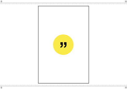
And one to check typeface pairings …
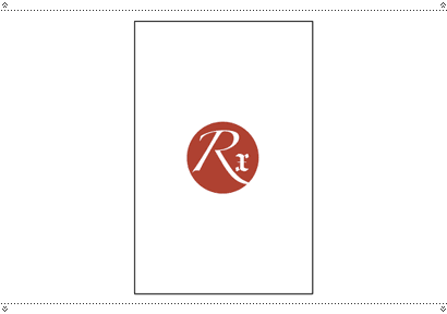
One for kerning …
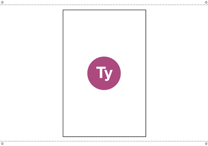
One for alignment …
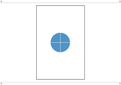
One for colour combinations …
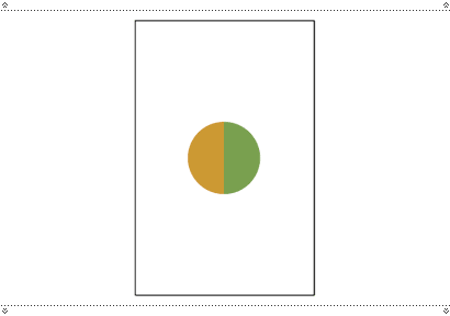
And one last general one for perhaps a basic overall fucked-up-ness that’s completely beyond redemption …
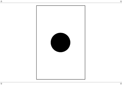
Imagine finding one of those slipped into your pocket, or on your chair when you return to your desk, or laid on top of your comp …

“I went down on my knees at once. On the floor close to his hand there was a little round of paper, blackened on the one side. I could not doubt that this was the BLACK SPOT; and taking it up, I found written on the other side, in a very good, clear hand, this short message: “You have till ten tonight.”
Maintained through our ADV @ UnderConsideration Program
ENTRY DETAILS
ARCHIVE ID 2072 FILED UNDER Miscellaneous
PUBLISHED ON Sep.08.2004 BY marian bantjes
WITH COMMENTS
Comments
Daniel’s comment is:

Nice one Marian; great read. I just got back from watching The Village at the cinema and in a similar way, this post brings forward an idea of the past; presenting a more simple, effective way about the present.

What about one for layout?

On Sep.09.2004 at 01:03 AM
kev’s comment is:

One for being pretentious...

On Sep.09.2004 at 03:07 AM
mGee’s comment is:

And while you're at it, why not bring back the scarlet letter A.

How about just telling your designer "friend"? It might make you a better friend.

On Sep.09.2004 at 07:26 AM
Armin’s comment is:

Marian, this could really be developed into some sort of learning tool for undergrad designers. Like a first or second semester teaching aid, with explanations on the back on how to correct the "problem". And instead of getting a piece of gum in each deck, they get an eye patch.

I once heard that Mr. Tharp — and I can't verify this, maybe he can if he reads this — used to send tickets (like parking tickets) to people who did bad design. See? We need some sort of DMV for design…

There should also be Bad Design awards or annuals.

On Sep.09.2004 at 08:23 AM
marian’s comment is:

And instead of getting a piece of gum in each deck, they get an eye patch.

Arrr! Avast!

I have always wanted to have a Design Police. My fellow colleagues and I used to joke about what fun it would be to storm into offices and seize bad material. We came very close to printing up T-shirts.

Funny, I like to tease my boyfriend Dante, who is fairly opinionated about most things, about giving out citations to people who do things incorrectly (in his opinion). When he approves, I say, "So it gets Dante's Certificate of Approval, then?"

There should also be Bad Design awards or annuals.

Would we have to pay to enter them?

On Sep.09.2004 at 08:42 AM
bryony’s comment is:

this could really be developed into some sort of learning tool for undergrad designers.

I have to agree. This could be turned into a great tool for students and even interns to learn more based on application. It is great to hear the theory of things, it is another to understand it, and yet a completely different thing to learn how to apply. Acting in ways of cheat sheets, this symbols with explanations could develop a better understanding of all of the above.

You could also look at them all together, say at the end of the semester, and analyze the progress achieved in a certain period of time, in each of the categories covered.

On Sep.09.2004 at 08:55 AM
Armin’s comment is:

> Would we have to pay to enter them?

They would be funded by the Design Police.

On Sep.09.2004 at 09:09 AM
Daniel’s comment is:

Should someone pass this on to Ellen Lupton at Design Writing Research?

On Sep.09.2004 at 11:07 AM
Mike’s comment is:

The Design Police.

Boy, they would be the busiest division of law enforcement. Just think of all the doughnuts.

On Sep.09.2004 at 11:09 AM
Darrel’s comment is:

Personally, I just prefer it when someone just comes out and says "your kerning is all fucked. FIX IT!"

On Sep.09.2004 at 12:02 PM
Andrew Twigg’s comment is:

hmmm... I can't imagine coming back to my desk and finding one of these without being absolutely infuriated! I'd much rather a friend OR an enemy tell me what's wrong, and why it's wrong.

This reminds me of the system used in my kindergarten and first grade classes: One earned green bones and red bones ( Clifford was our class mascot both years, which explains the bone thing) - green were for good deeds, red for bad, and you pay off red bones with green ones, or use green ones to "buy" things from the goodie box. Luckily, though, the red bones didn't magically appear over night, they were given to you by the teacher on the spot and you were told why. Incidentally, I think I only ever got one red bone, and I was humiliated!

Anyway, the idea is interesting, but I agree most with mGee and Darrel. Saying my kerning is off or my color choice is bad isn't really helpful. Let me know how it's off and you'll do me a favor and maybe make me a better designer.

On Sep.09.2004 at 12:17 PM
marian’s comment is:

Isn't it odd. Perhaps I'm just too playful by nature, but I can imagine receiving one of these and feeling the comedic horror of it, followed by the—shall we say—treasure hunt to find out what I did wrong. "My kerning? My fucking kerning? Where?"

I would probably learn more from reexamining my own material than having someone point it out to me. And I would enjoy it more.

I would also enjoy throwing it back in the face of whoever gave it to me (playfully, joyously, with humour: "You bastard! You yellow spotted me!") if I disagreed with their verdict. Like Long John Silver, I would enjoy dissuading them of their call on my behaviour.

And of course I would love giving them out, and watching them gasp in horror then try to find their error.

All this education and professional respect ... I will always choose fun and graphics with a spot of impish glee.

On Sep.09.2004 at 01:44 PM
Darrel’s comment is:

Tangentally related to this is the concept of 'extreme Design' which I've simply stolen from proponents of 'extreme programming'. In the programming world, the concept is that two heads are better than one and two people, working side-by-side on the same code on the same computer will have a total productivity higher than the sums of their work had they been working independantly.

I think the same applies to graphic design. One of the more rewarding environments I've worked in was at a small 4-person design firm where we all worked in one open room on the same project. We'd whip out ideas, throw them on the wall, and then we'd all contribute/critique/ripapart all the ideas and take them to completion as a group.

It's akin to a band where individuals take writing credits vs. where the band shares the writing credits. Sharing the process makse for less bruised egos and, imho, produces MUCH better, quicker output. The old 'whole is greater than the sums' philosophy.

On Sep.09.2004 at 01:45 PM
Armin’s comment is:

> Let me know how it's off and you'll do me a favor and maybe make me a better designer.

OK, fair enough… we can put a space for "notes" in each card, so that people can write some of their own banter.

On Sep.09.2004 at 01:46 PM
lorenzo’s comment is:

This reminds me of the system used in my kindergarten and first grade classes:

Yeah, this too reminds me of the gold, silver or no star on the forehead system teachers had during kindergarten and first grade. This is a great idea, quite simple and definitely very graphic. I'd want to collect them all. Oh yeah, what about for layout or job well done?

On Sep.09.2004 at 03:00 PM
bDuffie’s comment is:

It's time to put this idea in to practice. I plan on printing some of these out and using them during critiques this quarter. I'm sure most of my classmates will say WTF, but then they don't read Speakup.

And personally, I feel that making the designer (especially at the student level) find their own errors in color, type/kerning, and layout will make them a better designer and better able to self-critique for later in their careers. It is important to say there is a problem, but always pointing out exactly where can be counter-productive. Granted, I want to know exactly where the problem is when I'm on deadline though.

On Sep.09.2004 at 10:38 PM
Rorie’s comment is:

A Black Spot campaign has already been held, by the lovely people over at adbusters.

It was used to 'unbrand America' - put a black spot on any corporate logo such as Nike or McDonalds, which condone sweatshops, animal cruelty and unethical practise etc.

Were you aware of this?

On Sep.10.2004 at 03:07 AM
Armin’s comment is:

Yup.

On Sep.10.2004 at 08:37 AM
jo’s comment is:

Wow, this really does hearken back to elementary-school days, where teachers pass out those "Great Job!" stickers if you spelled your words-of-the-week right. We should definitely have reward stickers for good design.

I love the simplicity and pleasing aesthetics of these designs. As a recent graduate with fresh student memories, I can imagine the frustration I'd feel as a first-year graphics student who wasn't being told exactly where the problem was. It seems like a trial-by-fire approach, which would work for some, but grate against other learning styles.

What I imagine could be a gradual introduction: teach 'em what kerning is first, and then warn them, "Next week, we won't tell you where they are anymore, but you'll receive these!" and wave a little sheet of condemning spots in their faces. That'd keep 'em on their toes...

(This is hardly the profound post I had imagined I would create after lurking around Speak Up for so long, but that's a different [neurotic] story.)

On Sep.10.2004 at 10:08 AM
Chris Rugen’s comment is:

In my undergrad classes and in her grad classes at CMU, one of my professors, Karen Moyer, would use (in a very teacherly and non-insulting manner) colored stickies to denote 'venial' and 'mortal' sins for her basic typography exercises. She'd then group them and we'd review the whys and hows. It was good because it allowed the students to say to themselves "OK, what could I have done wrong" before we examined them as a group and classified the various types of general mistakes/conundrums of the projects. I don't know if I could do it myself, but it was very effective, particularly in the tightly controlled environment of typographic fundamentals.

As a professional, I'd really prefer a brief, to-the-point note or meeting.

On Sep.10.2004 at 10:09 AM
marian’s comment is:

Were you aware of this?

Nope. (Where the hell was I on July 3?) But I see no evidence of pirates in their campaign.

I think the cards are not for fragile egos, nor are they for insecure environments. I think they would have gone down well in my former office because we already had a close, open and friendly relationship between designers. Being tipped a spot in such a circumstance would have been received as both fun and serious. For myself, I would prefer the cards to oh-so-seriously discussing an error, because they are more amusing: they give a clue and I'm "dooty bound" to find the rest, or prepare my defence.

I have received a request for a PDF of the spots. If anyone else wants them, just drop me a line at my first name at underconsideration.com.

On Sep.10.2004 at 01:28 PM
Don Julio’s comment is:

There's a little black spot on the sun today.

On Sep.10.2004 at 07:40 PM
Anthony Edwards’s comment is:

I agree with Kev — oh, and yes, this might be a little bit of resentment for not getting back to me about using your quote, Marian.

On Sep.10.2004 at 09:52 PM
Rob ’s comment is:

I have to say, in all simplicity, that these are just fabulous. I have requested the PDF and am looking forward to sharing these with students at MICA and will hopefully get back with their reaction to them. I can't wait.

Thank you Marian for this brilliant adoption of something that most would have merely overlooked as just another scene in a great tale.

On Sep.11.2004 at 10:14 PM