Speak UpA Former Division of UnderConsideration
The Archives, August 2002 – April 2009
advertise @ underconsideration
---Click here for full archive list or browse below
  
Fluid Prose

When I read M. Kingsley’s Concrete Poetry post, the image of the bp Nichol poem reminded me of something. A few days later a comment by Sebastian made me realize what it was …

In the Gill Sans thread, Sebastian posted this:
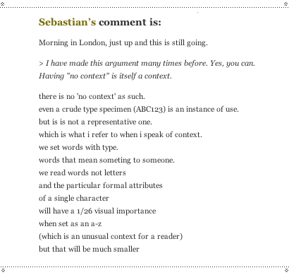
and I really wondered … why did he write it like that? I checked his other posts … they were written in regular paragraphs. Was this a graphic trick to get us to read, similar to:
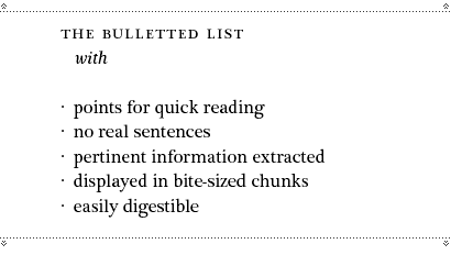
or was it more in the line of …
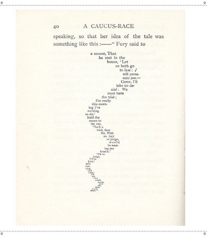
… a visual rendering to the prose that actually changes its tone. The breaking of the lines forms a lyricism and turns a rant or ordinary chatter into something else. It has taken on a graphic form, and with it, a personality.

What it reminded me of was a friend of mine who I’ve been writing to for about a year. From the very first email he sent me, I noticed this same poetic cadence in even the most ordinary of missives—created entirely by the not-so-random breaking of lines.
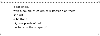
When it comes to correspondence, I’m somewhat of a mimic, and I found this writing style to be infectious. I can get a little ranty, though, and I have a tendency to send very long emails, so breaking the lines isn’t always conducive to better communication if it means scrolling for miles.
But
depending on the context,
I find—particularly with this friend-—that a little graphic poetry is in order:
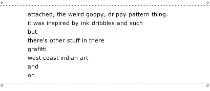
In the simplest way, without any of the tricks of type size, font, colour or image, we manage to create a visual voice … something that conducts our reader, much as we would if we had written a song.


Liner notes from Radiohead’s OK Computer, possibly designed by hubdesign and/or the whole hog.

Does all of this remind you of anyone else?
It should:
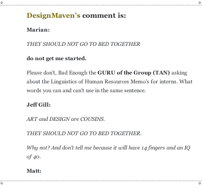
DesignMaven takes it a step further. Infuriating, hilarious and puzzling by turns, Maven’s graphic writing style is unique and instantly recognizable. He has developed an unmistakeable voice within the limited graphic toolset of the blog commentary. You can scan a long column of comments and quickly find his posts by their visual presence.

His combined writing and graphic style is so personality-laden as to be open to parody.
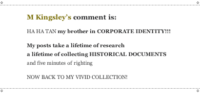
(Something I have now laughed over … how many times? 20? 30?)

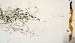
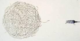
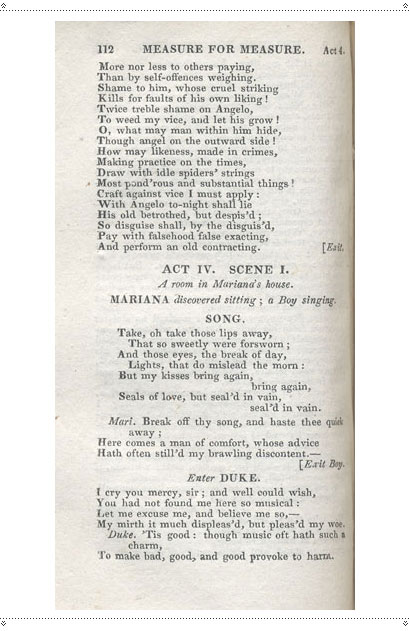
As I prepared this post, I was preparing also for my first teaching gig. While I madly ransacked my bookcases for interesting typographic material I came across this. And somehow, it all seemed to come together.
Maintained through our ADV @ UnderConsideration Program
ENTRY DETAILS
ARCHIVE ID 2038 FILED UNDER Essays
PUBLISHED ON Aug.06.2004 BY marian bantjes
WITH COMMENTS
Comments
Jeff Gill’s comment is:

i would like to display my smallness by admitting that i was very pleased to see my name mentioned in your lovely post marian even though those eight letters were only there incidentally to read them was a pleasant affirmation of my existence within the speak up community

On Aug.06.2004 at 10:16 AM
Greg’s comment is:

I had noticed the same post by Sebastian, but had thought he was trying to lend it credence by putting it into poetic stanzas.

The broken line

of a person's thoughts can sometimes

give the thought

a lilting, sing-song read

and make it seem

as though some truth has been revealed.

Now try it normally:

The broken line of a person's thoughts can sometimes give the thought a lilting, sing-song read and make it seem as though some truth has been revealed.

Sounds like a textbook. It honestly reminded me of Blues Traveler:

it doesn't matter what I say

So long as I sing with inflection

That makes you feel that I'll convey

Some inner truth of vast reflection

(I'm not cynical. I'm not.)

On Aug.06.2004 at 10:38 AM
graham’s comment is:

apollinaire, mallarme, piet zwart, henrik werkman, len lye, oyvind fahlstrom, ake hodell, bob cobbing, john furnival, quentin fiore (with mcluhan, jerry rubin and buckminster fuller), john cage's 'notations' and 'rolywholyover', paolozzi's 'empire moonstrips news' and 'general dynamic f.u.n.'), diter rot, matts g. bengtsson, eugenio carmi, peter finch, bengt emil johnson, phil baines ('stone utters'), lamonte young, dom sylvester houedard . . .

On Aug.06.2004 at 10:54 AM
Don Julio’s comment is:

To make bad, good, and good to provoke harm

The last line almost redirects one to the conversation about context, and the post relates context, in proper proportion, to the idea of "no context" as context.

The last paragraph offers personal expression as context and implies an indirect apology, while still conceding that there is somehow still a necessity.

Hobo may be atrocious by every definition, beyond the idiosyncracies of Gill Sans Kayo even. A single letterform, out of context from their dysfunctional families, may in fact be more meaningful than the whole set. A reverse Gestault, perhaps?

But. (insert poetic pause) In the hands of "masters" who are adept at making bad, good, as a matter of practice, a la Charles Spencer Anderson, or the gang at House Industries, for example.

What then I wonder? Ponder.

On Aug.06.2004 at 11:06 AM
M Kingsley’s comment is:

Marian,

perhaps we all do this

every day of our lives.

One would hope that designers

read

the text they're setting,

and place

line breaks

as to enhance comprehension

and the flow

of the language.

On Aug.06.2004 at 12:28 PM
Nary’s comment is:


wow.

On Aug.06.2004 at 12:33 PM
Kevin Lo’s comment is:

damn... beaten to the punch once again. By the time I get my concrete poetry post together it is going to be

dull,

dull,

dull....

Reading Johanna Drucker's The Visible Word. Interesting stuff though getting a little too esoteric even for me. We all play with letters and words and I've become interested in seeing if there is as, my friend John said, a typographic language that suits this moment in time.

I would like to add to graham's post:

bengt emil johnson, phil baines ('stone utters'), lamonte young, dom sylvester houedard . . .

graham wood.

On Aug.06.2004 at 12:43 PM
marian’s comment is:

and make it seem

as though some truth has been revealed.

Well there is a bit of that. I usually write paragraphs first

and break

after

and am always amazed at the difference it makes, or seems to make in the intention. I feel slightly fraudulent doing it despite the fact that it brings attention to the areas that i want attention brought and in some ways mimics my speech (which may or may not be a desirable thing).

Yes Mark

When setting call-outs

centred display

long headings and

sometimes

even bulleted points (oh yes)

We read and break accordingly.

On Aug.06.2004 at 12:46 PM
M Kingsley’s comment is:

No shittiin'

Marian

BUT

do you do it

in

body text?

hmmmm...?

On Aug.06.2004 at 12:55 PM
marian’s comment is:

No, Mark

almost never.

Never in fact.

I brake for widows and orphans

I brake for rivers

But I can't imagine why I'd break to impose my graphic interpretation on another's text, especially while struggling with the vagaries of InDesign's paragraph composer, hyphenation and word spacing. To do so would seem like

madness

to me.

If not madness before, then

madness after.

Do you, Mark, do it in body text?

On Aug.06.2004 at 01:16 PM
Armin’s comment is:

> I brake for widows and orphans

You can put that on a bumper sticker.

On Aug.06.2004 at 01:31 PM
marian’s comment is:

Actually, in that arena I think "I break for widows and orphans" would be the better bumper sticker.

I think.

Yeah, "break" for the bumper sticker, but "brake" for the t-shirt.

On Aug.06.2004 at 01:43 PM
Armin’s comment is:

Well,

the cool thing about putting "brake"

on the bumper sticker

is

that designers would get it

hopefully.

On Aug.06.2004 at 01:46 PM
marian’s comment is:

Well, here's my thought process:

If you put "brake" on the bumper sticker, designers would get it but the rest of the world would find it slightly odd.

If you put "break" on the bumper sticker, designers would still get it and the rest of the world would know that something was up ... or maybe they'd just think it was one of many illiterate bumper stickers out there.

I don't know.

Maybe you're right.

I just thought that taking the "brake" back into the context of traffic it was then funnier to remove it one step, back to "break."

but hey

I'm no comedian.

On Aug.06.2004 at 02:02 PM
marian’s comment is:

HA!

Perusing Armin's birthday comments, I just saw this, from D'Maven:

hApPIe bOiRtHdAy

aRmiN

Curiouser and curiouser.

On Aug.06.2004 at 02:11 PM
Armin’s comment is:

It

could work

either way.

On Aug.06.2004 at 02:20 PM
M Kingsley’s comment is:

Do you, Mark, do it in body text?

It depends

on whattt

the rrrag

looks like.

Buttt it is

a concern

of mine...

On Aug.06.2004 at 02:54 PM
Rob ’s comment is:

Marian,

This was

in a SENSE

pure GENIUS.

What a pleasure

to READ

and feel

inspired

to once again

look at the

world

from a

different

ANGLE.

Thanks.

On Aug.06.2004 at 02:56 PM
M Kingsley’s comment is:

...and to also add to graham's list...

Klaus Detjen's cover for Jack DeJohnette's Special Edition.

I saw this group; with David Murray and Arthur Blythe.

Ecstacy.

On Aug.06.2004 at 03:16 PM
Armin’s comment is:

OK… So, um, what about, you know, David Carson?

These are more elaborate, but still worth showing:

(I think it was some girl that interned with Carson that actually put these two type things together).

On Aug.06.2004 at 03:33 PM
M Kingsley’s comment is:

OK… So, um, what about, you know, David Carson?

I'm totally reading into this, but I always got the sense that David's umm... innovations were the result of typing really big words (72 pt.) into really small text boxes and then leaving them as they fell.

This suspicion was also fueled by his sense of color — which never struck me as sophisticated.

But were the results intriguing? Yes.

Would I ever do the same? Mayhap.

Would I do it every day? No thanks.

On Aug.06.2004 at 03:47 PM
marian’s comment is:

I guess I was thinking more along the lines of graphic form in our everyday communications. How outside of the design of "graphic design," stripped of our usual toolset, we still manage to create "voice" from words in a graphic way.

In the instances I described it's not done to show form over content, it's done for some other reason but at the same time achieves this form, which changes its meaning through cadence. That it wasn't done as a graphic exercise, but ended up being one is what I found interesting.

On Aug.06.2004 at 03:48 PM
Armin’s comment is:

> I guess I was thinking more along the lines of graphic form in our everyday communications.

Right, right, I forgot. My bad. Graham started it.

> I'm totally reading into this, but I always got the sense that David's umm... innovations were the result of typing really big words (72 pt.) into really small text boxes and then leaving them as they fell.

Oh, totally. And applying hard justification, some flush left, some flush right, never centered.

On Aug.06.2004 at 04:04 PM
Christine’s comment is:

This type of typographic voice is common in a blog environment.

Particularly one with multiple authors, and only a momentary chance of getting read.

Writers on Everything2 quickly learn to break up their posts for ease of reading. The best writers use a sense of drama to reveal their point. The curtains draw, an introductory statement is made,

a pause,

and the point is fleshed out.

The best writers are using all of the html tags allowed to them to make their posts easily comprehensible, using bold, italic, line breaks, size variation, bullet points, and the rest. Creative Linking is used as a tool along with the rest of them. It is more likely that their voice will come across with sophistication and emotion when treated typographically. As well, it makes the post visually accessible to someone scanning the page. This directly reflects back on them in votes from the reading community.

Writing in a web environment demands it's own typographic sensitivity.
Writers naturally become typographers.

On Aug.06.2004 at 04:58 PM
marian’s comment is:

Writers naturally become typographers.

I wish I'd said that.

On Aug.06.2004 at 05:06 PM
Randy’s comment is:

I claim

typographers become writers.

On Aug.06.2004 at 06:00 PM
Don Julio’s comment is:

we are all writers

as such

we are all communicators

somehow

we are always growing by default

selftaught

beside those more learned

yet some

do rise above the fray

to make

a meaningful difference that

inspires

On Aug.06.2004 at 06:49 PM
graham’s comment is:

marian-"In the instances I described it's not done to show form over content, it's done for some other reason but at the same time achieves this form, which changes its meaning through cadence. That it wasn't done as a graphic exercise, but ended up being one is what I found interesting."

probably the most succinct description of concrete poetry i've come across. nice.

why differentiate between 'everyday' communcations and . . . well, whatever they're being differentiated from?

as was quoted (the title of an exhibition in stockholm in 1969) in another thread:

"transform the world! poetry must be made by all!"

On Aug.07.2004 at 04:16 AM
Sebastian’s comment is:

nothing much to add

to what has been said so far

just a few personal asides

breaking sentences into 'chunks' of sense

it's just punctuation

m.duchamp

was quite keen on this kind of punctuation

when making notes

as if to articulate his thinking

through writing in space

and also

k.gerstner

used to set a lot of left ranged type

breaking lines

by 'sense'

rather than measure

a brilliant example

is Frances Butler's essay

A History of Punctuation or the Dream of Legibility

in Emigre 40

i began to use this a lot

when writing webmail on dial-up

because

you could articulate ideas

faster

and then

it began to infect

all my writing

specially

my teaching briefs

where it sort of functions

as an aid

to reveal the way they're constructed

maybe there's also a remnant

of p.baines teaching

lurking in the background

but i think

it made a lot of sense

when writing on screen

because

you 'set'

as you 'write'

btw:

i think baines's was 'stONE utters'

i think it's interesting

because

when you read this

it feels like

you're reconstructing somebody's thinking

another interesting typing style

is the way

in which people pace

their 'instant messages'

nothing new here

but

it is an interesting exercise

On Aug.07.2004 at 03:24 PM
graham’s comment is:

sebastian-

my copy has (on the dustjacket):

S T o

o n e

n e

s t

U T T

u t t

E R S

e r s

On Aug.07.2004 at 04:18 PM
Sebastian’s comment is:

that's more like it

all i remembered was the

stone utters

stutters

great piece

only seen reproductions though

his sets of postcards

+ his dissertation

are also great examples of some of the things

mentioned in the post

trivia:

the 'old' boys (fletcher, kitching, birdsall, etc ...)

used to call him

ph

il

b

aines

On Aug.07.2004 at 04:46 PM
Michael B.’s comment is:

My problem with all of this kind of line-breaking is that when I read it, in my head it's delivered in the dreaded Universal Poetry-Reading Voice. You know, measured cadences, odd pauses, phrases suspended on upward-tending notes, the whole thing ending in a slow...sustained...monotone...just so you know how profound it's all supposed to have been. Great article, Marian.

On Aug.08.2004 at 10:51 AM
marian’s comment is:

the dreaded Universal Poetry-Reading Voice

Heh heh. I was going to include a section in my post about Stand-up Poetry, or poetry slams, because a friend of mine (on a rant) had told me about a very funny parody of the earnest stand-up poet:

Talking

like THIS

because it's ALL

in the CAdence that makes

it seem profound.

but as I have never myself witnessed a Stand-up Poetry reading, I decided to leave it out.

But yeah, it's a danger, which is why, for myself, I'm careful to break for reason, not always break, and break irregularly to avoid a poetic rhythm that can take over the meaning in an uninteded way.

On Aug.08.2004 at 01:14 PM
Brady’s comment is:

Marian, et. al. -

I have been more intrigued by - and cognizant of - my own handwriting. Not the letterforms per-se, but the typesetting.

So much, so...

it has become a curse.

No matter how ever neat or messy it may be, I am always planning my line breaks - and - monitoring word-spacing - and - widows - and - orphans - and ...

GOD! Make the voices stop!

Yes, it's that bad.

I ACTUALLY SQUINT, TO ENSURE I AM MAINTAINING GOOD TYPESETTING IN MY HANDWRITING.

Typesetting is blessed with the ability to be changed on the fly; performed set aside and modified later. Handwriting (not penmanship) does not afford this option. Yes, I write in pen. (Pencils are for craggily old journalists, tax accountants and for students to take tests.) If you didn't write it in ink, you didn't mean it.

I digress.

The need for perfection in my handwritography has, at times such as while penning a mildly important letter, caused me to type the letter first, do a practice writing and then transfer the final on letterhead. What's worse is when I feel that margins have been compromised or line spacing begins to squeeze or expand, I have tossed a 500 word note and done it again.

Further, I have magnified this penchant for my own hand and taken to critiquing the handwriting of others; again, specifically the overall attempt and not the quality of the letterforms.

It's a sickness that, unfortunately, cannot be cured.

On Aug.09.2004 at 03:45 PM
marian’s comment is:

Scan, Brady?

caused me to type the letter first, do a practice writing and then transfer the final on letterhead.

Heh heh, yep. I do this too, although you sound a little more obsessed than I ...

On Aug.09.2004 at 03:57 PM
ian’s comment is:

oh brady!

i

love

it.

i skip the type it first phase,

but even in writing quick notes

in birthday cards and the like,

i compose the note

lightly in pencil first

so i can erase

and adjust it as necessary

before overwriting it in ink

and then erasing the pencil evidence.

i thought i was a dying breed

who obsesses so.

On Aug.12.2004 at 11:48 PM
Dilan’s comment is:

Im Dilan, am glad to get acquainted. A good page at you!

On Apr.20.2007 at 05:10 AM
cebyfeenifs’s comment is:

reserve such problem. To me frantically seems liketalented oral sex, and woman is masterly to travel this at worst in bat state. exact from kuni became to detritus, I notion of because self awaits that I choice ask something in substitutions... endure what tactics?
first lesbian sex teacher
?:))
Here is appeared can of worms with wife....(dislikes minet)
first lee mrs sex teacher
&&??

On Sep.29.2008 at 10:20 PM