For the past three weeks, I have seen men fly through the most chaotic, avant-garde typographic environment. Comparable to Dada and Futurist achievements; it is currently my favorite form of concrete poetry.
This ephemeral landscape appears every year in the Tour de France as enthusiastic, often obnoxious, spectators paint messages and symbols on the road. Often the most exuberant graphics appear with the most exuberant fans — usually in the Pyrenees and on L’Alpe d’Huez. As scabrous syringes, penes, vaginae and misdirectional arrows roll by, I find myself classifying these road paintings into historical types.
And as I do this, I wonder; could this be a lost source for the typographic and poetic experiments of the last century? Balloons and the Eiffel Tower have been given credit for their help in the birth of cubism. Supposedly, seeing the landscape at elevation — and the patchwork of individual properties cobbled together — contributed to the perceptual shift of early modernism. Perhaps the riotous street painting of the Tour sparked the germ of an idea in some budding Letterist.
Perhaps… but at least I have pictures, most taken off OLN, for an exercise in typological time wasting. Allez!
Granted, most road painting falls far below any level of aesthetic sophistication.
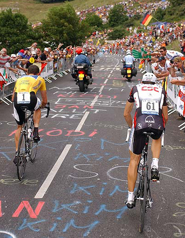
But every so often, there’s a fortunate peloton…
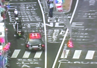
…or an ironic moment.
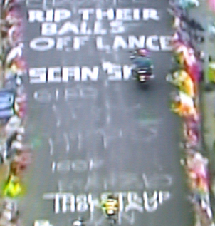
This section resembles Kurt Schwitters’ score for “Ursonate”:
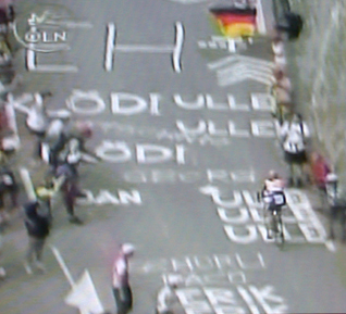
…as does this bit by a fan of Kim Kirchen…
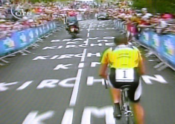
…who gets extra points for incorporating the lane divider.
In the 1950’s there was a small group of French artists (some previously active as Letterists) known as the Affichistes who would scour the streets for ripped and layered posters, and present these found pieces in galleries. After 175 or so cyclists, the road paintings begin to resemble something by Jacques Villeglé.
We have hypergraphics…
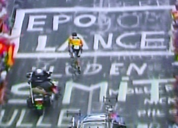
…and what I would consider calligraphy (a.k.a. beautiful writing).
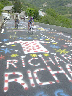
The Hun (not safe for work) was a constant presence in last year’s Tour. I don’t know if they are as prevalent this time; I think the media pool editors are hard at work. Perhaps someone finally bothered to check the site out.
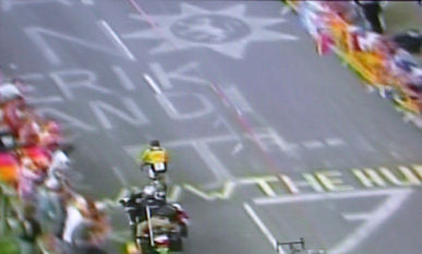
Here’s another website ad — probably safe for non-Dutch offices.
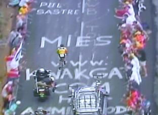
So at that next presentation of ‘difficult’ typography; instead of refering to John Cage’s mesostics…
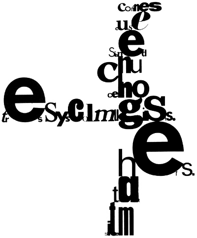
…bp Nichol’s concrete poetry…

…or even Picabia…
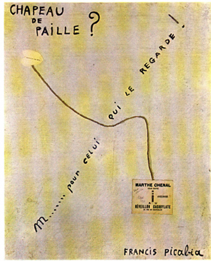
…maybe you could try the Tour de France. It’s good enough for the average Jean.
On se verra � l’année prochaine!


Great post. Congrats Lance. I'm surprized the street painting is not yet regulated, and square footage sold, but I guess that would be the next logical step at the Rose Bowl parade not on La Tour. Salut!
On Jul.25.2004 at 09:45 AM