Speak UpA Former Division of UnderConsideration
The Archives, August 2002 – April 2009
advertise @ underconsideration
---Click here for full archive list or browse below
  
Hazardous Freedom

In December 1965 three high school students in Des Moines, Iowa gathered at the home of Christopher Eckhardt, 16. The subject: opposition to the Vietnam War and how to protest America’s involvement. The solution: wear black armbands to school and fast on two days — activities they and their parents had previously participated in. School officials learned of the plan and quickly issued a policy that any student with an armband would be asked to remove it, and upon refusal would be suspended until they complied.

Christopher, his sister Mary Beth and John Tinker wore their armbands, were sent home, and did not return until after the agreed upon period for armbands had ended. Their parents sued for nominal damages and the case ended up in the United States Supreme Court (Tinker v. Des Moines) where Justice Fortas wrote the opinion:

But, in our system, undifferentiated fear or apprehension of disturbance is not enough to overcome the right to freedom of expression. Any departure from absolute regimentation may cause trouble. Any variation from the majority’s opinion may inspire fear. Any word spoken, in class, in the lunchroom, or on the campus, that deviates from the views of another person may start an argument or cause a disturbance. But our Constitution says we must take this risk… and our history says that it is this sort of hazardous freedom — this kind of openness — that is the basis of our national strength and of the independence and vigor of Americans who grow up and live in this relatively permissive, often disputatious, society.
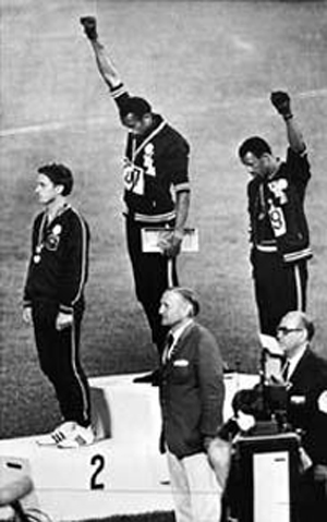
1968_Olympics.jpg

Three years later — October 18, 1968 — college teammates, then Olympic athletes, Tommie Smith and John Carlos won gold and bronze medals in the 200-meters. During the medal ceremony, Smith and Carlos stood in stocking feet, eyes averted away from the flag, and held a black-gloved fist in the air — the black power salute.

Smith said at the time:
I couldn’t salute the flag in the accepted manner because it didn’t represent me fully; only asking me to be great on the track and then obliging me to come home and be just another nigger.

It was the fist that scared people… White folks would have forgotten the black socks, the silk scarf and bowed head. But they saw that raised black fist and were afraid.

Their medals were revoked and they came home to death threats.

Skip ahead to…

On June 28 of this year, Sony Computer Entertainment America sent out a press release entitled “Sean ‘P. Diddy’ Combs, Jay-Z and Paris Hilton Join PlayStation2 to Celebrate 4th of July Weekend in Style.”

It read in part:
To kick-off the July 4th weekend, PlayStation�2 will celebrate Independence Day with the debut of the PlayStation�2 Estate, a private, all-inclusive retreat that will serve as the ultimate Hamptons destination. Located in Bridgehampton, NY and situated on six acres of pristine property that includes a three-acre pond, a 12,500 square-foot mansion with nine bedrooms and full guest amenities, the PlayStation 2 Estate will feature a series of private evening events hosted by Sean “P. Diddy” Combs, Jay-Z and Paris Hilton. During the day, the PlayStation 2 Estate will also offer a variety of activities to keep guests entertained such as spa treatments, badminton, horseback riding, canoeing, bocce ball, croquet, ping-pong, and the latest in PlayStation 2 gaming.

snip…

Sunday, July 4: PlayStation 2 and Sean “P. Diddy” Combs Celebrate the Red, WHITE and Blue.
Celebrating Independence Day “Diddy Style,” PlayStation 2 and Sean “P. Diddy” Combs will host the annual WHITE party. The ultra-exclusive event will feature a viewing of the original Declaration of Independence and a special musical performance.

During that star-spangled evening, Mr. Diddy launched his new non-profit coalition called Citizen Change.

I want young people to know that your vote can change your life… I am asking young Americans to hold their vote hostage and force the candidates to address our issues… There are only a few people in America who have the energy and enthusiasm to get young people to step up to the plate and get excited and passionate about this election, and I am one of them… The revolution has begun.

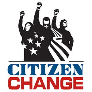
Of course, this effort needs a logo.
2004_Diddy.jpg

As you can guess, I’m worried. Worried that this initiative was announced at the “ultimate Hamptons destination” during an “ultra-exclusive event” — with no huddled masses in sight. Worried that Mr. Diddy borrowed Norman Lear’s copy of the Declaration of Independence and told guests that it was “his date”. I wonder… What are “our issues”? How does one “hold their vote hostage” — by not voting? What “revolution” is he speaking of? I’ve been to the website and there’s not much there. How is he planning to do anything in only four months without any plans of action? Its a good thing he got the logo done in time!

So here we are again; a once-powerful symbol held upside-down at the ankles with everything of substance being shaken out of its pockets. Eyes averted in bitterness are now averted because that’s what those two runners did — and I’m a runner! I ran a marathon! And that cliched criticism of being wrapped up in the flag is also appropriated without that difficult irony. Like a contemporary Potemkin village, I present the Citizen Change logo. No matter what one thinks of the type or how it’s drawn, you just know that we’re going to be seeing it on sweat suits and T-shirts.

The last words go to Olympian Jesse Owens’ comments to Tommie Smith and John Carlos:
The black fist is a meaningless symbol. When you open it, you have nothing but fingers — weak, empty fingers. The only time the black fist has significance is when there’s money inside. There’s where the power lies.

Ain’t that the truth.

Happy Bastille Day everybody. Don’t forget to vote.

Maintained through our ADV @ UnderConsideration Program
ENTRY DETAILS
ARCHIVE ID 2008 FILED UNDER Critique
PUBLISHED ON Jul.09.2004 BY m. kingsley
WITH COMMENTS
Comments
Kevin Lo’s comment is:

Great article mr. Kingsley. Damn that makes me angry. First thing to get up to, too...

So here we are again; a once-powerful symbol held upside-down at the ankles with everything of substance being shaken out of its pockets

This is a question that plagues me constantly. Images of resistance, which once existed in the public domain, in the public imagination, being transformed into commodity.

Here in the UK a trendy clothing company called BoxFresh is using the Zapatista slogan "We Are You".

NO YOU FUCKING AREN'T!

But not only do these uses empty the original symbol of its meaning, they subvert them and removing them from language. Now that Diddy's using his "citizen change"(ugh!!!!!), with all the bucks behind him, how long before we forget the image from the Olympics and what it meant. Sure, getting young people to vote (which is what it says on the site vs. what diddy has said about "holding the wote hostage") is important, but c'mon...... the elitism there just makes me sick.

The co-option of language happens so damn often these days that we take it for granted - especially as designers. Don't we have some sort of responsibility to history, to culture or is it all just another expendable resource for us to mine until its dry and we end upo in a landscape that says nothing to no one.

I was walking through soho with a friend the other night, not sure how I ended up there, desperately searching for a café that I could afford to have a coffee in, that was comfortable, where we could talk. All I found were posh clubs and bars - one sleek black box, with red lighting, and a ten-foot black-clad bouncer at the door. Its name? .... Revolution (set in disturbance no less).

what the hell can we do about this? I had a brief exchange with Tom Gleason about this once, and we were of differing opinions:

...You're right about the importance of cultural expressions alongside intellectual realm.

Is there a way to develop a visual language that cannot be co-opted? You think so, but I don't. Sure it's desirable, but some desires are silly. We want a visual language that is not only a sign of resistance, but a sign resistant to change. That's one or two steps away from idol worship, because we would be able to absolutize the meaning of these designworks. They would be timeless. Think of the Bible. People wanted that to be the absolute Word, but that has been proven impossible.

But should we fight against co-option or not? That fight is a fight against change, not FOR change. A movement which desires any kind of change should promote the possibility of change...

Kevin, fist in the air....

On Jul.09.2004 at 05:39 AM
big steve’s comment is:

Does anyone else see the guy on the right as a stubborn metrosexual (with his hand on his hip and the expression on his face)? And I swear that girl is supposed to resemble Che.

The narcissism of this makes me sick, from Puffy's quote that he has the power to start a revolution, to his face plastered in the middle of this logo. Hey, Puff, 1998 Called. They found your street wrapped in a silk Versace ascot! Seriously, this looks like a tax write-off at best, and is more likely to excite the Lizzie Grubman crowd than the Lizzie McGuire crowd. This is just another reason for a Cristal party, and another reason for Puff to make warm-ups with his ugly mugg on them (anyone see the MTV special he produced by himslf about him running the New York Marathon? Pulitzer quality journalism!). I'd imagine the non-profit funded, ultra exclusive Hamptons bash had an open invite to the youth of America, right? Or was it a benefit to raise money for youth activism? No? Ah, yes, it was devised to continue Bill Clinton's oft-forgotton Midnight Bocce Ball urban program. Right.

This is about as powerful and reactionary as the pre-ripped Anarchy t-shirts they sell for $20 in malls across America. It makes me sick to see a strong symbol of strength and social/political protest marketed on the most disguisting, cheesy level, but I take solace in my prediction that this is so out of touch that it probably wouldn't even make Ian Robinson's MTV News Break if Paris Hilton was caught playing strip PS2 with Jay-Z over a plate of caviar and blow.

The bigger issue is the youth of america, specifically my generation's apathy. On a daily basis I hear my friends and colleagues, college students and graduates whom i have usually respected as intelligent individuals, say things like politics are stupid - I just don't care about them and It doesn't matter to me who wins the election, it's not gonna affect me anyways. And then there are the kids who say (and there are a good number of them), 'I'm not gonna vote because I just don't know enough about either side.' IT'S FUCKING JULY, YOU'VE GOT FOUR F-ING MONTHS TO FIGURE IT OUT!. Some people say the mention of the draft would be enough to activate kids politically - I doubt it, since there are already hundreds of thousands of our friends and brothers and sisters and classmates fighting for their lives halfway across the world and no one seems to give a poop. I think Bill Cosby's comments last week speak to more than the Black community in America, they speak to an entire class of people, and an entire age group. But those comments are already forgotten, not to be brought up again until David Chapelle does a skit about it when his new season starts in the fall.

I know it's not the same as their identity, but i cannot help but think of Citizen watches when i look at the typeface.

On Jul.09.2004 at 07:29 AM
Michael B.’s comment is:

Unfortunately, the same principles that protect the original, authentic gesture also protect the inane appropriation of it. Of course, Jesse Owens identified the ultimate principle: the fistful of dollars. If Tommie Smith and John Carlos had thought to trademark the raised fist salute, they could be suing the ass off of P. Diddy today.

Great topic and great research.

On Jul.09.2004 at 07:57 AM
Tom Dolan’s comment is:

Great topic. Jeebus. Aren't P Diddy's 15 minutes about a week overdue?

On Jul.09.2004 at 08:30 AM
Rob’s comment is:

here are only a few people in America who have the energy and enthusiasm to get young people to step up to the plate and get excited and passionate about this election, and I am one of them

Mmmm....are his record sales down? This smacks of an attempt to co-opt the reputation of legitimate efforts (ie, MTV's Get Out the Vote) for some extra PR for P. Diddy, not to mention the co-opting of true revolutionaries who actually put something at risk for a their cause.

I'd say I'd be less cynical about this if he had started this effort a year or two ago and opened the doors to the youth of America with a real plan of action. When you can't even get your messages straight, well then, people start questioning your true intentions. And your symbolism becomes a liability rather than an asset.

Great topic and fabulous reasearch. Thanks.

On Jul.09.2004 at 08:51 AM
marian’s comment is:

Appropriation and subversion of symbols of power and protest is now an old marketing trick. How many times have you been outraged to hear a song used in advertising whose original intent was the antithesis to, if not the product, the concept of selling anything ...

The peace symbol, the Anarchy symbol, Che Guevara, Karl Marx, the cross ... all have fallen, through one method or another, to the mighty dollar.

This situation seems more overtly manipulative and blindly stupid, however. It is really unfortunate that that fist full of dollars didn't land in the hands of someone with intelligence and the real will to spearhead a movement.

Interestingly this goes back to some of our previous debates over the symbology of logos vs. the actions of an organization/corporation. As we've noted in the past, they can represent themselves however they want, or tell us who they are, but unless they actually follow through, that representation is meaningless--or in this case, nauseating.

Imagine for a moment that this "organization" was not unveiled in the way and place it was, the confused sentiment announced in the way it was by the narcissistic and frankly stupid person it was. Imagine that many fists full of dollars had been contributed to a genuine campaign to get young people to vote, and to read and to understand the issues; imagine it had been unveiled in inner-city neighbourhoods across America along with, say, centres devoted to providing access to political information staffed by people ready to explain and discuss the issues (for example). How does the logo look under those circumstances? The 3 races, the raised fists, the flag, and of course the name "Citizen Change"?

I guess my point is that the meaning is not in the symbol but in the actions behind the symbol no matter what that symbol is.

Great post, Mark. Thanks.

On Jul.09.2004 at 09:07 AM
Arikawa’s comment is:

Coopting other's works/stands/ideologies is nothing new for Diddy. All of his 'hits' have just been re-workings of old songs.

On Jul.09.2004 at 10:40 AM
nick shinn’s comment is:

ok, an old white guy weighs in.

at least I get it.

it's like that movie "White Chicks" where all the white critics said "how come all the white characters don't notice how fake the masks are?" duh -- whitey don't get it.

there are many viewpoints, agendas and strategies within hip-hop, but Sean is doing what he does best, going beyond parody of the commercialized, celebritized, blingified, self-referentialized monster of mass culture, taking it at face value. post-ironic.

vanity? -- give him his due. these days, everybody's proud and it's humilty that has the stigma.

kevin, you ask "Is there a way to develop a visual language that cannot be co-opted?" and P. Diddy answers, the question is irrelevant. and the money is in his fist to prove it.

On Jul.09.2004 at 10:51 AM
M Kingsley’s comment is:

This smacks of an attempt to co-opt the reputation of legitimate efforts (ie, MTV's Get Out the Vote) for some extra PR for P. Diddy

If you follow the link to register to vote, you end up on a page with both the Citizen Change and the Rock the Vote logos. So I guess there's not even staff over at DiddyCentral to start this 'revolution'.

I guess my point is that the meaning is not in the symbol but in the actions behind the symbol no matter what that symbol is .

Marian — I'd like to think that all my Branding rants are beginning to have their effect on you. ;)

On Jul.09.2004 at 10:56 AM
Jerry’s comment is:

Don't we have some sort of responsibility to history, to culture or is it all just another expendable resource for us to mine until its dry and we end up in a landscape that says nothing to no one.

I would like to believe that we do, but remember? We have a duty to our clients’ needs first, as long as their message is materialized, we have done our best. We’re visual butlers.

On Jul.09.2004 at 11:02 AM
marian’s comment is:

Marian — I'd like to think that all my Branding rants are beginning to have their effect on you. ;)

Mmmmm ... Mark, all your rants have always had an effect on me. And when it comes to branding, I have no memory of disagreeing with you--however, my memory is infinitely fallible, so keep up the good work.

On Jul.09.2004 at 11:30 AM
Darrel’s comment is:

“Sean �P. Diddy’ Combs, Jay-Z and Paris Hilton Join PlayStation2 to Celebrate 4th of July Weekend in Style.”...sums up America quite nicely methinks. ;o)

On Jul.09.2004 at 12:07 PM
Omar’s comment is:

Thanks for that Mr Kingsley.

A very nice essay, indeed.

I've have a thought to share though...

One reason a black-gloved fist raised in the air doesn't instill the same fear as it did in '68 is that the state of racism in America is not nearly as bad as it was then. To a large degree, the Civil Rights movement was successful.

Sometimes, images which call for socio-politcal change lose meaning because...well, the change takes place. Their only meaning resides in history.

I find it perplexing that some people will remenisce about certain images which called for change, and yet are not willing to accept that times have changed.

The fact that some of these images have lost all meaning is a good thing - they were successful. To some extent you should be happy to see these historical images on tshirts. You should be happy that they haven't been forgotten and lost to history.

What saddens me is that, rather than attempting to create new symbols for today's problems, people are so reliant on yesterday's. Maybe that's because we really don't have any problems? Or maybe it's because there's such a disconnect between western culture and today's, more international, problems?

Cheers.

On Jul.09.2004 at 03:33 PM
Omar’s comment is:

One more thing...

A major reason capitalism is so eager to co-opt these symbols of protest is that today's youth culture responds to them so well. And they do so, void of any historical background. It's amazing how effective these images are - how they're able to magically exude an atmosphere of reform outside of their original context.

So here's a toast to the creators of these images.

You're a good lot.

On Jul.09.2004 at 03:44 PM
M Kingsley’s comment is:

Omar -

Please don't put words in my mouth — I'm hardly nostalgic for anything mentioned in the post; only critical of the mercenary cynicism behind the Citizen Change project (at least it's current incarnation).

The success or failure of the Civil Rights movement is a debatable point. One that I'm not going to even bother addressing further than to suggest Googling the difference between the Black Panthers of the 60's and today's New Black Panthers. There are always alternative views.

A brief skimming through basic semiotic or linguistic theory can answer why symbols are often derived from previous ones. Communication requires a common basis and total originality is a difficult position to begin a dialogue.

On Jul.09.2004 at 04:27 PM
Omar’s comment is:

Have I offended you?

When did I ever put words in your mouth? My comments weren't directed to anyone specifically. It was just a general observation. Don't flatter yourself. If I'm going to criticise you, I'll address you directly Mr. Kingsley. The negativity which you read in a comment is the negativity with which you read in it. The only thing I had to say to you was that I enjoyed you're writing. You're welcome.

And I don't need "a brief skimming through semiotic or linguistic theory." Thank you for the suggestion though.

I'm not asking, nor did I ever ask, for origniality. Nowhere in my two posts do I see the word "original" used in that context. If you're so interested in language, maybe you should spend more time reading what I've written. It seemed to me that an issue of discussion was the recycling of political symbols for use in today's political struggles. That's what I read in it. My apologies if I am mistaken. Why do you assume that because I ask for something new, I'm asking for something void of all communicative functionality? Or even something original for that matter. Placing some contemporarliy relevant text underneath a image borrowed from an earlier day and age is hardly what I consider to be establishing a "common basis" for the sake of communication - but it's what most of the political images I see today amount too.

I cannot, in recent memory, recall any new political images that have struck my fancy. I'd like to see some if anyone has come across one. Also, I'd be curious to know (and see) what was the "common basis" of the images we are nostalgic for.

As for the success of the Civil Right's movement, I know I'm not nearly as fear stricken as white American's were in the 60's. I think that's the case for many others. It is that fear which made what Tommie Smith and John Carlos did so effective. I feel that the progress made, in this regard, is a major reason as to why symbols which came into existence during the Civil Rights movement have begun to lose meaning in the public's eye.

Have a great weekend everybody.

On Jul.09.2004 at 05:15 PM
Robert L. Peters’s comment is:

Thanks for the thoughtful post, M. Kingsley.

On Jul.09.2004 at 05:42 PM
Brady’s comment is:

This makes me so ill I can't put together a coherent comment on the whole, PlayStation/Diddy/Paris thing.

Mark, you must still be trying to scrub the filth off of you after having to cobble together such a great article from such a rotting pile of garbage this media event was.

Plus, I think we are all thinking the same thing.

- -

With that said... I'd like to comment more specifically on the fist full of dollars issue.

>The only time the black fist has significance is when there’s money inside.

Jesse Owens' statement poses an interesting, if not ironic, juxtaposition to the comments attributed to our famed Mr. Jordan.

> At a press conference before his second season with the Washington Wizards, he announced that he would be wearing a black armband during games “in the tradition of silent but visible protest”.

This never happened. Well, he wore the arm band, but not for the reasons mentioned in the article that announced his move. (I think it was tendonitis from playing baseball.)

Come closer and I'll tell you why...

The press conference would have taken place in the Fall of 2002. Before the 2002-2003 season - Jordan's last.

From the article:

"You know, most of all, I feel bad for dealing with Nike, for so many reasons."

Oh, man! Celebrity endorsers have been dropped like a bad habit for sneezing too loudly. So, I guess Phil Night told Jordan to go deal with someone else, right?

Nope. Because he never said it. if he did you would not be reading this from Nike's annual report for the fiscal year ended May 31, 2003:

The increased sales in apparel reflected higher demand for in-line products, particularly for NIKE brand and Brand Jordan basketball apparel, more than offsetting the effect of the expiration of our apparel license agreement with the National Football League in fiscal 2001. ... As in the apparel business, sales of NIKE brand and Brand Jordan basketball footwear products were the primary drivers of increased wholesale sales of in-line footwear during the year.

Continuing from the article:

"It bothers me that they are still using child labor. It bothers me that they have inundated the Third World with billboards advertising their high priced shoes made for pennies by little kids. And I'm talking about the Third World in the US, in the inner city, as well as in Asia and South America, you know?"

Yet, Nike and Mr. Jordan are still partners selling - among other things - the http://niketown.nike.com/pdp.jhtml?style=307546&categoryID=52759" target="_blank">Jordan XIX for a measly $165.

How can that be? I've been fired for being late.

Jordan has never been outspoken on any sociopolitical issues to the point of never saying anything, even dancing around such issues. He has been railed against by the press for having never distanced himself from Nike when the child labor issues came to a head at the end of the 1990's.

I wonder why people believed he would do otherwise?

My comments are not for the purposes of making and ethical or moral judgment about Nike or Michael Jordan, but it does illustrate the irony between the Jesse Owens' statement and the situation created by the apocryphal proclamation of Jordan's distaste for his employer...

Jordan's fist is full of dollars, but it would seem that Mr. Knight has a tight grip on them as well.

On Jul.09.2004 at 05:45 PM
jenny’s comment is:

As I understood it, people who didn't wear all WHITE to this event weren't allowed in. Funny, huh?

More on the fist full of dollars bit and brands...

P.Diddy is no great rapper, but is, apparently, quite a businessman. Bad Boy Records grossed something in the neighborhood of $300 mil last year. His Sean John label is apparently one of Bloomingdale's best sellers of men's clothing, and had sales of something like $450 mil in 2002. If, in fact, Puffy's goal is to become the "Ralph Lauren of the Street" he seems well on his way. A cynical co-opting of Tommie Smith & John Carlos seems almost par for the course.

Marian, you are so right - its too bad that a few of the fists full of dollars couldn't have been used to really help educate people and get out the vote. But then, maybe there's no point if the real goal is "to dignify the urban life and package it for people who may never have entered a city"?

Thanks, M. Kingsley, for a great post.

On Jul.09.2004 at 06:24 PM
M Kingsley’s comment is:

Brady - Many thanks for the clarification. I've excised the erroneous section. The source contained a false attribution to an Anti-Defamation League spokesperson.

Omar - Down boy! You started off addressing me, and later wrote "you should be happy that they haven't been forgotten". Hopefully you'll allow how I could interpret your entry. Friends? Buddies?

On Jul.09.2004 at 08:17 PM
Rob’s comment is:

I find it perplexing that some people will remenisce about certain images which called for change, and yet are not willing to accept that times have changed.

Omar, I don't think anyone here is not willing to accept that times have changed. Nor do I think there is any reminiscing about images that invoked change in their use.

What we are commenting on is the cynical and almost laughable way that these images have been co-opted by Sean (most likely relying on their historical nature) or his designers to promote something so ass-backwards that it leaves one wondering just what the world is really coming too.

So, in a nutshell, as Marian so wonderfully wrote, ...the meaning is not in the symbol but in the actions behind the symbol no matter what that symbol is." And the action so far, is far less impressive than any image Sean could have created or co-opted from history.

Have a great weekend everyone.

On Jul.09.2004 at 09:08 PM
Omar’s comment is:

Kingsley...no hard feelings mate. I just wasn't expecting the response I got from you - it caught me by suprise. I'll start using "yous" instead of "you" to indicate plurality. As much as I try, I always seem to come off as agressive, as supposed to light-hearted.

So when is the AV version of SpeakUp going to be released Armin?

Rob, I disagree. I think that any cynicism or resentment felt towards P. Diddy has to stem from some sense nostalgia. Go through some of the posts towards the beginning of the discussion and you might see what I mean. Or maybe not. I don't know. If I had the answers, I wouldn't be here.

Ultimately, I'm just not as offended(?) by all of this as some of you are. But I think that's probably because I'm a lot younger than many of you.

The beach beckons me. Peace.

On Jul.09.2004 at 11:46 PM
nick shinn’s comment is:

Never thought I'd be defending Puffy, a guy whose work doesn't really connect with me, however...

To those who accuse him of cynicism, it's you who are the cynics, suspecting the worst of his motives.

Mining the retro-chic of the black power salute to "rock the vote" is consistent with his goals, as stated in the story linked by Jenny, "I want people to know how serious we are [at making money] and what we are capable of doing. And I want to be known as a businessman who made something better, made my people happy, and had some fun."

Citizen Change is a non-partisan, non-profit campaign (the word used in its press release) or organization (the word used on its website). I can't find it claiming to be, as M. Kingsley states, a coalition.

As a campaign, it hasn't taken off yet, but there are over three months to go before the election. I expect the logo/theme to roll out on Sean John clothing and in ads on both the Sean John site and the P. Diddy site, with maybe a Citizen Change rap. Both these sites would link to the Citizen Change site, which incorporates the Rock the Vote registration engine. So Puffy will be quite in line with all the other businesses, individuals, and organizations who are hooking up with Rock the Vote. And by creating a custom campaign, he has added value.

Why do so many on this thread think that he is using a campaign to get young voters out, for his own benefit, rather than (as he says) using his prestige to add credibility to voting? And why wouldn't you expect it to do both?

On the use of "co-opt" to describe re-using the black power salute, this is the same term used by Stokely Carmichael describing LBJ saying "We shall overcome."

'Each time he gave a talk, Stokely would cite Alice in Wonderland:

"When I use a word," Humpty Dumpty said in a rather scornful tone, "it means just what i choose it to mean, neither more nor less."

"The question is," said Alice, "whether you can make words mean so many things."

"The question is," said humpty Dumpty, "who is to be master, that's all.'

(Quoted from Eldridge Cleaver's "Post-prison writings and speeches")

Citizen Change gives new meaning to the black power salute, by including women (erstwhile, a contentious issue for the Panthers) and, outrageously, whites -- with the black guy center stage. By repurposing what many perceive as a sacred cow, Puffy is the master.

On Jul.10.2004 at 01:27 AM
M Kingsley’s comment is:

>Citizen Change is a non-partisan, non-profit campaign (the word used in its press release) or organization (the word used on its website). I can't find it claiming to be, as M. Kingsley states, a coalition.

Nick, the word "coalition" comes from http://www.nynewsday.com/news/local/manhattan/nyc-nyvote053881998jul05,0,417485.story?coll=nyc-moreny-headlines" target="_blank"> here. The word can be defined as the joining together of two or more groups or parties, usually to form a government or opposition — in this case how about the combination of Citizen Change and Rock The Vote? Or how about Citizen Change and PlayStation 2? It's only a word, it means just what I choose it to mean, neither more nor less. ;)

http://story.news.yahoo.com/news?tmpl=story&u=/040705/482/nyjs10607050753" target="_blank"> A interesting, and slightly amusing picture is found here.

On Jul.10.2004 at 09:59 AM
big steve’s comment is:

Nick, I think the problem that most people here have with this is that the so-called charity work that puff is doing for this organization includes A) a lot of self-promotion and B) throwing filthy rich frolics with his boys and girls in the Hamptons (notice, there's no mention of the Fourth of July party being a fundraiser, and I would suspect that with the money they blew on the party they could have funded Rock The Vote for six months).

I think i speak for a few to say that there is very little about [what is available for] this organization that A) states a mission B) outlines goals or C) does anything BUT promote puffy in his usual narcissistic way. And for the old-timers who may be unsure, I will say again that this guy has the street cred of John Secada (or John Tesh, you choose). He's always been seen as a poseur - he used Biggie's life and death to rocket him to the top, and even though he get's a lot of airtime on MTV, no one really respects him, which is to say [despite his claims and wishes other wise] he has no power / influence over the youth of america. Further, i would go so far as to say that there may be a little less distaste for this logo if puffy were not the rockstar / idol / martyr / savior / whatever depicted by it.

I personally see a problem with someone using any social program to co-opt their agenda or as self promotion - It would be like like Duce Staley and Charles Woodson forcing the United Way to rework their logo to add their faces just because they helped out with the campaign

Speaking of the party, i just noticed this short anecdote by a waitress at the party floating on a random website. You can really feel the political activism exhibited by Paris and Russell Simmons in her account...

On Jul.10.2004 at 11:32 AM
Rob’s comment is:

To get the scoop on the event, go HERE. And see how inconsistent it is with the positioning that "The Master" is trying to take with his efforts.

I have no doubt that in his mind Sean means well. But my question to him would be, why did he choose an extremely rich, money-crowd event in the Hamptons as the launch for his "revolution". Was his goal to use this crowd as 'investors' in his effort? And what's the tie-in with PS2? There seems to be no mention of this effort on their web site, and if you were going to launch said revolution at a PS2 event (and knowing their target market) wouldn't you at least request that they co-sponsor your efforts?

It's true that with money you can do much more. But really, if the effort is to get more people to register to vote, did he really need to do this under a separate banner than Rock the Vote (and considering his links to Rock the Vote the proof it seems on some level it is the same effort). And why now? Why do this just three months before the election? Why not earlier in the year? Why not last July 4? (Maybe, in his defense, someone just made the suggestion recently or he came up with the idea himself recently).

Now that I've strayed far away from design and more into issues of strategy, let me address something beach-bound (lucky guy) Omar wrote:

I think that any cynicism or resentment felt towards P. Diddy has to stem from some sense nostalgia.

I think the cynicism arose from the how and why and who with he decided to launch this effort. I think had he launched this effort in the middle of Central Park with a free concert for the youth of area (especially of voting age) and ample opportunitities for voter registration, the reaction would have been much different. As Marian pointed out, it's not the mark itself but the actions, so far, that the mark represents that are in question. As for Sean, time will tell what how sincere his efforts are.

On Jul.10.2004 at 01:30 PM
Kevin Lo’s comment is:

As Marian pointed out, it's not the mark itself but the actions, so far, that the mark represents that are in question.

to bring it back to graphic design, c'mon that's a pretty ugly ass logo. I mean, you'd figure he could've splurged on at least a semi-competent designer. I guess Puff's drawn alright but the other people are just absurd - what is with mr. "metrosexual"'s (I have no idea what that means) head? where did his neck go? is he wearing a turtleneck??? he also seems to have cloned puff's arm and attached it to his shoulder. and that pose, yeesh!

Miss "I wanna be Che"'s arm seems awfully twisted too, that must hurt! The perspective overall is just so wrong, wrong, wrong!!

And let's not even start with the type...

On Jul.10.2004 at 04:03 PM
Gunnar Swanson’s comment is:

Thanks, Kevin. I was wondering whether the sophomore design class first try logo would get mentioned for more than its metacarpal waving heritage.

I do think Omar’s point about the success of the civil rights movement is bolstered by the difficulty that puffy/Diddy seems to have in channeling the spirit of Adam Clayton Powell, even in the Hamptons.

On Jul.10.2004 at 04:41 PM
Frank DeRose’s comment is:

Lately, all the discussion I read about design leaves me feeling a bit empty...like chinese food and MSG. I read Kingsley's post, and I thought, well yeah, goddamn Puff Daddy for trying to do something...it is not up to our "Graphic Design" standards. I wonder if perhaps P. Diddy chose the Hamptons party because its one of the biggest social events in the city to make his announcement? No, it couldn't be because he knew that there would be oodles of media coverage. I'm sure it was because he wanted to keep the announcement happening somewhere far away from all those black kids.

Kingsley, you are quick to criticize someone elses efforts as not good enough, but what are your solutions? There is too much talk about how what everyone else is doing is not good enough, but no suggestions of true improvements...and if you mention semiotics I'll fucking scream. Rather than criticize someone else, spend your time thinking of a viable solution.

On Jul.10.2004 at 06:12 PM
nick shinn’s comment is:

What's wrong with a guy putting himself on a logo for a political campaign, if it's his campaign? That's where the buck stops. Does Rock the Vote have a monopoly on get-out-the-vote campaigns?

Self-promotion (dropping one's name, very self-referentially post-modern) is a rap thing.

There was a mirroring of the establishment in the Black Panthers -- they were not the government, but Cleaver was Minister of Information. In the same vein, compare Puffy's "Citizen Change" logo to the imagery being used by political candidates: Pictures of them in dramatic poses, with flag.

Puffy is being criticized for being wealthy, vain, and liking to party, as if this somehow is at odds with a campaign to get urban youth to vote. If the target group shares these widely held values, they might well think he's on point.

I don't like retro design. I'm not impressed by celebrity culture and ostentatious displays of wealth. And I don't listen to P.Diddy or wear Sean John.

But in response to M Kingsley's criticism of the Citizen Change logo for stripping the substance from a once powerful symbol, I disagree. I think it's a very clever, creative, complex, and meaningful way of revitalizing an old icon. Whether it will be powerful, and how the campaign will play out, remains to be seen.

On Jul.12.2004 at 01:18 AM
M Kingsley’s comment is:

Nick -

Thank you for your thoughts. I actually agree with much of what you wrote: I too think this use of the black power salute is clever, has creativity and is quite complex. We disagree whether it is meaningful, and on what we each mean by "clever" — I'm using it as a perjorative. We also differ in our respective comfort with the postmodern-ness of the whole inhabitation-of-persona strategy. You think P. Diddy is thoughtful, I don't. Other than that, we're buds.

You are correct to point out the similarity to political candidates and their use of the flag. My issue is the contradiction of its inclusion in conjunction with the black power salute. Smith and Carlos refused to look at the flag because of their disillusionment and their critical act seems to me more (to use a problematic word) patriotic because of the effect on their personal lives. Mentioned here and here.)

As to whether there's any power in this effort, or what the results will be... My prayer is for Citizen Change's success. For the source of my skepticism, and a little historical background, I can currently only offer this article from The New York Post — April 28, 2004 Wednesday, Pg. 10:

DIDDY'S CHARITY RUNNING SLOW

Six months after Sean "P. Diddy" Combs ran the New York City Marathon, the $2 million he raised for charities and public schools has yet to be fully distributed.

Back in November, Combs presented a fake "check" to Mayor Bloomberg, promising that half of the money would go to city schools to build new libraries and computer facilities, while the other $1 million will be divided between two charities - the Children's Hope Foundation and Daddy's House Social Programs.

The charities got their $1 million quickly. But although the public schools immediately got a check for $500,000, inside sources say it's been like pulling teeth to get the other half of the promised funds.

"It was insane," a source said. "Puffy refused to return calls or any other form of communication . . . The majority of the people who gave him money were on food stamps [and] sent him $10 - that's a lot of money for people on food stamps."

Among Combs' other more high-profile donors were: Mayor Bloomberg, who pitched in $10,000; Jay-Z, who gave $25,000; and Ben Affleck and Jennifer Lopez, who gave a combined $78,000.

According to the inside source, Combs, who has spent the last month rehearsing for "Raisin in the Sun," only started planning on distributing the other $500,000 when reporters began calling last week. "He finally had to pay attention," the insider said.

Combs says the rest of the money will be distributed, but only after he has personally inspected the schools he's chosen - including JHS 117 in East Harlem, JHS 259 in Bedford-Stuyvesant, IS 164 in Washington Heights and JHS 218 in East New York.

Lois Najarian, Combs' rep, said: "So far, half a million dollars has already been donated to the public schools by the Diddy Runs the City Fund. We are anxiously awaiting a report back from them to make sure that construction [of libraries and computer centers] has begun. To date, we have not received this report.

"Sean has been asking to visit the schools to make sure that the marathon money is put to good use. He will visit them once school officials allow him to do so. One cannot simply hand over large sums of money blindly unless it's clear that the money is used for what was originally promised."

Ed Skyler, Bloomberg's press secretary, said: "We have no reason to believe the second half of the money won't be delivered soon, and the first installment has already been put to good use."

On Jul.13.2004 at 01:51 AM
nick shinn’s comment is:

>You think P. Diddy is thoughtful, I don't.

I don't know where he gets his ideas. How formal or informal his crew is. What kind of a factory-cum-party-in-motion does he have -- like Warhol, Gershwin, or Morris? Or Aldus, for that matter -- was he a party guy?

Creativity is intuitive, surely. That's thought too. the rationale comes later. As an artist, Puffy's medium is media-celebrity-money-culture, heavy on the meta. Starting with the fine arts, pure technique has been derogated, you just need an idea and a marketable reputation, then get technicians to make your shit machine (Wim Delvoye).

M, who designed the CC logo?

For designers, thought serves to refine an idea, to make it sophisticated.

The Citizen Change logo is an extremely refined design. Parts of it look crudely rendered (as Kevin points out), but just how studied is that?

The way the stars and stripes are laid down is smooth and fearless -- the perspective stripes like a classic Japanese-modern logo, very nice.

I'm impressed by the typography; for starters, the condensed Microgramma (an extended face), and its pairing with the other type is brilliantly opposite -- I don't recognize the face, maybe it's drawn specially -- the C needing to be squared up, the overall finish not too "Didone". All in all a complex integration of disparate elements.

This ain't no dumb, ham-fisted logo -- why do so many designers find fresh handwork objectionable, and are so quick to praise the banal "hands-off" design of the new YWCA logo?

On Jul.13.2004 at 10:52 AM
Armin’s comment is:

> All in all a complex integration of disparate elements.

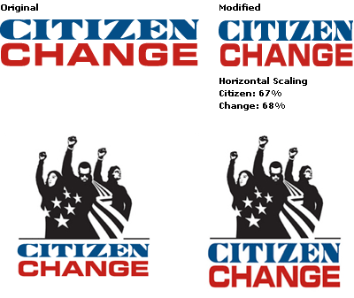
Five wrongs don't make a right, Nick. Executionally, this logo is pretty bad. I think you are giving them too much benefit of the doubt — and credit. The problem with the logo is that it's neither "street" enough nor "formal" enough… it falls mediocrally in between.

> I don't recognize the face, maybe it's drawn specially

Perhaps the vertical scaling threw you off?

Now, doesn't that (the bottom "change") look better? That's because the vertical and horizontal widths now match!

The idea of the logo is striking indeed, but as far as an "extremely refined design"? No way.

On Jul.13.2004 at 11:20 AM
nick shinn’s comment is:

Armin, don't you think that condensing an extended typeface is a devious idea, just to keep things from being too slick and banal? Yes, it's "wrong" in the pure, formalist sense, but it's right when it fits with the other design elements. And it gives the piece a little bit of edge. Yeah, I know faux condensed styling is a nasty old desktop cliche, but I'm going to give the designer credit here for subtle parody of that with "so wack it's ill" attitude.

Doing a little trick like that, rather than using straight type which is already refined, is the logo designer's process of refinement -- taking something off the shelf and nuancing it to fit the piece it's used in.

Not that I'm a fan of 50-year old typefaces, I'd rather see today's designers use today's faces, preferable mine. But if they are gonna go retro, at least do something interesting like that. It's kinda like Dalliance Roman in a way (which is an "italic" backslanted).

Call me bourgeois, but I don't buy the fundamentalist either/or, street/pro notion of design virtue, with the middle as mediocre. There are more things in heaven and earth. The Citizen Change logo reminds me of the client who wants to put everything in the ad, so you call in the illustrator who specializes in collage. Come to the amusement park and try all these rides. Or like a Rivera mural, historical materialism spelled out. It's Big Design, not Big Idea Design, relies more on hard work.

Pardon my ignorance, but what is the Citizen typeface?

On Jul.13.2004 at 06:01 PM
Steve Mock’s comment is:

Nah... it looks like an amateur, immature move. (who's the bourgeois now?!) I'm all for a devious move, but that distortion has no grace. I don't find it all that subtle, either... in a fingernails-across-a-blackboard kind of way.

Here's what I think happened: Somebody set those two words/faces at the same ostensive point size and the bottom one ended up being a little wider than the bounds of the top one. A little horizontal scaling lined 'em up. It's a common tale.

I'm gobsmacked that you would defend this Mr. Shinn, your faces are so very excellent.

On Jul.14.2004 at 08:37 AM
nick shinn’s comment is:

Thanks for the compliment, Mr Mock.

I think you're right about how the two words were set -- probably lots of experimenting with available fonts on the designer's hard drive to find a combo that could be shoe-horned to work together.

But I still don't know what that top typeface is -- if it's a font or hand drawn/modified just for this, so can't speak with greater authority.

From a practical point of view, if the designer of CC had used a properly-stressed Eurostile, then he/she would have had to use a more nicely finished "Didone" above it, and probably drawn Ms Che and Mr Metrosexual a bit differently, and the overall effect would have been too corporate.

Grace is a mistake for design that requires an anti-establishment political edge, even a slight one. (Anti-establishment here in the sense of bringing down the average age of voting, not bringing down the government.)

So I continue to defend this logo design as being entirely appropriate, and far preferable to the utter banality of such as the new YWCA effort.

The inventive representation of the flag leaves the Bush-Cheney and Kerry-Edwards logo-flags in the dust. And surely m. kingsley is mistaken to say "that cliched criticism of being wrapped up in the flag is also appropriated without that difficult irony", because it could just as easily be interpreted as a satire/parody, literally wrapping the pseudo-candidate in the flag which the real candidates wrap themselves in figuratively.

Nader-Camejo uses the flag most discretely, has the most ostensibly professional design (with Dax typeface.)

On Jul.14.2004 at 10:58 AM
Armin’s comment is:

Nick, we obviously differ greatly in this, and I will not try to change your mind. I say none of the decisions for this logo were the work of genius but of amateurism. Is that good? Bad? Whatever, it doesn't matter, because that's where it gets subjective.

I present one last piece of evidence. (The fonts, by the way, are Eurostile Bold Extended and the freeware font One Dollar; thanks to Miss Tiff and Franz at Typophile for the quick identification).

On Jul.14.2004 at 04:42 PM
nick shinn’s comment is:

Armin, I too simulated the logo, and didn't find it to be as simple as you say.

I downloaded "onedollar", and used Bitstream Square 721 for the Eurostile/Microgramma typeface.

Here are the values I ended up with (InDesign, placing the logo size as, behind a text box):

CITIZEN

size: 31.3 pt, tracking +65, scaling 65%

CHANGE

size: 27.5 pt, tracking -15, scaling 73%

I don't think it's amateurish to go to that amount of trouble manipulating size, scaling, and letterspacing in order to get the typefaces to work together in a particular setting. It's serious typography.

Of course, it would have been more professional to use designer types...

On Jul.15.2004 at 02:59 PM
Armin’s comment is:

> It's serious typography

Nick, you are killing me!

On Jul.15.2004 at 07:25 PM
nick shinn’s comment is:

Thanks.

On Jul.15.2004 at 08:52 PM
M Kingsley’s comment is:

From a comment on Design Observer...

anyone guess the author?

It depends on the consciousness directed at the everyday, everywhere object. An aesthetic awareness, activated by the grandiose ecclesiatical vibe of a major public musem, will find the sublime; but a political awareness sees injustice and inhumanity.

:0

On Jul.16.2004 at 12:39 PM
Brady’s comment is:

HORIZONTAL SCALING OF TYPE ≠ SERIOUS TYPOGRAPHY

> I don't think it's amateurish to go to that amount of trouble manipulating size, scaling, and letterspacing in order to get the typefaces to work together in a particular setting.

Well, too bad they didn't go to the trouble of making the words line up visually — or even physically — left to right.

Plus, to do what was done to those letterforms was probably not handled via the CHARACTER PALETTE in Illustrator. This is quick work for the scale tool.

On Jul.16.2004 at 02:05 PM
nick shinn’s comment is:

I'm not making value judgements here.

It's easy to adopt a prejudiced viewpoint towards a piece of design, seeing only "flaws", and not see the intent and attention to detail that went into it.

Armin attempted to show how the logotype was made, but he missed the letterspacing adjustments (see above, July 14). Brady, you may be right about the scale tool rather than the character palette, but what does it matter how it was done?

Brady, I don't think you realize why the two lines are lined up as they are: it's so that the letters ZEN are directly above NGE, and so that the left side of the first I in Citizen lines up with the edge of the H below. The way the round of the C in Citizen protrudes to the left is a typographic adjustment called "overshoot", and is balanced by the protruding top right serif on the final N.

I suspect the designer tried many different combos before settling on this unusual pairing of typefaces. There's an idea here: Harmonizing extreme genre contrast. To get it to work, the words have been separately colored, sized, scaled, and tracked. And the outcome brings them together, by highlighting elemental forms -- square and triangle. The quality of "blockishness" would not have been possible without the letterspacing adjustments. If this isn't serious typography, nothing is.

Serious is making the effort to achieve an effect, with no bias against any particular technique, such as horizontal scaling. It's not about the quality of the outcome, which is the subjective worth critics see in the typography. It's about engaging the craft with care and attitude.

On Jul.16.2004 at 05:49 PM
Brady’s comment is:

Nick,

I spent some time mulling over your response last night, but forgot to post until now.

--

> I'm not making value judgements here.

While I am pointing out flaws in execution, I am making value judgments. There is value in educated (not necessarily formal education — so save the 'ivory tower' backlash), skilled execution of typography, which comes from an understanding of the balance of weight, spacing and scale — if not simply a keen eye.

> It's easy to adopt a prejudiced viewpoint towards a piece of design, seeing only "flaws", and not see the intent and attention to detail that went into it.

No argument there. First impressions bear a ton of influence on our opinions. They can, however, be overcome. Following a first impression, I make an effort to study the suspect design in order to formulate a 'professional' opinion, which may sometimes lead to granting a benefit of the doubt.

> Brady, you may be right about the scale tool rather than the character palette, but what does it matter how it was done?

It matters because you just deflated your previous argument:

> I don't think it's amateurish to go to that amount of trouble manipulating size, scaling, and letterspacing in order to get the typefaces to work together in a particular setting. It's serious typography.

The scale tool does not exactly take the commitment to go through the trouble you speak of. A trouble emphasized by the highly detailed numbers you presented and you can't achieve that 'precision' with the scale tool. It is the path of least resistance.

> Brady, I don't think you realize why the two lines are lined up as they are: it's so that the letters ZEN are directly above NGE, and so that the left side of the first I in Citizen lines up with the edge of the H below.

That would be fine, if it were true...

Barring that there is no visual alignment in any of the typography, the physical alignment you point out does not exist either.

> The way the round of the C in Citizen protrudes to the left is a typographic adjustment called "overshoot", and is balanced by the protruding top right serif on the final N.

Again, that would be fine if it were true...

I know what overshoot is — it is specifically what I am speaking of when there is no visual alignment in the logotype — and it seems that the designer does not know what overshoot is nor how it is properly used.

The overshoot on the C (citizen) is much grater than is should be especially since it is not balanced by the serif of the N on the opposite end — as you suggest.

> There's an idea here: Harmonizing extreme genre contrast.

The idea is not bad — the execution is.

> The quality of "blockishness" would not have been possible without the letterspacing adjustments.

Again, letter-space adjustments are one thing. Free scaling is far more removed from such a detailed process.

> If this isn't serious typography, nothing is.

I think Tschichold is twisting in his grave.

> Serious is making the effort to achieve an effect, with no bias against any particular technique, such as horizontal scaling.

You simply do not horizontally scale typography! This is not a biased, elitist opinion but one formed from reason. Typefaces are designed with certain considerations to the proportions of each letterform.

You are a type designer Nick — you know this! Imagine horizontally scaling the beautiful monoline Nelson Primary™ — I shudder at the thought.

By scaling the type it destroys those proportions; vertical widths become too thin for the horizontal strokes. In this case it is way to obvious and it looks terrible.

> It's not about the quality of the outcome, which is the subjective worth critics see in the typography. It's about engaging the craft with care and attitude.

It is about QUALITY and there is a lack of it in this execution.

I think you are giving the designer way too much credit — beyond the benefit of the doubt — in this case.

On Jul.19.2004 at 11:31 AM
nick shinn’s comment is:

Brady,

A few points.

First, I don't agree with the way you defined how the characters line up vertically, by using lines at the sides -- to me it's more about the characters' "center of gravity".

If you move the top line to the right a bit, the ends do line up better, but then the middle, especially the Z, looks like it's too far to the right. So leaving it the way it is (with both lines centered on the same axis) is OK; the next level of refinement would have been to make the N in Citizen a bit wider, with a lighter main stroke, and the C a bit narrower, with a heavier stroke (see below).

Secondly, the scaling thing, numbers vs. intuitive. Although I gave numerical values, I still eyeballed the elements into place, and used the "nudge" arrow. I don't see the difference -- scaling something to fit is scaling it to fit, no matter the technique.

Thirdly, I often wonder about the way vertical stems in type are made thicker to counteract the optical illusion. Is the illusion consistent across the population? I'm not aware of any research that has been done. As a type designer, I ask myself, is this phenomenon something that I am overly aware of, relative to the reader, and am I perhaps over-compensating? It's interesting to note that different typefaces that are ostensibly monoline have different ratios of vertical to horizontal stem thickness.

Finally, I made up a more "proper" version of the logo, using Eurostile Bold, and making "citizen" more consistent by condensing the C and beefing up its top serif, thinning the main stroke of the Z and N.

While CITIZEN looks better, I find that CHANGE in Eurostile Bold looks strange, due to Novarese's idiosyncratic treatment of the N, which makes it very wide, and the way his C and G are different widths. Throw in the thicker vertical stroke to the C, and it's clear that this is a very mannerist face, where Novarese is overdoing the detail techniques that are used to even out overall typographic color. In a display setting such as this, they can become obvious.

Also, with the rounder corners, there isn't so much of the feel of basic geometry that harmonizes the two words. I don't know if the designer considered Eurostile Bold, but I would have to say that, despite the contrary stem widths, overall, with the steady tempo of its character widths, it looks better than the more "correct" setting.

Above, as is: "improper" typography.

Below, modified with "correct" typography.

On Jul.19.2004 at 01:49 PM
nick shinn’s comment is:

That last sentence didn't read too snoothly. Should be:

... despite the contrary stem widths, overall, with the steady tempo of its character widths, the horizontally scaled extended type looks better than the more "correct" setting.

On Jul.19.2004 at 01:55 PM
big steve’s comment is:

I guess puffy didnt even care for that logo...

Bask in the greatness of VOTE OR DIE. Now that's what I call a slogan! [or is it a logo, DMaven, can you help me clear this one up? jokes].

On Jul.21.2004 at 05:25 AM