Speak UpA Former Division of UnderConsideration
The Archives, August 2002 – April 2009
advertise @ underconsideration
---Click here for full archive list or browse below
  
Why, Why, Y?

Quick Quiz:
What is the mission of the YWCA?

Answer:
I didn’t know either.

The good news is that when you see the new YWCA logo (I’ll show you in a minute), you will know exactly what their mission is.

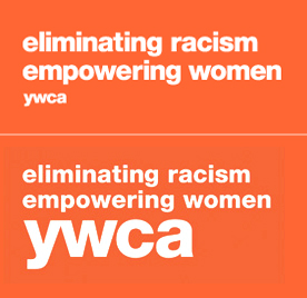
Really, this is actually quite an accomplishment. It is very hard, if not impossible to convey that type of information through a logo. These don’t do it. You could have a tree as a logo, if you wanted to represent nature or growth, but even that doesn’t convey mission. Now, the YWCA’s mission is “Eliminating racism, empowering women.” So, what is their new logo? A leaping person? A smile? No. This is the new YWCA logo . Not just the name, but the whole thing. It is quite amazing and as Michael Bierut stated in “The Tyranny of the Tagline” on Design Observer, “it’s amazing it hasn’t been done before.”

The previous identity was created in 1988 at Bass/Yager & Associates. That logo, “a stylized ‘W’ enclosing a sunrise which suggests the letter ‘Y’” was fairly successful in that by emphasizing the “W”, it was able to distance itself from the YMCA, with which it is constantly confused. It did not however add meaning to the YWCA, which is what it needed. It was a fine logo, but what is interesting to me is that the recommended version, much like United Way, had a gradation, which seems unnecessary and inconvenient for small, local not-for-profits. The tapered lines, which Saul Bass loved so much, created enough dimension.

The new identity was created by Landor, which was selected from a field of 48 firms that responded to the YWCA’s request for proposals. Landor actually competed against only 5 others that were invited to make presentations in March of 2003. Four months after winning the assignment, Landor presented 6 design concepts and one entitled, “Hallmark” was chosen.

As far as the design, the concept is brilliant: No one knows what the hell we do, so let’s elevate that message to the highest visibility. There are actually two versions of the logo. One uses the name small and the other reverses the hierarchy. This is good, although it is yet unclear when and how each will be used. Right now, the version with the small name is used in the national website while the other is interspersed throughout their annual report and both are used on various merchandise.

One problem I have with the design is that it seems to be straight Helvetica. A major problem with organizations that are decentralized, is that a lot of liberties are taken with the national identity at a local level. This identity, especially with its two size variations, is inviting alterations. The fact that it looks “typed in”, is inviting people to create their own version. That is a problem. Often, simple wordmarks will have a small but noticeable design element incorporated in the type to discourage this.

One of the most important aspects of identity work is internal buy-in. You need to have people on board in order for it to be successful. Here is a quote from a regional YWCA representative: “Responses to the new brand have been strong in both directions. Within our own region, we received negative responses from at least half of the Associations. Several positive responses were received as well.” Only time will tell how successful the new identity is and how many locals embrace it. Local YWCA’s have until December of 2005 to be fully compliant with the new identity.

It’s not too often that you can do something new or innovative in branding or design and that is exactly what was done. Overall, I like the new YWCA identity. Again, the mission of this identity was to convey the mission of YWCA. Mission accomplished.

* Special thanks to Design Maven for research, knowledge and passion in addition to amazing archive material.

Maintained through our ADV @ UnderConsideration Program
ENTRY DETAILS
ARCHIVE ID 2006 FILED UNDER Branding and Identity
PUBLISHED ON Jul.06.2004 BY David Weinberger
WITH COMMENTS
Comments
Tan’s comment is:

Mission accomplished. I like the new identity because there's clear rational behind the change, and smart, new thinking behind the execution.

The YWCA brand was well-known and had differentiation, but had lost all relevance to people. In other words, people recognized and knew the mark, but didn't care. This new identity brings that relevance back full force.

Bravo.

On Jul.06.2004 at 11:08 AM
Levi’s comment is:

Too cool for school. Absolutely awesome.

I love it when marketing doesn't talk out of its rear.

On Jul.06.2004 at 11:21 AM
Frank Lin’s comment is:

Ok I'll take the plunge...

Reviewing out loud)...

..Instead of having the name YWCA and the

subtitles or motto beneath, Landor simply reversed it by putting the motto on top and switched the

sizes.

I do think this definately makes it more interesting and memorable..

I wonder, are they going to ever change up the text or are they going to always have it read:

eliminating racism

empowering women

?

It Really does look like the text can be easily replicated and changed to meet certain agendas

--which can be good or bad.

On Jul.06.2004 at 11:22 AM
Tom Dolan’s comment is:

I find this very interesting. I'll go so far as to say I think it's taking the notion of "identity" beyond the logo, and beyond graphic design completely. I believe the unaffected Helvetica is a clear choice (I have done a similar thing), communicating that the 'identity' of the organization is neutral, flexible, adaptable and not more important than what the organization does. I'd go so far as saying this 'identity' would work in any typeface, and that's precisely the point — to establish and link the brand so thoroughly with the tagline as to have the typeface become unimportant. Now that's brilliant.

On Jul.06.2004 at 11:33 AM
big steve’s comment is:

I think this is pretty sweet! Does anyone else see the resemblence to the older TheTruth.com print ads and t-shirts? They were a little more orange and had similar white and black text with their dot-matrix logo in the bottom right corner.

On Jul.06.2004 at 11:34 AM
Sarah B.’s comment is:

Genius!

Absolute genius!

I think the TheTruth.com "identity" was along the same line.. but not as to the point as this.

Doesn't it feel like a Monday today?

On Jul.06.2004 at 11:39 AM
franz’s comment is:

Someone should tell their web people to not use Arial for all the headlines! It's nice that they're trying to match the look of the logo, but the combination hurts my eyes.

On Jul.06.2004 at 11:40 AM
Tan’s comment is:

Sorry, I just noticed it was a Landor mark. Duh.

Funny, no one internally has made a big deal of it, so I assumed it was another branding agency like Futurebrand. Must've been the NY Landor office.

For the record, I like the work, but not because I have a hometeam bias.

...

Back to the id — Isn't it amazing how brilliant solutions are so obvious?

On Jul.06.2004 at 11:46 AM
Armin’s comment is:

This is the equivalent of bringing the table of contents to the cover of an annual report, brochure or magazine. Instead of having to flip one or two very heavy pages to find out what you will find inside it is right there in front of you, no need for the extra effort.

Yes, it is quite cool. Genius? I don't know… Like anything Landor does, this required master salesmanship and a strong belief in what they were doing to back it up. It does break the boundaries of what a logo is, and that is pretty damn good, of course, but it could also be seen as unimaginative… bear with me. And I'm just throwing this out for the sake of discussion, not sure this is my conviction.

David said "You could have a tree as a logo, if you wanted to represent nature or growth, but even that doesn’t convey mission." Very true, no discussion there. But, as designers, do we really want to spell everything out? Leave nothing to the imagination? When does genius become laziness? Next thing you know we will be "describing", with typography only, a photograph in a book cover, rather than showing an actual photograph. Of course, this is worst case scenario, but with trends spreading like wildfire and most of the times being misused this "tyranny of the tagline", as Michael B. coined it, could be rather dangerous.

But on the upbeat: great work, it's refreshing somehow.

One last question/concern, there is a YWCA in Mexico… will they "translate" the logo? One thing is to render a brand name in different languages like Coca-Cola, but this is whole different animal. Maybe not.

On Jul.06.2004 at 11:54 AM
laura’s comment is:

Love it. That's the smartest logo design that I have seen in a long time. The orange colour screams independent, strong and all that womanly stuff females are accomplishing in today's society.

On Jul.06.2004 at 11:58 AM
Sheepstealer’s comment is:

I was driving to work this morning in my zoom zoom when I stopped at I'm Lovin' It for a McMuffin. On my way out of the driveway I was cut off by an engineered like no other car in the world. I swerved into a kid and knocked him right out of his just-do-its.

- - - - -

I salute the mission of the YWCA. As an organization they clearly have done many great things to empower women and eliminate racism. But I'm not sure I buy it as an identity.

The key to a powerful brand is to set up the proper expectation then meet/exceed that expectation. For example, a consumer has completely different expectations when visiting a Nordstrom vs. a Walmart, yet both stores make customers happy by delivering what is expected.

I think hanging an identity on such a lofty statement does a disservice to the YWCA. As I look at the world and I see that racism is not eliminated, and that not all women are empowered, the organization who is claiming to solve these problems drops credibility points. And bringing these statements the forefront of the mind by logo-izing them accentuates the problem. I'm actually more reminded that racism is not eliminated when I see this.

It's a decent tagline, it's a fantastic mission highlighting worthy goals. It's prohibitive as an identity.

On Jul.06.2004 at 12:16 PM
Feluxe Socksmell’s comment is:

OK, its nice... but genius?

Get a grip, sisters. Helvetica- the most ubiquitous font in the history of graphic design. The real power of this new identity/ brand will be left to the hands of the advertising agency. Monkees can choose helvetica black.

Lets hope they dont hire Colin Powell as spokesperson. As you know, he and his faux Village entourage practically destroyed the YMCA earlier this week in China.

On Jul.06.2004 at 12:19 PM
Tan’s comment is:

>I'm not sure I buy it as an identity.

SS — Your tagline-driven examples are fun, but they are product brand descriptors, not organizations.

Here's the question. What's the purpose of a logo when everyone recognizes the name and acronym of that organization or group? It's like making a logo for the Beatles. What would be the function of that identity? How would it help people to "buy it"? Is it differentiation — meaning, are there a bunch of bands with similar names with similar prominence? Of course not. An identity/logo for the Beatles is unnecessary.

The YWCA has a similar situation. Their acronym is their brand. The YWCA doesn't have a recognition problem. In their case, the identity/logo becomes an opportunity to define that brand further — to (re)establish relevance. Why do it with words? Because it's consistent with the typographic/acronym name. The "YWCA" then becomes an author's signature to the idea.

I buy it.

On Jul.06.2004 at 12:47 PM
Stephen Erickson’s comment is:

Tan is right on the money. This would not have happened if the YWCA name was not already recognizable. It most likely would not have happened if the client was not non-for-profit. YMCA has an agenda not a product. To that end the mark communicates their agenda and simultaneously encourages people to think its relevance to them. Genius, no. A tactical move to advance the relevance of YMCA, yes. Extra points for choosing a common typeface and using it in a manner that can be inexpensively reproduced with minimal investment.

On Jul.06.2004 at 01:18 PM
Darrel’s comment is:

It's smart design. I'm not sure if we should call a smart solution, 'genious' though.

What I see:

Everyone knows of the YWCA. No need to inform people that it exists. So, skip the logo altogether. Pick a color, and be consistent with the tag line.

In many ways, this is 'less design' where 'less is more' and, as such, certainly makes for a good, practical solution.

Do we see it as 'genious' only because we as graphic designers are all-to-eager to whip up yet-another-logo-to-submit-to-design-annuals?

(And while I'm all for ending racism and empowering women, I'm not sure how that fits in to most people, at least around here, equating YWCA as the fitness center ;o)

(Oh...and while their site looks pretty, I can't find anything on it! What's with having to use the site map to navigate the content?)

On Jul.06.2004 at 01:44 PM
Sarah B.’s comment is:

Not that I am backing down on my initial remarks... but I guess I have to watch what I say, and how I say it around here.

In our office "Nice", "Cool idea", "Thats Genius" and "Great" are common remarks as someone slides past your desk.. the latter 2 are when you are doing a REALLY good job, I guess.

I DO think it is a great idea.. and somewhat "Genius", - in that I have never seen anything quite like that done.

And, it takes a lot for a "identity/logo" to impress me.. this did.

Sure.. its in Helvetica... that doesn't have to mean they took the easy way out. Maybe they wanted it to be simple and to-the-point, like what they are trying to have the YWCA mean.

On Jul.06.2004 at 01:45 PM
Darrel’s comment is:

Oh...wait...nevermind. Their web team used Dreamweavers bad implementation of javascript menus which don't appear at all in Firefox. Ugh.

On Jul.06.2004 at 01:46 PM
Rob ’s comment is:

Yes, it'a clever idea but it certainly can't be called a logo. It's simply a tagline being used a logo. It's, as suggested on DesignObserver, branding trumping design. Plain and simple.

And will it really work and for how long? How will it be positioned in spaces where there is lots of copy? How wil one discern it from other text. And I really have an issue with variation one, where the YWCA is toppled by the tag. No matter what their mission, I still feel the name of the 'brand,' should be the driver, not the tagline.

If anything, and somewhat troubling, while however smart this solution is, it redefines the role of tagline as never before. And really, as many of you have mentioned, there was very little design involved in the creation of this 'tagolog' (I don't know what else to call it)

And, borrowing from Michael and DesignObserver, even some of the creative greats had trouble with the validity of taglines. “Agencies waste countless hours concocting slogans of incredible fatuity,” wrote David Ogilvy. “Notice that all of these bromides are interchangeable — any company could use any of them.”

That being said, the YWCA certainly isn't the only organzation in the world who's goals are stopping racism or the exploitation of women. This 'tagolog' isn't really uniquely YWCA and there is no longer a strong visual (ie, the original Bass logo) that in one quick glance that will say YWCA. Words need take longer to decode in the mind then a 'logo' and on this level, I think this solution may end up not effectively representing the brand.

On Jul.06.2004 at 01:48 PM
Joy’s comment is:

"Empowered"?

The most cliched term around.

On Jul.06.2004 at 01:54 PM
Darrel’s comment is:

It's, as suggested on DesignObserver, branding trumping design. Plain and simple.

Is that bad in this case? Is the YWCA worse off for not having an icon by their name?

there is no longer a strong visual (ie, the original Bass logo) that in one quick glance that will say YWCA.

I think the acronym 'ywca' communicates fairly quickly. We all know what the ywca *is*, and the tagline simply clarifies what it *does*.

On Jul.06.2004 at 01:58 PM
DesignMaven’s comment is:

Knee jerk reaction. I hated it.

It's a non Logo with a Ostentatious Tagline.

A Naomi Klein Solution.

The execution is poor. Especially when you see the Design Implemented on the Building.

Signage is a series of Banners. With the Identity

implemented on the windows. Which weakens the visual strength of the Design.

An Advertising ploy. Marketing Solution and

Communication Solution.

No even the Swiss would implement the Design or try to sell it.

It's a throw-back to sixties identity solutions

when Designer(s) had no vision and resulted to non poignant monograms or ideograms.

The Design Solution does not in anyway exceed or come close to the original design nor the solution created by SAUL BASS. Which incorporated the original elements.

In my HUMBLE OPINION. The new YWCA IDENTITY if a Failure. A Major Travesty.

Worst than anything FutureBrand did with UPS and United Way.

GOD knows, I've built a shrine of Landor's work in the past. This Identity is weak on Design and Heavy on Marketing and Communication. Tagline only last about six months or a year. Will YWCA change the tagline every year ???

It's already boring the hell out of me.

Brilliant Design BULLSHIT !!!

On Jul.06.2004 at 01:59 PM
Darrel’s comment is:

Their web team used Dreamweavers bad implementation

OK, not to take this off into an entirely different direction, but what's with big organizations willing to pay for gigantic rebranding efforts and then hiring any run-of-the-mill-dime-a-dozen-'I read the DW manual and now know how to make web sites!'-hack to build the web site?

(OK, OK, I'll save that for another rant another day...)

On Jul.06.2004 at 02:20 PM
Joseph’s comment is:

I agree fullheartedly with DesignMaven and Rob.

This piece is not a logo. It's the mission statement/tagline. Definitely not maximum meaning with minimal means.

On Jul.06.2004 at 02:24 PM
Tan’s comment is:

>This Identity is weak on Design and Heavy on Marketing and Communication.

heavy on communication is usually a good thing with identities.

To Rob's point — it's hard to call it a logo. It's an identity in the vaguest sense of what an identity is. Traditional symbols like UPS's shield and ATT's globe are empty icons chosen and then filled with symbolism. YWCA's new identity states the point up front, foregoing symbolism completely. But does that make it any less effective as a tool for communication? No. Is it less artful and imaginative? Perhaps.

>Tagline only last about six months or a year. Will YWCA change the tagline every year?

Sure. Probably not every 6 months, but maybe every 5 years. Why not, if the identity was designed for it? If YWCA's mission is to mold themselves to their communities for public service — then wouldn't that be the ultimate act of humility and dedication — to change and reflect the needs of those they serve?

>It's the mission statement/tagline.

I think many people are using "tagline" as a dirty word. That's because so many out there are meaningless and contrived in their use. But let's be fair, and give this new identity statement a chance, a benefit of the doubt that it won't mean complete shit in a few months. Let's not be such cynics.

On Jul.06.2004 at 02:37 PM
JonSel’s comment is:

what's with big organizations willing to pay for gigantic rebranding efforts

They probably didn't pay for it.

We all know what the ywca *is*

I didn't. I have a better idea now.

Will YWCA change the tagline every year ???

They can't. And they were smart to make it functional and explanatory and not overly emotional. It's not "Just Do It" or "Think Different". It explains who and what and why they are. This needs to stay constant for at least 5 years to remind and reeducate their audience to what they exactly do. Then, POSSIBLY, they could ditch it, make "ywca" a simple logotype, and try more emotional and evocative taglines.

My issues with the ID echo Rob's. I'm not sure how successful this is in application. I think it calls for designs heavy on imagery, actually, so the tagline/logo are prominent and not lost in a sea of words. I do think it is incredibly simple, honest, and visually differentiating from the legions of leaping figures, hugging families and smiling babies that populate the land of non-profit identity.

And Bass's logo wasn't anything special, sorry Maven.

Must've been the NY Landor office.

Nope. SF.

On Jul.06.2004 at 02:37 PM
Armin’s comment is:

Well, Landor's work begs to ask the question(s):

What is a logo? Is a logo simply an icon?

What defines a logo? It's implementation and usage?

Not terribly deep questions though… but you know where I'm trying to get at.

Like Maven, my initial reaction was that it was a bad, lazy solution and when I saw that Landor did it, I was rather dissapointed. Nonetheless, the logo has definitely grown on me, I like what it "does".

It's the Detroit Pistons of logos…

On Jul.06.2004 at 02:43 PM
Darrel’s comment is:

it was a...lazy solution

There's a fine (or maybe really blurry) line between a 'lazy, half-assed' solution and a 'simple, practical' solution. ;o)

On Jul.06.2004 at 03:02 PM
big steve’s comment is:

There are a dozen half-heartted art school arguments about words as images/glyphs (that though the symbols are universally know as letters/ words, they are still no more than symbols/ icons placed on an orange canvas), or maybe about how the layout / use of space in the 'logo' sets it apart from a tagline (because it's not like anytime someone types "eliminating...women ymca" on an orangish background is THE logo - this, from the layout / font / colour / size ration is THE logo) but I think it's much more simple than that.

This is the logo because it is the logo - where's the point of contention? Because there are a lot of letters to process? Because they make a phrase rather than a single word? The FedEx logo has never been questioned - Why, because there's a nifty little arrow between the E and the X? IBMs logo is okay because there are lines through the letters, right? I'm not trying to be dense, but trying to make a point - just because there are more than three letters in a logo, or because the letters dont have special kerning doesnt negate the logo-ness of the logo.

Personally, i think the Saul Bass logo was a piece of garbage. It reaks of the 1980s like a bad pair of MC Hammer pants. $0.02

On Jul.06.2004 at 03:07 PM
Feluxe Socksmell’s comment is:

Well, (SF) Landor's work begs to ask the question(s): What is a logo?

Apparently anything Helvetica.

Seven years ago I was hired by a (nameless) firm to compete against Landor's submittal of... surprise... lower case helvetica bold. The then "original, genius" exectution lost out to a simple idea... which was tweaked and pooped out in house (I sued). Ironically, if you go to logolounge.com Landor claim they did it.

Go to logolounge.com, see Avaya, see Landor and you'll see about 20 or 30 other logolies. Now thats Genius.

On Jul.06.2004 at 03:25 PM
Michael B.’s comment is:

I think this was a case of desparate times calling for desparate measures. When (nearly) everyone's heard of you, but (almost) nobody can describe what you stand for, doing a classic wordmark or pictoral symbol or abstract mark, and hoping that somehow people will come to associate your acronymic name with your mission...well, good luck.

I agree with Stephen E. above: this seems to be a situation that non-profits find themselves more than most clients. Several years ago, I worked on the identity for the March of Dimes, an organization that was started in the 1930s to find a cure for polio. They actually outlived their mission, and after some years of confusion, came up with a slogan: "Preventing Birth Defects." (They actually invented the term 'birth defects.") In the 80s, Dan Friedman at Anspach Grossman Portugal did an elegant but rather cold geometric logo that juxtaposed the three-word name and the three-word tagline in overlapping parallelograms. We got involved when the mission changed one more time, from preventing birth defects to advocating for healthier babies: new tagline (Saving Babies, Together) and new icon. With a baffling name, the March of Dimes has lived through their taglines.

Because these organizations rely so much on grass roots support, identity changes are very tricky. The Audubon Society had a simliar problem about ten years ago. Organizationally, they are actually very strong wildlife preservation advocates, but the name is something that most people associate with bird watching (which their members also do, of course, and enthusiastically.) A large CI firm conducted a study that concluded that their existing logo -- a bird, of course -- was part of the problem. They then went to Tibor Kalman, of all people, who helped create a new logo: a wordmark with "Audubon" knocked out of a wavy rectangle. A banner, get it? Well, the members didn't, and they went apeshit. The bird was restored by popular acclaim.

Audubon would have been better off adding a tagline. And YWCA was luckily they didn't have a pictoral mark beloved by their membership.

By the way, I can't speak for this project, but non-profit identity work on this scale is seldom pro-bono.

On Jul.06.2004 at 03:41 PM
Steve Mock’s comment is:

Logo, roughly translated from the Greek, means word(s), does it not? It does not mean picture.

I don't think it's a tagline. I think it's more like big cosmic undertakings. Kind of like somebody said, "Take all your cute little picto-swooshes and stick 'em. Here's something important."

DM: It's a throw-back to sixties identity solutions when Designer(s) had no vision and resulted to non poignant monograms or ideograms.

Anybody else find this really funny coming from this person?

Tear down your shrines, man. We need this. We need some oblique thinking. Change the mind.

So it's crazy simple. So what? I applaud this.

On Jul.06.2004 at 03:42 PM
Rob ’s comment is:

But does that make it any less effective as a tool for communication? No. Is it less artful and imaginative? Perhaps.

I think this will have to remain to be seen. Or at least the YWCA will have to see.

This is the logo because it is the logo - where's the point of contention? Because there are a lot of letters to process? Because they make a phrase rather than a single word?

I won't argue the symantics of sign, symbol and glyphs. What I will argue is that I don't consider taking three lines of type, clearly what is their mini-mission statement, their tagline still makes it more tagline than logo. More marketing than design. Could it become a logo, in the sense of being a recognizable set of visual symbols? Sure, but how long will that take? And at what expense to their overall strategy of communicating messages beyond these two core statements?

We can argue back and forth what makes a 'logo.' But the possible problems I see here, already stated above, are my main concerns. I think there could be a dangerous precedent where branding and taglines become more important than visual identity, and I think this is a perfect example. I'm not sure that one should dominate the other more that they should work together. And I'd argue that in a society where we are hammered with thousands and thousands and thousands of written, visual and aural messages a day, this approach, no matter how brilliant or lazy to us as designers, risks getting lost in the clutter.

Who knows, maybe like Armin, I will grow to appreciate it more for what it is. For it's attempt to break out simplisticly without fan fare and still expressing the core beliefs (I assume) of the organization. But I still would say, that in such a bold attempt to be different, creatively they may have hit the mark, but whether or not it will 'wow' the world at large, will remain to be seen.

On Jul.06.2004 at 03:47 PM
Steve Mock’s comment is:

Oh yeah... all opinions aside, that was a great article. Nice use of support material. Thoughtful explanations... yes. Good.

On Jul.06.2004 at 03:58 PM
Darrel’s comment is:

I think there could be a dangerous precedent where branding and taglines become more important than visual identity

How is that dangerous? Well--to anyone other than visual identity firms?

no matter how brilliant or lazy to us as designers, risks getting lost in the clutter.

But at least it isn't adding to it. ;o)

but whether or not it will 'wow' the world at large, will remain to be seen.

Does it need to? They're not selling pop-culture ala Apple or Nike. They're not selling buzz-words like IBM or ING. They're not selling fake 'goodness' like the telcos or Wal-Mart. They're just an org trying to clarify their bigger mission to average folks. In this case, I think the 'wow'--if that is truly needed for a mark to be successful--is more of an 'aha!...THAT is what they do!'

On Jul.06.2004 at 04:07 PM
Tan’s comment is:

>What is a logo?

It's visual language — a symbol, a representation, a statement.

Not quite sure about your assessment that it's "lazy." Does that mean it's too obvious? Not complex enough? Not symbolic? Not stylized enough?

For those of you who make distinctions b/t letters and symbols — consider Chinese (Japanese, or Korean), a language made completely out of icons. Does it really matter if a logo is an icon or a letter, a word, or a statement?

Or does the only thing that matters is that it's true to what it's supposed to communicate?

The more I think about it, the more innovative of a communications solution this identity becomes.

But Rob, I do agree w/ you that this does set an interesting precedence for elevation of "Brand-lines�"— words replacing symbols, etc. Along with asking if there are too many written messages, we should ask if we are becoming overloaded with a clutter of too many logos. Maybe that's why this solution feels so radical.

On Jul.06.2004 at 04:15 PM
ps’s comment is:

No even the Swiss would implement the Design or try to sell it.

of course we would.

On Jul.06.2004 at 04:19 PM
ginny ’s comment is:

I think it's a cop out. I've seen it before from Landor. As a matter of fact, they tried to do the same thing with a company that fired them and the firm I work for was given the challenge to come up with their new logo after they paid Landor millions.

The one thing I've always loved about identity design is that it's like a puzzle that needs to be solved. Although this "new mark" clearly states it's intent, it doesn't look like a logo. There's nothing really all that unique about it except that the "tag-line" or "mission statement" is larger than the logotype.

I think they could have at set ywca in a different typeface or actually tried to "design" an original logotype.

It's gimmicky. I'm surprised at the "genius" reactions that are coming from some of you...

On Jul.06.2004 at 04:20 PM
ps’s comment is:

Seven years ago I was hired by a (nameless) firm to compete against Landor's submittal of... surprise... lower case helvetica bold. The then "original, genius" exectution lost out to a simple idea... which was tweaked and pooped out in house (I sued). Ironically, if you go to logolounge.com Landor claim they did it.

i think landor do that just to piss you off feluxe. rumors are they have people go through your garbage to find inspiration.

i personally like what they have done for YWCA. i just hope it won't turn into this trend where every tagline turns into the "logo". in the YWCA case, i think it makes perfect sense. i like that they kept it generic, this might give it a chance to withstand all the abuse it will have to endure. maybe it'll still work even if presented in all sorts of typefaces.

On Jul.06.2004 at 04:36 PM
Darrel’s comment is:

I'm still not sure if I've gotten a legitimate answer to what's WRONG with the mark other than purely aesthetic opinions. Quite a few of you are saying it's a 'cop-out' or 'brand over design' or 'helvetica? Yuck!' or 'but it's NOT a logo' but I think there needs to be more to these arguments for them to stick (and I'm interested in hearing them!)

On Jul.06.2004 at 04:42 PM
Tan’s comment is:

So, here's an interesting comparison. Is this....

really any different than this?

Other than the fact that one has more words and different colors — are the marks really that drastically different visually?

And would you term both as being "cop-out"?

Which one actually communicates more? Just food for thought...

On Jul.06.2004 at 05:23 PM
jenny’s comment is:

I didn't love this logo at first site, although as the day progresses its grown some on me. It certainly differentiates the YWCA from "legions of leaping figures, hugging families and smiling babies that populate the land of non-profit identity".

Perhaps just as importantly, it is radically different from the YMCA logo (and my extension, the organization) which I don't think the Bass logo did overly well - I still saw the "Y" more than the "W" in the old logo. And although I knew they were different organizations, as of yesterday I would have said that the YWCA and the YMCA were pretty providing the same services. This logo makes a real distinction between the two as well as saying something about the mission/goals of the YWCA.

That being said, I think implementation is going to the big problem for this logo. Part of the point of a logo is recognition no matter where you happens to be - San Francisco, Seattle - wherever. A number of you have argued that the name alone is enough, but the YWCA doesn't actually have instantaneous name recognition - they do have a problem with being associated with/overshadowed by the YMCA.

I'm just not sure that this logo will retain that recognizability if (or more likely when) the local organizations start to play with it - say, by putting the whole thing on one line, or changing the font, or ditching the orange background and putting the words (say centered) over photographs. I'm not saying that properly implemented, those alternatives couldn't look good and get the message across. But I think those types of changes would mean it ceases to be a "logo" in a meaningful visual way.

On Jul.06.2004 at 05:30 PM
Darrel’s comment is:

say, by putting the whole thing on one line, or changing the font, or ditching the orange background and putting the words

Wouldn't that be true of ANY logo if you didn't require that users of said logo adhered to the identity standards.

On Jul.06.2004 at 05:37 PM
mazzei’s comment is:

One problem I have with the design is that it seems to be straight Helvetica.

yeah! but for once it done RIGHT— it's brilliant that's its "helvetica"...just adds to the whole design. it's makes the message the design.

The fact that it looks “typed in”, is inviting people to create their own version.

really cool IDEA.

RIGHT and they would use "helvetica" which is another reason why this is so killer.

On Jul.06.2004 at 05:51 PM
Patrick C’s comment is:

The fact that it looks “typed in”, is inviting people to create their own version. really cool IDEA. RIGHT and they would use "helvetica" which is another reason why this is so killer.

Actually, they'll use Arial and it will look like shit.

Which one actually communicates more?

MoMA communicates more...

1. because there is variation in the text treatment (small "o" does all the work here).

2. because it says less.

My criticism of the YWCA "logo" is that it lacks invention. Invention is what makes logos memorable, what creates that instant recognition.

The big problem with this "logo" is that it is not memorable. It is two lines of text that I can't be bothered to read on a busy day. After reading the write-up, the comments, and viewing the images, I still couldn't remember what the tag line was exactly. That's a failure.

On Jul.06.2004 at 06:06 PM
jenny’s comment is:

Darrel,

You're right, of course. But, to quote Armin a few weeks back on the United Way logo, "a consistent use of the logo (which obviously represents said core values) is much harder to control." The very simplicity of this logo is going to make the kinds of variations I described tempting. And easy.

I'm not saying that you can't make people adhere to identity standards - years ago I worked for a regional YMCA and that Y was very strict about adhering to the Y's identity standards. I'm just saying that the implementation is a serious concern for an organization that's made up of f regional affiliates and associations. Especially when, according to the article, at least one regional association said that "at least half" of the local associations had negative responses to the new logo.

On Jul.06.2004 at 06:09 PM
DesignMaven’s comment is:

Big Steve:

Personally, i think the Saul Bass logo was a piece of garbage. It reaks of the 1980s like a bad pair of MC Hammer pants. $0.02

You defne the essence opinions are like assholes and everybody GOT ONE.

You're entitled to your opinion as everybody else.

I find your comments are as cras and erroneous

as your comment equating Reagan to Bin Laden.

Having said that. Taglines are advertising. They are not Identities. Taglines are slogans.

Advertising and Identity Design are two separate professions. They are like OIL and WATER.

They don't go together. If you ever worked on any large scale Identity Projects or any Identity Projects at all.

In brief and Laymen terms; Corporate Identity is a Management Tool used to accurately address the Goals and Aspirations of a Corporation.

However, the Corporate Image is composed of all planned and unplanned verbal and visual communication that emanate from the Corporate Body and leave an impression on the observer.

The Corporate Identity (Symbol) is one of the major influences on the Corporate Image, it is all planned and all visual.

A successful Corporate Identity System visually separates and distinguishes a Corporation or Firm from its competitors.

The Corporate Identity whether a Trademark, Brandmark, Logo or Logotype is the Corporation or Firm's visual statement to the world of who and what the company is. How the Corporation see itself. What it want to be; and what it has become

meaning Public Perception; how the world will view the Corporation.

The most important element of the Corporate Identity Program is the Identity Symbol. It is the first element of your Marketing and Communication Program the general public will see and remember. (Not the Tagline)

At the same time, the Corporate Identity is the Flagship of the Corporation. It is the banner under which the President, CEO, and Managing Partners gather its employees to meet the public.

Corporate Identity is the ARTFUL SCIENCE of assessing a Corporations or Firms need through Identity Development and Design, Marketing Analysis, and Communications Planning.

Although, these disciplines are very different from each other when combined they form a Cohesive unity which decisively address the Goals and Aspirations of Management.

Essentially, Corporate Identity addresses all the needs of visual and verbal Communication treatment.

Corporate Identity is Confidential. Identity Consultants provide Corporations and Businesses with Analysis, Research, Design and Implementation.

To Strategically Position and Leverage a Company for Financial Growth. Building Brand Loyalty among its Consumers. Inspiring Investors (shareholders and Motivating Employees.

The Corporate Identity Process involves a Thorough Understanding of:

Marketing: Identity Strategy; Identity Assessment; Identity Positioning; Identity Measurement; Identity Management; Identity (E)Valuation.

Communication: Communications Planning, Internal Communications, Public Communications, Media Communications; Information Architecture, Crises Management.

Corporate Brand Identity: Naming and Name Systems, Corporate Identity, Print Literature, Package Design, Retail Environments, Brand Architecture, Technology Branding, Audio and Motion Graphics Branding, Interactive Strategy and Design, Visual Merchandising, Trade Shows, Exhibits, Launch Programs.

Different from Advertising, Corporate Identity involves Strategic issues, Identity Design

must last 20-30 years or longer, unlike Advertising, which is more often Tacticle in nature

Advertising is Tacticle because you do campaign one year and you may need to do something else the following year, perhaps even six months later. You also have the option to re-examine, adjust, eliminate, etc.

With Corporate Identity, Consistancy and Repetition are crucial. You begin with a modest franchise of Recognition and Understanding, and that Value become Greater

and Greater as Recognizability increases, as it gets attached to more and more events, more and more Products and Services. After time, it begins to take on Layers of Meaning and Reassurances and Recognition, that together become almost Irreplaceble after a period of time.

You have to be Damn sure that what you started with was right, because as the years go by it becomes more and more difficult and COSTLY to Rectify a Mispositioning or

a Miscommunication.

Steve Mock:

Logo, roughly translated from the Greek, means word(s), does it not? It does not mean picture.

DM: It's a throw-back to sixties identity solutions when Designer(s) had no vision and resulted to non poignant monograms or ideograms.

Anybody else find this really funny coming from this person?

Tear down your shrines, man. We need this. We need some oblique thinking. Change the mind.

How insidious from a person that does not know the difference between a Logo, Logotype, Identity, Trademark, and Service Mark.

I'll go on record saying. That I know more about Branding and Corporate Identity than 99.9 percent of the people writing on this site.

Granted, when a student or professional want something in reference to Idenity Design or Branding. They ultimately seek my Expertise. And I can name names. That's not what this about self congratulatory.

I've forgotten more about Branding and Identity than you'll ever know if you lived 26 lifetimes.

A Logo is a Emblem. Whether it describes a company or an event.

The term Logo is a universal term Designers use to describe anything that represents a company Pictorially.

Fact of the matter, Logos have very little to do with Identity Design. As I described above.

Generally, Logos are descriptive. They come in the form of:

1. Signatures: A company name rendered in a particular and distinctive manner.

2. The Seal: A name or group of words rendered in a cohesive form.

3. The Monoseal: A monogram or seal within a shape like form.

4. The Monogram: A letter or combination of letters rendered in distinctive form.

5. The Abstract: A graphic device, geometric or otherwise, represents a company or service.

6. Glyph: An Identity that pictorializes a companies service or competence.

7. Alphaglyph: An Identity formed around a letter or letters that pictorializes a companies service or area of competence.

BIG STEVE and STEVE MOCK:

My question to you IDENTITY GENIUSES.

Name me four (4) more categories Logo(s) and Trademarks are designed under. Give me their discriptions.

Should be easy for you BRAIN SURGEONS and Rocket Scientist.

JonSel:

How contrite. YWCA was a Landmark Identity Designed by SAUL BASS. For a company that clearly lost it's Brand Equity. At the time, core values

and corporate culture was in disarray.

What does this new Identity do that the old identity does not.

Certainly, Doctor Dorothy Height was brought into YWCA many years ago by Lady Byrd Johnson.

There fight for WOMEN RIGHTS have always been their mantry.

YWCA has worked covertly not overtly for WOMEN RIGHTS.

I'm afraid that tagline is more APPROPO, for Jesse Jackson's Rainbow/Push and Al Sharpton's National Action Network.

Not appropriate for the YOUMG WOMEN CHRISTIAN ASSOCIATION.

However, YWCA, work in this respect has always been BEHIND THE SCENE !!!!!!!

TAN: I'm trying to find a modicum of semblance for Landor's non poignant solution.

It is not at all a Landor Identity. That one can say. "ONLY LANDOR COULD'VE DONE THAT"

My point of obervation is that Landor is owned by Young & Rubicam. WPP owns both.

Craig Branigan is a Young & Rubicam Transplant. Now CEO of Landor.

Mr. Branigan emphatically stated in an interview. He was moving Landor from Design Driven Solution(s) to more Marketing and Communication Solutions.

In the past, Landor was left alone in reference to their Identity Practice. Today, it seem(s) as if the Parent Company, Young & Rubicam is enforcing advertising ploys to it's Identity Practice. I see this as Gimmick. That will be short lived. Perhaps backfire on Landor.

Yeah, I love Landor when they BREAK THE RULES.

Only when they get it right. I think they shot themselves in the foot.

On Jul.06.2004 at 06:10 PM
ps’s comment is:

design maven, you're yelling again...

all your listings of terms and descriptions make me wonder if you have a problem with this being called "corporate identity". is anything that does not match the definition in your rule-book bad? or are you simply trying to show us that you just know all the definitions by heart.

so what, the tagline is not a tagline anymore. it just got promoted. rewrite your books.

On Jul.06.2004 at 06:41 PM
DesignMaven’s comment is:

Peter

Is that advertising you're promoting or just

good ole Landor asskissing!!!!!!

You can't change the rules of Identity Practice.

They've been embedded since the beginning.

Not my Rule Book. The rule book of the Forebearers. I didn't write the book. Just follow it's prescription.

On Jul.06.2004 at 07:04 PM
Tan’s comment is:

>It is not at all a Landor Identity..Today, it seem(s) as if the Parent Company, Young & Rubicam is enforcing advertising ploys to it's Identity Practice. I see this as Gimmick. That will be short lived. Perhaps backfire on Landor...Yeah, I love Landor when they BREAK THE RULES. Only when they get it right.

Maven, Maven, Maven...you are such a traditionalist. I mean that as a compliment, of course.

Of course, you're right about it not looking like a Landor mark. It's not one of my favorites, that's for sure. Never said I loved it. Only said I liked it.

I also admit it's very gimmicky. A statement as a logo is definitely different.

But I don't think it's as detrimental to the organization or Landor as you seem to think. I think the solution is novel, interesting, a genuine attempt at solving the mission/mark conundrum. It made me scratch my head and reconsider my definition of what a corporate identity can be. It's challenging.

'Course, I'm less of a traditionalist than the Master himself. I concede that by your definitions, it's a bastard approach.

As to Y&R's influence — have no worries. They're still just cousins. And Craig Branigan is most concerned with providing good products and good service value to our clients. He doesn't peer over our shoulders during critiques or control designers' motives. If anything, he's very enthused about innovative design approaches that challenge conventions. He's also very personable — you'd like him.

On Jul.06.2004 at 07:12 PM
Armin’s comment is:

> There's a fine (or maybe really blurry) line between a 'lazy, half-assed' solution and a 'simple, practical' solution.

> Not quite sure about your assessment that it's "lazy." Does that mean it's too obvious? Not complex enough? Not symbolic? Not stylized enough?

Darrel and Tan, I was guilty of all the assumptions you described. My initial reaction was that it was just a too-obvious-not-symbolic-not-stylized-enough-half-assed solution for a quick buck. I can quickly admit I was wrong with my initial reaction. And also, I did get over my reaction before Michael or Dave wrote about it.

On Jul.06.2004 at 07:21 PM
Mike’s comment is:

Well, after all that I have only one thing to add, and then I'll go turn my brain off for a while.

It seems to me that this solution is the kind of thing our profession has been asking for. It certainly seems to have stirred things up — turned the "rules" inside out.

I give credit to both sides of the project. It's a bold move.

On Jul.06.2004 at 09:19 PM
Jill’s comment is:

Design Maven--dude, you need to take a course on how to write coherent sentences. It sounds like you have much to say and share...but is this really how you communicate with clients? Or just a ruse to prevent the rest of us from learning your true identity?

I do enjoy your posts...when I can understand them.

"Name me four (4) more categories Logo(s) and Trademarks are designed under. Give me their discriptions"

Huh? Sigh.

On Jul.06.2004 at 09:32 PM
DesignMaven’s comment is:

TAN:

Well said. Yes, I am a traditionalist. And try to hold onto the mantra's set forth by the Founding Fathers.

My problem with Landor today. The same as it was with the Swooshes and Archs of the 90s.

The WORLD looks to Landor. They are the Trendsetters along with Wolf Olins.

My taste and inclination has always been the strategic and analytical approach. Design Driven Identities of Pentagram, Unimark International, Bart Crosby, Chermayeff & Geismar, Monigle Associates. Anspach Grossman Portugal, Siegel & Gale. (others) And of course BASS and RAND.

While this solution is indeed unique to Landor.

We are now going to see a plethora of similar and copy-cat Identities by Designers trying to emulate Landor.

Anyone that has seen my Identities can testify.

I use HELVETICA EXCLUSIVELY.

And hated Nevelle Brody for 20 years because he did not like HELVETICA.

My Education and Roots in Visual Communication is DEEPLY ROOTED in BAUHAUS, SWISS, and AMERICAN MODERN.

I do not stray from these eras of Visual Communication. I will die and go to my grave

revering these Design Eras.

It's COOL for Landor to Break the Rules.

Not so cool for everybody else to do swooshes, arches, and non descript Identities.

Today, Originality has disappeared from Corporate Identity. Everybody trying to look like everybody else. Not true when SAUL BASS and PAUL RAND were alive.

GOD BLESS Consultancies like Pentagram for upholding Tradition.

As much as I love HELVETICA. Not even I would resort to that solution.

All my Identities are Pencil put to paper. Usually Glyphs or Abstracts and/or Ideograms poignantly expressed and/or Communicating a symbol.

I've never used a ready available typeface and created an Ideogram from it. Unheard of in this day and time.

Even PAUL RAND realized the typeface he selected for IBM City Medium needed to be poignantly expressed.

What did he do. Drew lines through it to convey the lines of IBM's mainframe computer.

I know for a fact I use HELVETICA and San Serif typefaces more than anybody writing on this site.

Can I ge an Amen from Michael B. and David Weinberger whom have seen my work.

If you want to make me happy. Pack up your bags and move to San Francisco. Head Landor's Identity Practice. No that the young lady I revere has given up her post at Landor. And suppossedly moved on...

On Jul.06.2004 at 09:57 PM
DesignMaven’s comment is:

Jill:

I'll deal with your question.

The question I asked has an answer. It is pertinent for those who pretend to be experts in Branding and Identity.

Reading your email address. I assume you are a person that sell books.

If you were ask by an employer or given a test

inquiring the differences of The Dewey Decimal System and the Library of Congress Classification System. How would you answer.

Certainly there are differences in the Dewey Decimal System and the Library Congress Classification System.

Anyone that work in a Libray can expound on the differences.

Most important, anyone dealing in Identity Design can readily answer this question.

If your child ask you "Mommy why is the Sky Blue". What do you tell him or her. There is an answer and only one answer.

Your response to my question is Blinded by your IGNORANCE, not mine.

I don't mean Ignorance in a negative way.

Certainly your lack of knowledge.

My question is a legimate question. For those whom pretend and bullshit people with their lack of knowledge of subject matter on Speak Up. And I'm calling their bluff.

On Jul.06.2004 at 10:57 PM
big steve’s comment is:

Maven, where to start?

I've never claimed to be an expert, genius, rocket scientist, guru, brain surgeon or anything of the sort... I'm not any of the above, but if i was i would have the humility to let my actions speak for me instead of ranting and screaming about how amazing and iconic I am and how my word is definitive... I'm not gonna get into ad hominum attacks [i'll leave those to you - kudos for stewing about the reagan thing over a month after his death though!] but i will say this: You're not a god - not a design god, not a corporate identity god, not any sort of devine, infallible being, actually. And just because you read some pedantic buzz-word laden definition of Identity in a book - even if you wrote it for that matter - doesn't make you such. I don't know what your credentials are, nor do i care. No one, no single person in thie world has the power or knowledge to decide whether or not something is a logo or a corporate identity or tagline or icon et al - it's simply not an objective matter. But you insist that your opinion is the definitive answer and instead of explaining why you feel the way you do, you spout off a lot of didactic definitions that have nothing to do with the opinion that you disagree with (you said a lot about corportate identity, but never actually addressed your problem with my statement, other than that I am not a 'rocket scientist' or 'brain surgeon'). I have no respect for someone who tries to limit a field to their liking because they're afraid of new things or things they dont understand. You remind me of the art critics who rejected photography as not being real art, then it was only b+w, no colour, then it was installation, and film, and video, etc etc. You've got the conviction of clement greenberg with none of the substance. Things change, whether you want them to or not. And believe it or not, something can be a considered a logo, even if you dont approve of it.

I think Tan's example of the MoMA logo proved the point i was trying to make in my first post... or maybe the fact that when viewing the logo we've all seen an image and not just four words typed in David's original article. But then again, as Maven pointed out, I'm not the genius that he is and i dont have the experience that he does. Hell, i'm not even a designer... I've never made a single logo or identity in my life... i'm just a [college] kid. My bad.

On Jul.06.2004 at 11:18 PM
Jose Nieto’s comment is:

Here I was, thinking about what I was going to write on the criticism thread, when I notice where all the action's been today...

I've been thinking about this "mark" since Michael B. covered it in DO, and I have yet to make up my mind completely about it. At first it felt like a gimmick, then I began to groove to Michael's enthusiasm. Now that I've seen it a gain, a thought came to mind: how is this identity different from merely writing? Or to put it another way, what value has graphic design brought to this solution. The choice of Helvetica? The line breaks? Leading and size? Several posters have suggested that the local chapters will use unapproved typefaces. Will the mark really become less effective in Arial?

Let's try an experiment:

empowering women

eliminating racism

ywca

That's Landor's solution, set in Georgia. Does it work? Is it more compelling? Less so? I'm not sure. I do know the answer for the MoMA logo, though: can't imagine those letters set in anything but Franklin Gothic (or, I should say, Matthew Carter's Franklin Gothic.)

Landor's YWCA mark seems to be the epitomy of "default systems" design, as discussed on Emigre 64 -- or to use Jeff Keedy's awkward phrase, "in-faux-mation graphics." Mind you, I don't necessary think that this is a bad thing, especially in a non-profit marketplace dominated by cliched symbols and over-exuberant graphics. And you wouldn't confuse it with a corporation identity (like, say, the United Way redesign).

Still, for some reason, it makes me kind of sad.

On Jul.06.2004 at 11:48 PM
DesignMaven’s comment is:

Steve:

You remind me of the guy that wrote Graphic Design USA Magazine one year ago. His question was why does this magazine only show images created by White People.

If you need to see the email I wrote I can provide them.

I wrote the guy and ask him which African American Graphic Designer(s) and Illustrators

he thought should be included. Whom he thought was relevent in the African American Community.

Certainly, I announce who I was as well my RACE. Which is not important.

I wanted to let the Gentleman know whom he was talking too.

After several conversations. I gave the Gentleman a test. Same as I did you. He obliged me. Unlike yourself.

This guy could not name not one Graphic Designer or Illustrator working today. That should be given feature in Graphic Design USA.

1. I ask him to name the first White Historic Signifcant Graphic Designer to sponsor the First Black Graphic Designer(s) exhibit at Gallery 303 in New York. He Couldn't name him.

2. I ask him to name five Black Graphic Designers working in the last fifty years. He couldn't name any.

3. I ask him to name five Black Illustrators working in the last fifty years. He couldn't name any.

He did name one Graphic Designer Fo Wilson.

Whom is now retired and working in Furniture Design. The rest of the people he named were Fine Artist.

His cop-out was the same as yours I don't differentiate between Graphic Designers, Illustrators and Fine Artist.

Your comment, No one person can define what a logo is.

What Planet are you from Steve ???

If you really believe that. We shouldn't be having this conversation.

Such and such magazine says that Illustrator(s) and Fine Artist Design the page before they create an image. I consider all of them Designers.

My response to him was Such and such magazine is not the governing body for the AIGA Lifetime Achievement Award, Art Directors Club Hall of Fame. Certainly not the governing body for inclusion into Graphic Design USA, Commarts, Print. (others)

I also stated to him. If you cannot name five African American Designer(s) and Illustrator(s) How the Hell do you expect Graphic Design USA and the other periodicals to know who's who. If you don't know.

This guy was 'talking loud and saying nothing'. If I may paraphrase James Brown.

He needed a soap box and only wanted to see his name in print.

I personally named for him over 20 African American Graphic Designer(s) and 20 African American Illustrator(s).

Historically, only two or three qualify to be inducted in the Art Directors Club Hall of Fame

and AIGA Hall of Fame.

For the record, I'm nobody in this business.

Honestly and truthfully.

How is that for HUMILITY.

That's all the qualification I need.

I appreciate your response. Doesn't exonerate you from answering my question.

Name me four more categories or classiication of Logos ???

On Jul.07.2004 at 12:38 AM
Steve Mock’s comment is:

Yes, master.

The Scribble - A somewhat incoherent representation; careless hurried writing; meaningless marks and lines.

The Doodle - A figure, design, or scribble drawn or written absent-mindedly.

The Jot (or Iota) - To write down hastily. Used metaphorically or proverbially for the smallest thing.

The Chicken Scratch - An instance of cramped or illegible writing.

Now, give me four synonyms for rodomontade and their descriptions.

On Jul.07.2004 at 07:59 AM
DelBoy’s comment is:

Viva DesignMaven! the 'Frodo' of the design world.

On Jul.07.2004 at 08:09 AM
Tom Dolan’s comment is:

Jose asked: How is this identity different from merely writing? Or to put it another way, what value has graphic design brought to this solution?

I think clearly the answer is very little, by intention. I said this about 75 comments ago, and it seems the reason so many folks have their panties in a bunch — this design is of course undesign — and as such threatens to supplant graphic designers as the high priests of corporate identity. I think it's clear that the concept is for the identity to not be constrained by graphic design, but to transcend it. The choice of typeface and color are functional, and timely. If the 'identity' succeeds, they can be changed often and will become minor details. It is not about this specific iteration, it is identity beyond graphic design. That's what's interesting.

On Jul.07.2004 at 08:36 AM
Steve Mock’s comment is:

I agree, Tom. It's downright transcendental. That's what struck me as really interesting about it.

You know, it seems we bitch about what can be done to transcend the business, about what can be done to keep things fresh, what can be done to evolve... (see: Emigre 66 > Mute)

Then something comes along that threatens to take the "decoration" out, and - oh no - it's not design.

It is gimmicky. Big deal. No more gimmicky than a lot of visual puns out there that get just as tired.

On Jul.07.2004 at 09:01 AM
Darrel’s comment is:

this design is of course undesign

Intentional undesign is an oxymoron. I'd say this is undecoration.

(Though I concede that the term undesign has come to mean 'spartan decoration' which is obviously what I think you were getting at and which I agree with.)

On Jul.07.2004 at 09:30 AM
Brady’s comment is:

Where is it written that identities (brand, corporate or otherwise) need to be symbolized by a stylized logotype, icon, illustration or mark?

And who can rightly say this is not design? This comment shines a light on the reason why designers are constantly fighting to be welcome at the table with business leaders solving their problems, rather than the "decorators" that come in later to "make it pretty".

I love this new IDENTITY because it answers a huge challenge. COMMUNICATION. As a non-profit organization that relies on outside funding to support their programs - which are specialized, targeted programs that address their longstanding mission - they need to communicate effectively with the public. Especially now, when there seems to be more non-profit organizations with a large majority existing for women's issues, the struggle for funding is becoming increasingly difficult.

Multiply that difficulty by the fact that many do not know the history of the YWCA, plus the assumption most have that it is part of the YMCA and have the same missions; and you have got a huge communications issue. For example, a friend asked me as we drove by our local YWCA "What is the difference?" I knew that the fundamental difference was that the YWCA exists to provide programs to empower women, and the Y was about mind, body and spirit - for all people. I had no idea about the YWCA's historical commitment to the elimination of racism. Communicating this fact - by wearing it on their sleeve - is not necessarily a bold move in our prevailing PC environment, but more importantly, differentiates them from not only the Y but other women's organizations as well.

Would we, or anyone else, be talking about the YWCA, its history and ultimate mission outside of a meeting with a local director of development? That is powerful stuff.

O.K. - I don't like the orange in this format. Obviously the TRUTH campaign owns that mind share and it's hard to shake. Plus, orange is the new green in identity work. I wonder why they went away from the red - which was more prevalent in most usage I had seen recently?

And yes, unfortunately the web site is a disappointment.

On Jul.07.2004 at 09:36 AM
Tom Dolan’s comment is:

By "undesign" I don't mean not designed, or minimal, or spartan, or non-decorated. Minimal or spartan is often a very strong tonality. Rather, by 'undesign' I mean design that is intentionally not about establishing a style or tone but is [rather] self-consciously as neutral as possible. Again, this seems to be a conscious choice, to let the spirit of the identity come from the words, not the typeface.

On Jul.07.2004 at 10:12 AM
ginny’s comment is:

The reason I called it a "cop-out" for those of you who don't READ the entries, just react to them is:

A) Landor has done this EXACT same thing before. I have seen it and it has failed for them because the organization who hired them, fired them and then hired us. I saw their work. So...I don't think it's all that UNIQUE, in that respect. For those of you who think this is so innovative...it really isn't. They're just reusing an idea that didn't work for another corporation. I guess it can still be innovative since it's "supposedly" the first one out there, the first one that they talked someone into, but I think I'm a bit biased because I have had seen this solution from Landor before.

B) I think it's a fine idea to have the "mission statement" as part of the identity. Even larger than the identity. But why not actually "create" an interesting logotype with the YWCA? Why set it exactly the same as the mission? There seems to be a lack of consideration in this. I agree with Patrick C's comment about lack of invention. That is why it is "gimmicky". That is why this will be a short-lived trend.

C) I, like others, have looked at this logo for the last two days and can't remember the "tag-line"/"mission statement". Is that my fault? or is the logo not working?

On Jul.07.2004 at 10:14 AM
Armin’s comment is:

> and can't remember the "tag-line"/"mission statement"

It's an identity… you are only supposed to recognize it… that's the marketer/brander in me talking.

> I guess it can still be innovative since it's "supposedly" the first one out there, the first one that they talked someone into, but I think I'm a bit biased because I have had seen this solution from Landor before.

Exactly, this is what I meant early on when I said "this required master salesmanship". H&R Block's square, another minimal logo by Landor, wasn't the first time it was pitched from what I hear. This only proves that an idea can only be as strong as the person selling it.

On Jul.07.2004 at 10:21 AM
Tom Dolan’s comment is:

But why not actually "create" an interesting logotype with the YWCA?

Because then you're stuck with the style you've created by your 'interesting' design. This is about escaping the establishment of a graphic style. Note: I'm not saying I predict success — I'm saying it's interesting.

On Jul.07.2004 at 10:25 AM
ginny’s comment is:

It's an identity… you are only supposed to recognize it… that's the marketer/brander in me

But Armin, I thought that the fact that the "mission statement" was used as the qualifyer to the YWCA and used larger was the nature of this argument? That IS what makes it "unique". They're putting it out there loud and strong exactly who they are and what they stand for. So shouldn't we remember it? If we don't, what makes it so unique?

On Jul.07.2004 at 10:34 AM
ginny’s comment is:

Tom:

How do you know that this solution is about "escaping the establishment of graphic style"? Is this something that Landor or YWCA claimed about this mark? or Is this something that you and others have concluded with this Speak Up argument?

(can you tell I'm a little slow at work...three posts in two days...I've been missing from this site for awhile. I actually have time to read the entries.)

On Jul.07.2004 at 10:39 AM
Patrick C’s comment is:

ginny, thank you. I was about to write pretty much the same thing.

Armin the whole point of forgoing an icon for plain text is so that people will remember what the bloody text says - it is the identifier.

But how is this logo memorable when every day, thousands of times a day we are confronted with plain text?? Plain text forms the bulk of this web site. Why the hell am I going to remember these two "undesigned" lines of text?

Answer: I'm not. They are indistinguishable from the background noise.

On Jul.07.2004 at 10:47 AM
Tom Dolan’s comment is:

Is this something that you and others have concluded...?

Yes, it's a conclusion, deduction, analysis by me [and others here who agree], but I don't think it's an unreasonable one. Even if Landor disagreed it wouldn't make the conclusion incorrect. I'm not wanting to spin this thread off on a completely new tangent, but I'm saying (and I'd say you're agreeing, by noting the graphic design's lack of interestingness) that Helvetica is the best choice in 2004 for a 'neutral' typeface. By choosing it you are self-consciously relying on other elements of the identity to carry personality and spirit. Of course over its history Helvetica has communicated other things, but today, the mainstream audience (in America) sees Helvetica/Arial as the 'default' typeface — hence my application of the label of undesign. [In the UK the face might be Gill Sans, in Germany, DIN etc].

On Jul.07.2004 at 10:49 AM
Darrel’s comment is:

and can't remember the "tag-line"/"mission statement

I'm surprised by this. Do people, upon seeing this new identity, NOT remember that the Y has to do with helping women and preventing racism?

I read it once and thought "oh! OK, that is what the YWCA is about".

But how is this logo memorable when every day, thousands of times a day we are confronted with plain text?

It's not plain text. It's a specific typeface in a specific weight in a specific box in a specific color.

We are also confronted a thousand times a day with icons, logos, wordmarks, identities, commercials, print ads, etc. Sometimes being simple IS what makes you louder in this sea.

Why the hell am I going to remember these two "undesigned" lines of text?

It's not important if you remember it. It's only important that you recognize it, and, more so, that when you do see it, you are reminded that they are about ending racism and empowering women.

On Jul.07.2004 at 11:23 AM
Armin’s comment is:

For one day only we are jumping on the tagline tyranny bandwagon… please empty your browsers' cache or do a "hard refresh" by holding down the ALT key and clicking your browser's refresh button. Then revel in our trendsetting logo! (Just on the main pages, not the comment windows).

On Jul.07.2004 at 11:42 AM
Feluxe Socksmell’s comment is:

"The WORLD looks to Landor. They are the Trendsetters..."—Wavy Mavy

No, they are not. Youre high (again).

this solution is indeed unique to Landor.—Wavy Mavy

No, it is not. Crack is wack.

I use HELVETICA EXCLUSIVELY.—Wavy Mavy

Gee, thats fun. Party on.

No that the young lady I revere has given up her post at Landor..."

finally something to chat about. I presume you speak of Ms. Youngblood? Interesting. She is about the only decent Landorian designer.

Wavy, youre insane but we still love your spirit.

Back to my Old 97s CD

On Jul.07.2004 at 11:43 AM
Armin’s comment is:

> She is about the only decent Landorian designer. — Feluxey Suxy

Not anymore. She's Creative Director of Banana Republic now.

On Jul.07.2004 at 11:51 AM
ps’s comment is:

Then revel in our trendsetting logo!

trendsetting? it looks familiar. but besides that. i think the "speak up" logo says the same -- and more.

On Jul.07.2004 at 12:01 PM
Tom Dolan’s comment is:

Armin, funny.

On Jul.07.2004 at 12:13 PM
Tan’s comment is:

>If you want to make me happy. Pack up your bags and move to San Francisco. Head Landor's Identity Practice. Now that the young lady I revere has given up her post at Landor. And suppossedly moved on...

Maven, thanks for the sentiment. If only that was an option.

Margaret will indeed be missed by many. She left to become a VP of creative services (or something like that) at Banana Republic. But there are still many talented identity designers who remain. To be fair, Margaret was more responsible for business development and management than the day-to-day creation of identities and logos. So credit should rightly go to her talented team as well.

>The reason I called it a "cop-out" for those of you who don't READ the entries, just react to them is..

Easy there, ginny. Sorry for taking your term out of context. But it did seem to fit the majority of criticism.

As to remembering the tagline, you're right — the words are too complicated to be remembered quickly. They are powerful, complex statements. Which is why, in many ways, the words feel genuine and purposeful — instead of sounding like a hollow marketing jingle that rhymed or would easily roll of your tongue.

Good quotes take time to enter the public consciousness.

On Jul.07.2004 at 12:14 PM
Jeff G’s comment is:

the words are too complicated to be remembered quickly. They are... complex statements

You crack me up, Tan! Thanks. I was stuck agreeing with everything you wrote up until this.

-

I have been thinking for about four years now that something would come along to replace (only in certain instances, of course) The Logo. This is a great stab at it.

On Jul.07.2004 at 01:03 PM
tabitha’s comment is:

sure, its something different and fresh, but what does it communicate to people who can't read english characters?

On Jul.07.2004 at 01:13 PM
DesignMaven’s comment is:

Steve Mock:

Good attempt, The Scribble, The Doodle, The Jot, and Chicken Scratch.

These are Ideations not bonifide classifications

dealing with Identity.

I suggest you take courses in Semantics and Semiotics. Which is the Language of Symbols and Signs.

I'll give you and "A". A least you did attempt.

Me compadre Felix: The Logoholic.

You're just MAD because Landor didn't properly credit you for AVAYA.

Stop directing everybody to Logolounge. Self Promotion doesn't become you.

I read that HILARIOUS article you wrote as Guest Editorial on Logolounge.

So did everybody else that visited the site.

TAN:

You can buy a new home in San Francisco.

BIG STEVE:

I take exception to not being called a GOD. That's hitting below the belt.

To Steve Mock, FELIX, and BIG STEVE:

NO AUTOGRAPHS BUT YOU MAY TOUCH MY GARMENT

On Jul.07.2004 at 01:22 PM
Patrick C’s comment is:

It's not important if you remember it. It's only important that you recognize it, and, more so, that when you do see it, you are reminded that they are about ending racism and empowering women.

Or was that empowering racism and eliminating women? I can't remember because it was moving quickly on the side of a bus and I read a lot of other shit set in helvetica/arial on coloured backgrounds in specific weights today.

On Jul.07.2004 at 01:34 PM
Tan’s comment is:

>You crack me up, Tan! Thanks. I was stuck agreeing with everything you wrote up until this.

Well, they are complex statements. There's a multisyllabic verb, followed by a descriptive noun.

Simple statements are more like "Just luvin' it" or "Realize Your Potential". They're catchy, uncomplicated, popcorn-marketing phrases.

In comparison, "Eliminating Racism, Empowering Women" are much more complicated ideas to grasp — are they not?

On Jul.07.2004 at 01:40 PM
Jeff G’s comment is:

I'll give you one of four.

Women - Much too complicated for my simple mind.

On Jul.07.2004 at 02:15 PM
ginny’s comment is:

Patrick...once again, my sentiments exactly.

On Jul.07.2004 at 02:19 PM
Darrel’s comment is:

sure, its something different and fresh, but what does it communicate to people who can't read english characters?

What did the old logo communicate?

On Jul.07.2004 at 02:35 PM
nick shinn’s comment is:

Rather than being un-trendy, this is extremely trendy in a very retro 1970s orange-with-Helvetica, No Logo kind of way.

I recall that many companies, especially industrial, had such all-Helvetica IDs in the 60s and 70s, except that they also had a "logo" to go with the wordmark. Still keeping the faith:

Lufthansa

I worked on ads for Manville in the '80s, they had no logo then, just the name in Helvetica, and the heads and text were all set in Helvetica too. Very purist.

So nothing particularly groundbreaking here, except no caps, other than the option of "tagline for logo" which is unlikely to be used.

The difference between original Swiss minimalism and the retro variety is that now everybody is a typesetter. As Mr Keedy says, if this sort of thing catches on, what will people need graphic designers for?

The Landors may be able to get away with charging big bucks for no-designism, but not the rank and file.

On Jul.07.2004 at 02:37 PM
Darrel’s comment is:

Or was that empowering racism and eliminating women?

Well, if we're assuming people are that stupid, then I guess you have a point...

On Jul.07.2004 at 02:39 PM
M Kingsley’s comment is:

Nick Shinn opined

>The Landors may be able to get away with charging big bucks for no-designism, but not the rank and file.

Well, a quick glance at the Landor website tells us why the rank and file can't. It's cause we ain't gots the Brand Driver.

And I quoth:

Based on the strategic direction articulated in the Analysis phase, our brand consultants and designers set out to develop various conceptual options. At the core of this process is the development of a Brand Driver�, which we create in collaboration with you through ideation workshops. Simply speaking, the Brand Driver� is a unique, compelling insight which drives and unites all aspects of brand expression, which can underpin the development of an entire branding program.

"Simply speaking"!?

On Jul.07.2004 at 02:47 PM
big steve’s comment is:

Nice logo Armin!

Without renigging on any of my statements, i wanna clear up that i never said this was great, genius, groundbreaking, or anything similar. I simply said that it IS a logo or identity (as long as the good people at Landor and the YWCA agree that it is). As far as people not remembering the five words contained in the logo, i guess it's understandable, but i think that if a viewer sees it at least a few times, they'll be able to associate the YWCA with womens rights and racism, which is more than most of us knew before tuesday morning, and does effectively set it apart from the new YMCA logo. Plus, look at the truth.com ads (yes, this is a logo, yes those were ads, looking past that...) - i dont remember what a single one of them said, but i do know they were for an anti-smoking campaign, so i say mission accomplished.

On Jul.07.2004 at 02:49 PM
marian’s comment is:

Holee crapola.

I've been away and I missed the knock out drag down mud-wrestling Beast-fest, right here on Speak Up. Thank God (or Maven) for instant replay.

NO AUTOGRAPHS BUT YOU MAY TOUCH MY GARMENT

This is the all-time funniest you've ever said, Maven.

Um ... pretty much everything that could be said has been said, but here's what I think:

Although I too have trouble remembering the specific words, I do remember the intent. As many have pointed out, they have effectively informed me of something about their organization that i didn't previously know, and i'm not likely to forget it.

That's effective communication.

But is it a logo? Well, yes. It is not overly simple, but there are many, many examples of complicated graphic symbols that function as logos through intent and implementation. Provided it's used consistently it will eventually prove its logo worth. A little oddball, we may view it with suspicion for a while, keep it on probation so to speak, but I'm sure it's capable of pulling through.

It is also, given its nature, more prone than most identities to fall apart. All this talk of YWCA people "creating their own version" is a problem that could demote this logo from its newfound status as logo back to tagline or worse.

More than most logos I think this one has its work cut out for it to maintain consistency of use in order to become a readily recognized identifier for the ywca.

This logo is a bit like getting to know someone through email: you learn the core of them first: all the inner squishy stuff presented without a face.

Very 21st century.

I do think this is a one-shot wonder though. They have effectively dominated a graphic corner. There will be a few copycats, but I can't see many of them making it, partly because lines of words do tend to look alike (Hmmm, reminds me of a certain post of mine a while back), and partly because most companies or organizations don't have as much--or little--to say.

Others have said it before, I have said it before, I will say it again. The ultimate success of any logo depends on longevity and consistent use. It could be a six-legged dog--just keep using it and it'll do its job.

On Jul.07.2004 at 02:55 PM
marian’s comment is:

Big Steve,

heh, heh. I should add that this logo is perhaps more open to parody than any other I have ever seen.

Now there's something I usually forget to take into consideration while designing.

On Jul.07.2004 at 03:02 PM
Tan’s comment is:

>I read a lot of other shit set in helvetica/arial on coloured backgrounds in specific weights today. [ginny] Patrick...once again, my sentiments exactly.

So what are you suggesting? Less words in the visual environment is always better? So everything should be iconographic language, or else it's a waste of people's time?

That sounds like you're not only seeking efficient graphics, but condoning illiteracy. Why read, when pictures are so easier to grasp quickly?

Sorry, but weak argument.

I, for one, don't mind reading busboards and deciphering signage text.

On Jul.07.2004 at 03:08 PM
big steve’s comment is:

Maven, the garment comment, That's sexual harassment and I dont have to take it anymore! (and as we used to reply in the heartland, "you do if you wanna keep your job, bitch!"). Seriously though, i've gotta take a cue from my friend and soon to be boss, Dov Charney, from this month's JANE magazine, "I dont believe in god. I'm a pure Jewish Hustler." So you're outta luck in the worship department.

Speaking of simple logos from common fonts, look at Dov's company, American Apparel. There's the double as in a rounded box, but overall the company depends on a clean, simple identity devised from a clean, simple font, and I've always thought it was spectacular. If you get a chance to check out the factory in l.a., you can see that everything from the loading dock signs, delivery trucks, employee badges, business cards, t-shirts, banner graphics all use the same simple font without the aa graphic and it's still completely recognizable as Americal Apparel.

As for YWCA, relating to nick's comments about it being retro, i can totally see YWCA shirts with this on them being sported by the tragically hip at clubs and bars, but i think its simplicity will allow it to outlast the trend.

On Jul.07.2004 at 03:11 PM
ginny’s comment is:

Tan:

I think you're jumping to conclusions about a simple statement that points out, the message can get misconstrued if not read completely and correctly. For example, when a bus drives by very quickly.

There has been more than one post that suggests that since this is an identity, it doesn't necessarily need to be read but recognized. But what I have been arguing all along is that the point of the "mission statement" logo was to read it and then connect it to the YWCA and learn what they stand for.

Yes, we should assume that everyone out there is pretty dumb...lets face it. Why are our newspapers written for an 8th grade reading level? And I never said that iconographics are better than words. For you to say I'm condoning illiteracy is ridiculous and I take offense to that. You're putting words in my mouth and making huge overgeneralizations and leaps.

On Jul.07.2004 at 03:35 PM
ginny’s comment is:

Armin...so funny! Thanks for making realize we need not to take these things so seriously. Love your new logo!

On Jul.07.2004 at 03:58 PM
Armin’s comment is:

Last one… promise.

On Jul.07.2004 at 04:04 PM
Tan’s comment is:

Hey Armin, don't start a war you can't finish buddy :-)

...of course I'm only responding to overgeneralizations with overgeneralizations.

Look, it's 4 words and an acronym name. What's so hard to swallow?

On Jul.07.2004 at 04:16 PM
Tan’s comment is:

>Yes, we should assume that everyone out there is pretty dumb...lets face it. Why are our newspapers written for an 8th grade reading level?

wait..I just re-read this. So are you suggesting (not putting words anywhere) that the mass public is likely incapable of understanding this message? So reality is...it should be dumbed down like a newspaper?

Just asking for clarification on what you wrote ginny.

On Jul.07.2004 at 04:26 PM
Armin’s comment is:

Just helping get the point accross… and doing it pro-bono ; )

On Jul.07.2004 at 04:27 PM
Gunnar Swanson’s comment is:

I wonder if taking a step back would be of use. There’s a tendency to regard trademarks as little pieces of art and to talk about them as if they were hung on a wall for our aesthetic delight. It strikes me that the main function of a logo (or logotype or monogram or abstract mark. . .) can be likened to a machine tool—a lathe, mill, or other machine whose function is to make other tools. The value of the machine tool is measured by how well it can be used to make tools which are in turn judged by how well they perform a task.

The primary function of a logo is to be used as a basis for developing a visual identity system. The visual identity system is, in turn, a tool for instilling particular attitudes in particular people.

(Marks also act as a sort of mnemonic device, a thing that [we hope] our audience will associate with the brand so its presence provides a mental link to all the good stuff that is known about the organization. That assumes, of course, that at least some of the right good stuff is known about the organization.)

Since this conversation comprises a bunch of graphic designers (the tool users) would it be helpful to consider this in terms of how useful of a tool it would be? Assume you’re doing graphic design for the YWCA. Your strategic task is to overcome confusion with the YMCA, to escape that group’s shadow, and to clearly position the YWCA as an organization that concentrates on social reform. Your tactical task is whatever the specific project is about—getting people to come to an event, donate money, etc.

Assuming you have many such projects for the YWCA. What sort of—in deference to Maven’s well-founded terminological objections, let’s call it a basic identity unit—what sort of basic identity unit would be the best anchor for your strategic and tactical task. What would best aid your doing great and effective design for the YWCA?

On Jul.07.2004 at 04:28 PM
Patrick C’s comment is:

Why read, when pictures are so easier to grasp quickly? Sorry, but weak argument.

Not really. You just asked the question that answers the why of icons in general. We use icons because "pictures are so easier to grasp quickly."

That's where I think this logo has a fault.

I, for one, don't mind reading busboards and deciphering signage text

You, for one, are a designer who likes to discuss the theory of design. Of course you don't mind reading busboards etc. But don't assume that this is the mindset of the general public.

On Jul.07.2004 at 04:31 PM
Darrel’s comment is:

We use icons because "pictures are so easier to grasp quickly.

Please show me an icon that says 'empowering women. ending racism' as well as those four words do.

Most corporate logos don't say ANYTHING in and of themselves. The only say something because we've attached this overall company brand to the mark. It seems as if the YWCA wasn't having a problem with people identifying them (it was a recognizable logo) but rather recognizing what they DO. This mark seems to solve that issue. And since the simple acronym YWCA is fairly well known, why the need for an extra visual element/icon?

But don't assume that this is the mindset of the general public.

But what are you proposing as the alternative?

On Jul.07.2004 at 05:20 PM
Jose Nieto’s comment is:

Most corporate logos don't say ANYTHING in and of themselves. The only say something because we've attached this overall company brand to the mark.

Darrell, you've pretty much encapsulated my general queasiness about this particular direction in corporate identity: it feels overdetermined, as if Landor did not trust that the rest of the branding components (publications, advertising, environments, etc.) to pull their own weight. I think it's asking the mark to do too much. You're right, most logos do not say much by themselves, but that's because they're supposed to be part of a larger, multifaceted branding strategy. They accrue meaning and valuable within a marketing context. And, most important, they build over time. The Nike swoosh is the perfect example of this: it is now an incredibly loaded symbol, but it did not start that way -- it became so.

What would best aid your doing great and effective design for the YWCA?

Gunnar, I think you've asked an excellent question. It's interesting that most posters have complained about the YWCA website, which is, at this moment, the most obvious application of the mark. A part of the problem, I think, is that it feels cluttered -- a big chunk of text on top (the logo), a big chunk of text in the middle (the headline). Kind of makes you think...

On Jul.07.2004 at 05:51 PM
Darrel’s comment is:

Jose:

You make a very compelling argument.

That said, it seems like the Y has had this problem for a while and this solution seems to make sense in that if they can say what their oft-misunderstood (or not known) core mission is in 4 words, and put it right up front, why not?

On Jul.07.2004 at 06:04 PM
DesignMaven’s comment is:

Gunnar Swanson

Your check's in the mail !!!!!!

I'm demoting Felix. Calling Wavy Mavy. Don't think I don't know he's calling me Wavy Gravy the Woodstock Legend. That told everybody not to take the brown acid.

A guy mentions Timothy Leary and get's TAGGED FOR LIFE!!!!!!

Marian:

Thanks, I was wondering where you were. Making Money of course !!!!!! Your comments, well said.

BIG STEVE:

You're Killing me. Can I get at least MOSES Statue ??? He wore Garments.

Nick Shinn:

Please read my opening statement yesterday. I think I posted number fifteen.

It is retro-swiss. That's what I meant when I said the Identity was a throw-back to the 60s.

Darrel:

What did the old logo communicate:

Without having the Identity Manual in front of me.

I think it's in storage.

The Bass Design Identity represented Foward Thinking, Sunshine, Intelligence, Youth, Strength, Dynamism and Passion.

I'm giving you this extemporaneously without the arcane material.

TAN:

I was the first to discover the YWCA redesign within our Study Group. I discussed it with Michael Bierut and David Weinberger at length.

Armin, allowed me to be write the Guest Editorial on YWCA. Because of my love for Saul Bass.

After Armin discovered YWCA was created by Landor. I decided not to write the Editorial because I could not remain impartial. Thought David Weinberger to be the more qualified writer

of the Editorial. Because he doesn't wear his emotions on his sleeve. I was correct.

I need to say this to you. And I'm sure you know where I'm going.

I wouldn't be so upset if it were not a SAUL BASS redesign.

It needed to be said, because you met me all the way on the Marketing and Communication aspect of the new YWCA Identity.

Certainly, appreciated your CANDOR.

Personally felt I needed to reciprocate your generosity.

You're more than a STAND UP GUY. You're a TRUE FRIEND. I commend you for your Friendship and CANDOR!!!!!!!!

On Jul.07.2004 at 06:08 PM
nick shinn’s comment is:

Big Steve, re American Apparel logo, that really strikes me as hypocrisy that they would strive to use everything made in downtown LA except the typeface. Rise up, type designers of LA! And ironic that Helvetica is the corporate font of their nemesis The Gap.

Not to mince words, the establishment discriminates against minority races and women -- that's the status quo, after all -- so it's strange that the YWCA would use a typeface that is favored by the establishment. (How can it be neutral when it is the house style of so many trans national corporations?) Why not use a radical typeface/wordmark to represent a radical position? And if you're going to play the sexual politics game, you should walk the talk, with a typeface by Ms Licko.

On Jul.07.2004 at 06:14 PM
Darrel’s comment is:

The Bass Design Identity represented Foward Thinking, Sunshine, Intelligence, Youth, Strength, Dynamism and Passion.

Right. It didn't say anything. It also didn't communicate the mission clearly, which it seems that the Y needed.

Nick...all valid points, but really only relative to those that know a bit about typography. We graphic designers tend to read way too much into logos. ;o)

On Jul.07.2004 at 06:23 PM
Jose Nieto’s comment is:

if they can say what their oft-misunderstood (or not known) core mission is in 4 words, and put it right up front, why not?

That's a good question. As I said in my first post, I haven't made up my mind about it. I'm curious to see how the identity develops. Does it gain meaning over time? Will the tagline disappear once it's done it's job?

We should definitely revisit this topic in a year or so, perhaps with more sample applications.

On Jul.07.2004 at 06:25 PM
big steve’s comment is:

Nick, to answer your question (about American Apparel at least), though the company is progressive, Dov (the founder) has emphasized the social/ cultural aspects of the company, but only secondary to the quality of the product. He's actually expressed anger that people only focus on his sweatshop free politics and not the fact that his shirts are just plain better than others. That said, i'm sure he picked the best font for the job (or at least the best designer to pick the best font for the job). I think Zuzana Licko's fonts are great (she's made some of my favorites) but your claim that these progressive companies need to use specific fonts because of their heritage is like saying that the NAACP can only use african-american designed fonts in its identity, or that MADD should only use fonts made by women designers who have lost children to drunk drivers...

Some things transcend politics. To paraphrase Larry David (a jewish man), "I'd fuck a holocaust denier if she's hot enough."

On Jul.07.2004 at 06:47 PM
jenny’s comment is:

Jose,

Here's a couple of sample application of the new logo that came up on google that are not hosted on the national organization's site:

Kansas City YWCA

Boston YWCA

Portland YWCA

Alot is going to depend on the way it's applied at at the local level. The local organizations produce much if not all of their own collateral, and the way the Bass logo was applied across these websites is pretty variable. Some of the local organizations used it as I assume the identity manual stated, that is in the gradiant or the red; others used in in blue, gold, purple, teal, etc. And some didn't use it at all:

On Jul.07.2004 at 07:33 PM
DesignMaven’s comment is:

Darrel:

The current YWCA Tagline doesn't do anything to improve the Identity. Other than bring attention to the organization.

The current tagline, can be applied to any women organization. The Girl Scouts, The Campfire Girls, League of Women Voters,Women Judges of America etc.

What's exclusive about the new tagline that you seem to find meritorious.

The new YWCA Ideogram without the tagline does not

communicate the organizations mission. Statement of Fact.

It says nothing.Just Alphabet soup. Regardless of what typeface is used.

Empowering Women

Eliminating Racism

Empowering Women is a realistic obtainable goal.

Eliminating Racism is unrealistic.

As a goal unobtainable.

The Bass Designed Identity does communicate forward thinking, sunshine, youth, dynamism ...

Without knowing the corporate mission.

Thus the Identity exclusive to the organization.

The current YWCA Marketing and Communication Campaign is not an Identity at all.

It is a Visual Statement.

On Jul.07.2004 at 07:50 PM
nick shinn’s comment is:

>...the NAACP can only use african-american designed fonts in its identity, or that MADD should only use fonts made by women designers who have lost children to drunk drivers...

Steve, the issue is voluntary affirmative action. Maybe NAACP should support empowerment across the board. Why should systemic discrimination matter in some areas and not others? Type designers are people too.

As Maven has pointed out above, minority professionals are disproportionately underrecognized in graphic design, illustration, photography, etc.

MADD is not about empowerment, but nonetheless, would it be a mistake for them to use a typeface designed by someone convicted of drunken driving? Or just ironic?

If people don't know any better, it doesn't matter. But now Cipe Pineles is in the Hall of Fame.

For a political organization, nothing transcends politics: If you agree with Larry David, it's like saying, hey, Greenpeace should use environmentally-friendly paper, but as their designer in certain circumstances I'm going to use really toxic paper coz it looks so good.

So yes, if the new YWCA tag line is a postion they really believe, and not just a marketing slogan, it strikes me as truly bizarre that their new logo is 100% good old corporate-favorite-designed-by-a-dead-white European-guy Helvetica.

On Jul.07.2004 at 09:00 PM
Jose Nieto’s comment is:

Alot is going to depend on the way it's applied at at the local level.

Thanks for the links, Jenny. Boston seem the best of the lot, and even there the application is not very successful. I'm afraid it doesn't bode well, but I'm willing to withold judgement till I see more uses of the identity.

One more thing: logo design is the closest that graphic design comes to poetry, by which I mean that it's about distillation, metaphor, and allusion. The new YWCA mark reads more like prose. I can't say whether that's progress.

On Jul.07.2004 at 09:27 PM
Darrel’s comment is:

The current YWCA Tagline doesn't do anything to improve the Identity. Other than bring attention to the organization.

Isn't attention what they are after?

Empowering Women is a realistic obtainable goal.

Eliminating Racism is unrealistic.

As a goal unobtainable.

You are right. Why bother?

The Bass Designed Identity does communicate forward thinking, sunshine, youth, dynamism ...

No it doesn't. That is just designer-speak. It sells the mark, not defines what the mark actually says to people.

On Jul.08.2004 at 08:12 AM
ginny’s comment is:

Interesting Design Maven:

The Portland site switched the size relation between the "mission" and the logo...that changes the whole point, doesn't it? Somebody's not paying attention to the design standards.

Tan:

Yes! We should dumb down society, NEVER use words in anything...we should live in a solely pictogram world. And while we're at it, lets litter, kill baby seals and take away everyone's rights. God Bless America.

Come on...you read too much into my statements. I said iconographics are not necessarily better than words in my last post.

But society is pretty uneducated as a whole. Either you can take that into consideration when designing or not. And because I was trying to address that the point of this entire logo was to "understand immediately" what the YWCA's mission is, does it fail because 50% of our society is illiterate? Maybe, maybe not. It's just something to think about.

On Jul.08.2004 at 09:17 AM
Darrel’s comment is:

While I don't completely agree with your argument, Nick, I thought this article was interesting as it pertains to your POV:

http://www.nytimes.com/2004/07/08/nyregion/08blocks.html?ex=1090269306&ei=1&en=1bf3ab45a198e45b

On Jul.08.2004 at 09:43 AM
Armin’s comment is:

> The Portland site switched the size relation between the "mission" and the logo...that changes the whole point, doesn't it? Somebody's not paying attention to the design standards.

Actually, they are… as David mentioned in his post, there are two versions of the logo:

On Jul.08.2004 at 10:16 AM
ginny’s comment is:

my bad...

On Jul.08.2004 at 10:49 AM
Tan’s comment is:

Ginny — I do see what you're saying, and agree with it to some extent. But let me ask you this: isn't it exciting that there's a public organization out there trying to push more complex ideas into urban neighborhoods? I don't think they're ignoring the illiteracy rate, I think they're challenging and elevating it. How? Because it's different than everything else. It's not selling menthol cigarettes, DWI attorneys, or auto parts stores. It's introducing a couple of noble ideas for those who choose to take a second to read. I think that's pretty cool.

On Jul.08.2004 at 11:00 AM
ginny’s comment is:

touche, Tan, touche.

On Jul.08.2004 at 11:13 AM
Rob ’s comment is:

I have to admit, begrudgingly, that in it's proper use the 'logo' is growing on me, but very slowly.

I agree with Tan that the YWCA is using this as an opportunity to take it's message directly, without any hesitation, into every interaction it has with its audience and anyone else that might read an ad, brochure or web site. That is probably the coolest part of this entire solution.

I will still question it's validity in being a true logo in the sense of establishing a visual identity for YWCA. But as Michael B. mentioned many posts ago, that's not what they really needed at this point in time. So, this radical departure from the norm, which certainly struck a nerve to our design/visual sensibilities (as well as our corporate identity brain cells), may work in this one application. This one time. But to see a wholesale copycat run of similar solutions for other 'organizations' or companies, would be a troublesome trend.

On Jul.08.2004 at 12:51 PM
Gunnar Swanson’s comment is:

The problem with so much graphic design (and one of the main reasons that graphic design is not seen as valuable by clients) is that the strategic is lost in the tactical: It becomes all about the particular and loses the opportunity to also project the organization’s larger message. In some ways this solution seems to be childproofing with graphic designers cast as the toddlers. No matter what designers do, the strategic statement will survive.

If I were to be assigned this basic identity unit (I’m trying to get beyond any arguments about whether it fits any preexisting terminology and also to try to think of this as itself, not as a replacement for something that doesn’t exist) and were told to develop a visual identity system based on it, my first impulse would be to put focus on it by developing a system that contrasted with it visually. All other type Sabon or Bembo or something. Am I missing the point of defeating the logo-as-thing?

On Jul.08.2004 at 01:32 PM
DesignMaven’s comment is:

Darrel:

Isn't attention what they are after?

I would assume so Darrel. Why, if your mission has been covert for over 100 years. You want to bring attention to racism and racial issues via

a Tagline.

I noticed the Brand Revitalization in April when it first launched. I haven't seen one television commercial or marketing campaign. Referencing the revitalization or supporting the Tagline.

Someone on SU stated they saw a Billboard Advertisement on the side of bus. I've yet to see that. I leave in Washington D.C. where the headquartered office is now located.

I live in the same Community with Doctor Dorothy Height. Who was in the forefront of the movement with Lady Byrd Johnson.

That's my problem with the Visual Statement.

When have you ever seen YWCA sit at the table to discuss racism and racial issues ???

It's always been the NAACP,Core, Congress For Racial Equality, Rainbow/Push, NAN, National Action Network. (others)

I shudder to think something happens to a young lady. She seek the services of YWCA (after reading the Tagline) for job discrimination, drug abuse councelling, sexual abuse. And she's turned away. Because that's not YWCA's mission.

Again, their task force is implemented administratively at the Political level. Not neccessarily community based.

The Tagline, while not a mis-representation is mis-leading.

While we can respectively disagree on the merit of the Bass Designed Identity.

As stated when I posted. I was expounding extemporaneously.

What I expounded on was the Psychology of Color associated with Corporate Coat of Arms.

Each Color has a meaning and representation.

Color theory is scientifically proven to have the associations I mentioned.

Just as the color Orange, Green and Blue have

psychological effects of meaning, associations and represtentation.

There's no way to know the association of an Identity on it's public unless you test.

Thus, you show someone ywca (in any typeface)

in a foreign country ask them what it mean or represent. They will tell you nothing.

Show them the Bass Design Identity and they will tell you it looks like a sunrise suggesting the letter "Y".

If that's all they can sumise. That's a more positive association with the 80s (YWCA) version than the alphabet soup (ywca). Which give new definition to AUSTERE and Sterility.

Furthermore, I'm so confident in Saul Bass' Identity for YWCA. I'll bet you the current ywca

Identity will not last sixteen years. Which is the shortest lifespan of any Bass Identity.

I'll guarantee you the current ywca Identity will have a shorter lifespan that sixteen years.

When it happens, you'll say MAVEN

was right.

This is like a Cyber Bet. To see whose right or

wrong.

My personal feeling about Taglines. Not associating YWCA's Tagline with ENRON. Example how Taglines can mis-lead !!!!!!!!

ERON

TAGLINE:

Respect:

We treat others like we would like to be treated ourselves. We do not tolerate abusive or disrespectfull treatment. Ruthlessness, callousness, and arrogance don't belong here.

Integrity:

We work with customers and prospects openly, honestly, and sincerely, When we say will do something, we will do it; when we say we canot or will not do something, then we won't do it.

Communication:

We have an obligation to communicate. Here, we take the time to talk with one another... and we take time to listen. We believe that information is meant to move and that information moves people.

Excellence:

We are satisfied with nothing less than the very best in everything we do. We will contine to raise the bar for everyone. The great fun hear will be for all of us to discover just how good we can really be.

What a crock of Sugar Honey Ice Tea.

On Jul.08.2004 at 01:49 PM
DesignMaven’s comment is:

Gunnar:

Gunnar, your point well taken. And as Michael B.

told me in private. Your solution would be an

alternative solution of sorts.

Sorry for the second post. Your comment is exactly what Michael stated.

Buid a system of coordinates as an alternative solution of one of many possible alternative solutions. Without having to compete with Bass' Identity. Although, it was discarded.

Sorry for revelling part of our conversation

Bro.

Just got excited about Gunnar's Post.

On Jul.08.2004 at 02:06 PM
big steve’s comment is:

Maven, just a quick note.

First, for your argument about the statement in orange being misleading, would that not be misleading if it was a tagline, or a slogan, or anything other than it being part of the logo? Or does the logoness of the statement make it more misleading? I dont think it is though - maybe a woman could not ask the YWCA to personally find the guy who raped her and stab him, or to poop in a paper bag and put it on her bosses doorstep after he fires her, but i believe it is within their realm to take on a case of racism or sexism legally speaking just as the ACLU does, or the NAACP. The political activism from said organizations often comes from legal defense / representation.

As for colour coding, i agree that there are emotions or feelings coded into colour - i took that class in college too, but those meanings can be transformed, and often are. I dont want to site specific examples because then we'll just argue about the success of each, but you know what i mean... Like i said earlier, things can change.

You said someone in another country may look at the new logo and not understand it whereas that person could look at the old logo and would attribute sunshine and a Y. First, that's assuming they have a grasp of the Latin alphabet (I wouldnt know what a Q looks like in Cyrillic or Arabic if there is even an equivalent) but also that a Y means anything to someone outside of America (and inside for that matter, being as when you use it as a proper noun (i.e. The Y) it is to speak of the YMCA, which can cause confusion). Plus that old gradient is sooo MS Word clip-arty (sorry, that's just to bug you ;) ).

I agree that longevity is important, but i dont think it's the most important thing. More importantly, I think it's hard to gauge the success of a logo solely on its longevity as there are so many other factors that go into re-branding (budget, new services being added, new audience being addressed, etc). So what if this logo doesnt last 16 years? Speaking as a young person, i think it addresses my generation much more than the old one (which was probably hip in its day, but is not anymore), which makes the organization seem fresher and more approachable. Now if only D.A.R.E. could do the same!

On Jul.08.2004 at 02:54 PM
Darrel’s comment is:

I haven't seen one television commercial or marketing campaign. Referencing the revitalization or supporting the Tagline.

Well, TV and Marketing campaigns cost money. If a new logo was in order, might as well have it do the heavy lifting if it can.

When have you ever seen YWCA sit at the table to discuss racism and racial issues ???

Never. Like I said *my* vision of the YWCA is taht it's the gym I go to. I'm sure this was their issue and why this logo was chosen. It *was* an unknown mission. Placing it up front as the logo seems to make sense to me as a way to get that mission out there up front and center.

Color theory is scientifically proven to have the associations I mentioned.

Color means a million different things to a million different people in a million different contexts.

I'll guarantee you the current ywca Identity will have a shorter lifespan that sixteen years.

Is that an issue? I'm a fan of making marks that have some lifespan to them, but this mark seems fine if only used for a year. And can you get more timeless than Helvetica?

On Jul.08.2004 at 02:56 PM
Armin’s comment is:

> *my* vision of the YWCA is that it's the gym I go to

Dude, you go to a chicks gym?

On Jul.08.2004 at 03:14 PM
DesignMaven’s comment is:

BIG STEVE and DARREL:

Armin, Just made a Believer out of me.

Have you seen his new Visual Statement for Speak Up.

Haven't laugh that hard in a Long Time.

Upper Left Corner of Speak Up page.

Genius Personified!!!!!!

On Jul.08.2004 at 05:17 PM
Tan’s comment is:

>Dude, you go to a chicks gym?

I've heard their bathrooms are much nicer, and they have couches and tvs in them.

On Jul.08.2004 at 11:52 PM
Darrel’s comment is:

I'm assuming Armin was being sarcsatic, but the one we go to has a guys locker room too. ;o)

On Jul.09.2004 at 09:39 AM
Armin’s comment is:

Yeah, just teasing you… girleen.

On Jul.09.2004 at 10:02 AM
david e.’s comment is:

Nothing like jumping into the conversation after everyone else has probably gotten bored of it — but I'll add my 2 cents worth anyhow. And I admit I haven't read everything here, so I apologize if I'm being redundant.

Not just the name, but the whole thing. It is quite amazing and as Michael Bierut stated in “The Tyranny of the Tagline” on Design Observer, “it’s amazing it hasn’t been done before.”

Actually it has. When the president of Benetton was frustrated with the lack of good solutions for a new logo design he was seeing in the work of the design firm he'd hired, he asked their ad agency what their opinion was. "The United Colors of Benetton" was only that company's tagline until the ad agency (I cant remember who it was) had the idea of creating a simple logotype using the entire tagline. Now THAT’S an innovative logo.

To me, the YWCA logo doesn't work as well. It looks more like a simple logotype with a tagline, instead of coming together as a whole.

On Jul.12.2004 at 12:26 PM
Bush Cheney’s comment is:

On Jul.12.2004 at 12:30 PM
David Weinberger’s comment is:

Lets keep this on topic, Mr. Pres

Yeah, Benetton is similar. A little different in the sense that the name is incorporated into the line unlike the YWCA lockup. Its kinda like "Nobody beats the WIZ". Great example though.

On Jul.12.2004 at 12:35 PM
david e.’s comment is:

I'd like to add that this logo still says nothing about what the organization actually does. I know nothing more about what the YWCA actually does than I did before I saw it. As a tagline, it seems kind of empty and somewhat phony — especially the "eliminating racism" part. Is working to eliminate racism really one of this organization's primary functions? Are they really accomplishing this goal? If so, and more importantly, how are they going about doing this?

On Jul.12.2004 at 12:45 PM
CCHS’s comment is:

Sorry, very rude of me to be sidelining a thread, but I couldn’t resist.

Here’s my take on the logo:

First, I believe it is a logo. At least, it has the potential to be. I’m not sure it’s enough to simply declare a thing to be a logo. Logos identify, communicate, connect, etc. We have come to mistakenly equate form with function (i.e. it’s a symbol meant to represent an organization, ergo it must be a “logo”). On a larger level, however, a symbol doesn’t become a logo until it starts working as one. If this graphic and verbal device comes to be understood to always mean YWCA, then it fulfills the promise of this label called “logo”

Second, while courageous, I’m not sure it is a good logo. For starters it compounds it’s generic nature (i.e. unadulterated Helvetica), with generic phrasing. Just as many logos can be dated by the arc of their swoosh or the geometry of their abstraction, this will be anchored in time by its attachment to the term “empowering.” If it were designed eight years ago it might well have read “shifting the paradigm for women.” If a picture is worth a thousand words, you better make sure the four you choose to paint that picture have some gravitas.

Lastly, I think what we really ought to be talking about is not the result, but the process that led up to it. I’ve read earlier posts that allude to the infamous Landor recycling of ideas, but let’s be honest, we all do to some degree, right? The process I’m talking about, though, involves the dialogue between one of the world’s largest branding companies and the country’s oldest women’s activist group. Each brings with them the force of history and tradition - an institutional attitude to the way things are. Somehow the two cut through all of that to come up with an idea for a logo that really does transcend (despite some aforementioned antecedents) the existing, ahem, paradigm in identity/logo design. For that, both should be applauded.

On Jul.12.2004 at 01:47 PM
Michael B.’s comment is:

Not just the name, but the whole thing. It is quite amazing and as Michael Bierut stated in “The Tyranny of the Tagline” on Design Observer, “it’s amazing it hasn’t been done before.”

It also occurred to me after the fact that Xerox had attempted to do something similar, with similar motivations, I would guess, with "Xerox The Document Company." Tough to try to own the idea of "documents" when your name is a synonym for "copies."

On Jul.12.2004 at 03:02 PM
David Weinberger’s comment is:

Tony Spaeth just posted a review of the new YWCA identity on his website. Tony is great and can be really funny as well:

"First Impressions:

Was the old YW mark meant to be a crotch, or am I seeing things?"

On Jul.29.2004 at 02:13 PM
Armin’s comment is:

Thanks for the update Dave. There is something telling to be found there… Check Tony's main Review page, just how lost does the ywca logo get? Only because I know the logos are set in alphabetical order I knew where it would be. The logo, when placed proportionally among other logos, is completely lost. It looks like somebody just wrote something there… looks weak. Just an observation.

On Jul.29.2004 at 02:23 PM
Von Glitschka’s comment is:

Sorry but YWCA new logo...er...type is lame.

I keep hearing the same argument "It defines what they do?"

Really? Sorry but if I didn't already know what YWCA stood for I still wouldn't have a clue after seening this typeset logo wannabe.

Something about this logo did remind me of something though.

Can you read me now? Good.

Von

On Aug.02.2004 at 12:49 AM
Daniel Green’s comment is:

I'm looking at a copy of the first annual Print Casebook on Packaging (circa 1975). It's hilarious. Practically every other page shows an all-type sans serif (often Helvetica) design solution. The type is set straight when the product is serious (pharmaceuticals), and at an angle when it wants to be upbeat (hot dogs, shower heads). Yet this was really fresh back then. My concern with the YWCA mark is that it looks fresh today because it's so different from all other marks. But that difference will quickly be lost when the host of imitations start to flood the market. Then, because it has no visually distinctive hook, it will be lost in a sea of tag-marks.

On Aug.03.2004 at 10:26 AM
Mark ’s comment is:

Wow this is really unconventional I think this is the first time I've ever seen the tagline above the name.Its a very good attempt to seperate itself from the design of big corporate brands,and is a very good successor to the previous one which was nice, but I do agree it didn't really communicate the message of what the organization does for women. Basically the previous logo was all but just a nice piece of artwork and that font is very 1970s Star Trek-ish lol

unlike organizations like the Red Cross which are simple and modern yet easily recoginized for what they do just by the logo

The previous YWCA logo unforunately seemed to have been caught up in the fads and trends of the logos of the decade and after a number of years became dated. So finally a new logo was requested and they came up with this:

Now this one looks like it conveys the message easily and thats good.

However I have a two problems with this.

1. This logo looks too basic the letters are plain and there looks like theres no unique mark to the letters. Sadly nothing looks distinct and it seems that there's no connections between letters or indents like Kmart and Microsoft have:

What I'm concerned about this is that anyone could easily type this logo up and pose as the Ywca and could scam people easily by just posing as the Ywca and asking for money.

2. Theres not really anything that stands out in this logo, I mean other than the unsual postioning of the tagline over the name theres nothing that sticks out. One sugesstion I have is to put the name in between the taglines and in a distinctive font thats different yet not over the top and in all caps, also at least put it inside some type of "Y" shape like a triangle.

Other than that I'm fine with it, by the way I think its time for a change to the Ymca logo all I get from it is a yeild sign and a slightly bent shape which forms a "Y"

On Sep.06.2005 at 06:21 PM
Mark ’s comment is:

I forgot to post the Ymca logo

On Sep.06.2005 at 06:24 PM
Mark’s comment is:

The old Ywca logo would be a great red alert graphic LOL.

anyway heres a couple Ywca logos from outside and inside the country

one from New Zealand:

From Washington State:

From Canada the YWCA logo is at the right:

">

From either Japan or China or one of those Asian countries:

Their website is kind of interesting even though I can't read it

/index.php3

Ireland:

Switzerland:

One from Aukland,New Zealand:

Russia:

Australia:

Victoria,Australia

this is from the Victoria website

a really nice one from Scotland:

Say whatever you want about this one from U.K.

A nice rendition with a slight change to the previous YWCA logo from Southern Methodist University

this is San Francisco's and Marin site hasn't changed yet!

old Ywca logo from this image I think it was supposed to be an abstract woman rasing her hands up high.

This is from Yonkers website.

Its a nice one too

Type in this link to see it.

http://ywcayonkers.org/

One more old logo, very big outline

On Sep.06.2005 at 07:34 PM