Speak UpA Former Division of UnderConsideration
The Archives, August 2002 – April 2009
advertise @ underconsideration
---Click here for full archive list or browse below
  
Spectrum Scheming

So you find yourself sitting in the middle of a room with lots of ideas, samples, color chips and scraps from cool magazines trying to figure out what color should go on the wall, the trim, the shelving unit… should you go with contrasting colors or a simple tone on tone? Would your significant other forgive you if you went for the eye-prickling orange hue? With a burgundy trim? Would it be safer (alias “boring”) to go with beach sand tones… Would your kids dig it?

The same can be said of when after many hours/days/weeks you are at the point in which you like your design and it’s time to choose your color palette. Where to start? Corporate colors. Yuck. Mood setters… hmmm… I don’t know. What about a trendy combo? I mean, some of the colors we have to work with are quite something:
You look out the window and get some ideas from mother nature, orange and green, white and blue, lavender and plum with a hint of off-white? What makes a given color work with another? And what makes a color combination successful? Because Martha Stewart would use it one of her collections?

Behr understands how hard a decision this can be, and how daunting for the inexperienced or overwhelmed. They offer a series of tools to help you out:

a. Inspiration: articles and images help you create practical, artistic, emotional, fashionable and/or historical choices.
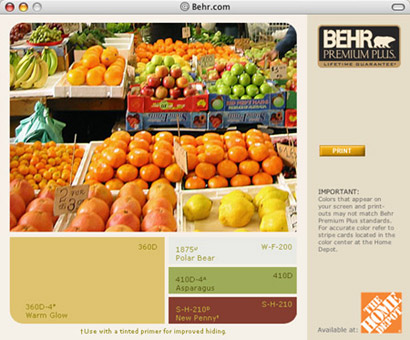
b. Explore Color: It helps and guides you by having you choose one color and giving you options to combine with (neutral, contrasting, calming, etc.), you can go back and modify your colors, and even place them in a room to get an idea of what it will look like in your home.

Pantone� provides us with the Pantone COLORTEAMSM which can help us with some recommendations, seasonal direction, color meanings (by culture and country), but you need to contact them by phone or email. This is great, but different from what Behr has to offer, which is giving us a tool to spark our imagination, and help us get to the vision that you can see but can’t grasp just yet.

As a designer it is important to know and understand color, to know how to work with it, and yet we usually complain about the corporate colors we have to deal with in many of our projects. Why do you think this is?

If we are the best people to decide which colors best communicate and represent our client’s needs, which color combinations carry our message to the right consumers in the best possible way, why are we (many a time) bitching about our own doing?

Maintained through our ADV @ UnderConsideration Program
ENTRY DETAILS
ARCHIVE ID 1932 FILED UNDER Discussion
PUBLISHED ON May.04.2004 BY bryony
WITH COMMENTS
Comments
Armin’s comment is:

Both Behr tools are actually pretty damn cool. (Hello 70s color palette!). While I like to think (and say) that color comes magically to me in my dreams and through pure intangible inspiration it is totally informed by all the things that are portrayed in these two Behr tools. In fact, I see myself going there for those times when I am not "inspired" and will be happy to accept that I got the color combination off some public-targeted tool for people who should be on Trading Spaces.

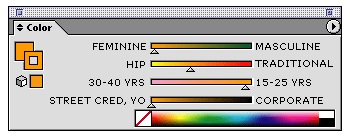
I think a cool tool for designers would be some sort of application that initially gave you a palette of 2-3-4 colors and then — being the picky asses we tend to be — we could tweak some of the values and that would in response alter the other colors to match the hues, saturations, etc… actually, what would be like totally cool is if it had values for things like Feminine vs Masculine or Hip vs Traditional, and you could slide the value between them to get a color palette. I would then bitch about how lazy designers are who use the Colorthron 2000� to select their colors. But it would be kind of a cool thingie.

In the meantime common sense will have to do I guess.

On May.04.2004 at 05:31 PM
Levi’s comment is:

Wow. That's a great site.

On May.04.2004 at 06:01 PM
Tan’s comment is:

In my experience, printed colors is like type. You get familiar with a color through use — you become comfortable with what it can do, and what it can or cannot combine with. I'm sure we all have our favorites too, like PMS 123, 180, 384, 4525, etc. And like typefaces, you sometimes revert back to old standbys when crunchtime comes.

The random PMS chips-in-a-cup method sometimes works remarkably well too.

I read a few years ago that the leading industry that dictated color trends in everything from automobiles to magazines is....(drum roll).... the carpet industry. Really. Apparently, carpet manufacturing is so complicated that it requires color trend forecasting way in advance of other industries. In fact, in this article, a carpet guy (?) predicted that browns and earthtones would be the next color trend for cars, which at the time, seemed gross and implausible. But lo and behold, it has in fact, come true. Copper/dark beige/brown is the new teal in car colors, in everything from PT Cruisers to BMWs. Go figure.

So while the BEHR site is great, next time you're at Home Depot, go check out the carpet aisles too.

On May.04.2004 at 07:28 PM
graham’s comment is:

back in the day when the only programme i knew was freehand and you still had to print artwork out and stick it on boards, there was a lovely thing freehand did.

once you'd made your thing, type and pics and colours and stuff, if you grouped it and then picked it up and moved it all you'd see everything in complimentary colours as it moved.

usually i'd change all my colours because the complimentaries were so much lovelier.

those were the days.

On May.05.2004 at 03:08 AM
Su’s comment is:

Armin: So you want a sort of Techni- Color -Schemer / -Match / -Scheme for print, yes? Lazy monkey. But sure, it'd be nice.

(Upon further digging, howzabout Color Consultant Pro?)

Are those books with bunches of categorized palettes worth anything? Seems like they'd probably be really conservative or at least boring.

Re: Mother Nature, this article at Boxes and Arrows has a few neat ideas about using landscapes as a source not just for color schemes, but for the overall arrangement of color within a layout.

Graham: Yet another reason old versions of software are nice to keep around. You never know when some quirk the developers "fixed" might come in handy. I remember reading an interview a while back with some guy who's been using Photoshop since pretty much the first version, and is now used as a consultant by the developers. He actually still uses a few ancient versions of it for particular purposes(blurring, etc) because he prefers the results the old algorithms give.

On May.05.2004 at 04:07 AM
Armin’s comment is:

Su, I was actually thinking of something more like this:

(Yes, I spent more time on this than I should have).

> Re: Mother Nature, this article at Boxes and Arrows has a few neat ideas about using landscapes as a source not just for color schemes, but for the overall arrangement of color within a layout

One of my favorite line of papers is Gilbert's Oxford by Holly Hunt which is, presumably and according to their story, inspired by landscapes, textiles and other such inspirational items.

On May.05.2004 at 08:55 AM
Scott d’s comment is:

Ok, this is kinda strange; yesterday I was thinking about posting on SpeakUp the link to Behr's online color tools. I'm in the process of buying my first house and while I won't close until late June, I'm already thinking about what colors I should paint my rooms (currently all walls in the house are white). I resisted the urge to bring my Pantone guide with me to the home inspection to use some of the time to select colors (don't have any paint chips-yet, and I have to make sure my color selections go with the carpet.)

I'd love to have the opportunity to select color palettes for clients, but have not had the chance recently. I'm currently bitching about a client's color palette that consists of a teal, which should have died ten years ago, along with black.

One of my favorite sites for selecting colors for web design is More Crayons

On May.05.2004 at 10:24 AM
Tan’s comment is:

I know 3 designers that chose interior house paints based on the old Champion Benefits paper line — whose pallette, if I'm not mistaken, was created by Stephen Doyle. I have a couple of rooms painted based on those colors.

>I resisted the urge to bring my Pantone guide with me to the home inspection to use some of the time to select colors

Scott, did you know that interior house paints has 15 times more colors than Pantone? The Sherwin Williams color selector has something like 15,000+ colors while the PMS selector only has 1,012 (I just checked). Somehow, it seems wrong that interior designers get to play w/ more colors than us.

On May.05.2004 at 05:08 PM
Steven’s comment is:

Armin-

Of course the main problem with your UI methodology is that the interface designer/programmer is assuming and presetting color choices to represent emotive or cultural archetypes, which of course is completely subjective and variable.

Tan-

Yeah, I agree that certain colors and combinations can become trusted old friends. But I'm always fascinated with combinations made by others that are different from my own sensibilities. It generates a little critical dialog in my mind which considers the influences and meanings that are so different from my own. Do the colors, in fact, "work" and therefore therein lies some greater chromatic truth or wisdom. Or do the colors fail, and therefore they serve as confirmation of one's own sensibilities and insights.

Graham-

It's funny that you mention that old FreeHand inverse color situation. That had the same affect on me, from time to time, as well. Interesting to note how technological quirks affect one's creative process.

As for me, I consider color combinations and choices to be a totally personal, subjective, culturally influenced phenomenon. As designers, we are constantly integrating our sensibilities with our clients, within the social/cultural context of any given project. Mucking about with various color combinations has always been one of my favorite parts of the design process; right up there with typography.

One of my frequent frustrations, though, is dealing with other designers (both Web or print) who don't get the fundamental difference between projected colors on a computer screen and reflective colors of printed pieces. Frequently what Photoshop or Pantone will suggest as a color translation is really "off" from the actual experience of these colors within a given context. I could tell ya some sad tales of chromatic woe.

And since we're also talking about paint colors here, I'd just toss out the phenomenon of the significant shift in perception of a color between what it looks like on a little color chip compared what it becomes when covering an entire room or wall. (Coincidentally, wife and I are actually going through some of this right now in figuring out how we want to paint our living room and dining room. I think I've gotten my wife on board with trying some hopefully interesting color transitions between the two rooms. Although, it definitely isn't going to be "eye-prickling orange" with burgundy trim [gag]). And yes Tan, I think that because of this dramatic color within environment relationhip, you need to have lots of slight shifts in various ways because they translate to big shifts when they are put on a wall. But then again, I've always thought that there were gaps in the PMS color system.

Scott d and others, BTW, as well my wife and I have spoken with a morgage broker and we're in the process of getting approved for a loan, as I type this. It's kind of scary because my work situation isn't yet completely regular, but with the current interest rates we figure that we can afford to buy a modest house and start to build up some equity for close to what it costs to rent, rather than giving money away to the landlord. We just sort of casually started this and it's amazing how quickly the pieces are coming together.

On May.05.2004 at 06:05 PM
Darrel’s comment is:

I resisted the urge to bring my Pantone guide with me to the home inspection to use some of the time to select colors

Actually, Pantone now has a house paint swatch book. It was advertised in House And Garden Magazine a month or two ago (can't find any mention online, though).

On May.06.2004 at 09:36 AM
Scott d’s comment is:

> did you know that interior house paints has 15 times more colors than Pantone? The Sherwin Williams color selector has something like 15,000+ colors while the PMS selector only has 1,012 (I just checked). Somehow, it seems wrong that interior designers get to play w/ more colors than us.

Tan, I assumed that there were more options for interior house paints, but didn't realize there were over 15,000 colors to choose from. I agree, it doesn't seem fair that interior designers have more colors to play with.

On May.06.2004 at 09:50 AM
Allison’s comment is:

Has anyone else read Colorist by Kobayashi? It is a really fascinating analytical look at color usage and inspiration. But it's also pretty academic.

On a more approachable, and practical, note — I like The Designers Guide to Global Color Combinations by Leslie Cabarga. The author uses design samples from around the world to look at societal relationships with color, and also provides some interesting palettes based on the work that is shown. It can really open your eyes to wonderful colors if you are feeling like you are stuck in a color palette rut. Plus the intro is hysterical.

I like the online tools for encouraging you to think about house colors in a different way... but, having recently suffered through trying to choose colors for my own place, I can tell you — no matter what tools you use — it is hard!

Especially when your husband is a designer too.

On May.06.2004 at 10:51 AM
Rick’s comment is:

Hmmm, responses, responses.

1) Scott D - We bought a house a year ago, and hated the pastel colors the previous owners had painted all the rooms. So we drove around, looking at everything we could, carrying my fan guides, a set of chipbooks and a sketchpad. When we saw something we liked, we matched it as closely as possible, taped down chips on the pad and took digital pictures. Instant mood boards.

Let's talk about how nerdly I felt standing in front of Evergreen Hospital trying to match their entrance signage and tearing out chips while people were driving in, forks stuck into their heads or whatever.

2) Tan, I think you're right on the money re: use of a particular palette. Ove the years I've grown comfortable with earth tones, and though I don't particularly like them, I think I can rock the khaki pretty well. I don't know if that's an asset or a crutch.

3) re: House paint vs Pantone, etc: Here's a cool site that kinda takes your RGB values and translates them into interior paint, by brand:

Color Harmonies

...at least I think that's what it does. I bookmarked it forever ago, and now Safari is pooping out when I try to use it. If memory serves, though, it will take your hex, rgb or whatever, and tell you what the paint brand equivalent is.

4) Steven: Buying a house was the most nerve-wracking, terrifying, exciting, adult things I've ever done. Good luck. Oh, and you know your "Target Price"?

Well, HAHAHAHAHAHAHAHAHAHAHAHA! You can take that number and pretty much forget it. But that's a good thing.

-R

On May.06.2004 at 11:29 AM
Scott d’s comment is:

Rick, thanks for the link it seems very useful; however, I don't see where it converts your RGB color into interior paint by brand.

> Buying a house was the most nerve-wracking, terrifying, exciting, adult things I've ever done. Good luck. Oh, and you know your "Target Price" Well, HAHAHAHAHAHAHAHAHAHAHAHA! You can take that number and pretty much forget it. But that's a good thing.

Exactly.

On May.06.2004 at 11:42 AM
Steven’s comment is:

Re: Housepaint & Computer Color Aids

This is precisely the situation that I mention with projected (monitor) colors and reflective (printed or painted) colors. While any computer-based color aids might be helpful in a general way, ultimately, the reality of paint on large surface areas is a completely different experience. There is a reason why most professional painters will have final color combinations approved by doing test areas on the actual wall. Some of the variable situations that completely change the nature of a perceived "color" are: the shift in the perception of color vibrancy when applied to a large area; the quality of light the room has, both ambient external and internal lighting fixtures; the color of carpeting and furniture; the reflective quality of the paint, i.e. flat, satin, semi-gloss, gloss; and the dominant colors of adjacent rooms.

Re: House Buying

Yeah, yeah. I hear ya! I'm currently between the mental spaces of "Oh My Gawd, I'm actually buying a house!" and "Holy Shit, I'm going to be a homeowner!" (if you know what I mean). And I totally understand the "forget the target price" scenario. But we're getting pre-approved for a loan and we're not in a desparate hurry to just buy just anything at any price. If we don't find something within our loan amount that we can live with/in, we'll just stay renters. Besides the main thrust of our efforts is to buy the house we're currently renting from our landlord, which has a little different dynamic than buying a house on the market. Any-hoo, thanks for wishing me luck. It is indeed exciting, terrifying, and ever-so adult.

On May.06.2004 at 04:37 PM
Tan’s comment is:

Sorry to hijack the thread, but I just have one advice on buying a house for Steven and others: Get in as soon as you can.

Don't wait for your dreamhouse. Just find a house that you can live with. The average first time home buyer only stays in their house for 5 years. Really.

Take advantage of the appreciation on housing cost while interest rates are still rock bottom. I don't mean to boast, but our house has appreciated 50% of its value in less than four years. Honest -- that's the rate of our neighborhood. There's no way we could have saved that amount in the same time period.

I've seen friends who've hesitated on buying a house b/c they're too picky or think they need to save for a larger down payment. And that's a mistake. Trust me, most people can't save faster than the average real estate appreciation where they live. In Seattle, the average appreciation right now is 11% annually, which is minimum $33,000 for a $300,000 house. You'd never get ahead.

Buy something livable and let the house's appreciation work in your favor. It's much smarter financially.

On May.06.2004 at 05:51 PM
Armin’s comment is:

An interesting color contest/gallery.

On Jun.25.2004 at 01:26 PM