Speak UpA Former Division of UnderConsideration
The Archives, August 2002 – April 2009
advertise @ underconsideration
---Click here for full archive list or browse below
  
Pantone: 3 Statements, 3 Questions

Pantone Statement: 40 years of the perfect match
Question to Speak Up: Do you ever get a perfect match?

Pantone Statement: Pantone, the color authority that designers trust, offers the consumer the color education and confidence needed to use color in new ways by providing them with the same color and trend direction on which design professionals rely.
Question to Speak Up: Do design professionals rely on Pantone for color and trend direction?

Pantone Statement: Color is the essential ingredient in driving product sales at retail.
Question to Speak Up: $15 for a spiral notepad?

Bonus question: What do you think the Pantone brand stands for?

Maintained through our ADV @ UnderConsideration Program
ENTRY DETAILS
ARCHIVE ID 1865 FILED UNDER Branding and Identity
PUBLISHED ON Mar.10.2004 BY David Weinberger
WITH COMMENTS
Comments
Rebecca C.’s comment is:

Yes. But I only use printers and shops I know & trust--after seeing their work.

Absolutely not. There are too many other influences to rely on a self-appointed "governing" body for direction.

Get real. Besides, I can't get it in quad-paper.

Pantone=color tools, nothing more.

On Mar.10.2004 at 08:46 AM
Ginny ’s comment is:

Yes, I've gotten a perfect match. But that has a lot more to do with the printer/pressman and the person who actually mixes the inks than with pantone. Pantone just gives the formula.

I don't rely on Pantone for color trend and direction. Color is chosen on a project by project basis. I must point out that I use Toyo swatches just as much as I use Pantone and I actually like Toyo better because they have a larger selection than Pantone.

Why would I pay $15 for a Pantone notepad? I have notepads coming out of my ears from all of the paper reps, and they're FREE.

On Mar.10.2004 at 08:47 AM
Custom Kahuna’s comment is:

1. Perfect? Never. Acceptable? Definitely.

2. Agree with Rebecca's comment 100%.

3. Pantone's got a monopoly on the product. And I forked out for a Survival Kit like many people have. So much of their other products are overpriced for my small studio. What was that color trends document they offer -- over $200 bucks? Hey Pantone: Keep it!

On Mar.10.2004 at 09:10 AM
amanda’s comment is:

I don't rely on pantone for color trends and $15 for a notebook is ridiculous.

That matching gun though....wow. That is worth drooling over. You point the thing at anything and it will give you a pantone match. coolest. designer. toy. ever.

On Mar.10.2004 at 09:11 AM
David W’s comment is:

$15 for a notebook is ridiculous

It used to be $22. They must have marked it down.

On Mar.10.2004 at 09:15 AM
Christopher Johnston’s comment is:

1. I agree with Ginny on this one. It's touchy but with the right pressman I've seen a perfect (or near perfect) match.

2. Am I going to buck the trend on this one? I do use Pantone for color direction but not the section of Pantone that caters to the Graphic Arts. I always check out the Home Color Forecast Kit at the begining of each given year. Helps in keeping me abreast of the color changes in home/interior and fashion.

3. No way, José.

*c

On Mar.10.2004 at 09:30 AM
sarah B.’s comment is:

1. Depends on the printer. I would say a "perfect" match.. 15% of the time... but who is to say the swatch book isnt faded as well...

2. eh... no, not really.

3. and, unless it comes lined.. I wont even consider it as a notepad, but rather a journal.. and I can make my own for $15!!

On Mar.10.2004 at 09:34 AM
len’s comment is:

Do design professionals rely on Pantone for color and trend direction?

I do, but about as much as I rely on Quark for design trends and directions. Which is to say, not at all.

Just another case of a brand becoming synonymous with its category. Kleenex = tissues. Band-Aid = adhesive bandages. Jell-o = flavored gelatin. And Pantone = color management.

As far as their retail arm goes, god bless 'em. Hopefully that subsidizes the rest of the company, and suckers who pay for that stuff make the Survival Kit cost a bit less. (Hopefully.)

On Mar.10.2004 at 10:30 AM
steve’s comment is:

A little aside - sort of.

A few years ago, I read an article and their aspirations beyond just serving the graphic design and traditional print industries. At this point, they were already getting into standardizing dyeing inks and plastic colors.

Anyway, they were talking about becoming a service to the average lay-person consumer. I think the example they used was J. Crew. Imagine getting the J.Crew catalog, and rather than just seeing vague color descriptions like "camel" or gunmetal", there was a reference number as well. You get out your home-pantone book and compare.

They thought everyone should have some sort of consumer Pantone book. It would make shopping online, where color is only as good as your monitor, so much more reliable.

I don't know where this idea ended up.

Maybe they dropped it entirely.

Sounded good to me.

On Mar.10.2004 at 10:31 AM
arturo’s comment is:

1

Yes, it depends on the pressman ABSOLUTELY

2

Are u kidding? No

3

NOOOOOO, I also think it`s ridiculous, One detail about this... Why they don`t have the number of pages of the notebook??... Well even if it is 250 pages I won't buy it ;-)

On Mar.10.2004 at 10:41 AM
marian’s comment is:

It seems like if you really want a colour match, you throw out the Pantone book, bring a sample and get the printer to match it.

There's nothing makes me roll my eyes like a "colour trend," and the only one I've ever seen pan out is "black is the new black."

I feel the same way about Pantone as I do about Quark: companies that have grown contemptuous due to their ubiquity in the market. Well, I ditched Quark and if I could ditch Pantone I'd do that too, but alas, I'm stuck with them for now.

Their brand is design-targeted and over-priced notebooks aside, the presence of design in their materials is noticeable. Those cloth-bound chip books are really lovely. So in this sense they are a lot more design focused than, say, Adobe (what's up with the eternally hideous graphics on Adobe products?). To even know what a Pantone colour is pretty much means you're in or related to design and in light of this I think younger designers especially would be attracted to their non-essential products. Nothin' wrong with that.

Myself, I love to make Pantone off-colour jokes. (Ha ha.) There is a certain childish joy in e.g describing a dog turd as PMS 161. Try taking a sample of that to the printer.

On Mar.10.2004 at 10:51 AM
David Weinberger’s comment is:

The real problem I have with Pantone is that I just don't care about them as a brand. I don't know what they stand for, other than "color", and all of their marketing speak seems so far-fetched and made up. I also don't think they care about me as a consumer or designer. I really can't think of two bigger problems that a brand can have. Therefor, I don't think that all of these Pantone branded products can be successful unless they are successful despite the brand. It's like a book brought to you by the Dewey Decimal System. What does it mean?

They say they are "the world-renowned authority on color and provider of color systems and leading technology for the selection and accurate communication of color." However, every CMYK breakdown of one of their colors is wrong, just wrong. We do offset print tests for projects to come up with good CMYK alternatives and they are always different from Pantone's numbers, always better.

To answer my own questions: I rarely get the perfect match although I seem to have better luck on coated paper and with better printers. I don't rely on Pantone for color and trend direction and I would never buy any of their retail products.

On Mar.10.2004 at 10:55 AM
JonSel’s comment is:

David, I'm pretty much in agreement with your assessment of Pantone's brand. They are essential color tools to get from design to finished piece, but that's about it. All this talk about color expertise and knowledge. I wonder who takes them up on that, beyond the chips. If anyone has ever seen an identity standards manual, you must wonder about the copy always accompanying color chips. "These colors are not intended to match the Pantone color standards and have not been evaluated by Pantone for their accuracy..." Has anyone ever actually brought a Pantone rep to the press check to make sure they were evaluated for their accuracy??

And don't get me going on CMYK repro of Pantone colors...all wrong...horribly wrong.

Those who have seen and used TOYO swatches know how much better their color range is but how hard it is to get most printers to be willing to match them.

On Mar.10.2004 at 11:29 AM
Rob Bennett’s comment is:

I agree with all the comments above. Especially when I can remember a time when Pantone actually gave away their color chip books instead of charging an obscene amount of money for them. Yes, they certainly have made themselves synonymous with color in the graphic design business but I have to admit Toyo as well as some others, have some things to offer. And much like Quark (which I do still use), if Pantone doesn't start mathing up (no pun intended) to the competition, they will get burned.

Oh, and I never use them for color direction. As a designer in financial services all I know about is blue. You mean there are more colors out there? : ^ )

Anyone who needs to charge $15 for a spiral notebook needs ot have their thought patterns examined.

On Mar.10.2004 at 11:50 AM
Armin’s comment is:

Pantone's brand strength lies in its ubiquity as the de facto color-picking system. Being there first (I assume) is always a strong brand asset… not that that liberates them from taking care of their brand, but they don't have to. (I'm not defending them, because I do think they could do so much better).

Graphically,

I like the idea they have of changing the color of the little chips in every use but the execution and implementation of the logo could be a little better.

Pantone is not an exciting brand, but it doesn't need to be until they have competition. (Again, not defending them). They sort of get the job done just by being there.

Their chip books are really nice.

On Mar.10.2004 at 11:56 AM
Amber Nussbaum’s comment is:

I haven't gotten a perfect match. But close enough to be acceptable.

I don't rely on them for trend direction or how I select my colors. That's driven by the focus of the particular project.

Oh, and Amanda, the color matching gun you're drooling over? It's nice for picking up CMYK mixes from a particular color, but I can't even get mine to recognize swatches from the Pantone book as their correct colors.

I e-mailed Pantone to see if there was a calibration method I could use to get it to at least match the swatches correctly. They e-mailed back something ridiculous like, "The color matching gun is not intended to provide accurate color matching, but is simply a starting point to begin selecting color."

Nice.

On Mar.10.2004 at 12:41 PM
saxophonejones’s comment is:

I have a device that is "simply a starting point to begin selecting color." Actually I have two, one on either side of my nose.

On Mar.10.2004 at 01:57 PM
Armin’s comment is:

You mean you select color with your cheeks? How cool.

On Mar.10.2004 at 02:03 PM
amanda’s comment is:

only recognizes CMYK? well that is crap. I had visions of fighting crime with that swatch gun.

I used to have contests with a designer pal over matching pantone colors to this or that. We would sit in the coffee shop, pick out various objects & yell out the pantone color. How nerdy is that.

I am indifferent to the pantone brand. Like I am going to change the amount of spot color work I do just because the pantone logo is cool.

On Mar.10.2004 at 02:25 PM
rebecca’s comment is:

Re: CMYK repro, a long time ago in the pages of this blog, someone recommended Hennegan Printing's digital process tint guide. As far as I know they still give it away for free if you ask them enough times, and I find the fanbook format easy to use and the formulas spot-on accurate. The range of colors is so much wider and more subtle than Pantone or Trumatch builds, I have no reason to use them anymore.

On Mar.10.2004 at 04:05 PM
surts’s comment is:

Do design professionals rely on Pantone for color and trend direction?

I don't subscribe to any of those colour trend lists, but if I'm curious to see what's the flava of the day, I'll visit Maharam

On Mar.10.2004 at 04:12 PM
arturo’s comment is:

I'll visit Maharam

Wow!! From now on, I’ll visit it too, really nice stuff... well maybe except for Mau's "nano structure" stuff ;-)

On Mar.10.2004 at 10:07 PM
marian’s comment is:

I also don't think they care about me as a consumer or designer.

"The color matching gun is not intended to provide accurate color matching, but is simply a starting point to begin selecting color."

Yep. That's Pantone for you.

On Mar.11.2004 at 12:52 AM
Tom Gleason’s comment is:

This may be off topic, but is it a common practice to create a proof (FPO) in process colors, and then specify pantones to replace them? What is the reason for using bare process colors instead of a color-close proof?

On Mar.12.2004 at 11:09 AM
Armin’s comment is:

If you mean the proof you get from a printer before going to press… it's simply because of the available technology. A proof comes out from a 4-color printer that recreates PMS colors (just like an Epson) — which is why you have to rely on PMS chips for accuracy. If color is critical, you can ask your printer for a drawdown (sp?) where they mix the PMS color you want a smack a dab of it on the paper you choose, that is the best way to know what a PMS will look like in the final piece — you have to pay for it though, but it's worth every penny.

On Mar.12.2004 at 11:22 AM
Tom Gleason’s comment is:

No, sorry, my question wasn't clear. My fiancee is a sort of savage as well, in that she works for a label manufacturer (she's involved in printing) and deals with designers. Why would a designer send a proof (sure, perhaps it's FPO, but)with completely different colors than the ones specified? (For example, a proof made of Magenta and Black and Yellow and Cyan, and then the Pantone numbers specified are completely different colors, like Orange, Green, etc.) What would be the reason for a designer to send something like that to a printer, other than to confuse things? Obviously the printer, without being given a correct color proof, would have to go to the designer and say "so are you sure these numbers are right? do you know this is orange not magenta?"

On Mar.12.2004 at 11:50 AM
Armin’s comment is:

I see. It sounds like the designer is not very, well, bright. It is customary though to send perhaps a logo in two colors, printed off an Epson with the two corresponding and close-matching PMS chips. There will be a slight shift from the colors off the printer with the PMS chips so it is important to mention to the client the need to look at the PMS chips for color accuracy and decision.

But it sounds like the situation you describe above could be solved with common sense from the designer.

On Mar.12.2004 at 12:27 PM
Tom Gleason’s comment is:

Ok, thanks, that's exactly what I thought.

I trust my instinct, and I thought that was dumb, even though I am not familiar with the traditions of color-specification. (and if it is a tradition of some sort, it is long over) It's good to see that I might not be insane. At times my criticisms may spill over onto you guys; I may not have the right focus always, but I always have a point.

On Mar.12.2004 at 12:46 PM
JonSel’s comment is:

Tom, a proof sent by a designer to a printer should have all colors called-out. By that, I mean a little line, drawn from the color to the margin, then specifying either the CMYK breakdown or the PMS color it is to be printed in. This tells the printer what is going to be printed, regardless of how it may look onscreen (say, in a PDF) or on a supplied color comp. No reputable printer would try to match colors off a designer's own office printout anyway.

On Mar.12.2004 at 03:14 PM
Tom Gleason’s comment is:

JonSel, that's a good point. Obviously we wouldn't try to match the colors from a proof...but still. Why would anyone do that? We're not talking about the slight difference from proof to print; we're talking about using completely different colors. And from what I hear, it's not totally uncommon for some reason, but usually the designer makes it very clear that the proof is not even near color accurate.

On Mar.12.2004 at 03:51 PM
marian’s comment is:

(For example, a proof made of Magenta and Black and Yellow and Cyan, and then the Pantone numbers specified are completely different colors, like Orange, Green, etc.)

This sounds like maybe it was an overlay. Not all that long ago on a spot-colour job you'd run film, then have positives made of the film and assembled into an overlay to check the separations. Overlays don't come in a wide range of colours, though (usually CMYK, red, blue, green) so it is (was) common to use something close-ish to represent the PMS colour. So if the designer was a little bit old school, using a prepress house that was a little bit old school it's conceivable that they had an overlay made with C,M,Y,K to represent the separations of their PMS colours. Get it? Am I dating myself, here?

On Mar.12.2004 at 09:06 PM
Tom Gleason’s comment is:

Thanks Marian, this is the kind of information I was hoping to get. It improves my understanding of the situation (and the reason for this type of phenomenon) a bit.

On Mar.12.2004 at 09:40 PM
Armin’s comment is:

Yet, it is the year 2004 we are in. Right?

On Mar.13.2004 at 08:39 AM
marian’s comment is:

Yep, last I checked, though I do seem to fall asleep and wake up in another century now and then.

I'm not making an excuse for poor communication, just giving a possible explanation for this Pantone-less incident.

The question is, what would Pantone The Brand think of this? I think they would not be pleased--not pleased at all. (Sorry David, just trying to bring your thread back 'round)

On Mar.13.2004 at 09:45 AM
Armin’s comment is:

Back to the thread, yes. I just remembered that I.D. magazine a while back (May 2000 — 4 years ago, man, time flies) had an issue whose feature story was Pantone, they had 3-4 different covers on the newsstands with the masthead, some small blurbs and a PMS color. That's it.

Here is a really small picture, which is all I could find.

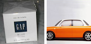
In it, author Tom Vanderbilt, towards the end of his article mentions a couple of examples of PMS nomenclature entering "mainstream". First, Gap's fragrance called Blue 655, then Ford's concept car 021C by Marc Newson. The evidence:

Beautifully put together by me.

Both instances purposedly named after PMS colors. Morale of the story? Designers like to make designers laugh with inside jokes. It's funny I tell ya.

On Mar.13.2004 at 03:05 PM
Kibble’s comment is:

Are they any good books or resources on the net that talk about the colour choosing process? Seems to me a great deal of thought goes into it by designers, rather than someone just looking at a colour and going "yeah, that looks nice" (although i'm sure that happens alot too!).

On Mar.13.2004 at 08:03 PM
Armin’s comment is:

Kibble, there are a lot of books on color theory, color combination techniques and such. I rarely rely on them, but I do know that looking at them in college was helpful in developing color sensibility. If you go to a bookstore you'll probably find 2-3 books on color, they are all pretty much the same, a quick glance does help in seeing color combinations at work that, um, work.

On the web, I haven't come across anything.

On Mar.15.2004 at 11:04 AM