Speak UpA Former Division of UnderConsideration
The Archives, August 2002 – April 2009
advertise @ underconsideration
---Click here for full archive list or browse below
  
Design Clichés

As original as we think we are as Graphic Designers we can sometimes end up using Design Clichés. They present an easy and viable solution to many design circumstances. They are also helpful when a client wants to blend in with the rest of the competition (i.e. Realtors plastering their face all over the place) and most importantly they heavily convey an intended message to a targeted audience. Here are some examples:

— Does construction equipment have to employ so much yellow?

— Do Heavy Metal bands really need to add umlauts to every single vowel (or consonant)?

— Are Script fonts utterly essential to wedding invitations?

I can’t think of many more at this time, I’m sure we can come up with some more clichés and it is highly encouraged that if you have ever used a Design Cliché you show it to us.

Thanks to Griff for the topic.

Maintained through our ADV @ UnderConsideration Program
ENTRY DETAILS
ARCHIVE ID 1512 FILED UNDER Critique
PUBLISHED ON Jul.10.2003 BY Armin
WITH COMMENTS
Comments
Darrel’s comment is:

I'm not sure if yellow construction equipment is as much of a cliche as it is a safety design issue.

But yea, the script fonts are a bit much on every single wedding invite. As an aside, we should have a thread where everyone posts their own wedding invites ;o)

On Jul.10.2003 at 09:26 AM
Sam’s comment is:

This is not exactly the same kind of cliche, but the expression I hate the most is "This logo wants to be down in the lower left corner" or "This type wants to be 6 point." I would rather chew on aluminum foil than hear this phrase said to clients.

On Jul.10.2003 at 09:44 AM
Armin’s comment is:

>I'm not sure if yellow construction equipment is as much of a cliche as it is a safety design issue.

Oh Darrel, always so usability oriented

Nothing? nobody can think of any more clichés. C'mon! think drop-shadows, colors, typefaces, papers, there are many... I think.

What about identities/logos for design firms? Is there a cliché there?

What about sports team logos? Yeah, you can't tell what sport they play anymore. As long as you have some swooshy thing going around the name of the team you are good to go.

On Jul.10.2003 at 10:16 AM
Darrel’s comment is:

What about identities/logos for design firms? Is there a cliché there?

How about the (all-helvetica + MTVesque abstract blob logo) + fully maximized flash interface sites? That's pretty cliche in my book. ;o)

On Jul.10.2003 at 10:33 AM
Armin’s comment is:

Why don't we do this too? What is a cliché in design?

On Jul.10.2003 at 10:36 AM
priya’s comment is:

re: wedding invites... not to hijack the topic but i am totally in love with those from claudia calhoun. i've already chosen the style & color. now i need a man. :)

clichés:

overall color schemes for holidays. (pink & red for v-day, red & green for xmas, orange and black for halloween, etc.) anyone know why the colors are those particular ones?

pink for girl babies, blue for boy babies.

green for landscapers.

On Jul.10.2003 at 10:36 AM
Kiran Max Weber’s comment is:

Spiral logotypes are a pretty big design cliche that emerged from the dot com era.

i am totally in love with those from claudia calhoun.

Nice work, nice site. Now all I need is a woman...

Does construction equipment have to employ so much yellow?

I'm not sure if yellow construction equipment is as much of a cliche as it is a safety design issue.

Isn't yellow also just Caterpillar's corporate color?

On Jul.10.2003 at 10:43 AM
Armin’s comment is:

Priya: i've already chosen the style & color. now i need a man.

Kiran: Now all I need is a woman...

Maybe I should open a new matchmaker section.

On Jul.10.2003 at 10:46 AM
jonsel’s comment is:

Armin's newest website: "Match Up". Look for it soon.

On Jul.10.2003 at 10:59 AM
priya’s comment is:

Maybe I should open a new matchmaker section.

only if you can make it look like this.

On Jul.10.2003 at 11:06 AM
jonsel’s comment is:

Howsabout PMS 286 blue for corporate logos? I am so tired of hearing, "well, we like blue" from identity clients. Duh. On the plus side, I did just sell a pink logo. I'm pretty happy 'bout that.

On Jul.10.2003 at 11:12 AM
Armin’s comment is:

>On the plus side, I did just sell a pink logo. I'm pretty happy 'bout that.

Was the client a woman? 'Cause no dude is going for a pink logo... I probably would, paired with a dark green... yes...

Another question, how related are clichés to stereotypes?

On Jul.10.2003 at 11:19 AM
Rick G’s comment is:

This might be a little off-topic, but since that's where the discussion is headed anyways...

Meta. Every single designer (including you, and certainly including me) totally overused this typeface in the last six years. Meta was the new "e". eHealthCare. eFax. e. e. e. Meta Meta Meta. Somewhwere I read a little comment about how Meta was the new Helvetica (sorry, I forget the source); I think Meta was the 90s version of Arial, fer heaven's sakes. Dot-com? Meta! Dot-org? Meta!

Wait, let's shake things up... let's use Officina! Let's use DIN Schriften! e! e! e! Wait, let's change that to an "i", since "e" is taken!

Whooo, I've had a LOT of coffee this morning.

-R

On Jul.10.2003 at 11:21 AM
corey’s comment is:

On movie posters - why do they always have to use Trajan if it's a serious movie, Gill Sans Extra Bold if it's a comedy and Impact for an action movie. Impact, christ, at least they could have used Compacta, but Impact?

And why do they always have the stars names at the top read "Star A and Star B" but the photo is of Star B and Star A?

On Jul.10.2003 at 11:47 AM
hp’s comment is:

Speaking of clichés, how about "customer-centric", "results-oriented", "enterprise class", "leading this or that", "industrial-strength", etc.

One could be easily led to believe there are actually companies out there that are failure-oriented makers of rickety widgets who could not care less about their customers.

:-0

Nowe that I think of it....

Regards,

-hp

On Jul.10.2003 at 11:53 AM
Paul’s comment is:

There's a big difference between something that is a cliché and something that simply uses recognized and easily understood visual language.

A design cliché is something whose overuse has rendered it essentially meaningless, like the aforementioned uses of Meta or Trajan, and I'd add the use of red in any identity for a Fast Food chain.

But does a Christmas card suffer if it uses red and green? I don't think so. In fact, red and green used together has so much meaning attached that almost anything can be make into a Christmas-themed image by employing them.

That's just one example, but I'm sure there are many others...

On Jul.10.2003 at 12:00 PM
Lea’s comment is:

Corey: perhaps it's because the fonts you listed are usually bundled with their computer and they didn't spend any budget on buying orginal fonts.

I know. I hate Impact, too. Almost un-naturally so. :P Down with IMPACT!

And I too, notice how they may have Star A and B in that order, but in the poster, they are not. Grr. Argh.

On Jul.10.2003 at 12:01 PM
rebecca’s comment is:

But Meta has old-style figures!

On Jul.10.2003 at 12:26 PM
Amanda’s comment is:

After much arguing and two months of concepts - my husband (designer) and I (designer) agreed on gill sans for our wedding invite.

& now we both hate it.

On Jul.10.2003 at 12:41 PM
Paul’s comment is:

Meta's a nice face; don't get me wrong, Rebecca. But as Rick G. pointed out, using it for your dot-com logo or identity does not exactly say anyting too unique about you.

On Jul.10.2003 at 12:41 PM
Rick G’s comment is:

The Star A and Star B thing, I'll wager, is some kind of bitchy contractual thing: the person who gets top billing doesn't get to be the higher-placed photo. Something tells me these people (or their agents) get quite persnickety about dumb things like that.

Impact. I could not hate another font more than Impact. Except for maybe SAND! Bwahahahahaha.

FWIW, I've been digging on Courier for a while. There's something quasi-oldschool rad about it. Ditto for OCR-A. I'm waiting until the day I can look at Chicago (!) as the new retro.

-R

On Jul.10.2003 at 12:45 PM
corey’s comment is:

Rick:

Yes there are contractual obligations on the ordering of stars names. There is a legal heirarchy that must be adhered to, sometimes the biggest named star just needs to be placed first, sometimes that star needs to have their own line and the rest on a line below them in a smaller point size. But there has never been a legal reason behind where on the poster a star is to be placed. Yes there are equal likeness issues, Star B must be no bigger than 90% the size of Star A, but also must not be smaller than 75% of Star A - but honestly I've never heard of a star being legally bound to the left side of a poster. I think it's just lazy designers.

Actually sometimes the stars have legals that say that their image cannot be flipped, so maybe it is something like that. I'm not certain, I just know it happens A LOT and is just weird to look at.

On Jul.10.2003 at 12:56 PM
Tan’s comment is:

> Howsabout PMS 286 blue for corporate logos?

I know! We seriously have had four or five clients with 286 as their corp color. I have a hypothesis (unproven) as to why this is so -- PMS 286 is the default blue in Corel Draw or Powerpoint. Crap like that is what makes our lives hell.

There's a great little book that Cahan designed for Stora Enso a year or so ago -- "New Models for Growth and Profitability". It's a witty satirical look at corporate design. There's a section in there with 8 pairs of major corporate competitors that tout blue as their distinguishing corp colors. Like:

GM : Ford

Arco : Mobil

HP : IBM

AT&T : Bell Atlantic

Chase : Citibank

They also have about a 100 examples of annual report theme centered around "Building", "Growing", "Leadership", "Value", and "Vision".

It's great stuff.

We have a number of biotech/healthcare clients. The cliches there is that they all push for photos of their equipment on the front covers of stuff. Some of those equipment are freaking scary -- like anal probes, giant industrial needles, bone saws and shit. And they always ask us to make it look "sexy".

Let see, the most common CEO portrait cliche is the "crotch cover" or "fig leaf" pose, or the "reverse fig leaf" pose.

Oh, and every high tech or software client wants the "Matrix" look on their stuff.

On Jul.10.2003 at 01:02 PM
Su’s comment is:

Corey: Matt(of Metafilter) blew this mini-rant out his a.whole a while back regarding comedy film title treatments.

On to the cliches:

As I've mentioned before, I'd like an explanation for the softly glowing type on every damn car commercial made within the last year.

Mason for anything even remotely "dark". I'm sure Barnbrook is so tired of this.

On Jul.10.2003 at 01:04 PM
Su’s comment is:

So um...Tan: Are those images of biotech equipment like, non-distributable and stuff? I loves me some industrial machinery.

Not like that, you pervs.

On Jul.10.2003 at 01:07 PM
Tan’s comment is:

oh yeah, everything about the damn UPS logo is cliché. It's the fulcrum of all that is trite and pretentious in branding.

yup, I still can't let it go...

On Jul.10.2003 at 01:08 PM
Tan’s comment is:

> I loves me some industrial machinery. Not like that, you pervs.

(ahem...rebecca, I wanna go on record. Again, this is totally not my fault. I can't be held responsible for the deviant behavior of others on SU.)

Su, just go into a local medical equipment store and tell em you're a medical student visiting from out of town. they'll give your more brochures and posters than you can carry. Maybe some..ahem.."samples."

Btw, you're the first person I know who's ever asked me for that stuff.

I fear your video collection.

On Jul.10.2003 at 01:18 PM
Sam’s comment is:

Just as bad as the star treatment on movie posters, it seems like 7 out of 10 posters use Trajan. Why?

On Jul.10.2003 at 01:22 PM
corey’s comment is:

Sam:

I was recently able to get away from Trajan (or as the client keeps calling it "Tra-Han"), by passing Requiem off as Trajan.

It's the same thing, only with some redrawn characters, it'll make your poster look like the others, but still be unique, everyone will be wondering what you used - I lied like Holden Caulfield.

On Jul.10.2003 at 01:28 PM
Chris’s comment is:

A rebel should do their wedding announcements with Arial.

A rebel designer should do their wedding announcements with Helvetica

On Jul.10.2003 at 01:42 PM
Sam’s comment is:

>>or as the client keeps calling it "Tra-Han"

Ha! This is worse than my client who calls me a "graphic artist."

Fight the power, Corey! Requiem is very fine indeed, especially that Y. Not that Trajan isn't also, but how did it become the default? I understand the use of the super-condensed sans serif--is it Empire?--for space reasons, but Trajan seems random.

On Jul.10.2003 at 01:43 PM
debbie millman’s comment is:

Some fun examples of brand clichés:

Names: An interesting dichotomy exists when products or companies share the same name—will the real Old English please stand up? Is it a beer, a malt liquor or furniture polish? A personal favorite is Carefree, which not only is the name for a chewing gum AND a line of feminine hygiene products, but also both brands use the same visual vocabulary and color palette.

Iconography:

Hmmm, this tricky. Rolex and Hallmark have nearly the same brand mark. Doral Cigarettes and fashion designer Todd Oldham also use crown iconography in their brand identity. A couple of others that use the same brand architecture: Perdue and Blockbuster, Bufferin and Snickers: the worlds biggest candy bars with the same logo typography as one of the world’s smallest analgesics.

Ah, Nike:

I can’t tell you how many clients have ask for the next swoosh. But what are they asking for really? In fact the logo was design by an art student twenty years ago, overnight for $60—and Phil Knight wasn’t very happy with it, he wanted it to have more action in it, more like Adidas’ logo. And in fact it happens to be Newport’s logo upside down. I love that.

On Jul.10.2003 at 01:52 PM
Armin’s comment is:

>Ah, Nike

This is completely off topic, but worth mentioning in our brand-driven world: Nike bought Converse.

On Jul.10.2003 at 01:58 PM
Amanda’s comment is:

nike bought converse! nooooo!

I am also waiting for Chigago to be the new retro font. Or not, so I am special for using it. I like it.

One thing that really pisses me off is I have noticed people calling it graphic design, graphicS design. I don't know of that is cliche but I sure as hell hate it.

On Jul.10.2003 at 02:35 PM
Patrick’s comment is:

— Are Script fonts utterly essential to wedding invitations?

I did my wedding invite with Adobe Garamond. I so wanted to buy Mrs. Eaves for it (which had just come out), but I was poor. Wait. If you look closely, you'll see a bit of Snell in there too. So sue me.

The clichés I am starting to get tired of are the standard corporate imagery. "Can you put a handshake on the cover of our bank's brochure? Maybe some fiber optic wires in the background since we use computers? And collage a globe in there too, so we look, uh, global. We may sell something to Canada someday." Does anyone really need to see a globe to know what global means? I have one in an annual I am working on now. At the client's request, of course.

On Jul.10.2003 at 03:07 PM
Rick G’s comment is:

Mmmmm, another one occurred to me: the arrow.

This used to be cutting edge; all the neat-o design sites (i.e. Zuadobank {RIP}) used it. But when it becomes something that The Man uses... it's expiration date has passed.

Glad I worked there before they did this.

I also might be getting a wee bit tired of pixel art. But maybe that's just me.

-R

On Jul.10.2003 at 03:21 PM
Armin’s comment is:

>another one occurred to me: the arrow.

That would be more of a trend. When Speak Up was a more angrier presence I had this. And then I was even angrier and upgrade it to this.

On Jul.10.2003 at 03:31 PM
Tan’s comment is:

> Glad I worked there before they did this.

hey Rick -- did you work at Talisma? They were spawned from Aditi right?

Guess who id'ed Aditi -- that's right, yours truly. Though I hold absolutely no responsibilities for the atrocities committed after I gave birth to the logo and initial print materials. That's when they were still cool and small.

And I never touched Talisma.

On Jul.10.2003 at 03:42 PM
David E.’s comment is:

I'll have you all know that I did my wedding invitation in script. It's no more a cliche than a white dress for the bride. It's a tradition...and personally, I dont think the whole world needs to be re-designed. Actually, I tried to something different but my bride insisted on script...hey, she's the boss.

A good topic would be "When does a trend become a cliche?" There are a few trends that I dont mind at all. I really like that clunky condensed serif face that I see all over. Is this the start of an anti-technology backlash? (what is this typeface anyhow? anyone know?) Then again, why is it always this particular face when there are many others that would work just as well (like Clarendon)?

By the way, I think it's kind of sad that Nike bought Converse.

On Jul.10.2003 at 03:47 PM
Kiran Max Weber’s comment is:

I like their "Design Methodology. Neat clouds.

On Jul.10.2003 at 03:48 PM
graham’s comment is:

tracing paper.

ripped paper as a design 'element'.

any font that mimics hand drawn or distressed stuff.

any font since univers, actually.

craft stuff (handmade paper and all that muck).

rivets for binding.

metal covers on things.

wit.

On Jul.10.2003 at 03:49 PM
graham’s comment is:

oh . . .

type in the shape of things-like type making a tree. or a building.

On Jul.10.2003 at 04:02 PM
Tan’s comment is:

> I like their "Design Methodology. Neat clouds.

you know, they invented the internet.

On Jul.10.2003 at 04:11 PM
David E.’s comment is:

So is every trend in design necessarily a cliche? When people look back at the dotcom era, will they think logos with swooshs and meta are really hip and "retro"? It's ironic that the whole technology revolution was supposed to be about innovation, yet it produced some of the least innovative graphic design in a long time.

On Jul.10.2003 at 04:28 PM
felix’s comment is:

Sam: Just as bad as the star treatment on movie posters, it seems like 7 out of 10 posters use Trajan. Why?

Yes!!!!

I can tell you how many times I been perplexed by this strange phenomenon.

It started somewhere around Remains of the Day and ended with a low budget blockbuster pawning themselves off as high-brow.

Trajan is to cinema as Times Roman is to desktop publishing.

Hooray for Trajannywood!

On Jul.10.2003 at 05:11 PM
David E.’s comment is:

if any of you could experience the wonderful world of entertainment design *gags*, you wouldn't even question why it's all so cliched. I once had the displeasure of working for 2 weeks ("testing" they called it...to see if they wanted to hire me) at a large firm that did nothing but newspaper advertising for movies. For a full page ad, teams of designers would do one hundred comps out of which the client would pick 3. Then, based on each concept another one hundred concepts would be executed for a total of 400...399 of which end up in the trash. If the client likes Trajan, that's what she gets.

You can tell i dont have a lot to do today.

On Jul.10.2003 at 05:31 PM
DREW’s comment is:

Cahan!!!!!!

On Jul.10.2003 at 05:43 PM
Bradley’s comment is:

Patrick--how could you use Adobe Garamond!? Noooo! It's been WAY too long since I proved myself dorky enough so I'm going to complain about the different versions...of...Garamond.

List o' Rants:

The term "graphic artist" like Sam mentioned.

The term "graphicS design" that someone else mentioned.

The term "commercial art"

The following descriptors: edgy, fun, conservative, sexy, good design

The following commands: make it pop, have some fun with it, play with it, push it

I'm sure there are more.

Other complaints: punctuation that isn't hung especially in display copy or slugs, but even in body copy (yes, its a bitch in Quark....so, fine.).

When award-winning pieces have even one widow or orphan. Punctuation outside of quotation marks and INSIDE quotation marks when they're on a distinct term.

Subheads that aren't set .5pt below normal. Numerals that appear larger than text. Too much or too little space between paragraphs.

This has turned into a typography rant. I'll go have a conversation with the brick wall out back now. What can I say? Working with Mark Oldach WILL turn you into a Type Nazi!

On Jul.10.2003 at 06:09 PM
Bradley’s comment is:

Didn't Bruce Mau use Times New Roman pretty frequently in S,M,L,XL? I thought it looked good...

On Jul.10.2003 at 06:17 PM
Rick G’s comment is:

hey Rick -- did you work at Talisma?

Yeah, for a very short while. It was pretty neat to have to have that awesome view, but the drive across the bridge every morning killed me. I do believe they were a spinoff from Aditi, but honestly I wasn't there long enough to know much more than that... it was right after I moved here and I knew I wasn't staying long enough to bother learning the history.

The Aditi ID is nice. You did that? Sweet!

I had a million other things to say but I'm beat. Too much meetin'.

-R

On Jul.10.2003 at 06:27 PM
Mike’s comment is:

Geez, this stuff is pure gold ! I mentioned before that I am not in design, I'm just a lurker.I used to set tile and I got to where I couldn't go take a leak at a bar or resturant without the bad tile work staring at me and since I've been checking out this site [about a week now] I can't drive through the urban sprawl without all the BAD design screaming at me. I swear I used to hardly notice. This must drive y'all crazy. Also, Priya's link to finding your life partner in 3 easy steps is freaking hilarious. This stuff is so much funnier than fiction.Debbie, your post above is killer.Thank you! My brother is in sports advertising. I can't wait to tell him the Nike/Newport connection. Where can I see a website that will show me some of the more common fonts that y'all are talking about? I am clueless here. Thanks to all.

On Jul.10.2003 at 08:37 PM
Sam’s comment is:

Bradley you're a typesetter after my own heart. But I thought you were going to split hairs on Garamond. No? Okay then:

Stempel: excellent Adobe version, horizontally economical, even better in metal. Strong like a New Enlgand minister.

ITC: I'd rather use rubber stamp type. Or maybe Goudy.

Simoncini: Simonwat? No, too close to ITC. No pointy bits, please.

Adobe Garamond: always a good choice, usually the perfect compromise between distinct and unnoticeable

Garamond 3: ah, Garamond 3, so lovely. Damn you, Dave Eggers, horde it all to yourself!

Ah, I feel better now.

Mike, welcome to the fold. Lots of fonts here at myfonts.com and the Adobe Type Collection. Stay away from Times Roman!

On Jul.10.2003 at 09:20 PM
Mike’s comment is:

Thanks, Sam

On Jul.10.2003 at 09:23 PM
Mike’s comment is:

I was going to mention this earlier. See how the myfonts.com logo has a partial uppercase letter in a box at an angle. Isn't this WAY overused?

On Jul.10.2003 at 09:30 PM
Darrel’s comment is:

The term "commercial art"

I actually love that term.

Other complaints: punctuation that isn't hung especially in display copy or slugs, but even in body copy (yes, its a bitch in Quark....so, fine.).

Well, we're going away from cliches into bitchin', BUT...speaking of bad typography...any of you web folks ever try to read a WROX book? These are relatively well known/recommended books on computer programming. Unfortunately, WROX has (or did, rather, as I think they went under) no one on staff with basic typography skills. Each page was laid out with edge-to-edge text (awful line lenghts with poor leading) and not a single quote or apostrophe (all hash marks--ARGH!) and a plethora of typos. I sent a letter to the editor and they just couldn't absorb my complaint.

OK, my little type rant is over.

On Jul.10.2003 at 09:49 PM
Tan’s comment is:

Hey Su, just messin w/ ya. Hope we're cool.

---

Rick -- thanks man. The Aditi logo is a bit dated, I'll admit. It's nuthin remarkable -- just mentioned it in passing.

A bunch of us Seattle postees should hook up for beer one of these days. There's a bunch of us from here, including 3 authors. We can give the Yorkers and Chicagoans a run for their money.

---

Anyway, back to the discussion. Sam -- I loved Stempel Garamond in college. Used it on everything. Then, in the early 90s, I fell in love with Adobe Garamond and had a torid love affair for years. Never fancied Garamond 3 or ITC for various reasons however. But now, I've left them all for a married woman, Mrs. Eaves.

---

Debbie -- brilliant brand comparos. And I'd give anything to be in NY tomorrow. sniff...I tried.

---

Ok, a big, mondo cliché to end:

Chopstick fonts for Chinese restaurants.

You know, the Chinese calligraphic looking shit. It's my biggest pet peeve in life. Offensive in every way. As an Asian designer, it's like typographic blackface. As if a bad Asian accent was translated to a typeface.

The irony is that most Asians I know have impeccable handwriting and penmanship.

Now Bamboo fonts are different. That's just a shitty font, not blatant typographic racism.

On Jul.10.2003 at 11:55 PM
Mark Kingsley’s comment is:

(long inhale)

1. flat/non-design with flush-left san serif font - usually in an acrid color.

2. "illustration" style that consists of a rough line drawing/tracing (often of something like a groovy clubkid listening to headphones) in a large field of flat color -- usually combined with typography taken from #1.

3. shakey type in motion graphics ala "se7en".

4. flat, direct photographic lighting with kino lights (banks of flourescents).

5. silhouettes as illustration.

6. cross-processed photos of rock musicians squatting on the streets of the east village -- shot with a wide-angle lens.

7. relying on emigre fonts to do the work for you.

8. irony

9. "skip intro"

10. design or branding firm websites that describe a proprietary "process" which is often pure drivel or designbabble.

11. design porn

12. cd labels that are nothing more than a flat flourescent color -- or white.

disclosure: i am often guilty of 8 of the above -- probably all 12 if i would only be honest. hell! i even went so far as to hide a "nina" in a recent illustration!

ooo, before i forget...

13. hiding the word "nina" in an illustration.

On Jul.11.2003 at 03:04 AM
Arikawa’s comment is:

I'm not sure that being “overused” is equal to being “clichéd” is equal to being “bad.”

(You can imagine me making lots of quote gestures in the air with my fingers, can't you?)

If this were the case, then owning a Windows PC would equate to something bad.

Oh wait… nevermind…

On Jul.11.2003 at 09:57 AM
Bradley’s comment is:

Hey Sam--

You don't perhaps remember from New York last May, do you? Back when you were I think still with Baker, right before you went out on your own...I was up there with Maria for the One Show.

Anyway, Garamond. Garamond 3 is coveted by all the "type snobs" like Eggers and Sterling...and now me too, but they got there first and boy does it show. Simoncini is a favorite of the design directors at W Magazine, and I'm with 'em on it. And typically I'm wary of Bitstream. Bitstream News Gothic makes my skin crawl, whereas News Gothic Monotype makes me glow.

Ohmigod I am SUCH a dork!

Mark Kingsley--

Great list. Love it. Right-on. Love the work on your site by the way...looks like y'all have fun there.

On Jul.11.2003 at 11:14 AM
David E.’s comment is:

People who hate ITC Garamond are just being type purists. If they had called it anything other than "Garamond" no one would have a problem with it. I've use it often, though never in the same situation that I'd use Adobe Garamond. There are many instances where where nothing works nearly as well.

As much as I love Art Chantry's techniques, I'm also really tired of irony in design. 1940's clip art is one cliche that seems to have died, thank God. For a while it seemed that all anyone needed to do to get into an annual was stick one of these big-headed gas station attendants or soda fountian workers on something.

And hey, what's "design porn"? I'm getting all excited now.

On Jul.11.2003 at 11:42 AM
David E.’s comment is:

...and speaking of irony:

Tan, If someone uses the old "chopsticks lettering" for kitcsh value, do you still find it offensive? For example, Abacrombe was doing t-shirts like this which (so they claimed) they thought would appeal to Asians—but, people did find them offensive and they were taken out of the stores. Also there's a hip local bar called the "Good Luck Bar" which has a 1940's Chinese theme, and of course uses that style of lettering in the sign.

And no one's mentioned Berthold Garamond. Does here anyone use it?

On Jul.11.2003 at 12:29 PM
Tan’s comment is:

> If someone uses the old "chopsticks lettering" for kitcsh value, do you still find it offensive?

No, of course not. It's all within the context. It's like bad kung fu movie references. If it's used as vernacular cultural references, then it's poking fun at the absurdity of it in the first place -- know what I mean? Same with the bar you mentioned.

And I didn't agree w/ the A&F suit -- people blew it out of proportion. Probably because they hated A&F, not because of the tshirt. The Gap has stuff like that all the time.

Here's a question -- so is Remedy the Aboriginal equivalent of chopstick fonts? Hmmm...

On Jul.11.2003 at 12:59 PM
pk’s comment is:

i have absolutely nothing to add to this thread except this:

the last wedding invite i did was designed in notcaslon, scala sans, and abstract calligraphy painted with a big fuckoff stick.

all together now: "get her."

On Jul.11.2003 at 02:15 PM
Mark Kingsley’s comment is:

david e. asked my definition of "design porn"

design magazines

design annuals

design monographs

all this stuff clouds our minds away from our true nature. it pollutes the profession with trends, stollen sollutions, toung-in-cheek references, etc.

i'm constantly amazed how susceptable i am to this stuff when i'm part of the profession that's making it.

On Jul.11.2003 at 03:56 PM
David E.’s comment is:

mark, you really spoiled my fantasy of what design porn was...here i was imagining it being something that my favorite female designers might have participated in.

seriously though, i think most people learn how to design as much from design books and magazines as they do from school and work experience. I dont think I'd be half the designer I am if it wasnt for studying and being influenced by the work of others. It's like saying a musician shouldn't own a collection of music.

On Jul.11.2003 at 04:14 PM
David E.’s comment is:

My all-time least favorite design-speak cliche is the word "horesy"...makes me want to tear my hair out. I mean, "too big" has the same amount of syllables. Cant people just say that?

On Jul.11.2003 at 05:43 PM
Bradley’s comment is:

David--

I actually prefer to say "Mr. Ed" instead of "horsey" but not many people get my reference...as has been well established, I am a dork.

Good point about the clipart cliche. Sometimes it boils down to the photography too, like when everyone started using Todd Hido-style photographs in everything from biotech corporations to sporting goods manufacturers. I remember this one piece quite vividly from a few years ago for MVP.com (now defunct) that looked EXACTLY like a Howry or Cahan book for one of their hardcore science clients. WTF?

I'm also amazed at people who use no more than five typefaces and the same three photographers and illustrators from project to project, and refuse to admit that they have a style.

It's kind of like when James Victore says he's "always trying to do something new" and then comes back with the same scribble style that he's always used. It's like dude, chill--the work is cool, you don't have to convince everyone you're always trying to be different.

Mark--

Ah, so that's what you meant by design porn. While I do as much or more bitching about that stuff than anyone I know, I still always end up in the "graphic design" section of the book store at some point when I visit. Its kinda sad and needs to stop. What got me ticked even more was that book that Taschen put out--100 Top Graphic Designers or something like that.

Of all the work that was in there, I'd say 90% of it was either self-promotional or for design award shows or design lectures. 9.5% was for microscopic clients I've never heard of (NB: this is not to take away from Cahan or anyone else who does great ARs, because few of us have ever heard of many of those corps). 0.5% was for something a little bigger, etc. It was pretty self-referential, self-absorbed, and did absolutely nothing to convince normal people that design is valuable.

Why are designers so obsessed with designing stuff for...other designers?

Maybe it parallels the reason that compels me to whine about Garamond variants.

But then again, I love the micro-style discussions that go on here that are totally esoteric sometimes. It's like photographers talking about lenses or illustrators discussing pens, inks, and brushes. I'm glad they know that stuff so well, and hopefully other people are happy that we give a damn about seemingly irrelevant minutiae.

This annoys me: designers saying that it "was so hard" to design their monographs. Eh? Hard in what way? That's a kind of...empty, hollow statement.

On Jul.11.2003 at 06:05 PM
Tan’s comment is:

David, did you mean "horsey"? Horesy means an animal that doesn't believe in God....I'm kidding, I just made that up :0)

On Jul.11.2003 at 06:08 PM
Mark Kingsley’s comment is:

david e. -

i do agree with you about the benefits of looking at the work of other designers, BUT that is only a small part of a designer's education. since our job is to order the world so the world can communicate and motivate, then we have to learn from other things than the work of other designers. otherwise, it's a snake eating it's own tail.

besides, in my experience i truly didn't flourish as a designer until i started hanging out with designers who were better, older and more experienced. their attitude towards work, creativity, clients and other designers revealed itself in idle conversation rather than formal presentation.

but then we're getting into the proper education of designers -- and that potato's too hot for me!

bradley -

funny you should mention taschen -- they publish books of vintage erotic photography a.k.a. "smart" porn! guess i'm on to something...

On Jul.11.2003 at 11:25 PM
Sam’s comment is:

oh yeah, i remember you, brad. what's yur email?

On Jul.14.2003 at 11:47 AM
David E.’s comment is:

Well maybe design collections are a little like porn—when I look at them i definetely get in the mood to design!

OK, how about rock band logos (or any "counter culture" logos) that are take-offs on well known corporate logos? That's become such an easy non-solution for logos in the last 10 years. It gets more irritating every time you see a new one.

On Jul.14.2003 at 03:21 PM
Armin’s comment is:

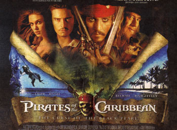
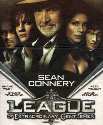
I know this is an old thread, so I'll try to recap a little bit. We were talking about clichés on movies, like the extensive use of Trajan for movie posters, the placement of stars and some other movie visuals.

This might not be a cliché, but I found these two movie ads on the same spread.

I call it "The V Neck Sweater" technique. And it is based on men's obsession with cleavage. That's all I have to say about that.

On Aug.09.2003 at 05:35 PM
Lea’s comment is:

interestingly enough, each "v-neck" poster actually has women with bounteous cleavage on it, too... but placed not-too-obviously off-center. ;)

On Aug.09.2003 at 05:55 PM