Speak UpA Former Division of UnderConsideration
The Archives, August 2002 – April 2009
advertise @ underconsideration
---Click here for full archive list or browse below
  
Design’s Top 100 - Part 2

The first part of this topic was a great success, but guess what? We only managed to compile 49 entries, that means we are halfway there. I have put together a more roomier page where you can leave comments and see what design pieces have been included so far.

Note: You can leave comments in the new page and right here too, it is the same comments window.

Maintained through our ADV @ UnderConsideration Program
ENTRY DETAILS
ARCHIVE ID 1328 FILED UNDER Critique
PUBLISHED ON Jan.02.2003 BY Armin
WITH COMMENTS
Comments
Armin’s comment is:

I've been doing a lot of research for this and I have tons of new stuff to put up. I'll post a few at a time so that it's not overwhelming.

Here we go:

One of the best opening credits by Pablo Ferro

I've never really liked Herb Lubalin's work but this logo is smart and very well executed

Does it get any better than this in music packaging?

On Jan.03.2003 at 09:10 AM
Scott Stowell’s comment is:

This is a great project you all are putting together. Lots of my favorites are included.

I have to request a correction, though: the Colors magazine cover (issue no.6: Ecology) was not designed by Tibor Kalman, but rather by me in 1993 while I was art director of the magazine. Tibor was the editor-in-chief of Colors, not its designer, and he always sought to make this clear as he was proud to be the one in charge of the content of the magazine, not just its form.

If your intention was to include a piece of Tibor's editorial design work, I would suggest any of the great covers produced while he was creative director of Interview magazine in the early 90s, or some of the pages he designed with Emily Oberman for Artforum magazine in the late 80s. If you just wanted to include a Colors cover, the covers of issue no.1 (designer: Emily Oberman), no.4 (designer: Paul Ritter) no.7 (me again), or no. 10 (art director: Mark Porter). Fernando Gutierrez is doing nice things with the magazine these days as well.

Good luck with the Top 100!

On Jan.03.2003 at 09:56 AM
Armin’s comment is:

>I have to request a correction, though: the Colors magazine cover (issue no.6: Ecology) was not designed by Tibor Kalman, but rather by me in 1993 while I was art director of the magazine.

Thanks for the correction Scott. I didn't know that. The Colors entry is supposed to be the magazine as a whole. In the second stage of this project I want to elaborate on each entry, and Colors will be featured as a whole, so we will include various covers. Now that you have mentioned some designer's names and their respective covers I will give the appropriate credits to each one.

Thanks!

On Jan.03.2003 at 10:18 AM
Armin’s comment is:

Here is some more:

One of the best thought through logos. By Macolm Grear. Be sure to read this too.

This one is up for discussion, is it good or is it just recognizable because of Warhol?

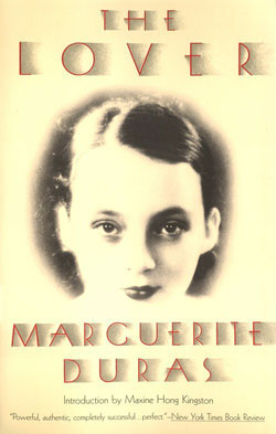
And a beautiful book cover by Louise Fili

On Jan.03.2003 at 01:05 PM
atley’s comment is:

this may, possibly, in all lack of serious, be a stupid question, BUT.

where can i find part 1? haha

au revoir.

atley

On Jan.04.2003 at 04:15 AM
Armin’s comment is:

>where can i find part 1?

You can find it here.

On Jan.04.2003 at 10:58 AM
Armin’s comment is:

And even more

Penguin Books' logo by Jan Tschichold

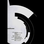
Another classic, this Bethoven poster by Josef M�ller-Brockman

This Emigre issue turned a lot of heads and is probably responsible for putting the Designer's Republic on the map

On Jan.04.2003 at 05:15 PM
pk’s comment is:

i'm such a sucker for malcolm garrett's lush work from the 80's:

couldn't find any documentation of the inner sleeve, but every component is beautifully considered...right down to a series of sylishly obscure medallions encircled by gold numerals which hide encoded language.

On Jan.04.2003 at 11:29 PM
roe’s comment is:

Peter Saville's work for Factory:

On Jan.05.2003 at 08:51 PM
roe’s comment is:

Dave McKean's work for DC:

(Actually, Dave McKean's work in general, but if I had to pick one...)

On Jan.05.2003 at 09:36 PM
Armin’s comment is:

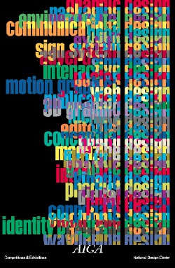
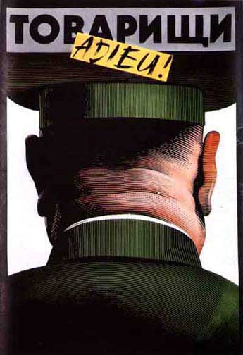
This poster by Steff Geissbuhler is not my favorite, but there's something about it

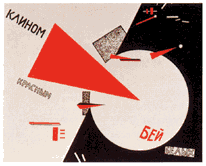
Another old old school design by El Lissitzky

And a poster by Saul Bass

On Jan.06.2003 at 10:09 AM
Darrel’s comment is:

I'd have to say the Presbyterian logo is a case of 'too much'. Just my opinion, mind you, but a logo shouldn't have to carry all of that literal interpretation.

The Campbell soup label wasn't designed by Warhol, was it?

On Jan.06.2003 at 05:13 PM
Armin’s comment is:

>The Campbell soup label wasn't designed by Warhol, was it?

As far as I know: no. He just painted about it.

>I'd have to say the Presbyterian logo is a case of 'too much'. Just my opinion, mind you, but a logo shouldn't have to carry all of that literal interpretation.

True, I could almost be certain that the church (as the client) wanted Grear to incorporate all these elements into the logo. And it seems like a good solution to that need. This is all my assumption. I'll find out.

On Jan.06.2003 at 05:19 PM
Brent’s comment is:

>>> One of the best thought through logos. By Macolm Grear. Be sure to read this too.

I'll agree that the Presbyterian logo is well thought through, does there not come a time when a logo can say too much? It seems very complex to me. Granted, church logo's are not easy, but should bit be necessary to read several pages to understand the logo?

Just my two cents..

On Jan.06.2003 at 06:27 PM
Brent’s comment is:

It apears I should have refreshed the page before commmenting! Sorry to repeat.

On Jan.06.2003 at 06:28 PM
Jon’s comment is:

>the Presbyterian logo is a case of 'too much

I'm going to have to search, but I distinctly remember reading how the brief required many of the elements that Grear eventually composed together in this logo. The brilliance of this logo, to me, is that, despite encompassing 5 or 6 items, the logo holds together as a singular mark. You can see all the pieces, or you see the whole. It works either way. It certainly breaks the 'rule' of one concept, one mark, but genius can do that!

Grear's identity work definitely was a major inspiration for me back in my Portfolio Center days and driving me into identity work.

On Jan.06.2003 at 08:07 PM
Armin’s comment is:

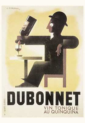
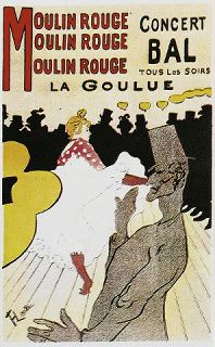
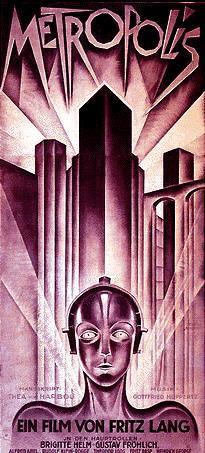
Sometimes it's hard to see vintage posters as actual Design pieces instead of artsy stuff to hang on the wall.

By A.M. Cassandre

how to forget Toulouse-Lautrec?

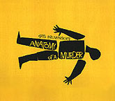
And one of the best movie posters. By... oh crap, I'm totally spacing out, I'll remember the name later

On Jan.07.2003 at 01:56 PM
Michael S’s comment is:

Here's a logo from Allan Fleming


More info here

On Jan.08.2003 at 08:53 PM
Armin’s comment is:

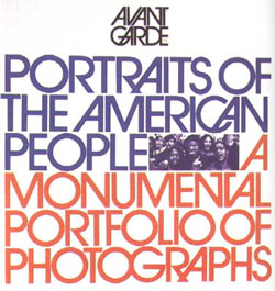
I know I've said I don't like Herb Lubalin's work, but this piece embodies everything that Avant Garde stood for at that point. I can't remember where, but once I read somebody say that Avant Garde only looks good when typesetting the word "Avant Garde"

A great hungarian poster designer is Istvan Orozs, this is one of my favorites

Anybody know who did this logo? I think it completely embodies the personality of the magazine and the aspiring emotions all it's readers want to achieve.

On Jan.09.2003 at 02:07 PM
Sam’s comment is:

Armin, it was designed by Rea Irvin, the magazine's first art director. I agree it suits the magazine but it has, in the hands of the masses, become a cliche for "New York." Opening a New-York style deli in Phoenix or Tampa? You can just imagine the horror...

On Jan.09.2003 at 03:34 PM
Armin’s comment is:

Let's put some editorial content in here. This cover of Esquire by George Louis is a gret devepolment for a great concept. The issue's title is "Masculinization of the American Woman."

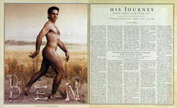
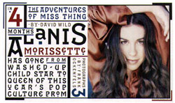
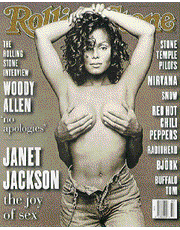
One of my favorite editorial designers is Fred Woodward from RollingStone magazine. I couldn't find a lot of his spreads, so these are only a few examples

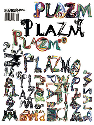
Plazm is a great magazine overall, but this collaboration with letterer Ed Fella is quite amazing

On Jan.12.2003 at 02:16 PM
Michael S’s comment is:

Here's a couple stills for the music video category, Royksopp's video Remind Me. Watch the Real Player video here

On Jan.12.2003 at 08:32 PM
Tom Cox’s comment is:

Lester Beall, International Paper trademark, 1958.

On Jan.14.2003 at 09:07 AM
Armin’s comment is:

Michael, I don't mean no disrespect to your choice in videos, but I would have to say that music videos don't qualify for this design roundup. Or, with the fear of being stoned by everybody here, that they would qualify as graphic design. After all they are not communicating a message for a service or product. Yes, they carry a message from the band though, but it's more of a subjective thing. And it doesn't serve as an information vehicle. If anybody feels I'm completely wrong, I'll be glad to hear it.

On Jan.14.2003 at 02:11 PM
michael s’s comment is:

No disrespect taken Armin, after I had posted the stills I re-read part 1 from December. In the context that you spelled out I can agree that maybe it's not the right place for it. But, if you were to mute the video and show it to some young students as an illustration of a day in the life of an adult, it works pretty well. Though there'll be no hard feelings if you want to remove it.

In it's place I'd like to add the Pirelli logo.

On Jan.14.2003 at 05:07 PM
Armin’s comment is:

>In it's place I'd like to add the Pirelli logo.

I do like the Pirelli logo. I can't remember which book it was, but it listed some "Bad" examples of typography use for a logo and one of them was Pirelli. I didn't agree. I'll try to find the book, because it had some interesting insights.

To add some more, this poster by Alexander (I think that's his name, not sure) Gelman. Another solid color/simple shape approach.

One more solid color/simple shape poster/logo by Saul Bass

And let's throw in a logo just for fun. By Fletcher/Forbes/Gill, one of the first big-name design firms.

On Jan.18.2003 at 12:29 PM
Claire’s comment is:

Does anyone know the name of the wine that Fernando Gutierrez designed a label for. You know the one, the g with a tail reminiscent of a bulls horn.

On Mar.03.2003 at 07:46 AM
Maxim ’s comment is:

>Alexander (I think that's his name, not sure) Gelman.

He is Alexander Gelman for sure. Wonderful russian-born designer.

http://www.curiouspictures.com/commercials/idea_gelman.html

http://www.portfolios.com/close-ups/alexander.gelman/

On Mar.06.2003 at 03:13 AM
Maxim’s comment is:

>the name of the wine...

Fernando Gutierrez worked for Temolo Rodriguez

winemaker.

On Mar.06.2003 at 03:19 AM
Jon’s comment is:

>Alexander Gelman

His firm is called DesignMachine.

I'm not a big fan of some of the ultra-letterspaced type, but, generally, his work is very concise. Simple, not simplistic. (And yes, this is off-topic now, sorry.)

On Mar.06.2003 at 12:38 PM
ogs’s comment is:

illustrations. photofraphy. links

On Jul.25.2003 at 07:34 AM
Michael B.’s comment is:

>>>I'll agree that the Presbyterian logo is well thought through, does there not come a time when a logo can say too much? It seems very complex to me. Granted, church logos are not easy, but should bit be necessary to read several pages to understand the logo?

Brent, sorry for the late response. I've always been a big fan of Grear's logo for the Presbyterian Chuch (see above) precisely for the reason you question it. Religious belief so often involves layer after layer of symbolism and interpretation. I don't think this kind of density would work for, say, an oil company, but I bet it was incredibly satisfying for the church members. The description of it kind of makes for a effective miniature parable in itself.

On Jul.25.2003 at 10:20 AM