Speak UpA Former Division of UnderConsideration
The Archives, August 2002 – April 2009
advertise @ underconsideration
---Click here for full archive list or browse below
  
Slow Company

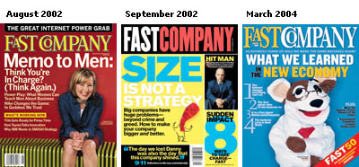
Although it’s not a design magazine per se, Fast Company has very interesting content and had a wonderful design philosophy until this September when they debuted their redesign. Patrick Mitchell has ruined a good thing. The new cover strategy looks like a cheap computer tabloid you can pick up on a street corner, the typography that was once innovative is now bland and their new section “The Speedometer” is right out of FHM or Maxim. Hopefully they will work their new look out over the next few issues or else I’ll save the $12 a year and read it online.

Maintained through our ADV @ UnderConsideration Program
ENTRY DETAILS
ARCHIVE ID 1208 FILED UNDER Critique
PUBLISHED ON Sep.09.2002 BY Kiran Max Weber
WITH COMMENTS
Comments
Armin’s comment is:

I can see they also stepped away from their old logo (check out the work by Parkinson while you are there) which wasn't incredible, but at least it had way more personality.

Did the web site change too? because it is quite lame. Not very Fast either.

On Sep.09.2002 at 03:50 PM
Kiran’s comment is:

I agree, the old logo did have more more personality and after reading the magazine for 2 years the entire redesign lacks it completely. The site did change. Lame indeed.

On Sep.09.2002 at 03:58 PM
Jon Selikoff’s comment is:

Something else I noticed: the new paper stock says one thing: Cheap Company!

On Sep.09.2002 at 09:19 PM
Todd’s comment is:

You'd think with the advertising slump they wouldn't have been able to justify the cost of a redesign to the paper mag, as well as the Web site. Something tells me that the redesign is being played as a stop-gap solution to falling page counts and sales figures. Counting the days 'til we say adios to Fast Company for good.

On Sep.09.2002 at 09:22 PM
Armin’s comment is:

We just got a copy of this issue here at work. And what a piece of crap. The cover feels like that wrapping paper used for Trident, not the one on the outside, but the one that actually covers the gum.

Then the logo. A drop shadow. INSIDE THE TYPE. I mean, what is this? 1984? are we just discovering Photoshop 2.0?

So sad.

On Sep.11.2002 at 05:23 PM
Armin’s comment is:

I just love it when companies realize — and do something about it — when they have screwed with a good thing. It's so good to see the ol' masthead back where it belongs (it seems a little more condensed this time). The nerve� replacing something with attitude and personality with something bland and ugly.

On Mar.14.2004 at 11:53 AM
JonSel’s comment is:

I noticed this the other day as well. Thank goodness they came to their senses. And it's also good to see the sock puppet make an appearance. I miss him.

On Mar.14.2004 at 01:43 PM
Brady’s comment is:

The new, old masthead is quite a half-assed execution which begs the question: Did they lose the original artwork file?

Also, the new, old masthead seems a little heavy handed.

Beyond the masthead, the editorial went south about the same time they changed the overall visual of the magazine. I was a subscriber for about five years and would have dropped it sooner but someone gave me a subscription a little over a year ago.

On a humorous note:

When Philip Kaplan started his Fucked Company web site, he naturally ripped off the Fast Company mast head. He was naturally asked to change it, so he did. Later, when Fast Company created it's new masthead, it looked quite similar to the one he had created.

On Mar.16.2004 at 09:48 AM
Patrick Mitchell’s comment is:

Let he who has never designed a piece of shit cast the first stone!

I am the culprit who foisted the "bland and ugly" redesign of FC on the world. That was 3 or so years ago now, and yes, after last week's news, FC does find itself looking into a very dark pit. The story behind that redesign is the story of a magazine in dire straits, under new (and meddling) ownership, and suffering from a complete lack of confidence and loss of its identity in the post- dot-com crash. The new economy was as dead as Enron, and FC was scrambling.

In retrospect, perhaps the right thing to do was to just shut it down then, rather than start chasing a new identity, but they never do that in the magazine biz. Gruner+Jahr, infamous for buying FC for a whopping $350 million (and who last week sold its entire US publishing operation for that same amount to Meredith Corp), had to save face for its grotesquely huge investment in the magazine.

Fast Company just celebrated its 10th anniversay, but now all signs lead to the magazine's liquidation in the very near future. A sad end to a brief but brilliant success story. The redesign didn't save it...or kill it...or erase the amazing 6-7 year run we had. Thanks for the memories!

On Jun.01.2005 at 11:37 PM
Armin’s comment is:

Patrick, thanks for sharing. Can't believe it's already been three years.

As a side story� Back in Juneish of 2004 I was preparing for a talk about rebrandings and I contacted someone at Fast Company to discuss the double-switcharoo on the masthead and once I got into the questions (that I sent via e-mail) I never got a response back after they had somewhat said yes. I guess troubled times are better left unscratched.

On Jun.02.2005 at 08:35 AM
Kiran Max Weber’s comment is:

Such a pity, I loved that magazine. Still do.

On Jun.02.2005 at 10:20 AM