--- ---

css typographic control

Fancy type
Same ol' HTML type

---

about

• Quipsologies, is a division of UnderConsideration, chronicling the most curious, creative, and notable projects, stories, and events of the graphic design industry on a daily basis.

• Quipsologies uses TypeKit to render P22 Underground, Skolar Web by TypeTogether, and Coquette by Mark Simonson.

• Quipsologies is run with Six Apart’s MovableType 6.8.8

Syndicate / RSS Feed

• All comments, ideas and thoughts on Quipsologies are property of their authors; reproduction without the author’s or Quipsologies’s permission is strictly prohibited

Contact us by e-mail

• Search through our archives (starting with Vol. 45 September 2010)

---

also by
underconsideration

UnderConsideration is a graphic design enterprise that runs a network of blogs, publishes books, organizes live events, and designs for clients.

online

Brand New / Displaying opinions, and focusing solely, on corporate and brand identity work.

FPO (For Print Only) / Celebrating the reality that print is not dead by showcasing the most compelling printed projects.

Brand New Classroom / Providing a space for critique and opinions on student identity work.

Speak Up (2002 – 2009) / Discussing, and looking for, what is relevant in, and the relevance of, graphic design. Archives Only.

Word It (2003 – 2010) / Encouraging creative diversity in the community through monthly, one-word challenges. Archives Only.

publishing

Flaunt: Designing effective, compelling and memorable portfolios of creative work / 2010, self-published.

Graphic Design, Referenced: A Visual Guide to the Language, Applications, and History of Graphic Design / 2009, Rockport.

Women of Design: Influence and Inspiration from the Original Trailblazers to the New Groundbreakers / 2008, HOW Books.

The Word It Book: Speak Up Presents a Gallery of Interpreted Words / 2007, HOW Books.

live events

2010 Brand New Conference / A one-day event on the development of corporate and brand identity projects by some of today’s most active and influential practitioners from around the world.

graphic design

Department of Design / Designing corporate and brand identities and full development of printed and digital matter for clients.

background color code

Color Code: Orange  

Quip’d by a representative of UnderConsideration

Color Code: Blue  

Quip’d by a contributing Quipsologist

Color Code: Green  

Submitted by our readers and Quip’d by UnderConsideration

---

adv @ underconsideration

Peek here for details

---

no.

by armin

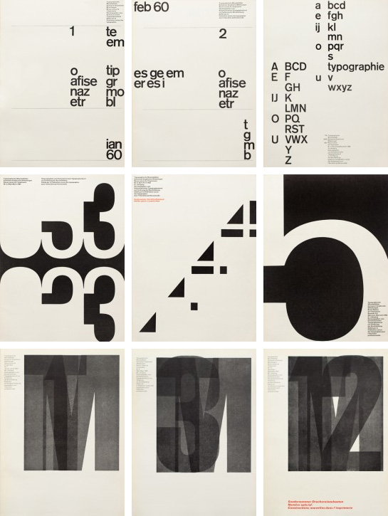
The TM Research Archive features an exhaustive collection of information and covers of Typographische Monatsblätter (TM), “one of the most important journals to successfully disseminate the phenomenon of ‘Swiss typography’ to an international audience.” Gridniks, rejoice.

Link

09.21.2012

via

johnson banks

QuipImaage
---

no.

by armin

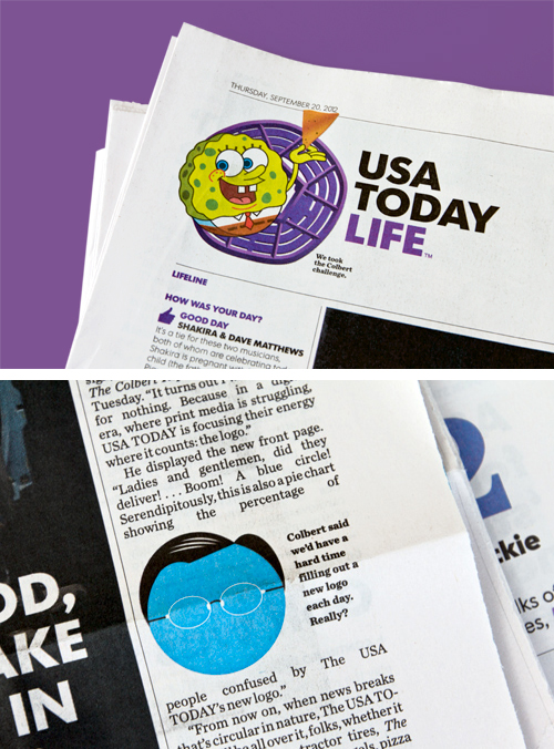
USA TODAY responds to Colbert’s antics by mashing up a square, triangle, and pentagon into a circle. Funny. If you missed Colbert’s comments see Quip No. 60.

Link

09.21.2012

via

Wolff Olins

QuipImaage
---

no.

by doug bartow

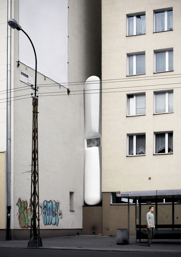
The Keret House is a tiny home that is currently being built in Warsaw. It’s just 47 inches wide at the front and 28 inches wide in the back, which makes it the narrowest house in the world.

Link

09.20.2012

QuipImaage
---

no.

by armin

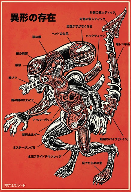
Anatomical guides to popular monsters, by Brad McGinty.

Link

09.20.2012

via

Official Hype

QuipImaage
---

no.

by armin

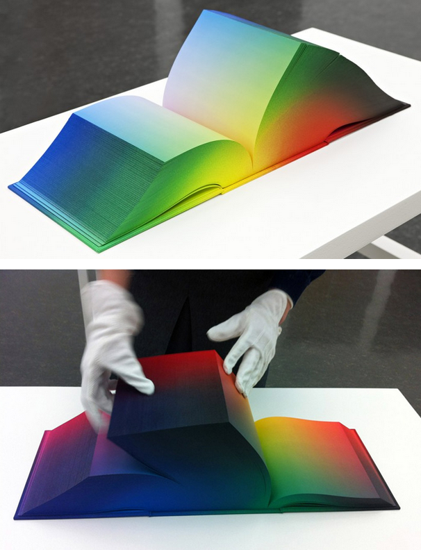
The RGB Colorspace Atlas, an 8-by-8-by-8-inch book co-designed by Daniel E. Kelm and Tauba Auerbach features the full RGB gradient across 3,632 pages.

Link

09.20.2012

via

SwissMiss

QuipImaage
---

no.

by armin

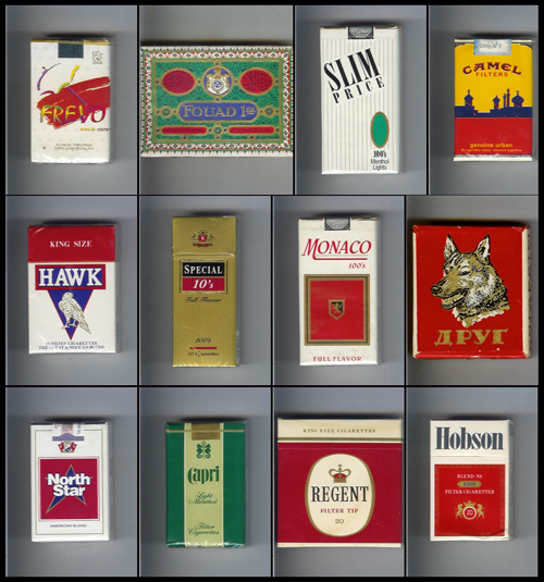
The Museum of Cigarette Packaging, with selections from Igor Sergeev’s 40,000-item collection.

Link

09.20.2012

via

Coud

QuipImaage
---

no.

by bryony

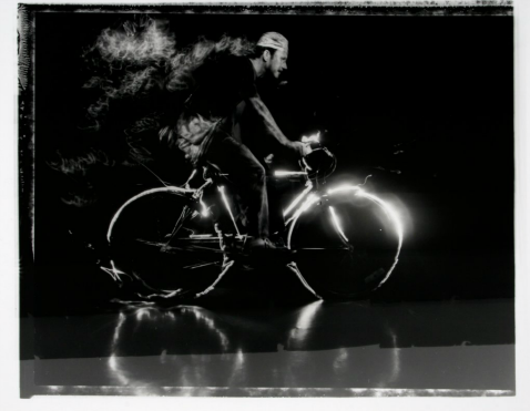
Amazing photographs by Sonia Soberats, who lost her eyesight late in life. Working with an assistant she does studio photography where she places the models, opens the shutter for an extended period, and then interacts with the subjects through light painting.

Link

09.20.2012

QuipImaage
---

no.

by armin

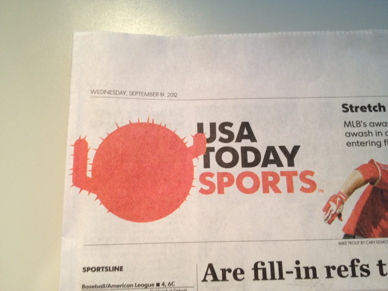
Tim Lampe chronicles the usage of the USA TODAY circle. Sample commentary: “Look, man, I know it looks like a testicle, but it’s actually a cactus.” It gets better from there.

Link

09.20.2012

QuipImaage
---

no.

by doug bartow

File Under Funny: Steven Colbert on USA Today’s new logo.

Link

09.19.2012

via

@mediafury

The Colbert ReportMon - Thurs 11:30pm / 10:30c
Logo Makeover for USA Today
www.colbertnation.com
Colbert Report Full EpisodesPolitical Humor & Satire BlogVideo Archive

---

no.

by armin

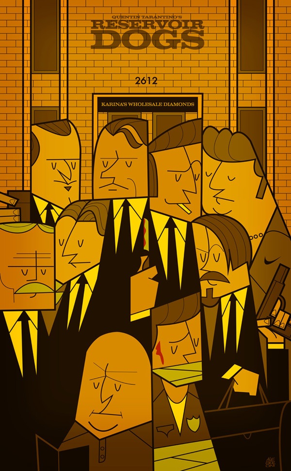
Awesome condensed and tightly-kerned illustration style by Ale Giorgini for this series of movie posters.

Link

09.19.2012

via

Nice Fucking Graphics

QuipImaage
---
---

many thanks to our adv @ underconsideration Partners

---
---