
A few facts: this was paid; we did two rounds in the span of 7 to 10 business days; none of the logos shown are finalized or refined; none of them were used; we did not do the actual logo being used by The Daily.
This exploration is in no way presented as “Aren’t these so much better than what they selected?” — some of them might actually would have been, some of them probably not, and some of them are downright bad ideas. The logos come with some bullet points of concept and rationale, just as they appeared in the long-distance presentation we provided. Some of them made it to a second round for some slight revisions.
As much as I like seeing a project from concept to implementation, every now and then just knocking out a dozen logos as an assignment is just as fun.

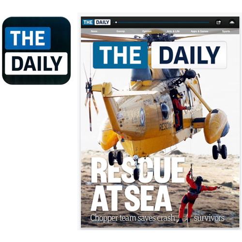

 ACTUAL DESIGN (NOT DONE BY UCllc)

This is the logo, in its stacked configuration, and the horizontal configuration as it appears on the app.



 DESIGN 01

- A “D” inspired by the RSS icon — the new standard for news portability.
- It’s a continuous loop signifying the continuity and streamlined app that The Daily experience can provide.

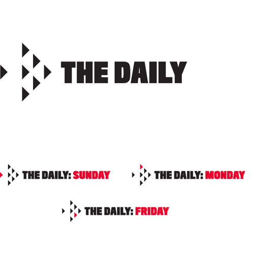

 DESIGN 02

- Seven triangles, one for each day of the week, in formation, ready to deliver the news.
- The overall shape forms an arrow, and you can also see a big D in the group of six arrows.

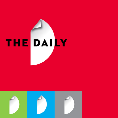

 DESIGN 03

- A concept that can work either as “digital file” or the idea of dog-earing something you want to return to time and again.
- Makes a “D”, of course.
- Works on any kind of color background.

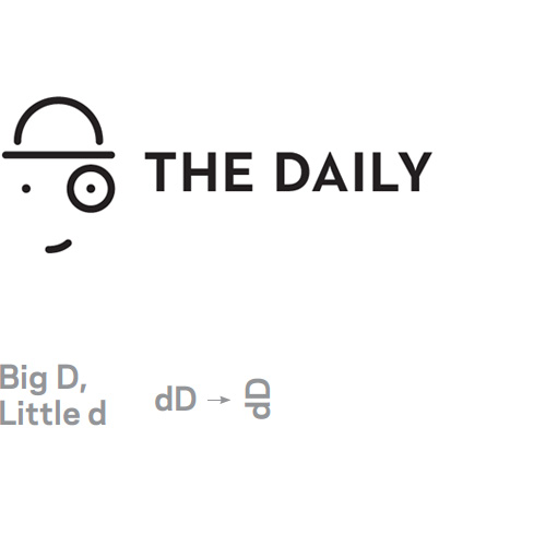

 DESIGN 04

- This is perhaps a big stretch, but it was a series of visual ideas starting by putting together dD and rotating them counter clockwise, which made it look like a guy with a bowler hat and a monocle. He makes sure you get what you need in terms of information. A nerd version of the Playboy bunny. It’s more humorous than serious, and maybe not right for the audience, but worth showing as an idea in the extreme end of the spectrum.

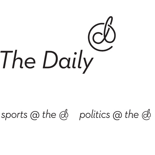

 DESIGN 05

- A complement to the @ symbol for a new generation. The “d” becomes a rebus for “daily.”
- This is probably the least masculine of our explorations. Not a bad thing, but worth pointing out.

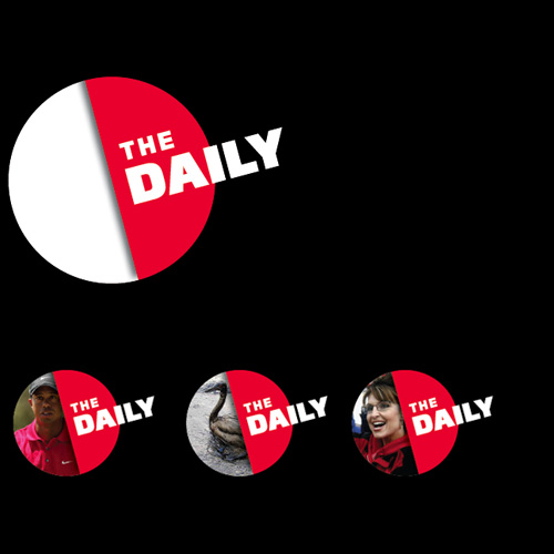

 DESIGN 06

- If you slice a globe in half you get a “D”. One half is for the logo, the other half can be filled in with whatever the top story may be.

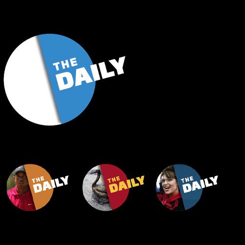

 DESIGN 06-A

- Color revisions to Design 06.

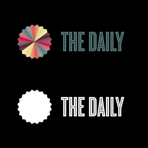

 DESIGN 07

- What rises daily? The sun. That’s what this is. A cool, groovy sun.
- Works in full-on color and single color.
- We realize there is various “The Daily Sun”s around the world and you might feel compelled to avoid joining that group, but this is less obvious and more sophisticated than the competition.
- Would make for a killer app button.

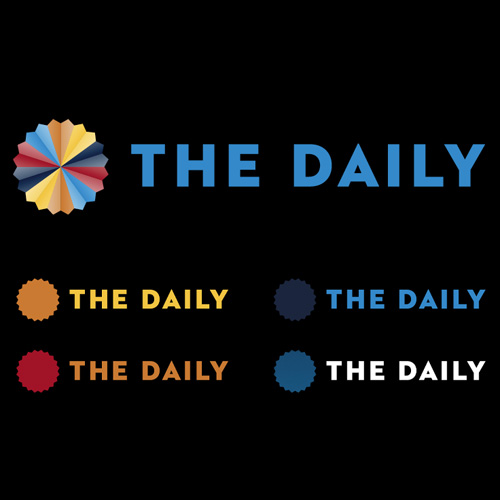

 DESIGN 07-A

-Type and color revisions to Design 07

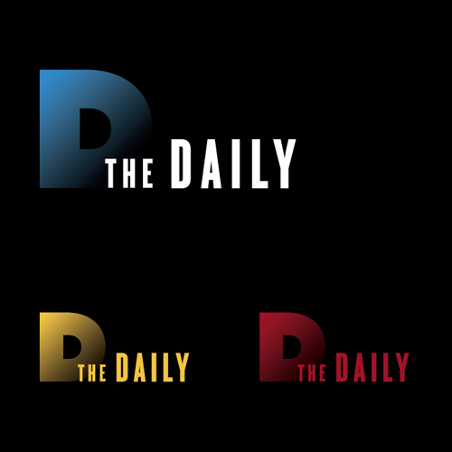

 DESIGN 08

- The Daily, rising from the dark, every morning. (Maybe too sci-fi?)

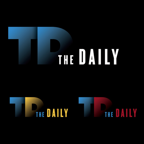

 DESIGN 08-A

-Revision to Design 08 with the two letters, “TD”.


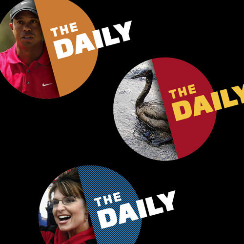


 ACTUAL DESIGN (NOT DONE BY UCllc)


comments