
Spanair, a 20-year-old international airline with hubs in Madrid and Barcelona, has recently undergone some management changes when its previous full owner, Scandinavian Airlines Systems, gave 80% of its share of the company to a new group of investors. As with other management changes, this lead to the redesign of Spanair’s identity. The job went to Morillas Brand Design, who led Spanair to two very viable solutions for a new logo. The obvious next step — sarcasm! — was to put those two identity options to public voting. Between May 5 and 11, close to 80,000 people voted and mid-May, the winner was announced.
Continue reading this entry
![]()
After a little break from soda discussion — although the eternally climbing comment count here suggests otherwise — here is a fresh one, Sprite. Just in time for the NBA All-Star’s Slam Dunk contest which Sprite sponsors they are putting into use a new, dynamic and active logo that, in context, is actually quite decent. I’m not sure I fall for the “explosive” starburst but there is something interesting about the way the lettering and the lemon/lime interact with it. Also, I realize there is this other Sprite logo, but I can’t figure out or don’t remember if it was just temporary, but the new logo certainly seems like an evolution of that. And reader Jared Ramey pointed out that the logo might be based on this. So for a mass consumer brand trying to appear cutting edge and “with it” this is not bad. Not my style or my thing, but not bad.
Thanks to Christopher Martin and Jared Ramey for the tip.
As the year comes to a close and the list tradition bears on, I thought a Best & Worst selection from the 2008 archives of Brand New would be entertaining. These are my best and worst and they don’t represent the comments on each of the original posts, whether positive or negative. Other than the first item in each category (my favorite and my least favorite) the selections are in no particular order. I’ll take this opportunity too, to thank everyone that visits Brand New — every single month of 2008 our readership increases — and for all of you that send us tips, we would literally not have the great content we have if it weren’t for your contributions. Posting will be light for the next two weeks. Enjoy your Holidays and have a happy new year.
Continue reading this entry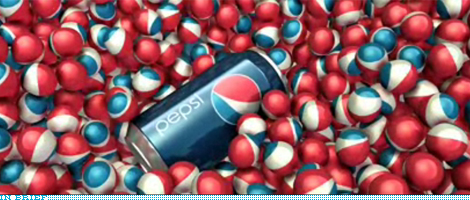
Thanks to James Bowie for the tip.
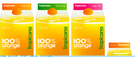
Just when you thought Pepsi week was over, comes the original scoop I had been talking about. Tropicana, another one of the Pepsi brands, has also gone under the knife… or the juicer. This is perhaps the least offensive work we’ve seen come out yet but it certainly pales in comparison to the previous line of packaging designed by Sterling Brands that hit the shelves no more than one or two years ago at the most. This new packaging feels, at best, like a discount store brand with what looks like, again, at best, rights-managed stock photography if not outright royalty free. And the typography is, once more, at best, a lame derivative of how the British have lately exploited geometric sans serifs like Futura and Avenir to great results — here’s just one example of many. And I really want to believe that the screw-cap will not be an orange-colored boobie as in the rendering above.
Continue reading this entry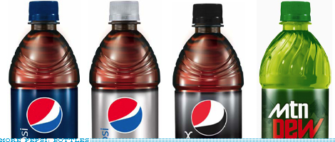
Update: Another friendly reader has sent in cans for Pepsi and Sierra Mist.
Update 2: A photo of actual cans posted on Fark has been added here.
And the goodies keep coming in! Let it be known that the week of October 20, 2008 has been declared as Pepsi Week at Brand New. A kind reader has sent in these renderings of the new bottles. Redeeming or just digging a deeper hole? You decide.

This is why I love our readers: David, aka “Logo Fiend” has dug around United States Patent and Trademark Office’s Trademark Electronic Search System (TESS) and found the registered work for the new Pepsi, Mtn Dew and Gatorade work. Now, this doesn’t mean it will all be used or that this will be its ultimate form, but if it’s been registered or trademarked it sure won’t be too different. I alluded to a scoop in the previous post, but this is not it, this is a bonus! So, thanks David, and enjoy everyone.
Continue reading this entry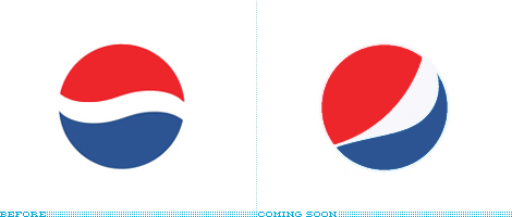
(Apologies for the delay on this one, I have been sitting on it since Wednesday, because there was, still is, a possibility for a bigger scoop. So if it happens I’ll just post it separately). This is possibly one of the biggest rebrandings that will take place over the next months/years as was announced this week that Pepsi will be revamping the design and identities of their key brands, in light of the decrease in sales with drops between 2% and 5% in different beverage categories. No visuals, other than the logo above, have been released so this is definitely a preemptive review of the work done by New York-based Arnell Group. There is plenty of quotables from the only two sources that have reported on the imminent change, so let’s get to those.
Continue reading this entry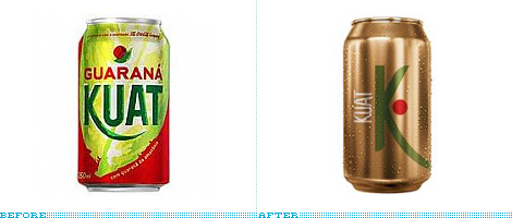
Guest Editorial by Guilherme Machiavelli
In Brazil, one of the biggest competitors of coke (be it Coca-Cola or Pepsi) in the soda market is a soft drink called Guaraná Antártica, made from the local fruit, guaraná. Ten years ago, Coca-Cola, in an attempt to tackle its rival, launched Guaraná Kuat. Kuat has been marketed in various forms, beginning with the (slightly odd) strategy of declaring itself as having the same taste as Guaraná Antártica. The brand later decided to target a teenage audience, with campaigns following the “Open up your mind‚” motto.
Continue reading this entry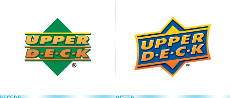
Guest Editorial by Von Glitschka
As a kid I grew up collecting baseball trading cards. I never worried about getting the entire set, I just collected the players I liked best. As far as the product was concerned it was pretty low-grade card stock, cheap full-color printing on the front with a one spot color uncoated back. The rock hard stick of chewing gum that came with each pack would often ruin the card next to it, or stain it with the white powder that coated the gum. This went on year in and year out throughout my childhood with a few new companies coming on the scene but still using the same tired methodology. In 1989 a new rookie company entered the trading card game. Its name was Upper Deck.
Continue reading this entry
Flash forward to the year 2015…
Imagine your local Best Buy at 5:30 am on a Saturday morning; late August 2015. Picture a winding line of 300 good Americans—moms, dads, children, teenagers, and husky Ebay speculators. The barbarians at the gate are loaded with lawn chairs, vitamin C, playing cards, fleece blankets, and other middle-class mechanisms of subsistence. All are biding their time in hopes of being one of the first few to get their knuckles around the newest model of the Compaq Presario VXXX series. Compaq is so hot right now—they sponsored the last space shuttle mission.Continue reading this entry

….bzzz….snap….crackle…awheeeeeeyoooooo…distortion….static…fade in…. Excuse me while I break into your regularly scheduled programming of corporate identity changes to focus on another aspect of Brand™: packaging. I’ve worked in both the corporate identity and packaging fields for over 10 years now. If I could sum up my general feeling on mass-market packaging (in the United States), I’d say it sucks. At some point, there are only so many variations one can do on ribbons, splashes, swooshes, dimensional type and fake water droplets. When small percentage points of market share can mean hundreds of millions of dollars, you can kind of understand. Kind of. So it thrills me to no end when someone of stature refuses to do it anymore.
I present the New Old Coke.
Continue reading this entry


