

![]()
![]()
CLIENT
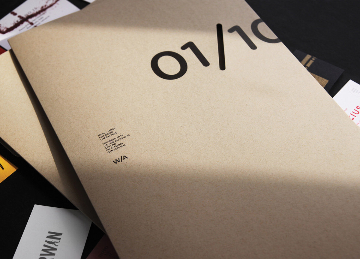
Wayward Arts is a monthly magazine curated by a different award winning design studio each issue, working with the finest print craftsmen at Flash Reproductions to produce the magazine of their collective dreams.
BRIEF
Each issue is developed by a different award-winning Canadian design studio who get to work with the finest print craftsmen and the finest paper to produce the magazine of their dreams.
APPROACH
Until this issue, there had never been a project which employed every single Flash offering on such a grand scale. This required unprecedented planning and preproduction for weeks. About 20 dockets were written, covering every nook and cranny of the project. The postproduction stage required hundreds of combined hours of collating.
PRODUCTION LESSONS
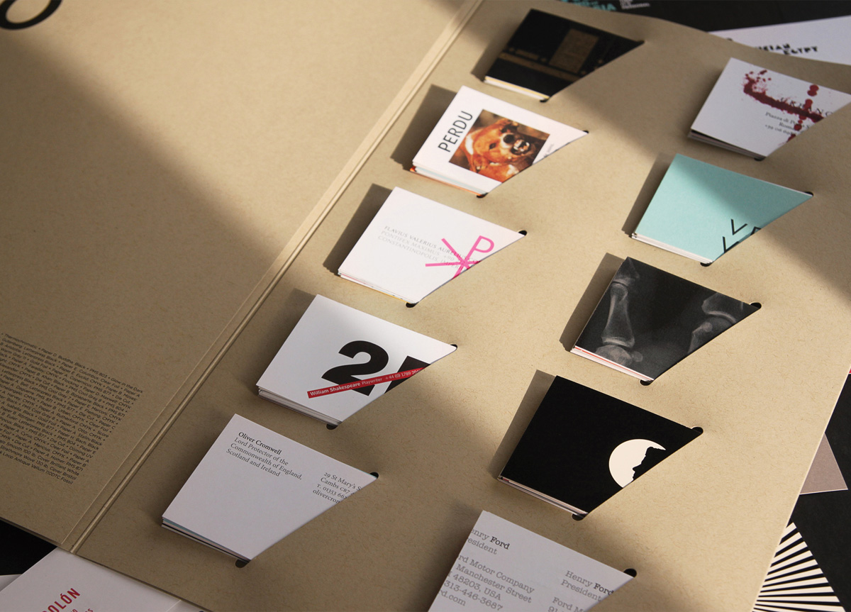
The phrase “haste makes waste” did not apply in this case. Thanks to the collaboration of the team before, during, and after production—this job went off without a hitch. Boxes of business cards were brought home where they were collated before insertion.
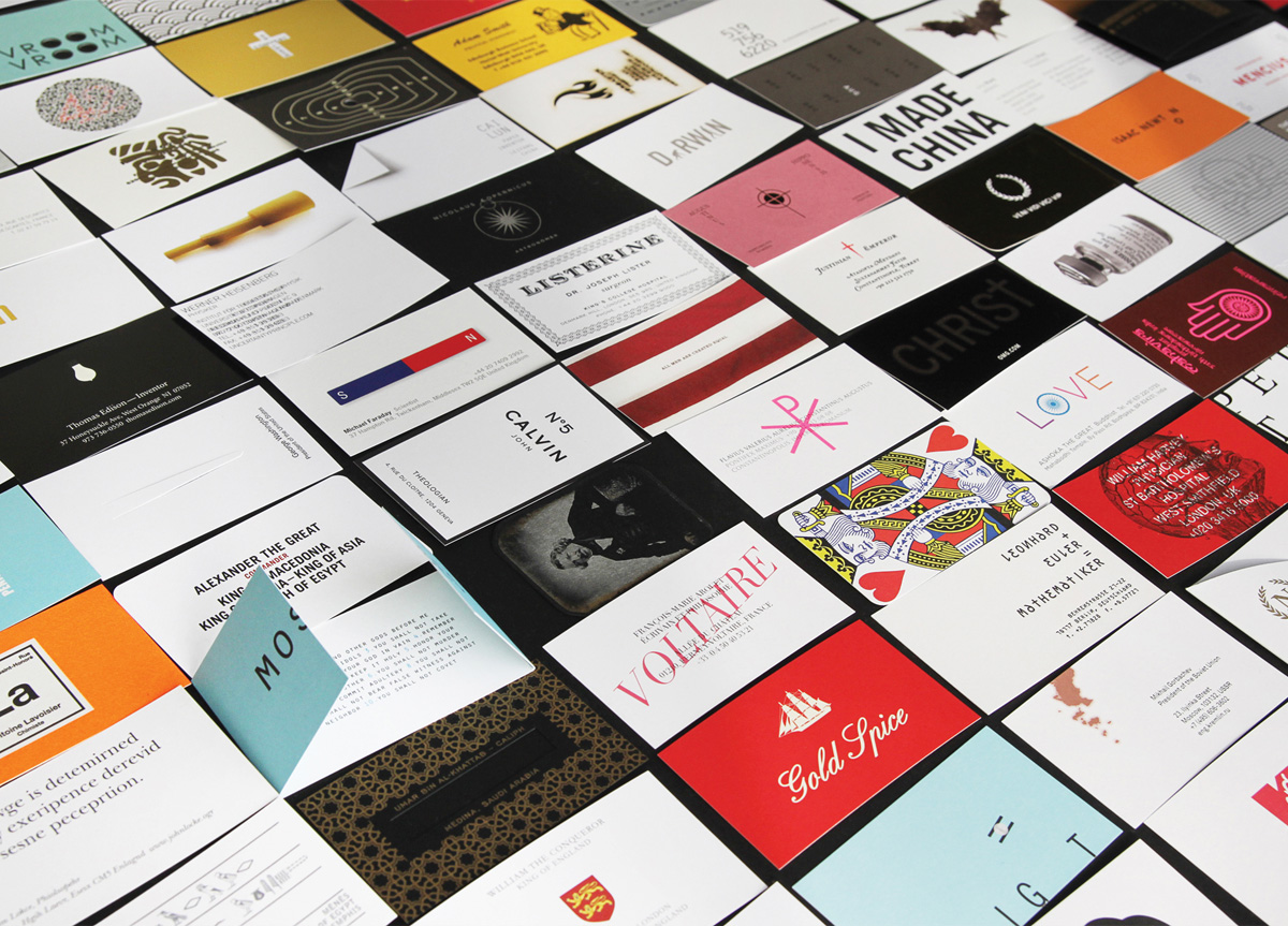
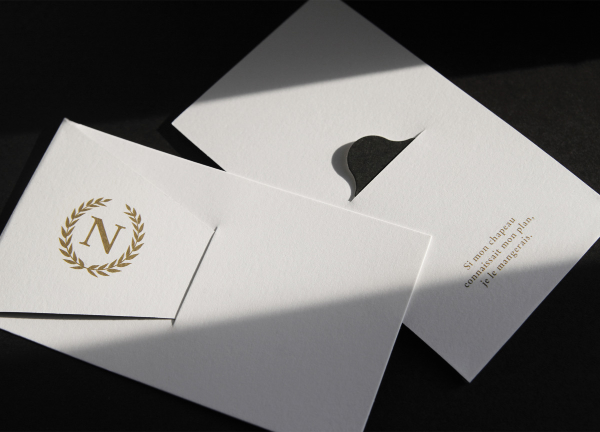
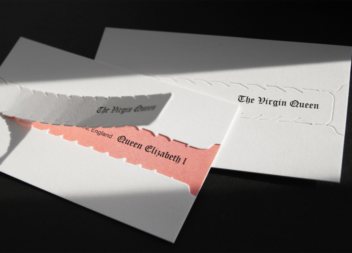
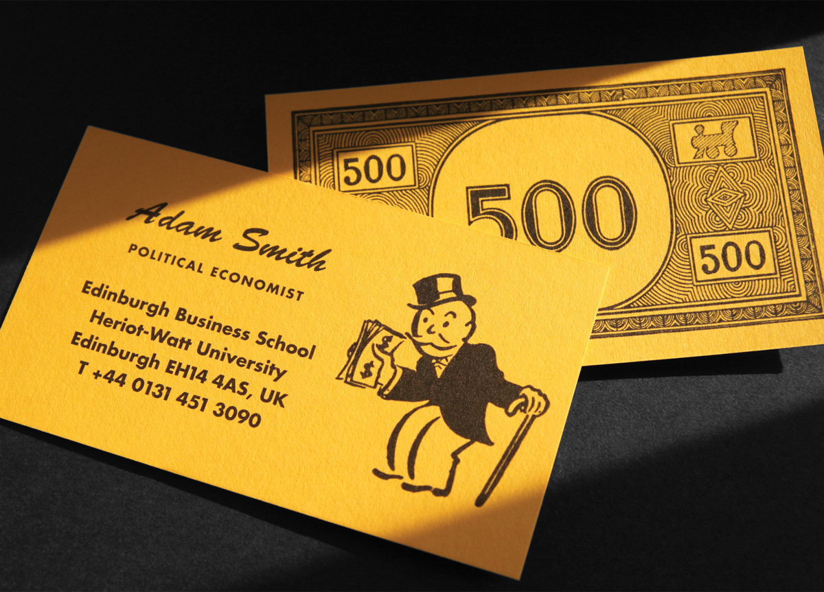
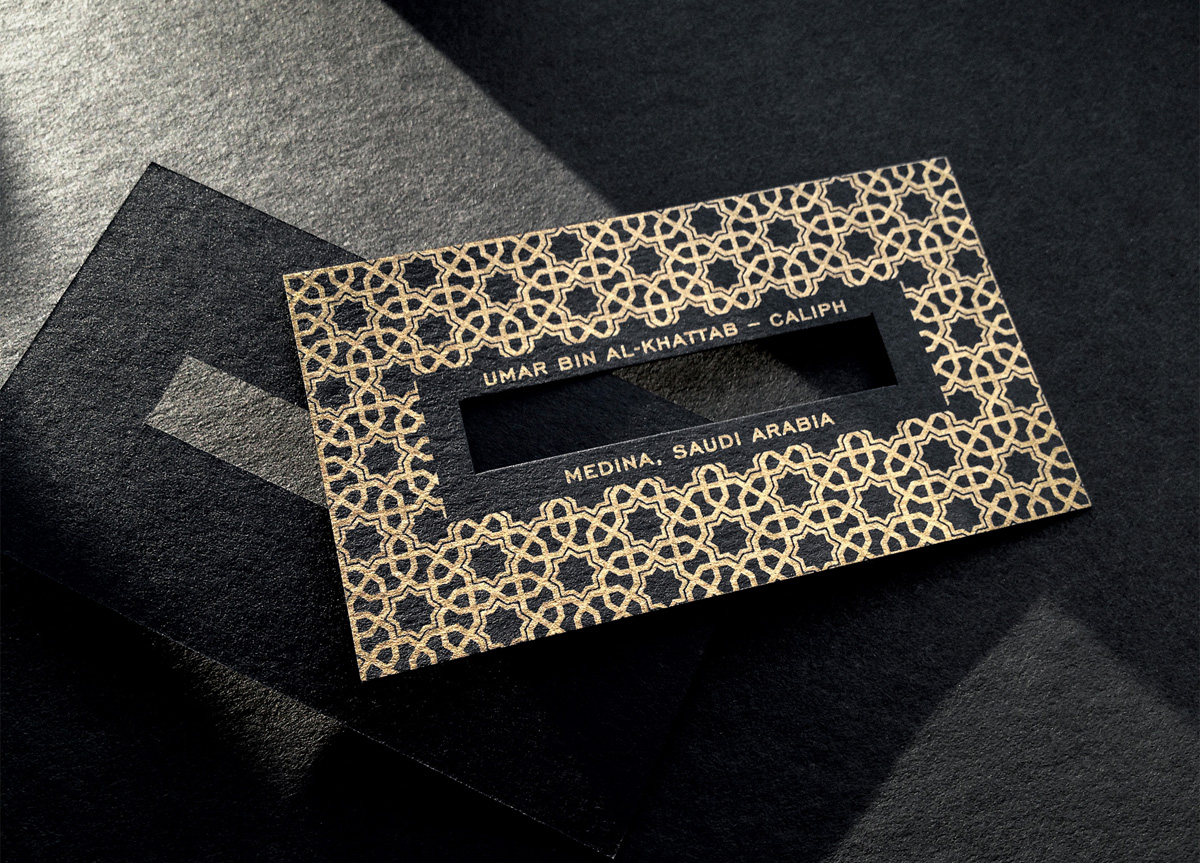
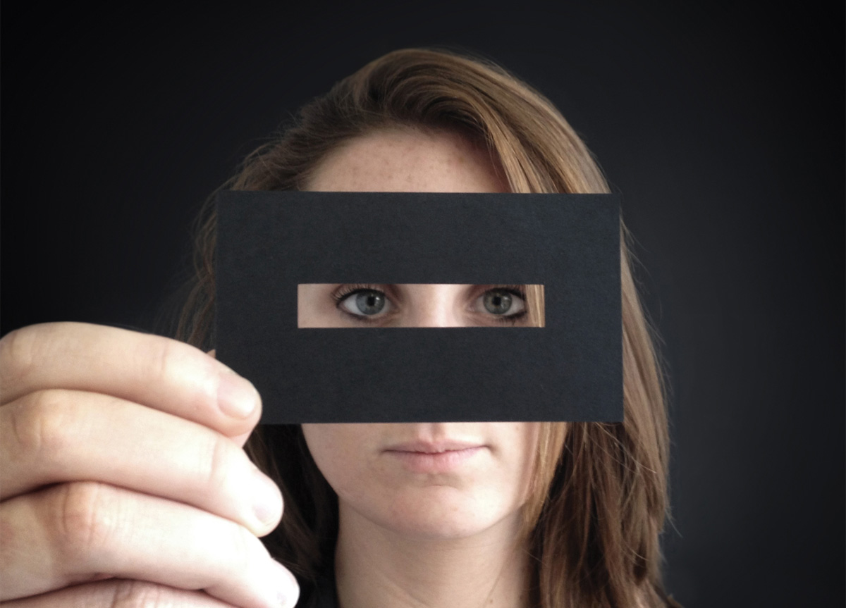
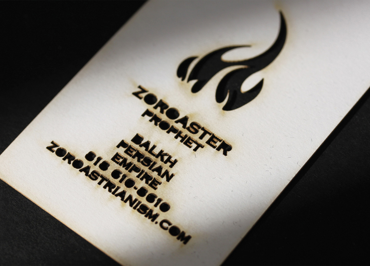
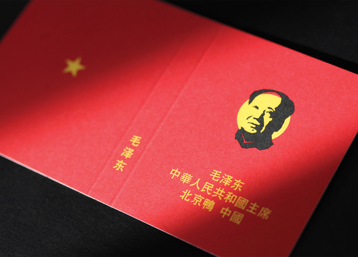
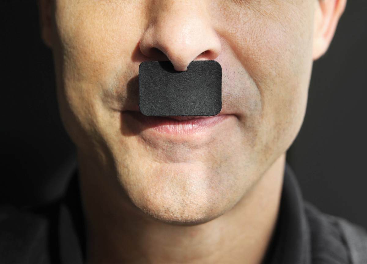
A disarmingly simple premise executed in the most complex manner possible. Harkening back to the printer’s business card sample books of the mid-20th century, this piece upends the concept with a contemporary twist. Each of he 100 business cards within is well designed, laugh out loud funny, and clever in the way it utilizes a production technique to complete a visual gag. A die-cut mustache for Der Fuhrer, a perforated pull tab which reveals the Virgin Queen’s contact information below. The care lavished on each card was considerable both in concept and execution. Each technique utilized—be it letterpress, offset, or foil—showed considerable mastery. I had great fun flipping through to see what surprise was next. Most importantly, I got the feeling that as much as I enjoyed viewing the piece, the creators enjoyed making it more. — John Earles


