
![]()
![]()
CLIENT
Wright is a Chicago, IL, based auction house specializing in modern and contemporary art and design. Auctions are meticulously curated across the spectrum of 20th and 21st century design.
BRIEF
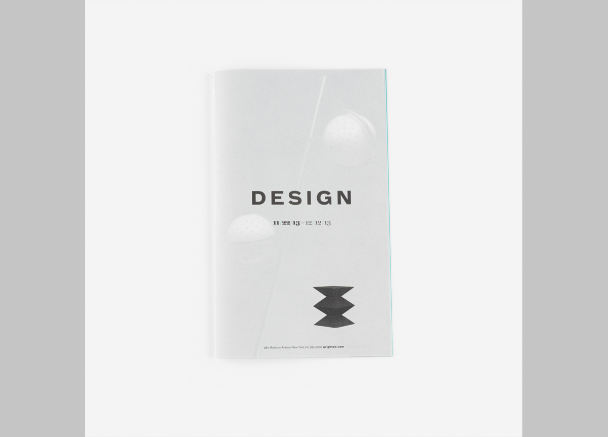
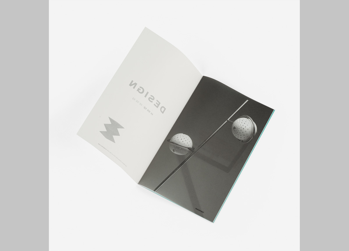
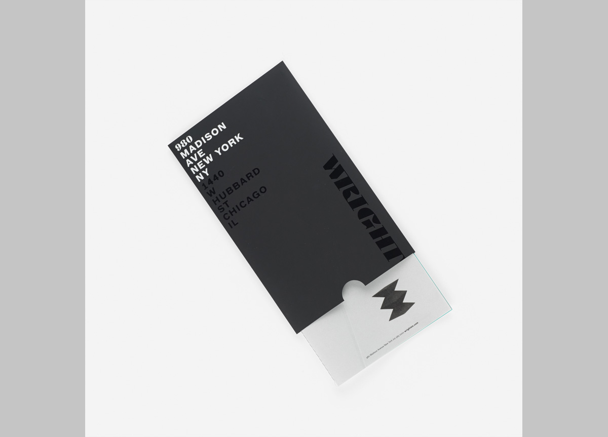
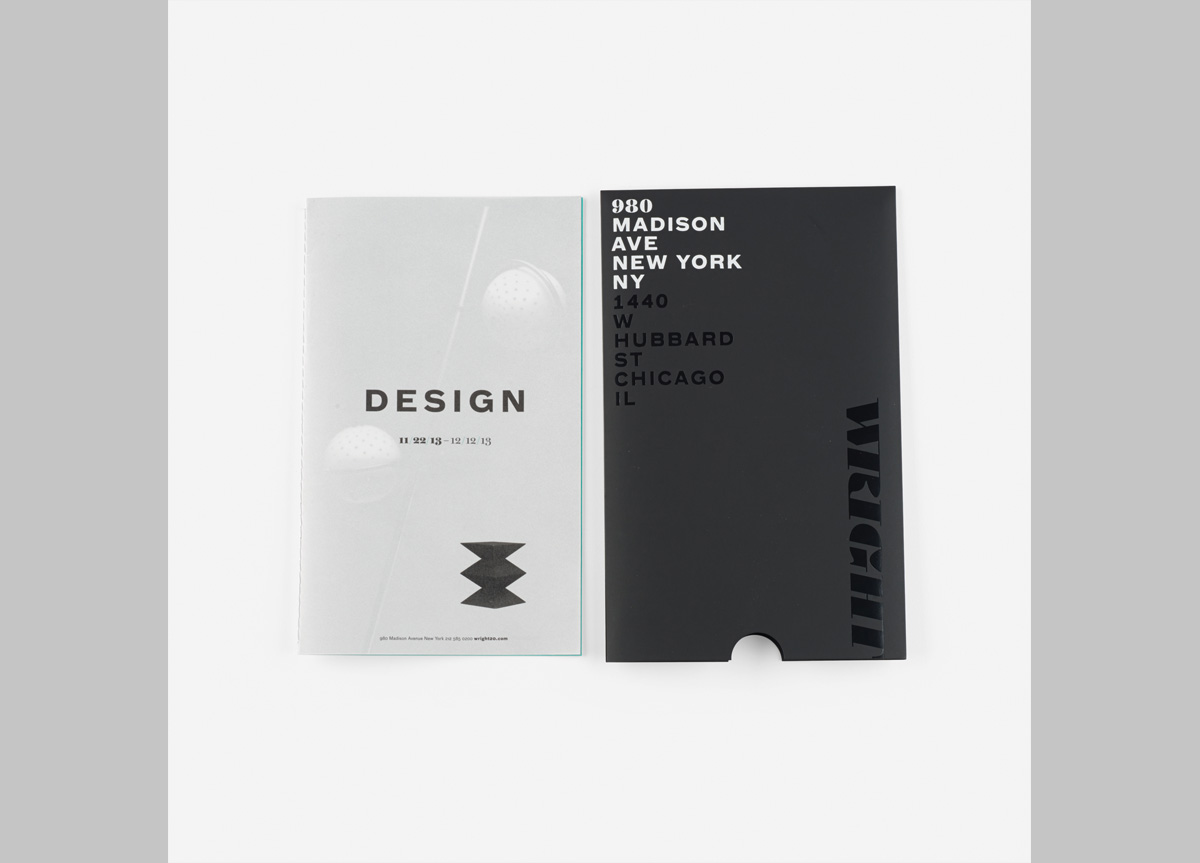
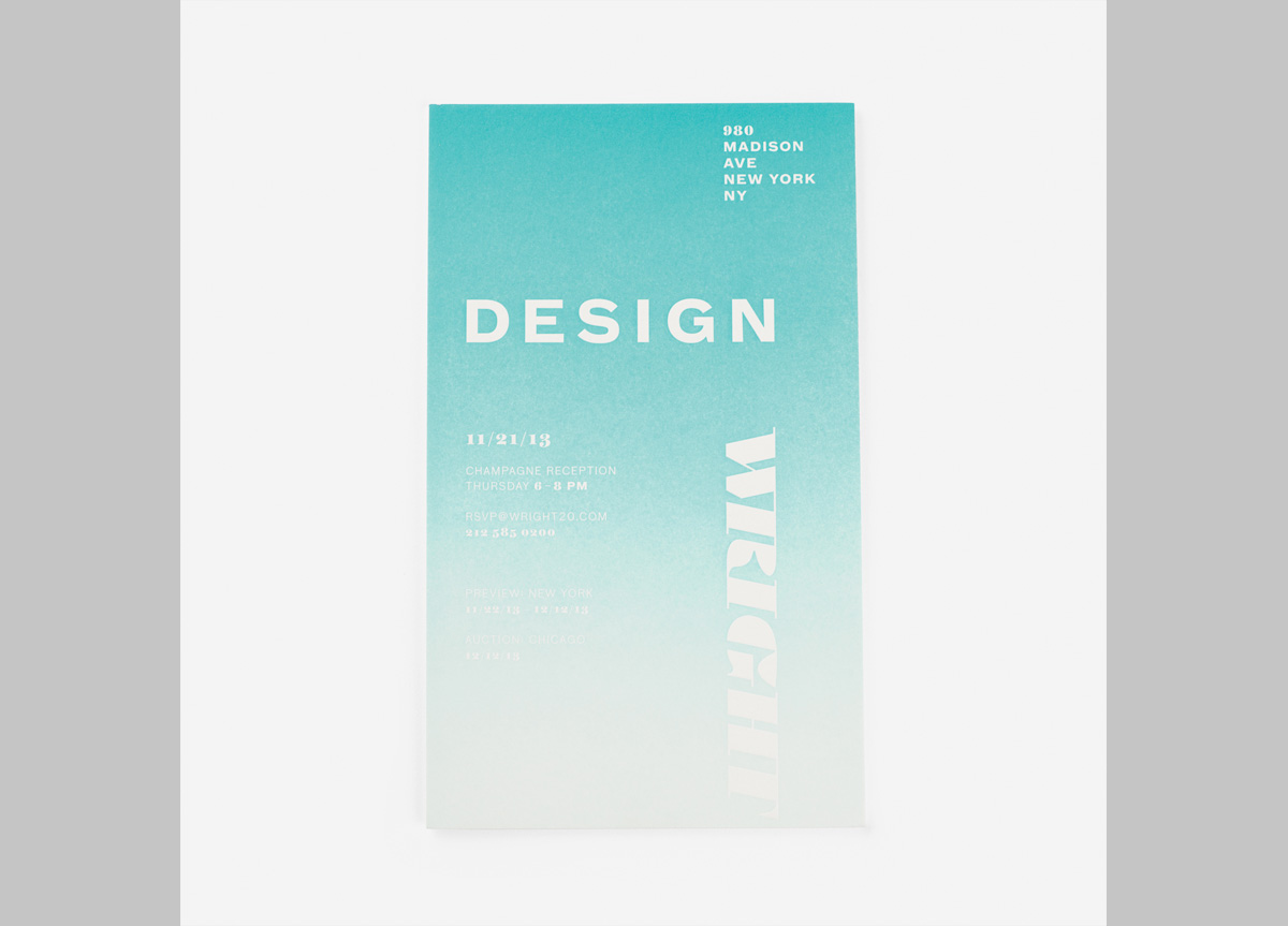
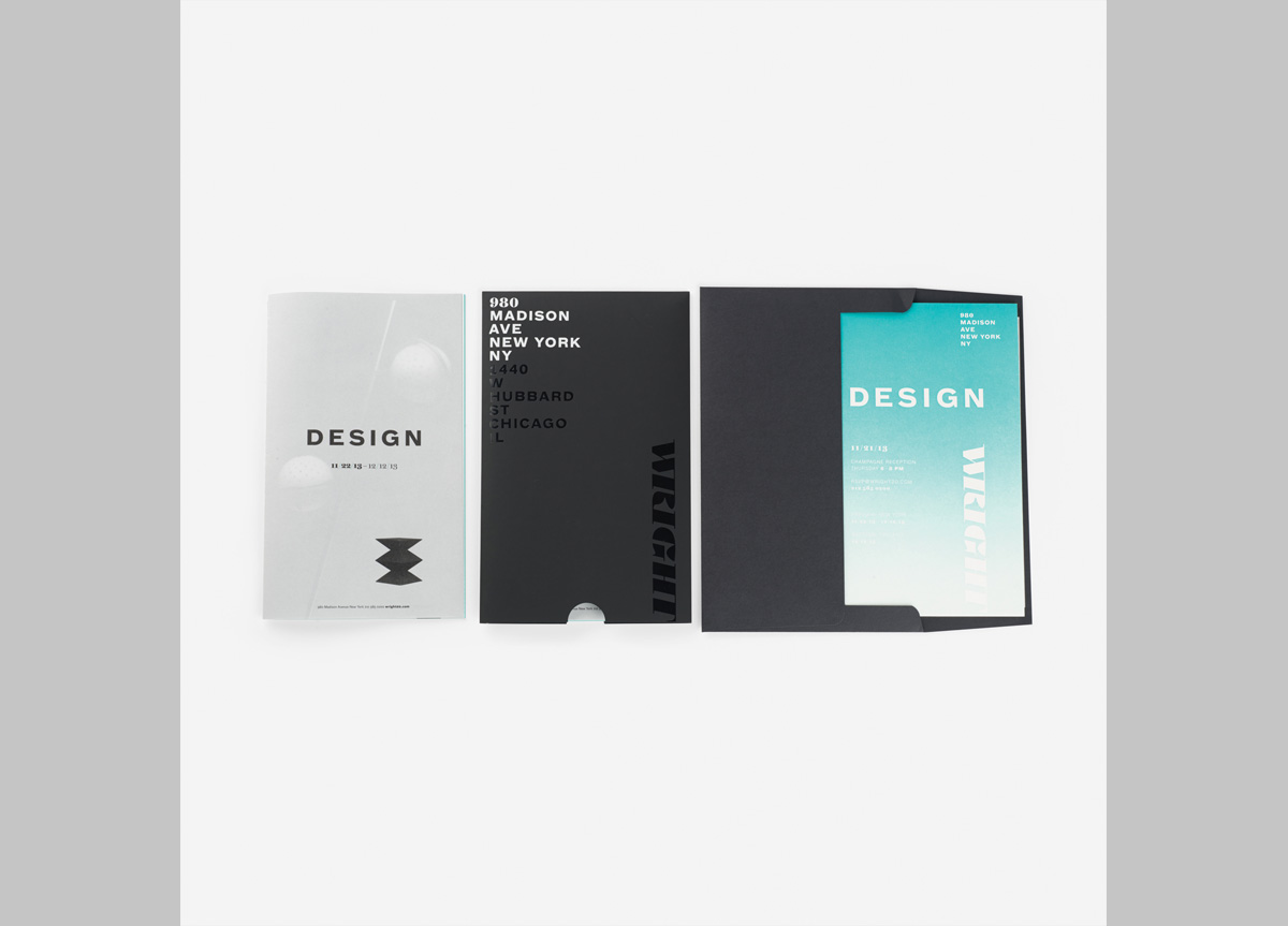
This suite announced the opening of Wright’s gallery in New York, NY, and included a VIP invitation to the opening night celebration of the December 2013 Design Exhibition.
APPROACH
The suite includes a foil stamped slipcase, letterpressed invitation, and a booklet featuring items in the exhibition—all mailed in an A10 black envelope, foil stamped with Wright’s logo and address. A slipcase with both white and black foil stamping emphasized the addition of Wright’s New York location. The small run of VIP invitations were letterpressed with a split-fountain to create the color gradient—no two pieces were alike. The booklet was printed on vellum creating a layered composition of silhouettes and type. Spine sewing with gray thread completed the booklet design to celebrate the exhibition.


