
![]()
![]()
CLIENT
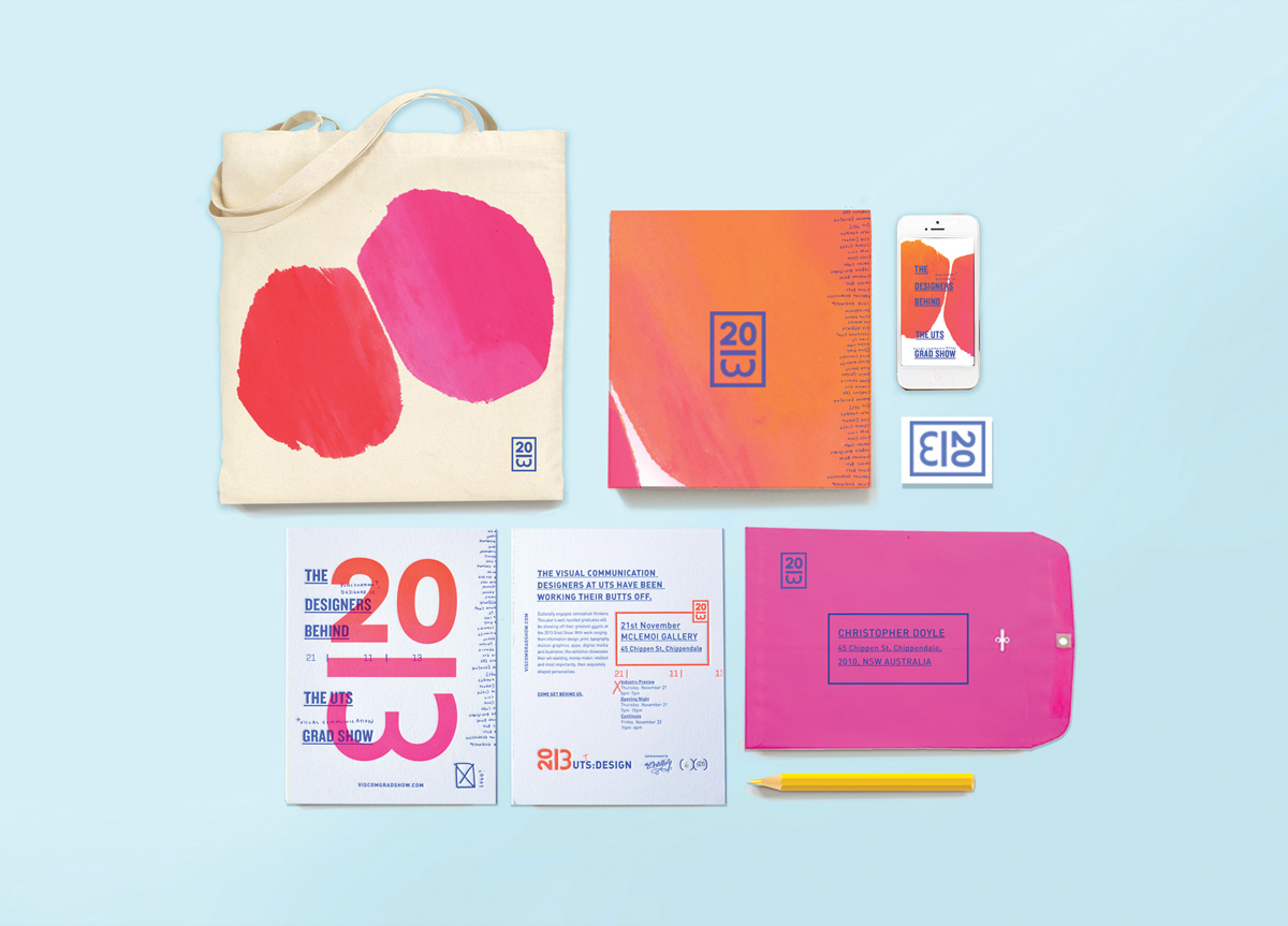
Design, Architecture and Building (DAB) is a faculty of the University of Technology Sydney. Its Visual Communication degree includes an end-of-year graduate show for its honors students.
BRIEF
As part of the final honors year of the UTS Visual Communication course, students are given the opportunity to create an identity for their Grad Show at the end of the year. Our aim from the start was to design something bold, engaging, and playful that encapsulated the youth and dedication of the graduating year group.
APPROACH
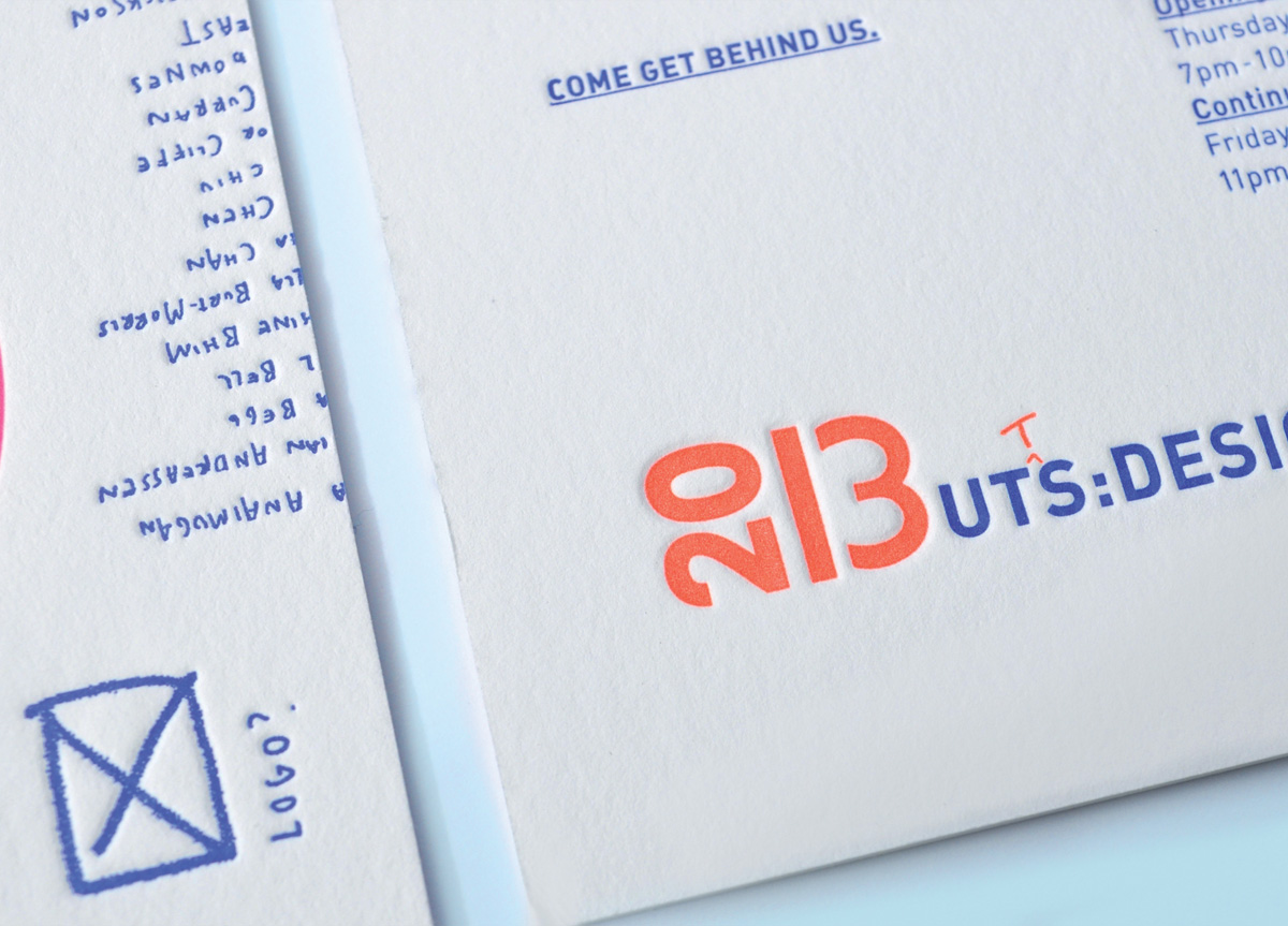
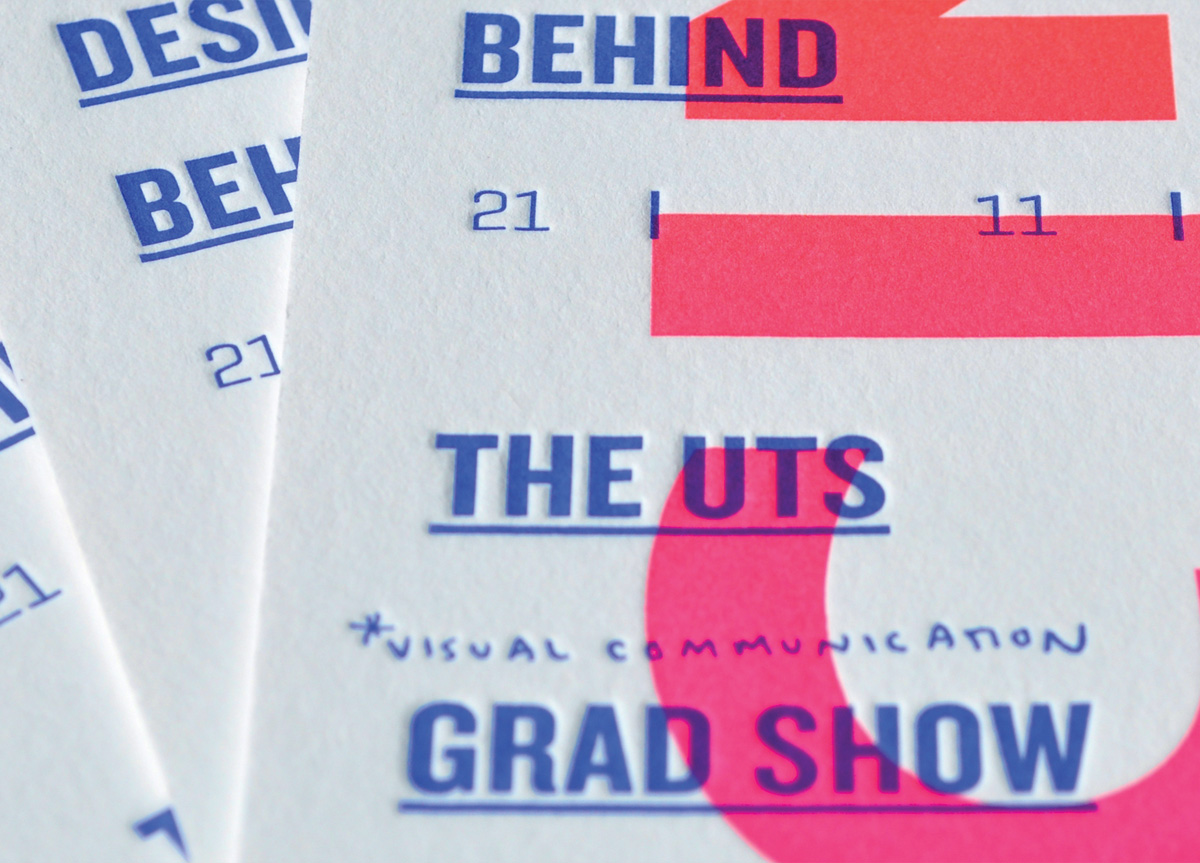
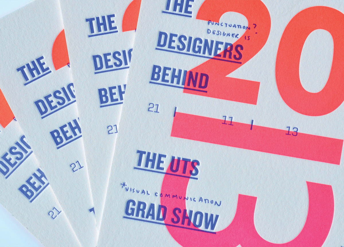
In creating this identity, we wanted to portray the fun, youthful, and dedicated personalities of this year’s graduates, particularly with reference to the idea of “working our butts off” and their “exposure” to the industry. Using a series of visual and verbal puns, a mark and identity was established across a variety of collateral including invitations, screen printed posters, and gallery murals. The invitations were letterpressed at The Distillery with a fluorescent ink gradient of PMS 805 to 806 with an overprint of Reflex Blue.


