
![]()
![]()
CLIENT
Yale Center for Customer Insights is where the most innovative and successful companies are partnering with the world’s leading-edge academics to understand the evolving dynamics of consumer behavior. Working together, they bring the latest academic theories into the marketplace—and bring back the latest marketplace thinking to our research. Sustainability Marketing: The Power of True Stories is a conference about new trends in sustainability, brand authenticity and storytelling, with talks from leading academics and practitioners across a range of fields. The conference is jointly presented by Yale University and Interbrand.
BRIEF
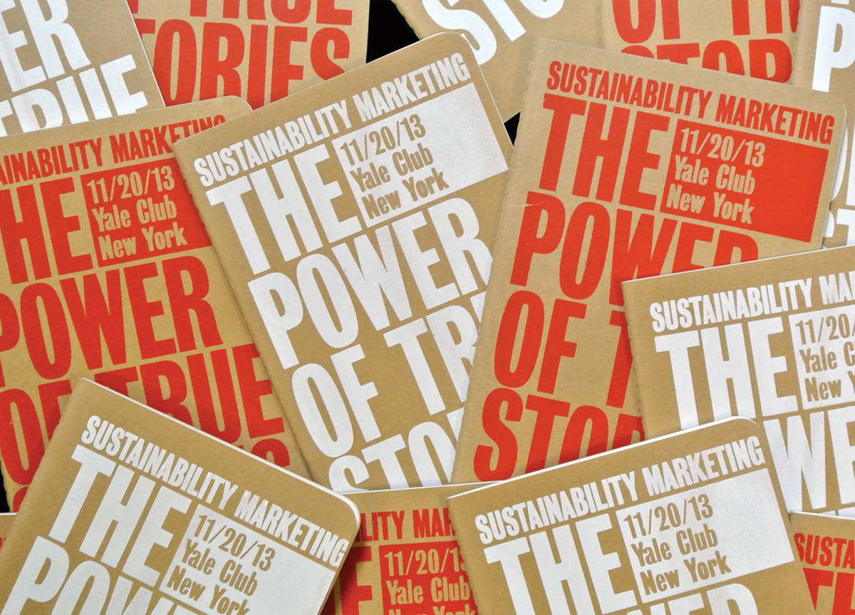
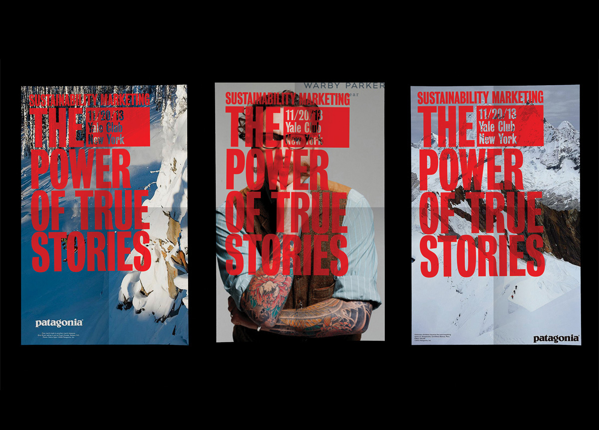
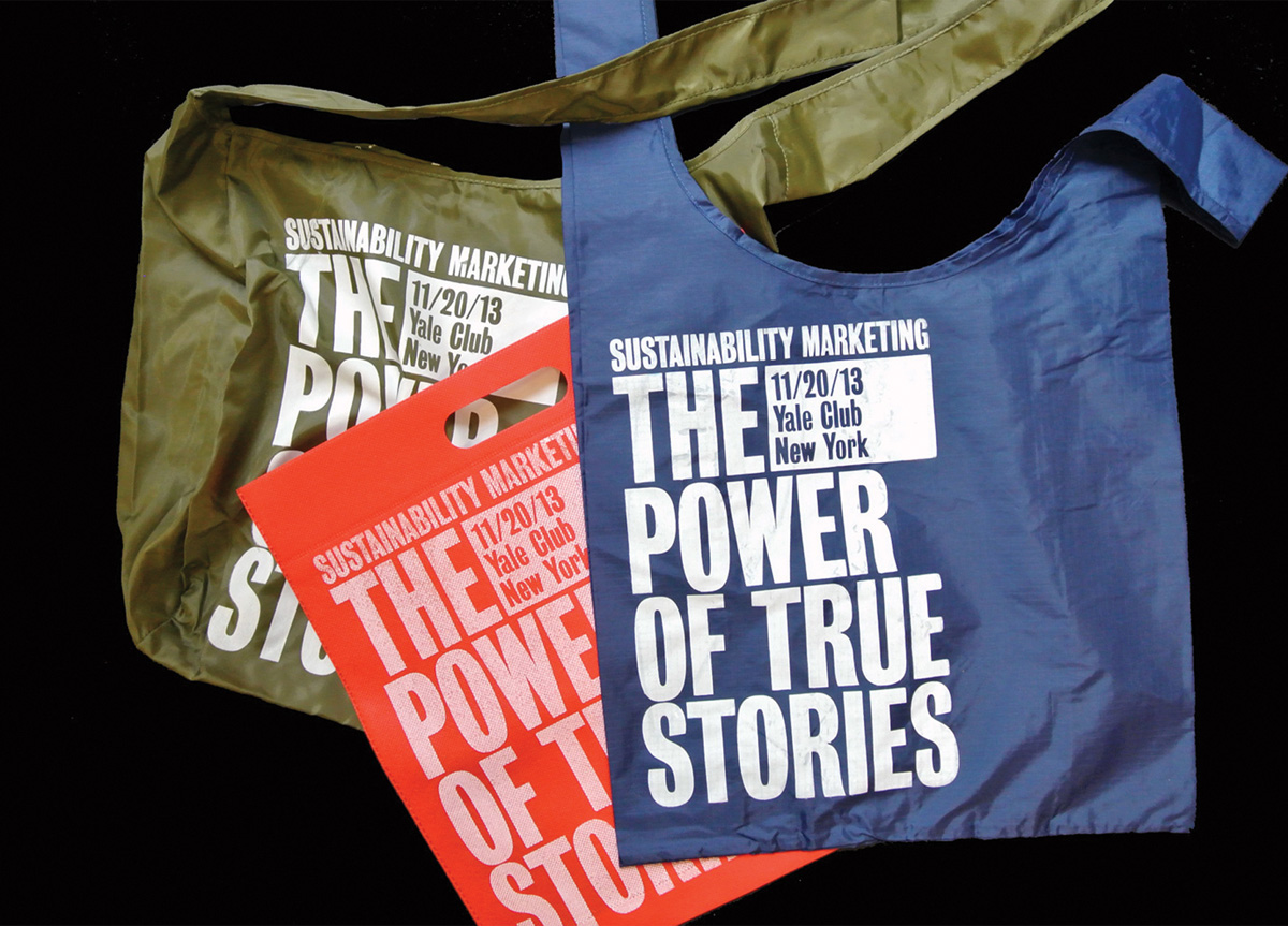
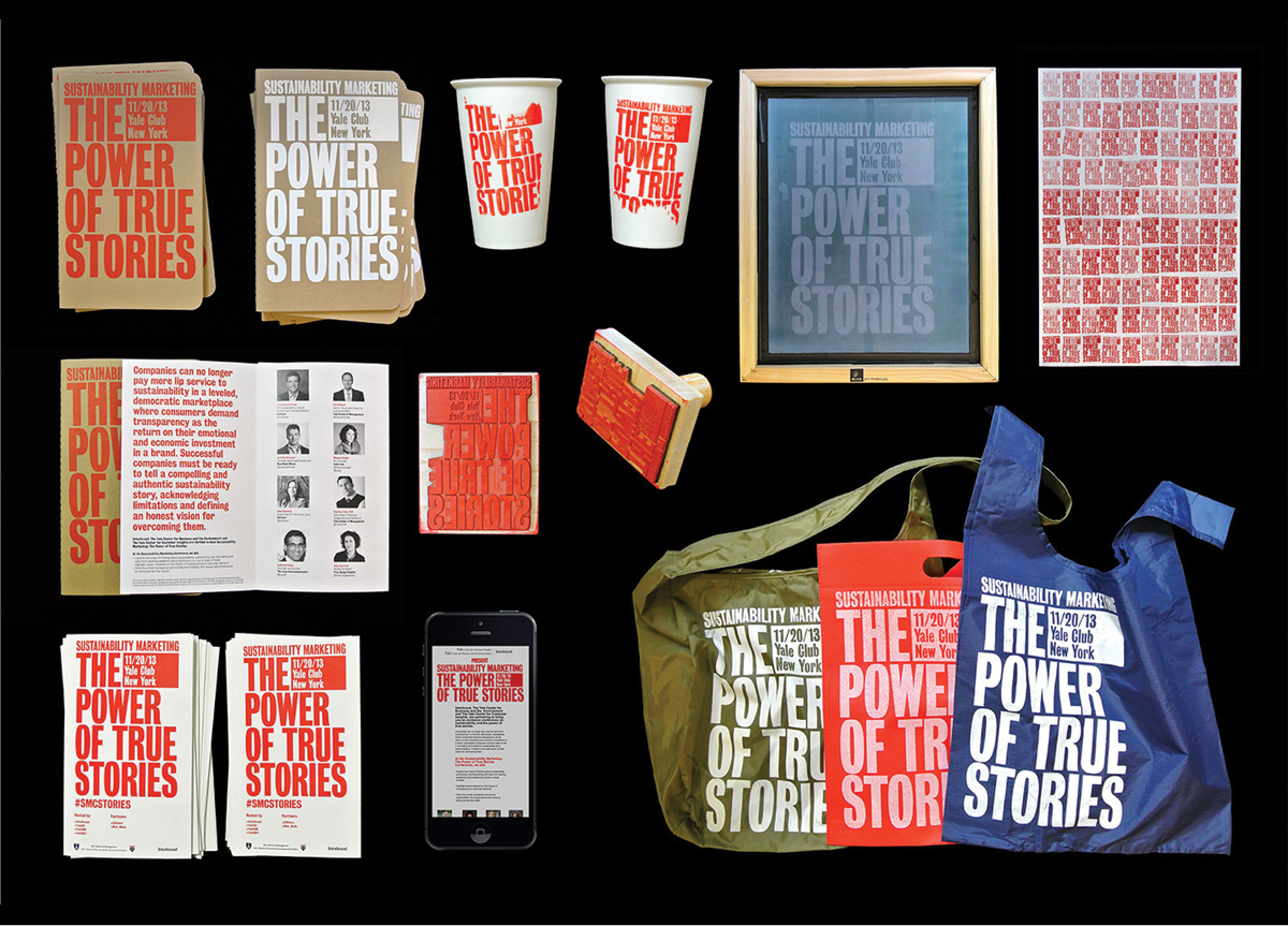
Yale University and Interbrand presented Sustainability Marketing: The Power of True Stories, to promote the benefits of telling authentic sustainability stories for brands. To limit the environmental impact of the conference we re-used existing material, and created minimal waste from the event materials and collateral.
APPROACH
Tote bags, notebooks, posters, and coffee mugs sourced from participating companies acted as the canvas for our sustainable designs. The color scheme and bold typography emphasized the importance of sustainability. We silkscreened the conference title onto notebooks and tote bags individually—this added a personal touch and created unique giveaways for the attendees. We further transformed everyday objects into thought-provoking collateral that shouted our sustainability story—discarded mugs were beautifully painted, and old banners were reused, stamped,and hung proudly from the balcony of the venue.


