
![]()
![]()
CLIENT
Wright is a Chicago, IL, based auction house specializing in modern and contemporary art and design. Auctions are meticulously curated across the spectrum of 20th and 21st century design.
BRIEF
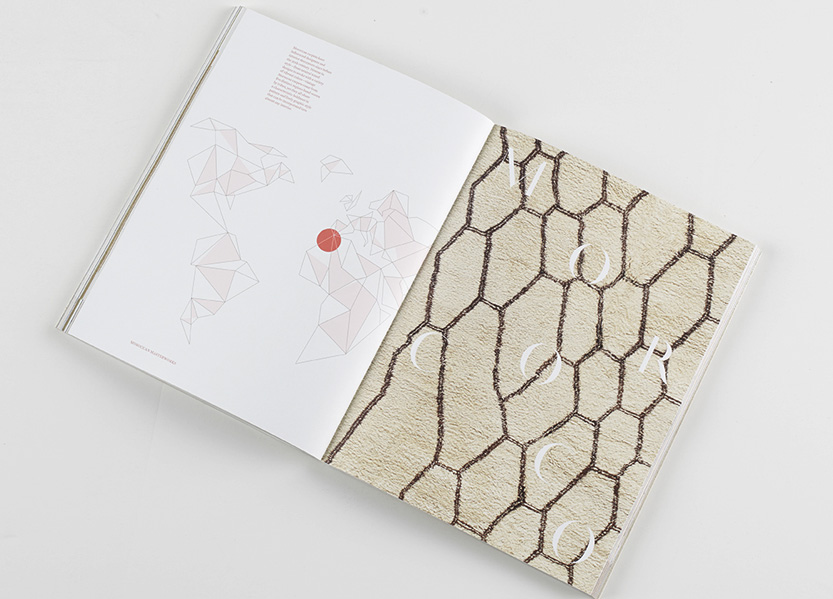
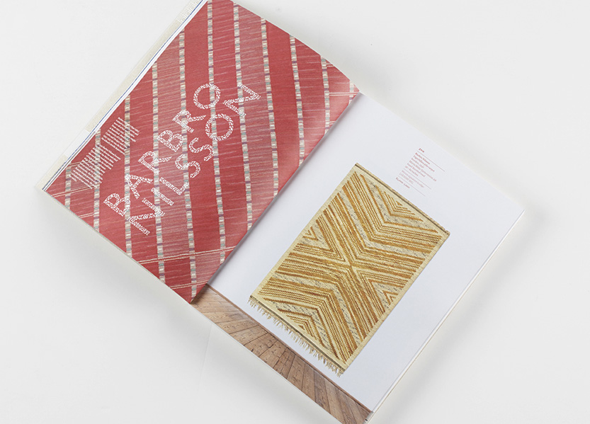
This book showcases rare carpets from the 20th century sold at Wright’s auction on June 13th 2014, curated by Nader Bolour of Doris Leslie Blau. The collection represents a large cultural and geographic range of important carpets from Scandinavian master weavers to rare French Art Deco works.
APPROACH
With over 150 carpets from different regions to showcase we set out to photograph many of the carpets with art and design pieces to add a fresh vibe to the material. Full-bleed details of carpet patterns, varying photo sets, and colorful captions offset the rich textiles. The book is organized by region—spreads introducing each chapter include illustrations of the geographic region and large bold titling. The titling is set in History, a robust typeface of varying weights and styles that unpredictably complements the different eras and styles of textile design.
PRODUCTION LESSONS
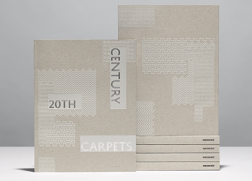
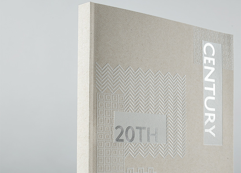
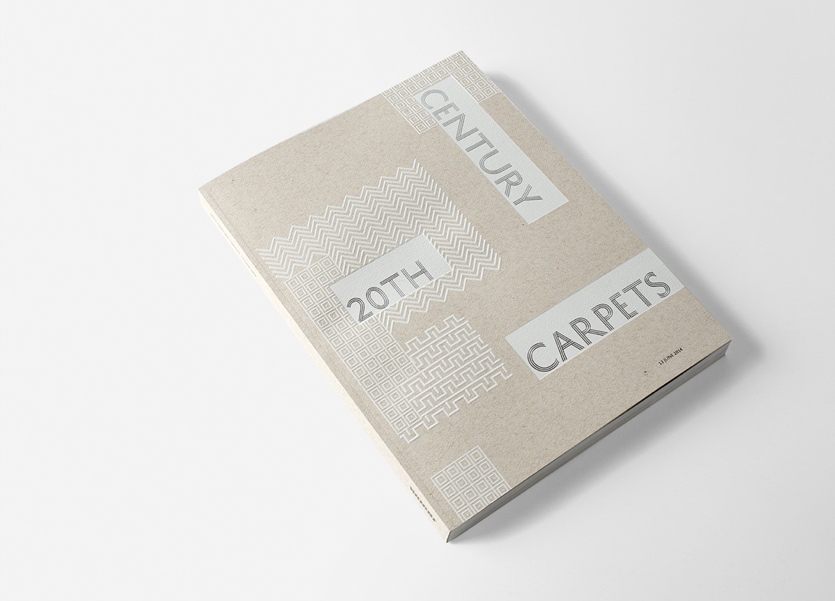
Classic Color worked with Wright’s design team to run tests on coated and uncoated papers before printing. With the UV press and HUV inks an amazing color range and detail came through on the uncoated stock, which we had been hoping to use for the body of the book from the start! The cover was printed with 4 plates of white, and run through the press a second time—8 total hits of white have the ink nearly sitting atop the paper with amazing contrast. To finish the cover, the Art Deco pattern was embossed and debossed, and finally the silver foil stamping was added for the text.
This catalog is as tactile and beautiful as it is informative. Wright has an outstanding global reputation specializing in 20 and 21st century design with top of the line communications to their discerning clients and distinguished collectors. The presentation of the catalog is as important in the decision making process and brand identity as the selection and presentation of the items themselves. The highly textured embossed and foil stamped cover picks up on the design esthetic of the rugs in the auction, the soft but sturdy cover paper folds with a luxuriously large flap. The cover paper feels like a designers sketch book while the interior paper is dull coated to pick up the high quality color photographs of each item in the auction. The design of the interior is modern, sophisticated, and playful. The rug and room photography styling is minimal with well chosen accents. The detail photographs are nothing less than design-porn. All together the catalog made me want to buy every rug and keep the catalog for design reference. The in-house Wright design team created an innovative and original design object that is also a useful and clear reference tool. — Gael ToweyHow is it that an auction catalog for carpets can captivate a roomful of demanding and very particular designers? Seduction. OK, the multi-level emboss is over the top, but combined with the stock and foil stamping, we just couldn’t put it down. The images of the carpets themselves were a loopy library in themselves, but careful thoughtfulness went into the propping and staging of the photos themselves, adding up a delight that was visual, tactile, intellectual and thorough. The judges were actually fighting over this copy. Funny that Gael walked away with it. — Stephen DoyleAn auction catalog which proves to be just as desirable as the pieces it contains. The layout included smartly art-directed photography, which was made for a publication I had a hard time putting down. The cover alone was a beautiful design to see and touch for its debossed and embossed foil on a paper with the right amount of tooth, and the color of wool. — John EarlesWell, again, each judge has a specific aesthetic background and the artwork I make these days is often inspired by the repetitive imagery and full color found in earthenware and tapestries, quilts and rugs. The book was cleverly designed, it highlighted details of selected carpets and blended splendidly all this imagery into one publication. Did I say blended? Hmmm, like a carpet? Excellent. And I’ve already ordered the catalog for myself. — Jim SherradenExquisite attention to detail, from choice of typeface, to balanced layouts, to smart photography and juxtaposition of content, makes for a catalog all jurors envied. — Marc English


