
![]()
![]()
CLIENT
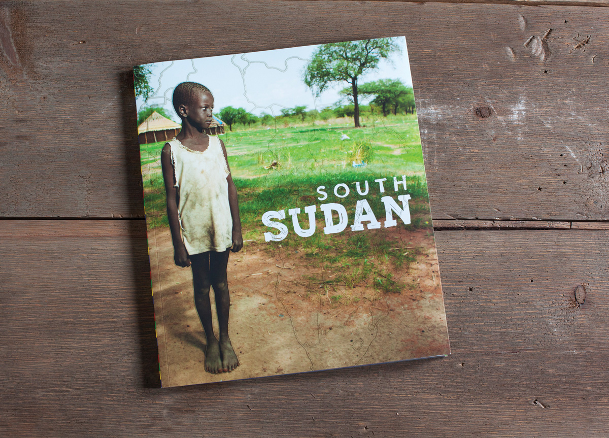
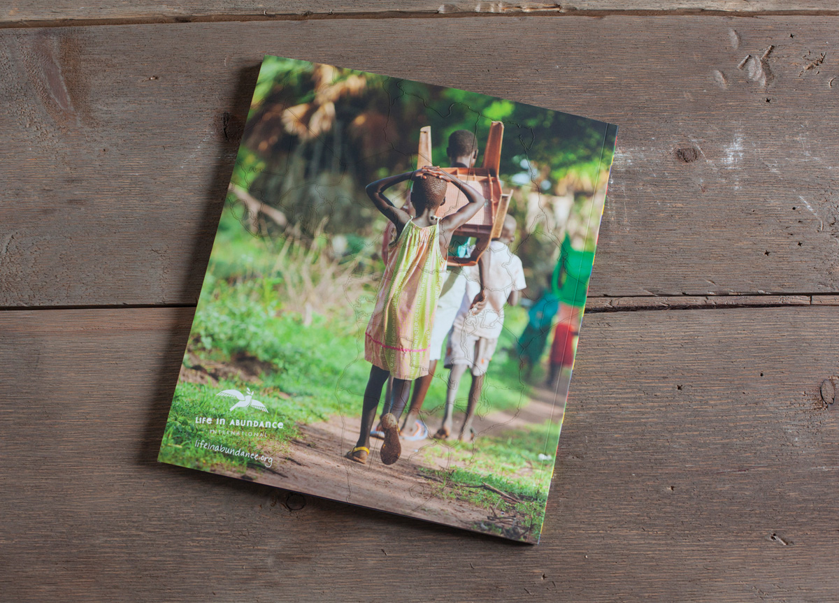
Life In Abundance (LIA) is an organization helping to restore health, renew hope, and inspire lasting transformation for the world’s most vulnerable families. South Sudan is one of the organization’s primary focuses at the moment.
BRIEF
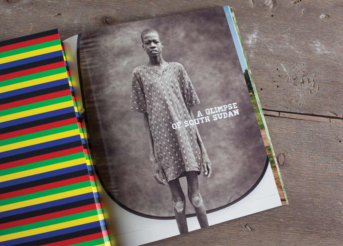
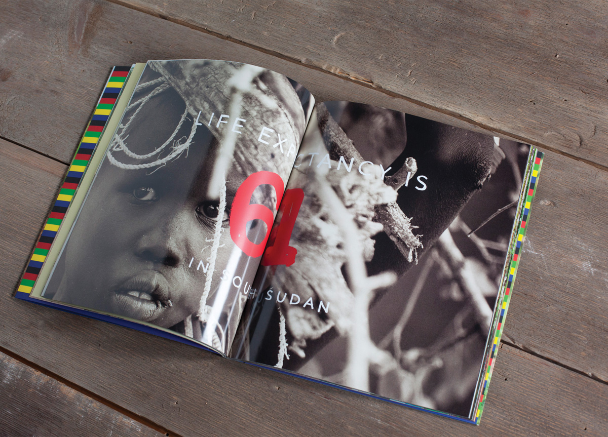
We were asked to make an awareness book of the people we met and interviewed. Photography combined with facts and statistics illustrates that we as a society can help evolve the harsh realities of their world. This is an introduction to the beauty, the people, the struggle, and most of all the hope that can be witnessed there.
APPROACH
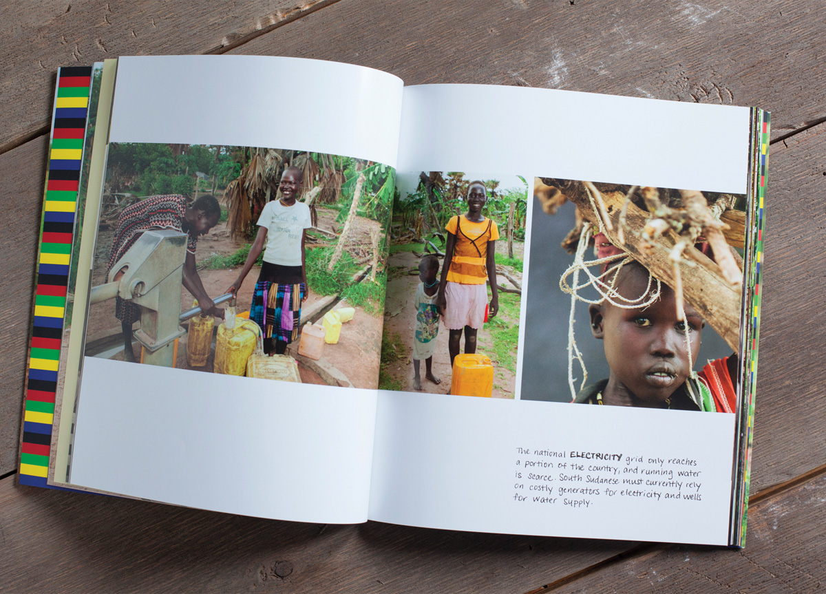
This book is a visual introduction to our world’s newest country South Sudan. It was created to help shine light on the lives of people living there. Through this book we hope to inspire the viewer to learn more and join LIA in helping bring hope and restoration. By visiting South Sudan and conducting visual and audio interviews, we were able to better understand what everyday life was, and is, like. We also spent several months collecting data from LIA and related organizations in order to build a comprehensive picture of the struggles and joys of the country.


