CLIENT
Commercial Artisan (Indianapolis, IN) is the graphic design studio of brothers James and Jon Sholly. Commercial Article is their offshoot publication. They are a traditional, print-based studio that focuses on work for arts organizations, not-for-profits, foundations, and schools.
BRIEF
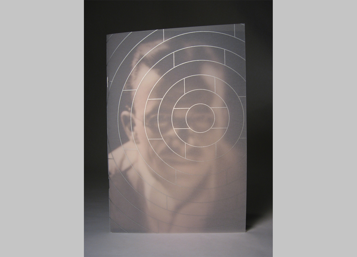
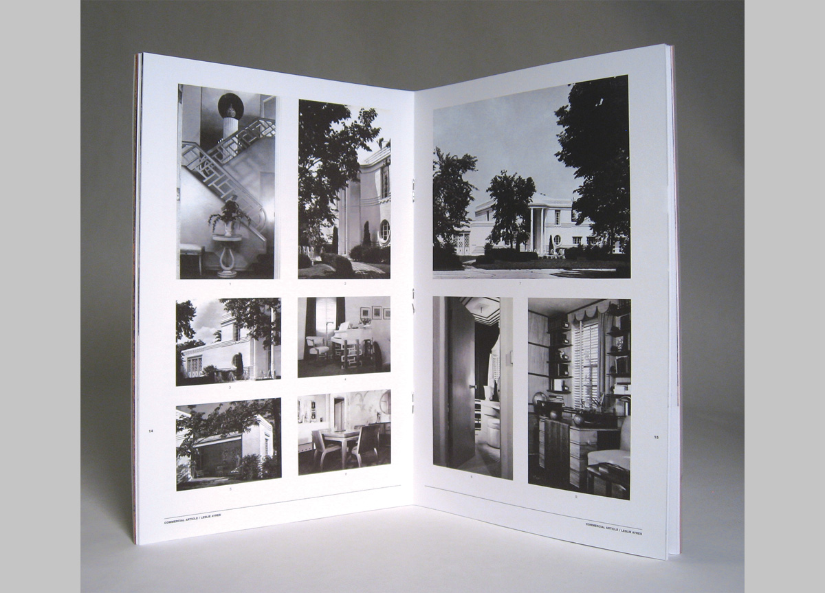
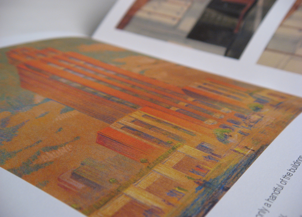
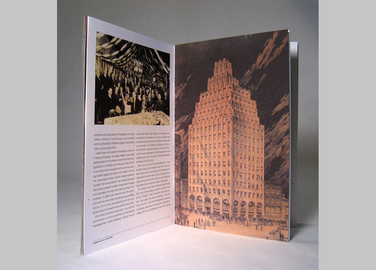
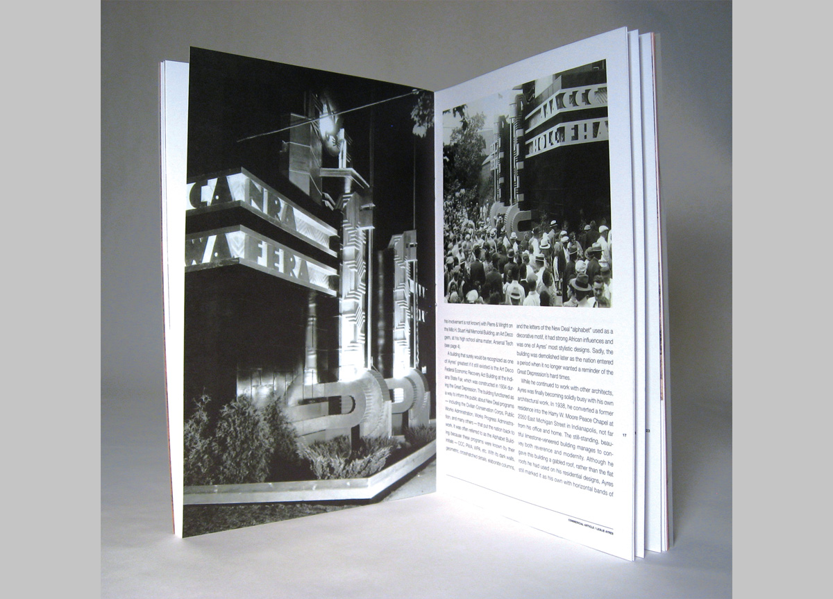
Commercial Article is an ongoing publication that explores the lives and work of lesser known design figures from Indiana. This issue spotlights an architect/architectural renderer named Leslie Ayers, who brought tremendous style to his projects, many of which no longer exist outside of his drawing archive.
APPROACH
Our purpose is to document the lives and work of design figures from Indiana that we feel haven’t received the recognition they deserve. We’re exploring regional design history via this irregularly produced publication. We have published five issues that showcase graphic, product, and building design. It is our goal to continue to collect and share these stories as long as we’re able to find them.
PRODUCTION LESSONS
The production of this piece is fairly straightforward, but I wish I had been cautioned to select a different size. Our 6.25 x 9.25-inch size is an awkward fit for the sheet size our printer can utilize. If we had scaled the piece down to 6 x 9‑inch, we would have been able to include more pages per sheet and thereby get a bigger publication for our money.
Judge’s Comments
I’m usually attracted to the unusual in design competitions. Sometimes I find myself thinking, “if I haven’t seen it before, then it is amazing.” So much of what is entered in a design show strictly echoes what is considered the latest design trend or philosophy or idea. In this particular show, because it was emphasizing printing process, I found my personal judges’ pick to actually be the one piece I felt the most familiar and comfortable with. It demonstrated everything I miss about printing that is not being exploited currently—duotones, varnishes, and smart hard-line graphic techniques. Surely, this was produced digitally (the entire printing paradigm has shifted completely at this point). But this really looks like what would have been considered a truly GREAT piece of graphic design production and printing from 20–30 years ago. As a result it simply looks fresh. I guess I so miss the quality of good printing and the amazing things that only printing can do (as opposed to what a computer can do) that I fell in love with this piece. — Art Chantry
