CATEGORY

Letterpress

RANK

Judges Pick

PRODUCTION DETAILS

Quantity

75 limited edition

Page Count

Number of Colors

2

Special Techniques

Binding

Dimensions

11 × 17

Paper Stock

Crane's Lettra, Pearl White, 110lb cover


DESIGN CREDITS

Designer, Concept Development

Jim Godfrey

Consultants

Patrick Wilkey, Tyrone Gibson, Courtney Davis


PRODUCTION CREDITS

Leland Rowley


TAGS

, , , , ,


LINKS

Jim Godfrey Design, LLC
Rowley Press

Poster for Self-Promotion by Jim Godfrey Design, LLC


CLIENT

Jim Godfrey is the current chair of the Department of Art & Visual Communications at Utah Valley University who loves typography and teaching students, while also freelancing.


BRIEF

As designers we’ve all struggled to find typefaces that compliment each other—it takes a lot of work and experimenting to get it right. As a professor at Utah Valley University, I constantly encounter students who ask me which typefaces work well together.


APPROACH

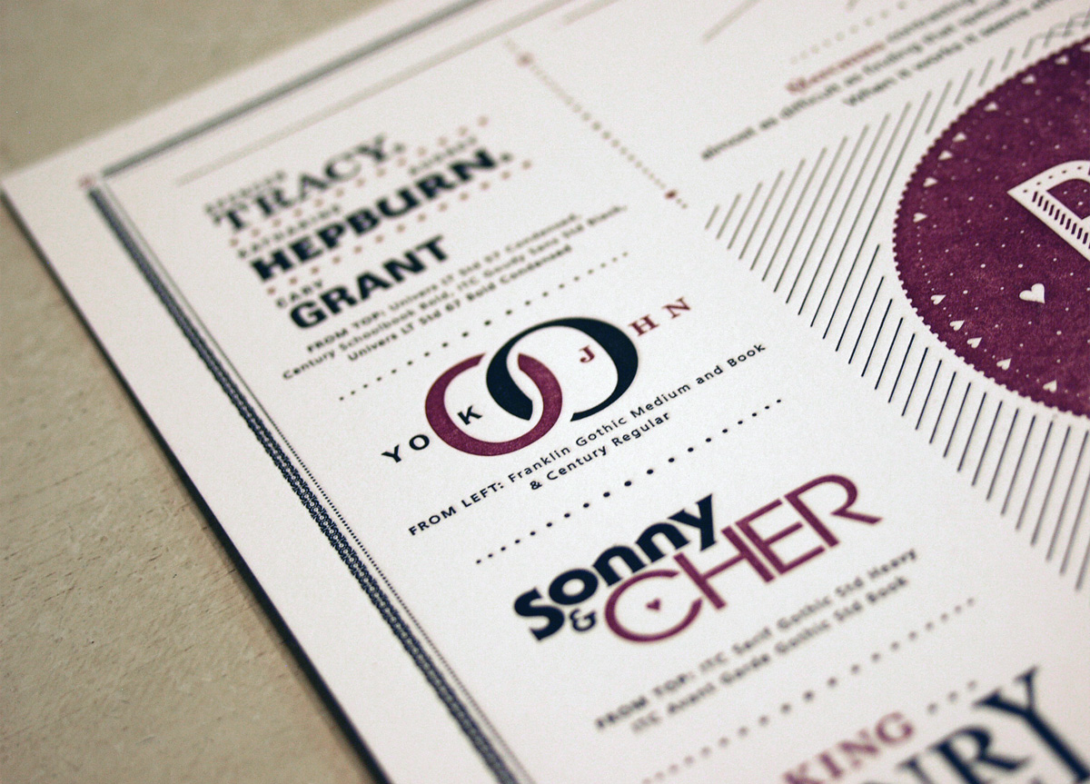
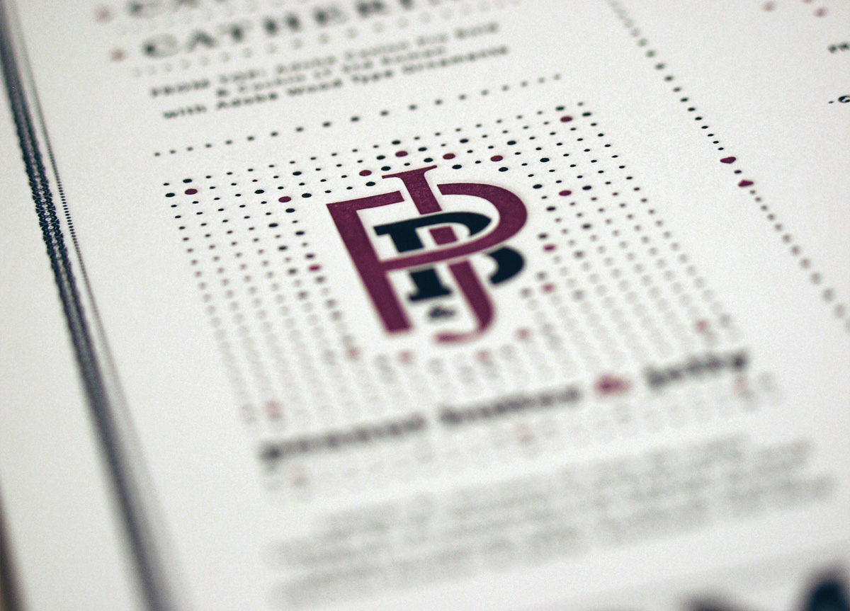
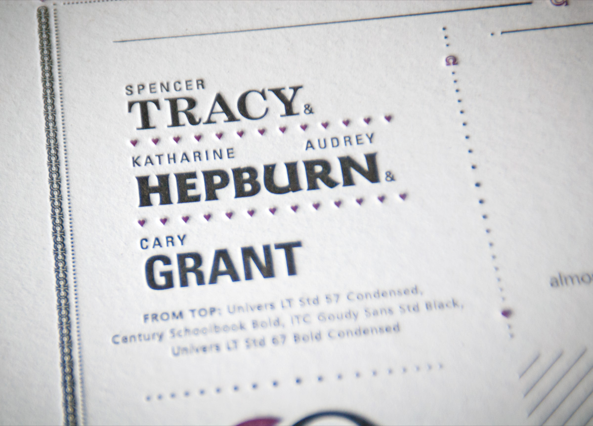
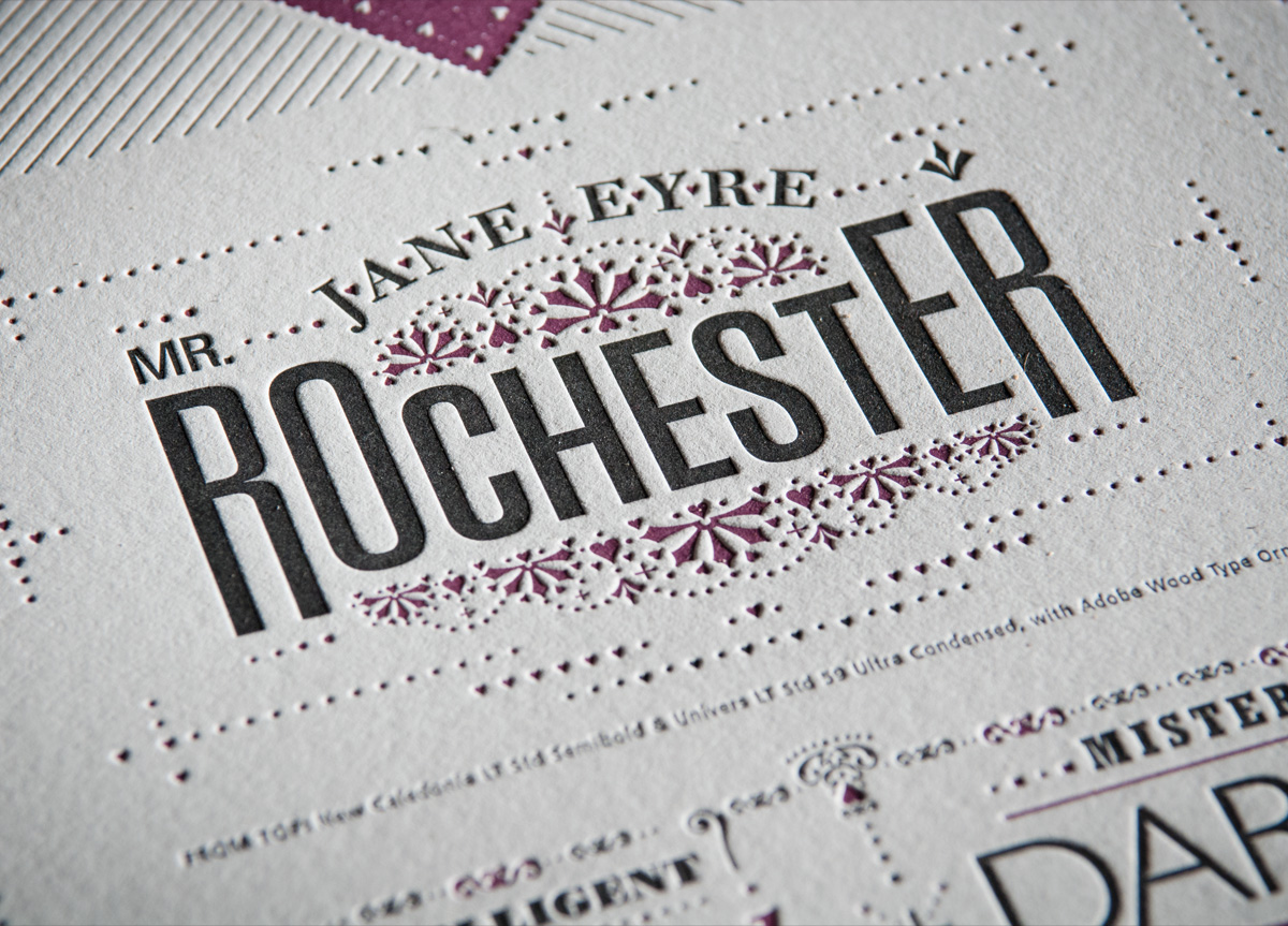
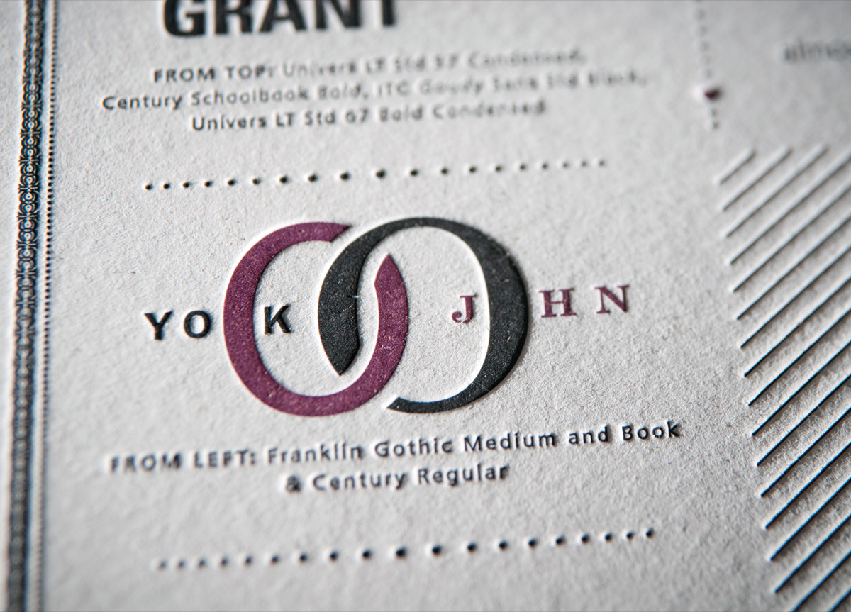
I designed this poster wanting to show a few interesting combinations of typefaces. I tried to make it entertaining by using famous couples from life, literature, and history as subject matter—it was hard to find couples that were not copyrighted, so there is no Ernie and Bert, Buzz and Woody, or Scarlett and Rhett. But there was rich fodder like King Henry VIII and Larry (the) King who had many “matches," as well as classics like John and Yoko, JFK and Jackie, Simon and Garfunkel, and even peanut butter and jelly.



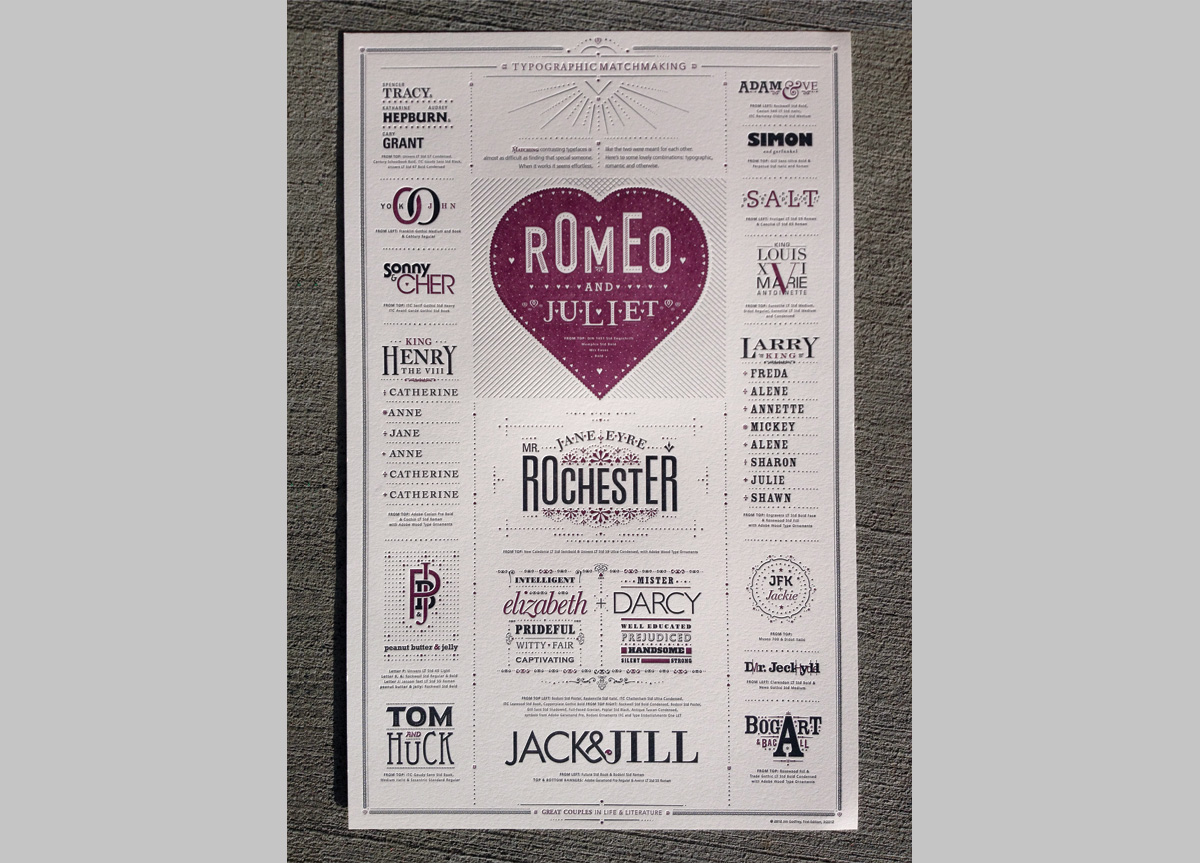
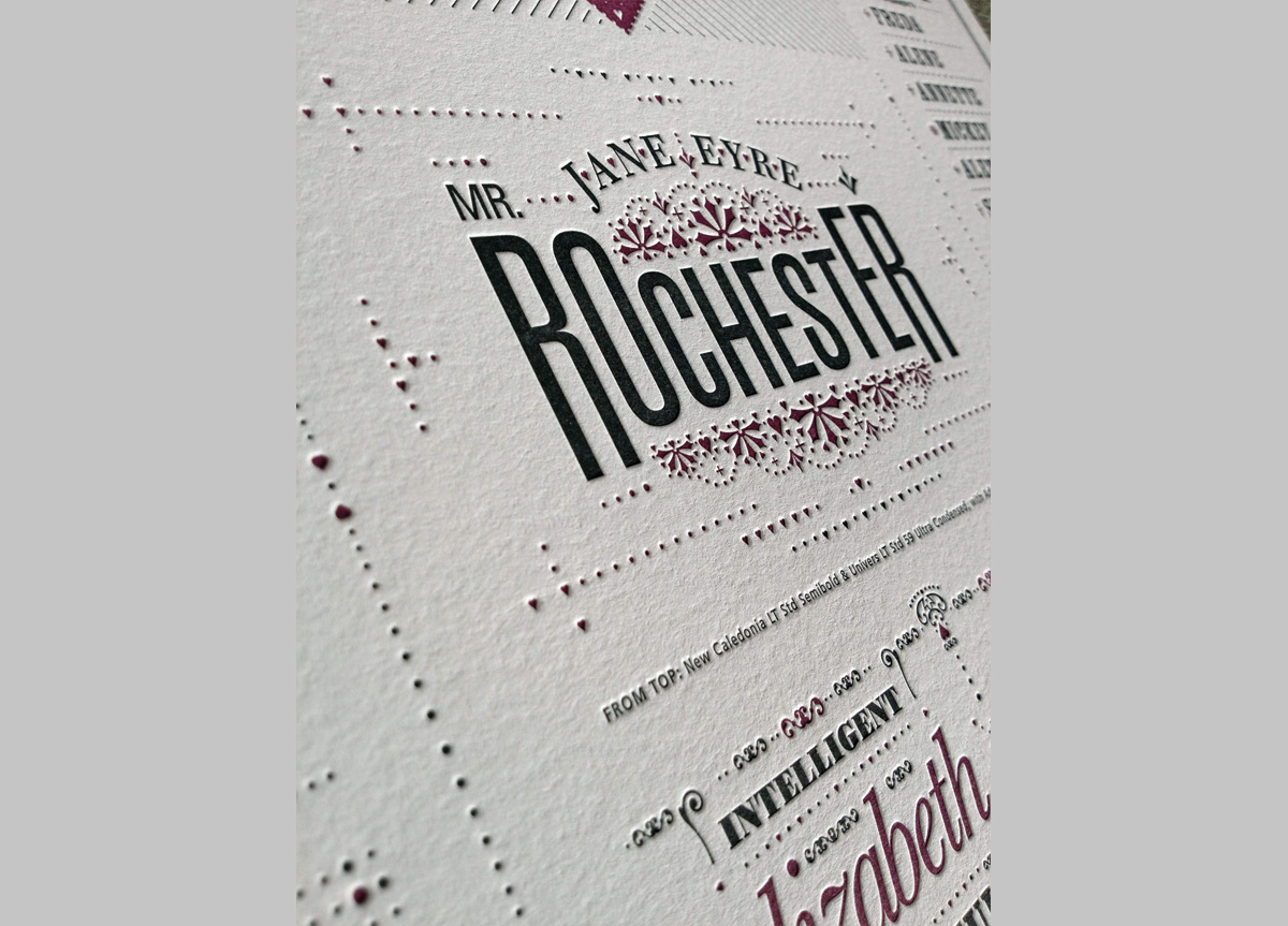
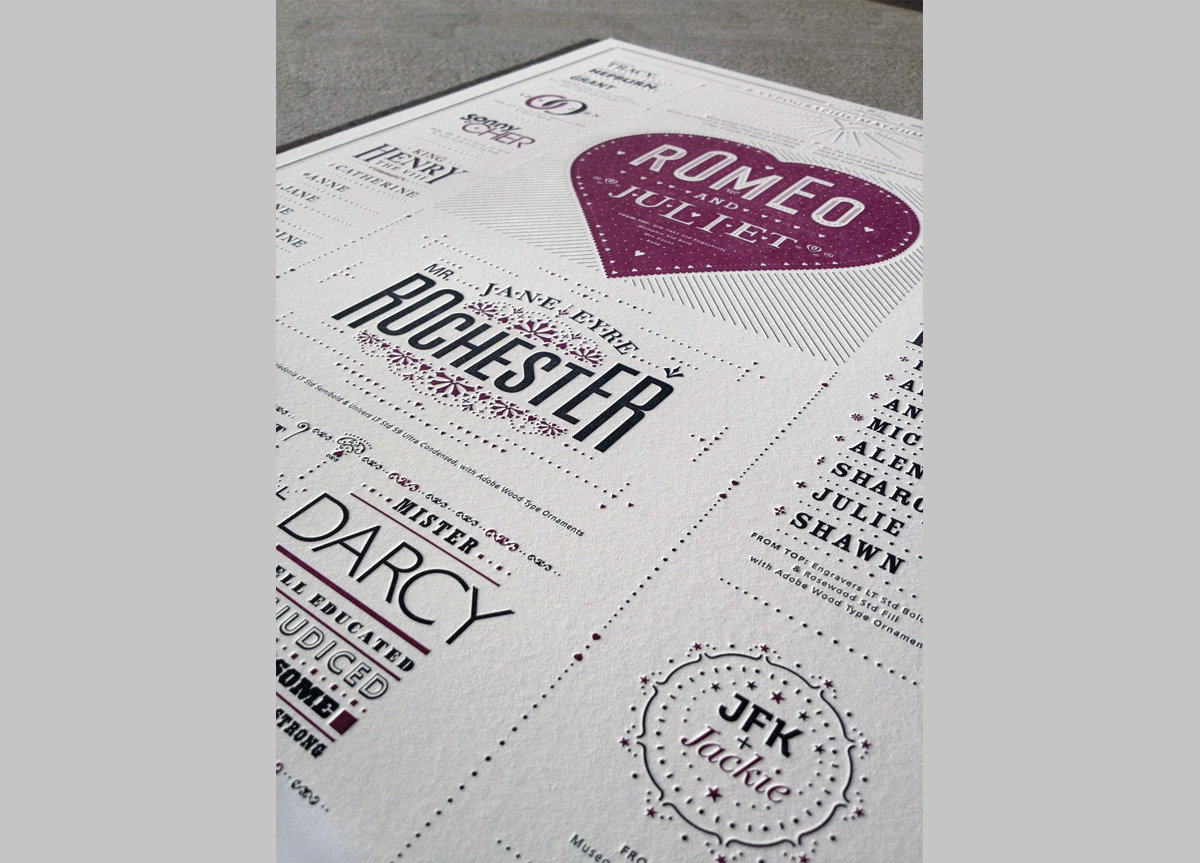
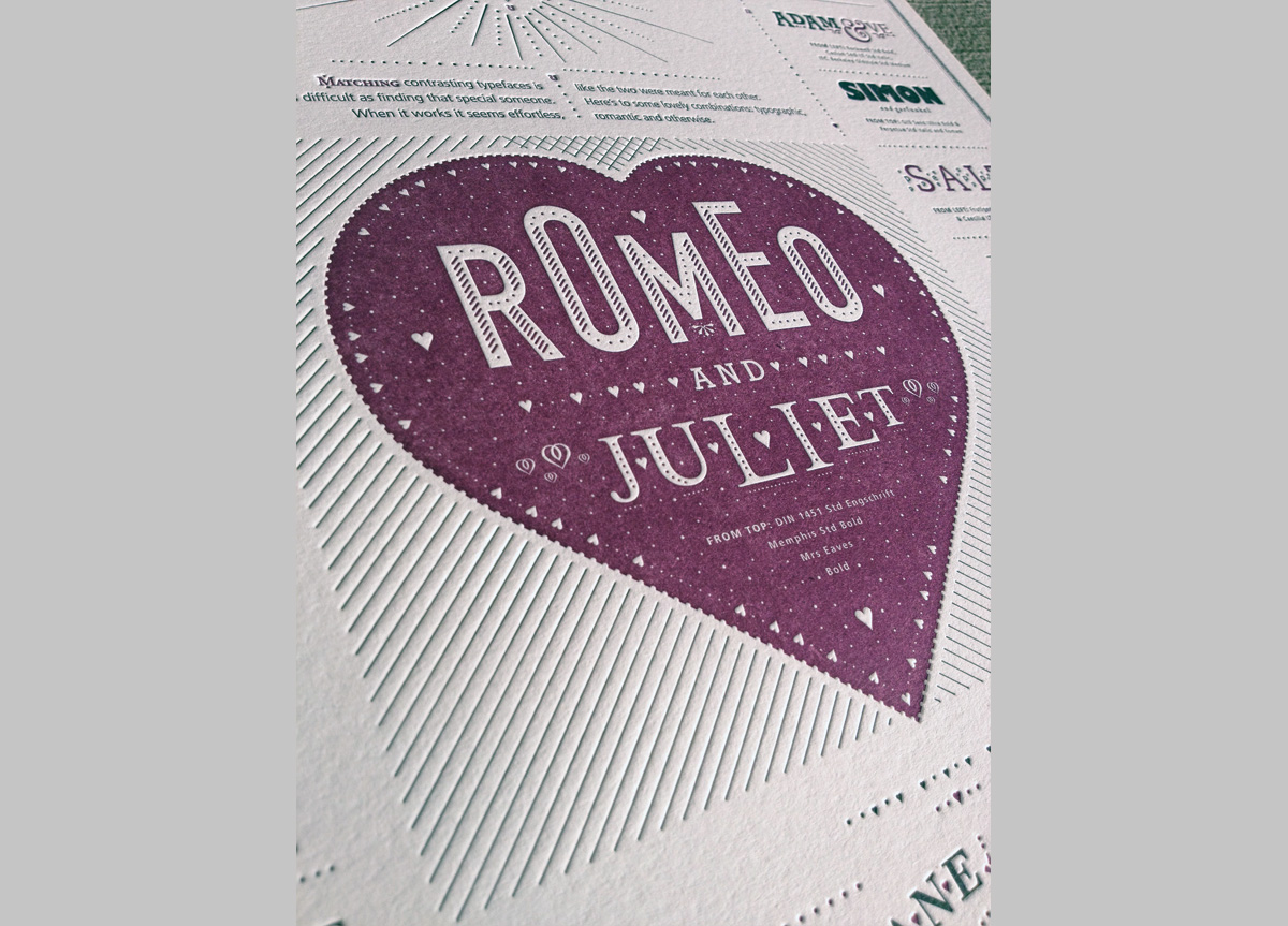
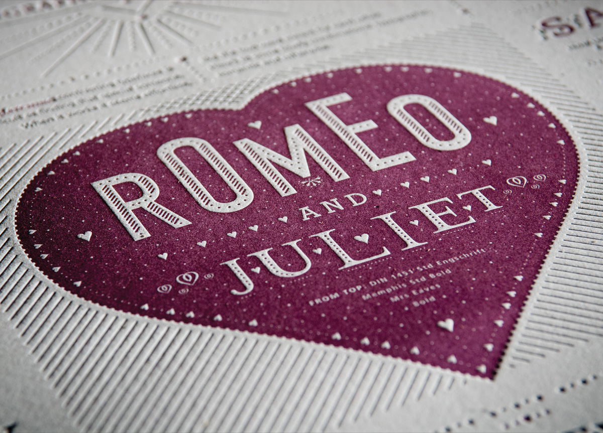
PRODUCTION LESSONSThis poster actually printed without a hitch, even with the tight registration it required. I was trying to take full advantage of letterpress by including many fine details using symbols, shapes, and small type. These details often were on separate plates and needed to line up perfectly. Rowley Press did a fantastic job.

Judge's Comments
What I loved about this piece was the story of the typography that came alive with each detail. The pattern, textures and type-centric design made it a perfect design for letterpress printing. The tight register of two colors on a poster this size is a production challenge that comes through in all the printing details. Well done indeed. — Ben Levitz

Browse entries