CLIENT
Henry and Company is an award winning, second-generation specialty print studio.
BRIEF
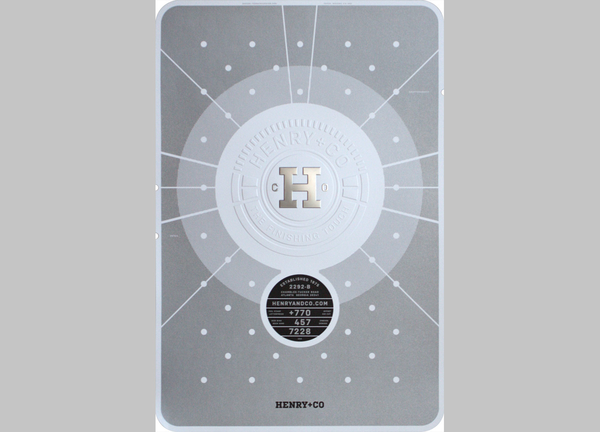
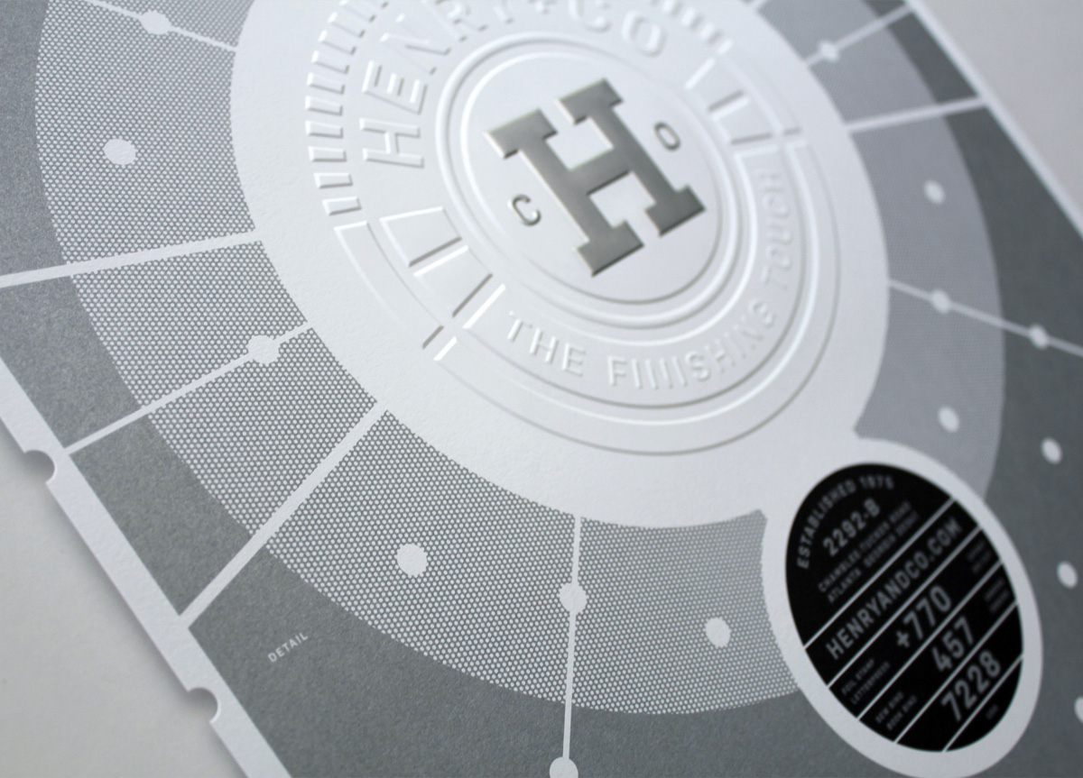
Jason Henry asked Lionel Ferreira to design a fresh look for his specialty print studio. He asked specifically for clean and simple design that would showcase the various print and finishing techniques offered at Henry and Company. He used Gucci as an example.
APPROACH
Lionel Ferreira designed a series of promotional posters for Henry and Company. They serve as a powerful marketing tool and are sent to potential clients as an introduction—hopefully they will “collect" the entire set. This poster is the first of the series and works beautifully alongside the business card.


