CATEGORY

Mix

RANK


PRODUCTION DETAILS

Quantity

Card 5,000
Menu 50 each

Page Count

Number of Colors

1

Special Techniques

Laser-etch

Binding

Dimensions

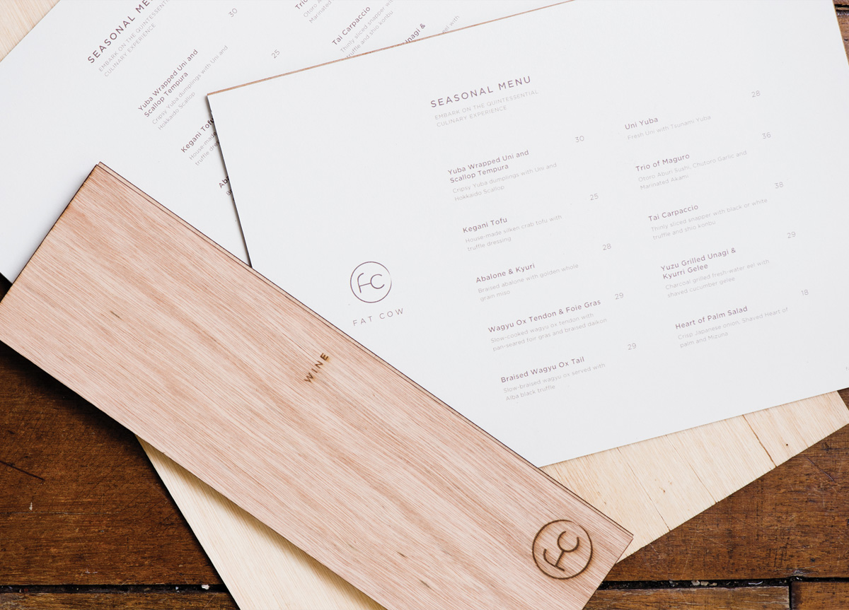
Menu 16.53 × 11.61
Menu 11.41 × 8.46
Business Card 3.34 × 2.16

Paper Stock

Recypal


DESIGN CREDITS

Creative Director, Art Director

Yah-Leng Yu

Designers

Gwen Chan, Bryan Angelo Lim


PRODUCTION CREDITS

Production, Quality Management

Bryan Angelo Lim


TAGS

, , , , , ,


LINKS

Fat Cow
Foreign Policy Design Group
Plixo

Menu and Stationery for Fat Cow by Foreign Policy Design Group


CLIENT

Fat Cow is a specialty beef restaurant employing the Japanese way of meat selection, preparation, and presentation.


BRIEF

We were tasked by the client to design their brand and identity collateral.


APPROACH

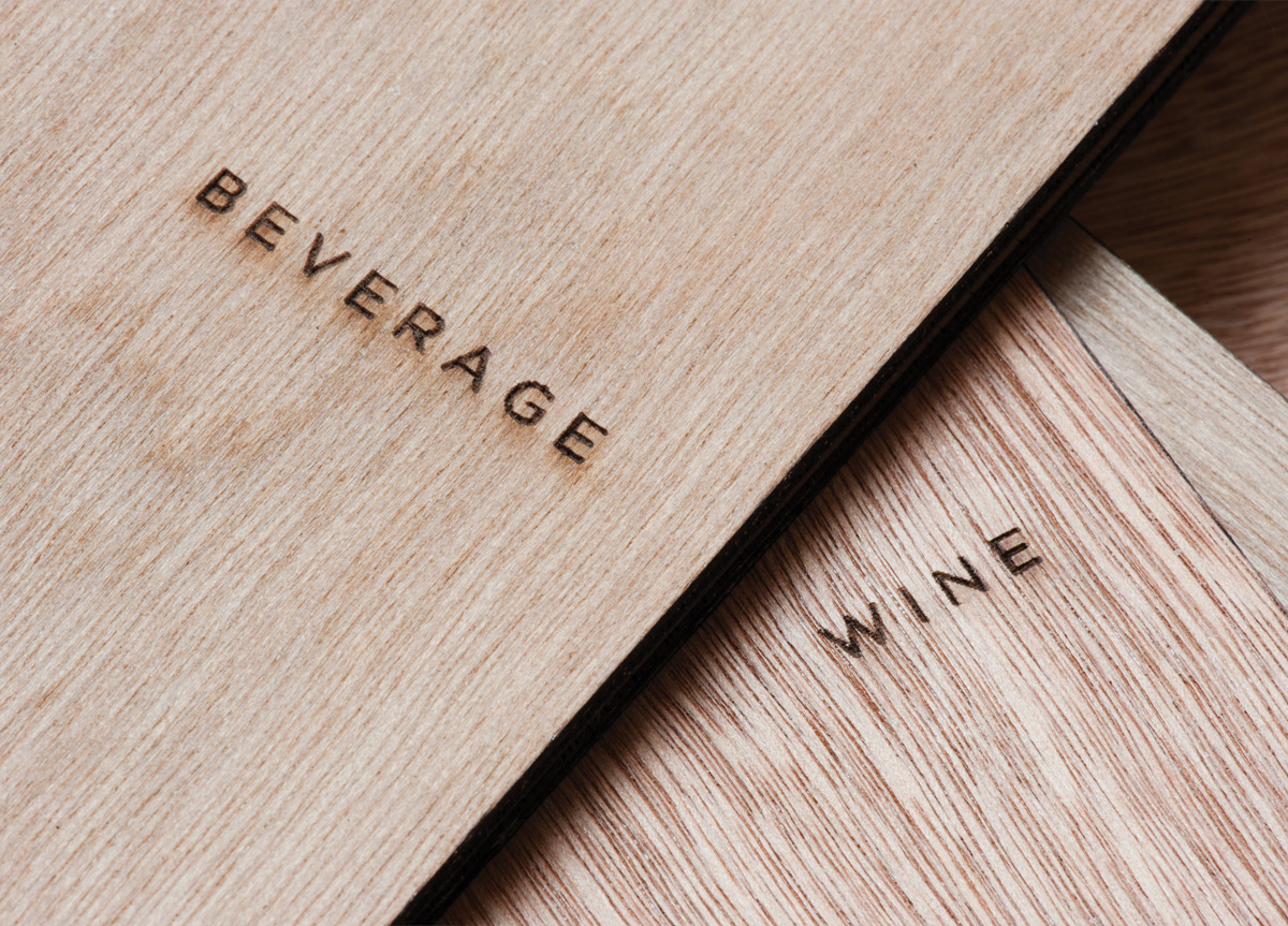
We drew inspiration largely from the Japanese aesthetic Wabi Sabi, with traits that include simplicity, economy, austerity, modesty, and the appreciation of the ingenuous integrity of natural objects and processes. We used wood as the primary platform of this brand communication, as the non-uniformity and texture suggests the Wabi Sabi beauty of imperfection. The mark and the searing on the wood are also reminiscent of the branding of cattle.


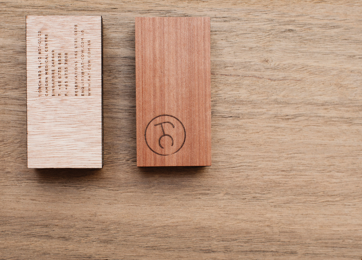
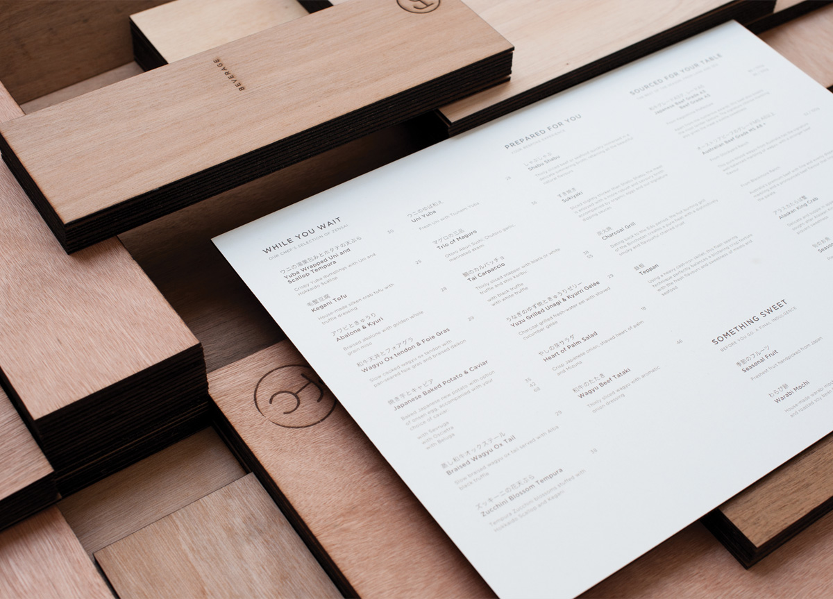
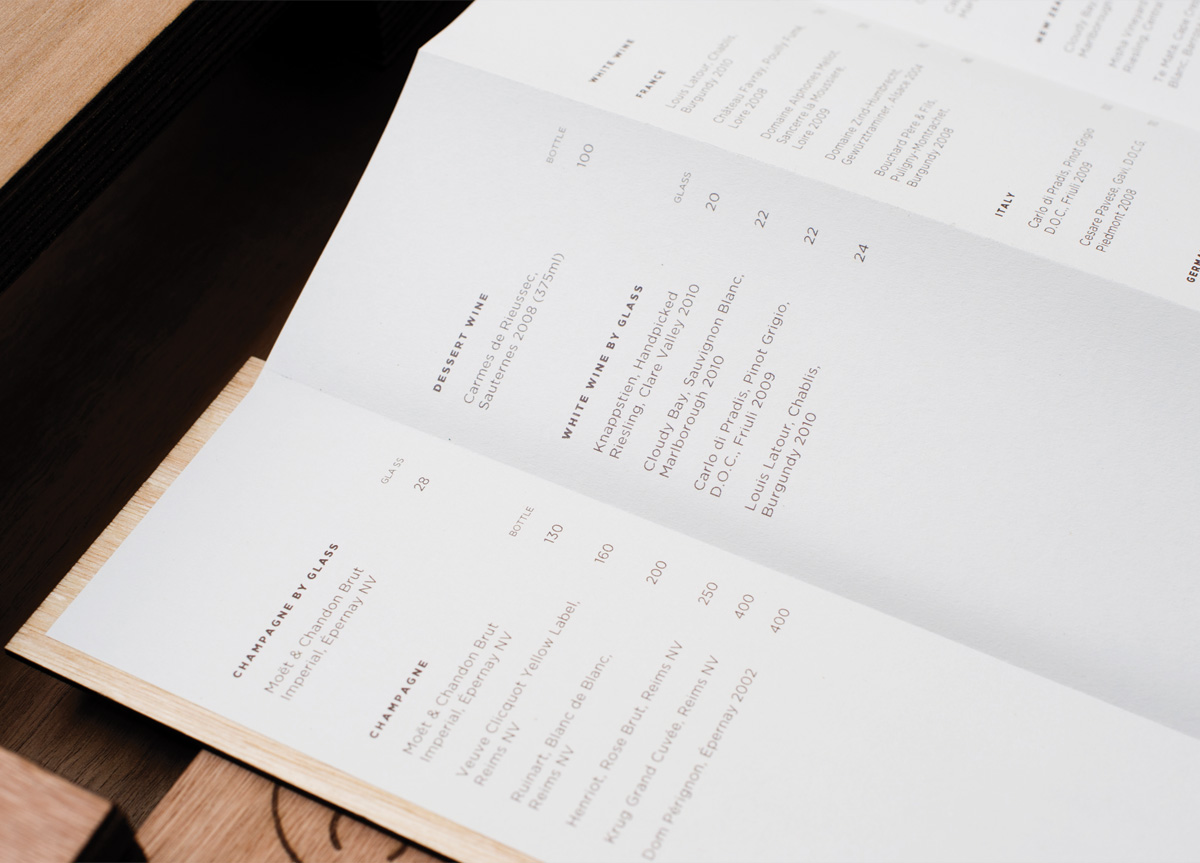
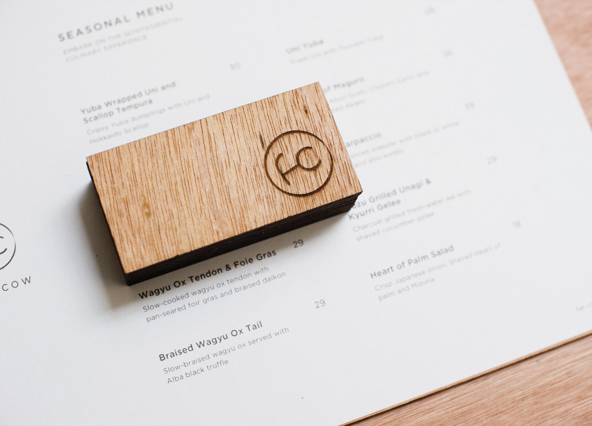
PRODUCTION LESSONSWe had many rounds of experiments and nit-picks before finally getting to a perfect “sear" on the wood—the etching has to be controlled in such a way that it does not toast out the logo, yet strong enough to leave a slight deboss on the wood. The ideal wood that we initially envisioned to use—the Matsu—is not so readily available in Singapore. Balsa wood was too thin, so we used Indonesian plywood. The decision of which one to use was not an easy one; since the logo is quite fine in size, it would be lost with certain wood grains if the wrong wood is picked.

Browse entries