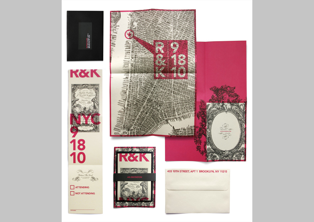
CLIENT
Richelle Singleton and Kenneth Rothermich.
APPROACH
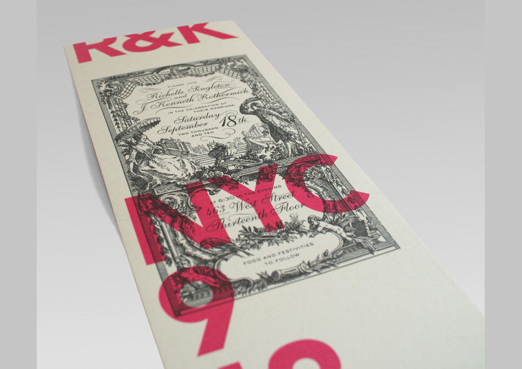
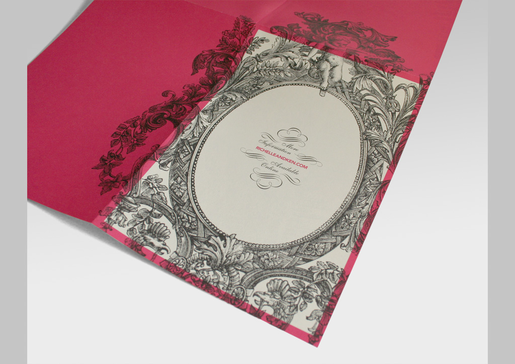
This invitation—designed for my own wedding—juxtaposes a traditional (if a bit over-the-top) invitation-style flourish and script against a big and bold, modernist typography—right on top of each other. The production methods were kept simple to let the graphics and typography do their thing while sticking to a budget.
By sticking with a seemingly basic 2‑color offset job, we were actually able to make much more of an impression than we would have if we had opted for something more extravagant. Using customizable off-the-shelf envelopes and stickers also helped cut costs. And fortunately for us, our printer was willing to work closely with us to maximize press sheets and get the most bang for our buck.
Judge’s Comments
What I loved about this piece was the story of the typography that came alive with each detail. The pattern, textures and type-centric design made it a perfect design for letterpress printing. The tight register of two colors on a poster this size is a production challenge that comes through in all the printing details. Well done indeed. — Ben Levitz