CLIENT
APPROACH
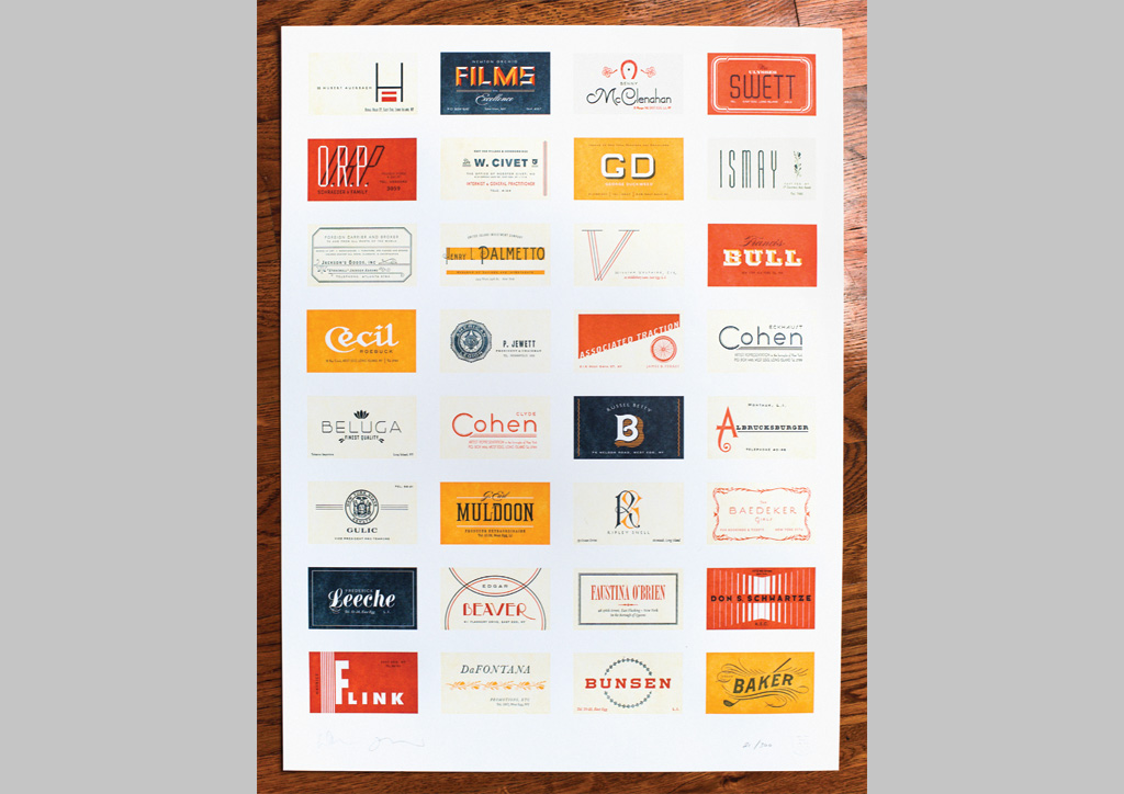
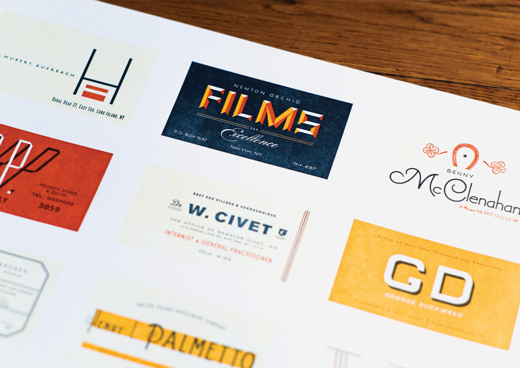
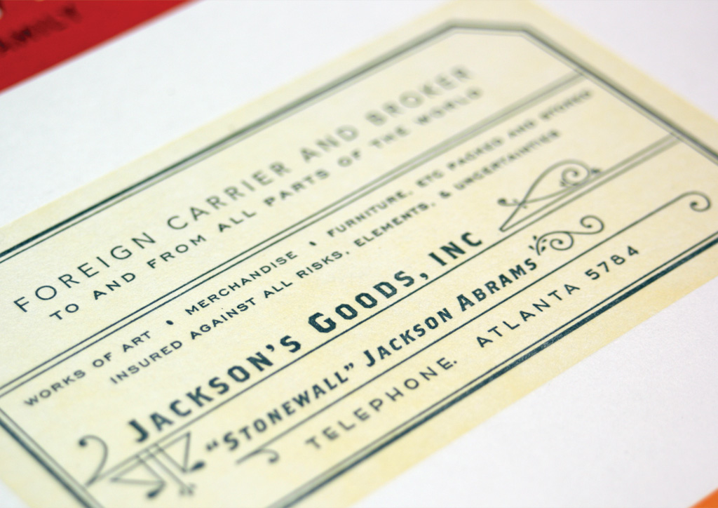
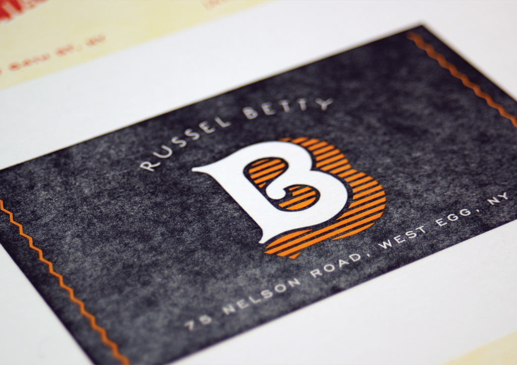
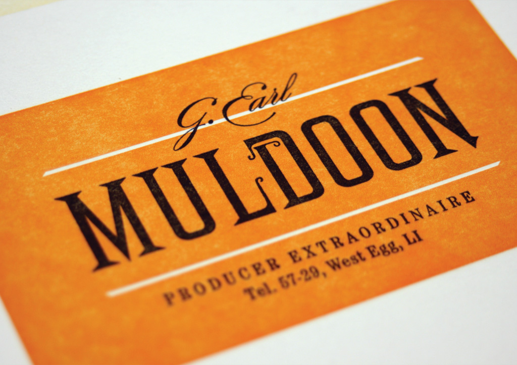
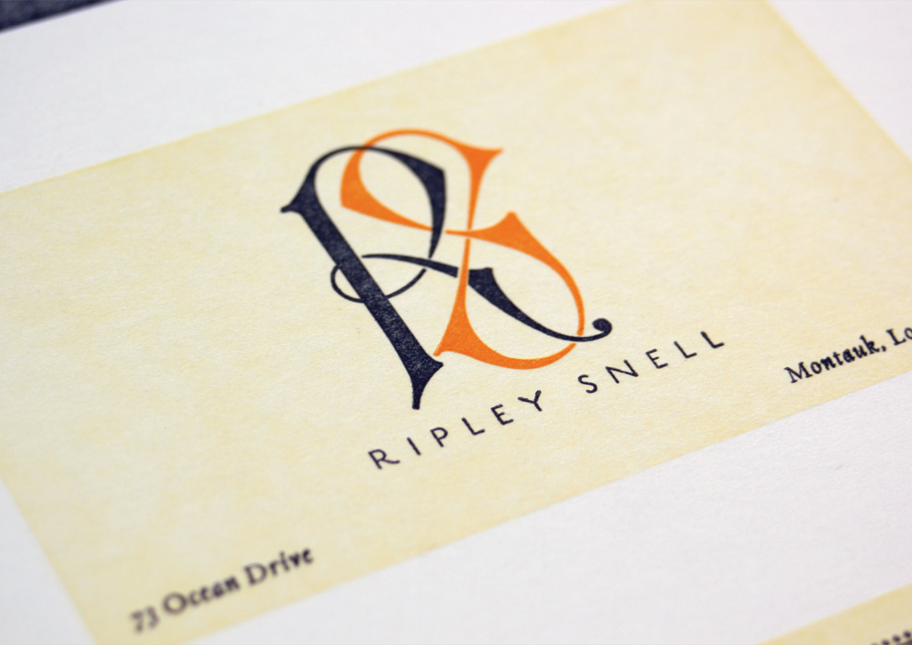
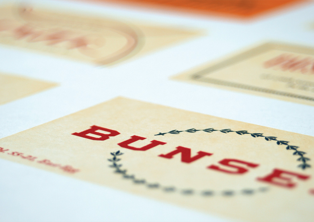
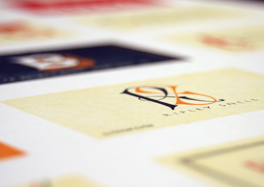
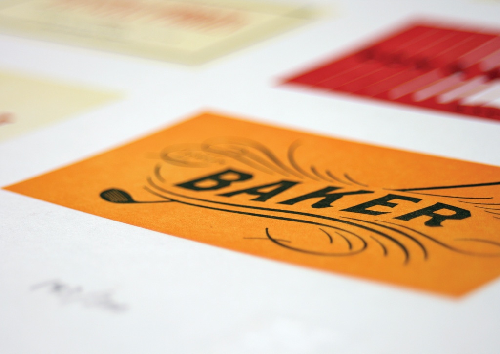
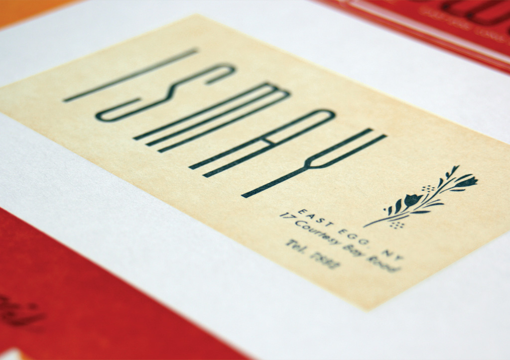
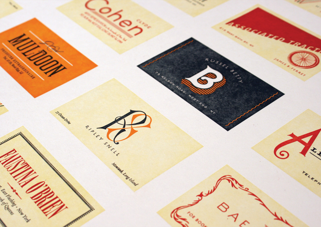
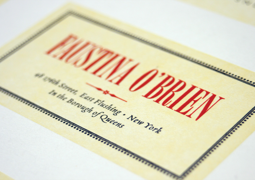
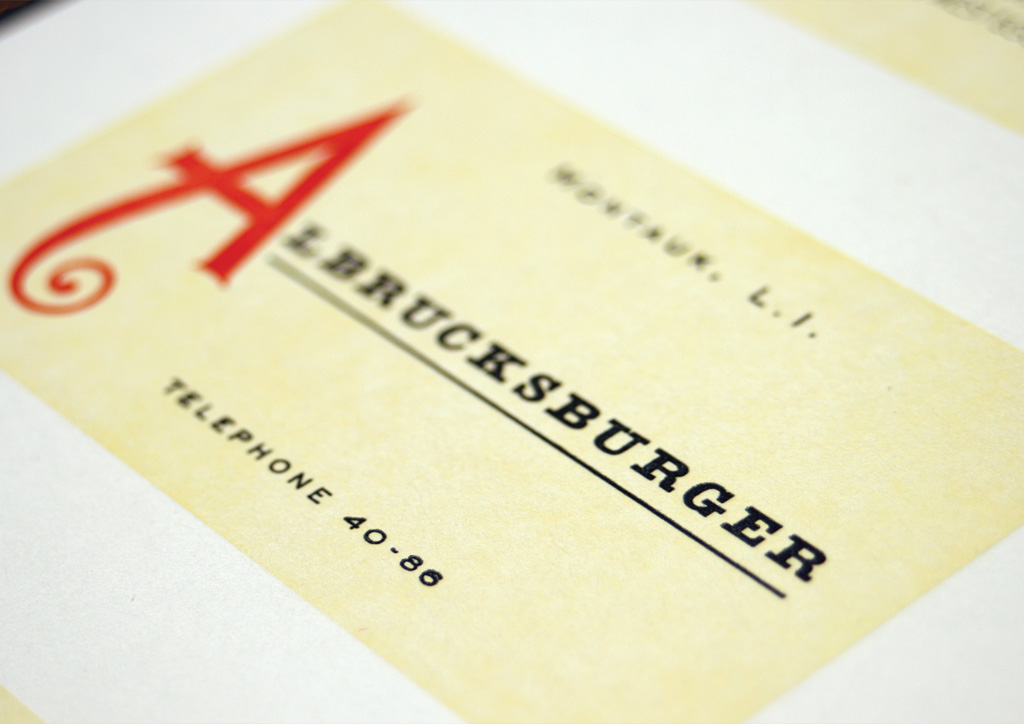
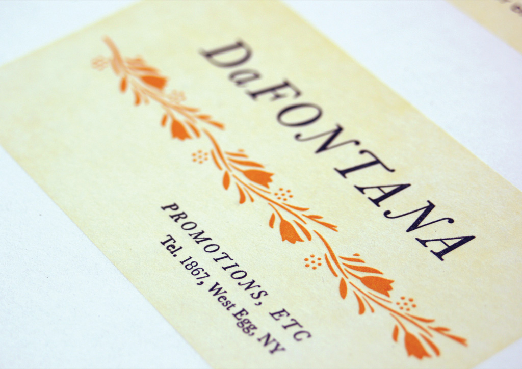
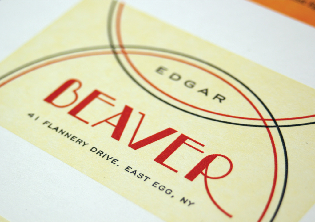
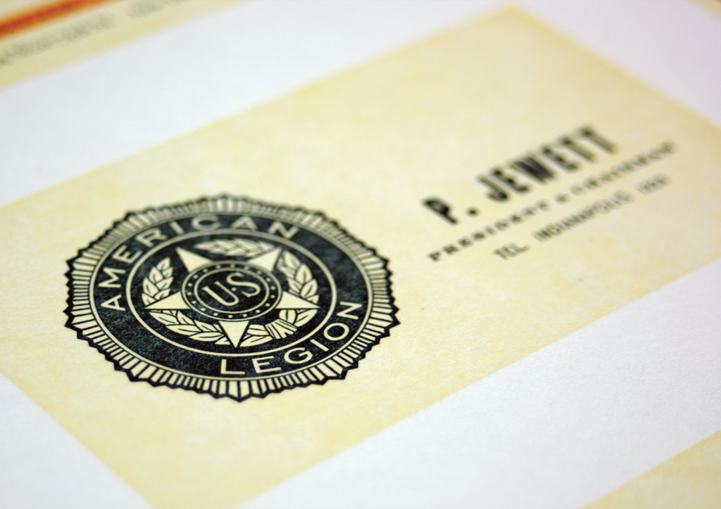
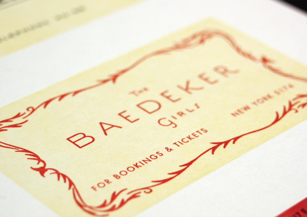
Chapter four of F. Scott Fitzgerald’s The Great Gatsby reads like a VIP guest list of the Jazz Age. Taking inspiration from those pages, this poster is comprised of the business cards of the movers and shakers that attended Gatsby’s parties. We set off to capture the typographic spirit of that era and to expand upon the characters’ back stories hinted at in those pages.
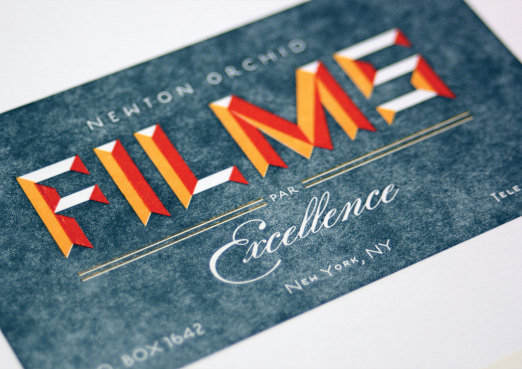
We considered many printing options for this piece ranging from embossed, offset, full-color printing to silkscreen. Ultimately we settled on 4‑color letterpress once we secured printing with someone whose work we admired and could accommodate the relatively large scale dimensions of the project.
Judge’s Comments
I chose this based on the difficulty of print based on design. Letterpress is challenging enough but to balance coverage and sharpness of type is really difficult. I also felt the design of vintage looking cards lent itself to the process. Overall, a fantastic piece. — Bruno Rohner
We all loved this piece for any number of reasons. And the any number of reasons were the thorough attention to period typography and design, and an immaculate print job, on a gorgeous paper. — Marc English
This poster is perfect. From concept to printing, every inch of it is incredibly well thought out and executed. The designers were able to capture the look of that era so perfectly and subtly—it doesn’t feel like a caricature of the time. It feels genuine, even down to the zip codes and phone numbers that reflect the time. I think any designer would happily have this in their homes and seethe with envy that they couldn’t design such a beautiful poster. — Jessica Hische