ADV @ UNDERCONSIDERATION Peek here for details
BROWSE
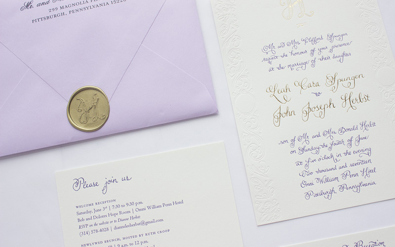
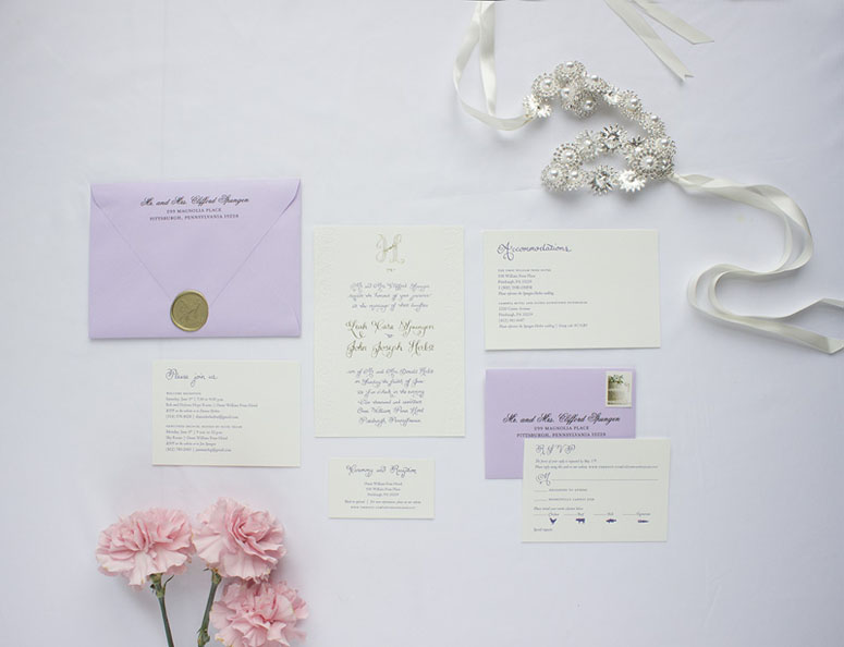
Herbst & Spungen Wedding Invitation Suite
Production Method
Foil stamp
Letterpress
Design
Anne Kostecki
Printing
Gilah Press + Design
A project about love and family, trusting instincts, and fulfilling promises—and lots of letterpress!
Client
John and Leah Herbst
Quantity Produced
150
Production Cost
1282.00
Production Time
3 Weeks
Dimensions (Width × Height × Depth)
Invitation: 5 × 7 in.
Accommodations card: 5 × 3.5 in.
RSVP card: 4 × 6 in.
Reception card: 3.5 × 2 × in.
Page Count
–
Paper Stock
Savoy / Natural / 118#
Number of Colors
1
Varnishes
–
Binding
–
Typography
Hand drawn calligraphy
Centaur
Centaur Italic
Centaur Bold
Project Description
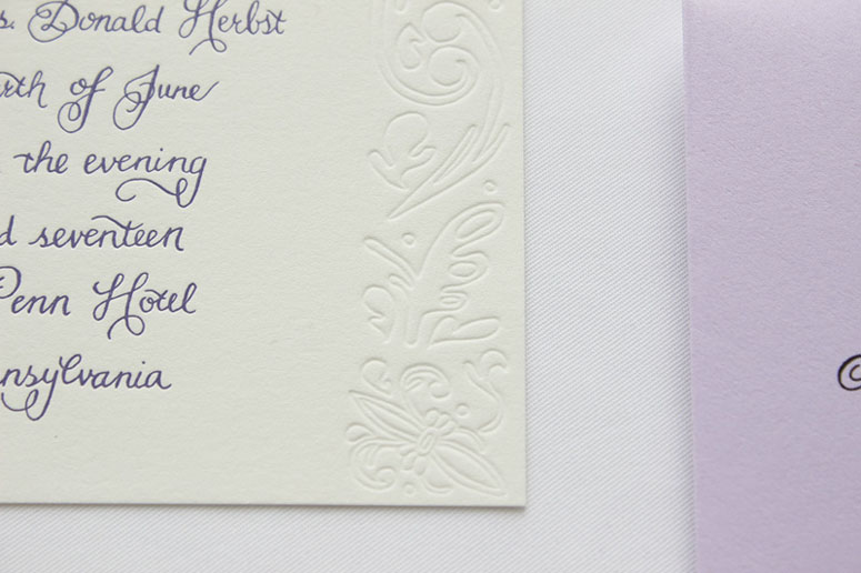
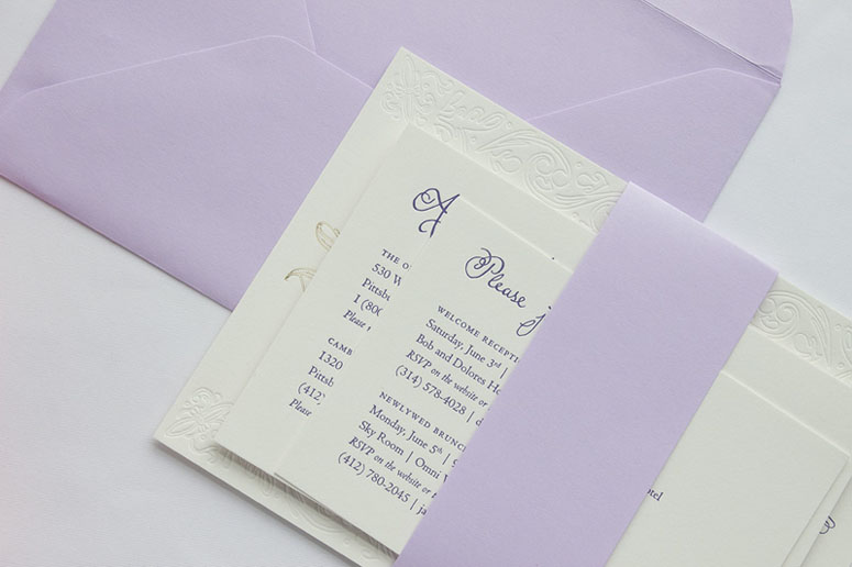
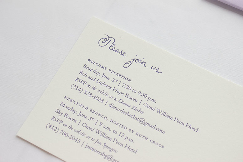
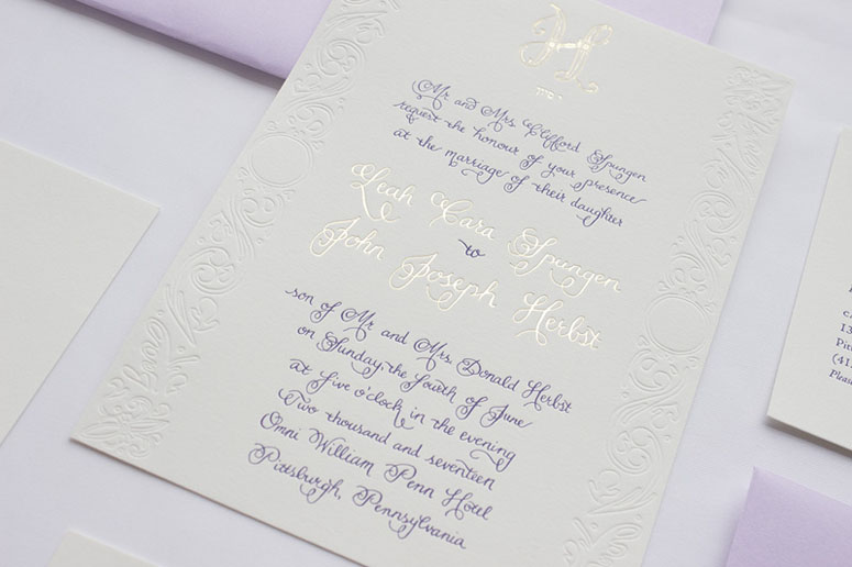
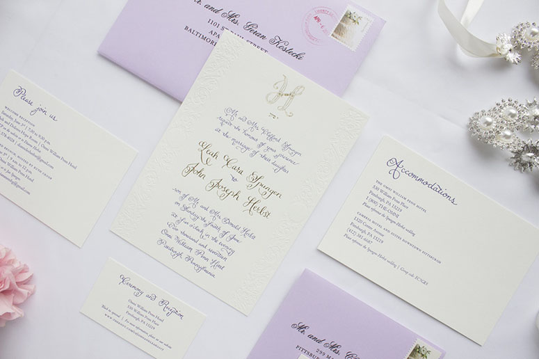
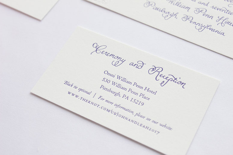
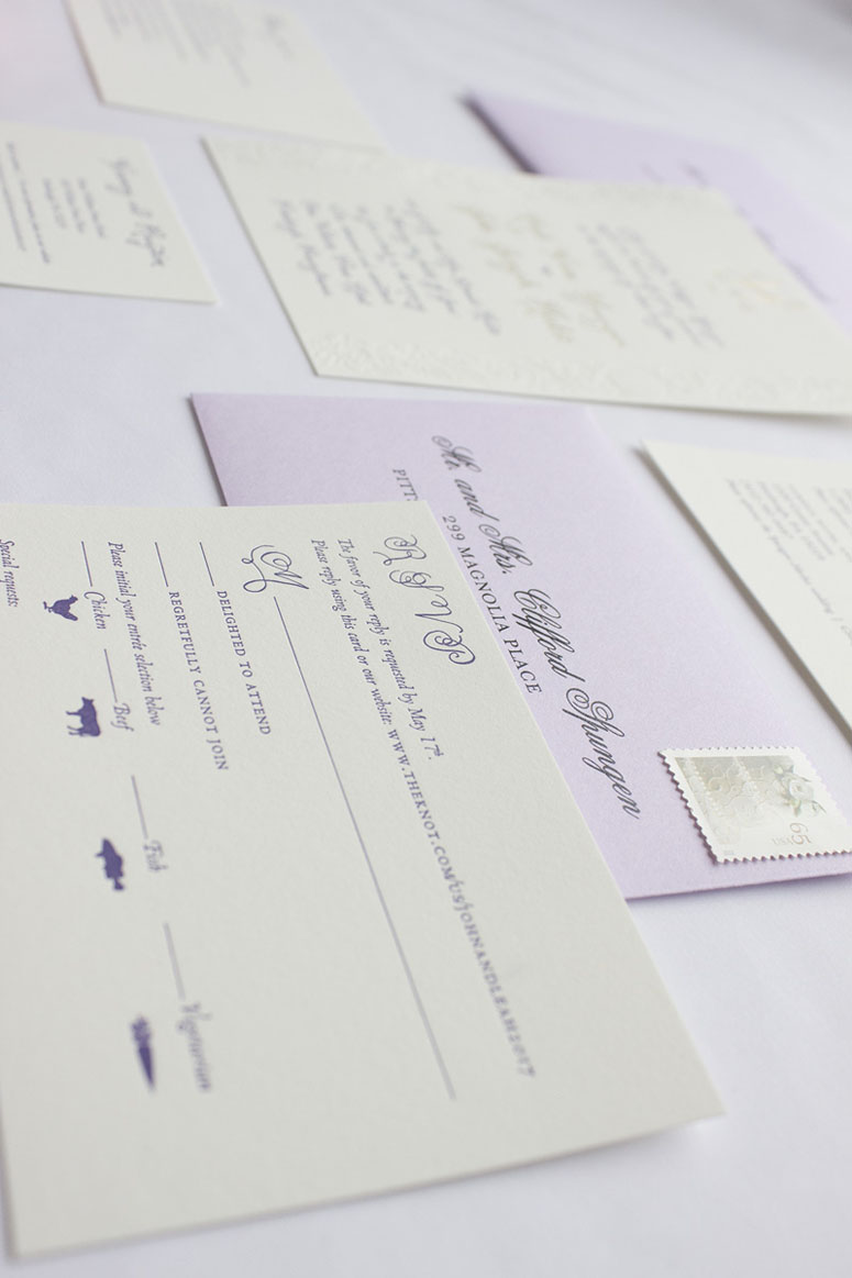
My brother and his fiancé asked me to design their wedding stationery, and I was beyond excited to begin. They asked first for a custom wordmark or monogram, and I used their initials ("J" for John, "L" for Leah, and combined both letters into an "H" for their new shared last name, "Herbst") and they absolutely loved the result. They loved the monogram so much, we used it on their ketubah (a Jewish wedding contract), programs, wedding signage, foil cocktail napkins, thank you notes, and I hand-carved it into their wedding guestbook, which I also made by hand. In addition to the monogram, the next design was the ketubah, which was inspired by early Renaissance Italian design, and featured laurel leaves and ornaments and painted in indigo, green, lavender, and metallic gold ink. Then we chose wedding colors: lavender, gold, ivory, and a deep purple for certain accents. Their wedding was to be an early summer, elegant affair in a historic Pittsburgh hotel, and the bride wanted to incorporate hand-drawn calligraphy with ornaments from my ketubah design. I designed the calligraphy for the invitation and headline copy for the accompanying pieces, and chose the typeface Centaur for the remaining copy. I also added handmade icons for the dinner selection on the RSVP card. I proposed a letterpress suite, with gold foil accents, and a blind emboss of the Italian-style ornaments along the border of the invitation. We paired it with lavender envelopes, bound together with a lavender belly band and sealed with a gold wax seal (with their monogram embossed, of course). The invitation suite was printed on 118# Savoy Natural paper, with a specially selected Pantone ink, gold metallic foil, and a blind emboss.Production Lesson(s)
I learned that there is an enormous amount of fine detail you can include in foil stamping and letterpress that I did not know was possible. I learned to trust my instincts when it comes to custom finishing like foil stamping and blind embossing, because it makes a difference in the beauty of the final product. I hope to have the opportunity again to work with creative finishing and letterpress.
Post Author

Bryony Gomez-Palacio
Editor of FPO and co-founder of UnderConsideration LLC.
More: Online / On Twitter
Date Published
September 5, 2017
Filed Under
Foil stamp
Letterpress
Wedding materials
Tagged with
Centaur
foil stamp
Hand drawn calligraphy
letterpress
savoy
wedding invitation
About
FPO (For Print Only), is a division of UnderConsideration, celebrating the reality that print is not dead by showcasing the most compelling printed projects.
FPO uses Fonts.com to render Siseriff and Avenir Next.
FPO is run with Six Apart’s MovableType
All comments, ideas and thoughts on FPO are property of their authors; reproduction without the author’s or FPO’s permission is strictly prohibited
Twitter @ucllc
Sign-up for Mailing List
Mailing list managed by MailChimp
Thanks to our advertisers
About UnderConsideration
UnderConsideration is a graphic design firm generating its own projects, initiatives, and content while taking on limited client work. Run by Bryony Gomez-Palacio and Armin Vit in Bloomington, IN. More…
blogs we publish
Brand New / Displaying opinions and focusing solely on corporate and brand identity work.
Art of the Menu / Cataloguing the underrated creativity of menus from around the world.
Quipsologies / Chronicling the most curious, creative, and notable projects, stories, and events of the graphic design industry on a daily basis.
products we sell
Flaunt: Designing effective, compelling and memorable portfolios of creative work.
Brand New Conference videos / Individual, downloadable videos of every presentation since 2010.
Prints / A variety of posters, the majority from our AIforGA series.
Other / Various one-off products.
events we organize
Brand New Conference / A two-day event on corporate and brand identity with some of today's most active and influential practitioners from around the world.
Brand Nieuwe Conference / Ditto but in Amsterdam.
Austin Initiative for Graphic Awesomeness / A speaker series in Austin, TX, featuring some of the graphic design industry's most awesome people.
also
Favorite Things we've Made / In our capacity as graphic designers.
Projects we've Concluded / Long- and short-lived efforts.
UCllc News / Updates on what's going at the corporate level of UnderConsideration.




Related entries
Black Sheep Studio Business Cards and Promotional Items
Cranky Bucks Promotion
Seegno Business Cards
“Miniature Views” Promotion