ADV @ UNDERCONSIDERATION Peek here for details
BROWSE
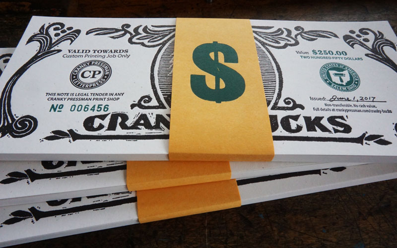
Cranky Bucks Promotion
Production Method
Letterpress
Design
Graphite & Lead
Jamie Berger, Design and Illustration
Printing
Cranky Pressman
While we don’t currently have a letterpress job in the pipeline to put these bucks into use, we have been enjoying them at the office—often paying each other for one thing or another. With deep letterpressed groves, these are better than Monopoly money.
Dimensions (Width × Height × Depth)
–
Page Count
–
Paper Stock
100C
80C
Number of Colors
2
Varnishes
–
Binding
Belly Band
Typography
Linoleum Cut Type (Cranky Bucks Heading)
Wood Type (Dollar Sign)
Myriad Pro
ITC Esprit
Kohinoor Devangari
Trade Gothic
Caslon
Project Description
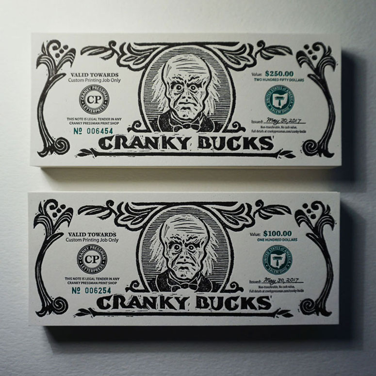
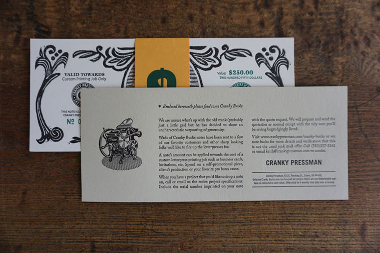
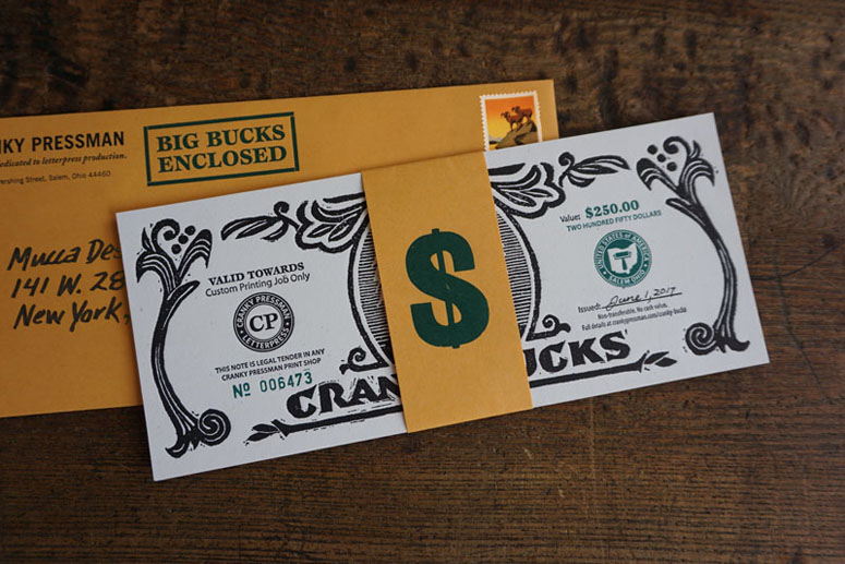
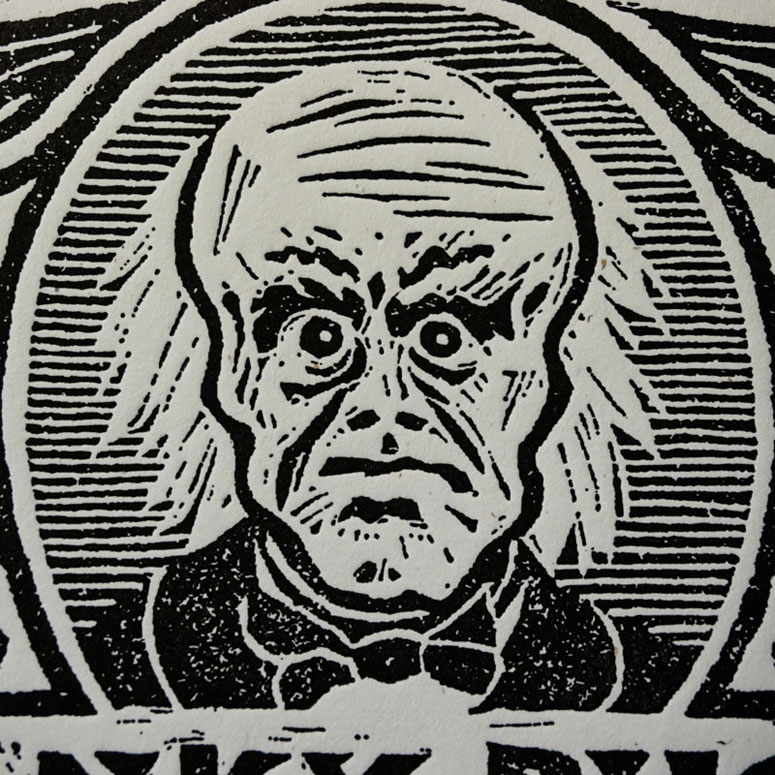
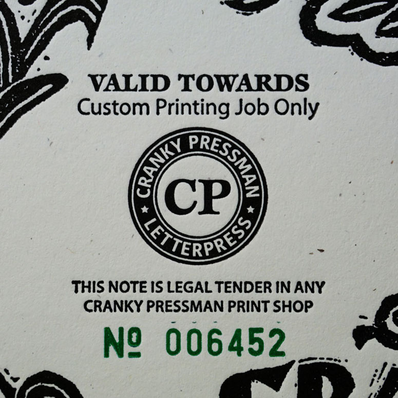
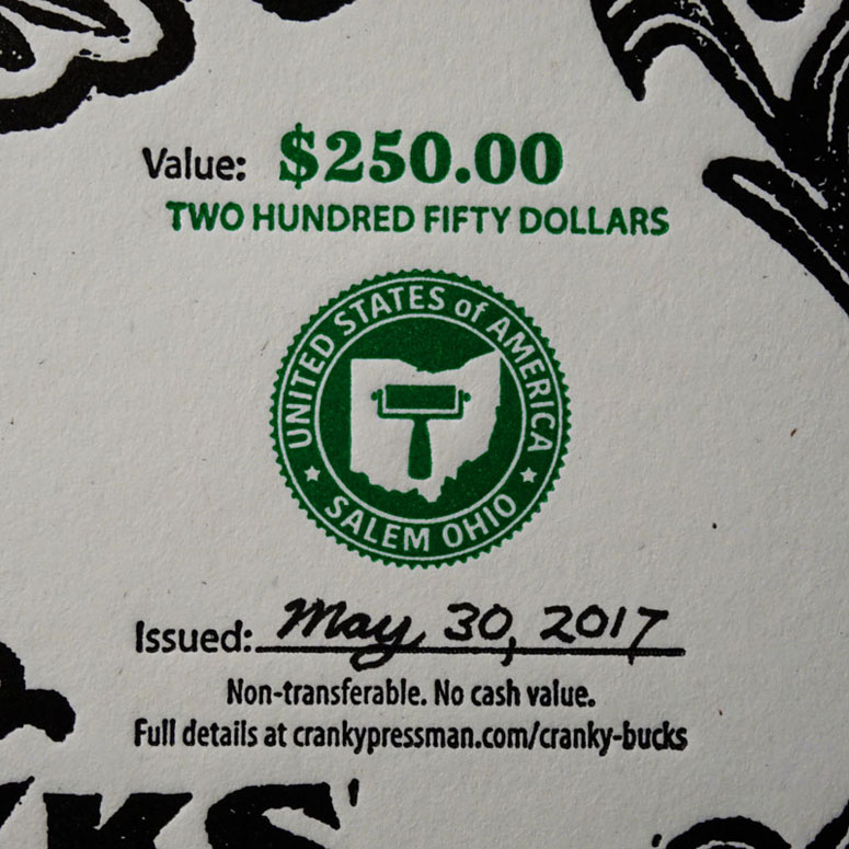
Cranky Pressman is an commercial letterpress printing shop. The crotchety old printer is determined to keep print alive (at least as long as he is). Besides doing the obligatory occasional printed promotion, we also feel that direct mail is an attractive but underused medium. Basically, people like to receive something nice in the mail now and then.The concept behind this piece not only uses print, it is based on an activity only a crafty and accomplished printer can pull off - counterfeiting money. Belly-banded wads of fake money were mailed to graphic design studios, advertising agencies and other creative professionals who make up the printer's key target market. The bank notes can be redeemed as discounts on custom letterpress projects ordered from the shop.
Once the promotion is finished the Cranky Bucks design will be repurposed and used as gift certificates for customers who want to give the gift of print.
The artwork for the Cranky Bucks notes was first hand-cut in linoleum. A proof was pulled of the linocut. This was scanned to create the final digital artwork and printing plates. Letterpress printed consecutive numbering was used on each note.
Production Lesson(s)
As I spend so much time in a old-style printing shop, I recently decided to take up wood and linoleum cutting. The main graphics and design of the note was hand-cut at 150% of the final size. This allowed me to actually be able to cut the amount of detail with my quite old but inexperienced cutting hands. A press proof of the linocut was pulled. This was then scanned and reduced in the digital artwork. Once reproduced at the final size everything tightens up and the details look much finer than they are on the original art. This is an old commercial art trick where you physically had to work at blown-up sizes because there was no other way before the computer came along.Just after the first batch of mailers were produced and mailed I was browsing the web and came across a promotion for The National Stationery Show that also used funny fake money. This was a coincidence and having worked in the business for a long time I can assure you that it is something that occasionally happens. It is part of this life we've chosen. I hope both promotions are a success and were enjoyed by there recipients.

Post Author

Bryony Gomez-Palacio
Editor of FPO and co-founder of UnderConsideration LLC.
More: Online / On Twitter
Date Published
August 29, 2017
Filed Under
Letterpress
Self promotion
Tagged with
Belly Band
letterpress
PMS
self-promotion
wood type
About
FPO (For Print Only), is a division of UnderConsideration, celebrating the reality that print is not dead by showcasing the most compelling printed projects.
FPO uses Fonts.com to render Siseriff and Avenir Next.
FPO is run with Six Apart’s MovableType
All comments, ideas and thoughts on FPO are property of their authors; reproduction without the author’s or FPO’s permission is strictly prohibited
Twitter @ucllc
Sign-up for Mailing List
Mailing list managed by MailChimp
Thanks to our advertisers
About UnderConsideration
UnderConsideration is a graphic design firm generating its own projects, initiatives, and content while taking on limited client work. Run by Bryony Gomez-Palacio and Armin Vit in Bloomington, IN. More…
blogs we publish
Brand New / Displaying opinions and focusing solely on corporate and brand identity work.
Art of the Menu / Cataloguing the underrated creativity of menus from around the world.
Quipsologies / Chronicling the most curious, creative, and notable projects, stories, and events of the graphic design industry on a daily basis.
products we sell
Flaunt: Designing effective, compelling and memorable portfolios of creative work.
Brand New Conference videos / Individual, downloadable videos of every presentation since 2010.
Prints / A variety of posters, the majority from our AIforGA series.
Other / Various one-off products.
events we organize
Brand New Conference / A two-day event on corporate and brand identity with some of today's most active and influential practitioners from around the world.
Brand Nieuwe Conference / Ditto but in Amsterdam.
Austin Initiative for Graphic Awesomeness / A speaker series in Austin, TX, featuring some of the graphic design industry's most awesome people.
also
Favorite Things we've Made / In our capacity as graphic designers.
Projects we've Concluded / Long- and short-lived efforts.
UCllc News / Updates on what's going at the corporate level of UnderConsideration.




Related entries
Black Sheep Studio Business Cards and Promotional Items
Herbst & Spungen Wedding Invitation Suite
Seegno Business Cards
“Miniature Views” Promotion