ADV @ UNDERCONSIDERATION Peek here for details
BROWSE
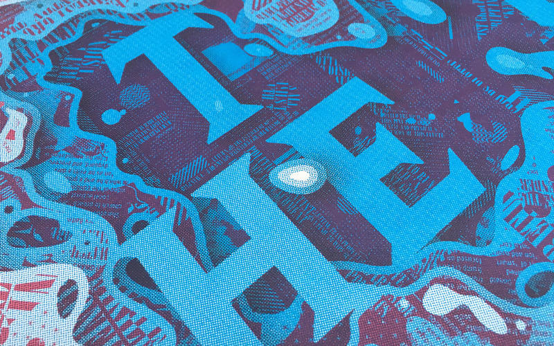
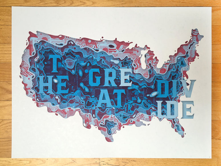
The Great Divide Poster
Production Method
Silkscreen
Design
Delicious Design League
Kyle Letendre - Design
Tyler Deal & Mike Agee - Production
Printing
Delicious Design League Print Shop
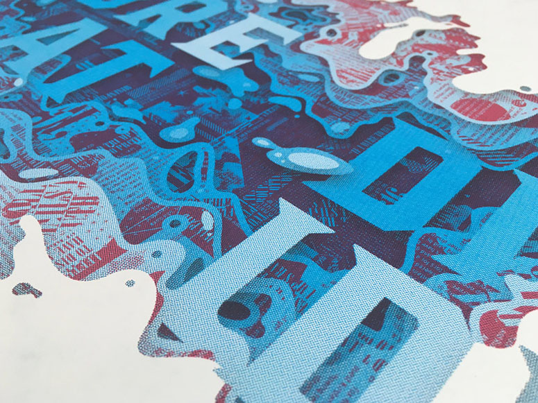
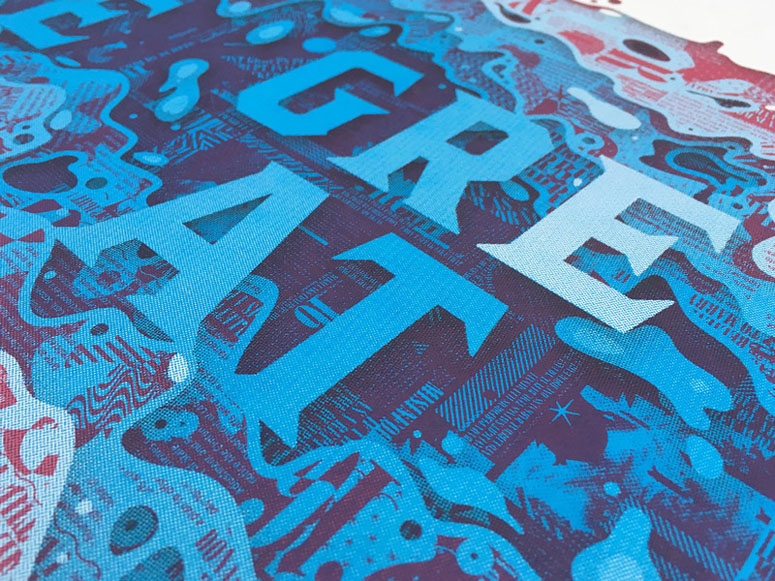
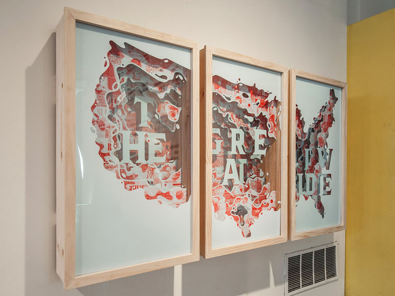
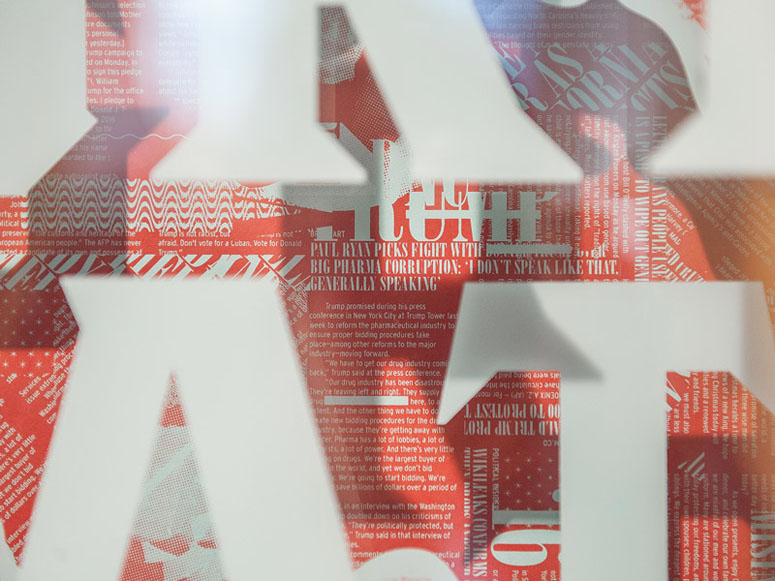
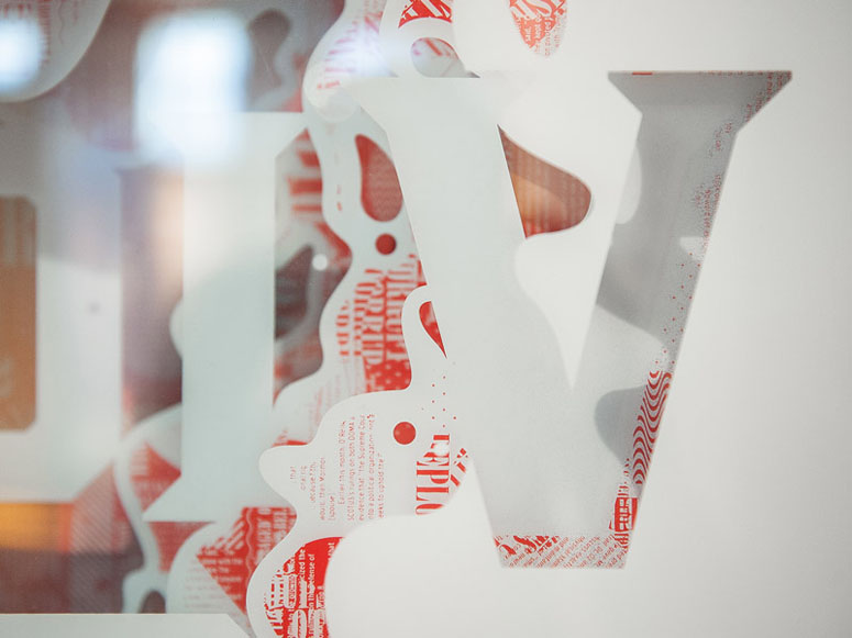
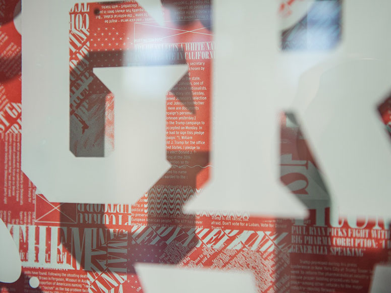
To complement a dimensionally layered installation at Typeforce 8 (shown in the second half of the pictures below), the poster uses some serious halftone action and only three spot colors to recreate the layering effect of the installation in a rich, energetic way.
Dimensions (Width × Height × Depth)
–
Page Count
–
Paper Stock
–
Number of Colors
3
Varnishes
–
Binding
–
Typography
–
Project Description
"The Great Divide" was the result of Delicious Design League's collective anxiety over the 2016 election, the fake news cycles that fueled it, and the following Trump-related political turmoil. Designed and crafted for Typeforce 8, Chicago's annual typographic exhibition, it was constructed from 12 plexiglass panels, 30-some layers of ink and a custom pine frame, coming in at roughly 70" wide by 42" tall. All printing was done in-house by the DDL Printshop, including this 3-color limited edition, which is available for purchase. Half of the proceeds will go to the ACLU.Production Lesson(s)
Producing the larger piece for Typeforce 8 was a huge challenge in itself. Not only did the sheer size of each panel push our presses and screens to their absolute maximum print areas, we had to print each panel in reverse order (red first, then blue) and backward on the backside of each piece of Plexi. The actually printing was a piece of cake, but developing a plan of attack for all 24 colors was the bulk of the work. We dedicated a drying rack to the whole piece by organizing each layer in order from the bottom up, left to right. This allowed us to work our way up the rack and keep track of which panels we printed and where they fell in the final piece, but also kept each panel protected from dust and particles throughout the two-week production window.Printing the edition was quick. Kyle used already designed assets from the larger piece and made it work at about 1/3 scale, then picked colors that would reflect the larger piece while being different enough to be a stand-alone piece.

Post Author

Bryony Gomez-Palacio
Editor of FPO and co-founder of UnderConsideration LLC.
More: Online / On Twitter
Date Published
March 14, 2017
Filed Under
Posters
Silkscreen
Tagged with
halftone
pms
poster
silkscreen
About
FPO (For Print Only), is a division of UnderConsideration, celebrating the reality that print is not dead by showcasing the most compelling printed projects.
FPO uses Fonts.com to render Siseriff and Avenir Next.
FPO is run with Six Apart’s MovableType
All comments, ideas and thoughts on FPO are property of their authors; reproduction without the author’s or FPO’s permission is strictly prohibited
Twitter @ucllc
Sign-up for Mailing List
Mailing list managed by MailChimp
Thanks to our advertisers
About UnderConsideration
UnderConsideration is a graphic design firm generating its own projects, initiatives, and content while taking on limited client work. Run by Bryony Gomez-Palacio and Armin Vit in Bloomington, IN. More…
blogs we publish
Brand New / Displaying opinions and focusing solely on corporate and brand identity work.
Art of the Menu / Cataloguing the underrated creativity of menus from around the world.
Quipsologies / Chronicling the most curious, creative, and notable projects, stories, and events of the graphic design industry on a daily basis.
products we sell
Flaunt: Designing effective, compelling and memorable portfolios of creative work.
Brand New Conference videos / Individual, downloadable videos of every presentation since 2010.
Prints / A variety of posters, the majority from our AIforGA series.
Other / Various one-off products.
events we organize
Brand New Conference / A two-day event on corporate and brand identity with some of today's most active and influential practitioners from around the world.
Brand Nieuwe Conference / Ditto but in Amsterdam.
Austin Initiative for Graphic Awesomeness / A speaker series in Austin, TX, featuring some of the graphic design industry's most awesome people.
also
Favorite Things we've Made / In our capacity as graphic designers.
Projects we've Concluded / Long- and short-lived efforts.
UCllc News / Updates on what's going at the corporate level of UnderConsideration.




Related entries
Um Caminho para Santiago CD Package and Diary
36 Days of Type Poster
CNN Digital New Hire Kit
Alivu EVOO Packaging
Ministry of Environment in Colombia Poster