ADV @ UNDERCONSIDERATION Peek here for details
BROWSE
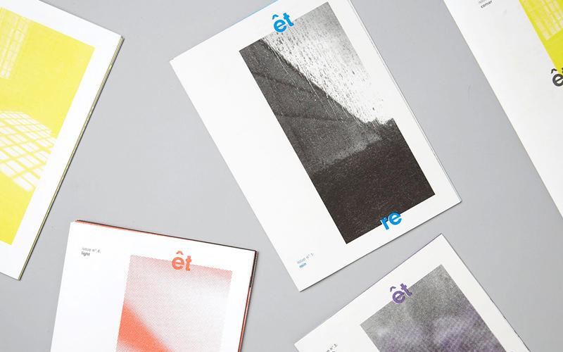
qu’est-ce que c’est design Zine
Production Method
Risograph
Design
qu'est-ce que c'est design
Printing
Knuckles & Notch
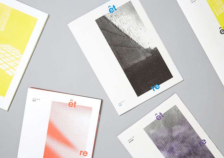
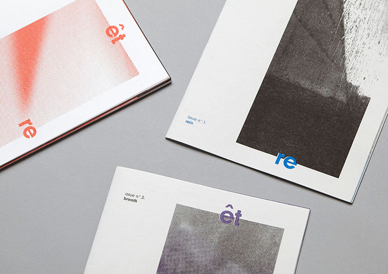
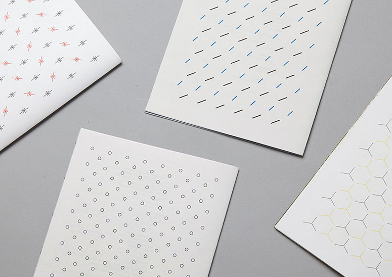
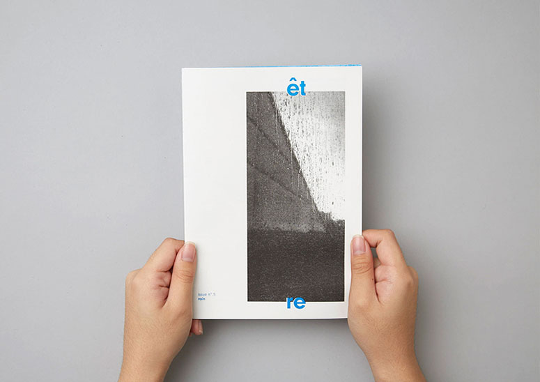
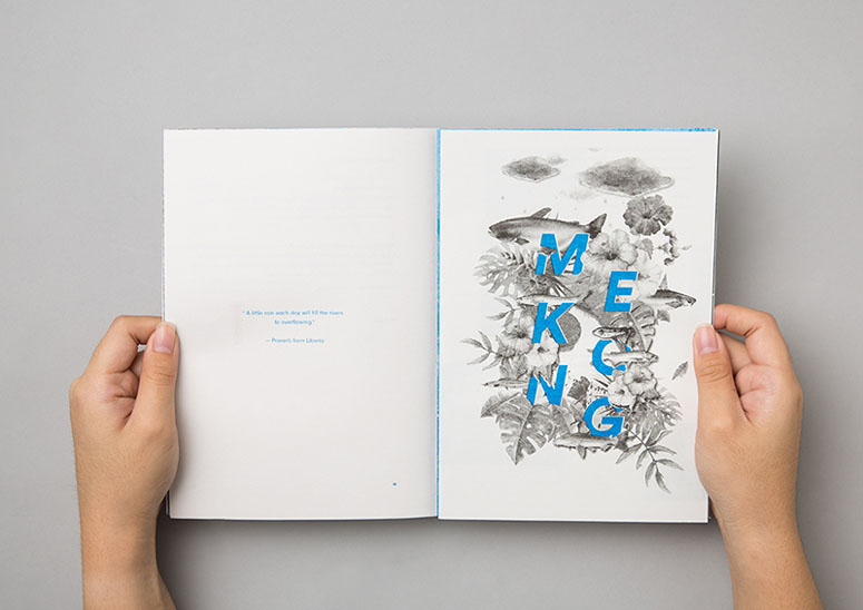
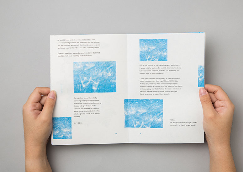
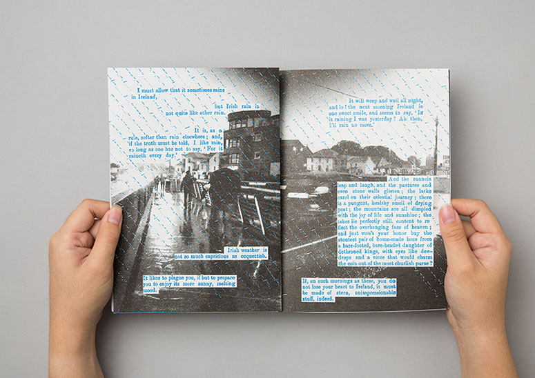
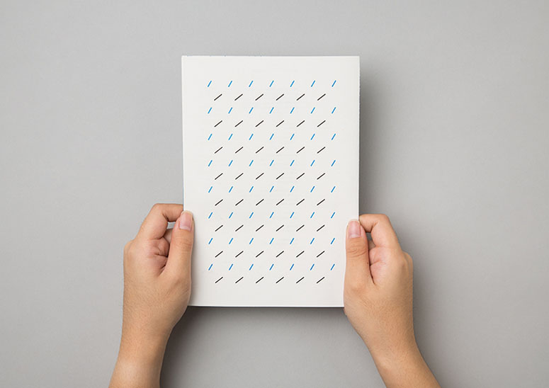
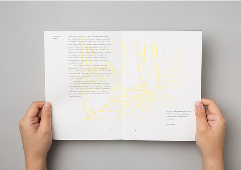
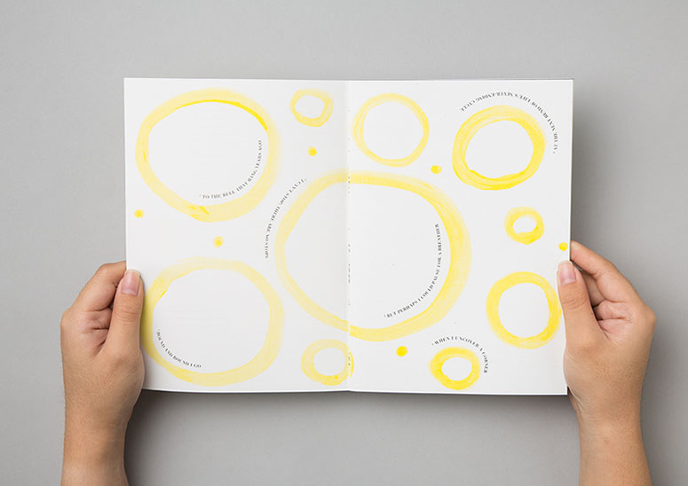
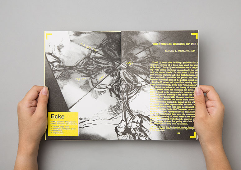
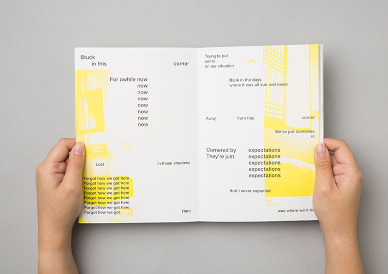
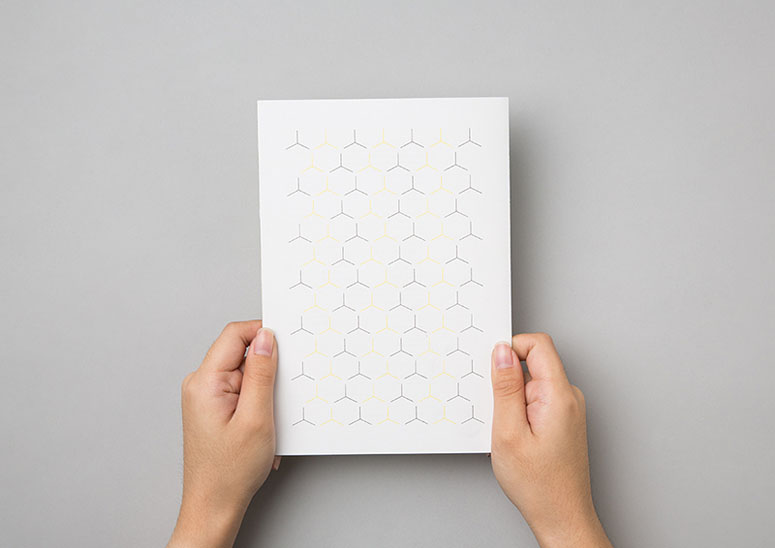
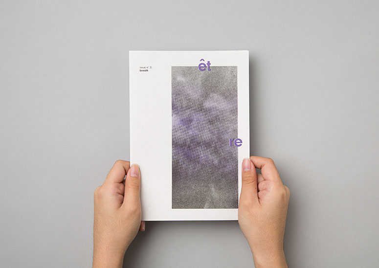
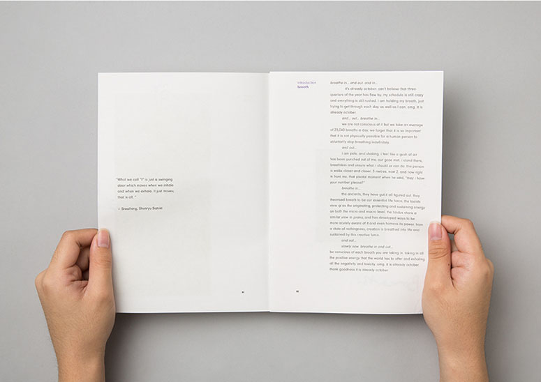
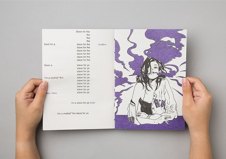
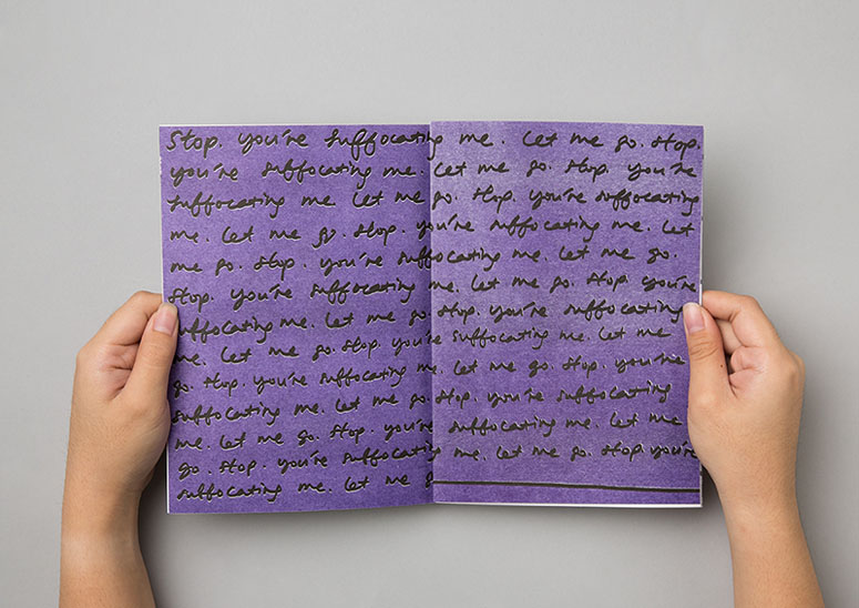
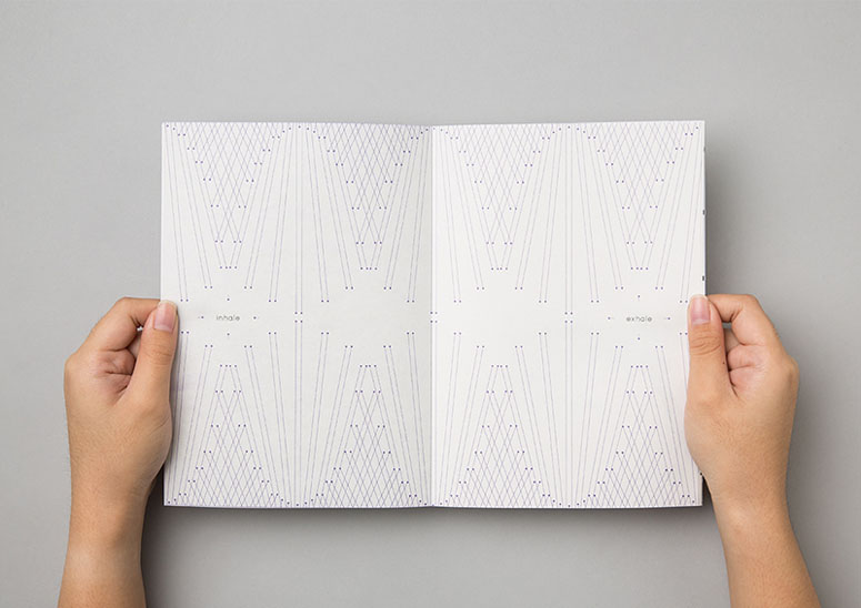
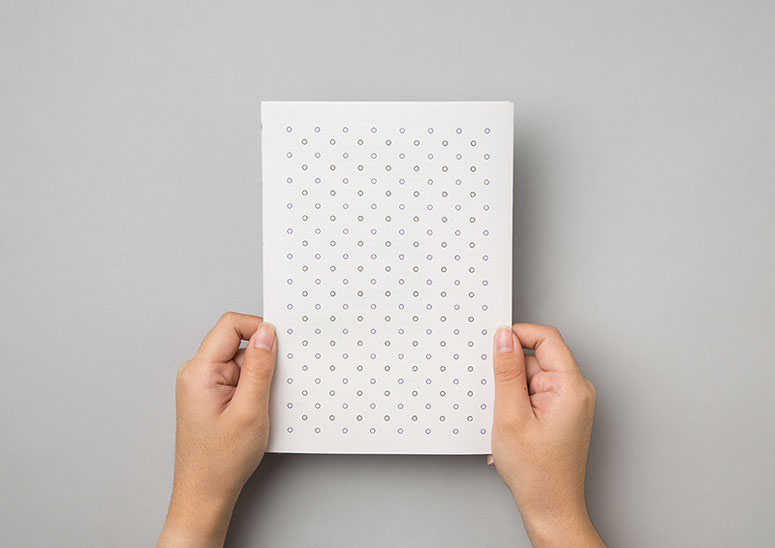
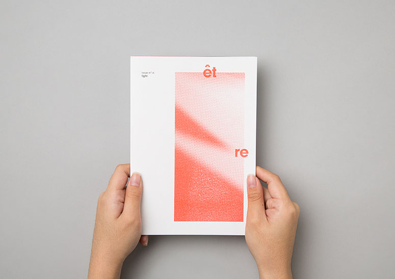
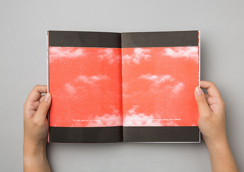
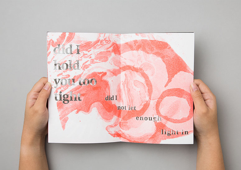
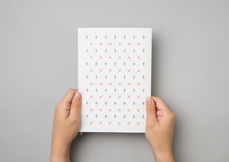
Explorations on themes and on printing technique through risograph come together in these four initial issues of qu’est-ce que c’est—patterns, images, and text explore water, earth, air, and fire.
Dimensions (Width × Height × Depth)
148 × 210 mm
Page Count
24
Paper Stock
Fancy Paper / Divina White / 150gsm /
Number of Colors
2
Varnishes
–
Binding
Gathered
Typography
Neuzeit Grotesk
Project Description
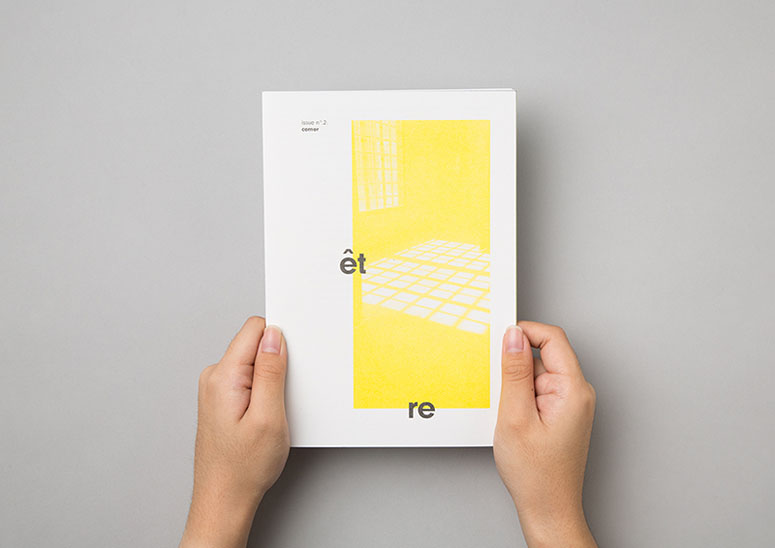
The word “être” is a french verb which means “to be”. As a irregular verb, it would conjugate differently when used in different contexts and voices. The publication was created with the intention to provide a sacred headspace for its reader–to cut out all distractions from the daily bustle and simply focus on being in the moment. This was how we arrived at titling the series “être”.Each issue focused on a singular theme of something that we often overlook. Deriving the themes for each issue from the classical elements, issue 1 was on rain (water), issue 2 corner (earth), issue 3 breath (air) and ended off with light (fire) for issue 4. In traditional thought, the classical elements were considered to be the fundamental matter that existed in all things, visible and invisible. The knowledge, understanding and appreciation of the classical elements pervaded the hearts and mind of even the common people. However, just like the overlooked things that each issue took on, these have slowly eroded away with time and changing priorities.
Risograph was deliberately chosen to embrace the imperfections that were inherent in this method of printing. This reflected our collective understanding of life, that though never perfect and never going according to plan, it is still something beautiful and worth appreciating to the fullest.
Each issue featured submissions from studio members—both permanent and transitory—and invited submissions, permitting the zine to present the many stories, interpretations and expressions that could emanate from one theme.
Production Lesson(s)
The initial process of learning how to separate complex and overlapping graphics suitably for Risograph printing was a steep learning curve. As soon as we got the hang of it and understood the potential of the printing method, we were able to plan our graphic and design better.
Post Author

Bryony Gomez-Palacio
Editor of FPO and co-founder of UnderConsideration LLC.
More: Online / On Twitter
Date Published
February 17, 2017
Filed Under
Risograph
Zine
Tagged with
Gathered
Neuzeit Grotesk
risograph
zine
About
FPO (For Print Only), is a division of UnderConsideration, celebrating the reality that print is not dead by showcasing the most compelling printed projects.
FPO uses Fonts.com to render Siseriff and Avenir Next.
FPO is run with Six Apart’s MovableType
All comments, ideas and thoughts on FPO are property of their authors; reproduction without the author’s or FPO’s permission is strictly prohibited
Twitter @ucllc
Sign-up for Mailing List
Mailing list managed by MailChimp
Thanks to our advertisers
About UnderConsideration
UnderConsideration is a graphic design firm generating its own projects, initiatives, and content while taking on limited client work. Run by Bryony Gomez-Palacio and Armin Vit in Bloomington, IN. More…
blogs we publish
Brand New / Displaying opinions and focusing solely on corporate and brand identity work.
Art of the Menu / Cataloguing the underrated creativity of menus from around the world.
Quipsologies / Chronicling the most curious, creative, and notable projects, stories, and events of the graphic design industry on a daily basis.
products we sell
Flaunt: Designing effective, compelling and memorable portfolios of creative work.
Brand New Conference videos / Individual, downloadable videos of every presentation since 2010.
Prints / A variety of posters, the majority from our AIforGA series.
Other / Various one-off products.
events we organize
Brand New Conference / A two-day event on corporate and brand identity with some of today's most active and influential practitioners from around the world.
Brand Nieuwe Conference / Ditto but in Amsterdam.
Austin Initiative for Graphic Awesomeness / A speaker series in Austin, TX, featuring some of the graphic design industry's most awesome people.
also
Favorite Things we've Made / In our capacity as graphic designers.
Projects we've Concluded / Long- and short-lived efforts.
UCllc News / Updates on what's going at the corporate level of UnderConsideration.




Related entries
ARCMTL + LA SERRES - Objets flottants Arts vivants Edition
“An Evening onboard the HMS Victory” Invitation
Risolve Studio 2017 Swatch Book
Marina Cardoso Business Cards
Illustrated Science Zine