ADV @ UNDERCONSIDERATION Peek here for details
BROWSE
2016 Brand New Conference Program
Production Method
Offset
Design
UnderConsideration
Printing
Classic Color
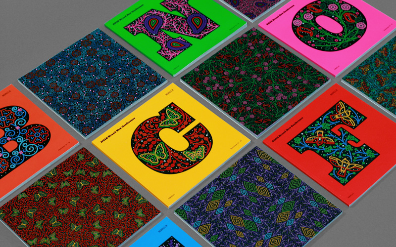
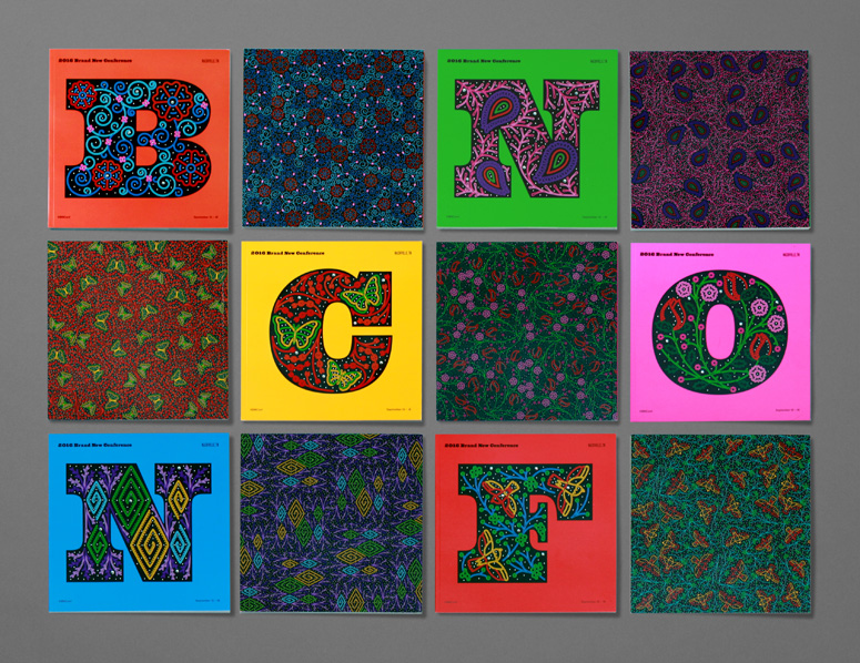
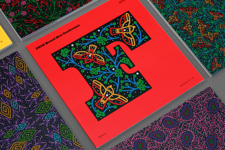
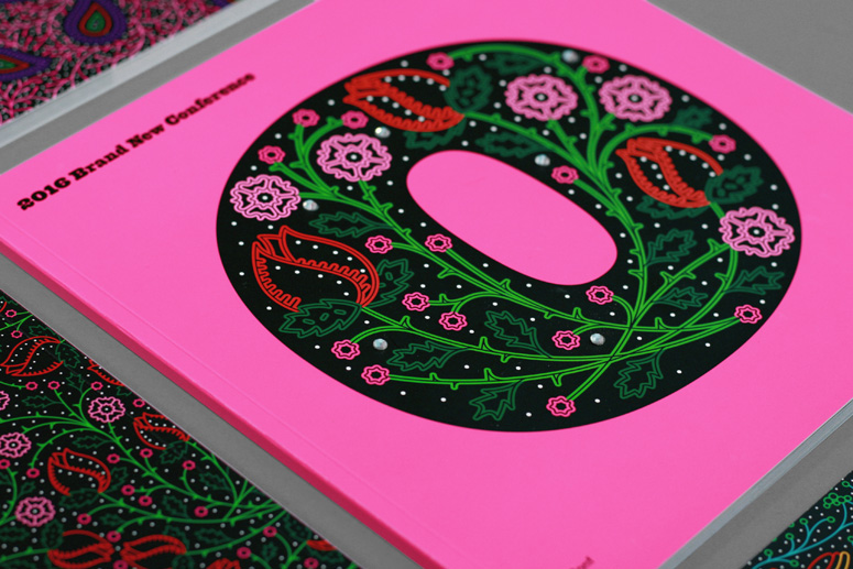
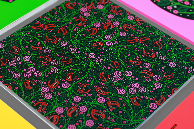
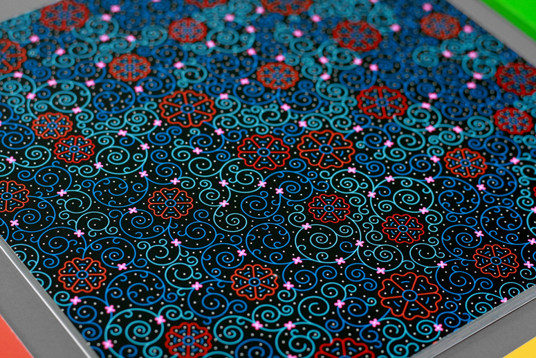
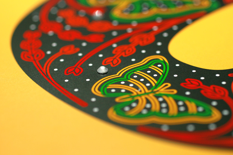
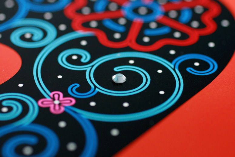
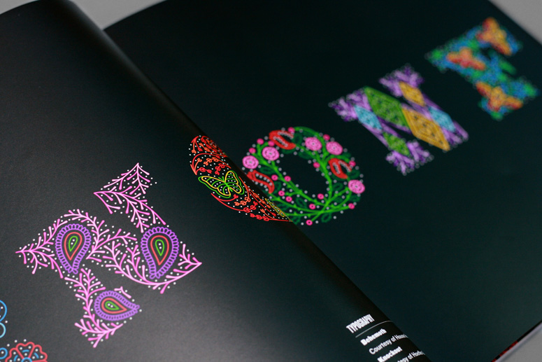
For a full explanation of where the identity behind the program come from, you can read this post on Brand New. One of the first things we developed for the conference was the program with the print run divided in six, so that each letter would take over the whole cover and was paired with its pattern in the back cover. The black of each letter has a dull varnish on it and the drawings inside the letters have a spot gloss varnish that give it a nice layered look.
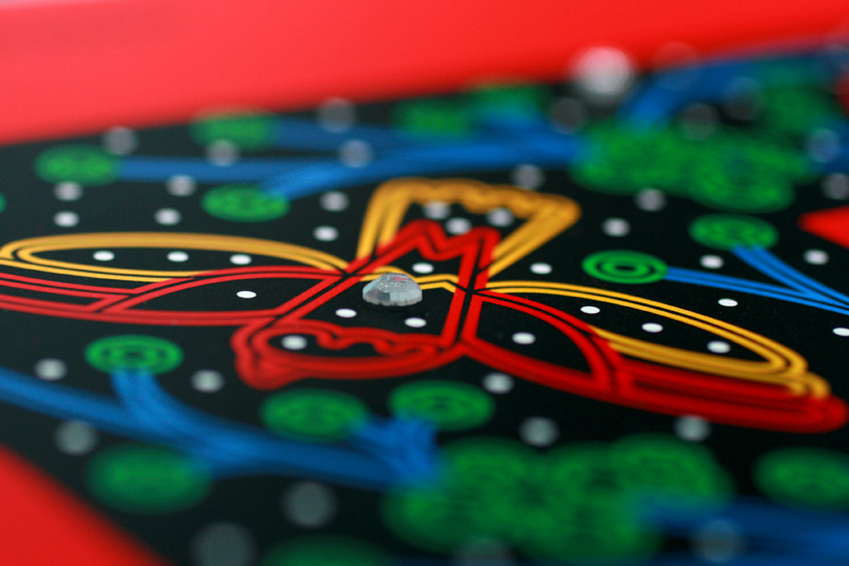
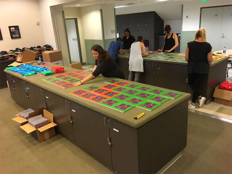
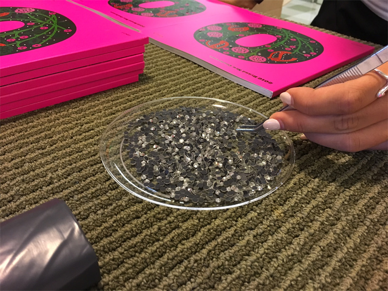
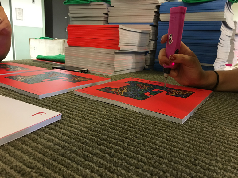
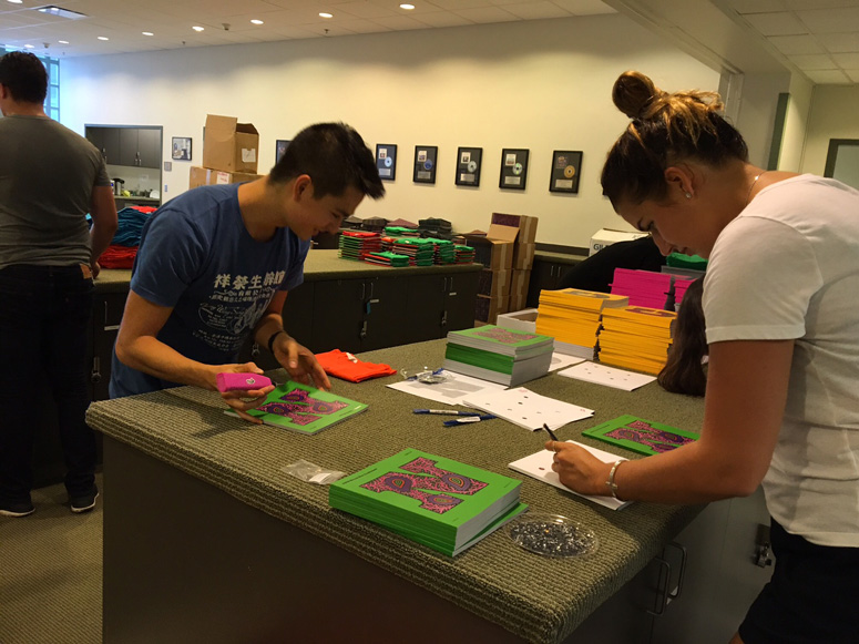
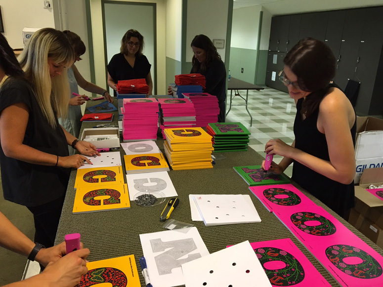
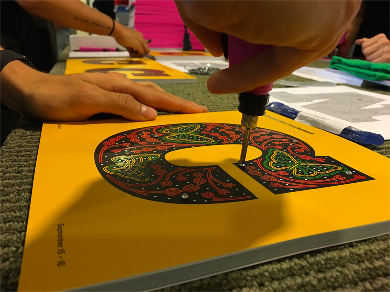
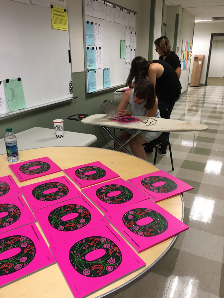
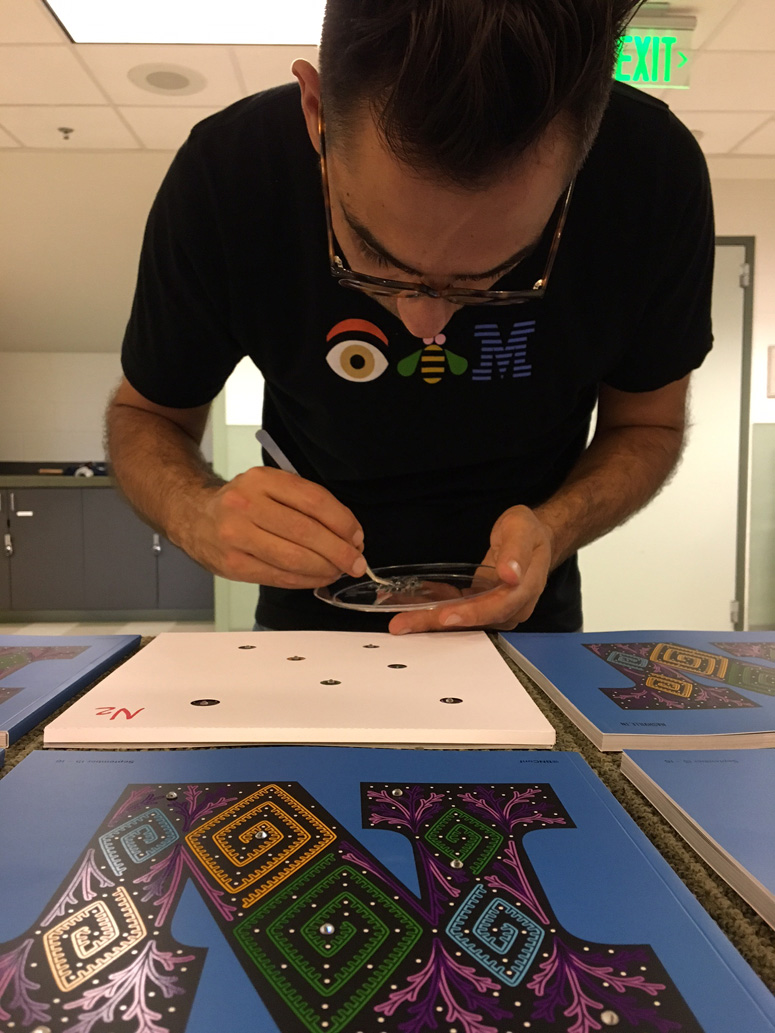
Each of the covers had seven hand-placed rhinestones that were painstakingly but bravely done by our volunteers on the day before the event. Pro tip: 7 rhinestones times 1,000 covers equals an inordinate amount of man- and woman-hours. When we originally planned it we figured it would take 3-4 hours, instead of the nearly 8 with almost all hands on deck. But, in the end, the programs had literal bling! A few photos of the grueling rhinestone-placing session are at the end of the post — in the very last image you can see the templates we used to help place the rhinestones.
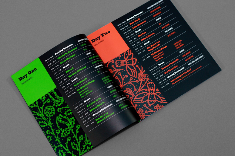
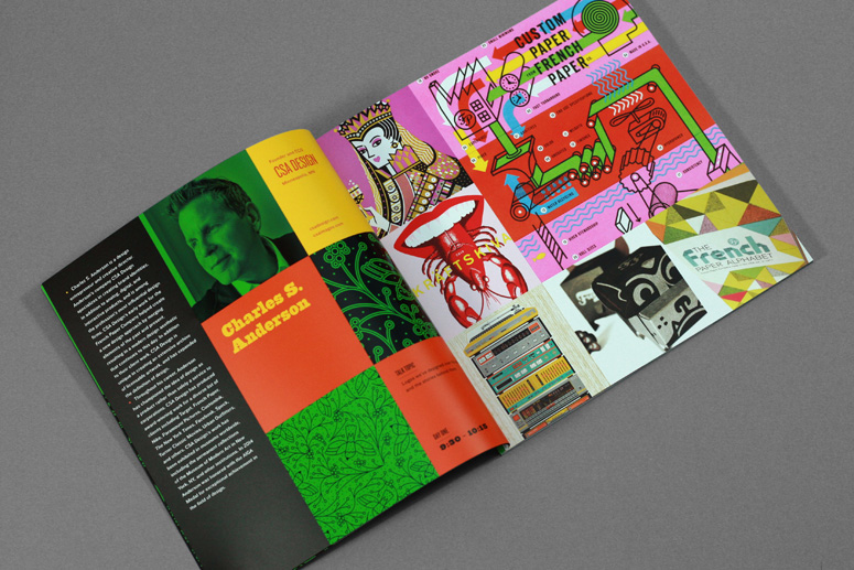
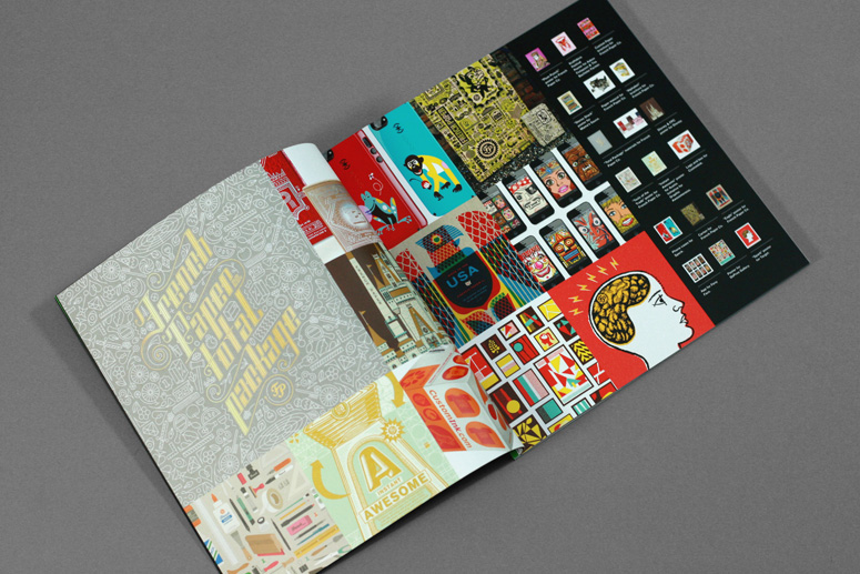
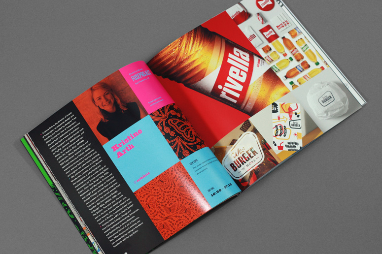
For the body of the program, we established a simple 3-by-3-inch grid and left absolutely zero white space. The idea was to have a program full of rich, tightly-cropped graphics. Small thumbnails at the end of each speaker showed the full image. Since we had some gloss varnish on the cover, Classic Color suggested we carry that into the body as well, so speaker photos and other key squares in the grid were hit with it. And, not to keep over-praising Classic, but the printing of the body is some of the best we’ve had for our conference. Having Sappi coated paper also helped!
Client
Brand New Conference
Quantity Produced
1,000
Production Cost
Sponsor Donated
Production Time
1 Month
Dimensions (Width × Height × Depth)
9 in × 9 in
Page Count
96 + Cover
Paper Stock
Cover: Sappi / McCoy Silk / 120C
Body: Sappi / McCoy Silk / 100T
Number of Colors
8-Color Printing!
Varnishes
Spot Gloss UV
Dull Varnish
Binding
Perfect-bound
Typography
Behemoth
Knockout

Project Description
Program for the 2016 Brand New Conference in Nashville, TN, on September 15 – 16.Production Lesson(s)
I was very worried about the registration of all the colors, especially with this being split into an 8-color process instead of the usual 4 — AND with a rich black of 40/30/30/30 — but Classic are wizards and there is no single bulging overlap or weird white sliver. I'm not sure other printers would have hit that so well. So I guess the lesson is to work with the best. Actually, here is a good lesson: if you are going to put rhinestones on the cover of something, do not stack it or pile it on top of anything without a buffer because the rhinestones will scratch the hell out of whatever is on top of them.
Post Author

Armin Vit
Editor of FPO and co-founder of UnderConsideration LLC.
More: Online / On Twitter
Date Published
October 12, 2016
Filed Under
Offset
Program
Tagged with
bnconf
classic color
colorful
DIY
rhinestones
sappi
spot gloss
About
FPO (For Print Only), is a division of UnderConsideration, celebrating the reality that print is not dead by showcasing the most compelling printed projects.
FPO uses Fonts.com to render Siseriff and Avenir Next.
FPO is run with Six Apart’s MovableType
All comments, ideas and thoughts on FPO are property of their authors; reproduction without the author’s or FPO’s permission is strictly prohibited
Twitter @ucllc
Sign-up for Mailing List
Mailing list managed by MailChimp
Thanks to our advertisers
About UnderConsideration
UnderConsideration is a graphic design firm generating its own projects, initiatives, and content while taking on limited client work. Run by Bryony Gomez-Palacio and Armin Vit in Bloomington, IN. More…
blogs we publish
Brand New / Displaying opinions and focusing solely on corporate and brand identity work.
Art of the Menu / Cataloguing the underrated creativity of menus from around the world.
Quipsologies / Chronicling the most curious, creative, and notable projects, stories, and events of the graphic design industry on a daily basis.
products we sell
Flaunt: Designing effective, compelling and memorable portfolios of creative work.
Brand New Conference videos / Individual, downloadable videos of every presentation since 2010.
Prints / A variety of posters, the majority from our AIforGA series.
Other / Various one-off products.
events we organize
Brand New Conference / A two-day event on corporate and brand identity with some of today's most active and influential practitioners from around the world.
Brand Nieuwe Conference / Ditto but in Amsterdam.
Austin Initiative for Graphic Awesomeness / A speaker series in Austin, TX, featuring some of the graphic design industry's most awesome people.
also
Favorite Things we've Made / In our capacity as graphic designers.
Projects we've Concluded / Long- and short-lived efforts.
UCllc News / Updates on what's going at the corporate level of UnderConsideration.




Related entries
2017 Brand New Conference Program
Severe(d): A Creepy Poetry Collection by Holly Riordan
Um Caminho para Santiago CD Package and Diary
BOYCO Classpack® Book
Antes de Perder la Esperanza Book