ADV @ UNDERCONSIDERATION Peek here for details
BROWSE
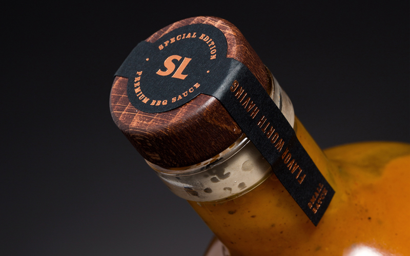
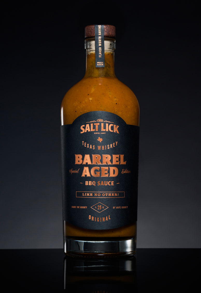
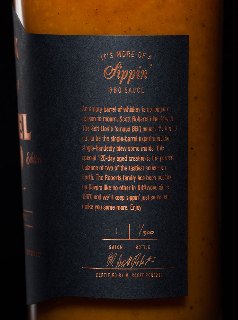
Salt Lick Whiskey Barrel-Aged BBQ Sauce Package
Production Method
Foil stamp
Design
Greatest Common Factory
Creative Director, John Trahar
Art direction and design, Katie Johnson
Copywriting, Zach Rener
Producers, Joel Henderson and Amy Hurt
Printing
Clove Street Press
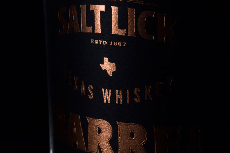
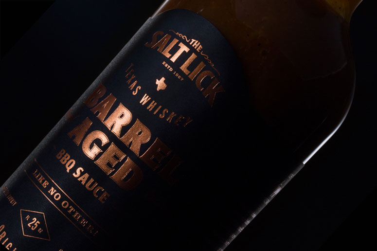
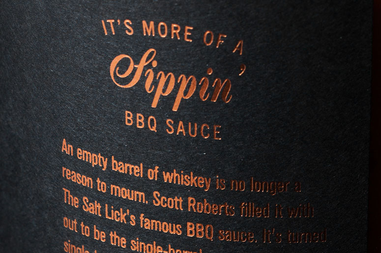
Learning the intricate nuances of designing for the shape of a bottle, this label takes advantage of the level of detail that can be obtained from foil stamping.
Dimensions (Width × Height × Depth)
–
Page Count
–
Paper Stock
Neenah / Classic Crest / Epic Black /
Number of Colors
–
Varnishes
–
Binding
–
Typography
–
Project Description
The Salt Lick, a Texas BBQ legend, asked us to create a bottle fit for their special edition whiskey barrel-aged BBQ sauce. We decided to play off the look of a vintage whiskey bottle with a bold, no-nonsense, typography-driven design. Since it is a special edition, we also wanted it to feel premium. So we picked a whopping 25 oz bottle and decided to print the label with a copper foil that would play off the color of the sauce itself and elevate the design even more. Each bottle is numbered and signed by the Pitmaster himself.Production Lesson(s)
The type on this bottle gets very small and the foil worked perfectly for that. Where there was a bit of a problem was within the letters "Barrel-Aged." There is a small, offset stroke surrounding the letters, and a bit of foil filled in in the space between. In retrospect, a pixel or two of extra space between the stroke and the letters could have helped a lot.Also, when creating the label to fit the shape of the bottle, we noticed that the tapering of the bottle made the wings of the label crooked. We had to slightly adjust the wings so that they pointed downwards at an angle of 3 degrees to compensate for the taper.

Post Author

Bryony Gomez-Palacio
Editor of FPO and co-founder of UnderConsideration LLC.
More: Online / On Twitter
Date Published
September 26, 2016
Filed Under
Foil stamp
Packaging
Tagged with
classic crest
foil stamp
metallic
neenah
package
About
FPO (For Print Only), is a division of UnderConsideration, celebrating the reality that print is not dead by showcasing the most compelling printed projects.
FPO uses Fonts.com to render Siseriff and Avenir Next.
FPO is run with Six Apart’s MovableType
All comments, ideas and thoughts on FPO are property of their authors; reproduction without the author’s or FPO’s permission is strictly prohibited
Twitter @ucllc
Sign-up for Mailing List
Mailing list managed by MailChimp
Thanks to our advertisers
About UnderConsideration
UnderConsideration is a graphic design firm generating its own projects, initiatives, and content while taking on limited client work. Run by Bryony Gomez-Palacio and Armin Vit in Bloomington, IN. More…
blogs we publish
Brand New / Displaying opinions and focusing solely on corporate and brand identity work.
Art of the Menu / Cataloguing the underrated creativity of menus from around the world.
Quipsologies / Chronicling the most curious, creative, and notable projects, stories, and events of the graphic design industry on a daily basis.
products we sell
Flaunt: Designing effective, compelling and memorable portfolios of creative work.
Brand New Conference videos / Individual, downloadable videos of every presentation since 2010.
Prints / A variety of posters, the majority from our AIforGA series.
Other / Various one-off products.
events we organize
Brand New Conference / A two-day event on corporate and brand identity with some of today's most active and influential practitioners from around the world.
Brand Nieuwe Conference / Ditto but in Amsterdam.
Austin Initiative for Graphic Awesomeness / A speaker series in Austin, TX, featuring some of the graphic design industry's most awesome people.
also
Favorite Things we've Made / In our capacity as graphic designers.
Projects we've Concluded / Long- and short-lived efforts.
UCllc News / Updates on what's going at the corporate level of UnderConsideration.




Related entries
KitchenAid Limited Edition Cards
BOYCO Classpack® Book
Herbst & Spungen Wedding Invitation Suite
Fracas Productions Business Cards
Gunnel Wåhlstrand Exhibit Book