ADV @ UNDERCONSIDERATION Peek here for details
BROWSE
Bell Rio Invitation
Production Method
Die-cut
Design
Zulu Alpha Kilo
Chief Creative Officer- Zak Mroueh
Creative Director - Ron Smrczek
Designer/Illustrator - Ryan Booth
Studio- Greg Hepstinstall
Agency Producer - Kari Macknight Dearborn
Account Director - Nevena Djordjevic
Printing
Flash Reproductions
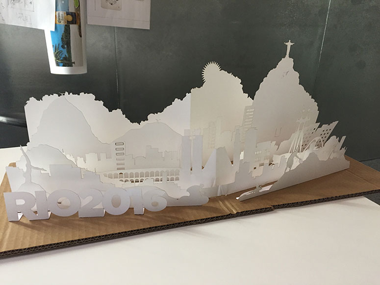
When a vision is placed in a designer’s mind, sometimes it doesn’t matter how many attempts and revisions it takes to make it work. Such is the case of this intricate hand-assembled die-cut.
Dimensions (Width × Height × Depth)
12.5 × 10.5 × in.
Page Count
–
Paper Stock
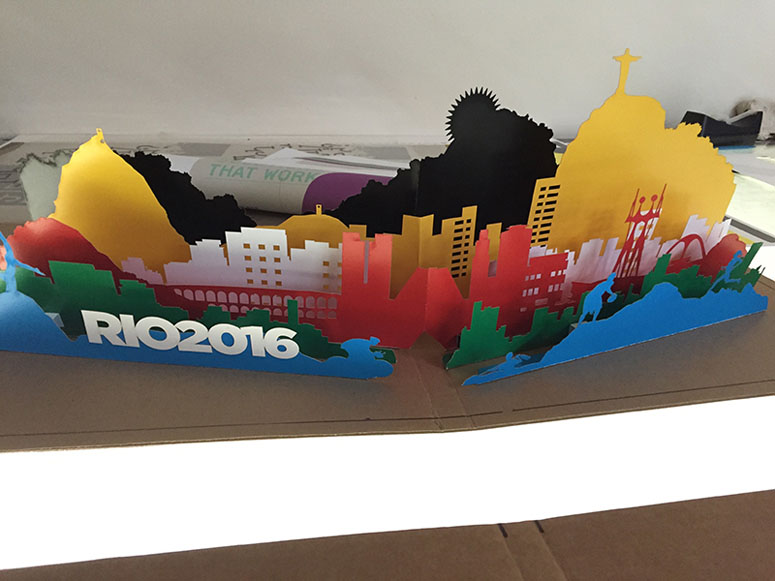
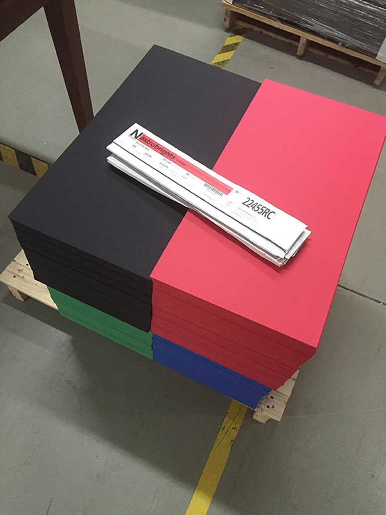
Neenah / Astrobright / Re-entry Red, Blast-Off Blue, Solar Yellow, Gamma Green, Eclipse Black, Stardust White / 80C
Number of Colors
–
Varnishes
–
Binding
Cloth book binding
Typography
Bell Slim Regular
Bell Slim Bold
Gotham Ultra
Gotham Medium
Gotham Book

Project Description
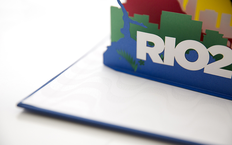
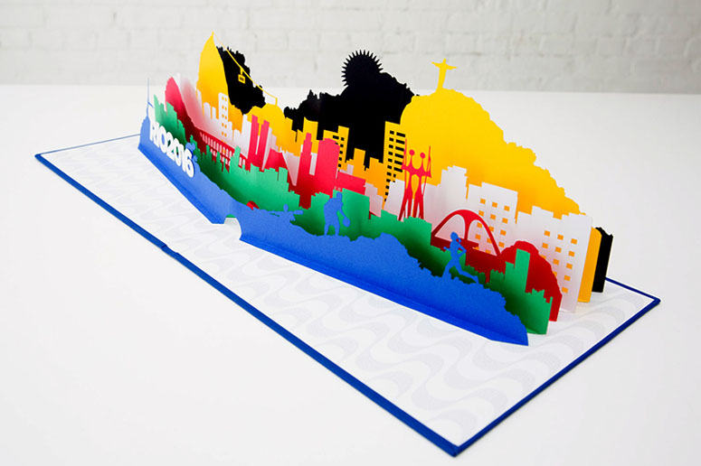
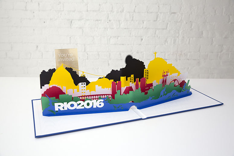
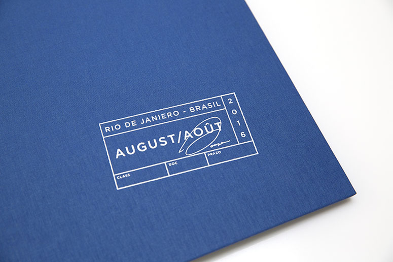
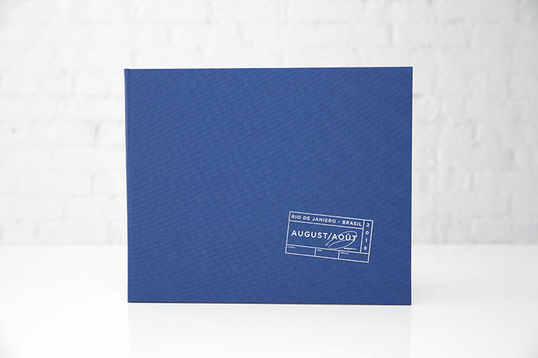
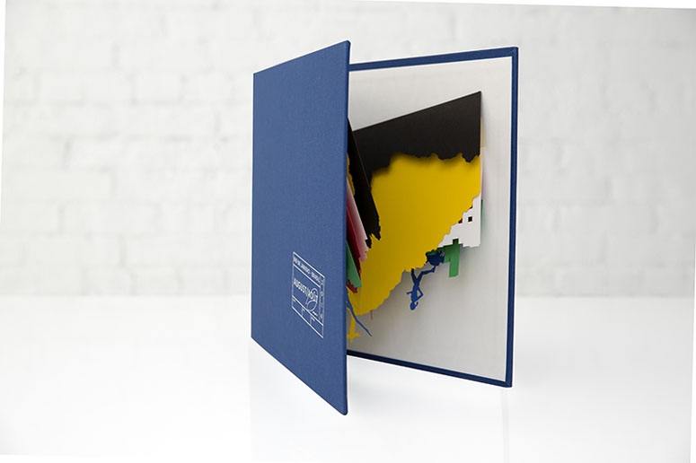
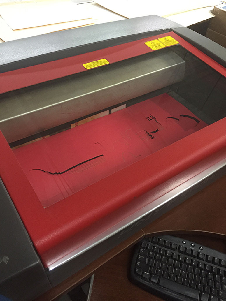
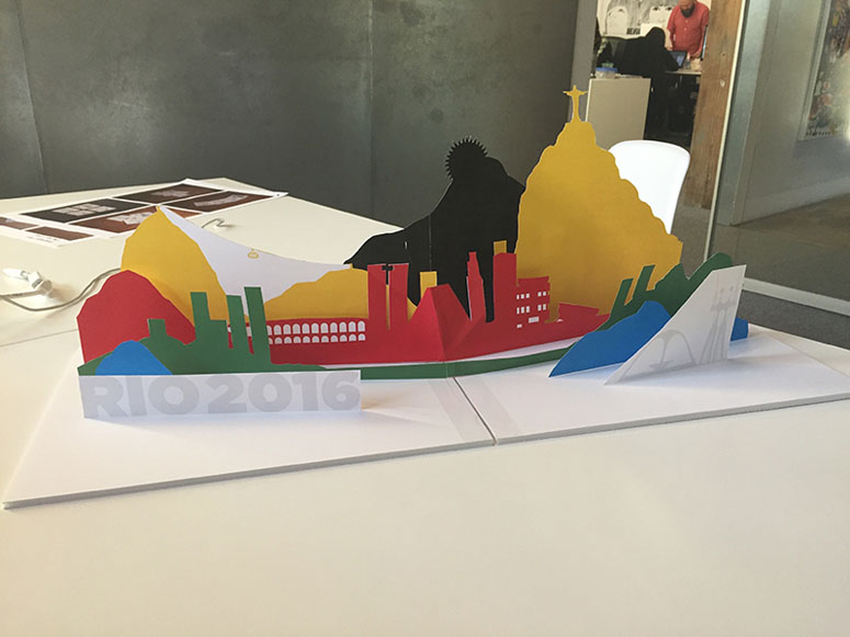
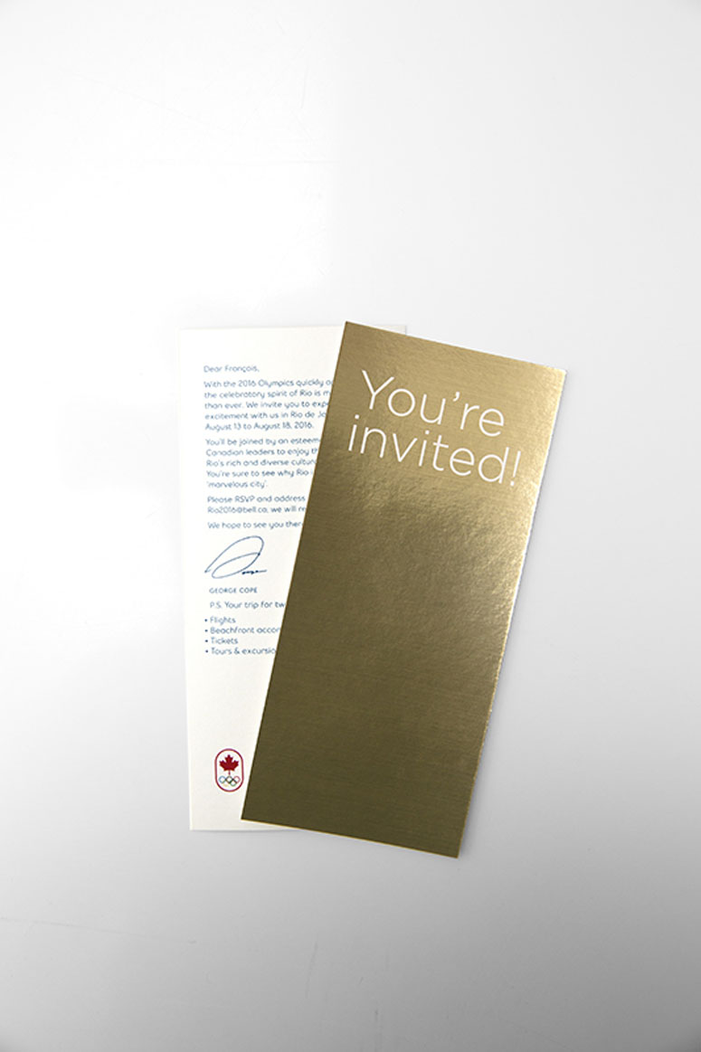
We created an invitation for 25 of Canada’s top business leaders to join Bell at the 2016 Rio Games with a personalized, hand assembled pop-up book. The invitation unfolds into an intricately layered skyline of Rio de Janeiro/Brazil. Each layer is laser die cut and corresponds to the colours of the Olympic rings. No printed ink was used in the construction of the book. All the colours came from naturally dyed paper.On behalf of the CEOs of Bell, we invited 25 of Canada’s top business elite to the 2016 Rio Games with a personalized, hand assembled pop-up book. The invitation unfolds into an intricately layered skyline of Rio de Janeiro. Each layer is laser die cut and corresponds to the colours of the Olympic rings. No printed ink was used in the construction of the book. All the colours came from naturally dyed paper.
Production Lesson(s)
There were many challenges in creating a custom pop-up book. How do you take a 2-dimensional object like paper and make it work in a 3-dimensional way? Rethinking how paper can bend and fold to move the way you want was a whole new way of designing for us. And we learned pretty quickly that pop-up books do not fit in either the traditional packaging or books category.So we had to ask ourselves a lot of questions and find the answers through trial and error. For example, we had to think about how the book worked when both open and closed. Did we have the right amount of paper tension? Will the layers stand up straight? And for how long? Will the glue hold? Is tape better? When the book is closed, will the layers tangle and tear the next time the book opens?
We built 11 mockups over the course of 4 months, tweaking layers and adjusting the illustrations between each version. The first few mockups included major redesigns, but with each subsequent version, the changes became more refined and the popup worked more smoothly.
Once we were happy with the final product, we had to come up with a way to hand assemble the rest of the popups in an efficient way. Tab placement guides were built into the clear gloss base and specific measurements were made for tab placements to add the correct tension throughout each layer. If tabs were not staggered, the entire book wouldn't close.
It was a steep learning curve and a LOT of work, but finishing something with this level of detail and complexity that the client also fell in love with is very rewarding.

Post Author

Bryony Gomez-Palacio
Editor of FPO and co-founder of UnderConsideration LLC.
More: Online / On Twitter
Date Published
July 13, 2016
Filed Under
Die-cut
Invitations
Tagged with
bell slim
cloth
die-cut
gotham
hand-assembly
invitation
neenah
About
FPO (For Print Only), is a division of UnderConsideration, celebrating the reality that print is not dead by showcasing the most compelling printed projects.
FPO uses Fonts.com to render Siseriff and Avenir Next.
FPO is run with Six Apart’s MovableType
All comments, ideas and thoughts on FPO are property of their authors; reproduction without the author’s or FPO’s permission is strictly prohibited
Twitter @ucllc
Sign-up for Mailing List
Mailing list managed by MailChimp
Thanks to our advertisers
About UnderConsideration
UnderConsideration is a graphic design firm generating its own projects, initiatives, and content while taking on limited client work. Run by Bryony Gomez-Palacio and Armin Vit in Bloomington, IN. More…
blogs we publish
Brand New / Displaying opinions and focusing solely on corporate and brand identity work.
Art of the Menu / Cataloguing the underrated creativity of menus from around the world.
Quipsologies / Chronicling the most curious, creative, and notable projects, stories, and events of the graphic design industry on a daily basis.
products we sell
Flaunt: Designing effective, compelling and memorable portfolios of creative work.
Brand New Conference videos / Individual, downloadable videos of every presentation since 2010.
Prints / A variety of posters, the majority from our AIforGA series.
Other / Various one-off products.
events we organize
Brand New Conference / A two-day event on corporate and brand identity with some of today's most active and influential practitioners from around the world.
Brand Nieuwe Conference / Ditto but in Amsterdam.
Austin Initiative for Graphic Awesomeness / A speaker series in Austin, TX, featuring some of the graphic design industry's most awesome people.
also
Favorite Things we've Made / In our capacity as graphic designers.
Projects we've Concluded / Long- and short-lived efforts.
UCllc News / Updates on what's going at the corporate level of UnderConsideration.




Related entries
Legion Paper All National Stationery Show Promotion
Ministry of Environment in Colombia Poster
Wakeboarding Magazine Athelete Award
“Let’s bite Till Die” Book
Twist Packaging