ADV @ UNDERCONSIDERATION Peek here for details
BROWSE
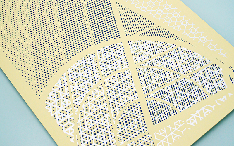
Geometric shapes. Patterns. Inks. Color. Overlay. All in great fun in the exploration of this poster and what can be done with a few basic elements that are pushed a bit further than usual.
Dimensions (Width × Height × Depth)
18 × 24 × in.
Page Count
–
Paper Stock
French Paper / Pop-tone / Banana Split / 100 C
Number of Colors
2
Varnishes
–
Binding
–
Typography
–

Project Description
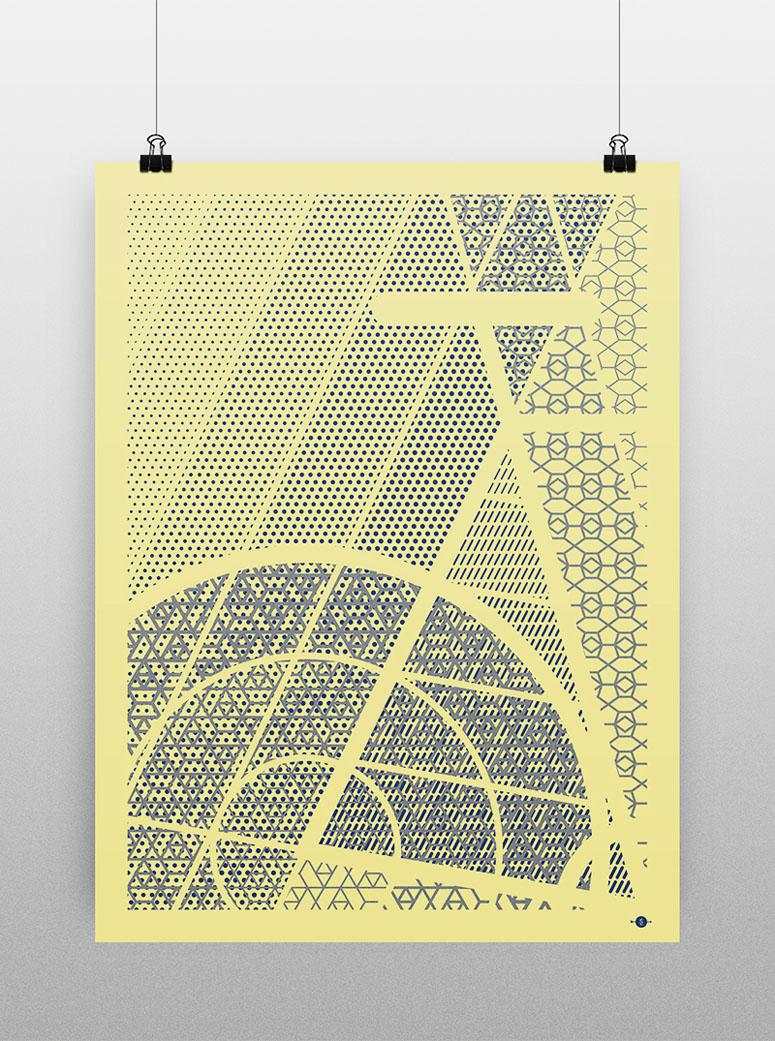
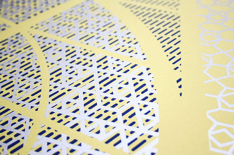
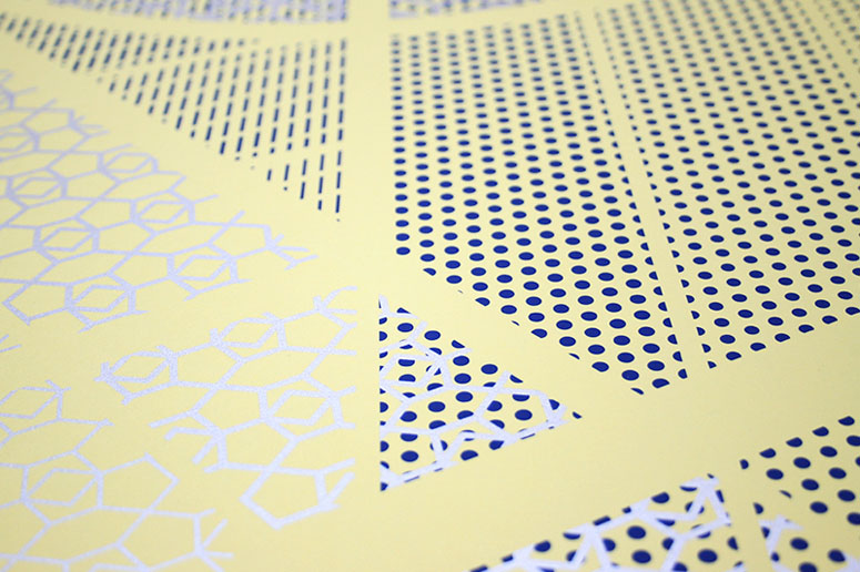
I'm into patterns a lot lately. How different patterns are juxtaposed to create a new pattern—that's what gave me the idea of using different patterns on my poster. And since the patterns were adding enough visual noise already, I wanted to utilize negative space for creating basic yet intricate shapes to delineate the cropped section of a bike. In a way, the patterns represent the different conditions a cyclist faces: the dotted pattern resembles dust and noise, the dashed pattern mimics rain, and both angular patterns symbolize leaves and snow. Also, it has metallic ink. I mean, who doesn't like metallic ink, right?Production Lesson(s)
With all the different patterns and cuts, I was concerned with the registration as it needed to be perfect for the negative space to cleanly delineate the bike, but Vahalla Studios did a fantastic job!
Post Author

Bryony Gomez-Palacio
Editor of FPO and co-founder of UnderConsideration LLC.
More: Online / On Twitter
Date Published
May 11, 2016
Filed Under
Posters
Silkscreen
Tagged with
french paper
metallic
pattern
PMS
poster
silkscreen
About
FPO (For Print Only), is a division of UnderConsideration, celebrating the reality that print is not dead by showcasing the most compelling printed projects.
FPO uses Fonts.com to render Siseriff and Avenir Next.
FPO is run with Six Apart’s MovableType
All comments, ideas and thoughts on FPO are property of their authors; reproduction without the author’s or FPO’s permission is strictly prohibited
Twitter @ucllc
Sign-up for Mailing List
Mailing list managed by MailChimp
Thanks to our advertisers
About UnderConsideration
UnderConsideration is a graphic design firm generating its own projects, initiatives, and content while taking on limited client work. Run by Bryony Gomez-Palacio and Armin Vit in Bloomington, IN. More…
blogs we publish
Brand New / Displaying opinions and focusing solely on corporate and brand identity work.
Art of the Menu / Cataloguing the underrated creativity of menus from around the world.
Quipsologies / Chronicling the most curious, creative, and notable projects, stories, and events of the graphic design industry on a daily basis.
products we sell
Flaunt: Designing effective, compelling and memorable portfolios of creative work.
Brand New Conference videos / Individual, downloadable videos of every presentation since 2010.
Prints / A variety of posters, the majority from our AIforGA series.
Other / Various one-off products.
events we organize
Brand New Conference / A two-day event on corporate and brand identity with some of today's most active and influential practitioners from around the world.
Brand Nieuwe Conference / Ditto but in Amsterdam.
Austin Initiative for Graphic Awesomeness / A speaker series in Austin, TX, featuring some of the graphic design industry's most awesome people.
also
Favorite Things we've Made / In our capacity as graphic designers.
Projects we've Concluded / Long- and short-lived efforts.
UCllc News / Updates on what's going at the corporate level of UnderConsideration.




Related entries
Um Caminho para Santiago CD Package and Diary
36 Days of Type Poster
CNN Digital New Hire Kit
Alivu EVOO Packaging
Ministry of Environment in Colombia Poster