ADV @ UNDERCONSIDERATION Peek here for details
BROWSE
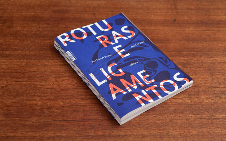
“Roturas e Ligamentos” Book
Production Method
Offset
Design
Dulce Cruz
Publisher: Abysmo
Poems: Taborda Duarte
Illustrations: André da Loba
Design: Dulce Cruz
Photos: Sílvio Teixeira
Printing
Orgal Impressores
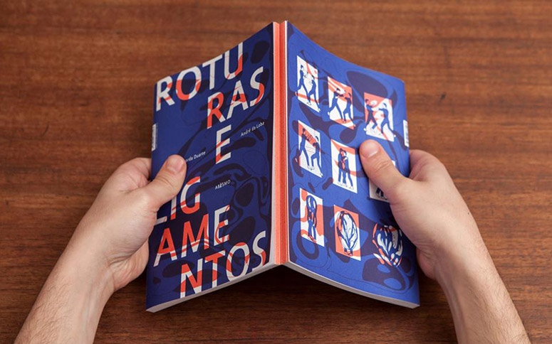
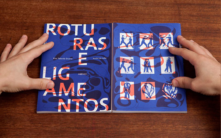
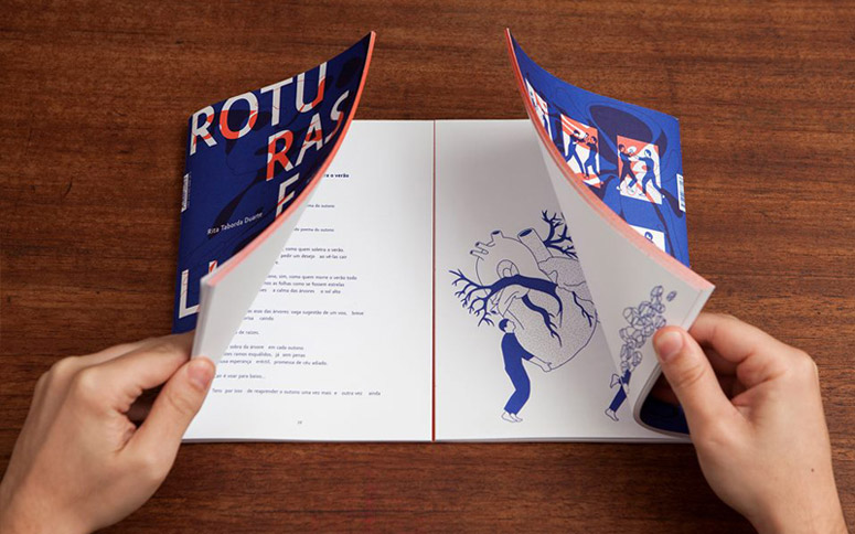
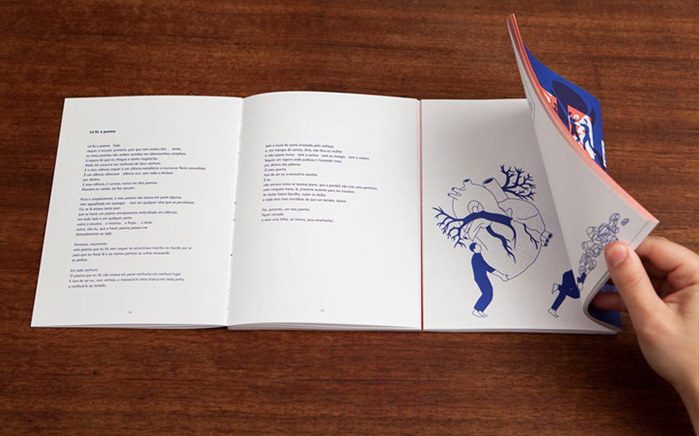
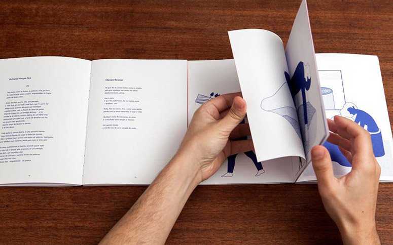
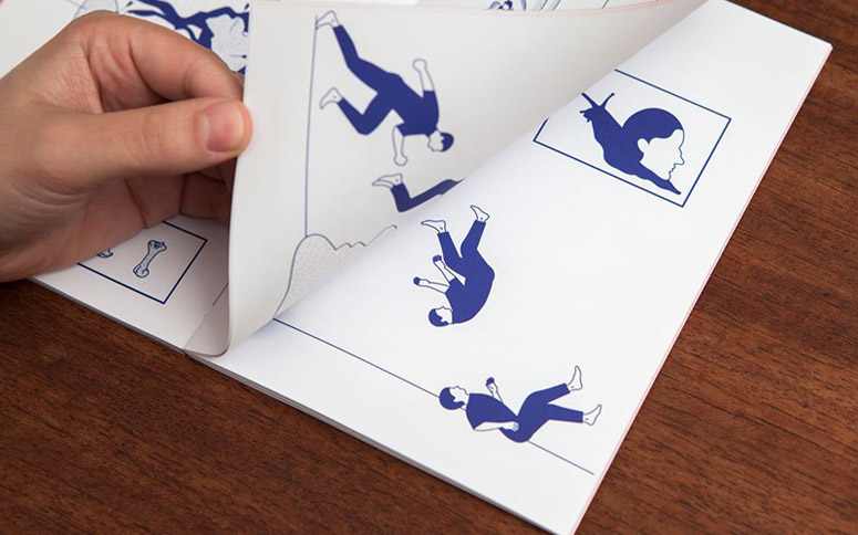
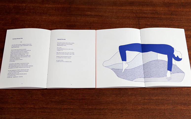
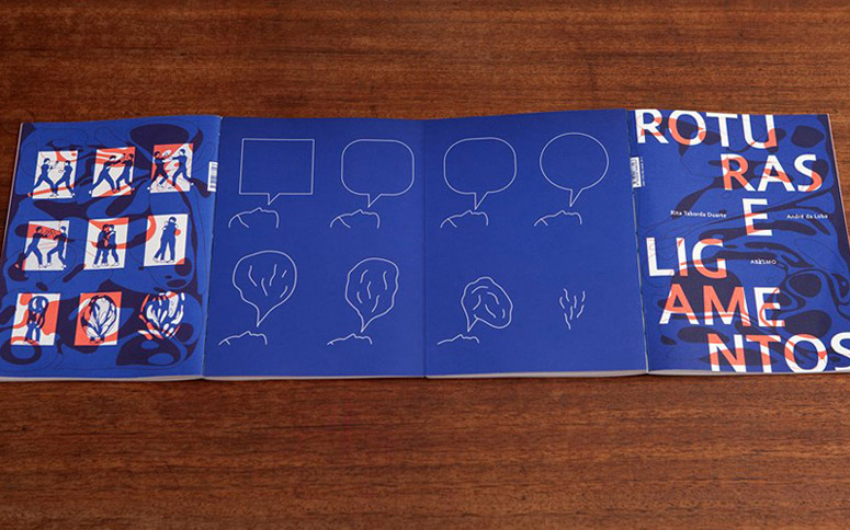
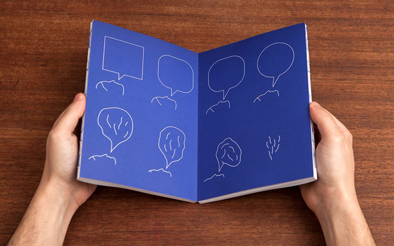
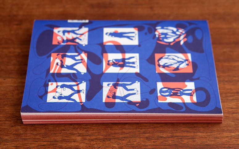
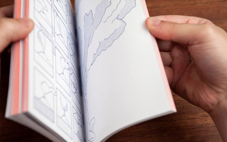
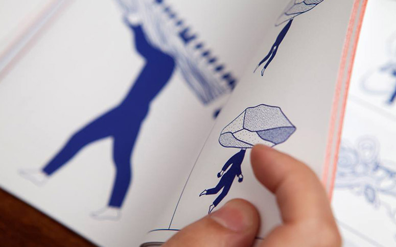
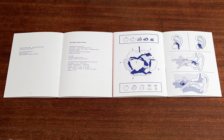
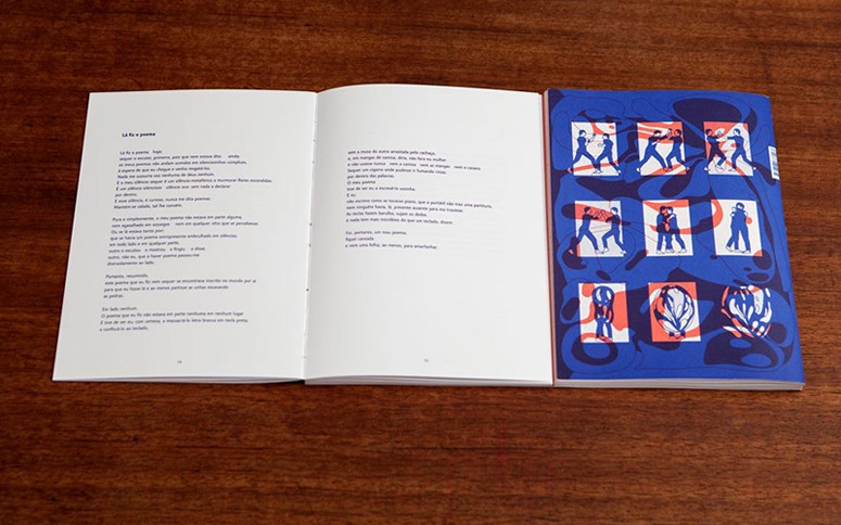
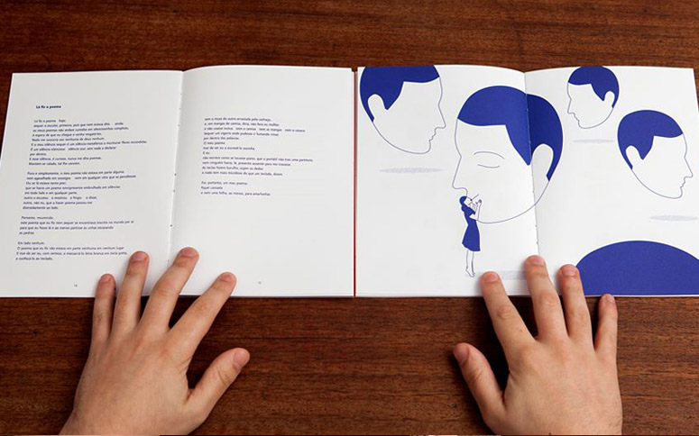
Portuguese designer Dulce Cruz creates a new way to experience books by combining two books in one, attached at the back cover. With the left side of the book composed soley of text and the right solely of image, readers can combine the two in seemingly limitless combinations.
Dimensions (Width × Height × Depth)
5.82 × 8.27 × 0.4 in.
Page Count
128
Paper Stock
Antalis / Print Speed / White / 135g
Number of Colors
2
Varnishes
–
Binding
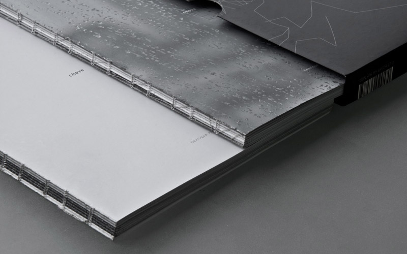
Exposed Threadsewn
Typography
Amor
Project Description
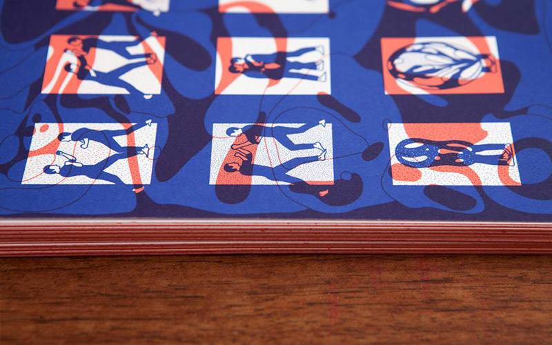
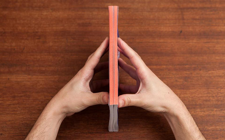
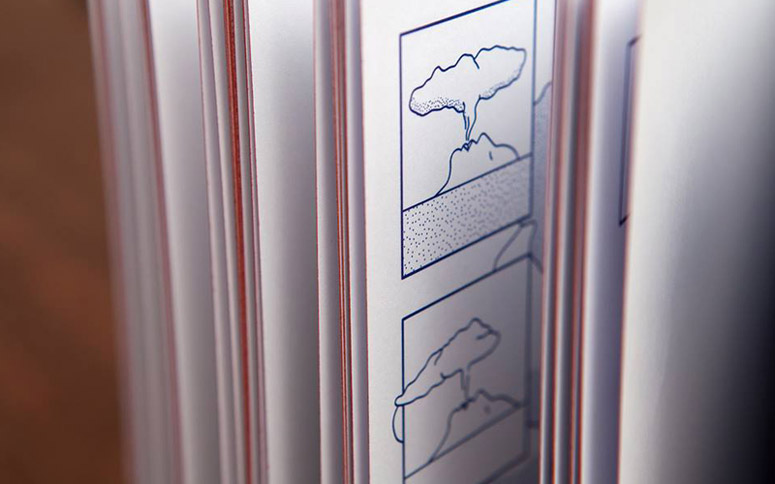
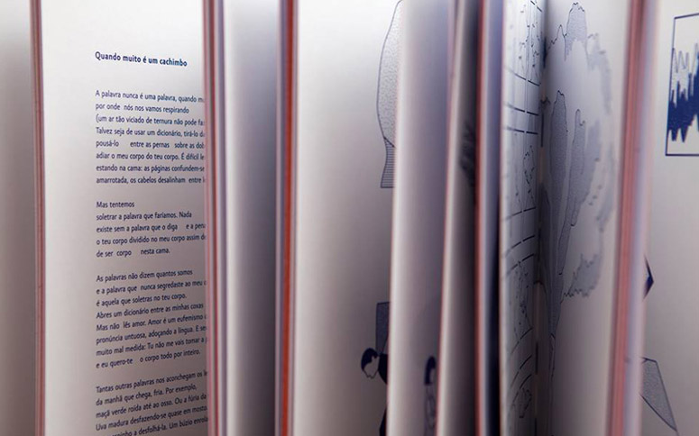
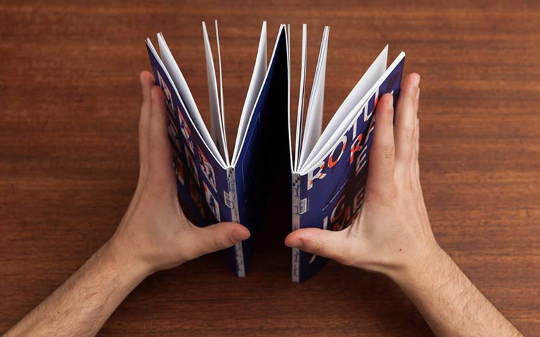
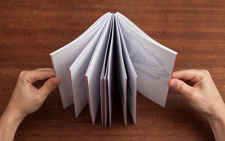
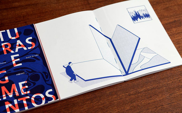
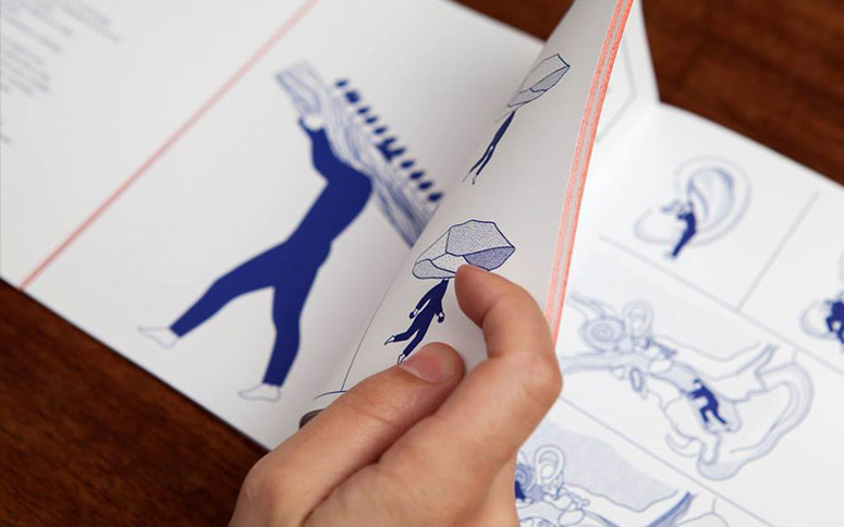
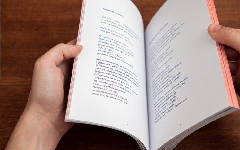
"Roturas e Ligamentos", (fractures and ligaments), the naked book, is in its essence two books. Bone and skin. Words and images. It can be read as an articulated itinerary between poetry and illustration, some connections are apparent, others more profound and only appear when the reader allows itself to get lost and deny a sequential structure. This way this book presents itself as a poem, allowing order for every individual chaos and allowing it to reconnect names, reorganize verbs, recombine words, letters and syllables, uncovering a net of new meanings.This book is paperback, printed in one pantone color on 150g Antalis Print Speed paper, (two on the cover). The tinted edge symbolizes the fracture of the body when separating the two parts. The exposed binding allows a complete spread of the book pages so the reader can combine any poem with any illustration through an endless exploratory reading process. Left sided book is solely made of texts and has no images (except the cover), right side of book is only made of drawings, (even the bar code was cut to fit this rule).
Production Lesson(s)
It was an amazing process to develop this book with the illustrator André da Loba. From the beginning of the project we knew this had to be a special book. After an exhaustive research on alternative ways of book binding and design we decided to create an object that represented the title "Fractures and Ligaments". The idea of making two different books connected by the back cover, allowing the reader to "break" and "re-attach" the illustrations to the text, seemed to be the best way.The greatest challenge was to make the two books' pages open completely so both could lay flat on a table side by side, enhancing its usability and playfulness. All of that got resolved after a meeting with the printer and a couple adjustments. With the help of the publisher we got to the final shape of the book. Each detail was carefully designed, before it was taken to production. As a result we have not just a tactile book, but a new way to read books.

Post Author

Kelly Cree
Writer for UnderConsideration LLC.
More: Online / On Twitter
Date Published
January 6, 2016
Filed Under
Books
Offset
Tagged with
exposed threadsewn
illustration
limited edition
poetry
About
FPO (For Print Only), is a division of UnderConsideration, celebrating the reality that print is not dead by showcasing the most compelling printed projects.
FPO uses Fonts.com to render Siseriff and Avenir Next.
FPO is run with Six Apart’s MovableType
All comments, ideas and thoughts on FPO are property of their authors; reproduction without the author’s or FPO’s permission is strictly prohibited
Twitter @ucllc
Sign-up for Mailing List
Mailing list managed by MailChimp
Thanks to our advertisers
About UnderConsideration
UnderConsideration is a graphic design firm generating its own projects, initiatives, and content while taking on limited client work. Run by Bryony Gomez-Palacio and Armin Vit in Bloomington, IN. More…
blogs we publish
Brand New / Displaying opinions and focusing solely on corporate and brand identity work.
Art of the Menu / Cataloguing the underrated creativity of menus from around the world.
Quipsologies / Chronicling the most curious, creative, and notable projects, stories, and events of the graphic design industry on a daily basis.
products we sell
Flaunt: Designing effective, compelling and memorable portfolios of creative work.
Brand New Conference videos / Individual, downloadable videos of every presentation since 2010.
Prints / A variety of posters, the majority from our AIforGA series.
Other / Various one-off products.
events we organize
Brand New Conference / A two-day event on corporate and brand identity with some of today's most active and influential practitioners from around the world.
Brand Nieuwe Conference / Ditto but in Amsterdam.
Austin Initiative for Graphic Awesomeness / A speaker series in Austin, TX, featuring some of the graphic design industry's most awesome people.
also
Favorite Things we've Made / In our capacity as graphic designers.
Projects we've Concluded / Long- and short-lived efforts.
UCllc News / Updates on what's going at the corporate level of UnderConsideration.




Related entries
2017 Brand New Conference Program
Severe(d): A Creepy Poetry Collection by Holly Riordan
Um Caminho para Santiago CD Package and Diary
BOYCO Classpack® Book
Antes de Perder la Esperanza Book