ADV @ UNDERCONSIDERATION Peek here for details
BROWSE
“I’d Letterpress The Shit Out Of That” Prints
Production Method
Letterpress
Design
Saint Gertrude
Luke Lucas, Dave Foster, Carla Hackett, Barry Spencer, Jess Cruickshank Dominique Falla, Jasmine Dowling, Jamie Clarke
Printing
Saint Gertrude
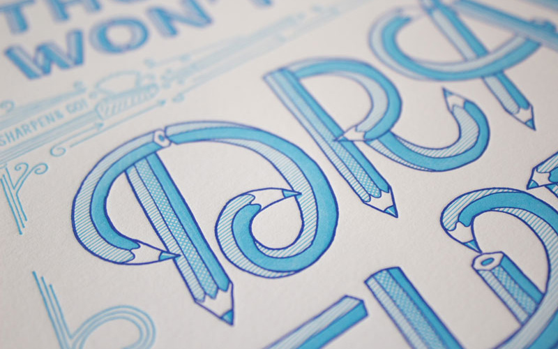
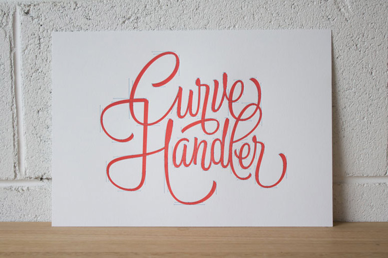
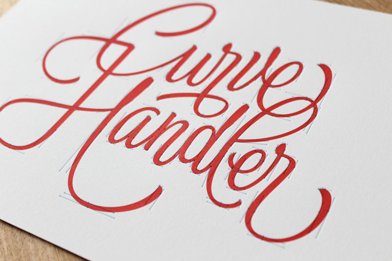
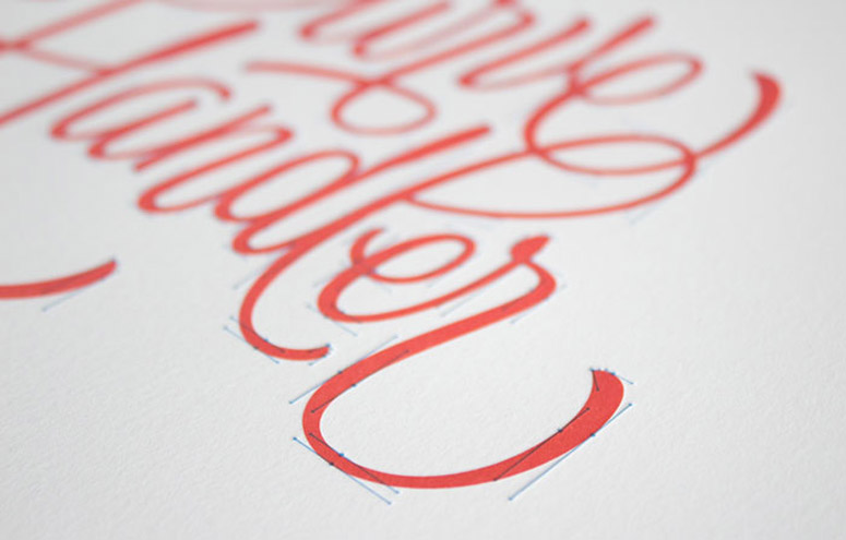
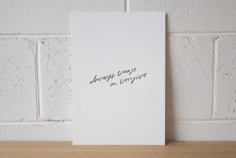
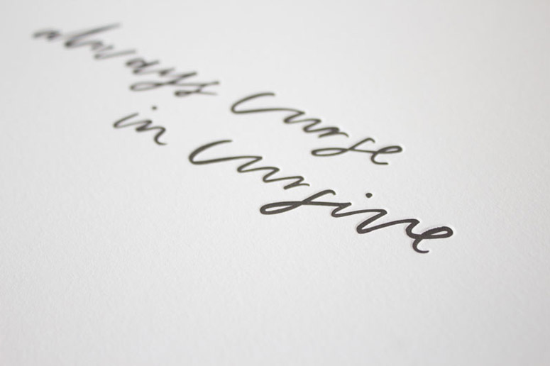
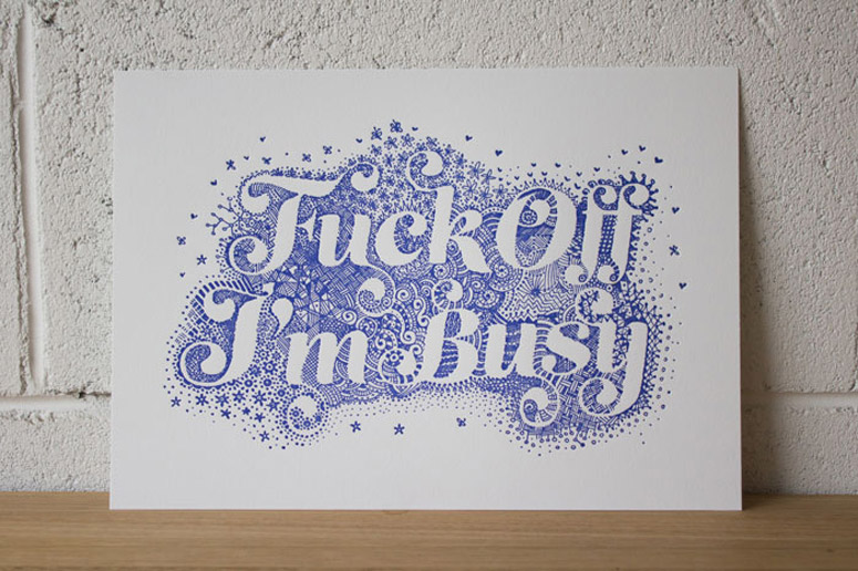
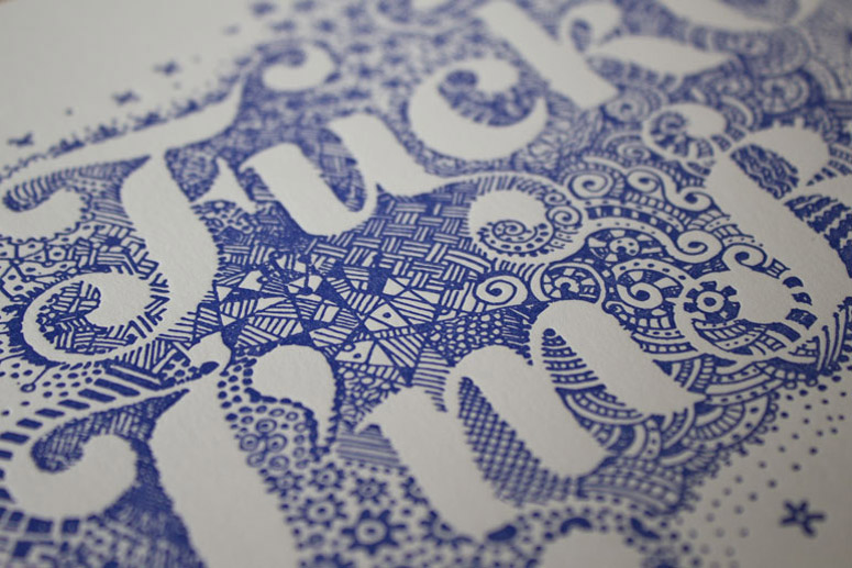
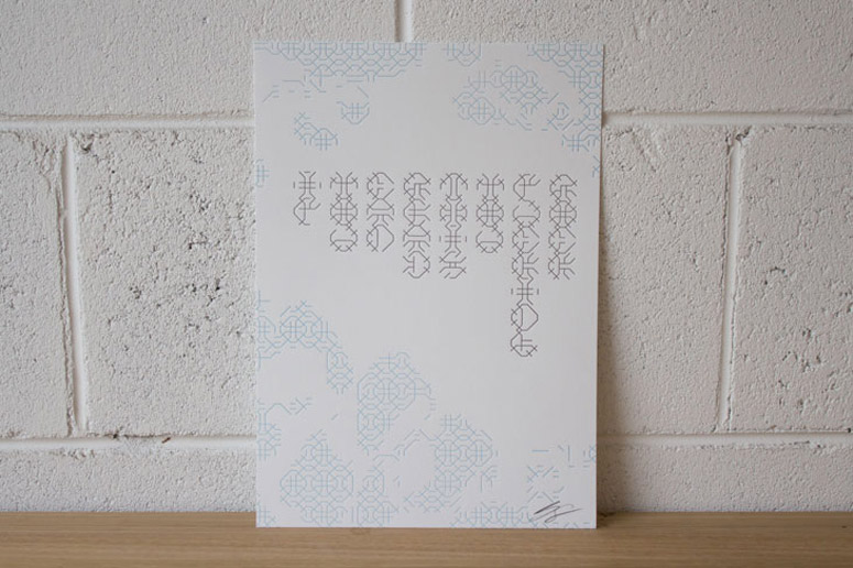
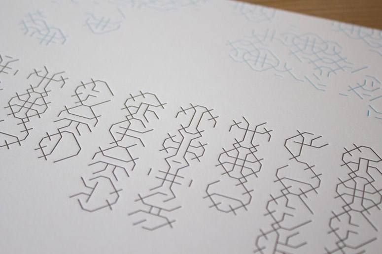
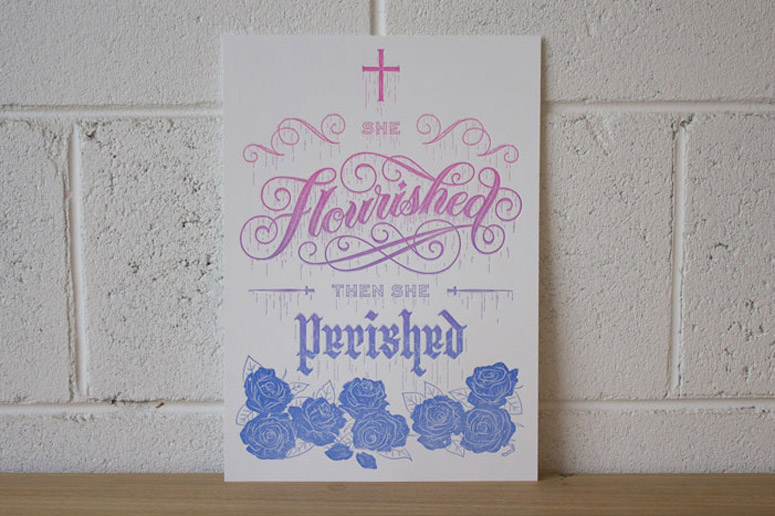
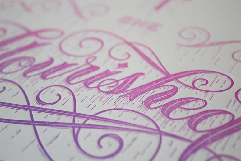
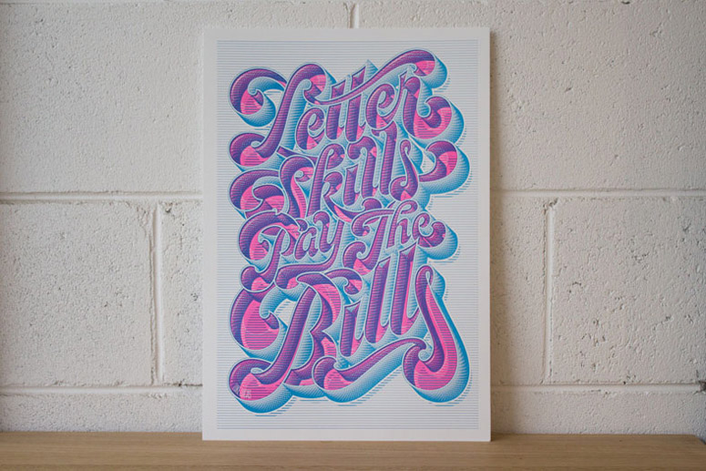
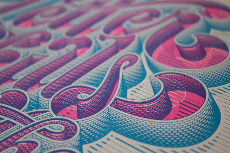
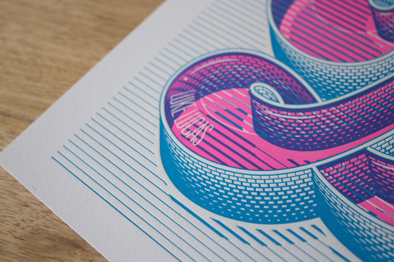
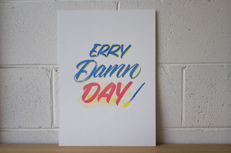
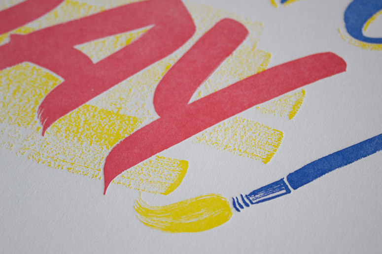
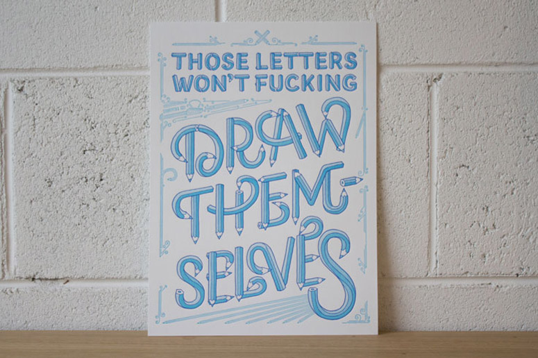
Conceptualized and curated by letterpress printer Saint Gertrude and letterer Carla Hackett, I’d Letterpress The Shit Out Of That was a one-night, group exhibition in Melbourne featuring Australia’s most prominent type and lettering artists. Each of the 8 limited-edition prints explores the collaborative nature of the two crafts while straddling the “0.25pt line between commercial design and fine art”.
Client
Group Exhibition
Quantity Produced
100 of each
Production Cost
$3,000
Production Time
4 weeks
Dimensions (Width × Height × Depth)
Various
Page Count
8
Paper Stock
–
Number of Colors
Various
Varnishes
–
Binding
–
Typography
Theo
Hand-lettered
Project Description
I'd Letterpress The Shit Ouf Of That is an irreverent and authentic expression of two niche industries that have experienced the highs and lows of popularity, over-saturation, misunderstanding and obsession.Lettering and letterpress share a lot of common ground. Both straddle a 0.25pt line between commercial design and fine art. We are designers and we are artists and we view the world through the lens of our work. This is an exhibition that celebrates and expresses both the collaborative nature of the two crafts, and the way in which eight letterers and one letterpress printer tackle each day and the fickle and volatile creative market we inhabit.
The exhibition was open for one night in Melbourne with prints available to purchase and take home. To break down common misconceptions surrounding both crafts, opening night also featured live lettering and letterpress demonstrations. The exhibition is currently continuing online until all limited edition pieces are sold out.
Epilogue: We all know that letterpress isn't a verb. It's kinda part of the joke.
Production Lesson(s)
No matter how seemingly simple a design, with my mind programmed for fine art, the perfection sensors were on high alert. I spent almost twice as long on each artwork as I had estimated, simply because I took perfection to the next level when it came to registration, ink coverage and impression. Each of these production elements needed to be reconsidered for their appropriateness to the artist's concept, so I had to turn off my 'printer' brain and turn on my 'artist' brain.
Post Author

Kelly Cree
Writer for UnderConsideration LLC.
More: Online / On Twitter
Date Published
December 15, 2015
Filed Under
Fine Art Print
Letterpress
Tagged with
exhibition
lettering
split fountain
About
FPO (For Print Only), is a division of UnderConsideration, celebrating the reality that print is not dead by showcasing the most compelling printed projects.
FPO uses Fonts.com to render Siseriff and Avenir Next.
FPO is run with Six Apart’s MovableType
All comments, ideas and thoughts on FPO are property of their authors; reproduction without the author’s or FPO’s permission is strictly prohibited
Twitter @ucllc
Sign-up for Mailing List
Mailing list managed by MailChimp
Thanks to our advertisers
About UnderConsideration
UnderConsideration is a graphic design firm generating its own projects, initiatives, and content while taking on limited client work. Run by Bryony Gomez-Palacio and Armin Vit in Bloomington, IN. More…
blogs we publish
Brand New / Displaying opinions and focusing solely on corporate and brand identity work.
Art of the Menu / Cataloguing the underrated creativity of menus from around the world.
Quipsologies / Chronicling the most curious, creative, and notable projects, stories, and events of the graphic design industry on a daily basis.
products we sell
Flaunt: Designing effective, compelling and memorable portfolios of creative work.
Brand New Conference videos / Individual, downloadable videos of every presentation since 2010.
Prints / A variety of posters, the majority from our AIforGA series.
Other / Various one-off products.
events we organize
Brand New Conference / A two-day event on corporate and brand identity with some of today's most active and influential practitioners from around the world.
Brand Nieuwe Conference / Ditto but in Amsterdam.
Austin Initiative for Graphic Awesomeness / A speaker series in Austin, TX, featuring some of the graphic design industry's most awesome people.
also
Favorite Things we've Made / In our capacity as graphic designers.
Projects we've Concluded / Long- and short-lived efforts.
UCllc News / Updates on what's going at the corporate level of UnderConsideration.




Related entries
Black Sheep Studio Business Cards and Promotional Items
Herbst & Spungen Wedding Invitation Suite
Cranky Bucks Promotion
Seegno Business Cards
“Miniature Views” Promotion