ADV @ UNDERCONSIDERATION Peek here for details
BROWSE
Addie & Zach Wedding Materials
Production Method
Letterpress
Design
Jim Godfrey
Printing
Rowley Press
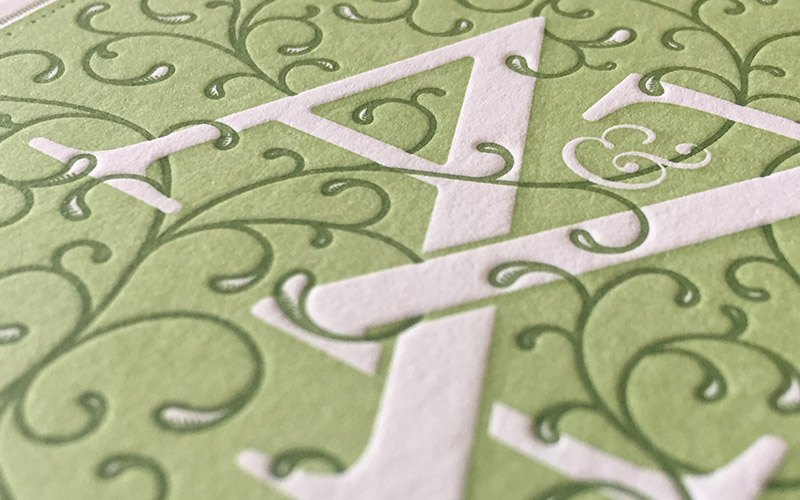
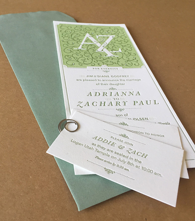
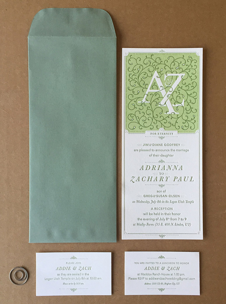
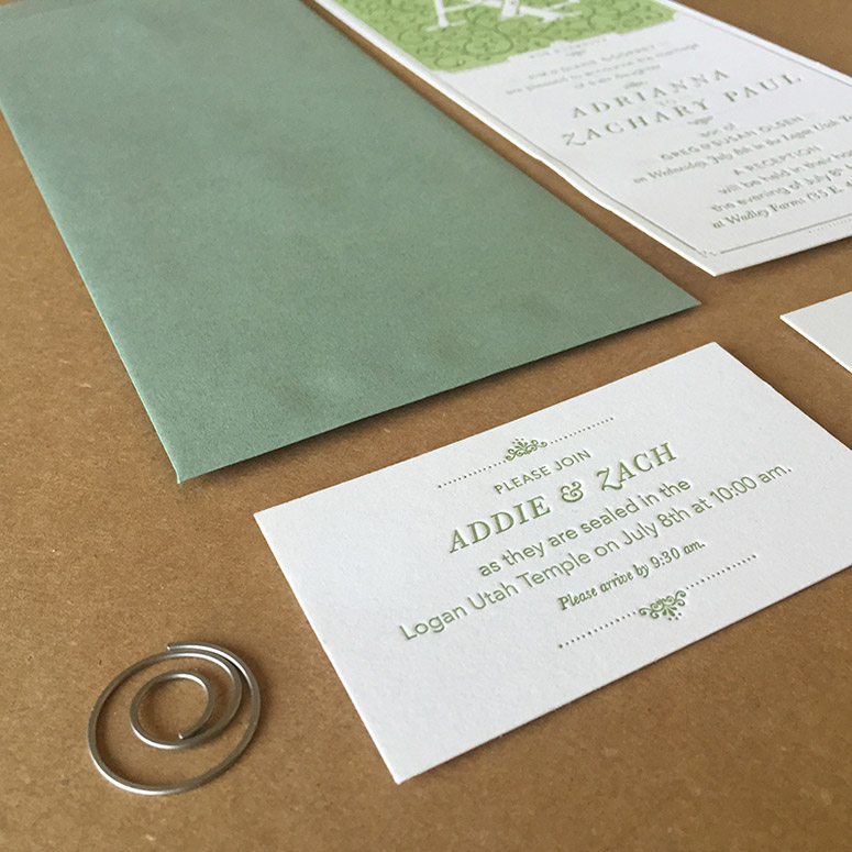
Designer Jim Godfrey chose a unique format to lend an air of playfulness to his otherwise restrained 2-color, monogram-driven invitation to his daughter’s wedding.
Client
Addie & Zach Olsen
Quantity Produced
500
Production Cost
$750
Production Time
3 Weeks
Dimensions (Width × Height × Depth)
card: 4 × 9 in.
inserts: 3.5 × 2 in.
Page Count
–
Paper Stock
Crane / Lettra / Pearl White / 110C
Number of Colors
2
Varnishes
–
Binding
–
Typography
Baskerville Italic
Avenir Light
modified form of Mrs Eaves
Project Description
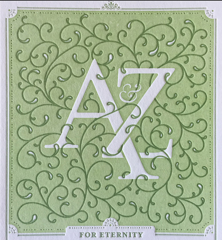
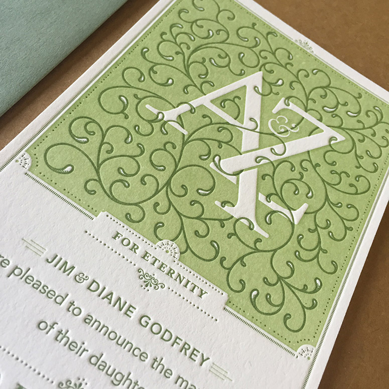
What do you do when you're a graphic designer and your daughter is getting married? Well, after the parental joy and panic have subsided, you design her invitations. Inspired by Erhardt Ratdolt's beautiful initial caps from the Renaissance, I tried to create something elegant and detailed. I wanted a format that was somewhat unique, to offset the fact that I would print two colors but only on one side of the paper. I sized the invitation to fit into a #10 policy envelope (with the flap at the top), to make it more unique and accentuate the verticality of the invitation. My daughter and her fiancé (and my wife and his parents) loved the design, which was letterpressed at Rowley Press.Production Lesson(s)
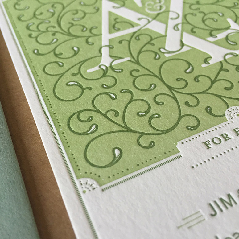
There were a couple of production problems we addressed. First, Rowley Press was concerned about the large area of ink coverage at the top of the invitation and being able to balance that with some of the fine details that printed in the same color. We decided it would be best to move some of those details to the other color plate, allowing him to run the ink more heavily for the lighter green plate. This created a beautiful, solid color background. The second issue to address was the trapping of the darker green vines (which also had some fine detail in their terminals) onto the lighter green. We decided to overprint the vines and only knock out the white in the highlights of the terminals. This worked well, although if you look closely there is a slight difference in color. But it was worth it to avoid the registration issues.
Post Author

Kelly Cree
Writer for UnderConsideration LLC.
More: Online / On Twitter
Date Published
September 16, 2015
Filed Under
Letterpress
Wedding materials
Tagged with
crane lettra
monogram
mrs. eaves
About
FPO (For Print Only), is a division of UnderConsideration, celebrating the reality that print is not dead by showcasing the most compelling printed projects.
FPO uses Fonts.com to render Siseriff and Avenir Next.
FPO is run with Six Apart’s MovableType
All comments, ideas and thoughts on FPO are property of their authors; reproduction without the author’s or FPO’s permission is strictly prohibited
Twitter @ucllc
Sign-up for Mailing List
Mailing list managed by MailChimp
Thanks to our advertisers
About UnderConsideration
UnderConsideration is a graphic design firm generating its own projects, initiatives, and content while taking on limited client work. Run by Bryony Gomez-Palacio and Armin Vit in Bloomington, IN. More…
blogs we publish
Brand New / Displaying opinions and focusing solely on corporate and brand identity work.
Art of the Menu / Cataloguing the underrated creativity of menus from around the world.
Quipsologies / Chronicling the most curious, creative, and notable projects, stories, and events of the graphic design industry on a daily basis.
products we sell
Flaunt: Designing effective, compelling and memorable portfolios of creative work.
Brand New Conference videos / Individual, downloadable videos of every presentation since 2010.
Prints / A variety of posters, the majority from our AIforGA series.
Other / Various one-off products.
events we organize
Brand New Conference / A two-day event on corporate and brand identity with some of today's most active and influential practitioners from around the world.
Brand Nieuwe Conference / Ditto but in Amsterdam.
Austin Initiative for Graphic Awesomeness / A speaker series in Austin, TX, featuring some of the graphic design industry's most awesome people.
also
Favorite Things we've Made / In our capacity as graphic designers.
Projects we've Concluded / Long- and short-lived efforts.
UCllc News / Updates on what's going at the corporate level of UnderConsideration.




Related entries
Black Sheep Studio Business Cards and Promotional Items
Herbst & Spungen Wedding Invitation Suite
Cranky Bucks Promotion
Seegno Business Cards
“Miniature Views” Promotion