ADV @ UNDERCONSIDERATION Peek here for details
BROWSE
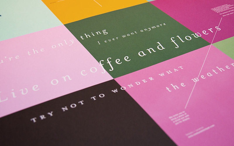
Mark & Michelle Wedding Invitation
Production Method
Offset
Design
TBD Studio
Designers: Mark Buchner, Michelle Buchner
Photography: Morgan Yew, Greg Bennett
Printing
Flash Reproductions
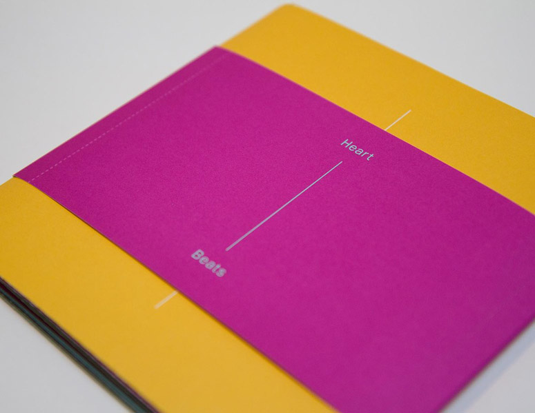
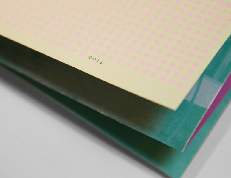
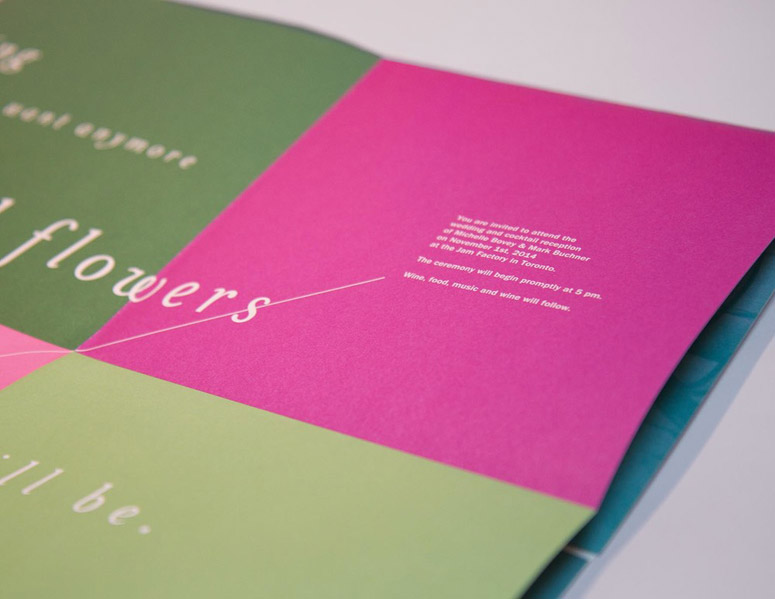
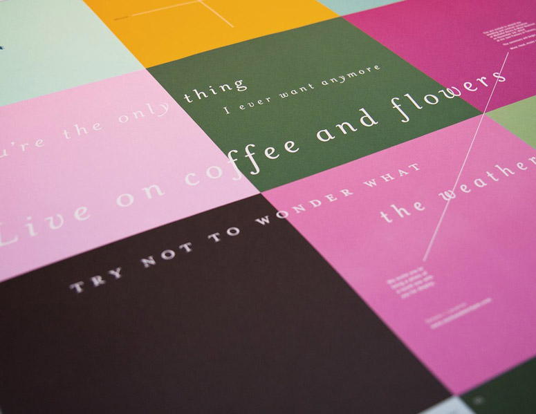
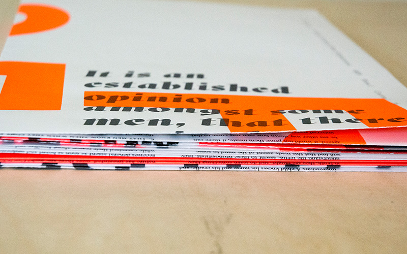
Hand-scored and folded, spot light-sensitive UV coated, and including a belly band that doubles as an RSVP card and save-the-date reminder, this thoughtful and colorful wedding invitation and poster is what happens when two designers marry each other.
Client
Self-promotion
Quantity Produced
200
Production Cost
–
Production Time
4 Weeks
Dimensions (Width × Height × Depth)
Poster Folded: 7 × 7 in.
Poster Open: 21 × 28 in.
Page Count
–
Paper Stock
Domtar / Cougar / White / 80 T
Number of Colors
6
Varnishes
Light-Sensitive Spot UV
Binding
–
Typography
Franklin Gothic
Mrs Eaves
Project Description
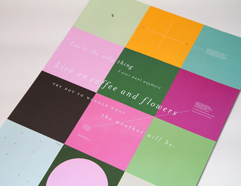
When presented with the task of designing our own wedding invite, we knew we were in for a gruelling process. Here we were, two designers marrying each other, subsequently making us our harshest and most critical clients yet: an interesting conundrum.What resulted was a 21-by-28-inch, fold-out poster invite. It aimed at amusing our invitees, and served as a catapult for what would become a colourful and energetic wedding day.
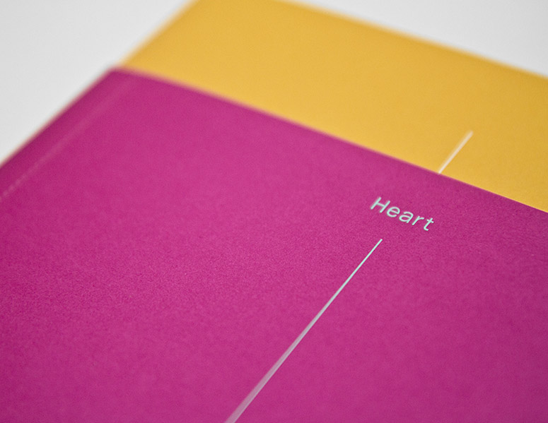
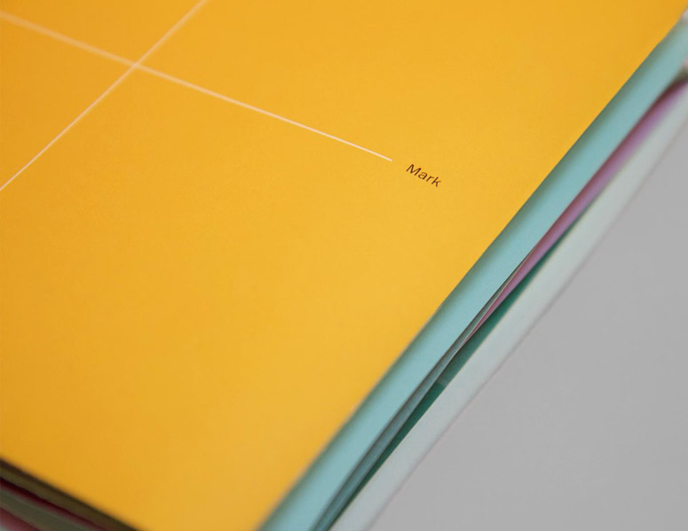
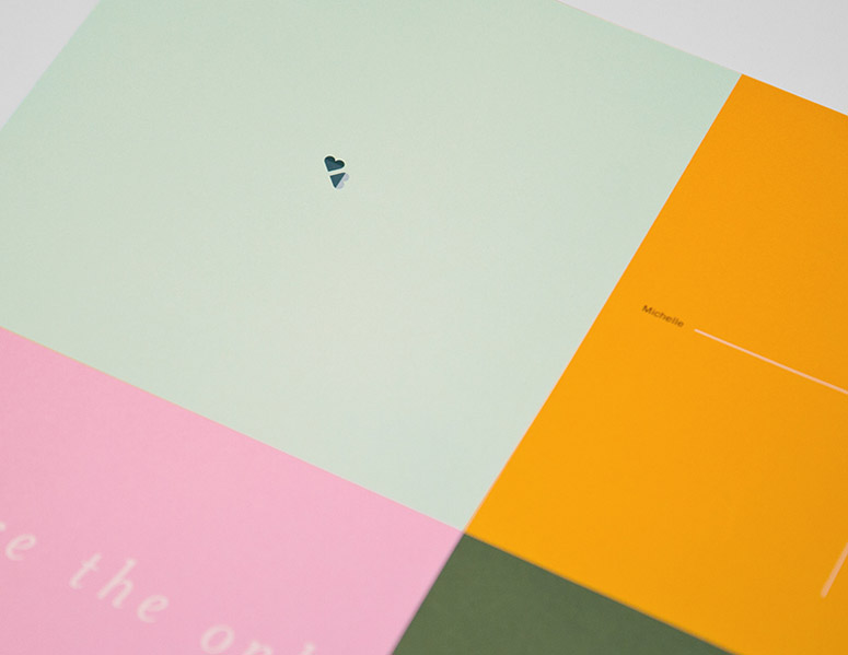
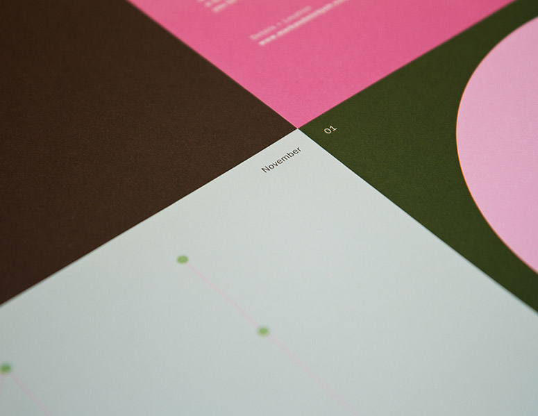
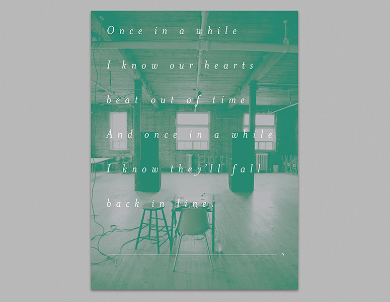
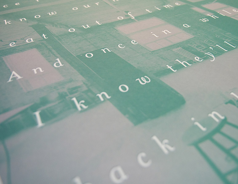
The theme Heart Beats references our love of music, and hints at the music oriented ceremony and reception. The invite unfolds first revealing the date coded in dots, which maintains logical orientation even when completely unfolded. The back of the invite serves as a poster with lyrics overlaying a silver duotone of the venue. A light-sensitive UV adds another layer of depth to the poetic verse. The belly-band tears apart to become an RSVP postcard, and a date reminder for the fridge. The double-heart logo subtly contains our initials, MB, and signifies a pair of hearts falling in-line.
Production Lesson(s)
The size of the poster presented a couple challenges. The alignment on the spot UV was very difficult to register because of the paper stretching. However, our printer did an outstanding job getting the best results possible. Our most tedious challenge was folding. Because the size exceeded what our printer could do in-house, we took it upon ourselves to score and fold all the posters by hand. Although it was a lot of work, it ensured the best and cleanest result possible.
Post Author

Kelly Cree
Writer for UnderConsideration LLC.
More: Online / On Twitter
Date Published
April 30, 2015
Filed Under
Offset
Wedding materials
Tagged with
duotone
folded poster
hand-assembled
hand-folded
hand-scored
spot uv varnish
About
FPO (For Print Only), is a division of UnderConsideration, celebrating the reality that print is not dead by showcasing the most compelling printed projects.
FPO uses Fonts.com to render Siseriff and Avenir Next.
FPO is run with Six Apart’s MovableType
All comments, ideas and thoughts on FPO are property of their authors; reproduction without the author’s or FPO’s permission is strictly prohibited
Twitter @ucllc
Sign-up for Mailing List
Mailing list managed by MailChimp
Thanks to our advertisers
About UnderConsideration
UnderConsideration is a graphic design firm generating its own projects, initiatives, and content while taking on limited client work. Run by Bryony Gomez-Palacio and Armin Vit in Bloomington, IN. More…
blogs we publish
Brand New / Displaying opinions and focusing solely on corporate and brand identity work.
Art of the Menu / Cataloguing the underrated creativity of menus from around the world.
Quipsologies / Chronicling the most curious, creative, and notable projects, stories, and events of the graphic design industry on a daily basis.
products we sell
Flaunt: Designing effective, compelling and memorable portfolios of creative work.
Brand New Conference videos / Individual, downloadable videos of every presentation since 2010.
Prints / A variety of posters, the majority from our AIforGA series.
Other / Various one-off products.
events we organize
Brand New Conference / A two-day event on corporate and brand identity with some of today's most active and influential practitioners from around the world.
Brand Nieuwe Conference / Ditto but in Amsterdam.
Austin Initiative for Graphic Awesomeness / A speaker series in Austin, TX, featuring some of the graphic design industry's most awesome people.
also
Favorite Things we've Made / In our capacity as graphic designers.
Projects we've Concluded / Long- and short-lived efforts.
UCllc News / Updates on what's going at the corporate level of UnderConsideration.




Related entries
2017 Brand New Conference Program
Severe(d): A Creepy Poetry Collection by Holly Riordan
Um Caminho para Santiago CD Package and Diary
BOYCO Classpack® Book
Antes de Perder la Esperanza Book